1. General Techniques
G1: Adding a link at the top of each page that goes directly to the main content area
Applicability
All technologies that contain links
This technique relates to:
Description
The objective of this technique is to provide a mechanism to bypass blocks of material that are repeated on multiple Web pages by skipping directly to the main content of the Web page. The first interactive item in the Web page is a link to the beginning of the main content. Activating the link sets focus beyond the other content to the main content. This technique is most useful when a Web page has one main content area, rather than a set of content areas that are equally important.
Note: Visible links are necessary for those navigating with a keyboard including switch users, those using techniques that generate keyboard strokes slowly, screen magnification software users, screen reader users working with sighted colleagues, keyboard only users and those navigating using voice recognition software.
Examples
Example 1: An online newspaper
An on-line newspaper contains many sections of information: a search function, a corporate banner, sidebars, minor stories, how to contact the newspaper, etc. The lead story is located in the middle of the page. The first link that the user reaches when tabbing through the page is titled "Skip to Lead Story". Activating the link moves visual focus to the story. Pressing tab again takes the user to the first link in the main story.
Example 2: A "Skip to main content" link
A Web page includes a variety of navigation techniques on each page: a bread crumb trail, a search tool, a site map, and a list of related resources. The first link on the page is titled "Skip to Main Content". A user activates the link to skip over the navigation tools.
Resources
Resources are for information purposes only, no endorsement implied.
Related Techniques
Tests
Procedure
Check that a link is the first focusable control on the Web page.
Check that the description of the link communicates that it links to the main content.
Check that the link is either always visible or visible when it has keyboard focus.
Check that activating the link moves the focus to the main content.
Check that after activating the link, the keyboard focus has moved to the main content.
Expected Results
All checks above are true.
G4: Allowing the content to be paused and restarted from where it was paused
Applicability
Any technology that includes moving or scrolling content.
This technique relates to:
Description
The objective of this technique is to provide a way to pause movement or scrolling of content. If the user needs to pause the movement, to reduce distraction or to have time to read it, they can do so, and then restart it as needed. This mechanism can be provided either through interactive controls that conform to WCAG or through keyboard shortcuts. If keyboard shortcuts are used, they are documented.
Examples
A site contains a scrolling news banner at the top of the page. Users who need more time to read it can press the Escape key to pause the scrolling. Pressing Escape again restarts it.
A Web page contains a link labeled "How to tie a shoe" which links to a Flash animation. Text immediately preceding the link informs the user that pressing the spacebar will pause the animation and restart it again.
Related Techniques
- G75: Providing a mechanism to postpone any updating of content
- G76: Providing a mechanism to request an update of the content instead of updating automatically
- G186: Using a control in the Web page that stops moving, blinking, or auto-updating content
- SCR33: Using script to scroll content, and providing a mechanism to pause it
Tests
Procedure
On a page with moving or scrolling content,
Use the mechanism provided in the Web page or by the user agent to pause the moving or scrolling content.
Check that the moving or scrolling has stopped and does not restart by itself.
Use the mechanism provided to restart the moving content.
Check that the movement or scrolling has resumed from the point where it was stopped.
Expected Results
#2 and #4 are true.
G5: Allowing users to complete an activity without any time limit
Applicability
This technique applies to any technologies or methods supporting the implementation of an activity which does not require timed interaction for its functionality.
This technique relates to:
Description
The objective of this technique is to provide users with all the time they need to complete an activity. This technique involves providing a specified activity which does not require timed interaction. Users are allowed as much time as they need to interact with the activity.
Examples
An interactive exam for a course provides all questions on one Web page. Users can take as much time as they need to complete it.
In an interactive game, users can take as much time as they like on their turn instead of having to complete their move within a limited amount of time.
In an online auction, each bidder can submit only one bid rather than submitting multiple competitive bids based on timing. The bidding is open for a full day, providing enough time for anyone to complete the simple bid form. Once bidding is closed, the best bid wins.
Resources
Resources are for information purposes only, no endorsement implied.
Related Techniques
Tests
Procedure
Determine if any timed interactions are present.
Expected Results
#1 is false.
G8: Providing a movie with extended audio descriptions
Applicability
Any technology that supports audio and video.
This technique relates to:
- Success Criterion 1.2.3 (Audio Description or Media Alternative (Prerecorded))
- Success Criterion 1.2.5 (Audio Description (Prerecorded))
- Success Criterion 1.2.7 (Extended Audio Description (Prerecorded))
Description
The objective of this technique is to provide a second version of video content that provides extended audio desciptions. One of the difficult things about creating traditional audio descriptions is that the narrator sometimes has to provide a lot of information during very short pauses in dialogue. Extended audio description temporarily pauses the audio and video to allow critical information to be delivered when pauses in dialogue are insufficient for adequate description.
Providing a second version of the movie with extended audio descriptions will make this content accessible for blind people who need to hear not only the dialogue but also the context and other aspects of the video that are not communicated by the characters' dialogue alone, and for which there is insufficient time during the natural dialogue.
Because it disrupts viewing for those who do not need the additional description, techniques that allow you to turn the feature on and off are often provided. Alternately, versions with and without the additional description can be provided.
Examples
Example 1
An alternate version of an online video of a family escaping from a burning building, there is a continuous dialogue between the husband and wife about where the children are. Meanwhile, in the background, a wall caves in, which is important information in the story because it will block their exit from that part of the building. The video track halts (same frame is repeated) while a narrator gives the details about the wall falling and the video continues.
Example 2
A training film has narrative that runs almost continuously throughout. An alternate version is available for people who have difficulty viewing the video portion. The alternate version freezes the video and provides audio description of key information.
Resources
Resources are for information purposes only, no endorsement implied.
Related Techniques
- G78: Providing a second, user-selectable, audio track that includes audio descriptions
- G69: Providing an alternative for time based media
- G173: Providing a version of a movie with audio descriptions
- SM1: Adding extended audio description in SMIL 1.0
- SM2: Adding extended audio description in SMIL 2.0
- SM6: Providing audio description in SMIL 1.0
- SM7: Providing audio description in SMIL 2.0
Tests
Procedure
Open the version of the movie that includes extended audio descriptions.
Check that the video halts for extended audio description when there is not enough space to include necessary narration between the natural dialogue.
Check that the necessary information is in the audio description.
If the alternate version(s) are on a separate page, check for the availability of link(s) to allow the user to get to the other versions.
Expected Results
Checks #2, #3 and #4 are true.
G9: Creating captions for live synchronized media
Applicability
Applies to all technologies that present audio visual information.
This technique relates to:
Description
The objective of this technique is to allow users who cannot hear to be able to access real-time synchronized media broadcasts. It is more difficult to create accurate real-time captions because there is little time to correct mistakes or to listen a second time or consult someone to be sure the words are accurately reproduced. It is also harder to simplify or paraphrase information if it is flowing too quickly.
Real-time typing text entry techniques exist using stenographic and rapid typing technologies. Re-voicing speech-to-text (where a person listens to speech and then carefully re-voices it into a computer trained to their speech) is used today for telephone relay services and may be used in the future for captioning. Eventually speech-to-text with correction will be possible.
Examples
Example 1: A television studio uses a real-time captioning service to create captions for its evening news online.
Resources
Resources are for information purposes only, no endorsement implied.
Related Techniques
Tests
Procedure
Check that a procedure and policy are in place to ensure that captions are delivered in real-time.
Expected Results
Check #1 is true.
G10: Creating components using a technology that supports the accessibility API features of the platforms on which the user agents will be run to expose the names and roles, allow user-settable properties to be directly set, and provide notification of changes
Applicability
Programming technologies that have standard components programmed to interface with accessibility APIs.
This technique relates to:
Description
The objective of this technique is to allow assistive technology to understand Web content so that it can convey equivalent information to the user through an alternate user interface.
Sometimes content is not created using markup language but rather using a programming language or tools. In many cases, these technologies have interface components that are already programmed to interface with accessibility APIs. If and author uses these components and fills in the properties (e.g., name, etc) the resulting user interface components in the content will be accessible to assistive technology.
However, if an author wants to create a user interface component that is new and they cannot use standard components, then they need to be sure to add the accessibility provisions themselves - and implement them in a way that is compatible with the accessibility API.
After completion, the custom component should be tested for Accessibility Support.
Examples
A Web page uses java to create an applet. A group of authors wants to create an entirely new type of interface component so they cannot use existing Java objects. They use Java swing classes to create their component because the Java swing classes already have provisions for connecting to different accessibility APIs. Using the Java swing classes they are able to create an interface component that exposes its name and role, is able to be set by AT and alerts AT to any updates.
A Web page uses an original ActiveX control that is written in the C++ programming language. The control is written to explicitly support the Microsoft Active Accessibility (MSAA) API to expose information about accept commands. The control then interacts directly with assistive technology running the user agent on systems that support MSAA.
Related Techniques
Tests
Procedure
Render content using an accessible User Agent.
Use an Accessibility Tool designed for the Accessibility API of the User agent to evaluate each user interface component.
Check that name and role for each user interface component is found by the tool.
Change the values on the component.
Check that the Accessibility tool is alerted.
Check that the component works with assistive technologies.
Expected Results
Checks #3, #5 and #6 are true for each user interface component.
G11: Creating content that blinks for less than 5 seconds
Applicability
Technologies that support blinking content.
This technique relates to:
Description
The objective of this technique is to minimize the distraction caused by blinking content and enable users to re-focus on the other content on the page.
Blinking content can be created using a variety of technologies, many of which include options to loop blinking content continuously or to otherwise specify the amount of time the blinking content is displayed. Limiting the blinking of content to five seconds minimizes the distraction that blinking can cause. This will benefit people with certain types of learning disabilities and people with low vision.
Examples
An animated image is used to highlight items on sale. Within a list of items for purchase, an image of a red tag followed by the phrase "On sale" is used to indicate items being offered at a reduced price. The image of the red tag blinks on loading of the page and stops within five seconds.
Related Techniques
- G152: Setting animated gif images to stop blinking after n cycles (within 5 seconds)
- G186: Using a control in the Web page that stops moving, blinking, or auto-updating content
- G187: Using a technology to include blinking content that can be turned off via the user agent
- G191: Providing a link, button, or other mechanism that reloads the page without any blinking content
- SCR22: Using scripts to control blinking and stop it in five seconds or less
Tests
Procedure
Find all items that blink.
For each item that blinks, determine if the interval between the start and end of the blinking is less than five seconds.
Expected Results
#2 is true.
G13: Describing what will happen before a change to a form control that causes a change of context to occur is made
Applicability
Applies to all technologies.
This technique relates to:
Description
The objective of this technique is to provide information to users about what will happen when a change to a form control results in a change of context. Because changing the value of a form control does not typically result in a change of context, it is important that authors provide instructions that make the user aware of the behavior in advance. Where possible, it is a good idea to programmatically associate the instructions describing the change with the form control itself.
The following are some examples of how to provide the instruction in different situations.
Provide instruction on the Web page with reading order that precedes the user interface element that causes change of context by change of setting.
For a multi-step process where users must complete particular steps in order to reach the user interface element where changes of setting would cause a change of context, provide the instruction as part of the process prior to the step where they would encounter the change of context.
In the case of an intranet where user training is required prior to the use of a Web application where user interface elements that cause changes of context when settings are changed, instruction is provided as part of the training.
Examples
A series of radio buttons at the top of a page include options for German, French and Spanish. Instructions precede the buttons that instruct the user that the language will be changed upon selecting an option.
A 50 question online survey displays one question at a time. Instructions appear at the beginning of the survey that explain that users will be taken to the next question of the survey upon selecting an answer to each question.
Resources
Resources are for information purposes only, no endorsement implied.
Related Techniques
Tests
Procedure
Locate content where changing the setting of a form control results in a change of context
Check to see that an explanation of what will happen when the control is changed is available prior to the controls activation
Expected Results
Check #2 is true.
G14: Ensuring that information conveyed by color differences is also available in text
Applicability
All technologies that support color and text.
This technique relates to:
Description
The objective of this technique is to ensure that when color differences are used to convey information, such as required form fields, the information conveyed by the color differences are also conveyed explicitly in text.
Examples
Example 1: A color-coded schedule
The schedule for sessions at a technology conference is organized into three tracks. Sessions for Track 1 are displayed over a blue background. Sessions in Track 2 are displayed over a yellow background. Sessions in Track 3 are displayed on a green background. After the name of each session is a code identifying the track in text: T1 for Track 1, T2 for Track 2, and T3 for Track 3.
Example 2: A color-coded schedule with icons
The schedule for sessions at a technology conference is organized into three tracks. Next to the title of each session is an icon consisting of a colored circle with a number in the middle showing what track it belongs to: blue circles with the number 1 represent track 1, yellow circles with the number 2 represent Track 2, and green circles with the number 3 represent Track 3. Each icon is associated with a text alternative reading "Track 1," "Track 2," or "Track 3," as appropriate.
[end change]Example 3: A form with required fields
A form contains several required fields. The labels for the required fields are displayed in red. In addition, at the end of each label is an asterisk character, *. The instructions for completing the form indicate that "all required fields are displayed in red and marked with an asterisk *", followed by an example.
Note: Asterisks may not be read by all screen readers (in all reading modes) and may be difficult for users with low vision because they are rendered in a smaller size than default text. It is important for authors to include the text indicating that asterisk is used and to consider increasing the size of the asterisk that is presented.
Example 4: A form with a green submit button
An on-line loan application explains that green buttons advance in the process and red buttons cancel the process. A form contains a green button containing the text Go. The instructions say "Press the button labeled Go to submit your results and proceed to the next step."
Resources
No resources available for this technique.
Related Techniques
- H92: Including a text cue for colored form control labels
- G138: Using semantic markup whenever color cues are used
- G182: Ensuring that additional visual cues are available when text color differences are used to convey information
- G183: Using a contrast ratio of 3:1 with surrounding text and providing additional visual cues on focus for links or controls where color alone is used to identify them
Tests
Procedure
For each item where a color difference is used to convey information:
Check that the information conveyed is also available in text and that the text is not conditional content.
Expected Results
Check #1 is true.
G15: Using a tool to ensure that content does not violate the general flash threshold or red flash threshold
Applicability
Applies to any technology
This technique relates to:
Description
The purpose of testing for violations of the general and red flash thresholds is to allow people who have photosensitive seizures to view Web sites without encountering material that is likely to cause a seizure. Warnings can be provided but people may miss them and children may not be able to read or understand them. With this technique all material is checked and if it violates flash or red flash thresholds it is either not put on the site or it is modified so that it does not violate the thresholds.
Note 1: There are some simple tests that can be run for particular simple types of flashing. For example:
If material flashes 3 times per second or less then the simple test in G19: Ensuring that no component of the content flashes more than three times in any 1-second period can be used.
If material flashes in only one place on screen at a time and is quite small then the simple test in technique G176: Keeping the flashing area small enough can be used.
Note 2: For all other types, a tool is needed to keep track of all the factors and apply them to the video on a time-continuous basis.
Examples
An animation of a thunderstorm shows six flashes of lightning. The flashes are so fast and large that the general flash threshold is violated when tested with a flash analysis tool. The animation is modified to create a short pause after each pair of lightning flashes. After the changes are made, the animation does not violate the general flash threshold.
Resources
Resources are for information purposes only, no endorsement implied.
Related Techniques
Tests
Procedure
Check to see to see that content does not violate the general flash and/or red flash threshold
use a tool that to determine that neither the General Flash nor Red Flash threshold were exceeded
Expected Results
Check #1 is true.
G17: Ensuring that a contrast ratio of at least 7:1 exists between text (and images of text) and background behind the text
Applicability
Any technology that produces visual output.
This technique relates to:
Description
The objective of this technique is to make sure that users can read text that is presented over a background. This technique goes beyond the 4.5:1 contrast technique to provide a higher level of contrast to make it easier for people with low vision to read.
If the background is a solid color (or all black or all white) then the contrast ratio of the text can be maintained by making sure that each of the text letters have a 7:1 contrast ratio with the background.
If the background or the letters vary in relative luminance (or are patterned), then the background around the letters can be chosen or shaded so that the letters maintain a 7:1contrast ratio with the background behind them even if they do not have that contrast ratio with the entire background.
The contrast ratio can sometimes be maintained by changing the relative luminance of the letters as the relative luminance of the background changes across the page.
Another method is to provide a halo around the text that provides the necessary contrast ratio if the background image or color would not normally be sufficiently different in relative luminance.
Examples
A black background is chosen so that light colored letters that match the company's logo can be used.
Text is placed over a picture of the college campus. Since a wide variety of colors and darknesses appear in the picture the area behind the text is fogged white so that the picture is very faint and the maximum darkness is still light enough to maintain a 7:1 contrast ratio with the black text written over the picture.
Resources
Resources are for information purposes only, no endorsement implied.
Related Techniques
Tests
Procedure
Measure the relative luminance of each letter (unless they are all uniform) using the formula:
L = 0.2126 * R + 0.7152 * G + 0.0722 * B where R, G and B are defined as:
if RsRGB <= 0.03928 then R = RsRGB/12.92 else R = ((RsRGB+0.055)/1.055) ^ 2.4
if GsRGB <= 0.03928 then G = GsRGB/12.92 else G = ((GsRGB+0.055)/1.055) ^ 2.4
if BsRGB <= 0.03928 then B = BsRGB/12.92 else B = ((BsRGB+0.055)/1.055) ^ 2.4
and RsRGB, GsRGB, and BsRGB are defined as:
RsRGB = R8bit/255
GsRGB = G8bit/255
BsRGB = B8bit/255
The "^" character is the exponentiation operator.
Note: For aliased letters, use the relative luminance value found two pixels in from the edge of the letter.
Measure the relative luminance of the background pixels immediately next to the letter using same formula.
Calculate the contrast ratio using the following formula.
(L1 + 0.05) / (L2 + 0.05), where
L1 is the relative luminance of the lighter of the foreground or background colors, and
L2 is the relative luminance of the darker of the foreground or background colors.
Check that the contrast ratio is equal to or greater than 7:1
Expected Results
#4 is true
G18: Ensuring that a contrast ratio of at least 4.5:1 exists between text (and images of text) and background behind the text
Applicability
Any technology that produces visual output.
This technique relates to:
Description
The objective of this technique is to make sure that users can read text that is presented over a background. For Success Criterion 1.4.3, this technique describes the minimum contrast ratio for text that is less than 18 point (if not bold) and less than 14 point (if bold). For Success Criterion 1.4.5, this technique relaxes the 7:1 contrast ratio requirement for text that is at least 18 point (if not bold) or at least 14 point (if bold).
If the background is a solid color (or all black or all white) then the relative luminance of the text can be maintained by making sure that each of the text letters have 4.5:1 contrast ratio with the background.
If the background or the letters vary in relative luminance (or are patterned) then the background around the letters can be chosen or shaded so that the letters maintain a 4.5:1 contrast ratio with the background behind them even if they do not have that contrast ratio with the entire background.
For example, if a letter is lighter at the top than it is a the bottom, it may be difficult to maintain the contrast ratio between the letter and the background over the full letter. In this case, the designer might darken the background behind the letter, or a thin black outline (at least one pixel wide) around the letter in order to keep the contrast ratio between the letter and the background above 4.5:1.
[end add]The contrast ratio can sometimes be maintained by changing the relative luminance of the letters as the relative luminance of the background changes across the page.
For example, if a page is very light on one edge and fades to very dark on the other edge, there is no color that can run across the page and meet the contrast guidelines on both edges. One way of addressing this would be to change the lightness of the letters as well so that each letter always meets the contrast ratio for the background that is immediately behind the letter.
[end add]Another method is to provide a halo around the text that provides the necessary contrast ratio if the background image or color would not normally be sufficiently different in relative luminance.
Examples
A black background is chosen so that light colored letters that match the companies logo can be used.
Text is placed over a picture of the college campus. Since a wide variety of colors and darknesses appear in the picture, the area behind the text is fogged white so that the picture is very faint and the maximum darkness is still light enough to maintain a 4.5:1 contrast ratio with the black text written over the picture.
See also the contrast samples in related resources.
Resources
Resources are for information purposes only, no endorsement implied.
Related Techniques
(none currently listed)
Tests
Procedure
Measure the relative luminance of each letter (unless they are all uniform) using the formula:
L = 0.2126 * R + 0.7152 * G + 0.0722 * B where R, G and B are defined as:
if RsRGB <= 0.03928 then R = RsRGB/12.92 else R = ((RsRGB+0.055)/1.055) ^ 2.4
if GsRGB <= 0.03928 then G = GsRGB/12.92 else G = ((GsRGB+0.055)/1.055) ^ 2.4
if BsRGB <= 0.03928 then B = BsRGB/12.92 else B = ((BsRGB+0.055)/1.055) ^ 2.4
and RsRGB, GsRGB, and BsRGB are defined as:
RsRGB = R8bit/255
GsRGB = G8bit/255
BsRGB = B8bit/255
The "^" character is the exponentiation operator.
Note: For aliased letters, use the relative luminance value found two pixels in from the edge of the letter.
Measure the relative luminance of the background pixels immediately next to the letter using same formula.
Calculate the contrast ratio using the following formula.
(L1 + 0.05) / (L2 + 0.05), where
L1 is the relative luminance of the lighter of the foreground or background colors, and
L2 is the relative luminance of the darker of the foreground or background colors.
Check that the contrast ratio is equal to or greater than 4.5:1
Expected Results
#4 is true.
G19: Ensuring that no component of the content flashes more than three times in any 1-second period
Applicability
Applies to any technology
This technique relates to:
Description
The objective of this technique is to avoid flashing at rates that are known to cause seizures if the flashes are bright and large enough. Since some users may be using screen enlargers, this technique limits the flashing of any size content to no more than three flashes in any 1-second period.
Note 1: This technique is stricter than the Level 1 Success Criteria but is easier to test and can be used to meet the Level 1 Success Criteria because all failure thresholds in the Level 1 Success Criteria involve flashing 3.5 flashes or more within one second. Most content does not flash at all and even content that blinks does not blink this fast except on rare occasions. Therefore, in order to avoid having to carry out the more complex testing specified by the Success Criteria, one could follow this technique to ensure that content only flashes one, two, or at most three times in any 1-second period.
Note 2: Regarding 3.5 Flashes; if there are seven transitions from dark to light or light to dark, it would be 3.5 flashes, which is more than the allowed three flashes (six transitions).
Examples of 3.5 flashes or seven transitions:
STARTING DARK-LIGHT-DARK-LIGHT-DARK-LIGHT-DARK-LIGHT or
STARTING LIGHT-DARK-LIGHT-DARK-LIGHT-DARK-LIGHT-DARK.
Examples
Content has lightning flashes. Content is designed so that lightning only flashes two or three times without a pause in flashing.
Resources
Resources are for information purposes only, no endorsement implied.
Related Techniques
Tests
Procedure
Check that there are no more than three flashes during any 1-second period.
If there are three flashes, check that the Light/Dark status at the end of the 1-second period is the same as at the start.
Expected Results
Both Step 1 and Step 2 are true.
G21: Ensuring that users are not trapped in content
Applicability
All technologies which support interactive operation.
This technique relates to:
Description
The objective of this technique is to ensure that keyboard users do not become trapped in a subset of the content that can only be exited using a mouse or pointing device. A common example is content rendered by plug-ins. Plug-ins are user agents that render content inside the user agent host window and respond to all user actions that takes place while the plug-in has the focus. If the plug-in does not provide a keyboard mechanism to return focus to the parent window, users who must use the keyboard may become trapped in the plug-in content.
This problem can be avoided by using one of the following mechanisms to provide a way for users to escape the subset of the content:
Ensuring that the keyboard function for advancing focus within content (commonly the tab key) exits the subset of the content after it reaches the final navigation location.
Providing a keyboard function to move the focus out of the subset of the content. Be sure to document the feature in an accessible manner within the subset.
If the technology used in the subset of the content natively provides a "move to parent" keyboard command, documenting that command before the user enters the plug-in so they know how to get out again.
If the author uses a technology that allows users to enter the sub-content with keyboard and does not allow users to exit the sub-content with keyboard by default (i.e., it is not a feature of the Web content technology or its user agents) then, in order to implement this technique the author would either build such a capability into their content or not use the technology.
Examples
Once a user tabs into an applet, further tabs are handled by the applet preventing the person from tabbing out. However, the applet is designed so that it returns keyboard focus back to the parent window when the person finishes tabbing through the tab sequence in the applet.
A page that includes content that is not accessibility-supported contains instructions about how to move focus back to the accessibility-supported content via the keyboard. The instructions precede the non accessibility-supported content.
The help information available from the content that is not accessibility supported documents how to move focus back to the accessibility-supported content via the keyboard, and the help information can be accessed via the keyboard.
The help information available for the Web page documents how to move focus from the content that is not accessibility supported to the accessibility-supported content via the keyboard, and the help information can be accessed via the keyboard.
Resources
No resources available for this technique.
Related Techniques
(none currently listed)
Tests
Procedure
Tab through content from start to finish.
Check to see that keyboard focus is not trapped in any of the content.
If keyboard focus appears to be trapped in any of the content, check that help information is available explaining how to exit the content and can be accessed via the keyboard.
Expected Results
#2 is false
G53: Identifying the purpose of a link using link text combined with the text of the enclosing sentence
Applicability
All technologies that contain links.
This technique relates to:
User Agent and Assistive Technology Support Notes
JAWS 5.0 and later includes the following keystrokes:
alt+leftArrow: read previous sentence
alt+rightArrow: read next sentence
alt+NumPad 5: read current sentence
Ctrl+NumPad5: read current paragraph
Window-Eyes 5.5 has hotkeys to read the current sentence and current paragraph.
To surf the internet with WindowEyes you must be in browse mode. Current sentence and current paragraph hot keys do not work in browse mode in version 6.1.
The [begin change]WindowsEyes[end change] default settings for reading surrounding link context are as follows:
Desktop settings:
Character = CTRL-NUMPAD-LEFT ARROW
Word = CTRL-NUMPAD-RIGHT ARROW
Line = CTRL-NUMPAD-CENTER
Sentence = Not available in Browse mode
(Next Sentence command is undefined by default on Desktop mode but the next line is the DOWN Arrow.)
Next Paragraph = P
Prior Paragraph = Shift P
Current Paragraph = Not Available in Browse mode
Laptop
Character = ALT-SHIFT-LESS THAN
Word Prior = ALT-SHIFT-J
Word = ALT-SHIFT-K
Word Next = ALT-SHIFT-L
Sentence Prior = ALT-SHIFT-7
Sentence = unavailable in browse mode
Sentence Next = unavailable in browse mode
Paragraph = Undefined on Laptop by default
Line Prior = ALT-SHIFT-U
Line = ALT-SHIFT-I
Line Next = ALT-SHIFT-O
Description
The objective of this technique is to identify the purpose of a link from the link and its sentence context. The sentence enclosing the link provides context for an otherwise unclear link. The description lets a user distinguish this link from links in the Web page that lead to other destinations and helps the user determine whether to follow the link. Note that simply providing the URI of the destination is generally not sufficiently descriptive.
Note: These descriptions will be most useful to the user if the additional information needed to understand the link precedes the link. If the additional information follows the link, there can be confusion and difficulty for screen reader users who are reading through the page in order (top to bottom).
Examples
Example 1:
A Web page contains the sentence "To advertise on this page, click here."
Although the link phrase 'click here' is not sufficient to understand the link, the information needed precedes the link in the same sentence.
Example 2:
A Web page contains the sentence "The first pilgrims came to America on the Mayflower."
Example 3:
In the news summary containing the sentence "The Smallville Times reports that the School Board chose a 2007 school calendar that starts on August 27.", the words "reports that" are a link to an article in the Smallville Times about the School Board meeting.
Note: Although this example satisfies the Success Criterion, putting information needed to understand the link after the link in this way is awkward for those who are reading through the document with a screen reader.
Resources
No resources available for this technique.
Related Techniques
- G91: Providing link text that describes the purpose of a link
- H2: Combining adjacent image and text links for the same resource
- H30: Providing link text that describes the purpose of a link for anchor elements
- H33: Supplementing link text with the title attribute
- H77: Identifying the purpose of a link using link text combined with its enclosing list item
- H78: Identifying the purpose of a link using link text combined with its enclosing paragraph
- H79: Identifying the purpose of a link using link text combined with its enclosing table cell and associated table headings
- H80: Identifying the purpose of a link using link text combined with the preceding heading element
- H81: Identifying the purpose of a link in a nested list using link text combined with the parent list item under which the list is nested
- C7: Using CSS to hide a portion of the link text
- ARIA1: Using the aria-describedby property to provide a descriptive label for input controls
Tests
Procedure
For each link in the content that uses this technique:
Check that the link is part of a sentence
Check that text of the link combined with the text of its enclosing sentence describes the purpose of the link
Expected Results
The above checks are true.
G54: Including a sign language interpreter in the video stream
Applicability
Applies to all technologies that present synchronized media information
This technique relates to:
Description
The objective of this technique is to allow users who cannot hear or read text rapidly to be able to access synchronized media material.
For those who communicate primarily in sign language it is sometimes less preferable and sometimes not possible for them to read and understand text at the rate it is presented in captions. For these latter individuals it is important to provide sign language presentation of the audio information.
One universally compatible way of doing this is to simply embed a video of the sign language interpreter in the video stream. This has the disadvantage of providing a lower resolution image that cannot be easily enlarged without enlarging the entire image.
Note 1: If the video stream is too small, the sign language interpreter will be indiscernible. When creating a video steam that includes a video of a sign language interpreter, make sure there is a mechanism to play the video stream full screen in the accessibility-supported content technology. Otherwise, be sure the interpreter portion of the video is adjustable to the size it would be had the entire video stream been full screen.
Note 2: Since sign language is not usually a signed version of the printed language, the author has to decide which sign language to include. Usually the sign language of the primary audience would be used. If intended for multiple audiences, multiple sign languages may be used. Refer to advisory techniques for multiple sign languages.
Examples
Example 1: A television station provides a sign language interpreter in the corner of its on-line news video.
Resources
Resources are for information purposes only, no endorsement implied.
Guidelines for the Production of Signing Books
"Sign Language presentation" gives a broad overview of issues to consider when filming sign language interpreters. Includes discussion of signing both written and spoken originals.
Techniques for filming are discussed in chapter 12, “Filming the Signer(s)".
Useful information about how to display the sign language interpreter in relation to the original synchronized media content is provided in Chapter 13, "Editing"
Note: These techniques may need to be adapted for Web-based presentation.
Related Techniques
- G81: Providing a synchronized video of the sign language interpreter that can be displayed in a different viewport or overlaid on the image by the player
- SM13: Providing sign language interpretation through synchronized video streams in SMIL 1.0
- SM14: Providing sign language interpretation through synchronized video streams in SMIL 2.0
Tests
Procedure
Have someone watch the program who can hear and is familiar with the sign language being used.
Check to see if there is a sign language interpreter on screen.
Check to see that dialogue and important sounds are being conveyed by the interpreter visible on screen.
Expected Results
#2 and #3 are true
G55: Linking to definitions
Applicability
All technologies that include links.
This technique relates to:
Description
The objective of this technique is to make the definition of a word, phrase, or abbreviation available by providing the definition, either within the same Web page or in a different Web page, and establishing a link between the item and its definition.
Links are a powerful option for providing access to the definition of a word, phrase, or abbreviation. A user can use the link to find the definition quickly and easily, and then return to his place in the content via the user agent's Back button.
Examples
Example 1
Technical terms and abbreviations in an article about sports injuries are linked to definitions in a medical dictionary.
Example 2
A textbook contains a glossary of new vocabulary words introduced in each chapter. The first occurrence of each of these words is linked to its definition in the glossary.
Example 3
A general glossary of abbreviations is provided. All occurrences of abbreviations are linked directly to the appropriate definition within that glossary.
Example 4
The word jargon is linked to its definition in the WCAG2 Glossary.
Example 5
The word "modulo" is jargon used in Web content about mathematics. A definition for modulo is included within the Web page. Each occurrence of the word modulo is linked to its definition.
Example 6
A Japanese idiom is linked to its definition. This example uses a link within the page to navigate to the definition of an idiomatic expression.
Example Code:
<p>....<a href="#definition">さじを投げる</a>....</p>

<h3>脚注:</h3>
<dl>
<dt id="definition" name="definition">さじを投げる</dt>
<dd>どうすることもできなくなり、あきらめること。</dd>
</dl>
Resources
No resources available for this technique.
Related Techniques
- G62: Providing a glossary
- G70: Providing a function to search an online dictionary
- G101: Providing the definition of a word or phrase used in an unusual or restricted way
- G102: Providing the expansion or explanation of an abbreviation
- G112: Using inline definitions
- H40: Using definition lists
- H60: Using the link element to link to a glossary
- H64: Using the title attribute of the frame and iframe elements
Tests
Procedure
For each word, phrase, or abbreviation to be defined:
Check that at least the first instance of the item is a link.
Check that each link navigates to the definition of the item.
Expected Results
Checks #1 and #2 are true.
G56: Mixing audio files so that non-speech sounds are at least 20 decibels lower than the speech audio content
Applicability
Any technology
This technique relates to:
Description
The objective of this technique is to allow authors to include sound behind speech without making it too hard for people with hearing problems to understand the speech. Making sure that the foreground speech is 20 db louder than the backgound sound makes the speech 4 times louder than the background audio. For information on Decibels (dB), refer to About Decibels.
Examples
Example 1: An announcer speaking over a riot scene
A narrator is describing a riot scene. The volume of the riot scene is adjusted so that it is 20 db lower than the announcer's volume before the scene is mixed with the narrator.
Example 2: Sufficient audio contrast between a narrator and background music
This example demonstrates a voice with music in the background in which the voice is the appropriate 20 DB above the background. The voice (foreground) is recorded at -17.52 decibels (average RMS) and the music (background) is at -37.52 decibels, which makes the foreground 20 decibels louder than the background.
Audio example
Audio Example: Foreground is 20 decibels above the background (mp3)
Transcript of audio example (good contrast):
"Usually the foreground refers to a voice that is speaking and should be understood. My speaking voice right now is 20 decibels above the background which is the music. This is an example of how it should be done.."
Visual example of the recording above
The audio example above is visually represented below in a snapshot of the file in an audio editor. A section is highlighted that contains foreground and background. It is a much larger wave than the section that contains only background.

Failure Example 3: Insufficient Audio Contrast between a narrator and background music
Audio example of the failure
This example demonstrates a voice with music in the background in which the voice is not 20 DB above the background. The voice (foreground) is at -18 decibels and the music (background) is at about -16 decibels making the foreground only 2 decibels louder than the background.
Audio Example: Foreground is less than 20 decibels above the background (mp3)
Transcript of audio example (bad contrast):
"This is an example of a voice that is not loud enough against the background. The voice which is the foreground is only about 2 decibels above the background. Therefore is difficult to understand for a person who is hard of hearing. It is hard to discern one word from the next. This is an example of what not to do."
Visual example of the failure
The highlighted section contains foreground and background. The wave is almost the same size the section that contains only background, which means the background is too loud in comparison to the foreground voice.

Resources
Resources are for information purposes only, no endorsement implied.
About Decibels by Gregg Vanderheiden
Tests
Procedure
Locate loud values of background content between foreground speech
Measure the volume in dB(A) SPL
Measure the volume of the foreground speech in dB(A) SPL
Subtract the values
Check that the result is 20 or greater.
Expected Results
#5 is true
G57: Ordering the content in a meaningful sequence
Applicability
All technologies.
This technique relates to:
Description
The objective of this technique is to ensure that the order of content presented to assistive technologies allows the user to make sense of the content. Some techniques permit the content to be rendered visually in a meaningful sequence even [begin change]if this is different from the order in which the content is encoded in the underlying source file[end change].
For example, when mixing languages with different directionality in HTML, the bidirectional algorithm may position punctuation in the wrong location in the visual rendering. The visual rendering problem could be corrected by moving the punctuation in the content stream so that the bidirectional algorithm positions it as desired, but this would expose the incorrect content order to assistive technology. The content is both rendered in the correct order visually and exposed to assistive technology in the correct order by using markup to override the bidirectional algorithm.
[end change]When rendered visually, white space characters such a space or tab may not appear to be part of the content. However, when inserted into the content to control visual formatting, they may interfere with the meaning of the content.
At a larger granularity, controlling the placement of blocks of content in an HTML document using layout tables may produce a rendering in which related information is positioned together visually, but separated in the content stream. Since layout tables are read row by row, if the caption of an illustration is placed in the row following the illustration, it may be impossible to associate the caption with the image.
Examples
Example 1
A Web page from a museum exhibition contains a navigation bar containing a long list of links. The page also contains an image of one of the pictures from the exhibition, a heading for the picture, and a detailed description of the picture. The links in the navigation bar form a meaningful sequence. The heading, image, and text of the description also form a meaningful sequence. CSS is used to position the elements on the page.
Example Code:
Markup:

<h1>My Museum Page</h1>
<ul id="nav">
	<li><a href="#">Link 1</a></li>
	...
	<li><a href="#">Link 10</a></li>
</ul>
<div id="description">
<h2>Mona Lisa</h2>
<p>
<img src="img.png" alt="Mona Lisa">
</p>
<p>...detailed description of the picture...</p>
</div>

CSS:

ul#nav
{
	float: left;
	width: 9em;
	list-style-type: none;
	margin: 0;
	padding: 0.5em;
	color: #fff;
	background-color: #063;
}

ul#nav a
{
	display: block;
	width: 100%;
	text-decoration: none;
	color: #fff;
	background-color: #063;
}

div#description
{
	margin-left: 11em;
}
Resources
No resources available for this technique.
Related Techniques
- G59: Placing the interactive elements in an order that follows sequences and relationships within the content
- C6: Positioning content based on structural markup
- C27: Making the DOM order match the visual order
- F1: Failure of Success Criterion 1.3.2 due to changing the meaning of content by positioning information with CSS
- F49: Failure of Success Criterion 1.3.2 due to using an HTML layout table that does not make sense when linearized
Tests
Procedure
Linearize content using a standard approach for the technology (e.g., removing layout styles or running a linearization tool)
Check to see if the order of content yields the same meaning as the original
Expected Results
Check #2 is true.
G58: Placing a link to the alternative for time-based media immediately next to the non-text content
Applicability
This technique is not technology specific and can be used in any technology that supports links.
This technique relates to:
- Success Criterion 1.2.3 (Audio Description or Media Alternative (Prerecorded))
- Success Criterion 1.2.8 (Media Alternative (Prerecorded))
Description
With this technique, a link to the collated document of captions and audio description is provided. The collated document could be at another location on the same Web page or at another URI. A link to the collated document is immediately adjacent to the non-text content. The link can be immediately before or after the synchronized media content. If the collated document is on the same Web page as other content then put "End of document" at the end so that they know when to stop reading and return to their previous place. If a "Back" button will not take the person back to the point from which they jumped, then a link back to the non-text content location is provided.
Examples
Example 1: An .MOV Document in an HTML Document
Code on a page called "Olympic_Sports.htm"
Example Code:
<a name="Olympic_Wrestling"></a>
<p><a href="http://www.example.com/movies/olympic_wrestling.mov">Olympic Wrestling movie</a>,
<a href="http://www.example.com/transcripts/olympic_wrestling_transcript.htm">Olympic
Wrestling collated Transcript</a></p>
Example 2: The link back to the .MOV Document in an HTML Document
Code on the page olympic_wrestling_transcript.htm
Example Code:
<p>Sports announcer 1: This is a great battle tonight between England's "Will Johnson" and
"Theodore Derringo" from Argentina</p>

<p>Scenery: There is a mat set out in the middle of the stadium with 500 people in the
stands...</p>

<p> ...more dialogue ...<p>

<p> ...more scenery...</p>

<p> ...etc...</p>

<p>Sports announcer 2: And that is all for tonight, thank you for joining us tonight where
Will Johnson is the new Gold Medalist.
<a href="../movies/Olympic_Sports.htm#Olympic_Wrestling>Return to Movie page</a> </p>
Resources
No resources available for this technique.
Related Techniques
Tests
Procedure
Check for the presence of a link immediately before or after the non-text content
Check that it is a valid link that points directly to the collated document of this particular synchronized media.
Check for the availability of a link or back function to get the user back to the original location of the synchronized media content
Expected Results
Items #1 through 3 are all true.
G59: Placing the interactive elements in an order that follows sequences and relationships within the content
Applicability
All technologies that contain interactive elements and define a default tab order for interactive elements.
This technique relates to:
Description
The objective of this technique is to ensure that interactive elements receive focus in an order that follows sequences and relationships in the content. When designing the content, the interactive elements such as links and form controls are placed in the content so that the default tab order follows the sequences and relationships in the content. Each technology defines its default tab order, so the mechanism for placing the controls in the content will depend on the technology used.
As an example, in HTML, the default focus order follows the order in which elements appear in the content source. When the order of the HTML source matches the visual order of the Web page, tabbing through the content follows the visual layout of the content. When the source order does not match the visual order, the tab order through the content must reflect the logical relationships in the content that are displayed visually.
Examples
A form contains two text input fields that are to be filled in sequentially. The first text input field is placed first in the content, the second input field is placed second.
A form contains two, side-by-side sections of information. One section contains information about an applicant; the other section contains information about the applicant's spouse. All the interactive elements in the applicant section receive focus before any of the elements in the spouse section. The elements in each section receive focus in the reading order of that section.
Resources
No resources available for this technique.
Related Techniques
- G57: Ordering the content in a meaningful sequence
- H4: Creating a logical tab order through links, form controls, and objects
- C27: Making the DOM order match the visual order
- SCR26: Inserting dynamic content into the Document Object Model immediately following its trigger element
- SCR27: Reordering page sections using the Document Object Model
- SCR37: Creating Custom Dialogs in a Device Independent Way
Tests
Procedure
Determine the order of interactive elements in the content.
Determine the logical order of interactive elements.
Check that the order of the interactive elements in the content is the same as the logical order.
Expected Results
Check #3 is true.
G60: Playing a sound that turns off automatically within three seconds
Applicability
Applies to all technologies except those for voice interaction.
This technique relates to:
Description
The purpose of this technique is to allow authors to play a sound on their Web page but avoid the problem of users not being able to use their screen readers due to interference by the content sound. It also allows the author to avoid putting controls on the Web page to control the sound - and the problem faced by users with screen readers in finding the control (when unable to hear their screen reader).
The technique is simple. The sound plays for 3 or less seconds and stops automatically.
Examples
Example 1: A Web page opens with a trumpet fanfare and then goes silent
Example 2: A homepage opens with the chairman saying "Binfor, where quality is our business." then going silent.
Example 3: A Web page opens with instructions on how to get started: "To begin, press the enter key."
Example 4: A Web page opens with a warning and then goes silent.
Resources
Resources are for information purposes only, no endorsement implied.
(none)
Related Techniques
Tests
Procedure
Load the Web page
Check that all sound that plays automatically stops in 3 seconds or less
Expected Results
#2 is true
G61: Presenting repeated components in the same relative order each time they appear
Applicability
Any technologies.
This technique relates to:
Description
The objective of this technique is to make content easier to use by making the placement of repeated components more predictable. This technique helps maintain consistent layout or presentation between Web pages by presenting components that are repeated in these Web units in the same relative order each time they appear. Other components can be inserted between them, but their relative order is not changed.
This technique also applies to navigational components that are repeated. Web pages often contain a navigation menu or other navigational component that allows the user to jump to other Web pages. This technique makes the placement of navigational components more predictable by presenting the links or programmatic references inside a navigational component in the same relative order each time the navigational component is repeated. Other links can be removed or inserted between the existing ones, for example to allow navigation inside a subsection of a set of Web pages, but the relative order is not changed.
Examples
A Web site has a logo, a title, a search form and a navigation bar at the top of each page; these appear in the same relative order on each page where they are repeated. On one page the search form is missing but the other items are still in the same order.
A Web site has a left-hand navigation menu with links to the major sections of the site. When the user follows a link to another section of the site, the links to the major sections appear in the same relative order in the next page. Sometime links are dropped and other links are added, but the other links always stay in the same relative order. For example, on a Web site of a company that sells products and offers training, when a user moves from the section on products to the section on training, the links to individual products are removed from the navigation list, while links to training offerings are added.
Resources
Resources are for information purposes only, no endorsement implied.
Tests
Procedure
List components that are repeated on each Web page in a set of Web pages (for example, on each page in a Web site).
For each component, check that it appears in the same relative order with regard to other repeated components on each Web page where it appears.
For each navigational component, check that the links or programmatic references are always in the same relative order.
Expected Results
#2 is true.
#3 is true.
G62: Providing a glossary
Applicability
Any technology containing text.
This technique relates to:
- Success Criterion 3.1.3 (Unusual Words)
- Success Criterion 3.1.4 (Abbreviations)
- Success Criterion 3.1.6 (Pronunciation)
Description
The objective of this technique is to make the definition of a word, phrase, or abbreviation available by providing the definition in a glossary. A glossary is an alphabetical list of words, phrases, and abbreviations with their definitions. Glossaries are most appropriate when the words, phrases, and abbreviations used within the content relate to a specific discipline or technology area. A glossary can also provide the pronunciation of a word or phrase.
The glossary is included at the end of the Web page or the glossary is located via one of the mechanisms for locating content within a set of Web pages. (See Understanding Success Criterion 2.4.5.)
If the glossary contains several definitions for the same word, phrase, or abbreviation, simply providing the glossary is not sufficient to satisfy this Success Criterion. A different technique should be used to find the correct definition. This is especially important if the uses of the word, phrase, or abbreviation are not unique within the Web page, that is, if different occurrences of the item have different definitions.
Examples
Example 1
Users of on line chat forums have created several acronyms and abbreviations to speed up typing conversations on the computer. For example, LOL refers to "laughing out loud" and FWIW abbreviates "for what it's worth". The site provides a glossary page that lists the expansions for the commonly used acronyms and abbreviations.
Example 2
A Web page discussing mathematical theory includes a glossary of commonly used mathematical terms, abbreviations and acronyms.
Example 3
A textbook contains a glossary of new vocabulary words introduced in each chapter.
Example 4
Dutch text uses the phrase 'Hij ging met de kippen op stok' (He went to roost with the chickens). The glossary explains that this phrase means 'Hij ging vroeg naar bed' (He went to bed early).
Example 5: A glossary of idiomatic expressions
The American novel "The Adventures of Huckleberry Finn" includes many idiomatic expressions that were used in the southwestern United States in the 1840s. In an online edition designed for students, each idiomatic expression is linked to an item in the glossary.
Resources
No resources available for this technique.
Related Techniques
Tests
Procedure
Check that either
The glossary is included in the Web page, or
A mechanism is available to locate the glossary.
Check that each word, phrase, or abbreviation to be defined is defined in the glossary
Check that the glossary contains only one definition for each item.
Expected Results
All three checks above are true.
Note: The definition of abbreviation used in WCAG is : "shortened form of a word, phrase, or name where the original expansion has not been rejected by the organization that it refers to and where the abbreviation has not become part of the language."
G63: Providing a site map
Applicability
All technologies.
This technique relates to:
Description
This is one of a series of techniques for locating content that are sufficient for addressing Success Criterion 2.4.5. A site map is a Web page that provides links to different sections of the site. To make the site map available within the site, at a minimum every page that is listed in the site map contains a link to the site map.
The site map serves several purposes.
It provides an overview of the entire site.
It helps users understand what the site contains and how the content is organized.
It offers an alternative to complex navigation bars that may be different at different parts of the site.
There are different types of site maps. The simplest and most common kind of site map is an outline that shows links to each section or sub-site. Such outline views do not show more complex relationships within the site, such as links between pages in different sections of the site. The site maps for some large sites use headings that expand to show additional detail about each section.
A site map describes the contents and organization of a site. It is important that site maps be updated whenever the site is updated. A Web page that does not link to all the sections of a site, that presents an organization that is different from the site's organization, or that contains links that are no longer valid is not a valid site map.
Examples
Example 1
The Web Accessibility Initiative provides a WAI site map that lists different sections of its Web site. The site map shows the different sections of the Web site, and shows some of the substructure within those sections.
Example 2
The site map for an on-line magazine lists all the sections of the magazine and the subsections in each section. It also include links for Help, How to Contact Us, Privacy Policy, Employment Opportunities, How to Subscribe, and the home page for the magazine.
Resources
Resources are for information purposes only, no endorsement implied.
Graphic Organizers page at the National Center for Accessible Curriculum provides a useful overview of different kinds of graphic organizers and their uses, plus a summary of relevant research on the effectiveness of graphical organizers for students with learning disabilities.
Related Techniques
Tests
Procedure
Check that the site contains a site map.
Check that the links in the site map lead to the corresponding sections of the site.
For each link in the site map, check that the target page contains a link to the site map.
For each page in the site, check that the page can be reached by following some set of links that start at the site map.
Expected Results
All of the checks above are true.
G64: Providing a Table of Contents
Applicability
All technologies.
This technique relates to:
Description
This is one of a series of techniques for locating content that are sufficient for addressing Success Criterion 2.4.5. A table of contents provides links to sections and subsections of the same document. The information in the document is usually organized hierarchically, and is intended to be read sequentially. Just as there could be many books in a library, each with its own table of contents, a Web site may contain many documents, each with its own table of contents.
The table of contents serves two purposes:
It gives users an overview of the document's contents and organization.
It allows readers to go directly to a specific section of an on-line document.
The table of contents typically includes only major sections of the document, though in some cases an expanded table of contents that provides a more detailed view of a complex document may be desirable.
The sections of the document could be located on the same Web page or divided into multiple Web pages. A table of contents is particularly useful when a document is divided into multiple Web pages.
There is a distinction between a table of contents and other Navigational elements such as a Navigation Bar or Site Map. A table of contents provides links to sections of the same document. Those sections could be located on the same Web page or spread across multiple Web pages. But together, they make a complete idea. To better understand this, consider a hard copy book which has sections. Each section belongs to the book. There could be many books in a library. In this example, the "library" is the entire Web site.
Examples
Example 1
The Web Content Accessibility Guidelines 2.0 contains a table of contents that is a hierarchical list of links to the sections and subsections of the document. The hierarchy of the table of contents reflects the organization of the sections, and each item in the table of contents is a link that takes the user directly to that section.
Example 2
The first page of Using Accessible PDF Documents with Adobe Reader 7.0: A Guide for People with Disabilities contains a table of contents that lists the sections of the guide. The PDF version of the Guide for People with Disabilities contains a more detailed table of contents for the entire document on page 3.
Resources
No resources available for this technique.
Related Techniques
Tests
Procedure
Check that a table of contents or a link to a table of contents exists in the document.
Check that the values and order of the entries in the table of contents correspond to the names and order of the sections of the document.
Check that the entries in the table of contents link to the correct sections of the document.
Expected Results
All checks above are true.
G65: Providing a breadcrumb trail
Applicability
All technologies.
This technique relates to:
Description
A breadcrumb trail helps the user to visualize how content has been structured and how to navigate back to previous Web pages, and may identify the current location within a series of Web pages. A breadcrumb trail either displays locations in the path the user took to reach the Web page, or it displays the location of the current Web page within the organization of the site.
Breadcrumb trails are implemented using links to the Web pages that have been accessed in the process of navigating to the current Web page. They are placed in the same location within each Web page in the set.
It can be helpful to users to separate the items in the breadcrumb trailing with a visible separator. Examples of separators include ">", "|", "/", and "::".
Examples
Example 1
A developer searches within the Web site of an authoring tool manufacturer to find out how to create hyperlinks. The search results bring him to a Web page with specific instructions for creating hyperlinks using the authoring tool. It contains the following links to create a breadcrumb trail:
Example Code:
Home :: Developer Center :: How To Center
In this example the breadcrumb trail does not contain the title of the current Web page, "How to create hyperlinks". That information is available as the title of the Web page.
Example 2
A photographer's portfolio Web site has been organized into different galleries and each gallery has further been divided into categories. A user who navigates through the site to a Web page containing a photo of a Gentoo penguin would see the following breadcrumb trail at the top of the Web page:
Example Code:
Home / Galleries / Antarctica / Penguins / Gentoo Penguin
All of the items except "Gentoo Penguin" are implemented as links. The current location, Gentoo Penguin, is included in the breadcrumb trail but it is not implemented as a link.
Resources
No resources available for this technique.
Related Techniques
Tests
Procedure
When breadcrumb trails have been implemented in a set of Web pages:
Navigate to a Web page.
Check that a breadcrumb trail is displayed.
Check that the breadcrumb trail displays the correct navigational sequence to reach the current location or the correct hierarchical path to the current location within the site structure.
For a breadcrumb trail that does not include the current location:
Check that all elements in the breadcrumb trail are implemented as links.
For a breadcrumb trail that does include the current location:
Check that all elements except for the current location are implemented as links.
Check that the current location is not implemented as a link.
Check that all links navigate to the correct Web page as specified by the breadcrumb trail.
Expected Results
For all Web pages in the set using breadcrumb trails,
Checks #2, #3, and #6 are true.
Either check #4 or #5 is true.
G68: Providing a descriptive label that describes the purpose of live audio-only and live video-only content
Applicability
Applies to all technologies
This technique relates to:
Description
This technique provides a descriptive label for Live audio-only and live video-only content. This label may be used in combination with an alternative for time-based media for audio or an alternative for time-based media or audio description of the video. Those alternative however are not part of this technique. The purpose of this technique is to ensure that the user can determine what the non-text content is - even if they cannot access it. NOTE: Even if full alternatives are also available, it is important that users be able to identify the non-text content when they encounter it so that they are not confused, and so that they can associate it with the full alternative when they encounter it.
Examples
Example 1
A live video feed of the east coast highway has the following descriptive label "Live video picture of East Coast Highway just south of the I-81 interchange showing current traffic conditions."
A live audio feed of the Mississippi House of Representatives has the following descriptive label "Live audio from the microphones in the Mississippi House of Representatives."
Resources
Resources are for information purposes only, no endorsement implied.
Related Techniques
Tests
Procedure
remove, hide, or mask the non-text content
display the text alternative(s)
check that the purpose of the non-text content is clear - even if content is lost.
Expected Results
#3 is true.
G69: Providing an alternative for time based media
Applicability
General technique. Applies to all technologies
This technique relates to:
- Success Criterion 1.2.3 (Audio Description or Media Alternative (Prerecorded))
- Success Criterion 1.2.8 (Media Alternative (Prerecorded))
Description
The purpose of this technique is to provide an accessible alternative way of presenting the information in a synchronized media presentation.
In a synchronized media presentation, information is presented in a variety of ways including
dialogue,
sounds (natural and artificial),
the setting and background,
the actions and expressions of people, animals, etc.,
text or graphics,
and more.
In order to present the same information in accessible form, this technique involves creating a document that tells the same story and presents the same information as the synchronized media. Such a document is sometimes called a screenplay. It includes all the important dialogue and actions as well as descriptions of backgrounds etc. that are part of the story.
If an actual screenplay was used to create the synchronized media in the first place, this can be a good place to start. In production and editing however, the synchronized media usually changes from the screenplay. For this technique, the original screenplay would be corrected to match the dialogue and what actually happens in the final edited form of the synchronized media.
In addition, some special types of synchronized media include interaction that has to occur at particular places in the playing of the synchronized media. Sometimes it may result in an action taking place (e.g., something is purchased, sent, done, etc.). Sometimes it may change the course of the synchronized media (e.g., the synchronized media has multiple paths that are determined by user input). In those cases links or some other mechanism would be used in the alternative for time-based media to allow people using the alternative to be able to have the same options and abilities as those using the synchronized media.
Examples
A training film shows employees how to use a new piece of equipment. It involves a person talking throughout while they demonstrate the operation. The screenplay used to create the training film is used as a starting point. It is then edited and corrected to match the dialogue etc. The film and the resulting alternative for time-based media are then made available on the company Web site. Employees can then use either or both to learn how to use the machine.
An interactive shopping environment is created that allows users to steer themselves around in a virtual store and shop. An alternative for time-based media allows the users to access the same shopping in text with links to choose aisles and to purchase things instead of dragging them into a virtual shopping basket.
Resources
No resources available for this technique.
Related Techniques
- G8: Providing a movie with extended audio descriptions
- G58: Placing a link to the alternative for time-based media immediately next to the non-text content
- G78: Providing a second, user-selectable, audio track that includes audio descriptions
- G158: Providing an alternative for time-based media for audio-only content
- G159: Providing an alternative for time-based media for video-only content
Tests
Procedure
View the synchronized media presentation while referring to the alternative for time-based media
Check that the dialogue in the alternative for time-based media matches the dialogue in the synchronized media presentation
Check that the alternative for time-based media has descriptions of sounds.
Check that the alternative for time-based media has descriptions of setting and setting changes.
Check that the alternative for time-based media has descriptions of actions and expressions of any 'actors' (people, animals etc).
If the alternate version(s) are on a separate page, check for the availability of link(s) to allow the user to get to the other versions.
Expected Results
#2, 3, 4, 5 are true.
G70: Providing a function to search an online dictionary
Applicability
All technologies
This technique relates to:
Description
The objective of this technique is to provide the definition of words, phrases, jargon, or abbreviation expansions by adding a mechanism to access an on-line dictionary to the Web page. This technique uses existing resources on the Web to provide the definition rather than requiring the author to create a glossary or other mechanism within the site. By providing access from within the Web page, a user can easily locate the desired definition. This technique can only be used if the online dictionary returns the correct definition.
Examples
Example 1
A site that describes how a computer works would include a search form on each Web page. The search would be performed against an on-line dictionary of computer terms, acronyms, and abbreviations. Since the dictionary is specialized for computer terms, the acronym expansion found should be more accurate than with a general dictionary.
Example 2
An online course in English grammar provides a paragraph of text which introduces new vocabulary words. Each of the vocabulary words is a link to an on-line dictionary to find the definition of the word. Activating a link will open up a new window to an online dictionary site with the specific vocabulary word defined.
Resources
No resources available for this technique.
Related Techniques
Tests
Procedure
For each word, phrase, or abbreviation to be defined:
Check that a mechanism exists within the Web page to search for the word, phrase, or abbreviation via an on-line dictionary.
Check that the result of the search of the dictionary for the word, phrase, or abbreviation [begin add]is[end add] the correct definition.
Expected Results
Checks #1 and #2 are true.
Note: The definition of abbreviation used in WCAG is : "shortened form of a word, phrase, or name where the original expansion has not been rejected by the organization that it refers to and where the abbreviation has not become part of the language."
G71: Providing a help link on every Web page
Applicability
All technologies.
This technique relates to:
Description
The objective of this technique is to provide context sensitive help for users as they enter data in forms by providing at least one link to the help information on each Web page. The link targets a help page with information specific to that Web page. Another approach is to provide a help link for every interactive control. Positioning this link immediately before or after the control allows users to easily tab to it if they have problems in the control. Displaying the help information in a new browser window ensures that any data that has already been entered into the form will not be lost. NOTE: A link is not the only means to provide help.
Examples
Example 1
The example below shows a label element that includes a help link. Including the help link within the label element allows screen reader users to have access to the help link when interacting with the input form control.
Example Code:
<form action="test.html">
	<label for="test">Test control
	<a href="help.html" target="_blank">Help</a></label>
	<input type="text" name="test" id="test" />
</form>
Related Techniques
Tests
Procedure
Identify a Web page that contains forms.
Determine if there is at least one link to help information [begin change]explaining how to complete the form on this Web page[end change].
Determine if there are links either before or after each interactive control to help information specific to that control.
Expected Results
Either #2 or #3 are true.
G73: Providing a long description in another location with a link to it that is immediately adjacent to the non-text content
Applicability
Applies to all technologies
This technique relates to:
Description
The objective of this technique is to provide a way to link to remote long descriptions in technologies that do not have a long description feature built directly into them (e.g., longdesc) or where the feature is known to not be supported.
With this technique, the long description is provided in another location than the non-text content. This could be at another location within the same URI or at another URI. A link to that long description is provided that is immediately adjacent to the non-text content. The link can be immediately before or after the non-text content. If the description is located along with other text then put "End of description" at the end so that they know when to stop reading and return to the main content. If a "Back" button will not take the person back to the point from which they jumped, then a link back to the non-text content location is provided.
This technique was commonly used in HTML before 'longdesc' was added to the specification. In HTML it was called a D-Link because it was usually implemented by putting a D next to images and using the D as a link to the long description. This technique is not technology specific and can be used in any technology that supports links.
Examples
Example 1: Bar chart
There is a bar chart on a Web page showing the sales for the top three salespeople.
The short text alternative says "October sales chart for top three salespeople."
Immediately after the non-text content is a small image denoting a long description. The alternate text for the image is "Long description of chart". The image links to the bottom of the page where there is a section [begin change]titled[end change] "Description of charts on this page". The link points to this specific description: " Sales for October show Mary leading with 400 units. Mike follows closely with 389. Chris rounds out our top 3 with sales of 350. [end of description]"
Example 2: Bar chart - in non-HTML technology where user agent "back" is not supported for security reasons.
There is a bar chart on a Web page showing the sales for the top three salespeople.
The short text alternative says "October sales chart for top three salespeople."
Immediately after the non-text content is a small image denoting the
long description. The alternate text for the image is "Long
description of chart". The image links to another page titled
"Description of charts in October Sales Report". The description
link points to this specific description: "Sales for October show
Mary leading with 400 units. Mike follows closely with 389. Chris
rounds out our top 3 with sales of 350. End of description.
<link> Back to Sales Chart
</link> ]"
Example 3: Caption used as link
There is a chart. The figure caption immediately below the chart serves as a link to the long description. The Title attribute of the link makes it clear that this is a link to a long description.
Example 4: Transcript of an audio-only file
There is a recording of a speech by Martin Luther King. Links to the audio file and the transcript appear side by side.
Resources
Resources are for information purposes only, no endorsement implied.
Related Techniques
Tests
Procedure
check for the presence of a link immediately before or after the non-text content
check that the link is a valid link that points directly to the long description of this particular non-text content.
check that the long description conveys the same information as the non-text content
check for the availability of a link or back function to get the user back to the original location of the non-text content
Expected Results
All 4 of the above are true
G74: Providing a long description in text near the non-text content, with a reference to the location of the long description in the short description
Applicability
Applies to all technologies
This technique relates to:
Description
The objective of this technique is to provide a long description without requiring the user to jump off to another location for the description. It also allows all users to see the description which may be useful to anyone who might miss some features in the non-text content.
With this technique, the long description is provided as part of the standard presentation (i.e., everyone receives it). The description is located near the non-text content but does not have to be the very next item. For example, there may be a caption under a chart with the long description provided in the following paragraph.
The location of this long description is then provided within the short text alternative so the user knows where to look for it if they cannot view the non-text content.
Examples
Example 1: Bar chart
There is a bar chart on a Web page showing the sales for the top three salespeople.
The short text alternative says: "October sales chart for top three salespeople. Details in text following the chart:"
The following is in the paragraph immediately below the chart. " Sales for October show Mary leading with 400 units. Mike follows closely with 389. Chris rounds out our top 3 with sales of 350"
Resources
Resources are for information purposes only, no endorsement implied.
Related Techniques
Tests
Procedure
check that the short text alternative includes the location of the long description
Check that the long description is near the non-text content both visually and in the linear reading order
check that the long description conveys the same information as the non-text content
Expected Results
All 3 of the above are true
G75: Providing a mechanism to postpone any updating of content
Applicability
Content that automatically updates itself.
This technique relates to:
Description
The objective of this technique is to ensure that users can postpone automatic updates of content, or other non-emergency interruptions. This can be accomplished either through a preference or by alerting users of an imminent update and allowing them to suppress it. If a preference is provided, automatic content update can be disabled by default and users can specify the frequency of automatic content updates if they choose to enable the setting.
Examples
A Web page provides stock quotes and automatically updates from time to time. The page provides a short form with a field "Refresh data frequency (minutes):" so users can adjust the frequency of the updating.
Related Techniques
Tests
Procedure
Find pages with content that automatically updates.
For each automatic update, look for a mechanism to adjust the timing of the updates.
Check that automatic updating is disabled by default or that the user is warned before an automatic update occurs and allowed to suppress it.
Expected Results
#3 is true.
G76: Providing a mechanism to request an update of the content instead of updating automatically
Applicability
Any technology or combination of technologies that support automatic updates.
This technique relates to:
Description
The objective of this technique is to let the user control if and when content is updated, in order to avoid confusion or disorientation caused by automatic refreshes that cause a change of context. Users of screen readers may find automatic updates confusing because it is not always clear what is happening. When a page is refreshed, the screen reader's “virtual cursor", which marks the user's current location on the page, is moved to the top of the page. People who use screen magnification software and people with reading disabilities may also be disoriented when pages are refreshed automatically.
Some content is frequently updated with new data or information. Some developers force automatic updates by inserting code in the content that causes the content to request a new copy of itself from the server. These updates and the frequency of these updates are not always under the user's control. Instead of triggering updates automatically, authors can provide a mechanism that allows the user to request an update of the content as needed.
Examples
Example 1
In HTML, a developer can provide a button or link that allows the user to update the content. For example, on a page with news items located at http://www.example.com/news.jsp
Example Code:
<a href="news.jsp">Update this page</a>Example 2
In a Web interface for e-mail (Webmail), a developer can provide a button or link to fetch new incoming mails instead of updating automatically.
Resources
Resources are for information purposes only, no endorsement implied.
Time outs and page refreshes, by the Web Access Centre of the Royal National Institute of the Blind (RNIB), provides rationale and techniques.
Related Techniques
Tests
Procedure
Find mechanisms to update the content (if such a mechanism is present).
For each such mechanism, check if it allows the user to request an update.
For each such mechanism, check if it can cause an automatic update.
Expected Results
If #2 is true, then #3 is false.
G78: Providing a second, user-selectable, audio track that includes audio descriptions
Applicability
Applies to any technology that has a sound track and visual content.
This technique relates to:
- Success Criterion 1.2.3 (Audio Description or Media Alternative (Prerecorded))
- Success Criterion 1.2.5 (Audio Description (Prerecorded))
Description
The objective of this technique is to provide an audio (spoken) version of information that is provided visually so that it is possible for people who cannot see to be able to understand audio-visual material.
Since most user agents today cannot merge multiple sound tracks, this technique adds the additional audio information to synchronized media by providing an option which allows users to replace the soundtrack with a new copy of the original soundtrack that has the additional audio description added. This added information focuses on actions, characters, scene changes and on-screen text (not captions) that are important to understanding the content.
Since it is not helpful to have this new information obscure key audio information in the original sound track (or be obscured by loud sound effects), the new information is added during pauses in dialogue and sound effects. This limits the amount of supplementary information that can be added to [begin add]the[end add] program.
The soundtrack with the audio description (of visual information) can either be an alternate sound track that the user can choose, or it can be the standard sound track that everyone hears.
Examples
A travelogue of the northeast has additional audio description added during the gaps in the dialogue to let listeners who are blind know what the person is talking about at any point in time.
A video shows a woodpecker carving a nest in a tree. A button within the content allows users to turn the audio description track on or off.
A lecture has audio description added whenever the instructor says things like "and this is the one that is most important." The audio descriptions lets listeners who can not see the video know what "this" is.
A movie file has two audio tracks, one of which includes audio description. Users can choose either one when listening to the movie by selecting the appropriate track in their media player.
Resources
Resources are for information purposes only, no endorsement implied.
Related Techniques
Tests
Procedure
Check that the audio track that includes audio descriptions can be turned on by using a control within the content itself or by selecting a preference in the media player.
Listen to the synchronized media
Check to see if gaps in dialogue are used to convey important information regarding visual content
Expected Results
Checks #1 and #3 are true.
G79: Providing a spoken version of the text
Applicability
Technologies that support links, audio formats.
This technique relates to:
Description
Some users who have difficulty sounding out (decoding) words in written text find it very helpful to hear the text read aloud. This service can now be provided easily using either recorded human speech or synthetic speech. For example, there are a number of products that authors can use to convert text to synthetic speech, then save the spoken version as an audio file. A link to the spoken version can then be provided within the content. Cost depends in part on the quality of the voice used and whether the text is likely to change frequently.
Spoken versions of short texts and static text content
This method is effective for small amounts of text and for longer documents that do not change often.
Make a recording of someone reading the text aloud, or use a tool that converts individual documents or selected passages into synthetic speech. Choose the clearest, most attractive voice if a choice is available.
Save the spoken version as an audio file. Use an audio format that is widely available and supported by media players.
Provide a link to the audio version.
Identify the audio format (for example, .MP3, .WAV, .AU, etc.).
Provide a link to a media player that supports the format.
Spoken versions of text that changes
Server-based methods may be best when pages change often or when user choice determines text content. Some server-based tools allow users to select any text they are interested in and listen to it. Typically, the user presses a button which starts the text-to-speech conversion and reads the text aloud.
Examples
Example 1: A Web site for a government agency
The Web site for a municipal housing authority has a button on every page labeled "Read this page aloud." The user selects the button and the page is spoken by a synthetic voice.
Resources
No resources available for this technique.
Related Techniques
(none currently listed)
Tests
Procedure
Check if a spoken version of the content is available.
Expected Results
Check #1 is true.
G80: Providing a submit button to initiate a change of context
Applicability
Content that includes forms.
This technique relates to:
Description
The objective of this technique is to provide a mechanism that allows users to explicitly request changes of context. Since the intended use of a submit button is to generate an HTTP request that submits data entered in a form, this is an appropriate control to use for causing a change of context and is a practice that does not create confusion for users.
Examples
Example 1
Example 1: A submit button is used for each form that causes a change in context.
Resources
Resources are for information purposes only, no endorsement implied.
Related Techniques
Tests
Procedure
Find all forms in the content
For each form, check that it has a submit button
Expected Results
#2 is true
G81: Providing a synchronized video of the sign language interpreter that can be displayed in a different viewport or overlaid on the image by the player
Applicability
Applies to all synchronized media technologies that allow synchronization of multiple video streams
This technique relates to:
Description
The objective of this technique is to allow users who cannot hear or read text rapidly to be able to access synchronized media material without affecting the presentation of the material for all viewers.
For those who communicate primarily in sign language it is sometimes less preferable and sometimes not possible for them to read and understand text at the rate it is presented in captions. For these latter individuals it is important to provide sign language presentation of the audio information.
This technique accomplishes this by providing the sign language interpretation as a separate video stream that is synchronized with the original video stream. Depending on the player, this secondary video stream can be overlaid on top of the original video or displayed in a separate window. It may also be possible to enlarge the sign language interpreter separately from the original video to make it easier to read the hand, body and facial movements of the signer.
NOTE: Since sign language is not usually a signed version of the printed language, the author has to decide which sign language to include. Usually the sign language of the primary audience would be used. If intended for multiple audiences, multiple languages may be used. See advisory technique for multiple sign languages.
Examples
Example 1
Example 1: A university provides a synchronized sign language interpreter video stream that can be displayed, at the viewer's option, along with any of their education programs.
Resources
Resources are for information purposes only, no endorsement implied.
Guidelines for the Production of Signing Books
"Sign Language presentation" gives a broad overview of issues to consider when filming sign language interpreters. Includes discussion of signing both written and spoken originals.
Techniques for filming are discussed in chapter 12, “Filming the Signer(s)".
Useful information about how to display the sign language interpreter in relation to the original synchronized media content is provided in Chapter 13, "Editing".
Note: These techniques may need to be adapted for Web-based presentation.
(none)
Related Techniques
Tests
Procedure
Enable the display of the sign-language window in the player.
Have someone watch the program who can hear and is familiar with the sign language being used.
Check to see if there is a sign language interpreter on screen or in a separate window.
Check to see that dialogue and important sounds are being conveyed by the interpreter and are synchronized with the audio.
Expected Results
#3 and #4 are true
G82: Providing a text alternative that identifies the purpose of the non-text content
Applicability
Applies to all technologies
This technique relates to:
Description
The purpose of this technique is to provide useful information via the text alternative even if the full function of the non-text content cannot be provided.
Sometimes, a text alternative cannot serve the same purpose as the original non-text content (for example an applet meant to develop two dimensional rapid targeting skills and eye hand coordination.) In these cases this technique is used. With this technique a description of the purpose of the non-text content is provided.
Examples
Example 1
An eye-hand coordination development applet has the following text alternative "Applet that uses the mouse and moving targets to develop eye-hand coordination"
A camera applet that has a round disk where you push on the edges to control a remote camera and a slider in the middle for zooming has the following text alternative "Control for aiming and zooming remote video camera".
Resources
Resources are for information purposes only, no endorsement implied.
Related Techniques
- G196: Using a text alternative on one item within a group of images that describes all items in the group
- H35: Providing text alternatives on applet elements
- H36: Using alt attributes on images used as submit buttons
- H37: Using alt attributes on img elements
- H53: Using the body of the object element
- H86: Providing text alternatives for ASCII art, emoticons, and leetspeak
Tests
Procedure
remove, hide, or mask the non-text content
replace it with the text alternative
check that the purpose of the non-text content is clear - even if function is lost.
Expected Results
#3 is true.
G83: Providing text descriptions to identify required fields that were not completed
Applicability
Content that includes mandatory fields in user input
This technique relates to:
- Success Criterion 3.3.1 (Error Identification)
- Success Criterion 3.3.3 (Error Suggestion)
- Success Criterion 3.3.2 (Labels or Instructions)
Description
The objective of this technique is to notify the user when a field that must be completed has not been completed. When users fail to provide input for any mandatory form fields, information is provided in text to enable the users to identify which fields were omitted. One approach is to use client-side validation and provide an alert dialog box identifying the mandatory fields which were omitted. Another approach, using server-side validation, is to re-display the form (including any previously entered data), with either a text description at the location of the omitted mandatory field, or a text description that identifies the omitted mandatory fields.
Examples
A user attempts to submit a form but has neglected to provide input or select a choice in one or more mandatory fields. Using client-side validation, the omission is detected and an alert dialog appears informing the user that mandatory fields have not been completed. The labels of the fields with this problem are changed to identify the problem field, and links to the problem fields are inserted in the document after the submit button so the user can move to them after dismissing the alert.
A user attempts to submit a form but has neglected to provide input or select a choice in one or more mandatory fields. Using server-side validation, the omission is detected and the form is re-displayed with a text description at the top informing which mandatory fields were omitted. Each omitted mandatory field is also identified using a text label so that the user does not have to return to the list at the top of the form to find the omitted fields.
A user is completing a form that contains mandatory fields. The labels of the fields indicate whether or not they are mandatory. The user tabs to a mandatory field, and tabs out of the field without entering any data or selecting a choice. A client-side script modifies the label of the field to indicate that leaving it blank was an error.
Note: Some screen readers may not notice and announce the change to the label so screen reader users may be unaware of the error.
Related Techniques
Tests
Procedure
Fill out a form, deliberately leaving one or more required (mandatory) fields blank, and submit it.
Check that a text description is provided identifying the mandatory field(s) that was not completed.
Expected Results
#2 is true
G84: Providing a text description when the user provides information that is not in the list of allowed values
Applicability
Content that collects user input where a limited set of values must be input.
This technique relates to:
Description
When users enter input that is validated, and errors are detected, the nature of the error needs to described to the user in manner they can access. One approach is to present an alert dialog that describes fields with errors when the user attempts to submit the form. Another approach, if validation is done by the server, is to return the form (with the user's data still in the fields) and a text description at the top of the page that indicates the fact that there was a validation problem, describes the nature of the problem, and provides ways to locate the field(s) with a problem easily. The "in text" portion of the Success Criterion underscores that it is not sufficient simply to indicate that a field has an error by putting an asterisk on its label or turning the label red. A text description of the problem should be provided.
When input must be one of a set of allowed values, the text description should indicate this fact. It should include the list of values if possible, or suggest the allowed value that is most similar to the entered value.
Examples
The user inputs invalid data on a form field. Before the user submits the form, an alert dialog appears that describes the nature of the error so the user can fix it.
The user inputs invalid data on a form field and submits the form. The server returns the form, with the user's data still present, and indicates clearly in text at the top of the page that there were input errors. The text describes the nature of the error(s) and clearly indicates which field had the problem so the user can easily navigate to it to fix the problem.
Tests
Procedure
Enter invalid data in a form field.
Check that information is provided in text about the problem.
Expected Results
#2 is true.
G85: Providing a text description when user input falls outside the required format or values
Applicability
Content that accepts user data input, with restrictions on the format, value, and/or type of the input.
This technique relates to:
Description
The objective of this technique is to provide assistance in correcting input errors where the information supplied by the user is not accepted . When users enter data input that is validated, and input errors are detected, information about the nature and location of the input error is provided in text to enable the users to identify the problem. One approach is to use client-side validation and provide an alert dialog box that describes the error immediately when users enter invalid data in field. Another approach, using server-side validation, is to re-display the form (including any previously entered data), and a text description at the top of the page that indicates the fact that there was an error , describes the nature of the problem, and provides ways to easily locate the field(s) with a problem.
However the text description is provided, it should do one of the following things to assist the user:
Provide examples of the correct data entry for the field,
Describe the correct data entry for the field,
Show values of the correct data entry that are similar to the user's data entry, with instructions to the user as to how to enter one of these correct values should the user choose to do so.
Examples
The user inputs invalid data on a form field. When the user exits the field, an alert dialog appears that describes the nature of the error so the user can fix it.
The user inputs invalid data on a form field and submits the form. The server returns the form, with the user's data still present, and indicates clearly in text at the top of the page that there were input errors. The text describes the nature of the error(s) and clearly indicates which field had the problem so the user can easily navigate to it to fix the problem.
The user inputs invalid data on a form field and attempts to submit the form. Client side scripting detects the error, cancels the submit, and modifies the document to provide a text description after the submit button describing the error, with links to the field(s) with the error. The script also modifies the labels of the fields with the problems to highlight them.
Related Techniques
Tests
Procedure
Fill out a form, deliberately enter user input that falls outside the required format or values
Check that a text description is provided that identifies the field in error and provides some information about the nature of the invalid entry and how to fix it.
Expected Results
#2 is true
G86: Providing a text summary that requires reading ability less advanced than the upper secondary education level
Applicability
All technologies.
This technique relates to:
Description
The objective of this technique is to provide a summary of complex content. The summary is provided in addition to the original content.
Users with disabilities that make it difficult to decode words and sentences are likely to have trouble reading and understanding complex text. This technique provides a short statement of the most important ideas and information in the content. The summary is easier to read because it uses shorter sentences and more common words than the original.
The following steps can be used to prepare the summary:
Identify the most important ideas and information in the content.
Write one or more paragraphs that use shorter sentences and more common words to express the same ideas and information. (The number of paragraphs depends on the length of the original.)
Measure the readability of the summary.
Edit the summary. Consider dividing longer sentences into two or replacing long or unfamiliar words with shorter, more common terms.
Repeat steps 3 and 4 as needed.
Examples
Example 1: A technical article with a readable summary
An article describes a technical innovation. The first item after the title of the article is a section with the heading, “Summary." The average length of the sentences in the summary is 16 words (compared to 23 words for sentences in the article), and it uses short, common words instead of the technical jargon in the article. A readability formula is applied; the summary requires reading ability less advanced than the lower secondary education level.
Resources
No resources available for this technique.
Related Techniques
- G79: Providing a spoken version of the text
- G103: Providing visual illustrations, pictures, and symbols to help explain ideas, events, and processes
- G153: Making the text easier to read
- G160: Providing sign language versions of information, ideas, and processes that must be understood in order to use the content
Tests
Procedure
For each summary provided as supplemental content:
Measure the readability of the summary.
Check that the summary requires reading ability less advanced than the lower secondary education level.
Expected Results
# 2 is true.
G87: Providing closed captions
Applicability
Any audiovideo technology where there are user agents that support closed captions.
This technique relates to:
Description
The objective of this technique is to provide a way for people who have hearing impairments or otherwise have trouble hearing the dialogue in synchronized media material to be able to view the material and see the dialogue and sounds - without requiring people who are not deaf to watch the captions. With this technique all of the dialogue and important sounds are embedded as text in a fashion that causes the text not to be visible unless the user requests it. As a result they are visible only when needed. This requires special support for captioning in the user agent.
NOTE: Captions should not be confused with subtitles. Subtitles provide text of only the dialogue and do not include important sounds.
Examples
Example 1
Example 1: In order to ensure that users who are deaf can use their interactive educational materials, the college provides captions and instructions for turning on captions for all of their audio interactive educational programs.
Example 2: The online movies at a media outlet all include captions and are provided in a format that allows embedding of closed captions.
Example 3: Special caption files including synchronization information are provided for an existing movie. Players are available that can play the captions in a separate window on screen, synchronized with the movie window.
Example 4: A video of a local news event has captions provided that can be played over the video or in a separate window depending on the player used.
Resources
Resources are for information purposes only, no endorsement implied.
Guides to Captioning
SMIL
Other Captioning
Related Techniques
Tests
Procedure
Turn on the closed caption feature of the media player
View the synchronized media content
Check that captions (of all dialogue and important sounds) are visible
Expected Results
#3 is true
G88: Providing descriptive titles for Web pages
Applicability
All technologies.
This technique relates to:
Description
The objective of this technique is to give each Web page a descriptive title. Descriptive titles help users find content, orient themselves within it, and navigate through it. A descriptive title allows a user to easily identify what Web page they are using and to tell when the Web page has changed. The title can be used to identify the Web page without requiring users to read or interpret page content. Users can more quickly identify the content they need when accurate, descriptive titles appear in site maps or lists of search results. When descriptive titles are used within link text, they help users navigate more precisely to the content they are interested in.
The title of each Web page should:
Identify the subject of the Web page
Make sense when read out of context, for example by a screen reader or in a site map or list of search results
Be short
It may also be helpful for the title to
Identify the site or other resource to which the Web page belongs
Be unique within the site or other resource to which the Web page belongs
Examples
Example 1: A title that lists the most important identifying information first
A Web page is published by a group within a larger organization. The title of the Web page first identifies the topic of the page, then shows the group name followed by the name of the parent organization.
Example Code:
<title>Working with us: The Small Group: The Big Organization</title>
Example 2: A synchronized media presentation with a descriptive title
A synchronized media presentation about the 2004 South Asian tsunami is titled “The Tsunami of 2004."
Example 3: A Web page with a descriptive title in three parts
A Web page provides guidelines and suggestions for creating closed captions. The Web page is part of a “sub-site" within a larger site. The title is separated into three parts by dashes. The first part of the title identifies the organization. The second part identifies the sub-site to which the Web page belongs. The third part identifies the Web page itself. (For a working example, see WGBH – Media Access Group – Captioning FAQ.)
Example 4: A newspaper Web page
A Web site that only permits viewing of the current edition titles its Web page "National News, Front Page". A Web site that permits editions from different dates to be viewed titles its Web page, "National News, Front Page, Oct 17, 2005".
Resources
No resources available for this technique.
Related Techniques
Tests
Procedure
Check that the Web page has a title
Check that the title is relevant to the content of the Web page.
Check that the Web page can be identified using the title.
Expected Results
All checks above are true.
G89: Providing expected data format and example
Applicability
Pages that collect information from users, and restrict the format the user can use.
This technique relates to:
Description
The objective of this technique is to help the user avoid input errors by informing them about restrictions on the format of data that they must enter. This can be done by describing characteristics of the format or providing a sample of the format the data should have.
Note: For data formats with common variations, such as dates and times, it may be useful to provide a preference option so users can use the format that is most comfortable to them.
Examples
Example 1
The following HTML form control for a date indicates in the label that the date must be in day-month-year format, not month-day-year as many users in the United States may assume.
Example Code:
<label for="date">Date (dd-mm-yyyy)</label>
<input type="text" name="date" id="date" />
Related Techniques
Tests
Procedure
Identify form controls that will only accept user input data in a given format.
Determine if each of the form controls identified in 1 provides information about the expected format.
Expected Results
#2 is true.
G90: Providing keyboard-triggered event handlers
Applicability
Applies to all technologies where content includes functionality.
This technique relates to:
Description
The objective of this technique is to permit individuals who rely on a keyboard or keyboard interface to access the functionality of the content. To do this, make sure that all event handlers triggered by non-keyboard UI events are also associated with a keyboard-based event, or provide redundant keyboard-based mechanisms to accomplish the functionality provided by other device-specific functions.
Examples
Example 1: A drag and drop feature A photo application includes a "drag" and "drop" feature to allow users to re-order photographs in an on-line album for presentation as a slide show. It also includes a feature that allows users to select a photo and 'cut' and 'paste' the items into the list at the appropriate point using only the keyboard.
Example 2: A reorder feature A Web application that allows users to create surveys by dragging questions into position includes a list of the questions followed by a text field that allows users to re-order questions as needed by entering the desired question number.
Resources
No resources available for this technique.
Related Techniques
Tests
Procedure
check that all functionality can be accessed using only the keyboard
Expected Results
#1 is true
G91: Providing link text that describes the purpose of a link
Applicability
All technologies that contain links.
This technique relates to:
- Success Criterion 2.4.4 (Link Purpose (In Context))
- Success Criterion 2.4.9 (Link Purpose (Link Only))
Description
The objective of this technique is to describe the purpose of a link in the text of the link. The description lets a user distinguish this link from links in the Web page that lead to other destinations and helps the user determine whether to follow the link. The URI of the destination is generally not sufficiently descriptive.
Examples
Example 1: Describing the purpose of a link in HMTL in the text content of the a element
Example Code:
<a href="routes.html">
  Current routes at Boulders Climbing Gym
</a>
Resources
No resources available for this technique.
Related Techniques
Tests
Procedure
For each link in the content that uses this technique:
Check that text of the link describes the purpose of the link
Expected Results
The above check is true.
G92: Providing long description for non-text content that serves the same purpose and presents the same information
Applicability
Applies to all technologies
This technique relates to:
Description
The objective of this technique is to provide a long text alternative that serves the same purpose and presents the same information as the original non-text content when a short text alternative is not sufficient.
Combined with the short text alternative, the long description should be able to substitute for the non-text content. The short alternative identifies the non-text content; the long alternative provides the information. If the non-text content were removed from the page and substituted with the short and long descriptions, the page would still provide the same function and information.
In deciding what should be in the text alternatives, the following questions are helpful.
Why is this non-text content here?
What information is it presenting?
What purpose does it fulfill?
If I could not use the non-text content, what words would I use to convey the same function and/or information?
Examples
Example 1
A chart showing sales for October has a short text alternative of "October sales chart". The long description would read "Bar Chart showing sales for October. There are 6 salespersons. Maria is highest with 349 units. Frances is next with 301. Then comes Juan with 256, Sue with 250, Li with 200 and Max with 195. The primary use of the chart is to show leaders, so the description is in sales order."
Example 2
A line graph that shows average winter temperatures from the past 10 years includes a short text alternative of "Average winter temperatures 1996-2006." The long description includes the data table that was used to generate the line graph.
Resources
Resources are for information purposes only, no endorsement implied.
Related Techniques
Tests
Procedure
Remove, hide, or mask the non-text content
Display the long description
Check that the long description conveys the same information conveyed by the non-text content.
Expected Results
#3 is true.
G93: Providing open (always visible) captions
Applicability
Any synchronized media technology, even ones that do not support closed captions.
This technique relates to:
Description
The objective of this technique is to provide a way for people who are deaf or otherwise have trouble hearing the dialogue in audio visual material to be able to view the material. With this technique all of the dialogue and important sounds are embedded as text in the video track. As a result they are always visible and no special support for captioning is required by the user agent.
NOTE: Captions should not be confused with subtitles. Subtitles provide text of only the dialogue and do not include important sounds.
Examples
In order to ensure that everyone can view their online movies, even if users do not know how to turn on captions in their media player, a library association puts the captions directly into the video.
A news organization provides open captions on all of its material.
Resources
Resources are for information purposes only, no endorsement implied.
(none listed)
Related Techniques
Tests
Procedure
Watch the synchronized media with closed captioning turned off.
Check that captions (of all dialogue and important sounds) are visible.
Expected Results
#2 is true
G94: Providing short text alternative for non-text content that serves the same purpose and presents the same information as the non-text content
Applicability
Applies to all technologies.
This technique relates to:
Description
The objective of this technique is to create a text alternative that serves the same purpose and presents the same information as the original non-text content. As a result, it is possible to remove the non-text content and replace it with the text alternative and no functionality or information would be lost. This text alternative should not necessarily describe the non-text content. It should serve the same purpose and convey the same information. This may sometimes result in a text alternative that looks like a description of the non-text content. But this would only be true if that was the best way to serve the same purpose.
If possible, the short text alternative should completely convey the purpose and information. If it is not possible to do this in a short phrase or sentence, then the short text alternative should provide a brief overview of the information. A long text alternative would be used in addition to convey the full information.
The text alternative should be able to substitute for the non-text content. If the non-text content were removed from the page and substituted with the text, the page would still provide the same function and information. The text alternative would be brief but as informative as possible.
In deciding what text to include in the alternative, it is a often a good idea to consider the following questions:
Why is this non-text content here?
What information is it presenting?
What purpose does it fulfill?
If I could not use the non-text content, what words would I use to convey the same function and/or information?
When non-text content contains words that are important to understanding the content, the alt text should include those words. If the text in the image is more than can fit in a short text alternative then it should be described in the short text alternative and a long text alternative should be provided as well with the complete text.
Examples
A search button uses an image of a magnifying glass. The text alternative is "search" and not "magnifying glass".
A picture shows how a knot is tied including arrows showing how the ropes go to make the knot. The text alternative describes how to tie the knot, not what the picture looks like.
A picture shows what a toy looks like from the front. The text alternative describes a front view of the toy.
An animation shows how to change a tire. A short text alternative describes what the animation is about. A long text alternative describes how to change a tire.
A logo of the TechTron company appears next to each product in a list that is made by that and has a short text alternative that reads, "TechTron."
A chart showing sales for October has an short text alternative of "October sales chart". It also has a long description that provides all of the information on the chart.
A heading contains a picture of the words, "The History of War" in stylized text. The alt text for the picture is "The History of War".
An image of a series of books on a shelf contains interactive areas that provide the navigation means to a Web page about the particular book. The text alternative "The books available to buy in this section. Select a book for more details about that book." describes the picture and the interactive nature.
Resources
No resources available for this technique.
Related Techniques
- G92: Providing long description for non-text content that serves the same purpose and presents the same information
- G95: Providing short text alternatives that provide a brief description of the non-text content
- G196: Using a text alternative on one item within a group of images that describes all items in the group
- H2: Combining adjacent image and text links for the same resource
- H24: Providing text alternatives for the area elements of image maps
- H36: Using alt attributes on images used as submit buttons
- H35: Providing text alternatives on applet elements
- H37: Using alt attributes on img elements
- H53: Using the body of the object element
- H86: Providing text alternatives for ASCII art, emoticons, and leetspeak
Tests
Procedure
Remove, hide, or mask the non-text content
Replace it with the text alternative
Check that nothing is lost (the purpose of the non-text content is met by the text alternative)
If the non-text content contains words that are important to understanding the content, the words are included in the text alternative
Expected Results
Check #3 is true. If the non-text content contains words that are important to understanding the content, check #4 is also true
G95: Providing short text alternatives that provide a brief description of the non-text content
Applicability
Applies to all technologies
This technique relates to:
Description
This technique is used when the text needed to serve the same purpose and present the same information as the original non-text content is too lengthy or when this goal cannot be achieved with text alone. In that case this technique is used to provide a short text alternative that briefly describes the non-text content. (A long text alternative is then provided using another technique such that the combination serves the same purpose and presents the same information as the original non-text content.)
In deciding what text to include in the alternative, it is often a good idea to consider the following questions:
Why is this non-text content here?
What information is it presenting?
What purpose does it fulfill?
If I could not use the non-text content, what words would I use to convey the same function and/or information?
Examples
A chart showing sales for October has an short text alternative of "October sales chart". It also has a long description that provides all of the information on the chart.
Resources
Resources are for information purposes only, no endorsement implied.
Related Techniques
- G74: Providing a long description in text near the non-text content, with a reference to the location of the long description in the short description
- G73: Providing a long description in another location with a link to it that is immediately adjacent to the non-text content
- G92: Providing long description for non-text content that serves the same purpose and presents the same information
- G94: Providing short text alternative for non-text content that serves the same purpose and presents the same information as the non-text content
Tests
Procedure
Check for the presence of a short text alternative that provides a brief description of the non-text content.
Expected Results
Check #1 is true.
G96: Providing textual identification of items that otherwise rely only on sensory information to be understood
Applicability
All technologies that present description of a content rendering to the user.
This technique relates to:
Description
The objective of this technique is to ensure that items within a Web page are referenced in the content not only by shape, size, sound or location, but also in ways that do not depend on that sensory perception. For example, a reference may also describe the function of the item or its label.
Examples
Example 1
A round button is provided on a form to submit the form and move onto the next step in a progression. The button is labeled with the text "go." The instructions state, "to submit the form press the round button labeled go". This includes both shape and textual information to locate the button.
Example 2
Instructions for a Web page providing on-line training state, "Use the list of links to the right with the heading, 'Class Listing' to navigate to the desired on-line course." This description provides location as well as textual clues to help find the correct list of links.
Example 3
The following layout places a button in the lower right corner and indicates it by position. An indication of the text label clarifies which button to use for users who access a linearized version in which the position is not meaningful.
Example Code:
<table>
  <tbody>
    <tr>
      <td colspan="2">Push the lower right [Preview] button.</td>
      <td>
        <span style="background: ButtonFace; color: ButtonText; border:
        medium outset ButtonShadow;
        width: 5em; display: block; font-weight: bold; text-align: center;">
        Print</span>
      </td>
    </tr>
    <tr>
      <td>
        <span style="background: ButtonFace; color: ButtonText; border:
        medium outset ButtonShadow;
        width: 5em; display: block; font-weight: bold; text-align: center;">
        Cancel</span>
      </td>
      <td>
        <span style="background: ButtonFace; color: ButtonText; border:
        medium outset ButtonShadow;
        width: 5em; display: block; font-weight: bold; text-align: center;">
        OK</span>
      </td>
      <td>
        <span style="background: ButtonFace; color: ButtonText; border:
        medium outset ButtonShadow;
        width: 5em; display: block; font-weight: bold; text-align: center;">
        Preview</span>
      </td>
    </tr>
  </tbody>
</table>
Resources
No resources available for this technique.
Related Techniques
(none currently listed)
Tests
Procedure
Find all references in the Web page that mention the shape, size, or position of an object. For each such item:
Check that the reference contains additional information that allows the item to be located and identified without any knowledge of its shape, size, or relative position.
Expected Results
Check #1 is true.
G97: Providing the abbreviation immediately following the expanded form
Applicability
Any technology containing text.
This technique relates to:
Description
The objective of this technique is to make the expanded form of an abbreviation available by associating the expanded form with its abbreviation the first time it occurs within a Web page. The expansion of any abbreviation can be found by searching the Web page for the first use.
When shortening a word, phrase or name by means of an abbreviation, initialism, acronym, or other shortened form, provide the full form before providing the abbreviated form. This makes the text easier to read and is advised by many style guides.
Note that some abbreviations require explanations rather than expansions. This technique is not appropriate for such abbreviations.
This technique is applied to the first occurrence of an abbreviation in a Web page. When combining multiple resources into a single Web page, the abbreviation would be expanded at the beginning of each resource. In this case, however, using a different technique for providing the expanded form may be more appropriate.
Examples
Example 1
"The United Nations High Commissioner for Human Rights (UNHCR) was established in 1950 to provide protection and assistance to refugees."
Resources
Resources are for information purposes only, no endorsement implied.
Related Techniques
Tests
Procedure
For each abbreviation in the content,
Search for the first use of that abbreviation in the authored component.
Check that the first use is immediately preceded by the expanded form of the abbreviation.
Check that the expanded form is the correct expanded form for the use of the abbreviation.
Expected Results
Checks #2 and #3 are true.
G98: Providing the ability for the user to review and correct answers before submitting
Applicability
Sites that collect data from users that is specific to the moment it is submitted, such as test data, and cannot be changed once it is submitted.
This technique relates to:
- Success Criterion 3.3.4 (Error Prevention (Legal, Financial, Data))
- Success Criterion 3.3.6 (Error Prevention (All))
Description
The objective of this technique is to provide users with a way to ensure their input is correct before completing an irreversible transaction. Testing, financial, and legal applications permit transactions to occur which cannot be "undone". It is therefore important that there be no errors in the data submission, as the user will not have the opportunity to correct the error once the transaction has been committed.
On a simple, 1-page form this is easy because the user can review the form before submitting. On a form that spans multiple Web pages, however, data is collected from the user in multiple steps before the transaction is committed. The user may not recall all of the data that was entered in previous steps before the step which commits the transaction.
One approach is to cache the results of each individual step and allow the user to navigate back and forth at will to review all data entered. Another approach is to provide a summary of all data collected in all steps for the user to review prior to the final commitment of the transaction.
Before the final step that commits the transaction to occur, instructions are provided to prompt the user to review the data entered and confirm. Once the user confirms, the transaction is completed.
Examples
An online banking application provides multiple steps to complete a transfer of funds between accounts as follows:
Select "transfer from" account
Select "transfer to" account
Enter transfer amount
A summary of the transaction is provided showing the from and to accounts and the transfer amount. The user can select a button to either complete the transaction or cancel it.
A testing application provides multiple pages of questions. At any time, the user can choose to return to previously completed sections to review and change answers. A final page is displayed providing buttons to either submit the test answers or review answers.
Related Techniques
Tests
Procedure
In a testing application or one that causes financial or legal transactions to occur and that also collects data from users in multiple steps:
Determine if the user is allowed to return to previous steps to review and change data.
Determine if a summary of all data input by the user is provided before the transaction is committed and a method is provided to correct errors if necessary.
Expected Results
Either #1 or #2 is true.
G99: Providing the ability to recover deleted information
Applicability
Content where user actions cause content to be deleted.
This technique relates to:
- Success Criterion 3.3.4 (Error Prevention (Legal, Financial, Data))
- Success Criterion 3.3.6 (Error Prevention (All))
Description
When a Web application provides the capability of deleting information, the server can provide a means to recover information that was deleted in error by a user. One approach is to delay deleting the data by merely marking it for deletion or moving it to a holding area (such as a trash can) and waiting some period of time before actually deleting it. During this time period, the user can request that the data be restored or can retrieve it from the holding area. Another approach is to record all delete transactions in such a way that data can be restored if requested by the user, such as in the edit history stored by wikis and source control applications.The retrievable information that is stored should be that which would be needed to correct the transaction.
Examples
A Web application allows users to set up folders and store data within them. Each folder and data item is accompanied by a checkbox to mark it for action, and two buttons, one to move and one to delete. If the user selects the delete button by mistake, large amounts of data could be lost. The application presents the data as deleted to the user right away, but schedules it for actual deletion in one week. During the week, the user may go into a "deleted items" folder and request any folder or data item awaiting actual deletion to be restored.
Tests
Procedure
Identify functionality that allows deleting content
Delete content and attempt to recover it.
Check if deleted information can be recovered.
Expected Results
#3 is true.
G100: Providing the accepted name or a descriptive name of the non-text content
Applicability
All technologies
This technique relates to:
Description
The objective of this technique is to allow users to identify the non-text content even if the non-text content is intended to provide a specific sensory experience. For example, a deaf person may want to know what an audio instrumental file is - even if they cannot hear it. Similarly, a blind person may want to know what the subject of a visual image is - even if they cannot see it.
Examples
Example 1
Example 1: A painting of the Mona Lisa has an alternate text of "Mona Lisa, by Leonardo da Vinci"
Example 2: A sound file has an alternate text of "5 Grade schoolers playing a Theramin".
Example 3: A famous modern art piece is labeled "Red, Blue and Yellow, by Piet Mondrian"
Resources
Resources are for information purposes only, no endorsement implied.
Related Techniques
Tests
Procedure
Check that alternate text provides a descriptive name
Check that alternate text provides a name that has be previously been given to the non-text content by the author or another.
Expected Results
#1 or #2 is true
G101: Providing the definition of a word or phrase used in an unusual or restricted way
Applicability
Any technology containing text.
This technique relates to:
Description
The objective of this technique is to provide a definition for any word used in an unusual or restricted way.
A word is used in an unusual or restricted way when:
dictionaries give several definitions of the word but one specific definition must be used in order to understand the content;
a specific definition must be used in order to understand the content and dictionaries list that definition as rare, archaic, obsolete, etc.;
the author creates a new definition that must be used in order to understand the content.
This technique can also be used to provide definitions for jargon, that is, the specialized vocabulary used in a particular profession or technical field and understood by people in that field but not by people outside the field.
The technique can also be used to define idiomatic expressions. For example, speakers of a language who live in a particular region may use idiomatic expressions that are accepted by everyone in the region but not by people from other regions where the same language is spoken.
Examples
Example 1: A term used in a restricted way
The word "technology" is widely used to cover everything from the stone tools used by early humans to contemporary digital devices such as cell phones. But in WCAG 2.0, the word technology is used in a more restricted way: it means a mechanism for encoding instructions to be rendered, played or executed by user agents, including markup languages, data formats, and programming languages used in producing and delivering Web content.
Example 2: A word used according to an obsolete definition
The word "ether" is defined as a substance that filled interplanetary space: "He believed that sound traveled through the ether."
Example 3: Jargon
The word "driver" is defined as software that contains specific instructions for a printer: "It may be necessary to update the driver for your printer."
Example 4: An idiomatic expression
Some people say "spill the beans" when they mean "reveal a secret", e.g., "In the police station, Joe spilled the beans about the plot to kidnap the prime minister."
Example 5: An idiomatic expression in Japanese
This example uses parentheses to provide the definition of an idiomatic expression in Japanese. The phrase in Japanese says that "he throws a spoon." It means that there was nothing he can do and finally he gives up.
さじを投げる(どうすることもできなくなり、あきらめること)。
Example 6: An unfamiliar adopted foreign word in English
Users may not understand the meaning of an unfamiliar word adopted from another language: "We need to leave town pronto (quickly).
Example 7: Unfamiliar adopted words in Japanese
In Japanese, Kata-kana is used for adopted foreign words. If words are unfamiliar to users, provide the meaning or translation so that users can understand them.
アクセシビリティ(高齢者・障害者を含む全ての人が利用できること)は、Webサイトに不可欠である。
English translation: "Accessibility" (it can be accessed by all users including elderly people and people with disabilities) is an essential aspect of the Websites.
レイアウトテーブルとCSSの併用をハイブリッド(複合型)という。
English translation: Using both layout table and CSS is called "hybrid" (combination of multiple forms).
Resources
No resources available for this technique.
Related Techniques
Tests
Procedure
For each word or phrase used in an unusual or restricted way:
Check that a definition is provided for the word or phrase
Expected Results
Check #1 is true.
G102: Providing the expansion or explanation of an abbreviation
Applicability
Any technology containing text.
This technique relates to:
Description
The objective of this technique is to provide information necessary to understand an abbreviation.
An abbreviation is the shortened form of a word, phrase, or name. For most abbreviations, providing the full word, phrase, or name is sufficient.
Some abbreviations represent words or phrases that are borrowed from a foreign language. For instance, many commonly used abbreviations in English are derived from Latin phrases, such as the short list of examples given below. The expanded form is only provided here as background information. For this category of abbreviations, providing an explanation is more helpful than the original expanded form, and the explanation of the abbreviation is provided instead of the expansion.
| Abbreviation | Latin expansion | Explanation |
|---|---|---|
| a.m. | ante meridiem | before noon; in the morning |
| p.m. | post meridiem | after noon; in the afternoon |
| e.g. | exempli gratia | for example |
| cf | confer/conferatur | compare |
If abbreviations do not need an expansion (for example, because the original expansion has been rejected by the organization that it refers to or if the abbreviation has become part of the language), provide an explanation, if appropriate, or treat the abbreviation as a word that does not require explanation.
Examples
Example 1: ADA
Some abbreviations have more than one meaning, and the meaning depends on the context. For example, ADA means "American Dental Association" in one context and "Americans with Disabilities Act" in another. Only the expansion relevant to the context needs to be provided.
Example 2: English abbreviations for phrases borrowed from Latin
In the following sentence, the explanation "for example" would be provided for "e.g.": Students participating in team sports, e.g., basketball or football, must set their schedules around team practice time.
Example 3: ABS
Some languages (including English and Dutch) borrowed the acronym ABS (Antiblockiersystem: anti-lock brakes) from German. An explanation (anti-lock brakes) is provided, rather than the expansion
Example 4: acronyms with no expansion
Examples of acronyms which no longer have expansions include
SIL, which used to mean Summer Institute of Linguistics, is now a name in its own right. See SIL history.
IMS, which used to mean Instructional Management Systems, is now a name in its own right.
For this category of examples, a short explanation of what the organization is or does is sufficient.
Example 5: Phrases that were once abbreviations, but have become part of the language
The Dutch fragment "'s nachts" meaning "at night" was originally an abbreviation for "des nachts". In the current Dutch language, the word "des" is rarely used anymore and perceived as archaic. Providing an expansion could be confusing. For "'s nachts" an expansion is not provided.
The English phrase "o'clock" was originally an abbreviation for "of the clock". Since then, "o'clock" has become part of the English language and an expansion does not need to be provided.
Resources
Resources are for information purposes only, no endorsement implied.
Related Techniques
Tests
Procedure
For each abbreviation in the content,
If the abbreviation has no expanded form, an explanation is provided.
If the expanded form of the abbreviation is in a different language than the content, an explanation is provided.
Otherwise, the expanded form is provided.
Expected Results
All the checks above are true.
G103: Providing visual illustrations, pictures, and symbols to help explain ideas, events, and processes
Applicability
All technologies.
This technique relates to:
Description
The objective of this technique is to provide visual illustrations that help users with reading disabilities understand difficult text that describes concepts or processes. The illustrations are provided in addition to the text.
Users with disabilities that make it difficult to decode words and sentences are likely to have trouble reading and understanding complex text. Charts, diagrams, animations, photographs, graphic organizers, or other visual materials often help these users. For example:
Charts and graphs help users understand complex data.
Diagrams, flowcharts, videos, and animations help users understand processes.
Concept maps and other graphic organizers help users understand how ideas are related to each other.
Photographs, drawings, and videos can help users understand natural or historical events or objects.
Examples
Example 1: An annual report for a company
An annual report discusses multiple factors that influenced the company's performance in the past year. The report also includes charts and graphs that illustrate how these factors interact. Each chart or graph has a text alternative as required by Success Criterion 1.1.1. Each one also has a number in its caption (e.g., “Figure 7"). These numbers are used in the text to reference the charts or graphs.
Example 2: Screen shots in technical documentation
Online documentation for a product includes step by step instructions. Each step is illustrated by a screen shot that shows the visual appearance of the screen. Each screen shot has text alternatives as required by Success Criterion 1.1.1.
Example 3: Illustrations of a complex natural event
A Web site discusses the tsunami of 2004. The site describes how the tsunami affected different places around the Indian Ocean. Photographs of the devastation in each area are included. Each photograph has a text alternative as required by Success Criterion 1.1.1. The site also explains what happens underwater during a tsunami. The explanation is accompanied by an animation that shows how a tsunami occurs and spreads over the ocean. The animation has a text alternative as required by Success Criterion 1.1.1.
Resources
Resources are for information purposes only, no endorsement implied.
Hall, T., and Strangman, N. CAST: Graphic organizers. Retrieved 5 April 2005 from NCAC Publications. This article illustrates several different kinds of graphic organizers, explains how each type may be useful, and summarizes research findings that graphic organizers support learning, especially among students with learning disabilities.
Tufte, Edward. Envisioning information. Cheshire, Conn.: Graphics Press. 1990.
Tufte, Edward. The visual display of quantitative information. Cheshire, Conn.: Graphics Press. 1983.
Tufte, Edward. Visual explanations : images and quantities, evidence and narrative. Cheshire, Conn.: 1997.
Related Techniques
(none currently listed)
Tests
Procedure
Identify text that discusses ideas or processes that must be understood in order to use the content.
Check if visual illustrations are available in the content or through links within the content.
Check that visual illustrations show the concepts or processes discussed in the text.
Expected Results
Checks #2 and #3 are true.
G105: Saving data so that it can be used after a user re-authenticates
Applicability
Web pages that require user authentication and limit the time available for submitting data.
This technique relates to:
Description
Web servers that require user authentication often terminate the session after a set period of time if there is no activity from the user. If the user is unable to input the data quickly enough and the session times out before they submit, the server will require re-authentication before proceeding. When this happens, the server stores the data in a temporary cache while the user logs in, and when the user has re-authenticated, the data is made available from the cache and the form is processed as if there had never been a session time-out. The server does not keep the cache indefinitely, merely long enough to ensure success after re-authentication in a single user session, such as one day.
Examples
A user has logged in to use a forum and replies to a post. The time taken to write the reply is longer than the time allowed by the server for a session of inactivity. The user submits the reply and is informed of the time out and prompted to log in again to submit the response. The user's post reply is retained by the server and if the user log-in is successful the reply is processed as normal. If the log-in cannot be successfully completed the reply is discarded.
The user had logged in to a secure area and fills out a form. The session times out for security reasons. The form data is retained by the server and the user is informed of the time out and is prompted to log-in again. If the user logs in correctly, the form is presented to the user with all of the data previously entered and user can submit the form. If the log-in cannot be successfully completed the form data is discarded.
Related Techniques
Tests
Procedure
On a site that requires user login to submit data,
Log in and begin the timed activity.
Allow the session to time out.
Submit the data.
Re-authenticate.
Check that the process can continue and be completed without loss of data, including the original data and any changes made after re-authentication.
Expected Results
#5 is true.
G107: Using "activate" rather than "focus" as a trigger for changes of context
Applicability
Applies to all technologies.
This technique relates to:
Description
The objective of this technique is to provide a method for activating things that is predictable by the user. Users with cognitive disabilities and people using screen readers or screen magnifiers may be confused by an unexpected event such as automatic form submission or activation of a function that causes a change of context.
With this technique, all changes of context would be triggered only by a specific action on the part of the user. Further, that action would be one that usually causes changes in context, such as clicking on a link or pressing a submit button. Actions that simply move the focus to an element would not cause a change of context.
Examples
Example 1
A page pops up a new window only when the user clicks(or uses spacebar) on a button rather than using onfocus to pop up a new window.
A submit button is used to move on to the next data entry screen rather than having the next screen appear automatically when the user tabbed onto a 'done' button.
Resources
No resources available for this technique.
Related Techniques
(none currently listed)
Tests
Procedure
Using a keyboard, cycle focus through all content
Check that no changes of context occur when any component receives focus.
Expected Results
#2 is true
G108: Using markup features to expose the name and role, allow user-settable properties to be directly set, and provide notification of changes
Applicability
Markup technologies where it is possible to expose the name and role, allow user-settable properties to be directly set, and provide notification of changes.
This technique relates to:
Description
The objective of this technique is to allow assistive technology to understand Web content so that it can convey equivalent information to the user through an alternate user interface and allow them to operate controls through the AT.
This technique involves using standard, documented and supported features to expose these properties to AT. It relies on the fact that these standard controls in standard browsers meet the requirements.
For HTML these assumptions are good. They may also be appropriate for some other technologies.
Even when the components support accessibility, it is essential that some information be provided by the author. For example, a control may have the ability to provide a name but the author still has to provide the name. The role attribute however may already be provided since it is a standard component with a fixed role.
Examples
Example 1
Example 1: A Web page written in HTML or XHTML uses standard form controls, and identifies the form control using the title attribute. The user agent makes information about these controls, including the name, available to assistive technology through the DOM and through a platform-specific Accessibility API.
Resources
Resources are for information purposes only, no endorsement implied.
Related Techniques
- G135: Using the accessibility API features of a technology to expose names and roles, to allow user-settable properties to be directly set, and to provide notification of changes
- H44: Using label elements to associate text labels with form controls
- H88: Using HTML according to spec
- H91: Using HTML form controls and links
- SCR21: Using functions of the Document Object Model (DOM) to add content to a page
Tests
Procedure
Visually inspect the markup or use a tool.
Check that proper markup is used such that the name and role, for each user interface component can be determined.
Check that proper markup is used such that the user interface components that accept user input can all be operated from AT.
Expected Results
Step #2 and #3 are both true for each user interface component
G110: Using an instant client-side redirect
Applicability
Applies to all technologies.
This technique relates to:
Description
The objective of this technique is to enable redirects on the client side without confusing the user. Redirects are preferably implemented on the server side (see SVR1: Implementing automatic redirects on the server side instead of on the client side (SERVER) ), because a server-side redirect does not cause new content to be displayed before the server sends the content located at the new URI. However, authors do not always have control over server-side technologies; in that case, they can use a client-side redirect. A client-side redirect is implemented by code inside the content that instructs the user agent to retrieve content from a different URI. It is important that the redirecting page or Web page only contains information related to the redirect.
Examples
Example 1: HTML: meta Refresh With a URI and No Timeout
In HTML 4.x and XHTML 1.x, it is possible to implement a client-side
redirect using the meta element: see H76: Using meta refresh to create an instant client-side redirect (HTML)
.
Resources
Resources are for information purposes only, no endorsement implied.
Related Techniques
Tests
Procedure
Find each link or programmatic reference to another page or Web page.
For each link or programmatic reference, check if the referenced Web page contains code (e.g., meta element or script) that causes a client-side redirect.
For each link or programmatic reference that causes a client-side redirect, check if the redirect is implemented without a time limit or delay and that the page only contains information related to the redirect.
Expected Results
Step 2 is false or step 3 is true.
G111: Using color and pattern
Applicability
All technologies that support images.
This technique relates to:
Description
The objective of this technique is to ensure that when color differences are used to convey information within non-text content, patterns are included to convey the same information in a manner that does not depend on color.
Examples
Example 1
A real estate site provides a bar chart of average housing prices in several regions of the United States. The bar for each region is displayed with a different solid color and a different pattern. There is sufficient contrast between the solid and pattern colors to meet Success Criterion 1.4.1. The legend uses the same colors and patterns to identify each bar.
Example 2
An on-line map of a transportation system displays each route in a different color. The stops on each route are marked with a distinctive icon such as a diamond, square, or circle to help differentiate each route.
Example 3
A flow chart describes a set of iterative steps to complete a process. It uses dashed, arrowed lines with a green background to point to the next step in the process when the specified condition passes. It uses dotted arrowed lines with a red background to point to the next step in the process when the specified condition fails. There is sufficient contrast between the line and background colors to meet Success Criterion 1.4.1.
Example 4
The content includes an interactive game. The game pieces for the 4 players are distinguished from one another using both color and pattern.
Resources
No resources available for this technique.
Related Techniques
Tests
Procedure
For each image within the Web page that use color differences to convey information:
Check that all information that is conveyed using color is also conveyed using patterns that do not rely on color.
Expected Results
Check #1 is true.
G112: Using inline definitions
Applicability
Any technology containing text.
This technique relates to:
Description
The objective of this technique is to provide a definition in context for any word used in an unusual or restricted way. The definition is provided in the text, either just before or just after the word is used. The definition may be included in the same sentence as the word that is being defined, or in a separate sentence.
Examples
Example 1: Ether
He believed that sound traveled through the ether, which was thought to be a substance that filled interplanetary space.
Example 2: Driver
It may be necessary to update the driver for your printer (the driver is software that contains specific instructions for your printer).
Example 3: W3C key words
Definition: The key words must, must not, required, shall, shall not, should, should not, recommended, may, and optional in this specification are to be interpreted as described in RFC 2119.
Example 4: A Japanese idiomatic expression defined in context
This example uses parentheses to provide the definition of an idiomatic expression in Japanese. The phrase in Japanese says that "he throws a spoon." It means that there was nothing he can do and finally he gives up.
さじを投げる(どうすることもできなくなり、あきらめること)。
Resources
No resources available for this technique.
Related Techniques
Tests
Procedure
For each word or phrase used in an unusual or restricted way:
Check that the word is defined in text either before or after the first occurrence of the word.
Expected Results
Check #1 is true.
G115: Using semantic elements to mark up structure
Applicability
Markup languages, including HTML 4.01, XHTML 1.x
This technique relates to:
Description
The objective of this technique is to mark up the structure of the Web content using the appropriate semantic elements. In other words, the elements are used according to their meaning, not because of the way they appear visually.
Using the appropriate semantic elements will make sure the structure is available to the user agent. This involves explicitly indicating the role that different units have in understanding the meaning of the content. The nature of a piece of content as a paragraph, header, emphasized text, table, etc. can all be indicated in this way. In some cases, the relationships between units of content should also be indicated, such as between headings and subheadings, or amongst the cells of a table. The user agent can then make the structure perceivable to the user, for example using a different visual presentation for different types of structures or by using a different voice or pitch in an auditory presentation.
In HTML, for example, phrase-level elements such as em, abbr, and cite add semantic information within sentences, marking text for emphasis and identifying abbreviations and citations, respectively. MathML, a markup language designed to maintain important distinctions between structure and presentation in mathematics, includes special "presentation" markup for the complex notations used to represent mathematical ideas as well as "content" (semantic) markup for the mathematical ideas themselves.
Examples
Example 1
A paragraph contains a hyperlink to another page. The hyperlink is marked up using the a element.
Example Code:
<p>Do you want to try our new tool yourself? A free
demonstration version is available in our
<a href="download.html">download section</a></p>
Example 2
A page about the history of marriage uses a quotation from Jane Austen's novel, Pride and Prejudice, as an example. The reference to the book is marked up using the cite element and the quotation itself is marked up using the blockquote element.
Example Code:
<p>Marriage was considered a logical step for a bachelor,
as can be seen in the first chapter of the novel
<cite>Pride and Prejudice</cite>:</p>
<blockquote>
     <p>It is a truth universally acknowledged, that a single man in
     possession of a good fortune, must be in want of a wife.</p>

     <p>However little known the feelings or views of such a man may
     be on his first entering a neighbourhood, this truth is so well
     fixed in the minds of the surrounding families, that he is considered
     the rightful property of some one or other of their daughters.</p>
</blockquote>
Example 3
A car manual explains how to start the engine. The instructions include a warning to make sure the gear is in neutral. The author feels the warning is so important that it should be emphasized so the warning is marked up using the strong element.
Example Code:
<h1>How to start the engine</h1>
<p>Before starting the engine, <strong>make sure the gear
is in neutral</strong>. Next, turn the key in the ignition.
The engine should start.</p>
Example 4
This example shows how to use the em and strong elements to emphasize text.
Example Code:
<p>What she <em>really</em> meant to say was,
"This is not ok, it is <strong>excellent</strong>!"</p>
Example 5: Using highlighting and background color to visually and semantically identify important information.
Example Code:
<style type="text/css">
.vocab {
background-color:cyan;
font-style:normal;
}
</style>
.......
<p>New vocabulary words are emphasized and highlighted
with a cyan background</p>
<p>The <em class="vocab">scathing </em> review of the play
seemed a bit too harsh. .... </p>
Resources
Resources are for information purposes only, no endorsement implied.
Mathematical Markup Language (MathML) Version 2.0, Second Edition
Jeffrey Zeldman's book "Designing with Web standards"
Web Design Group's article "Document style: Use the right tag for the job"
Related Techniques
- H39: Using caption elements to associate data table captions with data tables
- H42: Using h1-h6 to identify headings
- H44: Using label elements to associate text labels with form controls
- H48: Using ol, ul and dl for lists or groups of links
- H49: Using semantic markup to mark emphasized or special text
- H51: Using table markup to present tabular information
- H71: Providing a description for groups of form controls using fieldset and legend elements
Tests
Procedure
Check if there are parts of the content that have a semantic function.
For each part that has a semantic function, if corresponding semantic markup exists in the technology, check that the content has been marked up using that semantic markup.
Expected Results
Check #2 is true.
G117: Using text to convey information that is conveyed by variations in presentation of text
Applicability
Technologies that support variations in the visual presentation of text.
This technique relates to:
Description
The objective of this technique is to ensure that information conveyed through variations in the formatting of text is conveyed in text as well. When the visual appearance of text is varied to convey information, state the information explicitly in the text. Variations in the visual appearance can be made by changes in font face, font size, underline, strike through and various other text attributes. When these types of variations convey information, that information needs to be available elsewhere in the content via text. Including additional sections in the document or an inline description where the variation in presentation of text occurs can be used to convey the information.
Examples
Example 1: Indicating new content with boldface and a text indictator
The following example shows a list of accessibility standards. WCAG 2.0 is new, so is indicated in bold face. To avoid conveying information solely by presentation, the word "(new)" is included after it as well.
Example Code:
<h2>Web Accessibility Guidelines</h2>
<ul>
  <li><strong>WCAG 2.0</strong> (New)</li>
  <li>WCAG 1.0</li>
  <li>Section 508</li>
  <li>JIS X 8341-3</li>
  ...
</ul>Example 2: An on-line test requires students to write a short summary of a longer document.
When a sentence in the original document contains a word or phrase that must be used in the summary, the word or phrase is shown in a different font than the rest of the sentence. A separate section also lists all the words and phrases that must be used in the summary.
Example 3: Font variations and explicit statements.
An on-line document has gone through multiple drafts. Insertions are underlined and deletions are struck through. At the end of the draft a "change history" lists all changes made to each draft.
Example 4: Providing an alternate way to know which words in the text have been identified by using a different font.
An on-line test requires students to write a short summary of a longer document. The summary must contain certain words from the original document. When a sentence in the original document contains a word or phrase that must be used in the summary, the word or phrase is shown in a different font than the rest of the sentence. A separate section also lists all the words and phrases that must be used in the summary.
Resources
No resources available for this technique.
Related Techniques
Tests
Procedure
Find items where variations in presentation of text are used to convey information.
For those items, check to determine if information conveyed visually is also stated explicitly in text.
Expected Results
Check #2 is true.
G120: Providing the pronunciation immediately following the word
Applicability
All technologies.
This technique relates to:
Description
The objective of this technique is to make the pronunciation of a word available by providing the pronunciation after the word at least the first time it occurs within a Web page.
When a Web page contains words with the same spelling but different pronunciations, this technique is not appropriate for providing the pronunciation unless it is provided for each instance.
This technique is applied to the first occurrence of an abbreviation in a Web page. When combining multiple resources into a single Web page, the abbreviation would be expanded at the beginning of each resource. In this case, however, using a different technique for providing the expanded form may be more appropriate.
Examples
Example 1
In the following example of Japanese text, the information giving the pronunciation in Han characters(Kanji) is rendered in parentheses immediately following the text.
Example Code:
<p> 慶應大学 (けいおうだいがく) </p>
Resources
No resources available for this technique.
Related Techniques
Tests
Procedure
For each word that requires pronunciation information:
Search for the first use of that word in the Web page.
Check that the first use is immediately followed by the pronunciation of the word.
Expected Results
Check #2 is true.
G121: Linking to pronunciations
Applicability
All technologies that include links.
This technique relates to:
Description
The objective of this technique is to make the pronunciation of a word available by providing information about the pronunciation, either within the same Web page or in a different Web page, and establishing a link between the item and its pronunciation.
Examples
Example 1
A word is linked to its entry in a dictionary that includes pronunciation information.
Example 2
A word is linked to a sound file that will speak the pronunciation.
Example 3
A word in linked to its entry in a pronouncing dictionary.
Example 4
A word is linked to an International Phonetic Alphabet (IPA) representation of its pronunciation.
Example 5
A word is linked to an unambiguous phonetic spelling of the pronunciation.
Resources
No resources available for this technique.
Related Techniques
Tests
Procedure
For each word that requires pronunciation information:
Check that at least the first instance of the item is a link.
Check that each link navigates to information about the pronunciation of the item.
Expected Results
All checks are true.
G122: Including a text cue whenever color cues are used
Applicability
All technologies that support color and text.
This technique relates to:
Description
The objective of this technique is to combine color and text or character cues to convey information. Most users can quickly scan the content to locate information conveyed by using color differences. Users who cannot see color can look or listen for text cues; people using Braille displays or other tactile interfaces can detect text cues by touch.
Editorial Note: This technique has been changed to become H92
Examples
Example 1: Required fields in an HTML form
The instructions for an online form say, "Required fields are shown in red and marked with (required)." The cue "(required)" is included within the label element.
Example Code:
<label for="lastname" class="required">Last name(required):</label>
<input id="lastname" type="text" size="25" value=""/>
.required {
color=red;
}
Resources
No resources available for this technique.
Related Techniques
Tests
Procedure
For any content where color differences are used to convey information:
Check that the same information is available through text or character cues.
Expected Results
Check #1 is true.
G123: Adding a link at the beginning of a block of repeated content to go to the end of the block
Applicability
All technologies that contain links.
This technique relates to:
Description
The objective of this technique is to provide a mechanism to bypass a block of material by skipping to the end of the block. The first link in the block or the link directly preceding the block moves focus to the content immediately after the block. Activating the link advances the keyboard focus past the block. When there are multiple blocks to be skipped, the user skips from block to block via these links.
Examples
Example 1: Skip navigation links
The pages on an organization's Web site include a navigation bar or main menu containing links to major sections of the site, the site map, information about the organization, and how to contact the organization. The first link in this area is titled "Skip Navigation Links". A user activates the link to skip over these links.
Example 2: A book index
A book contains an index that is divided into a set of pages. In the content at the beginning of each page of the index are links for each letter of the alphabet, linking into the index where the entries start with that letter. The first link in the set is titled "Skip Links into Index". A user activates this link to skip over the links.
Example 3: Several sets of links
All the pages on a Web site include a section containing links to the site map, information about the organization, and how to contact the organization. All the pages in each section of the site also contain a set of links to its subsections. The first link in the first block is titled "Skip Navigation Links" and skips over the first set of links. The first link in the second block is titled "Skip Section Links" and skips over the subsection links.
Example 4: HTML page with several blocks of navigation links
This example demonstrates both the use of Heading elements at the beginning of each section (H69) and links that skip to the end of each section. This allows people to skip blocks of repeated content using keyboard navigation or using heading navigation, depending on the capabilities of their user agents. Note that some sections of the content are wrapped in a div element to work around a limitation of Internet Explorer (see the User Agents Notes for Creating HTML links to skip blocks of content (future link)).
Example Code:
<p><a href="#content">Content title</a></p>
    <h2>Main Navigation</h2>
    <ul>
      <li><a href="#subnav">Sub Navigation</a></li>
      <li><a href="/a/">Link A</a></li>
      <li><a href="/b/">Link B</a></li>
      <li><a href="/c/">Link C</a></li>
...
      <li><a href="/j/">Link J</a></li>
    </ul>
    <div class="iekbfix">
      <h2 id="subnav">Sub Navigation</h2>
      <ul>
        <li><a href="#ultranav">Ultra Sub Navigation</a></li>
        <li><a href="/suba/">Sub A</a></li>
        <li><a href="/subb/">Sub B</a></li>
        <li><a href="/subc/">Sub C</a></li>
...
        <li><a href="/subj/">Sub J</a></li>
      </ul>
    </div>
    <div class="iekbfix">
      <h2 id="ultranav">Ultra Sub Navigation</h2>
      <ul>
        <li><a href="#content">Content title</a></li>
        <li><a href="/ultraa/">Ultra A</a></li>
        <li><a href="/ultrab/">Ultra B</a></li>
        <li><a href="/ultrac/">Ultra C</a></li>
...
        <li><a href="/ultraj/">Ultra J</a></li>
      </ul>
    </div>
    <div>
      <h2 id="content">Content title</h2>
      <p>Now that I have your attention...</p>
    </div>
And the CSS
Example Code:
div.iekbfix {
  width: 100%;
}
Resources
Resources are for information purposes only, no endorsement implied.
Related Techniques
Tests
Procedure
Check that a link is the last focusable control before the block of repeated content or the first link in the block.
Check that the description of the link communicates that it skips the block.
Check that the link is either always visible or visible when it has keyboard focus.
Check that activating the link moves the focus to the content immediately after the block.
Check that after activating the link, the keyboard focus has moved to the content immediately after the block.
Expected Results
All checks above are true.
G124: Adding links at the top of the page to each area of the content
Applicability
All technologies that contain links
This technique relates to:
Description
The objective of this technique is to provide a mechanism to bypass blocks of material by providing a list of links to the different sections of the content. The links in this list, like a small table of contents at the beginning of the content, set focus to the different sections of the content. This technique is particularly useful for pages with many independent sections, such as portals. It may also be combined with other techniques for skipping blocks within a section.
Examples
Example 1
The Web pages on a site all start with three links that navigate to the main content of that Web page, the search field, and the navigation bar.
Resources
Resources are for information purposes only, no endorsement implied.
Related Techniques
Tests
Procedure
For each link in the set of links provided for this purpose:
Check that the only controls in the Web page that precede the link are other links in the set.
Check that the description of each link communicates that it links to some section of the content.
Check that the link is either always visible or visible when it has keyboard focus.
Check that activating the link moves the focus to that section of the content.
Expected Results
All checks above are true.
G125: Providing links to navigate to related Web pages
Applicability
All technologies that contain links
This technique relates to:
Description
The objective of this technique is to make it possible for users to locate additional information by providing links to related Web pages. It is one of a series of techniques for locating content that are sufficient for addressing Success Criterion 2.4.5. Links are a basic component of the World Wide Web. They are the mechanism that makes the Web an interconnected Web of content. Most authors employ this technique automatically when creating Web pages.
Examples
Example 1
The Web Content Accessibility Guidelines 2.0 contains links to definitions of terms used in guidelines and Success Criteria, links to documents explaining how to meet different Success Criteria, a table of contents for each section containing links to different subsections of that section, and a Comparison of WCAG 1.0 checkpoints to WCAG 2.0 . As users browse the document, they can follow these links to find related information.
Resources
Resources are for information purposes only, no endorsement implied.
Related Techniques
Tests
Procedure
For each link in the Web page:
Check whether the link leads to related information.
Expected Results
Check #1 is true.
G126: Providing a list of links to all other Web pages
Applicability
All technologies that contain links
This technique relates to:
Description
The objective of this technique is to provide a list of links to all the Web pages in the set on each Web page. It is one of a series of techniques for locating content that are sufficient for addressing Success Criterion 2.4.5. This technique is only effective for small sets of Web pages; if the list of links is longer than the rest of the content in the Web page, it may make the Web page more difficult for users to understand and use.
Note: Success Criterion 2.4.1 requires a technique for skipping this list of links.
Examples
Example 1
A family Web site contains home pages for all the members of the family. Each page contains a list of links to the home pages of the other family members.
Example 2
An electonic book is broken into separate Web pages for each chapter. Each Web page starts with a small table of contents that contains links to all the chapters in the book.
Resources
No resources available for this technique.
Related Techniques
Tests
Procedure
Check that each Web page contains a list of links to the other Web pages in the site
Check that the links in the list lead to the corresponding Web pages.
Check that the list contains a link for every Web page in the site.
Expected Results
All of the checks above are true.
G127: Identifying a Web page's relationship to a larger collection of Web pages
Applicability
All technologies.
This technique relates to:
Description
The objective of this technique is to enable users to identify the relationship between the current Web page and other Web pages in the same collection (e.g., on the same Web site). In some cases this can be done programmatically—for example by using the rel attribute of the link element in HTML. In other cases the information is provided by including the relevant information in the title of the Web page.
Examples
Example 1: The title of a Web page includes the name of the sub-site
A large Web site includes tutorials and reference materials for numerous technologies. The title of each Web page includes the name of the sub-site as well as the organization that produces the site.
Example 2: Including identifying information in metadata
A Web page includes metadata that identifies it as the table of contents for a collection of documents. The metadata for each document in the collection identifies the document's position in the collection and provides a reference to the table of contents.
Example 3: Chapters in an online textbook
An online textbook is divided into chapters. The title of each Web page includes the number and title of the chapter as well as the title of the textbook.
Resources
No resources available for this technique.
Related Techniques
Tests
Procedure
Check if the title of the Web page describes the Web page's relationship to the collection to which it belongs.
Check if the Web page includes metadata identifying the Web page's relationship to the collection to which it belongs.
Expected Results
Check #1 or check #2 is true.
G128: Indicating current location within navigation bars
Applicability
All technologies.
This technique relates to:
Description
The objective of this technique is to help orient the user by providing information about the current location via the navigational user interface component. This technique is especially useful when the Web pages are steps in a task that must be processed in order. Providing this indication helps the user to better understand his place in the sequence. The location may be indicated by adding an icon or text, or by changing the state of the item.
Examples
Example 1
A Web page implements tab panel style navigation. A list of panel tabs is displayed horizontally across the page. The current content is displayed in a panel below the list of panel tabs. When the user navigates to and selects a particular panel tab the content in the panel is updated to reflect the topic of the selected tab. In addition, the background color of the selected tab is changed from the default color and a check mark icon is displayed next to the tab panel text to indicate it is the active panel. The check mark icon includes an appropriate text alternative.
Example 2
The layout for a Web page uses a frameset and frames. One of the frames is designated as the navigation frame and another frame displays the content of the Web site. When the user selects a link in the navigation frame, the information related to the link is displayed within the content frame. The text for the selected item in the navigation frame is updated with an asterisk character to indicate that it is the selected topic.
Example 3
The navigation bar for a site is implemented as a list of links. The navigation bar appears on all Web pages within a collection of Web pages. As the user gives focus to or hovers over a particular link in the navigation bar the background color of the link is changed. This change in styling on mouseover or focus is specified via the cascading style sheet for the Web page. When focus is removed from the link the style is reset to the normal link style. When the link is activated to change the contents of the page, the selected link within the navigation bar is disabled since the result of following this link is the Web page currently being displayed. Changing the background color gives sighted users visual notification of the link to be selected. Disabling the link provides information to all users that it is the currently selected topic.
Resources
No resources available for this technique.
Related Techniques
Tests
Procedure
When the navigation component is repeated within a set of Web pages:
Check that the user is [begin change]given[end change] an indication of the currently selected item within the navigational unit.
Check that the selected item matches the content which is being displayed.
Expected Results
Checks #1 and #2 are true.
G130: Providing descriptive headings
Applicability
All technologies.
This technique relates to:
Description
The objective of this technique is to make section headings within Web content descriptive. Descriptive headings and titles (see G88: Providing descriptive titles for Web pages) work together to give users an overview of the content and its organization. Descriptive headings identify sections of the content in relation both to the Web page as a whole and to other sections of the same Web page.
Descriptive headings help users find specific content and orient themselves within the Web page.
Authors may also want to consider putting the most important information at the beginning of each heading. This helps users “skim" the headings to locate the specific content they need, and is especially helpful when browsers or assistive technology allow navigation from heading to heading.
Examples
Example 1
An HTML page that describes the range of tasks for disaster preparation may have the following headings:
Example Code:
  <h1>Disaster preparation</h1>
  <h2>Flood preparation</h2>
  <h2>Fire preparation</h2>
Note that the level 2 headings have the distinguishing information at the beginning (ie, instead of "Preparation for floods", "Preparation for fires", etc).
Example 2
A short article about the history of a town that explains about the founding and expansion of the town and then goes into some depth about the current situation. The title of the Web page is "History of Ourtown". The first section is called "The founding of Ourtown". The second section is called "Expansion of Ourtown". The third section is called "Ourtown today" which has the following subsections: "People in Ourtown", "Organizations in Ourtown" and "Buildings in Ourtown".
Resources
Resources are for information purposes only, no endorsement implied.
Tests
Procedure
Determine if the Web page contains headings.
Check that each heading identifies its section of the content.
Expected Results
Check #2 is true.
G131: Providing descriptive labels
Applicability
All technologies.
This technique relates to:
Description
The objective of this technique is to ensure that the label for any interactive component within Web content makes the component's purpose clear. Using the appropriate technology-specific techniques for technologies for associating labels with interactive controls allows assistive technology to recognize the label and present it to the user.
Examples
Example 1: Online maps with controls for zooming in and out
A Web application presents maps of a city. Users can “zoom in" to view part of the map in greater detail, and can “zoom out" to make [begin change]it[end change] show a larger part of the city. The controls can be operated using either a mouse or a keyboard. The controls are labeled “Zoom in (Ctrl + Shift + L)" And “Zoom out (Ctrl + Shift + R)."
Example 2: A form asking the name of the user
A form asks the name of the user. It consists of two input fields to ask for the first and last name. The first field is labeled "First name", the second is labeled "Last name".
Example 3: A form with required fields
A purchasing form includes several fields that are required. In addition to identifying the field, the label for each required field includes the word “required" in parentheses.
Resources
No resources available for this technique.
Tests
Procedure
For each interface component in the content:
Identify the purpose of the interface component.
Check that any required label is present.
Check that each label makes the component's purpose clear.
Expected Results
Checks #2 and #3 are true.
G133: Providing a checkbox on the first page of a multipart form that allows users to ask for longer session time limit or no session time limit
Applicability
Content that includes multipart forms
This technique relates to:
Description
The objective of this technique is to minimize the risk that users with disabilities will lose their work by providing a checkbox to request additional time to complete multipart forms. The checkbox can allow the user to request a specific amount of additional time (for example 15 minutes) or an indefinite extension. (Note that allowing an indefinite extension would be inappropriate if it jeopardized user privacy or network security.)
Examples
Example 1: A checkbox for requesting a specific extension
A Web page contains the first part of a five-part form. Immediately following the general instructions for completing the form is a checkbox with the label, “Allow an additional 15 minutes to complete each part of this form."
Example 2: Requesting an indefinite extension
A Web page contains the first part of a three-part form. Each part of the form includes more than 10 items. Some items require users to follow links for additional information. Immediately following the general instructions for completing the form is a checkbox with the label, “Allow as much time as I need to complete this form. I understand that I must close (quit) the Web browser if I choose to stop before completing the last part of the form."
Tests
Procedure
If the Web page contains the first part of a multipart form:
Check that the Web page includes a checkbox to request additional time to complete the form.
Check that if the checkbox is checked, additional time is provided to complete the form.
Expected Results
All checks are true.
G134: Validating Web pages
Applicability
Any markup languages and many other technologies.
This technique relates to:
Description
The objective of this technique is to avoid ambiguities in Web pages that often result from code that does not validate against formal specifications. Each technology's mechanism to specify the technology and technology version is used, and the Web page is validated against the formal specification of that technology. If a validator for that technology is available, the developer can use it.
Validation will usually eliminate ambiguities (and more) because an essential step in validation is to check for proper use of that technology's markup (in a markup language) or code (in other technologies). Validation does not necessarily check for full conformance with a specification but it is the best means for automatically checking content against its specification.
Examples
Example 1: Validating HTML
HTML pages include a document type declaration (sometimes referred
to as !DOCTYPE statement) and are valid according to
the HTML version specified by the document type declaration. The
developer can use off-line or online validators (see Resources
below) to check the validity of the HTML pages.
Example 2: Validating XML
XHTML, SVG, SMIL and other XML-based documents reference a Document Type Definition (DTD) or other type of XML schema. The developer can [begin change]use[end change] online or off-line validators (including validation tools built into editors) to check the validity of the XML documents.
Example 3: Batch validation with Ant
The xmlvalidate task of Apache Ant can be used for
batch validation of XML files. The following Apache Ant target is a
simple example for the validation of files with the extension
.xml in the directory dev\\Web
(relative to the Ant build file).
Example Code:
   <target name="validate-xml">
   <xmlvalidate lenient="no">
   <fileset dir="dev/web" includes="*.xml" />
   </xmlvalidate>
   </target>
Resources
Resources are for information purposes only, no endorsement implied.
Do not forget to add a doctype by the W3C Quality Assurance Initiative explains what doctypes are and why you should use them.
Recommended DTDs to use in your Web document by the W3C Quality Assurance Initiative is a list of commonly used declarations.
How do I validate my code or check for possible errors? describes the tools in the free editor HTML-Kit for checking HTML, CSS and XML.
Validating HTML and XHTML
The W3C Markup Validation Service by the World Wide Web Consortium allows you to validate HTML and XHTML files by URI, by file upload and by direct input of complete HTML or XHTML documents. There are also separate pages with an extended interface for file upload and for validating by URI (advanced options such as encodings and document types).
Installation Documentation for the W3C Markup Validation Service explains how to install this service (for example for use on an intranet).
HTML Validator is a German version of the W3C Markup Validation Service.
WDG HTML Validator by the Web Design Group allows you to enter a URI to validate single pages or entire sites. There are also versions to validate Web pages in batch mode (by specifying one or more URIs of HTML documents to validate), by file upload and by direct input of HTML code.
Offline HTMLHelp.com Validator is a tool for Unix users; it is the off-line version of the online WDG HTML Validator.
Off-line HTML Validator – A clipbook for NoteTab by Professor Igor Podlubny is an extension for the programming editor NoteTab. It uses James Clark's open-source SGML parser, which is also used by the W3C Markup Validation Service.
Off-line HTML Validator for Windows by Jan Kacur is another validator based on James Clark's open-source SGML parser. Source code (in Delphi) is also available.
Do-it-yourself Offline HTML Validator by Matti Tukiainen explains how you can create a simple validator with James Clark's SGML parser on Windows.
Validating an entire site by Peter Kranz explains how you can install a modified version of the W3C Markup Validation Service that outputs validation results as XML on Mac OS. Source code (in Perl and Python) is available.
HTML Validation Widget adds a "Validate HTML" option to Internet Explorer's context menu and validates the current HTML document with the Web Design Group's HTML Validator.
Can I use the W3C MarkUp Validation Service to validate HTML? explains how you can validate HTML from within the free editor HTML-Kit.
HTML/XML Validator is an online repair tool for HTML and XHTML based on Tidy and PHP 5. It is available in several languages but it is not a real validator.
[begin change]Fix Your Site With the Right DOCTYPE![end change] by Jeffrey Zeldman explains what HTML and XHTML doctypes work and what their effect is on the rendering mode of a few browsers.
Modifying Dreamweaver to Produce Valid XHTML by Carrie Bickner.
XHTML-Schemata für FrontPage 2003 und Visual Studio .NET by Christoph Schneegans is a German article that explains how the W3C XML Schemas for XHTML 1.0 can be used in FrontPage 2003 and Visual Studio .NET to create valid code.
Nvu is a free and open-source Web authoring tool for Windows, Macintosh and Linux that can call the W3C HTML Validation Service.
Amaya by the World Wide Web Consortium is a free and open-source Web authoring tool with support for HTML, XHTML, CSS, SVG and MathML that alerts you to validity errors when you save a document.
Web Developer Extension is an extension for Mozilla, Firefox and Flock by Chris Pedrick that allows you to use the W3C Validation Services for HTML and CSS.
Validating XML
HTML/XHTML/WML/XML Validator allows you to validate documents by URI or by file upload. An extended interface is also available.
HTML/XHTML/WML/XML Validator is a German version of the same validator.
XML Validator - A Document Validation Service by JavaView allows you to check wellformedness and validity of XML files, by file upload or by direct input of XML code.
Apache Ant's XMLValidate Task can be used to validate XML-based documents. This tool can be used to validate entire directories (and subdirectories) of XML files.
XML Schema Validator by Christoph Schneegans is an online tool that allows you to validate XML (and XHTML) files [begin delete]by [end delete]by URI, by file upload, by direct input of complete XML documents, and by direct input of XML code fragments. A bookmarklet that allows you to validate the page currently displayed in your browser is also available. This validator claims to be more accurate than the W3C validator.
XML Schema Validator by DecisionSoft is an online tool that allows you to validate an XML file against a W3C XML Schema, both of which can be uploaded.
STG XML Validation Form by the Scholarly Technology Group of Brown University allows you to validate XML files by URI, by file upload and by direct input of complete XML documents.
NetBeans: Working with XML, Part 1 and NetBeans: Working with XML, Part 2 by Tim Boudreau and others, explains how to enable XML support, validation and other related functionality in the open-source NetBeans framework. .
Schema Validator: this is a validator that allows you to paste XML and W3C XML Schema code into text boxes to validate XML code.
XML Nanny: a graphical tool for validating XML and XHTML, with support for DTD, W3C XML Schema, RELAX NG and Schematron (Max OX X).
Note that many programming editors, XML editors and integrated development environments (IDEs) can validate XML files. These include the following free and/or open-source tools:
the programming editor JEdit with the XML and SideKick plugins, which supports DTDs and W3C XML Schemas,
the “workbench" Eclipse with the Web Tools Platform,
the Web authoring tool SCREEM for the Gnome desktop environment, which supports DTDs,
the XML editor Jaxe, which validates XML files with Apache Xerces,
the XML editor Xerlin, which supports DTDs and to some extent W3C XML schema,
the XML editor xmloperator, which supports DTDs and RELAX NG schemas,
Emacs in nXML mode (see the YahooGroup Emacs nXML Mode),
the XML editor Pollo, which supports DTDs, W3C XML Schemas and RELAX NG schemas, and is best suited for tree-like XML files.
Validating CSS
The W3C CSS Validation Service allows you to validate CSS files by URI, by file upload and by direct input of CSS code.
The W3C CSS Validation Service: Validate by URI is an extended interface that allows you to specify a CSS stylesheet or an HTML page with CSS, specify the CSS profile and medium, and choose the types of warnings that should be displayed.
CSSCheck by the Web Design Group allows you to validate CSS files by URI and by direct input of CSS code. Note that it is primarily a CSS 1 checker.
CSSCheckUp by the Web Design Group allows you to validate CSS files by file upload. Note that it is primarily a CSS 1 checker.
CSS (Cascading Style Sheets) Validator allows you to validate CSS files by URI.
Related Techniques
(none currently listed)
Tests
Procedure
For HTML, SGML-based and XML-based technologies:
Load each page or document into a validating parser.
Check that no validation errors are found.
For CSS:
Load each external or internal stylesheet into a CSS validator.
Check that no validation errors are found.
For other technologies:
Follow the validation procedure defined for the technology in use, if any exists.
Expected Results
For HTML, SGML-based and XML-based technologies:
Step 2 is true.
For CSS:
Step 2 is true.
G135: Using the accessibility API features of a technology to expose names and roles, to allow user-settable properties to be directly set, and to provide notification of changes
Applicability
programming technologies that have standard components that are programmed to interface with accessibility APIs
This technique relates to:
Description
The objective of this technique is to allow assistive technology to understand Web content so that it can convey equivalent information to the user through an alternate user interface.
Sometimes content is not created using markup language but rather using a programming language or tools. In many cases, these technologies have interface components that are already programmed to interface with accessibility APIs. If an author uses these components and fills in the properties (e.g., name, etc) the resulting user interface components in the content will be accessible to assistive technology.
Examples
Example 1
A Web page uses java to create an applet. Java swing objects (e.g., pushbutton) are used because they have accessibility properties built in that can be accessed from assistive technology written in Java and, with the Java Access Bridge, those written in other languages that use the Accessibility API of the operating system. The author fills in the values for the components and the result is accessible to AT.
Resources
Resources are for information purposes only, no endorsement implied.
Related Techniques
(none currently listed)
Tests
Procedure
Render content using an accessible User Agent
Use an Accessibility Tool designed for the Accessibility API of the User agent to evaluate each user interface component
Check that name and role for each user interface component are found by the tool.
Expected Results
Step #3 is true for each user interface component
G136: Providing a link at the beginning of a nonconforming Web page that points to a conforming alternate version
Applicability
Primary content does not conform to WCAG but alternate versions exist that do conform to WCAG. This technique can only be used if a technology makes it possible to create an accessible link to an alternate version.
This technique relates to:
Description
The objective of this technique is to enable users to access alternate content that conforms to WCAG if the primary content, or the default content that users encounter when visiting a particular URI, does not conform. The alternate page, or conforming alternate version, may make some design or functionality compromises in order to conform, but must meet the requirements described in the definition in order to be a conforming alternate version. The definition of "conforming alternate version" is:
- conforming alternate version
version that
conforms at the designated level, and
provides all of the same information and functionality in the same human language, and
is as up to date as the non-conforming content, and
for which at least one of the following is true:
the conforming version can be reached from the non-conforming page via an accessibility-supported mechanism, or
the non-conforming version can only be reached from the conforming version, or
the non-conforming version can only be reached from a conforming page that also provides a mechanism to reach the conforming version
Note 1: In this definition, "can only be reached" means that there is some mechanism, such as a conditional redirect, that prevents a user from "reaching" (loading) the non-conforming page unless the user had just come from the conforming version.
Note 2: The alternate version does not need to be matched page for page with the original (e.g., the conforming alternate version may consist of multiple pages).
Note 3: If multiple language versions are available, then conforming alternate versions are required for each language offered.
Note 4: Alternate versions may be provided to accommodate different technology environments or user groups. Each version should be as conformant as possible. One version would need to be fully conformant in order to meet conformance requirement 1.
Note 5: The conforming alternative version does not need to reside within the scope of conformance, or even on the same Web site, as long as it is as freely available as the non-conforming version.
Note 6: Alternate versions should not be confused with supplementary content, which support the original page and enhance comprehension.
Note 7: Setting user preferences within the content to produce a conforming version is an acceptable mechanism for reaching another version as long as the method used to set the preferences is accessibility supported.
When using this techique, placing a WCAG-conforming link to alternate content at the top of the page allows users to find the link quickly and to move to the conforming alternate version. To ensure users can always find the alternate version, regardless of where they enter the site, each page that does not conform at the specified level would include a link to the conforming alternate version.
Examples
On a Web site, for each page that does not conform to WCAG at the declared level, the first link on the page is called "Alternate version". The target of this link is the alternate version of the page that conforms to WCAG at the declared level.
Related Techniques
Tests
Procedure
Identify a page that does not conform to WCAG at the claimed conformance level.
Determine if the page contains a link to a conforming alternate version of the page.
Determine if the alternate version is a conforming alternate version of the original page and that it conforms to WCAG 2.0 at the claimed conformance level.
Expected Results
Both #2 and #3 are true.
G138: Using semantic markup whenever color cues are used
Applicability
All technologies that support color and text.
This technique relates to:
Description
The objective of this technique is to combine color and semantic markup to convey information. Most users can quickly scan the content to locate information conveyed by using color. For users who cannot see color, semantic markup can provide a different type of cue. User agents can then make this type of structure perceivable to the user, for example using a different visual presentation for different types of structures or by using a different voice or pitch in an auditory presentation.
Most user agents will visually distinguish text that has been identified using semantic markup. Some assistive technologies provide a mechanism for determining the characteristics of content that has been created using proper semantic markup.
Examples
Example 1: Color and strong emphasis for required form fields
An HTML form contains several required fields. The labels for the required fields are displayed in red. In addition, the text of each label is marked up with the STRONG element for stronger emphasis. The instructions for completing the form indicate that "all required fields are displayed in red and are emphasized", followed by an example.
Resources
Resources are for information purposes only, no endorsement implied.
Related Techniques
Tests
Procedure
For any content where color differences are used to convey information:
Check that the same information is available through semantic markup.
Expected Results
Check #1 is true.
G139: Creating a mechanism that allows users to jump to errors
Applicability
Content that accepts user data input, with restrictions on the format, value, and/or type of the input.
This technique relates to:
Description
The objective of this technique is to help users find input errors where the information supplied by the user is not accepted. This includes fields with missing required information and fields with incorrect information. When users enter data input that is checked, and input errors are detected, a link to that error is provided so that the user does not have to search for it. One approach is to use server-side validation, and to re-display the form (including any previously entered data), and a text description at the top of the page that indicates the fact that there was an input error, describes the nature of the problem, and provides a link the field(s) with a problem.
Examples
Example 1: Server-side error checking
The user inputs invalid data on a form field and submits the form. The server returns the form, with the user's data still present, and indicates clearly in text at the top of the page that there were not accepted. The text describes the nature of the error(s) and provides a link to the field that had the problem so the user can easily navigate to it to fix the problem.
Example 2: Client-side error checking with a popup
The user inputs invalid data on a form field and attempts to submit the form. Client-side scripting detects the error, cancels the submit, and modifies the document to provide a text message describing the error, with links to the field(s) with the error. The script also modifies the labels of the fields with the problems to highlight them.
Example 3: Client-side error checking with no popup
When the user submits a form, instead of taking them to a new page, a script automatically sets focus to a text link that says "Errors have occurred." The link goes to the first item in an ordered list of descriptive error messages.[begin delete]"[end delete] Each list item is a link to the control where the error had occurred. And there is a link from the error back to the ordered list of descriptive error messages. The process is repeated as needed.
Related Techniques
Tests
Procedure
Fill out a form, deliberately leaving a required (mandatory) field blank, and make an input error on another field and submit the form.
Check that a text message is provided that identifies the field that is missing required data.
Check that a text message is provided that identifies the field with the input error.
Check that there is a link to each field that [begin delete]has [end delete]is missing required data from the missing data message
Check that there is a link to the list of errors from the error message.
Note: Success Criterion 3.3.2 requires that if an input error is detected and suggestions for correction are known and can be provided without jeopardizing the security or purpose of the content, the suggestions are provided to the user.
Expected Results
If #2 is true, then #4 is true.
If #3 is true, then #5 is true.
G140: Separating information and structure from presentation to enable different presentations
Applicability
Any technology
This technique relates to:
- Success Criterion 1.3.1 (Info and Relationships)
- Success Criterion 1.4.5 (Images of Text)
- Success Criterion 1.4.9 (Images of Text (No Exception))
Description
The objective of this technique is to facilitate the interaction of assistive technology with content by logically separating the content's structural encoding from the presentational encoding. Structural encoding is the indication of elements such as headings, paragraphs, lists, tables, etc., and is done by using technology features reserved for the purpose. By contrast, presentational encoding is the indication of formatting effects, such as typeface, color, size, position, borders, etc., and is also supported by technology features.
While presentational features visually imply structure — users can determine headings, paragraphs, lists, etc. from the formatting conventions used — these features do not encode the structure unambiguously enough for assistive technology to interact with the page effectively. Providing separate structure, functionality, and presentation layers allows the semantics implied by the formatting to become programmatically determined via the structure layer.
Following this technique allows user agents to:
Perform meaningful structure transformations based on the existing structure of the content, such as reordering sections or generating a list of sections or a list of links.
Support interaction with content based on structural characteristics that cannot be determined by assistive technology on the basis of presentational information alone. For instance, it may be desirable to provide special interactions with lists by indicating the number of list items or skipping to the end, but this is only possible if the list structure is encoded in addition to the list presentation.
Modify the presentation of content by substituting alternate presentation rules attached to structural features.
Examples
Example 1: HTML with CSS
An HTML document uses the structural features of HTML, such as paragraphs, lists, headings, etc., and avoids presentational features such as font changes, layout hints, etc. CSS is used to format the document based on its structural properties. Well-crafted "class" attributes in the HTML extend the semantics of the structural markup if needed to allow more flexible formatting with CSS. Assistive technologies can substitute or extend the CSS to modify presentation, or ignore the CSS and interact directly with the structural encoding.
Example 2: Tagged PDF
A PDF document consists mostly of the content embedded with formatting information. Information about the structure is provided in a separate section of the document using XML-like tags; this is called "tagged PDF". The information in these tags can be used by assistive technologies to adapt the presentation or understand the structure implied by the presentation.
Related Techniques
Tests
Procedure
Examine the encoding of a document.
Check that structural information and functionality are explicitly provided and is logically separated from presentational information.
Expected Results
Check #2 is true
G141: Organizing a page using headings
Applicability
Pages with content organized into sections.
This technique relates to:
Description
The objective of this technique is to ensure that sections have headings that identify them. Success Criterion 1.3.1 requires that the headings be marked such that they can be programmatically identified.
In HTML, this would be done using the HTML heading elements (h1, h2, h3, h4, h5, and h6). These allow user agents to automatically identify section headings. Other technologies use other techniques for identifying headers. To facilitate navigation and understanding of overall document structure, authors should use headings that are properly nested (e.g., h1 followed by h2, h2 followed by h2 or h3, h3 followed by h3 or h4, etc.).
Examples
Example 1: Headings used to organize an HTML page
A page on cooking techniques uses a h1 element for the overall title, and h2 elements for major sections on cooking with oil vs cooking with butter, and h3 elements for sub-sections on oil-cooking techniques.
Example Code:
<html xmlns="http://www.w3.org/1999/xhtml">
<head>
<title>Cooking techniques</title>
</head>
<body>
<h1>Cooking techniques</h1>
... some text here ...
<h2>Cooking with oil</h2>
... text of the section ...
<h3>Sautéeing</h3>
....
<h3>Deep frying</h3>
<h2>Cooking with butter</h2>
... text of the section ...
</body>
</html>
Resources
Resources are for information purposes only, no endorsement implied.
Related Techniques
Tests
Procedure
Examine a page with content organized into sections.
Check that a heading for each section exists.
Expected Results
Check #2 is true.
G142: Using a technology that has commonly-available user agents that support zoom
Applicability
All technologies with user-agent provided zoom capability.
This technique relates to:
User Agent and Assistive Technology Support Notes
The Zoom functionality in IE 7.0 does not always scale uniformly when absolute positioning is used and the page is scaled smaller. Microsoft Internet Explorer 7.0 supports both Zoom and Text Size changes for fonts set with %, em or named sizes.
Opera 9 supports Zoom.
Firefox 2 and below supports only text size changes, but can change the size of pt and px fonts as well as %, em and named sizes.
Firefox 3 supports both zoom and text size changes.
Description
The objective of this technique is to ensure content can be scaled uniformly by using a Web technology supported by user agents that change text size via a Zoom tool.
Content authored in technologies that are supported by user agents that can scale content uniformly (that is, zoom into content) satisfy this Success Criterion. Because this technique relies completely on user agent functionality, it is critical to test with a wide variety of user agents.
This technique requires that the zoom function preserve all spatial relationships on the page and that all functionality continues to be available.
Examples
Internet Explorer 7 and Opera 9 provide a zoom function that scales HTML/CSS page content uniformly.
To allow users to resize text, Adobe Reader provides a magnification tool that scales PDF pages uniformly.
Related Techniques
(none currently listed)
Tests
Procedure
Display content in a user agent
Zoom content to 200%
Check whether all content and functionality is available
Expected Results
Check #3 is true.
G143: Providing a text alternative that describes the purpose of the CAPTCHA
Applicability
Applies to all technologies.
This technique relates to:
Description
The purpose of this technique is to provide information via the text alternative that identifies the non-text content as a CAPTCHA[begin add]. Such[end add] tests often involve asking the user to type in text that is presented in an obscured image or audio file. From the text alternative, the user can tell that the CAPTCHA requires completing a task and what type of task it is.
When an alternate version of a CAPTCHA is available, the text alternative should include instructions about how to find the alternate version.
Examples
A CAPTCHA test asks the user to type in text that is displayed in an obscured image. The text alternative is "Type the word in the image".
A CAPTCHA test asks the user to type in text that is played in an audio file. The text alternative is "Type the letters spoken in the audio".
Related Techniques
Tests
Procedure
Remove, hide, or mask the CAPTCHA.
Replace it with the text alternative.
Check that the text alternative describes the purpose of the CAPTCHA.
Expected Results
Check #3 is true.
G144: Ensuring that the Web Page contains another CAPTCHA serving the same purpose using a different modality
Applicability
Applies to all technologies.
This technique relates to:
Description
The purpose of this technique is to reduce occasions in which a user with a disability cannot complete a CAPTCHA task. Because there are alternate CAPTCHA tasks that use different modalities, a user is more likely to be able to complete one of the tasks successfully.
Examples
A Web page that includes a CAPTCHA test that must be completed successfully before the user can advance to the next step in a process. The page includes both a visual task, such as typing words displayed in a image, and an audio task, such as typing letters spoken in an audio file. A user with hearing disabilities who cannot pass the audio CAPTCHA may be able to pass the video CAPTCHA.
A blog comment form includes a visual CAPTCHA that must be completed before a user can submit comments. In addition to the visual CAPTCHA, it includes a CAPTCHA with a form field that asks, "What is two plus seven?" with a text entry field that allows users to enter the correct answer.
Related Techniques
Tests
Procedure
For each CAPTCHA in a Web page
Check that the Web page contains another CAPTCHA for the same purpose but using a different modality.
Expected Results
Check #1 is true.
G145: Ensuring that a contrast ratio of at least 3:1 exists between text (and images of text) and background behind the text
Applicability
Any technology that produces visual output.
This technique relates to:
Description
The objective of this technique is to make sure that users can read text that is presented over a background. This technique relaxes the 4.5:1 contrast ratio requirement for text that is at least 18 point (if not bold) or at least 14 point (if bold).
If the background is a solid color (or all black or all white) then the contrast ratio of the larger-scale text can be maintained by making sure that each of the text letters have a 3:1 contrast ratio with the background.
If the background or the letters vary in relative luminance (or are patterned), then the background around the letters can be chosen or shaded so that the letters maintain a 3:1contrast ratio with the background behind them even if they do not have that contrast ratio with the entire background.
The contrast ratio can sometimes be maintained by changing the relative luminance of the letters as the relative luminance of the background changes across the page.
Another method is to provide a halo around the text that provides the necessary contrast ratio if the background image or color would not normally be sufficiently different in relative luminance.
Examples
A black background is chosen so that light colored letters that match the company's logo can be used.
Larger-scale text is placed over a picture of the college campus. Since a wide variety of colors and darknesses appear in the picture, the area behind the text is fogged white so that the picture is very faint and the maximum darkness is still light enough to maintain a 3:1 contrast ratio with the black text written over the picture.
Resources
Resources are for information purposes only, no endorsement implied.
Related Techniques
(none currently listed)
Tests
Procedure
Measure the relative luminance of each letter (unless they are all uniform) using the formula:
L = 0.2126 * R + 0.7152 * G + 0.0722 * B where R, G and B are defined as:
if RsRGB <= 0.03928 then R = RsRGB/12.92 else R = ((RsRGB+0.055)/1.055) ^ 2.4
if GsRGB <= 0.03928 then G = GsRGB/12.92 else G = ((GsRGB+0.055)/1.055) ^ 2.4
if BsRGB <= 0.03928 then B = BsRGB/12.92 else B = ((BsRGB+0.055)/1.055) ^ 2.4
and RsRGB, GsRGB, and BsRGB are defined as:
RsRGB = R8bit/255
GsRGB = G8bit/255
BsRGB = B8bit/255
The "^" character is the exponentiation operator.
Note: For aliased letters, use the relative luminance value found two pixels in from the edge of the letter.
Measure the relative luminance of the background pixels immediately next to the letter using same formula.
Calculate the contrast ratio using the following formula.
(L1 + 0.05) / (L2 + 0.05), where
L1 is the relative luminance of the lighter of the foreground or background colors, and
L2 is the relative luminance of the darker of the foreground or background colors.
Check that the contrast ratio is equal to or greater than 3:1
Expected Results
#4 is true
G146: Using liquid layout
Applicability
Applies to all technologies.
This technique relates to:
Description
The objective of this technique is to be able to present content without introducing horizontal scroll bars by using layout techniques that adapt to the available horizontal space. [begin change]Liquid layouts define layout regions that both resize with text, and reflow as needed to display the region on the screen.[end change] Although the exact layout therefore varies, the relationship of elements and the reading order remains the same. This is an effective way to create designs that present well on different devices and for users with different font size preferences.
The basic principles of liquid layouts are to:
Define the size of layout regions using units that will cause the region to scale relative to text, so they enlarge or shrink as text is enlarged or shrunk;
Position the layout regions as a row of adjacent floating boxes, which wrap to new rows as needed in much the same way as words in a paragraph wrap.
Complex liquid layouts may be achieved by nesting layout regions, thus creating localized liquid layouts within a larger liquid layout. Even simple liquid layouts require design finesse to achieve good-looking results at a wide range of text sizes, but well-designed liquid layouts can be the most effective page design.
Examples
Example 1: Simple liquid layout in HTML and CSS
The following fairly simple example uses HTML and CSS to create a liquid layout. The three columns adjust their size as text size is adjusted. When the total horizontal width exceeds the available width of the columns, the last column wraps to be positioned below, rather than beside, the previous column. The font size can be increased without either clipping or introducing horizontal scrolling until the longest word no longer fits in a column. This particular example uses percent sizes for the columns and defines them as floating regions using the "float" property.
Example Code:
<!DOCTYPE html PUBLIC "-//W3C//DTD XHTML 1.0 Strict//EN" "http://www.w3.org/TR/xhtml1/DTD/xhtml1-strict.dtd">
<html xmlns="http://www.w3.org/1999/xhtml">
<head>
<meta http-equiv="content-type" content="text/html; charset=utf-8" />
<title>Example of Basic Liquid Layout</title>
<style type="text/css">

.column
	{
	border-left: 1px solid green;
	padding-left:1%;
	float: left;
	width: 32%;
	}
#footer
	{
	border-top: 1px solid green;
	clear: both;
	}
</style>

</head>
<body>
   <h1>WCAG Example</h1>
   <h2>Text in Three Columns</h2>
      <div title="column one" class="column">
        <h3>Block 1</h3>
        <p> The objective of this technique is to be able to present content
            without introducing horizontal scroll bars by using layout
            techniques that adapt to the available horizontal space.
        </p>
      </div>

      <div title="column two" class="column">
        <h3>Block 2</h3>
        <p> This is a very simple example of a page layout that adapts as the
            text size changes.
        </p>
      </div>

      <div title="column three" class="column">
      <h3>Block 3</h3>
        <p> For techniques that support more complex page layouts, see the
            Resources listed below.
        </p>
      </div>

      <p id="footer">Footer text</p>
</body>
</html>
Resources
Resources are for information purposes only, no endorsement implied.
Related Techniques
Tests
Procedure
Display content in a user agent.
Increase text size to 200%.
Check whether all content and functionality is available with no horizontal scrolling.
Expected Results
Check #3 is true.
G148: Not specifying background color, not specifying text color, and not using technology features that change those defaults
Applicability
Any technology where text and background color are specified separately and browsers can control default colors.
This technique relates to:
- Success Criterion 1.4.3 (Contrast (Minimum))
- Success Criterion 1.4.6 (Contrast (Enhanced))
- Success Criterion 1.4.8 (Visual Presentation)
Description
The objective of this technique is to make sure that users can read text that is presented over a background. With this technique the author avoids having to do any contrast measures by simply not specifying the text color and not specifying the background. As a result the colors of both are completely determined by the user agent.
Some people who have vision disabilities set their user agent to override certain colors that they have trouble seeing. This technique will help avoid a situation where the user agent and web site conflict with each other over the foreground and/or background colors resulting in the same color for text and background, which would make it invisible for user who set their own colors in their browser or Assistive Technology.
[end add]Examples
Example 1
The author specifies neither text color nor background, and does not use CSS. As a result the user can set his browser defaults to provide the colors and contrasts that work well for them.
[end change]Resources
Resources are for information purposes only, no endorsement implied.
Related Techniques
Tests
Procedure
Look in all places that text color can be specified
Check that text color is not specified
Look in all areas that background color or image used as a background can be specified
Check that no background color or image used as a background is specified
Expected Results
# 2 and 4 are true
G149: Using user interface components that are highlighted by the user agent when they receive focus
Applicability
All technologies with user-agent provided focus highlighting.
This technique relates to:
Description
The objective of this technique is to ensure that the focused component can be visually identified by the user by relying on user agent support. It is common for user agents to highlight standard controls in some way when they receive focus. UAAG-conformant user agents do so when they satisfy checkpoint 10.2 "Highlight selection, content focus, enabled elements, visited links". When authors use standard controls for which the user agent provides this support, users are informed of the focus location in a standard, predictable way.
Examples
When html text input fields receive focus, browsers display a blinking vertical bar at the insertion point in the text field.
When html links receive focus, they are surrounded by a dotted focus highlight rectangle.
Resources
Resources are for information purposes only, no endorsement implied.
Tests
Procedure
For each focusable component in the Web page:
Set focus to the control
Check whether the user agent has highlighted the control in some way
Expected Results
#2 is true
G150: Providing text based alternatives for live audio-only content
Applicability
All technologies that present live audio-only information
This technique relates to:
Description
The objective of this technique is to allow users who cannot hear to be able to access real-time audio broadcasts. It is more difficult to create accurate real-time alternatives because there is little time to correct mistakes, to listen a second time or to consult someone to be sure the words are accurately reproduced. It is also harder to simplify or paraphrase information if it is flowing too quickly.
Real-time typing text entry techniques exist using stenographic and rapid typing technologies. Re-voicing speech-to-text (where a person listens to speech and then carefully re-voices it into a computer trained to their speech) is used today for telephone relay services and may be used in the future for captioning. Eventually speech-to-text with correction will be possible.
Examples
A radio station uses Web based captioning services to provide alternatives for live sporting events; the output from the service is incorporated in a viewport of the Web page which also includes a streaming audio control.
Related Techniques
Tests
Procedure
Check that a procedure and policy is in place to ensure that text alternatives are delivered in real-time
Expected Results
#1 is true
G151: Providing a link to a text transcript of a prepared statement or script if the script is followed
Applicability
All technologies that present live audio-only information
This technique relates to:
Description
The objective of this technique is to provide a transcript or script if the live audio content is following a set script. Because it is prepared in advance, the script can be more accurate and complete than live transcription. However, the script will not be synchronized with the audio as it plays. Live audio should not deviate from the script for this technique.
With this technique, a link to the transcript or script is provided and should conform to WCAG 2.0 and could either be included at another location on the same Web page or at another URI.
Examples
A live radio play of a fringe theatre group is being broadcast to the Web. As the actors stick largely to a set script, and the budget for the program is small, the producers provide a link (with the playwright's permission) to the script of the play in HTML.
A member of the government broadcasts an important policy speech on the Web. A transcript of the speech is made available on the Web site when the speech starts.
Related Techniques
Tests
Procedure
Check for the presence of a link that points directly to the script or transcript.
Check that the live audio follows the script.
If the alternate version(s) are on a separate page, check for the availability of link(s) to allow the user to get to the other versions.
Expected Results
All checks above are true.
G152: Setting animated gif images to stop blinking after n cycles (within 5 seconds)
Applicability
Any technology that supports animated gif (GIF89a)
This technique relates to:
Description
The objective of this technique is to ensure that animated gif images stop blinking within five seconds. There are three aspects of the design of animated gif images that work together to determine how long the image blinks (or otherwise animates):
the number of frames in the image, which are discrete images in the animation sequence;
the frame rate, which is how long each image is displayed;
the number of repetitions, which is how many times the entire animation is performed;
At its simplest, the duration of the animation is the number of frames times the frame rate times the number of repetitions. For example, a simple blinking image with 2 frames, a frame rate of .5 seconds, and 3 repetitions will have a duration of (2 * 0.5 * 3) seconds, or exactly 3 seconds.
Many animated gif images have a constant frame rate, i.e., the amount of time each frame is displayed is the same. However, it is possible to set a different frame rate for each frame, to allow certain frames to be displayed longer than others. In this case, the duration of the animation is the sum of the frame rates times the number of repetitions. For example, a simple image with two frames, the first of which displays for .75 seconds and the second for .25 seconds, and three repetitions will have a duration of ((.75 + .25) * 3) seconds, also exactly 3 seconds.
For an image to stop blinking within 5 seconds, one of the three variables must be adjusted. Most commonly, set the number of repetitions to five seconds divided by the product of the number of frames times the frame rate (or by the sum of the frame rate). Truncate this number down to the nearest integer, do not round up to the next integer, to ensure that the image will stop within five seconds.
If even one repetition results in more than five seconds of animation, one of the other factors must be adjusted. Reduce the number of frames in the image, or increase the frame rate. Be careful when increasing the frame rate that the resulting image does not fail the requirement not to exceed the general flash or red flash thresholds; attention to this is especially important for large images.
Examples
A simple blinking image. An image has 2 frames, a frame rate of .5 seconds, and 3 repetitions. The animation has a duration of (2 * 0.5 * 3) seconds, or exactly 3 seconds, and therefore meets the requirements of the success criterion.
Tests
Procedure
Display an animated gif and time how long it animates.
Alternatively, use an image editor to determine the number of frames, the frame rate, and the number of repetitions. Calculate the product of the number of frames multiplied by the frame rate times the number of repetitions. If the frame rates are not uniform, calculate the product of the sum of the frame rates multiplied by the number of repetitions.
Using either method, the duration of animation should be less than or equal to 5 seconds.
Expected Results
Check #3 is true
G153: Making the text easier to read
Applicability
All technologies.
This technique relates to:
Description
The objective of this technique is to ensure that the text of the Web page is not difficult to read. Users with disabilities that make it difficult to decode words and sentences are likely to have trouble reading and understanding complex text. If the text does not require reading ability more advanced than the lower secondary education level, no supplements or alternative versions are needed.
In order to reduce the complexity of the text:
Develop a single topic or subtopic per paragraph.
Use the simplest sentence forms consistent with the purpose of the content. For example, the simplest sentence-form for English consists of Subject-Verb-Object, as in John hit the ball or The Web site conforms to WCAG 2.0.
Use sentences that are no longer than the typical accepted length for secondary education. (Note: In English that is 25 words.)
Consider dividing longer sentences into two.
Use sentences that contain no more than two conjunction.
Indicate logical relationships between phrases, sentences, paragraphs, or sections of the text.
Avoid professional jargon, slang, and other terms with a specialized meaning that may not be clear to people.
Replace long or unfamiliar words with shorter, more common terms.
Remove redundant words, that is, words that do not change the meaning of the sentence.
Use single nouns or short noun-phrases.
Remove complex words or phrases that could be replaced with more commonly used words without changing the meaning of the sentence.
Use bulleted or numbered lists instead of paragraphs that contain long series of words or phrases separated by commas.
Make clear pronoun references and references to other points in the document.
Use the active voice for documents written in English and some other Western languages, unless there is a specific reason for using passive constructions. Sentences in the active voice are often shorter and easier to understand than those in the passive voice.
Use verb tenses consistently.
Use names and labels consistently.
Examples
The help pages for a Web application are written in language that is not more advanced than the lower secondary education level.
Tests
Procedure
Measure the readability of the text.
Check that the text requires reading ability less advanced than the lower secondary education level.
Expected Results
Check #2 is true.
G155: Providing a checkbox in addition to a submit button
Applicability
Any technology
This technique relates to:
- Success Criterion 3.3.4 (Error Prevention (Legal, Financial, Data))
- Success Criterion 3.3.6 (Error Prevention (All))
Description
The objective of this technique is to provide a checkbox that users must select to indicate they have reviewed their input and are ready for it to be committed. This is important when the nature of the transaction is such that it may not be reversible if input errors are subsequently discovered or when the result of an action is that data is deleted. The author provides a checkbox that is not selected when the page loads, with a label like "I confirm that the input is correct and am ready to submit" or "I confirm that I wish to delete this data". The checkbox should be located near the submit button to help the user notice it during the submission process. If the checkbox is not selected when the form is submitted, the input is rejected and the user is prompted to review their entry, select the checkbox, and resubmit. Only if the checkbox is selected will the input be accepted and the transaction processed.
This checkbox helps to guard against the consequences of an accidental form submission, and also serves to prompt the user to be sure they have entered accurate data. This is more secure than simply putting a label on the submit button like "input is correct, submit". Providing the checkbox as a separate control from the submit button forces the user to "double-check", as they must both select the checkbox and activate the submit button for the transaction to proceed. As such, this is a mechanism for reviewing, confirming, and correcting information before finalizing the submission.
Note: When users submit information without selecting the checkbox, they should not lose the information that they have entered when they return to the form to resubmit.
Examples
An online bank service allows users to transfer money between accounts in different currencies. Because exchange rates are constantly in flux, the money cannot be re-exchanged at the same rate if the user discovers an error in their input after the transaction has been carried out. In addition to the "account from", "account to", and "amount" fields, there is a checkbox with a label "I have checked that the amount I wish to transfer is correct". If this checkbox is not selected when the user submits the form, the transaction is not carried out and the user is notified. If the checkbox is selected, the (irreversible) transaction is carried out.
An online payment system stores user bank account information in order to process payments. There is an elaborate procedure for users to enter new accounts and verify that they are the owner. There is the facility to delete old accounts, but if an account is accidentally deleted, it would be difficult to reinstate it, and the transaction history with that account would be lost. Therefore, on pages that allow users to delete accounts, there is a checkbox with the label "I confirm that I wish to delete this account." If this checkbox is not selected when the user submits the form, the account is not deleted and the user is given an error message. Only if the checkbox is selected is the account deleted.
A checkout form on a shopping site includes a form that collects order, shipping and billing information. After submitting the form, the user is taken to a page where the information they have submitted is summarized for review. Below the summary, a checkbox with the label "I have reviewed and confirmed that this data is correct" is shown. The user must mark the checkbox and activate a "complete order" button in order to complete the transaction.
Related Techniques
Tests
Procedure
For user input pages that cause irreversible transactions to occur:
Check that a checkbox indicating user confirmation of the input or action is provided in addition to the submit button.
Check that if the checkbox is not selected when the form is submitted, the input is rejected and the user is prompted to review their entry, select the checkbox, and resubmit.
Expected Results
Checks #1 and #2 are true
G156: Using a technology that has commonly-available user agents that can change the foreground and background of blocks of text
Applicability
All technologies
This technique relates to:
User Agent and Assistive Technology Support Notes
Most browsers allow the user to change the color settings to override Web author's CSS and HTML color schemes. This includes IE, all versions of Firefox, Mozilla, and Opera after version 6.
When specified colors are overridden in Firefox and Netscape, most Javascript pop-up boxes and drop-down menus become unusable. Pop-up boxes gain a transparent background, superimposing the text of the box on the text of the page, and drop-down menus either become transparent or gain a dark-grey background.
IE 6 will not override background colors in the browser unless the same background color has also been selected in the system settings.
Description
Some people with cognitive disabilities require specific color combinations of foreground text and background to help them successfully understand the contents of the Web page. Most popular browsers provide the option to change colors settings globally within the browser. In this case the colors selected by the user override the foreground and background colors specified by the Web author.
In order to meet this success criteria, the Web author would design the page so that it works with browsers that have these controls, and the author does not override these controls.
Note that overriding the foreground and background colors of all text on a page may hide visual clues to the grouping and organization of the Web page, making it much more difficult to understand and use. This technique may not be appropriate when background colors are used to delineate areas of the page. This technique may be appropriate for technologies and user agents that do not alter border colors when background colors are overridden. If background colors are used to delineate areas of the page, "C23: Specifying text and background colors of secondary content such as banners, features and navigation in CSS while not specifying text and background colors of the main content (CSS) " may be used to permit the user to control the colors of the main text while retaining the visual structure of the Web page.
Examples
A Web page is designed using HTML and CSS to specify the foreground and background colors. The user sets their own colors in Internet Explorer 7 and they can view the content with their chosen foreground and background colors.
A Web page is designed using HTML and CSS. There is a link on the page to instructions on how to set colors in various browsers.
Resources
Resources are for information purposes only, no endorsement implied.
Tests
Procedure
Open the Web page in a browser that allows users to change colors of HTML content.
Change the foreground and background colors in the browser settings so they are different than those specified in the content.
Return to the page and check that that the new specified foreground text and background colors in the browser override the colors specified in the content.
Expected Results
Check #3 is true.
G157: Incorporating a live audio captioning service into a Web page
Applicability
All technologies that present live audio-only information.
This technique relates to:
Description
The objective of this technique is to use a real-time caption service to provide a text version of live audio content. Such services use a trained human operator who listens in to what is being said and uses a special keyboard to enter the text with only a small delay. They are able to capture a live event with a high degree of fidelity, and also to insert notes on any non spoken audio which is essential to understanding the event. The viewport containing the caption text is available on the same Web page as the live audio content.
Examples
An internet radio station provides a viewport on its Web page for its news services. Live news reports, especially emergency reports, are transcribed by a real-time caption service and displayed in the viewport.
A conferencing or screen-sharing service includes a window with running real-time transcription of the verbal presentation. This is achieved by arranging ahead of time with a remote relay audio-teleconference captioning service. The online web conferencing or screen-sharing service needs to be designed with this possible usage in mind because using a separate window for the live text would be a significant usability barrier.
A recurring audio conference uses an online hand-raising utility to assist with queuing. In order to facilitate use of this product in conjunction with an on-line relay conference captioning service, the queuing utility is designed to be fully operational in a narrow viewport. For additional enhancement, a website is created to bring up both viewports within a single Web page.
Resources
Resources are for information purposes only, no endorsement implied.
Captioned Text (provider for relay conference captioning)
Wikipedia entry for CART (variously Computer Assisted Real-time Captioning or Communication Access Real-time Translation)
Web conferencing products with integrated support for captioning viewport
Related Techniques
Tests
Procedure
Check that the Web page contains a viewport associated with the live audio content.
Check that the text of the live audio content appears in the viewport with less than 30 seconds delay.
Expected Results
All checks above are true.
G158: Providing an alternative for time-based media for audio-only content
Applicability
General technique. Applies to all technologies.
This technique relates to:
Description
The purpose of this technique is to provide an accessible alternative way of presenting the information in an audio-only presentation.
In an audio-only presentation, information is presented in a variety of ways including dialogue and sounds (both natural and artificial). In order to present the same information in accessible form, this technique involves creating a document that tells the same story and presents the same information as the prerecorded audio-only content. In this technique, the document serves as long description for the content and includes all of the important dialogue and as well as descriptions of background sounds etc. that are part of the story.
If an actual script was used to create the audio-only content in the first place, this can be a good place to start. In production and editing however, the content often varies somewhat from the script. For this technique, the original script would be corrected to match the dialogue and what actually happens in the final edited form of the audio presentation.
Examples
A podcast includes a description of new features in a recent software release. It involves two speakers informally discussing the new and updated features and describing how they are used. One of the speakers works from a list of questions that was used to outline the discussion prior to recording. After the recording is complete, the outline is then edited and supplemented to match the dialogue etc. The resulting transcript is then made available on the speakers Web site along with the audio-only file. The text alternative that identifies the audio only content reads, "Episode 42: Zap Version 12 (text transcript follows)" and the link to the transcript is provided immediately following the audio-only content.
Resources
Resources are for information purposes only, no endorsement implied.
Related Techniques
Tests
Procedure
View the audio-only content while referring to the alternative for time-based media.
Check that the dialogue in the transcript matches the dialogue and information presented in the audio-only presentation.
If the audio includes multiple voices, check that the transcript identifies who is speaking for all dialogue.
Check that at least one of the following is true:
The transcript itself can be programmatically determined from the text alternative for the audio-only content
The transcript is referred to from the programmatically determined text alternative for the audio-only content
If the alternate version(s) are on a separate page, check for the availability of link(s) to allow the user to get to the other versions.
Expected Results
All of the above checks are true.
G159: Providing an alternative for time-based media for video-only content
Applicability
General technique. Applies to all technologies.
This technique relates to:
- Success Criterion 1.2.1 (Audio-only and Video-only (Prerecorded))
- Success Criterion 1.2.8 (Media Alternative (Prerecorded))
Description
The purpose of this technique is to provide an accessible alternative way of presenting the information in an video-only presentation.
In a video-only presentation, information is presented in a variety of ways including animation, text or graphics, the setting and background, the actions and expressions of people, animals, etc. In order to present the same information in accessible form, this technique involves creating a document that tells the same story and presents the same information as the prerecorded video-only content. In this technique, the document serves as a long description for the content and includes all of the important information as well as descriptions of scenery, actions, expressions, etc. that are part of the presentation.
If a screenplay for the video-only content was used to create the content in the first place, this can be a good place to start. In production and editing however, the final version often varies somewhat from the screenplay. To use the screenplay, it would need to be corrected to match the final edited form of the video-only presentation.
Examples
An animation shows how to assemble a woodworking project. There is no audio, but the animation includes a series of numbers to represent each step in the process as well as arrows and picture-in-picture highlights illustrating how the assembly is completed. It also includes short outtake animations illustrating what will happen if assembly is done incorrectly. A text alternative that identifies the video-only content reads, "Breadbox assembly video (text description follows)," and the text description of the video includes a full text description of each step in the video.
Resources
No resources available for this technique.
Related Techniques
Tests
Procedure
View the video-only content while referring to the alternative for time-based media.
Check that the information in the transcript includes the same information that is in the video-only presentation.
If the video includes multiple people or characters, check that the transcript identifies which person or character is associated with each action described.
Check that at least one of the following is true:
The transcript itself can be programmatically determined from the text alternative for the video-only content
The transcript is referred to from the programmatically determined text alternative for the video-only content
- [begin delete]
If the alternate version(s) are on a separate page, check for the availability of link(s) to allow the user to get to the other versions.
[end delete]
- [begin add]
If the alternate version(s) are on a separate page, check for the availability of link(s) to allow the user to get to the other versions.
[end add]
Expected Results
All of the above checks are true.
G160: Providing sign language versions of information, ideas, and processes that must be understood in order to use the content
Applicability
All technologies.
This technique relates to:
Description
For some people who are deaf or have certain cognitive disabilities, sign language may be their first language. A sign language version of the page may be easier for them to understand than a written language version. The objective of this technique is to provide sign language versions of content that help signing users understand difficult text that describes concepts or processes. The sign language content is provided in addition to the text.
Since this is supplemental content (and not sign language for speech in content) it should be viewed as separate from the content and would not necessarily be synchronized. Although there may be occasions when that would be useful, it is not required.
To make the sign language version available with the rest of the Web page contents, the video may be embedded in the Web page directly or the Web page may include a link that brings up a video player in a separate window. The sign language version could also be provided via a link to a separate Web page that displays the video.
Sign language is a three-dimensional, visual language that uses the hands, arms, shoulders, head, face, lips and tongue of the signer. For viewers to understand what is being signed, the video must record the sign language completely. Generally speaking, the signer should be as close to the camera as possible without risking cut-offs (such as hands moving outside the video).
Information on how to find sign language interpreters is listed in the resources section below.
Note 1: If the video stream is too small, the sign language interpreter will be indiscernible. When creating a video stream that includes a video of a sign language interpreter, make sure there is a mechanism to play the video stream full screen in the accessibility-supported content technology. Otherwise, be sure the interpreter portion of the video is adjustable to the size it would be had the entire video stream been full screen.
Note 2: Since sign language is not usually a signed version of the printed language, the author has to decide which sign language to include. Usually the sign language of the primary audience would be used. If intended for multiple audiences, multiple sign languages may be used. Refer to advisory techniques for multiple sign languages.
Examples
The information about how to contact support or send questions about a Web site is provided in a sign language video as well as in text.
Help pages for a Web application are provided in sign language as well as in text.
A company Web site provides sign language videos describing the technical details of each product.
A religious Web site includes American Sign Language among the different languages in which it makes its site available.
Resources
Resources are for information purposes only, no endorsement implied.
National Institute on Deafness and other Communication Disorders: Information on American Sign Language
Perceptually optimised sign language video coding based on eye tracking analysis
See also Related Resources for Success Criterion 1.2.6 - Sign Language.
Related Techniques
Tests
Procedure
Identify text that discusses ideas or processes that must be understood in order to use the content.
Check if sign language supplements to the text are available in the content or through links within the content.
Check that the sign language supplements show the concepts or processes discussed in the text.
Expected Results
Checks #2 and #3 are true.
G161: Providing a search function to help users find content
Applicability
All technologies that include forms.
This technique relates to:
Description
Providing a search function that searches your Web pages is a design strategy that offers users a way to find content. Users can locate content by searching for specific words or phrases, without needing to understand or navigate through the structure of the Web site. This can be a quicker or easier way to find content, particularly on large sites.
Some search companies offer sites free access to their search applications. Search engines are available that can be installed on your own server. Some web hosting companies offer search scripts that customers can include on their web pages. Most services also offer paid versions of their tools with more advanced features.
Implementing a search function that will spell-check the terms, include different endings for the terms (stemming), and allow for the use of different terminology (synonyms) will further increase the accessibility of the search function.
The search functionality is added by either including a simple form on the Web page, usually a text field for the search term and a button to trigger the search or by adding a link to a page that includes a search form. The search form itself must be accessible, of course.
Techniques that are used to optimize search engine results for external searches also support internal search engines and make them more effective: use keywords, META tags, and an accessible navigation structure. Search sites provide guidance on how to create content that is optimized for search, for instance Microsoft's Guidelines for successful indexing, Creating a Google-friendly site, and Yahoo! Search Content Quality Guidelines.
Examples
Example 1: A Shopping Site
A shopping site organizes its products into different categories, such as women's clothes, men's clothes, and children's clothes. These have subcategories, such as tops, pants, shoes, and accessories. Each page also contains a search form. Users can type the product number or product description into the search field and go directly to that product, rather than needing to navigate the product categories to find it.
Example 2: A Help Center
A Help Center contains thousands of pages of Help information about a company's products. A search form allows users to search just the Help Center pages to find articles that contain the search terms.
Resources
Resources are for information purposes only, no endorsement implied.
Related Techniques
Tests
Procedure
Check that the Web page contains a search form or a link to a search page
Type text into the search form that occurs in the set of Web pages
Activate the search
Check that the user is taken to a page that contains the search term
Check that the user is taken to a page that contains a list of links to pages containing the search term
Expected Results
Check #1 is true, and either Check #4 or Check #5 is true.
G162: Positioning labels to maximize predictability of relationships
Applicability
All technologies that support forms
This technique relates to:
Description
When labels for form fields are positioned where the user expects them visually, it is easier to understand complex forms and to locate specific fields. Labels for most fields are positioned immediately before the field, that is, for left-to-right languages, either to the left of the field or above it, and for right-to-left languages, to the right of the field or above it. Labels for radio buttons and checkboxes are positioned after the field.
These positions are defined because that is the usual (and therefore most predictable) position for the label for fields, radiobuttons and checkboxes.
Labels are positioned before input fields since the fields sometimes vary in length. Positioning them before allows the labels to line up. It also makes labels easier to locate with a screen magnifier since they are immediately before the field and also can be found in a vertical column (when the start of the fields line up vertically). Finally, if the field has data in it, it is easier to understand or check the data if one reads the label first and then the content rather than the other way around.
Checkboxes and radio buttons have a uniform width while their labels often do not. Having the radio button or checkbox first therefore allows both the buttons and the labels to line up vertically.
Examples
Example 1: Labels above text fields

Example 2: Labels to the left of text fields

Example 3: Labels to the right of radio buttons

Resources
Resources are for information purposes only, no endorsement implied.
Related Techniques
- H44: Using label elements to associate text labels with form controls
- H71: Providing a description for groups of form controls using fieldset and legend elements
- H65: Using the title attribute to identify form controls when the label element cannot be used
- G131: Providing descriptive labels
- G167: Using an adjacent button to label the purpose of a field
Tests
Procedure
For each form field on the Web page:
Check that the form field has a visible label.
If the form field is a checkbox or radio button, check that the label is immediately after the field.
If the form field is not a checkbox or radio button, check that the label is immediately before the field.
Expected Results
All checks are true.
G163: Using standard diacritical marks that can be turned off
Applicability
All technologies.
This technique relates to:
Description
The objective of this technique is to provide users with a mechanism for turning standard diacritical marks on or off.
Many languages use diacritical marks or diacritics to indicate the pronunciation of words or to help distinguish between words. Some languages may use diacritics to denote vowels, to indicate consonant doubling, to indicate the absence of a vowel or a consonant, or for other purposes. Although text without such diacritics can be readable, the addition of diacritics can improve readability.
Examples
Example 1
A Web page in Hawaiian displays all diacritical marks by default and provides links that allow users to select the level of display of diacritical marks:
Display no diacritical markings
Use the footmark (‘) for the ʻokina, but do not display macrons
Show all diacritical markings
The visitor selects the level he or she prefers, and this preference is stored into a session cookie. All subsequent pages during that same session have access to the cookie, and show or hide diacritics according to the selected level.
On the server side, content is stored with all diacritical markings. If a visitor prefers fewer or no diacritics, a server-side function replaces or removes diacritics as desired before sending the response.
Example at Hawaiian language online.
Tests
Procedure
For any Web page in a human language that uses diacritical marks to distinguish between meanings:
Check that the default version of the content uses diacritical marks.
Check that there is a mechanism to turn diacritical marks on or off.
Check that using the mechanism to turn off diacritical marks results in content that does not display diacritical marks.
Check that using the mechanism to turn on diacritical marks results in content that displays diacritical marks.
Expected Results
Checks #1 - #4 are true.
G164: Providing a stated period of time after submission of the form when the order can be updated or canceled by the user
Applicability
All technologies that provide forms.
This technique relates to:
- Success Criterion 3.3.4 (Error Prevention (Legal, Financial, Data))
- Success Criterion 3.3.6 (Error Prevention (All))
Description
The objective of this technique is to allow users to recover from errors made when placing an order by providing them with a period of time during which they can cancel or change the order. In general, a contract or an order is a legal commitment and cannot be canceled. However, a Web site may choose to offer this capability, and it provides a way for users to recover from errors.
The Web content would need to tell the user how long the cancellation period is after submitting the form and what the procedure would be to cancel the order. The cancellation procedure may not be possible online. It may, for instance, require written notice be sent to [begin change]an[end change] address listed on the Web page.
Examples
Example 1: Online shopping
An online shopping Web site lets users cancel purchases up to 24 hours after they have been made. The Web site explains their policy, and includes a summary of the policy on the purchase receipt emailed to the user. After 24 hours, the purchase will be shipped to the user and can no longer be canceled.
Example 2: Custom orders
A Web site sells custom sports jackets that are made to order. The customer chooses the fabric and provides body measurements for the tailor. The Web site gives customers up to three days to change or cancel an order. Once the material has been cut to the customer's specifications, it is no longer possible to change or cancel the order. The company policy is described on its Web site.
Related Techniques
Tests
Procedure
Check that the Web page describes the time period to cancel or change an order.
Check that the Web page describes the process for canceling or changing an order.
Expected Results
Checks #1 and #2 are true.
G165: Using the default focus indicator for the platform so that high visibility default focus indicators will carry over
Applicability
Technologies that contain focusable elements
This technique relates to:
Description
Operating systems have a native indication of focus, which is available in many user agents. The default rendering of the focus indicator isn't always highly visible and may even be difficult to see against certain backgrounds. However, many platforms allow the user to customize the rendering of this focus indicator. Assistive technology can also change the appearance of the native focus indicator. If you use the native focus indicator, any system-wide settings for its visibility will carry over to the Web page. If you draw your own focus indicator, for example by coloring sections of the page in response to user action, these settings will not carry over, and AT will not usually be able to find your focus indicator.
Examples
Example 1
The default focus indicator on Microsoft Windows is a one-pixel, black dotted line around the focused element. On a page with a dark background, this can be very difficult to see. The creator of the page uses the default, and the user customizes it in Windows to make it a bright color.
Example 2
In HTML, form elements and links can be focused by default. In addition, any element with a tabindex attribute >= 0 can take focus. Both types of focused elements use the system focus indicator and will pick up platform changes in the focus indicator style.
Related Techniques
Tests
Procedure
Use the features of your platform to customize the appearance of the focus indicator
Tab through the page, noting the path of the focus
Check that the focus indicator for each control is visible
Expected Results
Check #3 is true
G166: Providing audio that describes the important video content and describing it as such
Applicability
All technologies that can contain video content
This technique relates to:
Description
Video-only content is inaccessible to people who are blind and to some who have low vision. Therefore, it is important for them to have an audio alternative. One way of doing this is to provide an audio track describing the information in the video. The audio should be a common audio format used on the internet, such as MP3.
Examples
Example 1
A Web page has a link to a video-only presentation of a spaceship landing on Mars. The link to the video is a picture of a spaceship. Near the video is a link to an audio file of a person describing the video. This would look something like the following code example in HTML.
Example Code:
<a href="../video/marslanding.mp4"><img src="../images/spaceship.jpg"
   alt="Mars landing, video-only" width="193" height="255"/></a>
<br />
<a href="Mars_landing_audio.mp3">Audio description of "Mars Landing"</a>
Related Techniques
Tests
Procedure
For a Web page that contains video-only content:
Check that there is link to an audio alternative immediately before or after the video-only content.
Expected Results
Check #1 is true.
G167: Using an adjacent button to label the purpose of a field
Applicability
All technologies that support forms
This technique relates to:
Description
When a button invokes a function on an input field, has a clear text label, and is rendered adjacent to the input field, the button also acts as a label for the input field. This label helps users understand the purpose of the field without introducing repetitive text on the Web page. Buttons that label single text fields typically follow the input field.
Note: The field must also have a programmatically determined name, per Success Criterion 4.1.2.
Examples
Example 1: A search function
A Web page contains a text field where the user can enter search terms and a button labeled "Search" for performing the search. The button is positioned right after the text field so that it is clear to the user that the text field [begin add]is[end add] where to enter the search term.

Example 2: Picking a form
A user in the United States must fill in a form. Since the laws and requirements are different in different states within the United States, the user must select the version of a form for his state of residence. A dropdown list allows the user to pick a state. The adjacent button is labeled "Get Form for State." Pressing the button takes the user to the Web page containing the form for the selected state.
Related Techniques
Tests
Procedure
For a field and a button using this technique:
Check that the field and button are adjacent to one another in the programmatically determined reading sequence.
- [begin change]
Check that the field and button are visually rendered adjacent to one another.
[end change]
Expected Results
All checks are true.
G168: Requesting confirmation to continue with selected action
Applicability
All technologies.
This technique relates to:
- Success Criterion 3.3.4 (Error Prevention (Legal, Financial, Data))
- Success Criterion 3.3.6 (Error Prevention (All))
Description
This technique is to seek confirmation from the user that the selected action is his or her intended action. Use this technique in situations where the action can not be undone after it has been followed through. This will help users avoid submitting a form or deleting data by mistake.
For example, this may occur when the user expects the 'submit' and 'cancel' buttons to occur in an order contrary to what is provided and selects a button too quickly to notice the unexpected order. Presenting the user with a confirmation request allows the user to recognize the error and either stop the submission of data or stop the loss of entered data.
The request for confirmation should inform the user of the action that was selected and the consequences of continuing with the action.
Examples
Example 1: Airline travel
An online travel Web site lets users create travel itineraries that reserve seats with different airlines. Users may look up, amend and cancel their current itineraries. If the user needs to cancel his travel plans, he finds the itinerary on the Web page and deletes it from his list of current itineraries. This action results in the cancellation of his seat reservations and is not reversible. The user is informed that the selected action will cancel their current seat reservations and that it may not be possible to make a comparable booking on the same flights once this action has been taken. The user is asked to confirm or cancel the deletion of the itinerary.
Example 2: Webmail
A Webmail application stores a user's email on a server, so that it can be accessed from anywhere on the web. When a user deletes an email message, it is moved to a trash folder from which it can be retrieved if it was deleted by accident. There is an "empty trash" command for deleting the messages in the trash folder from the server. Once the trash folder has been emptied, the messages can no longer be retrieved. Before emptying the trash folder, the user is asked to confirm or cancel deletion of the email in the trash folder.
Example 3: An online test
A form is used to collect answers for a test. When the 'submit' or 'reset' button is selected the user is presented with a web page that informs them of their choice and asks for confirmation to continue. Example 1: "You have selected to reset the form. This will delete all previously entered data and will not submit any answers. Would you like to reset the form? [yes button] [no button]" Example 2: "You have selected to submit the form. This will submit entered data as your final answers and can not be changed. Would you like to submit the form? [yes button] [no button]"
Example 4: Trading stocks
A brokerage site allows users to buy and sell stocks and other securities. If the user makes a transaction during trading hours, a dialog is presented informing the user that the transaction is immediate and irreversible, and has buttons that say "continue" and "cancel."
Related Techniques
Tests
Procedure
Initiate the action that can not be reversed or changed.
Check that a request to confirm the selected action is presented.
Check that the action can be confirmed and canceled.
Expected Results
Checks #2 and #3 are true.
G169: Aligning text on only one side
Applicability
All technologies.
This technique relates to:
Description
Many people with cognitive disabilities have a great deal of trouble with blocks of text that are justified (aligned to both the left and the right margins). The spaces between words create "rivers of white" running down the page, which can make the text difficult for some people to read. This failure describes situations where this confusing text layout occurs. The best way to avoid this problem is [begin add]not[end add] to create text layout that is fully justified.
Examples
Example 1
For most technologies, simply leave out any alignment declarations. For example, the following text will be justified to the left by default in HTML where the language of the page is [begin change]left to right[end change].
Example Code:
<p>
Lorem ipsum dolor sit amet, ...
</p>
Example 2
A Web page includes sections with mixed alignment. Paragraphs in the body of the page are aligned to the left margin. The text also includes a number of pulled quotations which are aligned to the right margin.
Related Techniques
Tests
Procedure
Open the page in a common browser.
Verify that content is not justified (aligned to both the left and the right margins).
Expected Results
Test procedure #2 is true.
G170: Providing a control near the beginning of the Web page that turns off sounds that play automatically
Applicability
All technologies where sound can be played automatically.
This technique relates to:
Description
The intent of this technique is to allow a user to turn off sounds that start automatically when a page loads. The control to turn off the sounds should be located near the beginning of the page to allow the control to be easily and quickly discovered by users. This is useful for those who utilize assistive technologies (such as screen readers, screen magnifiers, switch mechanisms, etc.) and those who may not (such as those with cognitive, learning and language disabilities).
In this technique, an author includes a control that makes it possible for users to turn off any sounds that are played automatically. The control should be keyboard operable, located early in the tab and reading order, and clearly labeled to indicate that it will turn off the sounds that are playing.
Examples
Example 1
A Web page contains a time-based media presentation that includes an audio track as well as an animated video describing how to repair a lawnmower engine. The page contains 2 buttons that say "Pause" and "Stop", which give the user control over when and if the time-based media plays.
Example 2
A Web page contains an embedded short film. The page contains a button that says "Pause the movie", which allows the user to pause the film.
Example 3
A Web page contains a Flash presentation that includes video and audio. The page contains a button that says "Turn off multimedia", which allows the user to stop any video and audio from playing.
Related Techniques
Tests
Procedure
Load a Web page.
Check for music or sounds that start automatically.
Check that a control that allows the user to turn off the sounds is provided near the beginning of the page.
Expected Results
Check #3 is true.
G171: Playing sounds only on user request
Applicability
All technologies that can play sound.
This technique relates to:
Description
The intent of this technique is to allow a user to control the use of sounds in Web content. Someone that uses a screen reader may find it very distracting and difficult to listen to their screen reader if there are also sounds coming from Web content. Providing a way to play sounds only upon request will give a user the control needed to listen to any sounds or other audio without interfering with the output from a screen reader.
Examples
Example 1
A Web page from [begin change]a[end change] grey whale conservation society has a looping background sound of grey whales singing. There are also sounds of water splashing. The sounds do not start automatically. Instead, the Web content provides a link at the top of the page to allow the user to start the sounds manually. The button says "Turn sounds on." After pressing the "turn sounds on" button, the sounds are heard. The user is then presented with an option to "turn sounds off."
Example 2
A link is provided to a sound file that includes the sounds of the grey whales. The link text says, "Hear the song of the grey whale (mp3)."
Related Techniques
Tests
Procedure
Load a Web page that is known to contain sounds that play for 3 seconds or longer.
Check that no sounds play automatically.
Check that there is a way for a user to start sounds manually.
Expected Results
Check #3 is true.
G172: Providing a mechanism to remove full justification of text
Applicability
All technologies.
This technique relates to:
Description
The objective of this technique is to provide a version of the page that does not have full justification (justified both left and right).
There may be circumstances when for layout purposes an author may want to have the text fully justified. In these cases, it is sufficient to provide a feature that removes the justification of text. The control should be easy to find and access and near the beginning of the page.
Note: This technique can be used in combination with a style switching technique to present a page that is a conforming alternate version for non-conforming content. Refer to C29: Using a style switcher to provide a conforming alternate version (CSS) and Understanding Conforming Alternate Versions for more information.
Examples
Example 1
A classic novel online is on a site that attempts to duplicate the look of the originally published work, which includes full justification. A button is provided near the top of the page saying "remove full justification" and a style switching technique is used to swap out the style sheet. The new style sheet aligns the text only on the left.
Related Techniques
Tests
Procedure
Open a page with full justification.
Check that there is a feature to remove the full justification.
Check that the feature removes the full justification.
Expected Results
Checks #2 and #3 are true.
G173: Providing a version of a movie with audio descriptions
Applicability
Any technology that supports audio and video.
This technique relates to:
- Success Criterion 1.2.3 (Audio Description or Media Alternative (Prerecorded))
- Success Criterion 1.2.5 (Audio Description (Prerecorded))
Description
The objective of this technique is to provide a second version of video content that provides audio desciptions so that it is possible for people who cannot see to be able to understand audio-visual material.
Since most user agents today cannot merge multiple sound tracks, this technique adds the additional audio information to synchronized media by providing a second version of the movie where the original soundtrack and additional audio description have been combined in a single track. This additional information focuses on actions, characters, scene changes and on-screen text (not captions) that are important to understanding the content.
Since it is not helpful to have this new information obscure key audio information in the original sound track (or be obscured by loud sound effects), the new information is added during pauses in dialogue and sound effects. This limits the amount of supplementary information that can be added to program.
Providing a second version of the movie that includes audio descriptions as the primary sound track will make this content accessible for blind people who need to hear not only the dialogue, but also the context and other aspects of the video that are not communicated by the characters' dialogue alone.
Examples
Two versions of a video of an opera [begin change]are[end change] available. The first version includes only the music. The second version includes both the music and voice describing the actions of the performers on stage.
A video of juggler performing in front of group of children includes a version with audio description. The narrator of the audio description describes the number and type of items the juggler is juggling as well as the reactions the children have during the performance.
Resources
Resources are for information purposes only, no endorsement implied.
Related Techniques
Tests
Procedure
- [begin change]
Open the version of the media that includes audio description.
[end change] Listen to the movie.
Check to see if gaps in dialogue are used to convey important information regarding visual content.
If the alternate version(s) are on a separate page, check for the availability of link(s) to allow the user to get to the other versions.
Expected Results
- [begin change]
#3 and #4 are true.
[end change]
G174: Providing a control with a sufficient contrast ratio that allows users to switch to a presentation that uses sufficient contrast
Applicability
Any technology.
This technique relates to:
- Success Criterion 1.4.3 (Contrast (Minimum))
- Success Criterion 1.4.6 (Contrast (Enhanced))
- Conformance Requirement 1 (Conformance Level)
Description
When the contrast between the text and its background for some portion of the page has not been designed to meet the contrast level for Success Criterion 1.4.3 or 1.4.6, it is possible to meet these guidelines using the "Alternate Version" clause in the conformance requirements (Conformance Requirement 1). A link or control on the page can either change the page so that all aspects conform, or it could take the viewer to a new version of the page that does conform at the desired level.
For this technique to be used successfully, three things must be true.
The link or control on the original page must itself meet the contrast requirement of the desired SC. (If the user cannot see the control they may not be able to use it to go to the new page.)
The new page must contain all the same information and functionality as the original page.
The new page must conform to all of the SC for the desired level of conformance. (i.e., the new page cannot just have the desired level of contrast but otherwise not conform).
This technique can be used to meet Success Criterion 1.4.3 by having text (or images of text) on the alternate version of the page be 4.5:1 contrast and any large text (or images of large text) be 3:1 contrast with its background. If the alternate version of the page has all text (or images of text) with 7:1 contrast and large text (or images of large text) with 4.5:1 contrast then it would satisfy both Success Criterion 1.4.3 and 1.4.6.
Note: This technique can be used in combination with a style switching technique to present a page that is a conforming alternate version for non-conforming content. Refer to C29: Using a style switcher to provide a conforming alternate version (CSS) and Understanding Conforming Alternate Versions for more information.
Examples
A page with some headlines that do not meet the 3:1 contrast requirements has a high contrast (5:1) link at the top of the page that takes the user to a new version of the page with minimum 4.5:1 contrast on all text and images of text.
A page uses shaded backgrounds for effect but results in text to background contrast of 4:1. A control at the top of the page says "high contrast". Clicking on it causes different styles to be used and dropping the background colors to achieve 7:1 contrast.
Related Techniques
- G17: Ensuring that a contrast ratio of at least 7:1 exists between text (and images of text) and background behind the text
- G18: Ensuring that a contrast ratio of at least 4.5:1 exists between text (and images of text) and background behind the text
- G145: Ensuring that a contrast ratio of at least 3:1 exists between text (and images of text) and background behind the text
- G148: Not specifying background color, not specifying text color, and not using technology features that change those defaults
Tests
Procedure
Check that a link or control exists on the original page that provides access to the alternate version.
Check that the link or control on the original page conforms to all success criteria for the conformance level being tested.
Check that the alternate version meets the contrast and all other success criteria for the conformance level being tested.
Expected Results
All three checks are true.
G175: Providing a multi color selection tool on the page for foreground and background colors
Applicability
Any technology that allows users to store preferences for reuse on other pages.
This technique relates to:
Description
The objective of this technique is to include a control on a Web page or set of Web pages that allows users to specify preferred foreground and background colors for the content. This technique can be implemented using any technology that allows users to store preferences that can be used across pages. Using this technique, an author includes a color picker control on the site which allows users to select and save foreground and background color preferences for use on other pages in a site. Pages are designed to look for these preferences and adapt accordingly when saved settings are found.
Many users with cognitive disabilities have trouble with standard black text on a white background. Sometimes, they can read the text a lot better using different colors for the text and background and sometimes these color combinations are very specific and not what would be expected by someone else (for instance brown on blue).
Some of these users will have difficulty setting colors using the browser's color settings or the operating systems color settings. Providing a tool on the web page that provides a wide range of foreground and background colors will allow them to easily change the colors without digging into the browser settings.
Examples
Example 1
The user may type hex values into the text fields. The "pick" link will open a color selection tool for the adjoining field.

The color selection tool opened for selecting a color.

Here is a working example of this technique implemented using PHP, Javascript, CSS and XHTML: Color Picker Example.
Resources
Resources are for information purposes only, no endorsement implied.
Related Techniques
- G148: Not specifying background color, not specifying text color, and not using technology features that change those defaults
- G156: Using a technology that has commonly-available user agents that can change the foreground and background of blocks of text
- C25: Specifying borders and layout in CSS to delineate areas of a Web page while not specifying text and text-background colors
Tests
Procedure
Check that there is a control on the page that is identified as a color selection tool.
Check that the color selection tool provides a variety of colors choices for the text and background.
Select new colors for the text and background using the tool.
Check that the content is updated to use the selected color combinations.
Expected Results
Checks #1 and #4 are true.
G176: Keeping the flashing area small enough
Applicability
Appropriate to use for all general Web content including special cases like material that is specifically designed for a display in a foyer.
This technique relates to:
Description
The purpose of this technique is to provide an easy way to pass the success criterion for things that flash, but are small.
If you have something that flashes more than 3 times in a one second period (so G19 can't be used), but the area that is flashing is less than 25% of 10 degrees of visual field (which represents the central area of vision in the eye), then it would automatically pass.
The 10 degree of visual field represents the central area of vision in the eye. This area is highly packed with visual sensors. Flashes in this area are transmitted to the visual cortex. For those with photosensitivity, this flashing of activity on the visual cortex can cause seizures. Flashing on other areas of the eye (which have far fewer sensors) has much less effect on the cortex. Hence, the focus on just the 10 degrees of central vision.
If the content is for general Web use, you can use Formula 1: Small Safe Area for Web Content.
If the content is for a known display (e.g., in a company foyer) then Formula 2: Small Safe Area for Known Displays should be used.
Formula 1: Small Safe Area for Web Content
Most Web authors do not know how to translate visual field to pixels, which is what they generally can deal with. This technique provides that translation.
At this point in time, the most prevalent display is 1024 x 768 and about 15-17 inches diagonally. When viewed at a typical viewing distance [begin change](22-26 inches)[end change] a 10 degree visual field will capture an area approximately 341 x 256 pixels. This is not circular, but neither is the central vision of most users, and the difference is so small (and at the edge of the central vision where sensors are fewer) that it is not important.
Since the criterion is 25% of any 10 degree visual field, any single flashing event on a screen (there is no other flashing on screen) that is smaller than a contiguous area of 21,824 sq pixels (any shape), would pass the General and Red Flash Thresholds.
1024 x 768 was chosen because it represents the most common screen size. It also works with higher resolution screens since the tighter pixel density would result in a smaller and safer image size.
Users with lower resolution displays or that enlarge or view their screens closely would have a higher risk depending on the viewing distance. To address the needs of this group, G19: Ensuring that no component of the content flashes more than three times in any 1-second period should be used since it is independent of screen resolution or viewing distance.
Formula 2: Small Safe Area for Known Displays
To calculate the small safe area (in pixels) on the screen when the screen size, resolution, and viewing distance is known, use the following procedure.
Note: For a number of reasons (distribution of central vision sensors often non-circular, simplicity, computational convenience, historical ), a 4:3 rectangular approximation of the central 10 degree of visual field is used that is 10 degrees wide and 7.5 degrees high. This has an area of 75 square degrees, vs the 78.5 square degree area of a true circle of 10 degrees.
To convert viewing distance to rectangle size, multiply the viewing distance by 0.1745 (10 * Pi / 180) to get the width of the rectangle, and multiply the viewing distance by 0.1309 (7.5 * Pi / 180) to get the height of the rectangle. (This calculation can be done in inches, or millimeters, or any other unit of length.)
Determine size of 10 degree angle of view in pixels.
To do this, multiply the width and height of the rectangle from step 1 by the resolution of the screen, in pixels per unit length, to get the horizontal and vertical size of the rectangle in pixels.
For a 1080p widescreen display (which is 1920 by 1080 pixels), the resolution of the screen in pixels per inch is 2203 divided by the diagonal screen size, in inches.
For a 720p widescreen display (which is usually 1365 by 768 pixels) , the resolution of the screen in pixels per inch is 1566 divided by the diagonal screen size, in inches.
For an LCD computer monitor which specifies the pixel pitch in millimeters / pixel, the resolution of the screen in pixels per inch is 25.4 divided by the pixel pitch in millimeters.
For any display, if you know the actual diagonal screen size in inches, and the horizontal and vertical resolution of the display in pixels, then the resolution of the screen in pixels per inch is the square-root of ( (horizontal resolution in pixels) * (horizontal resolution in pixels) + (vertical resolution in pixels) * (vertical resolution in pixels) ).
Multiply the width of the rectangle by the height and divide by 4.
Examples
An author creates an animation that will be displayed on a screen in the entrance lounge at a company. Using the size and resolution of the display and the closest distance that a person can stand when viewing the display, they calculate the size of 25% of the 10 degree of central vision in pixels (using the formula above). This would be the small safe area. They then are careful to never flash any area larger than the small safe area.
Resources
Resources are for information purposes only, no endorsement implied.
Related Techniques
Tests
Procedure
The small safe area is calculated.
Check that only one area of the screen is flashing at any time.
Check that the flashing content would fit into a contiguous container whose area is less than the small safe area.
Expected Results
Checks #2 and #3 are true.
G177: Providing suggested correction text
Applicability
Content that accepts user data input, with restrictions on the format, value, and/or type of the input.
This technique relates to:
Description
The objective of this technique is to suggest correct text where the information supplied by the user is not accepted and possible correct text is known. The suggestions may include correct spelling or similar text from a known pool of possible text.
Depending on the form, suggestions could be located next to the field where the error was identified, elsewhere on the page or via a search mechanism or reference where results would be listed on another URI. Where possible, suggestions for correction should be incorporated in a way that is easy for the user. For example, an incorrect submission may return a list of possible corrections where the user can select a checkbox or radio button to indicate which option was intended. Suggestions or links to the suggestions should be placed close to the form fields they are associated with, such as at the top of the form, preceding the form fields, or next to the form fields requiring correction.
Examples
A form field requires the user to input a length of time that could range from days to years. The user enters the number "6". The server returns the form as the user had submitted it and also includes a suggested text next to the form field: "Error detected. Did you mean: 6 days, 6 weeks, 6 months or 6 years?"
The user enters an incorrectly spelled city name. The server returns the form as the user had submitted it and also includes a message at the top of the form informing the user of the error and a link to a list of city names that the user may have meant, as determined by comparing their original input to a database of city names.
A bus route trip planner allows users to enter their origin an destination, allowing users to enter street addresses, intersections and city landmarks. When a user enters "Kohl," they are prompted with a list of search results with similar matches that reads, "Your search for 'Kohl' returned the following". A select box follows the prompt lists, "Kohl Center," "Kohl's Dept. Store-East" and "Kohl's Dept. Store-West" as options the user can choose from.
A search runs a spell check on input and provides a link of alternatives if a spelling error is detected. When the user clicks on the link, the search is automatically resubmitted with the correct spelling.
Related Techniques
Tests
Procedure
Identify form fields where correct text could be inferred from incorrect text.
Fill out the form, deliberately filling in the identified form fields with incorrect text.
Check that the user is presented with suggestions for the correct text.
Check that the suggestions are provided next to the form field or a link to the suggestions is provided close to the form field.
Expected Results
Checks #3 and #4 are true.
G178: Providing controls on the Web page that allow users to incrementally change the size of all text on the page up to 200 percent
Applicability
All technologies.
This technique relates to:
Description
The purpose of this technique is to provide a mechanism on the Web page to incrementally increase the size of text. Many people with low vision do not use magnifying software, and they may not be familiar with browsers text size adjustments. This may be particularly true of older people who are learning about computers later in life and who may be experiencing age related vision loss. It may also be true of some people with cognitive disabilities who also require increased font size.
This technique provides a mechanism that some users will find easier to use. The mechanism may include links or buttons that will switch the visual presentation to a different style sheet or use scripts to change the text size dynamically.
To implement this technique, an author provides controls that allow the user to incrementally increase or decrease the text size of all of the text on the page to a size that is at least 200% of the default text size.
This can be achieved by providing links, buttons or linked images and the controls themselves should be as easy to find (ex. prominently positioned within the page, presented in a larger text size, hight contrast, etc.) as possible.
This technique can also be used in circumstances where scalable fonts cannot be used, such as legacy code situtions.
Note: This technique can be used in combination with a style switching technique to present a page that is a conforming alternate version for non-conforming content. Refer to C29: Using a style switcher to provide a conforming alternate version (CSS) and Understanding Conforming Alternate Versions for more information.
Examples
A newspaper article has two buttons near the top of the page. The "increase text size" button has a big letter "T" with an upward arrow and the "decrease text size" button has a small letter "T" with a down arrow. There is
alttext on each button.A site has a number of style sheets with different text size. The user can choose any of the style sheets if their browser provides this functionality. Each page also includes the links "Increase text size" and "Decrease text size" that will change the style sheet currently applied to the appropriate alternate style sheet.
A site includes the text "Change text size:" followed by text links "Up" and "Down" on every Web page. The links trigger a Javascript that alters the value of the text-size property accordingly.
A site includes a link on every page that reads "Change text size." The resulting page includes a series of links that includes options representing the available sizes. The links read, "Smallest font size," "Small font size," "Default font size," "Large font size," etc. Instructions preceding the list direct users to choose a link to change to the desired font size.
Tests
Procedure
Increase the text size and check to see if the text size increased.
Check that the text size can be increased to 200% of the original size.
Decrease the text size to its default value and check to see if it in fact returned to the default size.
Expected Results
Checks #1 and #2 are true.
G179: Ensuring that there is no loss of content or functionality when the text resizes and text containers do not resize
Applicability
All technologies that reflow text when windows are resized.
This technique relates to:
Description
Some user agents support changing the size of text without changing other dimensions of the text container. Loss of content or functionality can occur when the text overflows the space that was allocated for it. However, the layout properties may provide a way to continue to display the content effectively. The block sizes may be defined wide enough that the text does not overflow when resized by 200%. Text may wrap when it no longer fits within the block, and the block may be tall enough that all the text continues to fit in the block. The block may provide scrollbars when the resized text no longer fits.
Examples
Example 1: A multi-column page layout
HTML and CSS are used to create a two-column layout for a page of text. Using the default value of the white-space property, normal, causes text to wrap. So as the size of the text is increased to 200%, the text reflows and the column of text grows longer. If the column is too long for the viewport, the user agent provides scrollbars so the user can scroll text into view because the author has specified the CSS rule overflow:scroll or overflow:auto.
Example 2
A newspaper layout with blocks of text in columns. The blocks have a fixed width, but no height set. When the text is resized in the browser, the text wraps and makes the blocks taller.
Example 3: Relative text and container sizes using percent and em units
Using relative units on both the text and the container allows the container to grow to accomdate the text, without any truncation. This image shows the text using "normal" font size in Internet Explorer. The gray box is the div container.

This image shows the same text and container using the "largest" font size in Internet Explorer. The gray container has grown to hold the larger text.

Example Code:
<style type="text/css">
  div { background-color:#ccc; line-height:120%; position:relative; }
  div.RelativeRelative { font-size:100%; width:8.1em; height:6.7em; }
</style>

<div class="RelativeRelative">
  Now is the time for all good men to come to the aid of their country.
</div>
Related Techniques
Tests
Procedure
Increase text size to 200%.
Check whether all content and functionality is available.
Expected Results
Check #2 is true.
G180: Providing the user with a means to set the time limit to 10 times the default time limit
Applicability
All technologies.
This technique relates to:
Description
The objective of this technique is to give people with disabilities enough time to complete tasks which may take them longer than someone without those challenges. Some mechanism such as a preference setting or a control on the page lets the user change the time limits to at least 10 times the default time limit. Preferably, the mechanism would have a variable adjustment that lets the user change the time limit to any value in its range, but could also provide ways to change the time limit by discrete increments. The user changes the time limit at the beginning of his session, before any activity that has a time limit.
Examples
An airline has an online ticket purchasing application. By default, the application has a 1 minute time limit for each step of the purchase process. At the beginning of the session, a Web page includes information that says, "We expect that each step in the purchasing process will take users one minute to complete. Would you like to adjust the time limit?" followed by several radio buttons "1 minute, 2 minutes, 5 minutes, 10 minutes."
A Web based email application automatically logs users out when there has been no activity for 30 minutes. The application includes a preference that allows users to adjust the amount of time to any value.
Related Techniques
Tests
Procedure
Check to see if there is a mechanism to set the time limit to 10 times the default time limit.
Change the time limit to a new value that is 10 times the default time limit.
Perform an action that has a time limit.
Wait until the default time limit has passed.
Check that the time limit does not expire until the limit specified in step 2 has passed.
Expected Results
Checks #1 and #5 are true.
G181: Encoding user data as hidden or encrypted data in a re-authorization page
Applicability
Pages that require user authentication where the time available for submitting data is limited.
This technique relates to:
Description
Web servers that require user authentication often terminate the session after a set period of time if there is no activity from the user. If the user is unable to input the data quickly enough and the session times out before they submit, the server will require re-authentication before proceeding. When this happens, the server passes (as hidden data) the information from the form into the page that is used for re-authentication. Then, when the user re-authenticates, the server can use the information passed on from the re-authentication page to submit the form directly or to present a page that includes the data that [begin change]is[end change] will be submitted for review. In this technique, the server does not have to store any user-submitted data on server. This is an important technique for those cases where it is either illegal or a security risk for the server to store information temporarily. It also is useful in that it frees the server from having to maintain the stored information and reconnect it with the newly authenticated session.
Note: If the data users are submitting is sensitive or presents a security risk, authors should consider the process used to pass the data to the re-authentication page and, after re-authentication, to the page that will process the original data in order to ensure that the data is protected.
Examples
A user has logged in to use a wiki and begins editing a page. The time taken to complete the edits exceeds the time allowed by the server for session inactivity. When the user submits the edits, the user is notified that the session has timed out and is redirected to a login page. The script that handles the original form submission passes the edits as a variable to the login page and when the user successfully logs in, passes the users edits back to the script that handles form submissions and the edits are processed as though no session timeout had occurred.
A user had logged in to a secure shopping site and fills out some of the information on an order form. For security reasons, the session times out after 30 mintues, but the user does not submit the form until 45 minutes after loading the page. The user is informed of the time out and is prompted to log-in again. If the user logs in correctly, the order form is presented to the user with all of the data previously entered and the user is able to review their submission and submit the form. If the log-in is not successfully completed, then the form data is discarded by the server.
Related Techniques
Tests
Procedure
On a site that requires user login to submit data:
Log in and begin the timed activity.
Allow the session to time out.
Submit the data.
Re-authenticate.
Check that the process can continue and be completed without loss of data, including the original data and any changes made after re-authentication.
Check that the process used to save the information submitted in step 3 is not stored on the server. (Note: This requires knowledge of the technology and features used to implement the technique.)
Expected Results
Checks #5 and #6 are true.
G182: Ensuring that additional visual cues are available when text color differences are used to convey information
Applicability
Colored text when the color is used to convey information such as:
Words that are links in a paragraph
Items in a list where some are different than others and are presented in colored text
This technique relates to:
Description
The intent of this technique is to provide a redundant visual cue for users who may not be able to discern a difference in text color. Color is commonly used to indicate the different status of words that are part of a paragraph or other block of text or where special characters or graphics cannot be used to indicate which words have special status. For example, scattered words in text may be hypertext links that are marked as such by being printed in a different color. This technique describes a way to provide cues in addition to color so that users who may have difficulty perceiving color differences or have low vision can identify them.
To use this technique, an author incorporates a visual cue in addition to color for each place where color alone is used to convey information. Visual cues can take many forms including changes to the font style, the addition of underlines, bold, or italics, or changes to the font size.
Note: While this technique is sufficient to meet the visual requirements of Success Criterion 1.4.1, the information conveyed by the color must also be available programmatically to satisfy Success Criterion 1.3.1. See How to Meet 1.3.1.
Examples
- [begin add]
The default formatting for links on a page includes presenting them both in a different color than the other text on the page underlining them to make the links identifiable even without color vision.
[end add] An article comparing the use of similar elements in different markup languages uses colored text to identify the elements from each language. Elements from the first markup language are identified using BLUE, bolded text. Elements from the second are presented as RED, italicized text.
- [begin change]
A news site lists links to the articles appearing on its site. Additional information such as the section the article appears in, the time the article was posted, a related location or an indication that it is accompanied by live video appears in some cases. The links to the articles are in a different color than the additional information but the links are not underlined, and each link is presented in a larger font than the rest of the information so that users who cannot see color can identify the links more easily.
[end change] Short news items sometimes have sentences that are also links to more information. Those sentences are printed in color and use a sans-serif font face while the rest of the paragraph is in black Times-Roman.
Related Techniques
- G14: Ensuring that information conveyed by color differences is also available in text
- H92: Including a text cue for colored form control labels
- G183: Using a contrast ratio of 3:1 with surrounding text and providing additional visual cues on focus for links or controls where color alone is used to identify them
Tests
Procedure
Locate all instances where the color of text is used to convey information.
Check that any text where color is used to convey information is also styled or uses a font that makes it visually distinct from other text around it.
Expected Results
Check #2 is true.
G183: Using a contrast ratio of 3:1 with surrounding text and providing additional visual cues on focus for links or controls where color alone is used to identify them
Applicability
Colored text when color alone is used to convey information such as words that are links in a paragraph
This technique relates to:
Description
The intent of this technique is to provide a redundant visual cue for users who may not be able to discern a difference in text color. Color is commonly used to indicate words that are links within a paragraph or other block of text. For example, scattered words in text may be hypertext links that are identified only by a difference in color with surrounding text. This technique describes a way to provide additional cues on hover and focus so that users who may have difficulty perceiving color differences or have low vision can identify them.
With this technique, a relative luminance (lightness) difference of 3:1 or greater with the text around it can be used if additional visual confirmation is available when a user points or tabs to the link. Visual highlights may, for example, take the form of underline, a change in font style such as bold or italics, or an increase in font size.
While using this technique is sufficient to meet this success criteria, it is not the preferred technique to differentiate link text. This is because links that use the relative luminance of color alone may not be obvious to people with black/white color blindness. If there are not a large number of links in the block of text, underlines are recommended for links.
Note 1: This technique is about the use of color in addition to luminosity. In this technique, the contrast ratio refers to the contrast between a link and the words around it. In Success Criterion 1.4.3 and 1.4.6, contrast ratio refers to the contrast between a word and its background. The difference is that [begin delete]because[end delete] this technique is about the ability for users to tell the difference (a noticeable difference) between different pieces of text whereas the contrast ratio used in success criterion 1.4.3 and 1.4.6 is about the readability of the text with its background for different color and vision disabilities.
Note 2: If an author wants to use the color portion of this technique (i.e., using different colors for the words where the colors have sufficient contrast with each other) and the author also wants to conform to SC 1.4.3 (contrast of both words with their backgrounds) the following colors can be used. (e.g., black text in a paragraph on a white background with the links shown as one of the colors in the list below.)
Note 3: If assistive technology or Web browsers at some point all provide an option to underline all links on Web pages for users, this could be used instead of an author-provided link highlighting mechanism.
Examples
Example 1: Colors that would provide 3:1 contrast with black words and 4.5:1 contrast with a white background
Example 2
The hypertext links in a document are medium-light blue (#3366CC) and the regular text is black (#000000). Because the blue text is light enough, it has a contrast of 3.9:1 with the surrounding text and can be identified as being different than the surrounding text by people with all types of color blindness, including those individuals who cannot see color at all.
Resources
Resources are for information purposes only, no endorsement implied.
Related Techniques
- G14: Ensuring that information conveyed by color differences is also available in text
- H92: Including a text cue for colored form control labels
- G145: Ensuring that a contrast ratio of at least 3:1 exists between text (and images of text) and background behind the text
- G182: Ensuring that additional visual cues are available when text color differences are used to convey information
Tests
Procedure
Locate all instances where color alone is used used to convey information about text.
Check that the relative luminance of the color of the text differs from the relative luminance of the surrounding text by a contrast ratio of at least 3:1.
Check that pointing (mouseover) to the link causes a visual enhancement (such as an underline, font change, etc.)
Check that moving keyboard focus to the link causes a visual enhancement (such as an underline, font change, etc.)
Expected Results
Checks #2, #3, and #4 are all true.
G184: Providing text instructions at the beginning of a form or set of fields that describes the necessary input
Applicability
All technologies.
This technique relates to:
Description
The objective of this technique is to help the user avoid input errors by informing them ahead of time about restrictions on the format of data that they must enter. Instructions on such restrictions are provided at the top of forms. This technique works best for forms that have a small number of fields or those where many form fields require data in the same format. In these cases, it is more efficient to describe the format once in instructions at the top of the form rather than repeating the same information for each field that has the same restricted format requirement.
Examples
Example 1
A business networking site allows users to post descriptions of jobs they have held. The form to gather the information includes fields for the company name, job title, from and to dates, and job description. At the top of the form are the following instructions:
Enter requested information about the position you wish to add to your profile. Dates should be entered in mm/dd/yyyy format."
Example 2
A corporate directory allows users to customize information such as telephone number and job responsibilities by editing their profile. At the top of the form are the following instructions:
You can modify the information in any field. When you select Finish, your changes will be saved and you will have the opportunity to publish your profile. Should you decide that you don't want to keep your changes, select the Cancel button.
You cannot edit the information that is displayed as system text in your profile (i.e., not contained in a field). This information has been obtained from an corporate human resources information. If you find something is incorrect or out of date that you cannot edit, select the help icon next to the information to find out how to correct it.
Phone numbers may contain numbers and dashes (-) only.
Required fields are marked with an asterisk (*) and must be filled in to complete the form.
Related Techniques
Tests
Procedure
Identify form controls that will only accept user input data in a given format.
Determine if instructions are provided at the top of the form about the expected format [begin add]of[end add] each of the form controls identified in 1.
Expected Results
Check #2 is true.
G185: Linking to all of the pages on the site from the home page
Applicability
All technologies that contain links.
This technique relates to:
Description
The objective of this technique is to make it possible for users to locate all the information in a small Web site by providing links to all Web pages from the home page. When the number of pages in the site is small enough, the home page can contain site map information directly. The other pages in the Web site contain links to the home page.
In this way, the home page serves as two mechanisms in one. It provides the usual navigation to pages. It also is a de facto site map to the site.
All the Web pages in the site may contain links to all the other pages, and those sets of links satisfy Success Criterion 3.2.3 (Consistent Navigation).
Examples
A small commercial Web site for a consultant contains a home page, a Contacts page for contacting the consultant, a page describing the consultant's background, and a page with examples of the consultant's work. Each page contains a navigation bar that links to all the other pages in the site.
Related Techniques
Tests
Procedure
Check that the home page contains links to all other pages in the Web site.
Check that all other pages in the Web site contain links to the home page.
Expected Results
All of the above checks are true.
G186: Using a control in the Web page that stops moving, blinking, or auto-updating content
Applicability
All technologies.
This technique relates to:
Description
The objective of this technique is to provide the user a control that allows him to stop moving or blinking content. Since the control is in the web page, the control itself meets the appropriate level of WCAG conformance e.g., it has appropriate contrast, it has a name that identifies it, it is keyboard accessible. The control is either at the top of the page or adjacent to the moving content. A single control may stop all moving or blinking content on the page, or there may be separate controls for separate parts of the content.
Examples
Example 1: Stock Market Ticker Tape
A Web page displays the latest stock market results in a "ticker tape" that automatically scrolls across the bottom of the screen. A "Pause" button lets the user stop the ticker tape. When the ticker tape is unpaused, it resumes displaying the current stock market information.
Example 2: Teleconferencing Tool
A teleconferencing Web page displays a speaker queue of people who wish to speak. A checkbox on the page lets the user choose whether the display of the queue should be updated automatically when a new person is added or removed, or whether it should only be updated when the user presses the "Refresh" button. When the queue is being updated automatically, the Refresh button is deactivated.
Related Techniques
Tests
Procedure
Check that there is a control on the Web page to stop the motion.
Activate the control.
Check that the motion, blinking or auto-updating has stopped.
Expected Results
Checks #1 and #3 are true.
G187: Using a technology to include blinking content that can be turned off via the user agent
Applicability
All technologies.
This technique relates to:
Description
The objective of this technique is to ensure that blinking content can be turned off using user agent features. User agents allow users to stop animation of content in certain technologies. When the user activates this feature, all animation, including blinking, is stopped.
The most common way for users to stop animation is to press the "escape" key. As long as there are no processes that take precedence in the event queue for a press of that key, this is taken as a command to stop animation of moving or blinking content.
Technologies for which this is known generally to work include:
Graphics Interchange Format (GIF)
Animated Portable Network Graphics (APNG)
Examples
A page contains a blinking banner intended to draw the user's attention to it. The banner is an animated gif image which repeats indefinitely. The user presses the "escape" key, which causes the user agent to stop the animation of all animated gif images on the page.
Tests
Procedure
Load a page that includes blinking content.
Activate the browser's stop animation command (usually the Escape key).
Check to see if the blinking stops.
Expected Results
Check #3 is true.
G188: Providing a button on the page to increase line spaces and paragraph spaces
Applicability
Any technology.
This technique relates to:
Description
Many people with cognitive disabilities have trouble reading text that is single spaced. A button that increases the line height will help them read the content. In order to retain the separation of paragraphs, the space between paragraphs should also increase so that it is at least 1.5 times as high as the line spacing.
Note: This technique can be used in combination with a style switching technique to present a page that is a conforming alternate version for non-conforming content. Refer to C29: Using a style switcher to provide a conforming alternate version (CSS) and Understanding Conforming Alternate Versions for more information.
Examples
Example 1
Use standard style page switching and have a button or link on the page that switches the stylesheet. The new stylesheet contains a rule to increase the line height and a class to increase the paragraph spacing.
Example Code:
p {line-height: 150%; margin-bottom: 2em;}
Resources
Resources are for information purposes only, no endorsement implied.
Related Techniques
Tests
Procedure
Check that there is a button or link on the page that increases the size of the line height and the paragraph spacing, which is labeled as such.
Activate the button or link.
Check that the feature increases the line height and the paragraph spacing.
Check that the paragraph spacing increase is at least 1.5 times greater than the line spacing.
Expected Results
Checks #1, #3 and #4 are true.
G189: Providing a control near the beginning of the Web page that changes the link text
Applicability
All technologies that contain links.
This technique relates to:
- Success Criterion 2.4.4 (Link Purpose (In Context))
- Success Criterion 2.4.9 (Link Purpose (Link Only))
Description
The objective of this technique is to provide the user with a control near the beginning of the page that takes the user to a conforming alternate version of the Web page where the link text alone of each link is sufficient to determine its purpose out of context.
Some users prefer to have links that are self-contained, where there is no need to explore the context of the link. Other users find including the context information in each link to be repetitive and to reduce their ability to use a site. Among users of assistive technology, the feedback to the working group on which is preferable has been divided. This technique allows users to pick the approach that works best for them. Users who need or prefer potentially longer but complete link text use this version.
If the control for switching to the alternate version is a link, it must always be possible to understand the purpose of the control directly from its link text.
This technique provides the alternate version for the current page view. It is also possible, and in some cases would be advisable, to save this preference in a cookie or server-side user profile, so that users would only have to make the selection once per site and would automatically be taken to their preferred version.
Note: This technique can be used in combination with a style switching technique to present a page that is a conforming alternate version for non-conforming content. Refer to C29: Using a style switcher to provide a conforming alternate version (CSS) and Understanding Conforming Alternate Versions for more information.
Examples
Example 1: Providing a Link to another Version
A Web page lists books for download in different formats. Alternate versions of the Web page use just the book format as the link text or the book title and format type.
Version with short link text:
Example Code:
...
<h1>Books for download</h1>
  <p><a href="books-full-links.html" >Full link Version</a></p>

  <ul>
  <li>The History of the Web:
  <a href="history.docx" class="hist">Word</a>,
  <a href="history.pdf" class="hist">PDF</a>,
  <a href="history.html" class="hist">HTML</a>
  </li>
  ...
  </ul>
Version with full link text:
Example Code:
...
<h1>Books for download</h1>
  <p><a href="books-short-links.html" >Short link Version</a></p>

  <ul>
  <li>The History of the Web:
  <a href="history.docx" class="hist">The History of the Web(Word)</a>,
  <a href="history.pdf" class="hist">The History of the Web(PDF)>/a>,
  <a href="history.html" class="hist">The History of the Web(HTML)</a>
  </li>
  ...
  </ul>
Related Techniques
- G91: Providing link text that describes the purpose of a link
- H30: Providing link text that describes the purpose of a link for anchor elements
- H24: Providing text alternatives for the area elements of image maps
- C7: Using CSS to hide a portion of the link text
- SCR30: Using scripts to change the link text
- G136: Providing a link at the beginning of a nonconforming Web page that points to a conforming alternate version
- C29: Using a style switcher to provide a conforming alternate version
Tests
Procedure
Check that there is a control near the beginning of the Web page to change link text.
Activate the control.
Check that all links in the resulting Web page have link text that describes their purpose.
Expected Results
Checks #1 and #3 are true.
G190: Providing a link adjacent to or associated with a non-conforming object that links to a conforming alternate version
Applicability
All technologies.
This technique relates to:
Description
It is better for all objects on a page to conform, but there are certain circumstances where that may not be possible. There may be situations when an object or section of content targets people with certain disabilities while those same attributes make it inaccessible for someone else. There may also be other reasons not to have a conforming object on the Web page. When an object does not conform, then a link to a conforming alternate version is adjacent to the non-conforming object in the linear reading order or is associated with the the non-conforming content. The conforming alternate version conveys the same information as the non-conforming version.
Examples
Example 1: A video of a rap song where audio descriptions would interfere with the artistic integrity of the music
A video of a rap song named "The Hip Hop Kid" has a musical background. Introducing "Audio Description" speaking parts during the pauses in the song would interfere with the guitar lines and drum grooves that the artist is trying to convey. On the Web page, immediately following the video object, there is a link that says, "Audio described version of 'The hip hop kid'" which contains a version of the video containing audio descriptions of what is happening visually in the video.
Example 2: An image of a historical document
A Web page about the Declaration of Independence contains an image of the document. There is not sufficient contrast between the text and the background, and the handwriting on the document is difficult to read. A link takes the user to an HTML version of the document.
Example 3: An animation that is not accessibility supported
An interactive animation created using a Web technology that is not accessibility supported is displayed on a Web page. A link to a conforming alternate version of the animation is adjacent to the non-conforming content.
Related Techniques
Tests
Procedure
For each non-conforming object in a page:
Check to see if there is a non-conforming object on the Web Page.
Check to see if there is a link to an identifiable conforming version of the object directly after the non-conforming object in the linear reading order.
Check to see if the link goes to a conforming version.
Expected Results
Checks #2 and #3 are true.
G191: Providing a link, button, or other mechanism that reloads the page without any blinking content
Applicability
This technique relates to all technologies.
This technique relates to:
Description
This is a general technique for allowing people who cannot use a page with blinking content to turn the blinking content off. Conformance Requirement 1 allows for conforming alternate pages to be used to meet conformance. This technique is an example of that approach applied to success criteria 2.2.2.
It is important that the page without blinking content contain all of the information that was on the page with blinking content.
Note 1: Removing the content that was blinking from the page would only be satisfactory if the blinking content was redundant with non blinking content in the original page.
Note 2: This technique can be used in combination with a style switching technique to present a page that is a conforming alternate version for non-conforming content. Refer to C29: Using a style switcher to provide a conforming alternate version (CSS) and Understanding Conforming Alternate Versions for more information.
Examples
A page has blinking text at the top warning users that they should not submit the page without first registering. A link at the very top of the page reloads the page with the blinking text replaced with text that is styled to be highly visible but does not blink.
Related Techniques
- G4: Allowing the content to be paused and restarted from where it was paused
- G11: Creating content that blinks for less than 5 seconds
- G152: Setting animated gif images to stop blinking after n cycles (within 5 seconds)
- G186: Using a control in the Web page that stops moving, blinking, or auto-updating content
- G187: Using a technology to include blinking content that can be turned off via the user agent
- SCR22: Using scripts to control blinking and stop it in five seconds or less
- SCR33: Using script to scroll content, and providing a mechanism to pause it
Tests
Procedure
Check that there is a mechanism to reload page to turn off blinking.
Check that reloaded page has no blinking.
Check that the reloaded page has all the information and functionality of the original page.
Expected Results
All of the above checks are true.
G192: Fully conforming to specifications
Applicability
This technique relates to all markup languages with specifications.
This technique relates to:
Description
When markup languages are used in a way that fully conforms to their specifications, all of the requirements in 4.1.1 are met. Therefore, while fully conforming to specifications is not required to conform to WCAG 2.0, it is a best practice and is sufficient to meet Success Criterion 4.1.1.
Examples
A page is created with care to make sure that all technologies are used according to specification. It is run though a validator and all identified errors are corrected. Specification requirements that can not be identified by validation are also checked and any failures are corrected.
Related Techniques
Tests
Procedure
Check that all technologies are used according to specification.
Note: While validators can be great tools for catching errors, they usually cannot catch all cases where content fails to fully conform to a specification.
Expected Results
Check #1 is true.
G193: Providing help by an assistant in the Web page
Applicability
All technologies.
This technique relates to:
Description
The purpose of this technique is to provide help using a multimedia avatar that provides assistance in using the Web page. An avatar can be particularly helpful to people with cognitive disabilities who may have trouble reading text. The use of visuals will help some people to focus on the material presented.
Note: The multimedia avatar must also satisfy relevant Success Criterion in Guideline 1.2.
Examples
The home page of an online banking application has an embedded avatar named Vanna. She gives new online banking clients a tour of the features provided in the application. The assistant can be started and stopped and paused. The client can rewind and fast forward through the material. A text alternative of the information is available from a link next to the avatar.
A volunteer site has a welcoming page for new volunteers. In it there is an application form. On the right side of the page there an interactive multimedia file with an avatar that explains all the features and sections of the application form.
Related Techniques
Tests
Procedure
Check that there is an assistant in the Web page.
Check that the assistant provides information to help understand the content of the page.
Expected Results
All of the above checks are true.
G194: Providing spell checking and suggestions for text input
Applicability
This technique relates to all technologies.
This technique relates to:
Description
In this technique spell checking and suggestions for text are provided. Often people with cognitive disabilities have trouble spelling a word, but may be able to get the spelling approximately correct. A spell checking program will save them time-consuming research on how to spell the word. This may also be true for blind and low vision users who might make a mistake when typing. It will also help people with dexterity disabilities who may be using a head pointer, or who may have scanning software which makes it very slow and difficult to type. A spell-checking solution that provides word suggestion(s) and a simple mechanism to select one and input it into the text input field provides important help for these users and others.
Examples
A search engine has a form field for search terms. When the form is submitted, a server-side application checks the spelling. If the spelling doesn't match any words for that language, it sends back a page with a text message at the top saying "Did you mean ..." with a link to the suggested word. If the user clicks on the link the suggested term is [begin change]entered[end change] into the form field and is resubmitted.
An airline has a on online ticket purchasing application. When a user types the name of a city into the form field a dropdown menu shows the closest match to the city in the top of the menu and other suggestions below.
Related Techniques
- G71: Providing a help link on every Web page
- G103: Providing visual illustrations, pictures, and symbols to help explain ideas, events, and processes
- G120: Providing the pronunciation immediately following the word
- G121: Linking to pronunciations
- H89: Using the title attribute to provide context-sensitive help
Tests
Procedure
Check that there is a form field on the page.
Enter a misspelled word.
Check that a suggested spelling is presented.
Check that a mechanism is available to enter the suggested word into the form.
Expected Results
Checks #3 and #4 are true.
G195: Using an author-supplied, highly visible focus indicator
Applicability
Generally applicable.
This technique relates to:
Description
The objective of this technique is enhance the focus indicator in the browser, by creating a highly visible one in the content. The default focus indicator in many browsers is a thin,dotted, black line. It can be difficult to see the line when it is around a form element which already has an outline, when the focused element is inside a table cell, when the focused element is very small, or when the background of the page is a dark color.
In this technique, when the user places focus on an element, using the mouse, tab key, arrow keys, keyboard shortcuts, or any other method, the application makes that focus more visible, using a combination of a highly contrasting color, a thick line, and other visual indicators such as a glow.
Examples
Example 1: Links
A Web page has a dark background color and light text and links. When focus lands on a link, the link is outlined with a bright yellow line, 3 pixels wide.
Example 2: Form Elements
A Web page includes a form inside a table. The borders of both the table and the form elements are thin, black lines. When focus lands on a form element, the element is outlined with a 5 pixel red line that is partially transparent.
Example 3: Menus
A Web page includes an interactive menu with sub-menus. A user can move focus in the menu using the arrow keys. As focus moves, the currently focused menu item changes its background to a different color, which has a 3:1 contrast ratio with the surrouding items and a 4.5:1 contrast ratio with its own text.
Related Techniques
- G149: Using user interface components that are highlighted by the user agent when they receive focus
- G165: Using the default focus indicator for the platform so that high visibility default focus indicators will carry over
- C15: Using CSS to change the presentation of a user interface component when it receives focus
- SCR31: Using script to change the background color or border of the element with focus
Tests
Procedure
Place focus on each focusable user interface element on the page using the mouse.
Check that there is a highly visible focus indicator.
Place focus on each focusable user interface element on the page using the keyboard.
Check that there is a highly visible focus indicator.
Expected Results
Checks #2 and #4 are true.
G196: Using a text alternative on one item within a group of images that describes all items in the group
Applicability
Any technology where a grouping of non-text content is used to present information or functionality.
This technique relates to:
Description
The objective of this technique is to avoid unnecessary duplication that occurs when a grouping of adjacent non-text content is used to present information or functionality.
In some cases, pages will present a group of images to convey information. When presented together or in a specific combination these groupings can convey different types of information. For example, two images of a star where one is presented in black and white and the other is colored can be used in combination to represent a user rating. For example, three filled stars followed by two unfilled stars might represent a rating of three out of five stars.
To use this technique, an author provides a text alternative that serves the equivalent purpose for the entire group and associates it with one item in the group. The other items in the group are then marked in a way that can be ignored by assistive technologies. In this way, the user is able to more efficiently identify the purpose of the group and can avoid duplication or confusion that may result had a text alternative been provided for each item in the group.
Examples
Example 1: A rating system in HTML
In the following example, a rating is shown as three filled stars and two empty stars. While a text alternative could have been provided for each of the five images, the author has instead provided the rating in the form "3 out of 5 stars" for the first image and has marked the others using null alt text.
Example Code:
<p>Rating:
   <img src="star1" alt="3 out of 5 stars">
   <img src="star1" alt="">
   <img src="star1" alt="">
   <img src="star2" alt="">
   <img src="star2" alt="">
  </p>
Example 2: A button created from a group of images in XHTML
In this example, each button has a set of images to indicate the level of conformance to WCAG being claimed. This approach makes it possible for assistive technologies to avoid announcing things like, "Image A, Image A, Image A" etc.
Example Code:
<p>Conformance Level:</p>
 <button name="A"><img src="a.png" alt="A" /></button> <br />
 <button name="AA"><img src="a.png" alt="AA" /><img src="a.png" alt="" /></button> <br />
 <button name="AAA"><img src="a.png" alt="AAA" /><img src="a.png" alt="" /><img src="a.png" alt="" /></button>
Related Techniques
- G94: Providing short text alternative for non-text content that serves the same purpose and presents the same information as the non-text content
- H2: Combining adjacent image and text links for the same resource
- H67: Using null alt text and no title attribute on img elements for images that AT should ignore
Tests
Procedure
Check that one item in the group includes a text alternative that serves the equivalent purpose for the entire group.
Check that the other items in the group are marked in a way that can be ignored by assistive technologies.
Check that the items marked in a way that can be ignored by assistive technologies are adjacent to the item that contains the text alternative for the group.
Expected Results
All of the above checks are true.
G197: Using labels, names, and text alternatives consistently for content that has the same functionality
Applicability
All content.
This technique relates to:
Description
The purpose of this technique is to help [begin delete]for[end delete] users with cognitive disabilities, blindness and vision loss to understand what will happen when they interact with a function on a Web page. If there are different labels on user interface components (i.e., elements, links, JavaScript objects, etc.) that have the same function, the user will not know that they have encountered a component with the same function and will not know what to expect. This could lead to many unnecessary errors. It is also recommended that this approach to consistent labelling be applied across the Web site.
Examples
A Web page has a form field at the top of the page labeled "Search". On the bottom of the page is another form field which provides the same function. It is also labeled "Search."
A picture of a question mark is used to steer users to sections of the page that provide additional information. Each time the picture of the question mark appears it has the same text alternative "more information."
A link to the Contact Us page of a Web site has the link text "Contact". At the bottom of the page [begin change]there[end change] is a link that also goes to the Contact Us page. It also has the link text "Contact".
Related Techniques
Tests
Procedure
Check that each component is associated with text that identifies it (i.e., label, name, or text alternative).
Check that this associated text is identical for each user interface component with the same function.
Expected Results
Checks #1 and #2 are true.
G198: Providing a way for the user to turn the time limit off
Applicability
This technique relates to all technologies.
This technique relates to:
Description
The objective of this technique is to provide a mechanism for people who cannot complete tasks within a specified time limit to turn off the time limit.
It is essential that the mechanism for turning off the time limit can be completed without a time limit itself and before the time limit for the page expires. To do this - the mechanism should be available at or near the top of the page so that it can be found and activated quickly by people with a wide range of disabilities.
Examples
A page has a listing of news headlines that automatically update every minute. At the top of the page is a link that turns off the updating.
Related Techniques
- G133: Providing a checkbox on the first page of a multipart form that allows users to ask for longer session time limit or no session time limit
- G180: Providing the user with a means to set the time limit to 10 times the default time limit
- SCR16: Providing a script that warns the user a time limit is about to expire
- G4: Allowing the content to be paused and restarted from where it was paused
- SCR33: Using script to scroll content, and providing a mechanism to pause it
- SCR36: Providing a mechanism to allow users to display moving, scrolling, or auto-updating text in a static window or area
Tests
Procedure
Check that there is a mechanism to turn off any time limits near the top of the page.
Verify that the time limit for the page is long enough that a user can easily navigate to the mechanism even if they are 10 times slower than most users.
Expected Results
Checks #1 and #2 are true.
G199: Providing success feedback when data is submitted successfully
Applicability
Content that accepts user data input.
This technique relates to:
- Success Criterion 3.3.1 (Error Identification)
- Success Criterion 3.3.2 (Labels or Instructions)
- Success Criterion 3.3.4 (Error Prevention (Legal, Financial, Data))
- Success Criterion 3.3.6 (Error Prevention (All))
Description
The objective of this technique is to reduce the effort required for users to confirm that an action, such as submitting a Web form, was completed successfully. This can be accomplished by providing consistently presented feedback that explicitly indicates success of an action, rather than requiring a user to navigate through content to discover if the action was successful.
Significant effort can be expended by users who can not easily scan through information to confirm their action (such as that data submitted has been successfully entered into a database, sent to a person, or added to content being edited).
Examples
A user logs into a system and gets a response indicating that: "You have successfully logged in," so they do not need to navigate through the screen to find an indicator that they are logged in, such as finding their user name, or perhaps the login link replaced with a logout link. Finding these cues can be time consuming.
A user fills in a quiz or test and submits it. The response informs them that the test was successfully submitted, so that they don't need to navigate through data, such as a list of submitted tests, to confirm that the test is listed there.
A visitor creates an account on a Web site. After submission of the form, feedback suggests that "Registration was successfully submitted ...," If they are automatically logged in after registration, the response also says "...and you have been logged in." If confirmation is required , the feedback includes a message such as "...an email has been sent to you to which you must reply to confirm your registration."
A user submits a form with information directed at support staff. The feedback indicates that the "The message was successfully sent, and you should receive a reply within the next 48 hours."
Tests
Procedure
Fill in form fields with no errors.
Submit the form.
Check that a feedback message on the screen confirms that the submission was successful.
Expected Results
Check #3 is true.
G200: Opening new windows and tabs from a link only when necessary
Applicability
Pages that open new windows
This technique relates to:
Description
The objective of this technique is to limit the use of links or buttons that open new windows or tabs within Web content. In general, it is better not to open new windows and tabs since they can be disorienting for people, especially people who have difficulty perceiving visual content. However there are some situations where it is preferable from an accessibility perspective to open a new window or tab. Here are two such situations:
Opening a page containing context-sensitive information, such as help instructions, or an alternate means of completing a form, such as a calendar-based date picker, will significantly disrupt a multi-step workflow, such as filling in and submitting a form, if the page is opened in the same window or tab.
The user is logged into a secured site, and following a link to a page outside of the secured scope would terminate the user's logon. In this case opening external links in an external window allows the user to access such references while keeping their login active in the original window.
It is recommend that when links are opened to a new window, there is advance warning.
Examples
Example 1: Online Form
An online form provides extensive context-sensitive help for each form field on a separate page because there is too much text to include within the form. The links to the context-sensitive help open in new windows or tabs to prevent the loss of any form data that has already been entered.
Example 2: Secure Web site
A page on a secure Web site includes a link to an external page that is outside of the secure session. The link opens in a new window or tab since opening the link in the same window will break or destroy the secure session.
Example 3: Date Picker
An online form includes a date field that allows the user to manually type in the date or select a date from a calendar-based date picker on a separate page. The link to the calendar-based date picker opens in a new window or tab to prevent the loss of any form data that has already been entered.
Resources
Resources are for information purposes only, no endorsement implied.
Related Techniques
G201: Giving users advanced warning when opening a new window
Applicability
Pages that open new windows
This technique relates to:
Description
The objective of this technique is to provide a warning before automatically opening a new window or tab. Opening new windows automatically when a link is activated can be disorienting for people who have difficulty perceiving visual content, and for some people with cognitive disabilities, if they are not warned in advance. Providing a warning allows the user to decide it they want to leave the current window, and the warning will help them find their way back, if they do decide they would like to go to the new window. It will help them understand that the "back" button will not work and that they have to return to the last window they had open, in order to find their previous location.
Examples
Example 1: Including the warning in the text describing a control
The name or label that describes a control can include the warning about opening in a new window.
Example Code:
<a href="knitting.html" target="_blank">All about Knitting
  (opens in new window)</a>
Example 2: Using CSS to provide a warning before opening a new window
The code below uses CSS to provide a warning before opening a new window.
Example Code:
<html>
  <head>
    <title>Pop-Up Warning</title>
    <style type="text/css">
    body {
      margin-left:2em;
      margin-right:2em;
    }
    :focus { outline: 0; }
    a.info {
      position:relative;
      z-index:24;
      background-color:#ccc;
      color:#000;
      text-decoration:none
    }
    a.info:hover, a.info:focus, a.info:active {
      z-index:25;
      background-color:#ff0
    }
    a.info span {
      position: absolute;
      left: -9000px;
      width: 0;
      overflow: hidden;
    }
    a.info:hover span, a.info:focus span, a.info:active span {
      display:block;
      position:absolute;
      top:1em; left:1em; width:12em;
      border:1px solid #0cf;
      background-color:#cff;
      color:#000;
      text-align: center
    }
    div.example {
      margin-left: 5em;
    }
  </style>
  </head>
  <body>
    <h1>Pop-Up Warning</h1>
    <p> This is an example of an <a class="info"
        href="popup_advisory_technique.html" target="_blank">
    	 <strong>External link</strong><span>Opens a new
          window</span></a>
    </p>
  </body>
</html>
Related Techniques
Tests
Procedure
For each link that opens automatically in a new window or tab when a change of context is initiated by a user request:
Check that there is a warning spoken in assistive technology that this link opens to a new window.
Check that there is a visual warning in text that this link opens to a new window.
Expected Results
Checks #1 and check #2 are true.
2. HTML and XHTML Techniques
H2: Combining adjacent image and text links for the same resource
Applicability
HTML and XHTML documents that contain links.
This technique relates to:
- Success Criterion 1.1.1 (Non-text Content)
- Success Criterion 2.4.4 (Link Purpose (In Context))
- Success Criterion 2.4.9 (Link Purpose (Link Only))
Description
This objective of this technique is to avoid unnecessary duplication that occurs when adjacent text and iconic versions of a link are contained in a document.
Many kinds of links have both a text and iconic link adjacent to each other. Often the text and the icon link are rendered in separate links, in part to create a slight visual separation from each other. Visually they appear to be the same link, but they are experienced by many people as two identical links and this can be confusing. To avoid this, some authors omit alternative text from the image, but this would fail Success Criterion 1.1.1 because the text alternative would not serve the same purpose as the graphical link. The preferred method to address this is to put the text and image together in one link, and provide null alternative text on the image to eliminate duplication of text.
Sometimes the text and the icon link are rendered in separate, adjacent table cells to facilitate page layout. Although WCAG 2 does not prohibit the use of layout tables, CSS-based layouts are recommended in order to retain the defined semantic meaning of the HTML table elements and to conform to the coding practice of separating presentation from content. If CSS is used, this technique can be applied to combine the links.
Examples
Example 1
The icon and text are contained in the same a element.
Example Code:
 <a href="products.html">
   <img src="icon.gif" alt="" />
   Products page
 </a>
Example 2
A link contains an icon and text, and the site help refers to the icon. The
img has a text alternative which is the name used for the icon in the
site help, which describes clicking the home page icon.
Example Code:
<a href="foo.htm">
  <img src="house.gif" alt="home page icon"/>
  Go to the home page
</a>
Failure Example 3
This example demonstrates a failure to apply this technique. An icon and text link are side by side. The text alternative for the image is the same as the text link beside it, leading to a "stutter" effect as the link is read twice.
Example Code:
<a href="products.html">
   <img src="icon.gif" alt="Products page" />
 </a>
 <a href="products.html">
   Products page
 </a>
Failure Example 4
This example demonstrates a failure to apply this technique. An icon and text link are side by side. In an attempt to remove the "stutter" the text alternative for the image is null. However, now one of the links has an unknown destination, which is its own link text problem.
Example Code:
<a href="products.html">
   <img src="icon.gif" alt="" />
 </a>
 <a href="products.html">
   Products page
 </a>
Failure Example 5
This example demonstrates an incorrect implementation of this technique. The icon and text are contained in the same a element. However, the text alternative for the icon is a duplicate of the link text, leading to a "stutter" effect as the description is read twice.
Example Code:
<a href="products.html">
  <img src="products.gif" alt="Products page"/>
  Products page
</a>
Resources
Resources are for information purposes only, no endorsement implied.
Related Techniques
- G91: Providing link text that describes the purpose of a link
- G94: Providing short text alternative for non-text content that serves the same purpose and presents the same information as the non-text content
- H30: Providing link text that describes the purpose of a link for anchor elements
- C9: Using CSS to include decorative images
- F89: Failure of Success Criteria 2.4.4, 2.4.9 and 4.1.2 due to using null alt on an image where the image is the only content in a link
Tests
Procedure
For each a in the content that contains an img element:
Check that there is no adjacent
aelement that has the samehrefattribute and the same description
For each a in the content that is contained in a table:
Check that there is no
aelement in an adjacent table cell that has the samehrefattribute and the same description
Expected Results
All checks above are true.
H4: Creating a logical tab order through links, form controls, and objects
Applicability
HTML and XHTML
This technique relates to:
Description
The objective of this technique is to provide a logical tab order when the default tab order does not suffice. Often, G59: Placing the interactive elements in an order that follows sequences and relationships within the content is sufficient and this technique is not necessary. It can be very easy to introduce usability bugs when setting the tab order explicitly.
In some cases, the author may want to specify a tab order that follows relationships in
the content without following the order of the interactive elements in the code. In
these cases, an alternative order can be specified using the tabindex
attribute of the interactive element. The tabindex is given a value between
0 and 32767.
When the interactive elements are navigated using the tab key, the elements are given
focus in increasing order of the value of their tabindex attribute.
Elements that have a tabindex value higher than zero will receive focus
before elements without a tabindex or a tabindex of 0. After
all of the elements with a tabindex higher than 0 have received focus, the rest of the
interactive elements are given focus in the order in which they appear in the Web
page.
Examples
Example 1
A genealogical search form searches for marriage records. The search form includes
several input fields for the bride and the groom. The form is marked up using a data
table that includes the fields of the groom in the first column and the fields of
the bride in the second column. The order in the content is row by row but the
author feels it is more logical to navigate the form column by column. This way, all
the groom's criteria can be filled in before moving on to the bride's criteria. The
tabindex attributes of the input fields are used to specify a tab
order that navigates column by column.
Example Code:
<form action="#" method="post">
 <table summary="the first column contains the search criteria
  of the groom, the second column the search criteria of
  of the bride">
 <caption>Search for marriage records</caption>
 <tr>
   <th>Search criteria</th>
   <th>Groom</th>
   <th>Bride</th>
 </tr>
 <tr>
  <th>First name</th>
  <td><input type="text" size="30" value="" name="groomfirst"
      title="First name of the groom" tabindex="1"></td>
  <td><input type="text" size="30" value="" name="bridefirst"
       title="First name of the bride" tabindex="4"></td>
 </tr>
 <tr>
  <th>Last name</th>
  <td><input type="text" size="30" value="" name="groomlast"
      title="Last name of the groom" tabindex="2"></td>
  <td><input type="text" size="30" value="" name="bridelast"
      title="Last name of the bride" tabindex="5"></td>
 </tr>
 <tr>
  <th>Place of birth</th>
  <td><input type="text" size="30" value="" name="groombirth"
      title="Place of birth of the groom" tabindex="3"></td>
  <td><input type="text" size="30" value="" name="bridebirth"
      title="Place of birth of the bride" tabindex="6"></td>
 </tr>
</table>
</form>
Example 2
A Web page contains a search field in the upper right corner. The field is given tabindex="1" so that it will occur first in the tab order, even though it is not first in the content order.
Example 3
Tabindex values need not be sequential nor must they begin with any
particular value. The values do not have to be unique. Elements that have identical
tabindex values are navigated in the order they appear in the
character stream. So in the following example, the tab order would be one, three,
two, four.
Example Code:
<a href="" tabindex="1">one</a>
 <a href="" tabindex="2">two</a>
 <a href="" tabindex="1">three</a>
 <a href="" tabindex="2">four</a>
In sections of the content where the tab order follows the content order, it can be less error prone to give all elements the same tabindex value rather than specifying a different number for each element. Then it is easy to rearrange those elements or add new elements and maintain a logical tab order.
Example Code:
 <a href="xxx" tabindex = "1">First link in list</a>
<a href="xxx" tabindex = "1">Second link in list</a>
<a href="xxx" tabindex = "1">Link that was added long
  after the original list was created</a>
<a href="xxx" tabindex = "1">Third link in list</a>
  ...
<a href="xxx" tabindex = "1">Twentieth link in list</a>
Resources
Resources are for information purposes only, no endorsement implied.
Related Techniques
- G59: Placing the interactive elements in an order that follows sequences and relationships within the content
- F44: Failure of Success Criterion 2.4.3 due to using tabindex to create a tab order that does not preserve meaning and operability
- F85: Failure of Success Criterion 2.4.3 due to using dialogs or menus that are not adjacent to their trigger control in the sequential navigation order
Tests
Procedure
Check if
tabindexis usedIf
tabindexis used, check that the tab order specified by thetabindexattributes follows relationships in the content.
Expected Results
Check #2 is true.
H24: Providing text alternatives for the area elements of image maps
Applicability
HTML and XHTML Documents that contain area elements.
This technique relates to:
- Success Criterion 1.1.1 (Non-text Content)
- Success Criterion 2.4.4 (Link Purpose (In Context))
- Success Criterion 2.4.9 (Link Purpose (Link Only))
User Agent and Assistive Technology Support Notes
The HTML 4.01 specification explains that the text of the alt attribute
is to be displayed when the element cannot be rendered normally. User Agents will
display the alt attribute text when images are not displayed. However,
currently, visual User Agents do not display the alt attribute text for area elements
of image maps when accessed by keyboard or when images are not displayed, and may clip
the area elements if the intrinsic size of the image is not used. In addition, the
display of alt attribute text in response to mouse-hover does not display in the font
size or color combination set in the User Agent.
The title attribute is meant to provide additional information. However,
current implementation in User Agents is access to either the title or alt attribute,
but not both. User Agents generally will display the title attribute text
when the mouse is placed over the element containing the title attribute.
[begin delete]For example, Internet Explorer will display the alt text on mouse-over if
there is no title text, Firefox and Opera only display the
title text on mouse-over and do not use the alt attribute
text for this purpose. Thus, to ensure the alt attribute text is visible on
mouse-over, the same text should be used on the title attribute. [end delete]
Therefore, when using image maps, successful implementation of this technique would require either:
Ensuring the area element alt attribute value is displayed in response to attaining focus (including keyboard focus), and that this applies both to situations where images are loaded and not loaded. OR
A redundant mechanism serving the same purpose as the area elements is present in the Web Page.
Description
The objective of this technique is to provide text alternatives that serve the same
purpose as the selectable regions of an image map. An image map is an image divided into
selectable regions defined by area elements. Each area is a link to another
Web page or another part of the current Web page. The alt attribute of each
area element serves the same purpose as the selectable area of the
image.
Examples
Example 1
This example uses the alt attribute of the area element
to provide text that describes the purpose of the image map areas.
Example Code:
<img src="welcome.gif" usemap="#map1"
    alt="Areas in the library. Select an area for
more information on that area." />
<map id="map1" name="map1">
  <area shape="rect" coords="0,0,30,30"
    href="reference.html" alt="Reference" />
  <area shape="rect" coords="34,34,100,100"
    href="media.html" alt="Audio visual lab" />
</map>
Resources
Resources are for information purposes only, no endorsement implied.
Related Techniques
Tests
Procedure
For each area element in an image map:
Check that the
areaelement has analtattribute.Check that the text alternative specified by the alt attribute serves the same purpose as the part of image map image referenced by the
areaelement of the imagemap.
Expected Results
The above checks are true.
H25: Providing a title using the title element
Applicability
HTML and XHTML
This technique relates to:
Description
All HTML and XHTML documents, including those in individual frames in
a frameset, have a title element in the head section that
defines in a simple phrase the purpose of the document. This helps users to orient
themselves within the site quickly without having to search for orientation information
in the body of the page.
Note that the (mandatory) title element, which only appears once in a
document, is different from the title attribute, which may be applied to
almost every HTML and XHTML element.
Examples
Example 1
This example defines a document's title.
Example Code:
<html xmlns="http://www.w3.org/1999/xhtml">
   <head>
      <title>The World Wide Web Consortium</title>
   </head>
   <body>
      ...
   </body>
</html>
Resources
Resources are for information purposes only, no endorsement implied.
Related Techniques
Tests
Procedure
Examine the source code of the HTML or XHTML document and check that a non-empty
titleelement appears in theheadsection.Check that the
titleelement describes the document.
Expected Results
Checks 1 and 2 are true.
H27: Providing text and non-text alternatives for object
Applicability
Documents that load media with the object element, when the media format is
not an accessibility-supported content technology.
This technique relates to:
User Agent and Assistive Technology Support Notes
This technique is not supported well by assistive technologies and cross-browser support is irregular.
Description
If object is used, provide a text
alternative in the content of the element:
Examples
Example 1
This example shows a text alternative for a Java applet using the object
element.
Example Code:
<object classid="java:Press.class" width="500" height="500">
  As temperature increases, the molecules in the balloon...
</object>
Example 2
This example takes advantage of the fact the object elements may be nested
to provide for alternative representations of information.
Example Code:
<object classid="java:Press.class" width="500" height="500">
  <object data="Pressure.mpeg" type="video/mpeg">
    <object data="Pressure.gif" type="image/gif">
      As temperature increases, the molecules in the balloon...
    </object>
  </object>
</object>
Resources
Resources are for information purposes only, no endorsement implied.
Related Techniques
Tests
No tests available for this technique.
H28: Providing definitions for abbreviations by using the abbr and acronym elements
Applicability
HTML and XHTML
This technique relates to:
User Agent and Assistive Technology Support Notes
Assistive technologies provide different levels of support for speaking title attributes. Some do not include features that allow users to access information provided via the title attribute.
Implementing this technique with the
titleattribute is only sufficient if thetitleattribute is accessibility supported. The content of thetitleattribute needs to be available to all keyboard users (not only those with text-to-speech software) for this attribute to be accessibility supported.JAWS 6.2 and higher and WindowEyes 5.0 and higher support the abbr and acronym elements. They can all be set to speak the title attribute when these elements are encountered, but this is not the default setting and is often not turned on by users.
Many graphical user agents render text enclosed within an
abbroracronymelement with a dotted line below or surrounding it. In addition, when the mouse hovers over the element, the expansion is displayed as a tool tip.In Internet Explorer 7 and below, items marked using the
abbrelement are not displayed with any additional formatting. For IE 6 and below, the expanded version does not display as a tooltip when the mouse hovers over the item.Within a given user agent or assistive technology,
abbrandacronymelements are presented to users in the same way.
Description
The objective of this technique is to provide expansions or definitions for
abbreviations by using the abbr and acronym elements.
It is always appropriate to use the abbr element for any abbreviation,
including acronyms and initialisms. When using HTML and XHTML,
initialisms and acronyms may be marked up using the acronym element. XHTML
2.0 proposes eliminating the acronym element in favor of the more general
abbr element.
Examples
Example 1: Using abbr element to expand abbreviations.
Example Code:
<p>Sugar is commonly sold in 5 <abbr title="pound">lb.<abbr> bags.</p>
<p>Welcome to the <abbr title="World Wide Web">WWW</abbr>!</p>
Example 2: Using abbr element to define abbreviations.
Example Code:
<p>Tasini <abbr title="and others">et al.</abbr> <abbr title="versus">v.</abbr>
The New York Times <abbr title="and others">et al.</abbr> is the landmark lawsuit
brought by members of the National Writers Union against ......</p>
Example 3: Using the acronym element to expand an acronym
Example Code:
<p>The use of <acronym title="Keep It Simple Stupid">KISS</acronym> became popular in ...</p>
Example 4: Using the acronym element to expand an initialism
Example Code:
<p><acronym title="World Wide Web">WWW</acronym></p>Resources
Resources are for information purposes only, no endorsement implied.
Related Techniques
Tests
Procedure
Check that an expansion or definition is provided for each abbreviation via
abbroracronym.
Expected Results
Check #1 is true.
H30: Providing link text that describes the purpose of a link for anchor elements
Applicability
HTML and XHTML documents that contain links, (<a href> elements)
This technique relates to:
- Success Criterion 1.1.1 (Non-text Content)
- Success Criterion 2.4.4 (Link Purpose (In Context))
- Success Criterion 2.4.9 (Link Purpose (Link Only))
Description
The objective of this technique is to describe the purpose of a link by providing
descriptive text as the content of the a element. The description lets a
user distinguish this link from other links in the Web page and helps the user determine
whether to follow the link. The URI of the destination is generally not sufficiently
descriptive.
When an image is the only content of a link, the text alternative for the image describes the unique function of the link.
When the content of a link contains both text and one or more images, if the text is sufficient to describe the purpose of the link, the images may have an empty text alternative. (See H67: Using null alt text and no title attribute on img elements for images that AT should ignore (HTML) .) When the images convey information beyond the purpose of the link, they must also have appropriate alt text.
Examples
Example 1
Describing the purpose of a link in HMTL in the text content of the a
element.
Example Code:
<a href="routes.html">
  Current routes at Boulders Climbing Gym
</a>
Example 2
Using the alt attribute for the img element to describe
the purpose of a graphical link.
Example Code:
<a href="routes.html">
   <img src="topo.gif" alt="Current routes at Boulders Climbing Gym" />
</a>
Example 3
Using an empty alt attribute when the anchor (a) element contains text
that describes the purpose of the link in addition to the img element.
Note that the link text will appear on the page next to the image.
Example Code:
<a href="routes.html">
  <img src="topo.gif" alt="" />
  Current routes at Boulders Climbing Gym
</a>Example 4
A site allows users to provide feedback on products, when the user is logged in, by clicking on the "Feedback" link in a product detail page. Other users or the product manufacturer are able to provide a response to any feedback. The feedback link displays an icon before the "Feedback" text when a response to the user's feedback is available. The help information describes this icon as a talking bubble containing quotation marks and includes the icon itself as an example. The icon's text alternative in the help text is "Response received icon". The same text alternative is used in the product detail pages (when a response is available) to allow identification of this icon through multiple modalities.
Example Code:
<a href="prod_123_feedback.htm">Feedback <img src="response.gif" width="15" height="15" alt="Response received icon" /></a>Example 5
A link contains text and an icon, and the icon provides additional information about the target.
Example Code:
<a href="WMFP.pdf">
Woodend Music Festival Program
<img src="pdficon.gif" alt="PDF format"/>
</a>Example 6
The “MyCorp” company’s annual report is made available on the corporate website as a PDF file, and the annual corporate budget is made available as an Excel file on the web site.
Note: Many users prefer to know the file type when opening a file that results in opening a new application to view the file, so it is often regarded as useful to include this additional information. However, this is not required for compliance with this success criterion.
Example Code:
<p>
<a href=”2009mycorp_report.pdf”>MyCorp 2009 Annual Report (pdf)</a><br />
<a href=”2009mycorp_budget.xls”>MyCorp 2009 Annual Budget (Excel)</a>
</p>Resources
Resources are for information purposes only, no endorsement implied.
Related Techniques
Tests
Procedure
For each link in the content that uses this technique:
Check that text or a text alternative for non-text content is included in the
aelementIf an
imgelement is the only content of theaelement, check that its text alternative describes the purpose of the linkIf the
aelement contains one or moreimgelement(s) and the text alternative of theimgelement(s) is empty, check that the text of the link describes the purpose of the linkIf the
aelement only contains text, check that the text describes the purpose of the link
Expected Results
The above checks are true.
H32: Providing submit buttons
Applicability
Content that includes form controls.
This technique relates to:
Description
The objective of this technique is to provide a mechanism that allows users to explicitly request changes of context. The intended use of a submit button is to generate an HTTP request that submits data entered in a form, so it is an appropriate control to use for causing a change of context.
Examples
Example 1:
This is a basic example of a form with a submit button.
Example Code:
<form action="http://www.example.com/cgi/subscribe/" method="post"><br />
 <p>Enter your e-mail address to subscribe to our mailing list.</p><br />
 <label for="address">Enter email address:</label><input type="text"
 id="address" name="address" />
 <input type="submit" value="Subscribe" /><br />
</form>
Example 2:
The following example uses a server-side script (specified in the
action attribute) that redirects the user to the requested page.
Example Code:
 <form action="http://www.example.com/cgi/redirect/" method="get"><br />
    <p>Navigate the site.</p><br />
    <select name="dest"><br />
      <option value="/index.html">Home</option/><br />
      <option value="/blog/index.html">My blog</option/><br />
      <option value="/tutorials/index.html">Tutorials</option/><br />
      <option value="/search.html">Search</option/><br />
    </select><br />
  <input type="submit" value="Go to Page" /><br />
  </form>
Resources
Resources are for information purposes only, no endorsement implied.
Navigational pulldown menus in HTML by Jukka Korpela discusses a few techniques that work or do not work.
Related Techniques
Tests
Procedure
Find all forms in the content
For each form, check that it has a submit button (input type="submit", input type="image", or button type="submit")
Expected Results
#2 is true
H33: Supplementing link text with the title attribute
Applicability
HTML and XHTML
This technique relates to:
- Success Criterion 2.4.4 (Link Purpose (In Context))
- Success Criterion 2.4.9 (Link Purpose (Link Only))
User Agent and Assistive Technology Support Notes
Current user agents and assistive technology provide no feedback to the user when links have
titleattribute content available.Some graphical user agents will display a tool tip when the mouse hovers above an anchor element containing a
titleattribute. However, current user agents do not provide access totitleattribute content via the keyboard.The tool tip in some common user agents disappears after a short period of time (approximately 5 seconds). This can cause difficulty accessing
titleattribute content for those users who can use a mouse but have fine motor skill impairment, and may result in difficulties for users who need more time to read the tool tip.Current graphical user agents do not provide mechanisms to control the presentation of
titleattribute content. The user cannot resize the tool tip text or control the foreground and background colors. The placement and location of the tool tip cannot be controlled by users, causing some screen magnifier users to be unable to access meaningful portions of thetitleattribute content because the tool tip cannot be fully displayed within the viewport.Some user agents allow access to supplementary information through the context menu. For example, the keystroke combination Shift+F10 followed by P will display the
titleattribute content, along with other supplementary information in Mozilla/Firefox.The HTML 4.01 specification explains that the text of the
altattribute is to be displayed when the element cannot be rendered normally. Thus, visual User Agents will display thealtattribute text when images are not displayed. Thetitleattribute is meant to provide additional information. User Agents generally will display thetitleattribute text when the mouse is placed over the element containing thetitleattribute. Internet Explorer will display thealttext on mouse-over if there is notitletext. The Firefox and Opera browsers only display thetitletext on mouse-over and do not use thealtattribute text for this purpose. [begin delete]Thus, if you want thealtattribute text visible on mouse-over, also include the text using thetitleattribute.[end delete]Assistive technologies provide different levels of support for speaking title attributes. Some do not include features that allow users to access information provided via the title attribute.
JAWS 7.0 and above will speak the value of title attributes depending upon a JAWS setting. This setting can be changed temporarily or permanently within JAWS.
WindowEyes 5.5 and above has a hot key, ins-E, that will speak additional information, including the title attribute, for the item with focus.
Implementing this technique with the
titleattribute is only sufficient if thetitleattribute is accessibility supported. The content of thetitleattribute needs to be available to all keyboard users (not only those with text-to-speech software) for this attribute to be accessibility supported.
Description
The objective of this technique is to demonstrate how to use a title
attribute on an anchor element to provide additional text describing a link. The
title attribute is used to provide additional information to help clarify
or further describe the purpose of a link. If the supplementary information provided
through the title attribute is something the user should know before
following the link, such as a warning, then it should be provided in the link text
rather than in the title attribute.
Because of the extensive user agent limitations in supporting access to the title attribute, authors should use caution in applying this technique. For this reason, it is preferred that the author use technique C7: Using CSS to hide a portion of the link text (CSS) or H30: Providing link text that describes the purpose of a link for anchor elements (HTML) .
Examples
Example 1: Clarifying the purpose of a link
Example Code:
<a href="http://example.com/WORLD/africa/kenya.elephants.ap/index.html"
   title="Read more about failed elephant evacuation">
   Evacuation Crumbles Under Jumbo load
</a>
Example 2: A link that opens in a new window
In HTML 4.01 the target="_blank" attribute can be used on an anchor
element to indicate that the URI specified by the href attribute will be opened in a
new window. This example shows using the title attribute of the anchor
element to provide information that the link will be opened in a new window.
Example Code:
<a href="http://example.com/subscribe.html"
     target="_blank"
     title="link opens in new window">
     Subscribe to email notifications about breaking news
</a>
Resources
No resources available for this technique.
Related Techniques
Tests
Procedure
Examine the source code for anchor elements.
For each anchor element that has a
titleattribute, check that thetitleattribute together with the link text describes the purpose of the link.
Expected Results
Check #1 is true.
H34: Using a Unicode right-to-left mark (RLM) or left-to-right mark (LRM) to mix text direction inline
Applicability
HTML and XHTML
This technique relates to:
Description
The objective of this technique is to use Unicode right-to-left marks and left-to-right marks to override the HTML bidirectional algorithm when it produces undesirable results. This may be necessary, for instance, when placing neutral characters such as spaces or punctuation between different directional text runs. The concepts used in this technique are described in What you need to know about the bidi algorithm and inline markup.
Unicode right-to-left marks and left-to-right marks can be entered directly or by means of character entities or numeric character references, as shown here.
left-to-right mark: ‎ or ‎ (U+200E)
right-to-left mark: ‏ or ‏ (U+200F)
Due to the bidi algorithm, a source code editor may not display character entities or numeric character references as expected.
Examples
Example 1
This example shows an Arabic phrase in the middle of an English sentence. The exclamation point is part of the Arabic phrase and should appear on its left. Because it is between an Arabic and Latin character and the overall paragraph direction is LTR, the bidirectional algorithm positions the exclamation mark to the right of the Arabic phrase.
The title is "مفتاح معايير الويب!" in Arabic.
Visually-ordered ASCII version (RTL text in uppercase, LTR in lower):
the title is "HCTIWS SDRADNATS BEW!" in arabic.
Inserting a Unicode right-to-left mark in the code immediately after the exclamation mark positions it correctly when you view the displayed text (see below). You can use a character escape or the (invisible) control character to insert the right-to-left mark.
The title is "مفتاح معايير الويب!" in Arabic.
Visually-ordered ASCII version:
the title is "!HCTIWS SDRADNATS BEW" in arabic.
Resources
Resources are for information purposes only, no endorsement implied.
Related Techniques
Tests
Procedure
Examine the source for places where text changes direction.
When text changes direction, check whether neutral characters such as spaces or punctuation occur adjacent to text that is rendered in the non-default direction.
When #2 is true and the HTML bidirectional algorithm would produce the wrong placement of the neutral characters, check whether the neutral characters are followed by Unicode right-to-left or left-to-right marks that cause neutral characters to be placed as part of the preceding characters.
Expected Results
Check #3 is true.
H35: Providing text alternatives on applet elements
Applicability
HTML and XHTML Documents that load Java applets where applet is not deprecated.
This technique relates to:
User Agent and Assistive Technology Support Notes
This technique is not supported well by assistive technologies. The HTML specification explains that text alternatives for applets are to be displayed when the element cannot be rendered. Therefore, text alternatives that are included in the body of
appletelements may not be available to users unless the user agent either does not support or has been configured not to render applets.IE 6 for Windows and Firefox 1.5 and Opera 9 on Windows treat alternative text for the applet element differently. IE will display the body text of the applet element and not the alt attribute. Firefox and Opera will display the alt attribute but not the body text.
Description
Provide a text alternative for an applet by using the alt attribute to label an applet and providing the text alternative in the body of the applet element. In this technique, both mechanisms are required due to the varying support of the alt attribute and applet body text by user agents.
Examples
Example 1: An applet to play the tic-tac-toe game.
Example Code:
<applet code="tictactoe.class" width="250" height="250" alt="tic-tac-toe game">
   tic-tac-toe game
</applet>
Related Techniques
Tests
Procedure
View the source code of the applet element
Check that the applet element contains an alt attribute with a text alternative for the applet
Check that the applet element contains a text alternative for the applet in the body of the applet element
Expected Results
Checks #2 and #3 are true.
H36: Using alt attributes on images used as submit buttons
Applicability
Applies to content using image-based submit buttons.
This technique relates to:
Description
For input elements of type 'image', the alt attribute of the
input element is used to provide a functional label. This label indicates
the button's function, but does not attempt to describe the image. The label is
especially important if there are multiple submit buttons on the page that each lead to
different results.
The input element is used to create many kinds of form controls. Although
the HTML and XHTML DTDs permits the alt attribute on all of these, it should be used
only on image submit buttons. User agent support for this attribute on other types of
form controls is not well defined, and other mechanisms are used to label these
controls.
Examples
Example 1
An input element with an alt attribute
Example Code:
<form action="http://example.com/prog/text-read" method="post">
  <input type="image" name="submit" src="button.gif" alt="Submit" />
</form>
Resources
Resources are for information purposes only, no endorsement implied.
Related Techniques
Tests
Procedure
For all input elements that have a type attribute value of "image", check for the presence of an alt attribute.
Check that the alt attribute indicates the button's function.
Expected Results
#1 and #2 are true
H37: Using alt attributes on img elements
Applicability
Images used within HTML documents.
This technique relates to:
Description
When using the img element, specify a short text alternative with the
alt attribute. Note. The value of this attribute is referred to as "alt
text".
When an image contains words that are important to understanding the content, the alt text should include those words. This will allow the alt text to play the same function on the page as the image. Note that it does not necessarily describe the visual characteristics of the image itself but must convey the same meaning as the image.
Examples
Example 1
An image on a Website provides a link to a free newsletter. The image contains the text "Free newsletter. Get free recipes, news, and more. Learn more." The alt text matches the text in the image.
Example Code:
<img src="newsletter.gif" alt="Free newsletter.
   Get free recipes, news, and more. Learn more." />
Example 2
An image on a Web site depicts the floor plan of a building. The image is an image map with each room an interactive map area. The alt text is "The building's floor plan. Select a room for more information about the purpose or content of the room." The instruction to "select a room" indicates that the image is interactive.
Resources
Resources are for information purposes only, no endorsement implied.
Related Techniques
- G82: Providing a text alternative that identifies the purpose of the non-text content
- H2: Combining adjacent image and text links for the same resource
- H24: Providing text alternatives for the area elements of image maps
- H30: Providing link text that describes the purpose of a link for anchor elements
- H45: Using longdesc
Tests
Procedure
Examine each
imgelement in the contentCheck that each
imgelement which conveys meaning contains analtattribute.If the image contains words that are important to understanding the content, the words are included in the text alternative.
Expected Results
Checks #2 and #3 are true.
H39: Using caption elements to associate data table captions with data tables
Applicability
HTML and XHTML data tables
This technique relates to:
Description
The objective of this technique is to programmatically associate captions for data tables where captions are provided in the presentation. The caption for a table is a table identifier and acts like a title or heading for the table.
The caption element is the appropriate markup for such text and it ensures
that the table identifier remains associated with the table, including visually (by
default). In addition, using the caption element allows screen reading software
to navigate directly to the caption for a table if one is present.
The caption element may be used whether or not the table includes a
summary attribute. The caption element identifies the table
whereas the summary attribute gives an overview of the purpose or explains
how to navigate the table. If both are used, the caption should not duplicate
information in the summary.
Although WCAG 2.0 does not prohibit the use of layout tables, CSS-based layouts are
recommended in order to retain the defined semantic meaning of the HTML and XHTML
table elements and to conform to the coding practice of separating
presentation from content. If a table is used for layout, the caption element
is not used. The purpose of a layout table is simply to control the placement of
content; the table itself is “transparent" to the user. A caption would "break"
this transparency by calling attention to the table.
Examples
Example 1: An appointment calendar with a caption
Example Code:
<table>
<caption>Schedule for the week of March 6</caption>
...</table>
Resources
Resources are for information purposes only, no endorsement implied.
HTML 4.01 Table Captions: The CAPTION element
Related Techniques
Tests
Procedure
Check for layout tables: determine whether the content has a relationship with other content in both its column and its row.
If “no," the table is a layout table.
If “yes," the table is a data table.
If the table is a layout table, check that the table does not include a
captionelement.If the table is a data table and it includes a
captionelement, check that thecaptionidentifies the tableIf both a
summaryattribute and acaptionelement are present for this data table, check that thesummarydoes not duplicate thecaption.
Expected Results
For layout tables, #2 is true.
For data tables, #3 and #4 are true.
H40: Using definition lists
Applicability
HTML and XHTML
This technique relates to:
Description
The objective of this technique is to provide the definitions of words or phrases by
presenting them in a definition list. The list is marked up using the dl
element. Within the list, each term is put in a separate dt element, and
its definition goes in the dd element directly following it. The
title attribute can be used to provide additional information about the
definition list.
Using dl, dt, and dd ensures that relationships
between terms and their definitions are preserved if the presentation format changes and
that the list of terms and definitions is treated as a unit.
Definition lists are easiest to use when the definitions are put in alphabetical order. Definition lists are typically used in a glossary.
Examples
Example 1
A list of definitions of nautical terms used on a Website about sailing.
Example Code:
<dl title="Nautical terms">
  <dt>Knot</dt>
  <dd>
    <p>A <em>knot</em> is a unit of speed equaling 1
      nautical mile per hour (1.15 miles per hour or 1.852
      kilometers per hour).</p>
  </dd>
  <dt>Port</dt>
  <dd>
    <p><em>Port</em> is the nautical term (used on
      boats and ships) that refers to the left side
      of a ship, as perceived by a person facing towards
      the bow (the front of the vessel).</p>
  </dd>
  <dt>Starboard</dt>
  <dd>
    <p><em>Starboard</em> is the nautical term (used
      on boats and ships) that refers to the right
      side of a vessel, as perceived by a person
      facing towards the bow (the front of the vessel).</p>
  </dd>
</dl>
Resources
Resources are for information purposes only, no endorsement implied.
Related Techniques
Tests
Procedure
For any set of words and their definitions that have the appearance of a list:
Check that the list is contained within a
dlelement.Check that each word defined in the list is contained within a
dtelement.Check that the definition for each word appears in the
ddelement immediately following the word'sdtelement .
Expected Results
All checks above are true.
H42: Using h1-h6 to identify headings
Applicability
HTML and XHTML
This technique relates to:
Description
The objective of this technique is to use HTML and XHTML heading markup to provide semantic code for headings in the content. Heading markup will allow assistive technologies to present the heading status of text to a user. A screen reader can recognize the code and announce the text as a heading with its level, beep or provide some other auditory indicator. Screen readers are also able to navigate heading markup which can be an effective way for screen reader users to more quickly find the content of interest. Assistive technologies that alter the authored visual display will also be able to provide an appropriate alternate visual display for headings that can be identified by heading markup.
Examples
Example 1: Hierarchical Heading Organization
In the following example, headings are used in a hierarchical layout with h3 as a subsection of h2, which is a subsection of h1.
Example Code:
<h1>Plant Foods that Humans Eat</h1>
<p> There are an abundant number of plants that humans eat...</p>
<h2> Fruit</h2>
<p> A fruit is a structure of a plant that contains its
  seeds...</p>
<h3> Apple</h3>
<p> The apple is the pomaceous fruit of the apple tree...</p>
<h3> Orange</h3>
<p> The orange is a hybrid of ancient cultivated origin...</p>
<h3> Banana</h3>
<p> Banana is the common name for herbaceous plants ...</p>
<h2> Vegetables</h2>
<p>A vegetable is an edible plant or part of a plant other than a
  sweet fruit ...</p>
<h3> Broccoli</h3>
<p> Broccoli is a plant of the mustard/cabbage family ... </p>
<h3> Brussels sprouts</h3>
<p> The Brussels sprout of the Brassicaceae family, is a Cultivar
  group of wild cabbage ...</p>
<h3> Green beans</h3>
<p> Green beans have been bred for the fleshiness, flavor, or
sweetness of their pods...</p>Example 2: Headings in a 3-column layout
In this example, the main content of the page is in the middle column of a 3-column
page. The title of the main content matches the title of the page, and is marked as
h1, even though it is not the first thing on the page. The content in
the first and third columns is less important, and marked with h2.
Note: It is important to note that the example code below is intended to show how headings can be used to bypass blocks of information. It is not intended to prescribe what level of heading should be used for a particular section of the web page. In the example, the layout could be presented with the first heading in each column at the same logical level (such as an h1), or as found in the example, where the logical level reflects it's importance in relation to the main content.
Example Code:
<head>
 <title>Stock Market Up Today</title>
 </head>

 <body>

 <!-- left nav -->
 <div class="left-nav">
 <h2>Site Navigation</h2>
 <!-- content here -->
 </div>

 <!-- main contents -->
 <div class="main">
 <h1>Stock Market up today</h1>
 <!-- article text here -->
 </div>

 <!-- right panel -->
 <div class="left-nav">
 <h2>Related links</h2>
 <!-- content here -->
 </div>
 </body>
Resources
Resources are for information purposes only, no endorsement implied.
Related Techniques
- H69: Providing heading elements at the beginning of each section of content
- G141: Organizing a page using headings
- F2: Failure of Success Criterion 1.3.1 due to using changes in text presentation to convey information without using the appropriate markup or text
- F43: Failure of Success Criterion 1.3.1 due to using structural markup in a way that does not represent relationships in the content
Tests
Procedure
Check that heading markup is used when content is a heading.
Check that heading markup is not used when content is not a heading.
Expected Results
Checks #1 and #2 are true.
H43: Using id and headers attributes to associate data cells with header cells in data tables
Applicability
HTML and XHTML
This technique relates to:
Description
The objective of this technique is to associate each data cell (in a data table) with
the appropriate headers. This technique adds a headers attribute to each
data cell (td element). It also adds an id attribute to any
cell used as a header for other cells. The headers attribute of a cell
contains a list of the id attributes of the associated header cells. If
there is more than one id, they are separated by spaces.
This technique is used when data cells are associated with more than one row and/or one
column header. This allows screen readers to speak the headers associated with each data
cell when the relationships are too complex to be identified using the th
element alone or the th element with the scope attribute.
Using this technique also makes these complex relationships perceivable when the
presentation format changes.
This technique is not recommended for layout tables since its use implies a relationship between cells that is not meaningful when tables are used for layout.
Examples
Example 1: A table with multiple rows of headers
Example Code:
<table>
   <tr>
     <th rowspan="2" id="h">Homework</th>
     <th colspan="3" id="e">Exams</th>
     <th colspan="3" id="p">Projects</th>
   </tr>
   <tr>
     <th id="e1" headers="e">1</th>
     <th id="e2" headers="e">2</th>
     <th id="ef" headers="e">Final</th>
     <th id="p1" headers="p">1</th>
     <th id="p2" headers="p">2</th>
     <th id="pf" headers="p">Final</th>
   </tr>
   <tr>
    <td headers="h">15%</td>
    <td headers="e e1">15%</td>
    <td headers="e e2">15%</td>
    <td headers="e ef">20%</td>
    <td headers="p p1">10%</td>
    <td headers="p p2">10%</td>
    <td headers="p pf">15%</td>
   </tr>
  </table>
Resources
Resources are for information purposes only, no endorsement implied.
HTML 4.01 header information with data cells
Related Techniques
- H39: Using caption elements to associate data table captions with data tables
- H51: Using table markup to present tabular information
- H63: Using the scope attribute to associate header cells and data cells in data tables
- H73: Using the summary attribute of the table element to give an overview of data tables
Tests
Procedure
Check for layout tables: determine whether the content has a relationship with other content in both its column and its row. If “no," the table is a layout table. If “yes," the table is a data table.
For data tables, check that any cell that is associated with more than one row and/or one column header contains a
headersattribute that lists theidfor all headers associated with that cell.For data tables where any cell contains an
idorheadersattribute,Check that each
idlisted in theheadersattribute of the data cell matches theidattribute of a cell that is used as a header elementCheck that the
headersattribute of a data cell contains theidattribute of all headers associated with the data cellCheck that all ids are unique (that is, no two elements in the page have the same id)
Expected Results
If table is a layout table, no cells contain
headersoridattributes- [begin change]
If table is a data table and any cell contains an
[end change]idattribute, checks #3.a, #3.b, and #3.c are true. If table is a data table and any cell is associated with more than one row and/or one column header, check #2 is true.
H44: Using label elements to associate text labels with form controls
Applicability
HTML and XHTML controls that use external labels
This technique relates to:
- Success Criterion 1.1.1 (Non-text Content)
- Success Criterion 1.3.1 (Info and Relationships)
- Success Criterion 3.3.2 (Labels or Instructions)
- Success Criterion 4.1.2 (Name, Role, Value)
User Agent and Assistive Technology Support Notes
The HTML and XHTML specifications allow both implicit and explicit labels. However, some
assistive technologies do not correctly handle implicit labels (for example,
<label>First name <input type="text"
                name="firstname"></label>
).
JAWS 7.10 was tested on Windows XP with Internet Explorer 6.0 and Firefox 1.5. It reads the label for explicit and implicit labels for text fields in both virtual PC cursor and forms reading mode. In forms mode it does not read the label for implicit labels on checkboxes and radio fields.
Window-Eyes 5.5 was tested on Windows XP with Internet Explorer 6.0 and Firefox 1.5. It will always speak the label for an explicitly labelled form field. It does not speak the label for the implicitly labelled form control in browse on mode but will speak the implicit label when navigating from control to control in browse off mode.
User agents will display a tool tip when the mouse hovers above an input
element containing a title attribute. Title attributes are exposed to
assistive technology and are displayed as tooltips in many graphical browsers.
Tooltips can't be opened via the keyboard, so this information may not be available to
sighted keyboard users.
If no label is available, JAWS and Window-Eyes speak the
title attribute when the form control receives focus
JAWS 6.0 and later can be set to speak both
labelandtitlewhen the two items are different; however, very few users are aware of this setting.WindowEyes 5.5 has a hot key, ins-E, that will display additional information, including the title attribute, for the item with focus.
Description
The objective of this technique is to use the label element to explicitly
associate a form control with a label. A label is attached to a specific
form control through the use of the for attribute. The value of the
for attribute must be the same as the value of the id
attribute of the form control.
The id attribute may have the same value as the name
attribute, but both must be provided, and the id must be unique in the Web
page.
This technique is sufficient for Success Criteria 1.1.1, 1.3.1 and 4.1.2 whether or not the label element is visible. That is, it may be hidden using CSS. However, for Success Criterion 3.3.2, the label element must be visible since it provides assistance to all users who need help understanding the purpose of the field.
Note that the label is positioned after input elements of
type="checkbox" and type="radio".
Note 1: Elements that use explicitly associated labels are:
input type="text"input type="checkbox"input type="radio"input type="file"input type="password"textareaselect
Note 2:
The label element is not used for the following
because labels for these elements are provided via the value attribute (for Submit and
Reset buttons), the alt attribute (for image buttons), or element content itself
(button).
Submit and Reset buttons (
input type="submit"orinput type="reset")Image buttons (
input type="image")Hidden input fields (
input type="hidden")Script buttons (
buttonelements or<input type="button">)
Examples
Example 1: A text input field
The text field in the example below has the explicit label of "First name:". The
label element's for attribute matches the
id attribute of the input element.
Example Code:
<label for="firstname">First name:</label>
<input type="text" name="firstname" id="firstname" />
Example 2: A checkbox
Example Code:
<input type="checkbox" id="markuplang" name="computerskills" checked="checked">
<label for="markuplang">HTML</label>
Example 3: A group of radio buttons
A small, related group of radio buttons with a clear description and labels for each individual element.
Note: To provide clear associations and instructions for a large set of related radio buttons H71: Providing a description for groups of form controls using fieldset and legend elements , should be considered.
Example Code:
 <h1>Donut Selection</h1>

<p>Choose the type of donut(s) you would like then select
   the "purchase donuts" button.</p>

<form action="http://example.com/donut" method="post">
<p>
  <input type="radio" name="flavor" id="choc" value="chocolate" />
    <label for="choc">Chocolate</label><br/>
  <input type="radio" name="flavor" id="cream" value="cream"/>
    <label for="cream">Cream Filled</label><br/>
  <input type="radio" name="flavor" id="honey" value="honey"/>
    <label for="honey">Honey Glazed</label><br/>
  <input type="submit" value="Purchase Donuts"/>
</p>
</form>
Resources
Resources are for information purposes only, no endorsement implied.
Related Techniques
Tests
Procedure
For all input elements of type text, file or
password, for all textareas and for all
select elements in the Web page:
Check that there is a
labelelement that identifies the purpose of the control before theinput[begin add],textarea, orselect[end add] elementCheck that the
forattribute of thelabelelement matches the id of theinput[begin add],textarea, orselect[end add] elementCheck that the
labelelement is visible.
For all input elements of type checkbox or radio in the Web page::
Check that there is a
labelelement that identifies the purpose of the control after theinputelementCheck that the
forattribute of thelabelelement matches theidof theinputelementCheck that the
labelelement is visible.
Expected Results
Checks #1 and #2 are true. For Success Criterion 3.3.2, Check #3 is also true.
H45: Using longdesc
Applicability
HTML and XHTML documents that include images that cannot be described in a short text alternative.
This technique relates to:
User Agent and Assistive Technology Support Notes
Some older assistive technologies do not support the longdesc attribute.
Description
The objective of this technique is to provide information in a file designated by the
longdesc attribute when a short text alternative does not adequately convey the function
or information provided in the image. The longdesc attribute is a URI, the target of
which contains a long description of the non-text content.
Examples
Example 1
Example Code:
<p><img src="chart.gif" alt="a complex chart" longdesc="chartdesc.html"/></p>Resources
Resources are for information purposes only, no endorsement implied.
Related Techniques
- G73: Providing a long description in another location with a link to it that is immediately adjacent to the non-text content
- G74: Providing a long description in text near the non-text content, with a reference to the location of the long description in the short description
- G92: Providing long description for non-text content that serves the same purpose and presents the same information
- G94: Providing short text alternative for non-text content that serves the same purpose and presents the same information as the non-text content
Tests
Procedure
Check that the
imgelement has a longdesc attribute.Check that the value of the
longdescattribute is a valid URI of an existing resource.Check that the content at the target of that URI contains a long description describing the original non-text content associated with it.
Expected Results
#1 through #3 are all true
H46: Using noembed with embed
Applicability
Documents that load plugins with the embed element.
This technique relates to:
- Success Criterion 1.1.1 (Non-text Content)
- Success Criterion 1.2.8 (Media Alternative (Prerecorded))
User Agent and Assistive Technology Support Notes
Note: Although embed is widely supported in user agents - it is not a valid part
of HTML or XHTML.
Description
The objective of this technique is to provide alternative content for the
embed element in a noembed element. The noembed is rendered
only if the embed is not supported. While it can be positioned anywhere on the
page, it is a good idea to include it as a child element of embed so that it is
clear to assistive technologies that a text alternative is associated with the
embed element it describes.
Examples
Example 1: noembed is provided inside an embed
Example Code:
<embed src="../movies/history_of_rome.mov"
  height="60" width="144" autostart="false">
  <noembed>
    <a href="../transcripts/transcript_history_rome.htm">Transcript of "The history of Rome"</a>
  </noembed>
</embed>
Example 2: noembed is provided beside an embed
Example Code:
<embed src="moviename.swf" width="100" height="80"
  pluginspage="http://example.com/shockwave/download/" />
<noembed>
  <img alt="Still from Movie" src="moviename.gif"
    width="100" height="80" />
</noembed>;
Resources
No resources available for this technique.
Related Techniques
(none currently listed)
Tests
Procedure
Check if
embedelement has a childnoembedelementCheck if
embedelement has anoembedelement that immediately follows it.
Expected Results
#1 is true or #2 is true
H48: Using ol, ul and dl for lists [begin add]or groups of links[end add]
Applicability
HTML, XHTML
This technique relates to:
User Agent and Assistive Technology Support Notes
Assistive technologies include inconsistent support for various uses of the type attribute used to indicate numbering and bullet styles.
Description
The objective of this technique is to create lists of related items using list elements
appropriate for their purposes. The ol element is used when the list is
ordered and the ul element is used when the list is unordered. Definition
lists (dl) are used to group terms with their definitions. Although the use
of this markup can make lists more readable, not all lists need markup. For instance,
sentences that contain comma-separated lists may not need list markup.
When markup is used that visually formats items as a list but does not indicate the
list relationship, users may have difficulty in navigating the information. An example
of such visual formatting is including asterisks in the content at the beginning of each
list item and using <br> elements to separate the list items.
Some assistive technologies allow users to navigate from list to list or item to item. Style sheets can be used to change the presentation of the lists while preserving their integrity.
The list structure (ul/ol) is also useful to group hyperlinks. When this is done, it helps screen reader users to navigate from the first item in a list to the end of the list or jump to the next list. This helps them to bypass groups of links if they choose to.
Examples
Example 1: A list showing steps in a sequence
This example uses an ordered list to show the sequence of steps in a process.
Example Code:
 <ol>
  <li>Mix eggs and milk in a bowl.</li>
  <li>Add salt and pepper.</li>
</ol>
Example 2: A grocery list
This example shows an unordered list of items to buy at the store.
Example Code:
<ul>
  <li>Milk</li>
  <li>Eggs</li>
  <li>Butter</li>
</ul>
Example 3: A word and its definition
This example uses a definition list to group a definition with the term that is being defined.
Example Code:
<dl>
  <dt>blink</dt>
  <dd>turn on and off between .5 and 3 times per second
  </dd>
</dl> Example 4: Using lists to group links
In this example the links are grouped using the ul and li
elements.
Example Code:
<a name="categories" id="categories"></a><h2>Product Categories</h2>
<ul class="navigation">
<li><p><a href="kitchen.html">Kitchen</a></p></li>
<li><p><a href="bedbath.html">Bed & Bath</a></p></li>
<li><p><a href="dining.html">Fine Dining</a></p></li>
<li><p><a href="lighting.html">Lighting</a></p></li>
<li><p><a href="storage.html">Storage</a><li><p>
</ul> CSS can be used to style the list elements, so this technique can be used with a variety of visual appearances.
Here is a style that removes the list bullets and the left padding that creates the indent and flows the individual list elements horizontally.
Example Code:
ul.navigation {
  list-style: none;
  padding: 0;
}
ul.navigation li {
  display: inline;
}
This style removes the list bullets and the left padding and displays the items in a floating block.
Example Code:
 ul.navigation {
 list-style: none;
 padding: 0;
}
ul.navigation li {
 display: block;
 float: left;
}Resources
Resources are for information purposes only, no endorsement implied.
Related Techniques
Tests
Procedure
Check that content that has the visual appearance of a list (with or without bullets) is marked as an unordered list.
Check that content that has the visual appearance of a numbered list is marked as an ordered list.
Check that content is marked as a definition list when terms and their definitions are presented in the form of a list.
Expected Results
All the checks above are true.
H49: Using semantic markup to mark emphasized or special text
Applicability
HTML and XHTML
This technique relates to:
User Agent and Assistive Technology Support Notes
Some semantic elements are not supported well by assistive technologies. Elements and attributes that are known to have limited support include
code,del,dfn,ins,kbd,s,sub,sup,tt, andq. For these elements, authors are encouraged to consider whether they are using them in a way that would require users to be able to access the semantic meaning of the markup in order to understand the content and, where understanding the semantics is required, to provide this information in text.Most screen readers do not provide automatic notification about
em,strong,b, ori.JAWS contains support for
blockquoteandcite. WindowEyes contains support forblockquote,qandcite.Firefox 1.0 (Windows) and higher, Opera 7.54 (Windows) and higher, Mozilla 1.7.3 (Windows) and higher automatically generate quotes around
qelements, but Internet Explorer 6 for Windows does not.
Firefox 1.0 (Windows) and higher, Opera 7.54 (Windows) and higher, Mozilla 1.7.3 (Windows) and higher automatically generate quotes around q elements, but Internet Explorer 6 for Windows does not.
Description
The objective of this technique is to demonstrate how semantic markup can be used to mark emphasized or special text so that it can be programmatically determined. Using semantic markup to mark emphasized or special text also provides structure to the document. User agents can then make the structure perceivable to the user, for example using a different visual presentation for different types of structures or by using a different voice or pitch in an auditory presentation.
Most user agents will visually distinguish text that has been identified using semantic markup. Some assistive technologies provide a mechanism for determining the characteristics of content that has been created using proper semantic markup.
Examples
See rendered examples of semantic text.
Example 1
This example shows how to use the em and strong elements
to emphasize text. The em and strong elements were
designed to indicate structural emphasis that may be rendered in a variety of ways
(font style changes, speech inflection changes, etc.).
Example Code:
...What she <em>really</em> meant to say was, "This is not ok,
it is <strong>excellent</strong>"!... Example 2
This example shows using the blockquote element to mark up long
quotations which may require paragraph breaks. It also demonstrates the use of the
cite element to specify a reference.
Example Code:
<p>The following is an excerpt from the <cite>The Story of my Life</cite> by Helen Keller</p>
 <blockquote>
   <p>Even in the days before my teacher came, I used to feel along the square stiff boxwood
   hedges, and, guided by the sense of smell, would find the first violets and lilies.
   There, too, after a fit of temper, I went to find comfort and to hide my hot face
   in the cool leaves and grass.</p>
 </blockquote>
Example 3
Here is the use of the q element to mark up a shorter quotation.
Quotes are provided around the q element, because many user agents do
not support this element yet and therefore do not display it properly (see UA
notes). CSS rules to suppress automatic generation of quotes are provided for those
user agents that do support the q element, to prevent them from
generating quotes automatically in addition to the quotes provided by the author,
resulting in double-quoted content. In the future, when the q element
is more broadly supported, the need to provide quotes and suppress browser-generated
quotes will go away.
Example Code:
q:before { content: ""; }
q:after { content: ""; }
Example Code:
 <p>Helen Keller said, "<q>Self-pity is our worst enemy and if we yield to it,
we can never do anything good in the world.</q>"</p>
Example 4
Superscripts and subscripts are created using the sup and
sub elements.
Example Code:
 <p>Beth received 1<sup>st</sup> place in the 9<sup>th</sup> grade science competition.</p>
<p>The chemical notation for water is H<sub>2</sub>O.</p>
Resources
Resources are for information purposes only, no endorsement implied.
Related Techniques
Tests
Procedure
Examine the content for information that is conveyed through variations in presentation of text.
Check that appropriate semantic markup (such as
em,strong,cite,blockquote,quote,sub, andsup) have been used to mark the text that conveys information through variations in text.
Expected Results
Check #2 is true.
Applicability
HTML and XHTML
This technique relates to:
Description
The objective of this technique is to demonstrate how to group links into logical sets using the map element. When links are grouped into logical sets (for example, in a navigation bar or main menu that appears on every page in a site) they should be marked up as a unit. Navigation bars are usually the first thing someone encounters on a page. People who are sighted are often able to ignore navigation parts and start reading the content of the page. Someone using a screen reader must first listen to the text of each link in the navigation bar before reading the interesting content. This technique uses the map element to mark up content so that a user with a screen reader can jump over the navigation bar and avoid reading all of the links.
Group links via one of the following mechanisms (in descending order of preference):
[end delete]ulorolmap
Examples
Example 1: Using lists to group links
In this example the links are grouped using the ul and li
elements.
Example Code:
<a name="categories" id="categories"></a><h2>Product Categories</h2>
<ul class="navigation">
<li><p><a href="kitchen.html">Kitchen</a></p></li>
<li><p><a href="bedbath.html">Bed & Bath</a></p></li>
<li><p><a href="dining.html">Fine Dining</a></p></li>
<li><p><a href="lighting.html">Lighting</a></p></li>
<li><p><a href="storage.html">Storage</a><li><p>
</ul> CSS can be used to style the list elements, so this technique can be used with a variety of visual appearances.
Here is a style that removes the list bullets and the left padding that creates the indent and flows the individual list elements horizontally.
Example Code:
ul.navigation {
  list-style: none;
  padding: 0;
}
ul.navigation li {
  display: inline;
}
This style removes the list bullets and the left padding and displays the items in a floating block.
Example Code:
 ul.navigation {
 list-style: none;
 padding: 0;
}
ul.navigation li {
 display: block;
 float: left;
}Example 2: Using map to group links
In this example, the map element groups a set of links, the
title attribute identifies it as a navigation bar.
Example Code:
 <map title="Navigation Bar">
  <p>
    [<a href="home.html">Home</a>]
    [<a href="search.html">Search</a>]
    [<a href="new.html">New and highlighted</a>]
    [<a href="sitemap.html">Site map</a>]
  </p>
 </map>
Resources
Resources are for information purposes only, no endorsement implied.
Related Techniques
Tests
Procedure
Examine the content for anchor elements which are to be grouped together
.
Check that the anchor elements are grouped using [begin delete]list or[end delete]
mapelements.
Expected Results
Check #1 is true.
H51: Using table markup to present tabular information
Applicability
HTML and XHTML
This technique relates to:
Description
The objective of this technique is to present tabular information in a way that preserves relationships within the information even when users cannot see the table or the presentation format is changed. Information is considered tabular when logical relationships among text, numbers, images, or other data exist in two dimensions (vertical and horizontal). These relationships are represented in columns and rows, and the columns and rows must be recognizable in order for the logical relationships to be perceived.
Using the table element with the child elements tr,
th, and td makes these relationships perceivable. Techniques
such as inserting tabs to create columns or using the pre element are
purely visual, and visually implied logical relationships are lost if the user cannot
see the table or the visual presentation is changed.
Examples
Example 1: A schedule marked up as a simple data table with column and row headers
This example uses markup for a simple data table. The first row shows the days of
the week. Time intervals are shown in the first column. These cells are marked with
the th element. This identifies the days of the week as column headers
and the time intervals as row headers.
Screen readers speak header information that changes as the user navigates the table. Thus, when screen reader users move to left or right along a row, they will hear the day of the week (the column header) followed by the appointment (if any). They will hear the time interval as they move up or down within the same column.
Example Code:
 <table>
  <tr>
    <td> </td>
    <th>Monday</th>
    <th>Tuesday</th>
    <th>Wednesday</th>
    <th>Thursday</th>
    <th>Friday</th>
  </tr>
  <tr>
    <th>8:00-9:00</th>
    <td>Meet with Sam</td>
    <td> </td>
    <td> </td>
    <td> </td>
    <td> </td>
  </tr>
  <tr>
    <th>9:00-10:00</th>
    <td> </td>
    <td> </td>
    <td>Doctor Williams</td>
    <td>Sam again</td>
    <td>Leave for San Antonio</td>
  </tr>
</table>
Resources
Resources are for information purposes only, no endorsement implied.
HTML 4.01 Table Element
HTML 4.01 Table rows: The TR element
HTML 4.01 Table cells: The TH and TD elements
Related Techniques
Tests
Procedure
Check for the presence of tabular information.
For each occurrence of tabular information:
Check that table markup with at least the elements
table,tr,th, andtdis used.
Expected Results
All checks above are true.
H53: Using the body of the object element
Applicability
Documents that load media with the object element.
This technique relates to:
- Success Criterion 1.1.1 (Non-text Content)
- Success Criterion 1.2.3 (Audio Description or Media Alternative (Prerecorded))
- Success Criterion 1.2.8 (Media Alternative (Prerecorded))
User Agent and Assistive Technology Support Notes
This technique is not supported well by assistive technologies and cross-browser support is irregular.
Description
The objective of this technique is to provide a text alternative for content rendered using the object element. The body of the object element can be used to provide a complete text alternative for the object or may contain additional non-text content with text alternatives.
Examples
Example 1: An object includes a long description that describes it
Example Code:
 <object classid="http://www.example.com/analogclock.py">
  <p>Here is some text that describes the object and its operation.</p>
</object>
Example 2: An object includes non-text content with a text alternative
Example Code:
<object classid="http://www.example.com/animatedlogo.py">
  <img src="staticlogo.gif" alt="Company Name" />
</object>
Example 3: The image object has content that provides a brief description of the function of the image
Example Code:
<object data="companylogo.gif" type="image/gif">
  <p>Company Name</p>
</object>
Resources
Resources are for information purposes only, no endorsement implied.
Related Techniques
Tests
Procedure
Check that the body of each
objectelement contains a text alternative for the object.
Expected Results
#1 is true.
H54: Using the dfn element to identify the defining instance of a word
Applicability
HTML and XHTML
This technique relates to:
Description
The objective of this technique is to use the dfn to mark the use of a
word or phrase where it is defined. The dfn element is used to indicate the
defining instance of the enclosed term. In other words, it marks the occurrence of the
term where the term is defined. Note that it encloses the term, not the definition. This
technique would be used in combination with G112: Using inline definitions to provide the definition.
Examples
Example 1
The following code snippet demonstrates the use of the dfn
element.
Example Code:
<p>The Web Content Accessibility Guidelines require that non-text content
has a text alternative. <dfn>Non-text content</dfn> is content that is not a sequence
of characters that can be programmatically determined or where the sequence is
not expressing something in human language; this includes ASCII Art (which is a
pattern of characters), emoticons, leetspeak (which is character substitution), and
images representing text .</p>
Resources
Resources are for information purposes only, no endorsement implied.
HTML 4.01 DFN Element
Related Techniques
Tests
Procedure
Identify all words that are defined inline in the text, that is, where the definition occurs in a sentence near an occurrence of the word.
Check that each word that is defined inline is contained in a
dfnelement.
Expected Results
Check #2 is true.
H56: Using the dir attribute on an inline element to resolve problems
with nested directional runs
Applicability
HTML and XHTML
This technique relates to:
Description
The objective of this technique is to identify changes in the text direction of text that includes nested directional runs by providing the dir attribute on
inline elements. A nested directional run is a run of text that includes mixed directional text, for example, a paragraph in English containing a quoted Hebrew sentence which in turn includes an English phrase. Use of the dir attribute on an enclosing span or other inline element may be necessary because the Unicode bidirectional algorithm can produce undesirable results when mixed
directional text contains spaces or punctuation. The concepts used in this technique are described in What you need to know about the bidi algorithm and inline markup.
Examples
Example 1
This example defines the text direction of a nested, mixed-direction phrase, in Hebrew and English, to be right-to-left. Because the whole quote is in Hebrew, and therefore runs right to left, the text "W3C" and the comma should appear to the left of (i.e., after) the Hebrew text, like this:
The title is "פעילות הבינאום, W3C" in Hebrew.
Visually-ordered ASCII version (RTL text in uppercase, LTR in lower):
the title is "w3c ,YTIVITCA NOITAZILANOITANRETNI" in hebrew.
The Unicode bidirection algorithm alone is insufficient to achieve the right result, and leaves the text 'W3C' on the right side of the quote:
The title is "פעילות הבינאום, W3C" in Hebrew.
Visually-ordered ASCII version:
the title is "YTIVITCA NOITAZILANOITANRETNI, w3c" in hebrew.
The following markup will produce the expected result:
Example Code:
<p>The title says "<span lang="he"
dir="rtl">פעילות הבינאום, W3C</span>" in Hebrew.</p>
Resources
Resources are for information purposes only, no endorsement implied.
Related Techniques
Tests
Procedure
Examine the text direction of text in the document
If the text direction is right-to-left, check that for the ancestor element that has a
dirattribute, the attribute has the value "rtl"If the text direction is left-to-right, check that there is no ancestor element with a
dirattribute, or that for the ancestor element that has adirattribute, the attribute has the value "ltr"
Expected Results
Checks #2 and #3 are true for all text.
H57: Using language attributes on the html element
Applicability
HTML and XHTML
This technique relates to:
User Agent and Assistive Technology Support Notes
Additional subtags for region, script, variant or other aspects may lead to errors in language switching in older versions of some screenreaders.
JAWS 8.0 can be configured to change language automatically on the basis of the lang attribute. However, it only switches amongst major languages as indicated by the primary code. If a regional language variant is indicated with a language subcode, JAWS will use the default variant for which it is configured.
Description
The objective of this technique is to identify the default language of a document by
providing the lang and/or xml:lang attribute on the html
element.
Identifying the language of the document is important for a number of reasons:
It allows braille translation software to substitute control codes for accented characters, and insert control codes necessary to prevent erroneous creation of Grade 2 braille contractions.
Speech synthesizers that support multiple languages will be able to orient and adapt to the pronunciation and syntax that are specific to the language of the page, speaking the text in the appropriate accent with proper pronunciation.
Marking the language can benefit future developments in technology, for example users who are unable to translate between languages themselves will be able to use machines to translate unfamiliar languages.
Marking the language can also assist user agents in providing definitions using a dictionary.
HTML 4.01 uses the lang attribute of the html element. XHTML served
as text/html uses the lang attribute and the xml:lang attribute of
the html element, in order to meet the requirements of XHTML and provide
backward compatibility with HTML. XHTML served as application/xhtml+xml uses the
xml:lang attribute of the html element. Both the lang
and the xml:lang attributes can take only one value.
Note 1:
HTML only offers the use of the lang attribute, while XHTML 1.0 (as a
transitional measure) allows both attributes, and XHTML 1.1 allows only
xml:lang.
Note 2: Allowed values for the lang and xml:lang attributes are indicated in the resources referenced below. Language tags use a primary code to indicate the language, and optional subcodes (separated by hyphen characters) to indicate variants of the language. For instance, English is indicated with the primary code "en"; British English and American English can be distinguished by using "en-GB" and "en-US", respectively. Use of the primary code is important for this technique. Use of subcodes is optional but may be helpful in certain circumstances.
Examples
Example 1
This example defines the content of an HTML document to be in the French language.
Example Code:
<!DOCTYPE HTML PUBLIC "-//W3C//DTD HTML 4.01//EN" "http://www.w3.org/TR/html4/strict.dtd">
<html lang="fr">
<head>
  <title>document écrit en français</title>
  <meta http-equiv="content-type" content="text/html; charset=utf-8" />
</head>
<body>
	...document écrit en français...
</body>
</html>
Example 2
This example defines the content of an XHTML 1.0 document with content type of
text/html to be in the French language. Both the lang and
xml:lang attributes are specified in order to meet the requirements of
XHTML and provide backward compatibility with HTML.
Example Code:
<!DOCTYPE html PUBLIC "-//W3C//DTD XHTML 1.0 Transitional//EN"
  "http://www.w3.org/TR/xhtml1/DTD/xhtml1-transitional.dtd">
<html xmlns="http://www.w3.org/1999/xhtml" lang="fr" xml:lang="fr">
<head>
  <title>document écrit en français</title>
  <meta http-equiv="content-type" content="text/html; charset=utf-8" />
</head>
<body>
...document écrit en français...
</body>
</html>
Example 3
This example defines the content of an XHTML 1.1 document with content type of
application/xhtml+xml to be in the French language. Only the xml:lang
attribute is specified.
Example Code:
<!DOCTYPE html PUBLIC "-//W3C//DTD XHTML 1.1//EN"
   "http://www.w3.org/TR/xhtml11/DTD/xhtml11.dtd">
<html xmlns="http://www.w3.org/1999/xhtml" xml:lang="fr">
<head>
  <title>document écrit en français</title>
	<meta http-equiv="content-type" content="application/xhtml+xml; charset=utf-8" />
</head>
<body>
	...document écrit en français...
</body>
</html>
Resources
Resources are for information purposes only, no endorsement implied.
Related Techniques
Tests
Procedure
Examine the
htmlelement of the document.Check that the
htmlelement has alangand/orxml:langattribute.Check that the value of the
langattribute conforms to BCP 47: Tags for the Identification of Languages or its successor and reflects [begin change]the[end change] primary language used by the Web page.
Expected Results
The above checks are all true.
H58: Using language attributes to identify changes in the human language
Applicability
HTML and XHTML
This technique relates to:
User Agent and Assistive Technology Support Notes
Additional subtags for region, script, variant or other aspects may lead to errors in language switching in older versions of some screenreaders.
JAWS 8.0 can be configured to change language automatically on the basis of the lang attribute. However, it only switches amongst major languages as indicated by the primary code. If a regional language variant is indicated with a language subcode, JAWS will use the default variant for which it is configured.
Description
The objective of this technique is to clearly identify any changes in language on a
page by using the lang or xml:lang attribute, as appropriate
for the HTML or XHTML version you use.
HTML 4.01 uses the lang attribute on elements. XHTML served as text/html
uses the lang attribute and the xml:lang attribute on
elements, in order to meet the requirements of XHTML and provide backward compatibility
with HTML. XHTML served as application/xhtml+xml uses the xml:lang
attribute on elements.
Note: HTML only offers the use of the lang attribute, while XHTML 1.0 (as a
transitional measure) allows both attributes, and XHTML 1.1 allows only
xml:lang.
Allowed values for the lang and xml:lang attributes are indicated in the resources referenced below. Language tags use a primary code to indicate the language, and optional subcodes (separated by hyphen characters) to indicate variants of the language. For instance, English is indicated with the primary code "en"; British English and American English can be distinguished by using "en-GB" and "en-US", respectively. Use of the primary code is important for this technique. Use of subcodes is optional but may be helpful in certain circumstances.
Examples
Example 1
This example demonstrates the use of the xml:lang attribute defining a
quote written in German. This snippet could be included by an XHTML 1.1 document
where lang is not allowed.
Example Code:
<blockquote xml:lang="de">
  <p>
    Da dachte der Herr daran, ihn aus dem Futter zu schaffen,
    aber der Esel merkte, daß kein guter Wind wehte, lief fort
    und machte sich auf den Weg nach Bremen: dort, meinte er,
    könnte er ja Stadtmusikant werden.
  </p>
</blockquote>
Resources
Resources are for information purposes only, no endorsement implied.
Related Techniques
Tests
Procedure
For each element in the document:
Check that the human language of the content of the element is the same as the inherited language for the element as specified in HTML 4.01, Inheritance of language codes
For each lang attribute in the document:
Check that the value of the
langattribute conforms to BCP 47: Tags for the Identification of Languages or its successor
For each xml:lang attribute in the document:
Check that the value of the
xml:langattribute conforms to BCP 47: Tags for the Identification of Languages or its successor
Expected Results
All checks above are true.
H59: Using the link element and navigation tools
Applicability
HTML and XHTML
This technique relates to:
User Agent and Assistive Technology Support Notes
The link element has inconsistent user agent and assistive technology support.
Some user agents provide an optional navigation bar which will display the information specified in the link element. Current versions of the Mozilla and Opera browsers provide this functionality. IE 6.0 and Firefox 1.5 do not offer this feature but it may be available through extensions or add-ons.
See The 'link'-Element in (X)HTML for more information on browser support for
link.
Description
The objective of this technique is to describe how the link element can
provide metadata about the position of an HTML page within a set of Web pages or can
assist in locating content with a set of Web pages. The value of the rel
attributes indicates what type of relation is being described, and the href
attribute provides a link to the document having that relation. Multiple
link elements can provide multiple relationships. Several values of
rel are useful:
Start: Refers to the first document in a collection of documents.
Next: Refers to the next document in a linear sequence of documents.
Prev: Refers to the previous document in an ordered series of documents.
Contents: Refers to a document serving as a table of contents.
Index: Refers to a document providing an index for the current document.
Examples
Example 1
A Web page for Chapter 2 of an on-line book might contain the following links
within the head section.
Example Code:
<link rel="Contents" href="Contents.html" title="Table of Contents"  />
<link rel="Index" href="Index.html" title="Index" />
<link rel="Prev" href="Chapter01.html" title="01. Why Volunteer?" />
<link rel="Next" href="Chapter03.html" title="03. Who Volunteers?" />
Resources
Resources are for information purposes only, no endorsement implied.
Use <link>s in your document from W3C's Quality Web Tips
LINK - Document Relationship from Web Design Group
Related Techniques
Tests
Procedure
For a Web page that is within a sequence or collection of Web pages:
Check that all
linkelements pertaining to navigation occur in theheadsection of the document.For each
linkelement in theheadsection of the document which pertains to navigation, check that it contains at least:a
relattribute identifying the link typea valid
hrefattribute to locate the appropriate resource
Expected Results
All of the checks above are true.
H60: Using the link element to link to a glossary
Applicability
HTML and XHTML
This technique relates to:
User Agent and Assistive Technology Support Notes
Some user agents provide an optional navigation bar which will display the
information specified in the link element. Current versions of the Mozilla
and Opera browsers provide this functionality. IE 6.0 and Firefox 1.5 do not offer
this feature but it may be available through extensions or add-ons. See The 'link'-Element in (X)HTML for
more information on browser support for the link element.
Description
The objective of this technique is to provide a mechanism for locating a glossary. When
terms in the content are defined on a separate glossary page, the glossary is referenced
using a link element in the head element of the document that
uses the glossary. The rel attribute of the link element is
set to "glossary", and the href attribute contains the URI of the glossary
page. User agents can then assist users in accessing the glossary quickly and
easily.
Examples
Example 1: The WCAG 2.0 Glossary.
Example Code:
<link rel="glossary" href="http://www.w3.org/TR/WCAG20/#glossary">Resources
Resources are for information purposes only, no endorsement implied.
Use <link>s in your document from W3C's Quality Web Tips
LINK - Document Relationship from Web Design Group
Related Techniques
(none currently listed)
Tests
Procedure
For any set of words and their definitions that are meant to serve as a glossary:
Check that the
headsection of the Web page that contains words, phrases or abbreviations defined in a glossary contains alinkelementCheck that the
linkelement has attributerel="glossary"Check that the
hrefattribute of thelinkelement refers to the glossary page.
Expected Results
All checks above are true.
Note: The definition of abbreviation used in WCAG is : "shortened form of a word, phrase, or name where the original expansion has not been rejected by the organization that it refers to and where the abbreviation has not become part of the language."
H62: Using the ruby element
Applicability
XHTML 1.1
This technique relates to:
User Agent and Assistive Technology Support Notes
Ruby markup includes the
rp element as a fallback mechanism for user agents that do not
support XHTML 1.1. Although ruby markup is only defined in XHTML 1.1, IE 5.0 and later
supports the ruby, rt, and rp elements even if they are
used in HTML 4.01 or XHTML 1.0.
Description
The objective of this technique is to use ruby annotation to provide information about the pronunciation and meaning of a run of text where meaning is determined by pronunciation.
There are many languages in which a run of text may mean different things depending on how the text is pronounced. This is common in East Asian languages as well as Hebrew, Arabic, and other languages; it also occurs in English and other Western European languages.
Ruby Annotation allows the author to annotate a "base text," providing a guide to pronunciation and, in some cases, a definition as well. Ruby is commonly used for text in Japanese and other East Asian languages. Ruby Annotation is defined as a module for XHTML 1.1.
There are two types of Ruby markup: simple and complex. Simple Ruby markup applies to a
run of text such as a complete word or phrase. This is known as the "base" text
(rb element). The Ruby annotation that indicates how to pronounce the term (the
rt element, or Ruby text) is shown in a smaller font. (The term "Ruby" is
derived from a small font used for this purpose in printed texts.) The Ruby text is
usually rendered above or immediately before the base text, that is, immediately above
horizontal text or immediately to the right of vertical text. Sometimes Japanese uses
Ruby to provide the meaning of text on the other side of the base text (visually) from
the phonetic annotation. Simple Ruby markup also provides a "fallback" option for user
agents that do not support Ruby markup (that is, user agents that do not support XHTML
1.1).
Complex Ruby markup makes it possible to divide the base text into smaller units, each of which may be associated with a separate Ruby annotation. Complex Ruby markup does not support the fallback option.
Ruby annotation is uncommon in languages such as Hebrew, where Unicode fonts can include diacritical marks that convey pronunciation. It is also uncommon in English and European languages.
Note: The primary reason for indicating pronunciation through Ruby or any other means is to make the content accessible to people with disabilities who could read and understand the language of the content if information about pronunciation were provided. It is not necessary to provide information about pronunciation for use by people who are not familiar with the language of the content.
Examples
Example 1: Ruby markup providing pronunciation information for an initialism
This example uses Ruby annotation to give the pronunciation of the initialism
(acronym) formed by the first letters of the words Web Content Accessibility
Guidelines. The letters WCAG are the base (the rb element), and the pronunciation
information is shown by the Ruby text (the rt element). The Ruby parenthesis element
rp is used for user agents that do not support Ruby annotations to
indicate that the text in the rt element provides the pronunciation
information. The pronunciation information is rendered in parentheses immediately
following the base text. (User agents that support Ruby do not show the
parentheses.)
Example Code:
<p>When we talk about these guidelines, we often just call them
  <ruby>
    <rb>WCAG</rb>
    <rp>(</rp>
      <rt>Wuh-KAG</rt>
    <rp>)</rp>
  </ruby>.
</p>
Example 2: Ruby annotation for Japanese
The following is an example in Japanese. For Japanese, the Ruby is used to give
the reading of Han characters(Kanji). the Ruby parenthesis element rp is
used for user agents that do not support Ruby annotations to indicate that the text
in the rt element provides the pronunciation information. The pronunciation
information is rendered in parentheses immediately following the base text. (User
agents that support Ruby do not show the parentheses.)
Example Code:
<p>
  <ruby>
    <rb>慶應大学</rb>
    <rp>(</rp>
    <rt>けいおうだいがく</rt>
    <rp>)</rp>
  </ruby>
</p>
Resources
Resources are for information purposes only, no endorsement implied.
Related Techniques
Tests
Procedure
For each run of text where a Ruby annotation is used to provide pronunciation information:
Check that a
rtelement contains pronunciation information for each run of text defined by therbelement.If simple Ruby markup is used, check that the
rpelement is present to indicate to user agents that do not support Ruby annotations that the text in the rt element provides the pronunciation information. .
Expected Results
Checks #1 and #2 are true.
H63: Using the scope attribute to associate header cells and data cells in data tables
Applicability
HTML and XHTML
This technique relates to:
User Agent and Assistive Technology Support Notes
The row and col values of the scope attribute are
currently supported to a large extent by most current versions of JAWS. However, there
are still some problems and WindowEyes support for scope is inconsistent.
The same is true for Japanese versions of these screen readers. Versions of JAWS prior
to version 5 and older versions of WindowsEyes have inconsistent support for
scope.
At the current time, those who want to ensure consistent support across Assistive
Technologies for tables where the headers are not in the first row/column may want to
use the technique for complex tables H43: Using id and headers attributes to associate data cells with header cells in
data tables. For simple tables that have
headers in the first column or row we recommend the use of the th and
td elements.
Description
The objective of this technique is to associate header cells with data cells using the
scope attribute. The scope attribute may be used to clarify
the scope of any cell used as a header. The scope identifies whether the cell is a
header for a row, column, or group of rows or columns. The values row,
col, rowgroup, and colgroup identify these
possible scopes respectively.
For simple data tables where the header is not in the first row or column, like the one in Example 1, this technique can be used. Based on screen reader support today, its use is suggested in two situations both relating to simple tables: :
data cells marked up with
tdthat also function as row header or column headerheader cells marked up with
tdinstead ofth. Sometimes, authors use this to avoid the display characteristics associated withthand also do not choose to use CSS to control the display forth.
Note: For simple tables that have the headers in the first row or column then it is sufficient to simply use the TH elements without scope.
Note: For complex tables use ids and headers as in H43: Using id and headers attributes to associate data cells with header cells in data tables.
Examples
Example 1: A simple schedule
In the following example, column #1 contains serial numbers for rows in the table
and the second column contains the key value for the row. The cells in the second
column may then use scope="row". The cells in the first row too are
marked up with td and use scope="col".
Example Code:
 <table border="1">
  <caption>Contact Information</caption>
  <tr>
    <td></td>
    <th scope="col">Name</th>
    <th scope="col">Phone#</th>
    <th scope="col">Fax#</th>
    <th scope="col">City</th>
  </tr><tr>
    <td>1.</td>
    <th scope="row">Joel Garner</th>
    <td>412-212-5421</td>
    <td>412-212-5400</td>
    <td>Pittsburgh</td>
  </tr><tr>
    <td>2.</td>
    <th scope="row">Clive Lloyd</th>
    <td>410-306-1420</td>
    <td>410-306-5400</td>
    <td>Baltimore</td>
  </tr><tr>
    <td>3.</td>
    <th scope="row">Gordon Greenidge</th>
    <td>281-564-6720</td>
    <td>281-511-6600</td>
    <td>Houston</td>
  </tr>
</table> Resources
Resources are for information purposes only, no endorsement implied.
Related Techniques
Tests
Procedure
For each data table:
Check that all
thelements have ascopeattribute.Check that all
tdelements that act as headers for other elements have ascopeattribute.Check that all
scopeattributes have the valuerow,col,rowgroup, orcolgroup.
Expected Results
All checks above are true.
H64: Using the title attribute of the frame and iframe elements
Applicability
HTML and XHTML documents that use frames or iframes
This technique relates to:
User Agent and Assistive Technology Support Notes
The use of the longdesc attribute on frame and iframe elements is not supported well by assistive technologies.
Description
The objective of this technique is to demonstrate the use of the title
attribute of the frame or iframe element to describe the contents
of each frame. This provides a label for the frame so users can determine which frame to
enter and explore in detail. It does not label the individual page (frame) or inline
frame (iframe) in the frameset.
Note that the title attribute labels frames, and is different from the
title element which labels documents. Both should be provided, since the
first facilitates navigation among frames and the second clarifies the user's current
location.
The title attribute is not interchangeable with the name
attribute. The title labels the frame for users; the name
labels it for scripting and window targeting. The name is not presented to
the user, only the title is.
Examples
Example 1
This example shows how to use the title attribute with
frame to describe the frames containing the navigation bar and the
document.
Example Code:
<html xmlns="http://www.w3.org/1999/xhtml">
  <head>
    <title>A simple frameset document</title>
  </head>
  <frameset cols="10%, 90%">
    <frame src="nav.html" title="Main menu" />
    <frame src="doc.html" title="Documents" />
    <noframes>
      <body>
        <a href="lib.html" title="Library link">Select to
        go to the electronic library</a>
      </body>
    </noframes>
  </frameset>
</html>
Example 2
This example shows how to use the title attribute with iframe to
describe the contents of an inline frame. The example also includes an alternative
link to the page included by the iframe element for older browsers, which may not
understand the iframeelement.
Example Code:
 <html xmlns="http://www.w3.org/1999/xhtml">
  <head>
    <title>A document using iframe</title>
  </head>
...
<iframe src="banner-ad.html" id="testiframe"
  name="testiframe" title="Advertisement">
    <a href="banner-ad.html">Advertisement</a>
</iframe>
...
</html>
Resources
Resources are for information purposes only, no endorsement implied.
Tests
Procedure
Check each frame and iframe element in the HTML or XHTML source code for the presence of a title attribute.
Check that the title attribute contains text that identifies the frame.
Expected Results
Checks #1 and #2 are true.
H65: Using the title attribute to identify form controls when the label element cannot be used
Applicability
HTML and XHTML form controls that are not identified using value,
alt, or element content
This technique relates to:
- Success Criterion 1.1.1 (Non-text Content)
- Success Criterion 1.3.1 (Info and Relationships)
- Success Criterion 3.3.2 (Labels or Instructions)
- Success Criterion 4.1.2 (Name, Role, Value)
User Agent and Assistive Technology Support Notes
User agents will display a tool tip when the mouse hovers above an
inputelement containing atitleattribute.If no
labelis available, JAWS and Window-Eyes speak thetitleattribute when the form control receives focusJAWS 6.0 and later can be set to speak both
labelandtitlewhen the two items are different; however, very few users are aware of this setting.WindowEyes 5.5 has a hot key, ins-E, that will display additional information, including the title attribute, for the item with focus.
Description
The objective of this technique is to use the title attribute to label
form controls when the visual design cannot accommodate the label (for example, if there
is no text on the screen that can be identified as a label) or where it might be
confusing to display a label. User agents, including assistive technology, can speak the
title attribute.
Examples
Example 1: A pulldown menu that limits the scope of a search
A search form uses a pulldown menu to limit the scope of the search. The pulldown
menu is immediately adjacent to the text field used to enter the search term. The
relationship between the search field and the pulldown menu is clear to users who
can see the visual design, which does not have room for a visible label. The
title attribute is used to identify the select menu. The
title attribute can be spoken by screen readers or displayed as a
tool tip for people using screen magnifiers.
Example Code:
<label for="searchTerm">Search for:</label>
<input id="searchTerm" type="text" size="30" value="" name="searchTerm">
<select title="Search in" id="scope">
…
</select>
Example 2: Input fields for a phone number
A Web page contains controls for entering a phone number in the United States, with three fields for area code, exchange, and last four digits.
Example Code:
<fieldset><legend>Phone number</legend>
<input id="areaCode" name="areaCode" title="Area Code"
type="text" size="3" value="" >
<input id="exchange" name="exchange" title="First three digits of phone number"
type="text" size="3" value="" >
<input id="lastDigits" name="lastDigits" title="Last four digits of phone number"
type="text" size="4" value="" >
</fieldset>
Example 3: A Search Function
A Web page contains a text field where the user can enter search terms and a button labeled "Search" for performing the search. The title attribute is used to identify the form control and the button is positioned right after the text field so that it is clear to the user that the text field is where the search term should be entered.
Example Code:
<input type="text" title="Type search term here" value="Type search term here"/> <input type="submit" value="Search"/>
Resources
Resources are for information purposes only, no endorsement implied.
Related Techniques
Tests
Procedure
Identify each form control that is not associated with a
labelelementCheck that the control has a
titleattributeCheck that the
titleattribute identifies the purpose of the control
Expected Results
All checks above are true.
H67: Using null alt text and no title attribute on img elements for images that AT should ignore
Applicability
HTML and XHTML documents that load images.
This technique relates to:
Description
The purpose of this technique is to show how images can be marked so that they can be ignored by Assistive Technology.
If no title attribute is used, and the alt text is set to null (i.e.
alt="") it indicates to assistive technology that the image can be safely
ignored.
Note: Although alt=" " is also valid, alt="" is recommended.
Note: Have a "null" alt attribute is not the same as having no alt attribute.
Examples
Example 1
The following image is used to insert a decorative image on a Web page.
Example Code:
<img src="squiggle.gif" width="20" height="20" alt="" />
Resources
Resources are for information purposes only, no endorsement implied.
'Null alt text' in WebAIM's 'Creating Accessible Images' also shows how to do this in Dreamweaver.
Related Techniques
(none currently listed)
Tests
Procedure
For each image that should be ignored.
Check that
titleattribute is either absent or empty.Check that
altattribute is present and empty or contains only whitespace (but not )
Expected Results
#1 and #2 are true
H69: Providing heading elements at the beginning of each section of content
Applicability
HTML and XHTML
This technique relates to:
User Agent and Assistive Technology Support Notes
[begin change]Most screen readers[end change] provide navigation via headings and provide information about the level of the heading. The Opera browser provides a mechanism to navigate by headings. Additional plugins support navigation by headings in other user agents.
Description
The objective of this technique is to use section headings to convey the structure of the content. Heading markup can be used:
to indicate start of main content
to mark up section headings within the main content area
to demarcate different navigational sections like top or main navigation, left or secondary navigation and footer navigation
- [begin change]
to mark up images of text that are used as headings
[end change]
In some technologies, headings are designed to convey logical hierarchy. Skipping levels in the sequence of headings may create the impression that the structure of the document has not been properly thought through or that specific headings have been chosen for their visual rendering rather than their meaning. Authors are encouraged to nest headings hierarchically. [begin add]When headings are nested hierarchically, the most important information is given the highest logical level, and subsections are given subsequent logical levels.(i.e., h2 is a subsection of h1).[end add]
Since headings indicate the start of important sections of content, it is possible for users with assistive technology to jump directly to the appropriate heading and begin reading the content. This significantly speeds interaction for users who would otherwise access the content slowly. Headings create chunks of information that can be found easily by people with disabilities, such as a blind person using a screen reader, or a person with a cognitive disability who uses assistive technology that delineates groups of information, or someone with a communication disability or illiteracy, who uses a screen reader to assist them in their reading.
In technologies that support Cascading Style Sheets (CSS), styling can be used to change the way headings look or sound. It is even possible to style headings using CSS so that they are exposed to assistive technology but are hidden from view visually. However, showing the headings visually benefits a wider set of users, including those with some cognitive disabilities.
[end delete]Examples
Example 1
This example organizes the sections of a search page by marking each section
heading using h2 elements.
Example Code:
<h1>Search Technical Periodicals</h1>
 <h2>Search</h2>
 <form action="search.php">
  <p><label for="searchInput">Enter search topic: </label>
  <input type="text" size="30" id="searchInput">
  <input type="submit" value="Go"></p>
 </form>
 <h2>Available Periodicals</h2>
 <div class="jlinks">
  <a href="pcoder.com">Professional Coder</a> |
  <a href="algo.com">Algorithms</a> |
  <a href="jse.com">Journal of Software Engineering</a>
 </div>
 <h2>Search Results</h2>
 ... search results are returned in this section ...
Example 2: Headings show the overall organization of the content
In this example, heading markup is used to make the navigation and main content sections perceivable.
Example Code:
<!-- Logo, banner graphic, search form, etc.  -->
  <h2>Navigation</h2>
    <ul>
      <li><a href="about.htm">About us</a></li>
      <li><a href="contact.htm">Contact us</a></li>
       ...
    </ul>
  <h2>All about headings</h2>
   <!-- Text, images, other material making up the main content... -->
Example 3: Headings show the organization of material within the main content
Note that in HTML 4.01 and XHTML 1.x, heading elements only mark the beginning of sections. Because there is no markup to associate a heading element with the section content explicitly, users will assume that the heading applies to all following content until the next heading element is encountered.
[end change]Example Code:
 <html xmlns="http://www.w3.org/1999/xhtml">
  <head>
    <title>Cooking techniques</title>
  </head>
  <body>
    <h1>Cooking techniques</h1>
    <p>
      ... some text here ...
    </p>
    <h2>Cooking with oil</h2>
    <p>
        ... text of the section ...
    </p>
    <h2>Cooking with butter</h2>
    <p>
        ... text of the section ...
    </p>
  </body>
</html>
Resources
Resources are for information purposes only, no endorsement implied.
Related Techniques
Tests
Procedure
For all content which is divided into separate sections,
Check that each section starts with a heading.
Expected Results
Check #1 is true.
H70: Using frame elements to group blocks of repeated material
Applicability
HTML and XHTML documents that use frames
This technique relates to:
Description
The objective of this technique is to demonstrate how framesets can be used to group blocks of repeated material. Since most user agents and assistive technology provide a way to navigate from frame to frame, using frames to organize elements can provide a mechanism for easily bypassing blocks of repeated content. If the site uses framesets, organize the blocks of content into separate frames. Make certain that the repeated blocks of content appear in the same frame within the frameset of each Web page. In addition, each frame element must have a title attribute to describe the content of the frame. When frames are properly titled, users can use frame navigation to easily navigate between blocks of content.
This technique is appropriate when framesets are already used to organize the content of the page; other techniques are preferred for pages that are not already using framesets, because many people using assistive technology have trouble with frames . An advisory technique about using noframes is available in Success Criterion 1.1.1.
Examples
Example 1
The following example shows the use of two frames to organize content. The source of the first frame is the Web page, navigation.html, which contains the HTML for the navigation. This frame has a title attribute which identifies it as a navigation bar. The second frame contains the main content of the site as indicated by the source parameter of main.html and the title attribute, "Main News Content" which identifies its function.
Example Code:
<frameset cols="20%, *">
  <frame src="navigation.html" name="navbar" title="Navigation Bar" />
  <frame src="main.html" name="maincontent" title="Main News Content" />
  <noframes>
    <p>View <a href="noframe.html">no frame version</a>.</p>
  </noframes>
</frameset>
Resources
Resources are for information purposes only, no endorsement implied.
HTML 4.01 The FRAMESET element
HTML 4.01 The FRAME element
Related Techniques
Tests
Procedure
If the Web page uses frames to organize content:
Check if repeated blocks of content are organized into separate frames.
Check that the frames with repeated content appear in the same location within each frameset.
Expected Results
Checks #1 and #2 are true.
H71: Providing a description for groups of form controls using fieldset and legend elements
Applicability
HTML and XHTML
This technique relates to:
Description
The objective of this technique is to provide a semantic grouping for related form controls. This allows users to understand the relationship of the controls and interact with the form more quickly and effectively.
Form controls can be grouped by enclosing them with the fieldset element. All controls within a given fieldset are then related. The first element inside the fieldset should be a legend element, which provides a label or instructions for the group. Fieldsets can be nested if desired, although this can lead to confusion if overdone.
Grouping controls is most important for related radio buttons and checkboxes. A set of radio buttons or checkboxes is related when they all submit values for a single named field. They work in the same way as selection lists, allowing the user to choose from a set of options, except selection lists are single controls while radio buttons and checkboxes are multiple controls. Because they are multiple controls, it is particularly important that they be grouped semantically so they can be more easily treated as a single control. Often, user agents will present the value of the legend before the label of each control, to remind users that they are part of the same group.
It can also be useful to group other sets of controls that are not as tightly related as sets of radio buttons and checkboxes. For instance, several fields that collect a user's address might be grouped together with a legend of "Address".
Authors sometimes avoid using the fieldset element because of the default display in the browser, which draws a border around the grouped controls. This visual grouping is also useful and authors should seriously consider retaining it (or some form of visual grouping). The visual effect can be modified in CSS by overriding the "border" property of the fieldset and the "position" property of the legend.
When a small group of related radio buttons includes clear instructions and distinct selections it may not be necessary to use fieldsets and legends; H44: Using label elements to associate text labels with form controls, may also be sufficient.
Examples
Example 1: A multiple choice test
This example shows a test item with one question and five possible answers. Each
answer is represented by a radio button (input type="radio"). The radio
buttons are contained within a fieldset. The test question is tagged
with the legend element.
Example Code:
<fieldset>
  <legend>The play <cite>Hamlet</cite> was written by:</legend>
  <input type="radio" id="shakesp" name="hamlet" checked="checked" value="a">
  <label for="shakesp">William Shakespeare</label><br />
  <input type="radio" id="kipling" name="hamlet" value="b">
  <label for="kipling">Rudyard Kipling</label><br />
  <input type="radio" id="gbshaw" name="hamlet" value="c">
  <label for="gbshaw">George Bernard Shaw</label><br />
  <input type="radio" id="hem" name="hamlet" value="d">
  <label for="hem">Ernest Hemingway</label><br />
  <input type="radio" id="dickens" name="hamlet" value="e">
  <label for="dickens">Charles Dickens</label>
</fieldset>
Example 2: A set of checkboxes
The User Profile page for a Web site allows users to indicate their interests by
selecting multiple checkboxes. Each checkbox (input type="checkbox")
has a label. The checkboxes are contained within a
fieldset, and the legend element contains the prompt for
the entire group of checkboxes.
Example Code:
<fieldset>
  <legend>I am interested in the following (check all that apply):</legend>
  <input type="checkbox" id="photo" name="interests" value="ph">
  <label for="photo">Photography</label><br />
  <input type="checkbox" id="watercol" name="interests" checked="checked" value="wa">
  <label for="watercol">Watercolor</label><br />
  <input type="checkbox" id="acrylic" name="interests" checked="checked" value="ac">
  <label for="acrylic">Acrylic</label>
  …
</fieldset>
Example 3: Radio buttons submitting to the same named field
This example requests the user to choose a single philosopher. Note that each field has the same "name" attribute, indicating these radio buttons are related (they all submit the same field), and should be grouped as shown. Also note that while the "name" attributes are the same, the "id" attributes must be unique.
Example Code:
<form action="http://example.com/vote" method="post">
  <fieldset>
    <legend>Your preferred philosopher</legend>
    <input type="radio" name="philosopher" id="philosopher_socrates" value="socrates"/>
    <label for="philosopher_socrates">Socrates</label>
    <input type="radio" name="philosopher" id="philosopher_plato" value="plato"/>
    <label for="philosopher_plato">Plato</label>
    <input type="radio" name="philosopher" id="philosopher_aristotle" value="aristotle"/>
    <label for="philosopher_aristotle">Aristotle</label>
  </fieldset>
  </form>
Note: Groups of related checkboxes work in the same way, except the user is allowed to express more than one preference for the field.
Example 4: Logically related controls
In this example, form fields for residential and postal addresses are distinguished by the value of the legend in each fieldset grouping.
Example Code:
<form action="http://example.com/adduser" method="post">
   <fieldset>
     <legend>Residential Address</legend>
     <label for="raddress">Address: </label>
     <input type="text" id="raddress" name="raddress" />
     <label for="rzip">Postal/Zip Code: </label>
     <input type="text" id="rzip" name="rzip" />
     ...more residential address information...
   </fieldset>
   <fieldset>
     <legend>Postal Address</legend>
     <label for="paddress">Address: </label>
     <input type="text" id="paddress" name="paddress" />
     <label for="pzip">Postal/Zip Code: </label>
     <input type="text" id="pzip" name="pzip" />
     ...more postal address information...
   </fieldset>
</form>
Resources
Resources are for information purposes only, no endorsement implied.
HTML 4.01 Checkboxes
Related Techniques
Tests
Procedure
Check that groups of logically related input elements are contained within a fieldset element.
Check that any group of
inputelements oftype="radio"ortype="checkbox"with the samenameattribute is contained within afieldsetelementCheck that each
fieldsethas alegendelement that includes a description of that group.
Expected Results
All of the above checks are true.
H73: Using the summary attribute of the table element to give an overview of data tables
Applicability
HTML 4.01, XHTML 1.x
This technique relates to:
Description
The objective of this technique is to provide a brief overview of how data has been organized into a table or a brief explanation of how to navigate the table. The summary attribute of the table element makes this information available to people who use screen readers; the information is not displayed visually.
The summary is useful when the table has a complex structure (for example,
when there are several sets of row or column headers, or when there are multiple groups
of columns or rows). The summary may also be helpful for simple data tables
that contain many columns or rows of data.
The summary attribute may be used whether or not the table includes a
caption element. If both are used, the summary should not
duplicate the caption.
Although WCAG 2 does not prohibit the use of layout tables, CSS-based layouts are
recommended in order to retain the defined semantic meaning of the HTML table
elements and to conform to the coding practice of separating presentation from content.
However, if a layout table is used, then the summary attribute is not used or
is null. The purpose of a layout table is simply to control the placement of content;
the table itself is “transparent" to the user. A summary would “break" this
transparency by calling attention to the table. A null summary
(summary="") on layout tables is acceptable.
Examples
Example 1: A data table with a summary but no caption
This example shows a bus schedule. The route number and direction are included in
the summary along with information on how to use the schedule.
Example Code:
<table summary="Schedule for Route 7 going downtown. Service begins
at 4:00 AM and ends at midnight. Intersections are listed in the top row.
Find the intersection closest to your starting point or destination, then read
down that column to find out what time the bus leaves that intersection.">
  <tr>
    <th scope="col">State & First</th>
    <th scope="col">State & Sixth</th>
    <th scope="col">State & Fifteenth</th>
    <th scope="col">Fifteenth & Morrison</th>
  </tr>
  <tr>
    <td>4:00</td>
    <td>4:05</td>
    <td>4:11</td>
    <td>4:19</td>
  </tr>
  …
</table> Example 2: A data table with both a summary and a caption
In this example both a summary attribute and a caption
element are used. The caption identifies the bus route. The
summary helps users who are blind understand how to use the schedule.
Screen readers read the caption, followed by the
summary.
Example Code:
<table summary="Intersections are listed in row 1.
Find the intersection closest to your starting point
or destination, then read down that column to find
out what time the bus leaves that intersection.
Service begins at 4:00 AM and ends at midnight.">
  <caption>Route 7 Downtown (Weekdays)</caption>
…
</table>
Resources
Resources are for information purposes only, no endorsement implied.
HTML 4.01 summary attribute
Related Techniques
Tests
Procedure
Check for layout tables: determine whether the content has a relationship with other content in both its column and its row.
If “no," the table is a layout table.
If “yes," the table is a data table.
If the table is a layout table, check that the
summaryattribute is not present orsummaryattribute is null.If the table is a data table and a
summaryis present, check that thesummaryattribute describes the table's organization or explains how to use the tableIf both a
summaryattribute and acaptionelement are present for this data table, check that thesummarydoes not duplicate thecaption.
Expected Results
For layout tables, #2 is true.
For data tables, #3 and #4 are true.
H74: Ensuring that opening and closing tags are used according to specification
Applicability
HTML and XHTML
This technique relates to:
Description
The objective of this technique is to avoid key errors that are known to cause problems for assistive technologies when they are trying to parse content which involve having opening and closing tags that are not used according to specification. These errors can be avoided by using the HTML or XHTML mechanism to specify the technology and technology version, and making sure the Web page does not have these types of errors in it. There are several validators that the developer can use: validation reports generally mention these types of errors. This technique deals only with errors related to incorrectly formed opening and closing tags. The document type declaration is not strictly necessary for this type of evaluation, but specifying the document type declaration makes it easier to use a validator.
Examples
Example 1: HTML
HTML pages include a document type declaration (sometimes referred to as
!DOCTYPE statement). The developer can use offline or online
validators (see Resources below) to check that all id attribute values are unique
and that opening and closing tags are used according to the specification.
Example 2: XHTML
Like other other XML-based documents, XHTML documents reference a Document Type Definition (DTD) or other type of XML schema. The developer can use online or offline validators (including validation tools built into editors) to check that opening and closing tags are used according to the specification.
Example 3: Using test frameworks
When a Website generates HTML or XHTML dynamically instead of serving only static pages, a developer can use XHTMLUnit, XML Test Suite or a similar framework to test the generated XHTML code.
Resources
Resources are for information purposes only, no endorsement implied.
Do not forget to add a doctype by the W3C Quality Assurance Initiative explains what doctypes are and why you should use them.
Recommended DTDs to use in your Web document by the W3C Quality Assurance Initiative is a list of commonly used declarations.
How do I validate my code or check for possible errors? describes the tools in the free editor HTML-Kit for checking HTML, CSS and XML.
For other resources, see G134: Validating Web pages.
Related Techniques
(none currently listed)
Tests
Procedure
Check that there are closing tags for all elements with required closing tags.
Check that there are no closing tags for all elements where closing tags are forbidden.
Check that opening and closing tags for all elements are correctly nested.
Expected Results
Steps 1, 2, and 3 are true.
H75: Ensuring that Web pages are well-formed
Applicability
Any XML-based markup languages.
This technique relates to:
Description
The objective of this technique is to avoid key errors that are known to cause problems for assistive technologies when they are trying to parse contents. Well-formedness is checked by parsing the document with a conforming XML parserand checking if the validation report mentions well-formedness errors. Every conforming XML parser is required to check well-formedness and stop normal processing when a well-formedness error is found (a conforming XML parser does not need to support validation).
Examples
Example 1:
XML files include a document type declaration, a xsi:schemaLocation attribute or other type of reference to a schema. The developer can use off-line or online validators, an XML editor or an IDE with XML support (see Resources below) to check well-formedness.
Example 2:
When XML files do not include a document type declaration, a xsi:schemaLocation attribute or a processing instruction referencing a schema even though there is a schema for them, the relevant schema is specified by a command line instruction, a user dialog or a configuration file, and the XML files are checked against the schema.
Example 3:
When XML files do not include a document type declaration, a xsi:schemaLocation attribute or a processing instruction referencing a schema even though there is a schema for them, the namespace is dereferenced to retrieve a schema document or resource directory (Resource Directory Description Language: RDDL), and the XML files are checked against the schema.
Example 4:
When a Website generates XML dynamically instead of serving only static documents, a developer can use XMLUnit, XML Test Suite or a similar framework to test the generated XML code.
Resources
Resources are for information purposes only, no endorsement implied.
Well-Formed XML Documents in Extensible Markup Language (XML) 1.0 (Third Edition), W3C Recommendation 04 February 2004.
Well-Formed XML Documents in Extensible Markup Language (XML) 1.1, W3C Recommendation 04 February 2004.
4.3.2 Well-Formed Parsed Entities in Extensible Markup Language (XML) 1.1, W3C Recommendation 04 February 2004.
For other resources, see G134: Validating Web pages.
Related Techniques
(none currently listed)
Tests
Procedure
Load each file into a validating XML parser.
Check that there are no well-formedness errors.
Expected Results
Step 2 is true.
H76: Using meta refresh to create an instant client-side redirect
Applicability
HTML and XHTML
This technique relates to:
Description
The objective of this technique is to enable redirects on the client side without confusing the user. Redirects are preferably implemented on the server side (see SVR1: Implementing automatic redirects on the server side instead of on the client side (SERVER) ), but authors do not always have control over server-side technologies.
In HTML and XHTML, one can use the meta element with the value of
the http-equiv attribute set to "Refresh" and the value of the
content attribute set to "0" (meaning zero seconds), followed by the URI
that the browser should request. It is important that the time-out is set to zero, to
avoid that content is displayed before the new page is loaded. The page containing the
redirect code should only contain information related to the redirect.
Examples
Example 1
Example Code:
 <html xmlns="http://www.w3.org/1999/xhtml">
  <head>
    <title>The Tudors</title>
    <meta http-equiv="refresh" content="0;URL='http://thetudors.example.com/'" />
  </head>
  <body>
    <p>This page has moved to a <a href="http://thetudors.example.com/">
      theTudors.example.com</a>.</p>
  </body>
</html>
Resources
Resources are for information purposes only, no endorsement implied.
Related Techniques
Tests
Procedure
Find all
metaelements in the document.For each meta element, check if it contains the attribute
http-equivwith value "refresh" (case-insensitive) and thecontentattribute with a number greater than 0 followed by;'URL=anyURL'(where anyURL stands for the URI that should replace the current page).
Expected Results
Step 2 is false.
H77: Identifying the purpose of a link using link text combined with its enclosing list item
Applicability
All technologies that contain links.
This technique relates to:
Description
The objective of this technique is to identify the purpose of a link from the link and its list item context. The list item enclosing the link provides context for an otherwise unclear link when the link item is the nearest enclosing block-level ancestor element. The description lets a user distinguish this link from links in the Web page that lead to other destinations and helps the user determine whether to follow the link. Note that simply providing the URI of the destination is generally not sufficiently descriptive.
Note: These descriptions will be most useful to the user if the additional information needed to understand the link precedes the link. If the additional information follows the link, there can be confusion and difficulty for screen reader users who are reading through the page in order (top to bottom).
Examples
Example 1
Example Code:
<ul>
  <li>
    Check out the video report for last year's
    <a href="festival.htm">National Folk Festival</a>.
  </li>
  <li>
    <a href="listen.htm">Listen to the instruments</a>
  </li>
  <li>
    Guitar Man: George Golden talks about
    <a href="mkguitars.htm">making guitars</a>.
  </li>
</ul>
Example 2: A list of video games for download
Example Code:
<ul>
  <li>
    <a href="tomb_raider.htm">Tomb Raider: Legend</a>
    <a href="tomb_raider_images.htm">See Images</a>
    <a href="tomb_raider.mpeg">(Download Demo)</a>
  </li>
  <li>
    <a href="fear_extraction.htm">F.E.A.R. Extraction Point</a>
    <a href="fear_extraction_images.htm">See Images</a>
    <a href="fear_extraction.mpeg">(Download Demo)</a>
  </li>
  <li>
    <a href="call_of_duty.htm">Call of Duty 2</a>
    <a href="call_of_duty_images.htm">See Images</a>
    <a href="call_of_duty.mpeg">(Download Demo)</a>
  </li>
  <li>
    <a href="Warhammer 40K.htm">Warhammer 40K</a>
    <a href="warhammer_40k_images.htm">See Images</a>
    <a href="Warhammer_40k.mpeg">(Download Demo)</a>
  </li>
</ul>
Resources
No resources available for this technique.
Related Techniques
- G53: Identifying the purpose of a link using link text combined with the text of the enclosing sentence
- G91: Providing link text that describes the purpose of a link
- H33: Supplementing link text with the title attribute
- H78: Identifying the purpose of a link using link text combined with its enclosing paragraph
- H79: Identifying the purpose of a link using link text combined with its enclosing table cell and associated table headings
- H80: Identifying the purpose of a link using link text combined with the preceding heading element
- H81: Identifying the purpose of a link in a nested list using link text combined with the parent list item under which the list is nested
- C7: Using CSS to hide a portion of the link text
Tests
Procedure
For each link in the content that uses this technique:
Check that the link is part of a list item.
Check that text of the link combined with the text of its enclosing list item describes the purpose of the link.
Expected Results
The above checks are true.
H78: Identifying the purpose of a link using link text combined with its enclosing paragraph
Applicability
All technologies that contain links.
This technique relates to:
User Agent and Assistive Technology Support Notes
JAWS 5.0 and later includes the following keystrokes:
alt+leftArrow: read previous sentence
alt+rightArrow: read next sentence
alt+NumPad 5: read current sentence
Ctrl+NumPad5: read current paragraph
[begin delete]The "read current sentence" keystroke supports examples 1, 2, and 4 below. [end delete]If alt+numPad5 is pressed when a link has focus, the sentence is read without changing the focus.
[begin delete]The "read current paragraph" keystroke supports Example 3 below. [end delete]If Ctrl+NumPad 5 is pressed when the link has focus, the entire paragraph is read without changing the focus.
Window-Eyes 5.5 has hotkeys to read the current sentence and current paragraph[begin delete]; thus Window-Eyes 5.5 supports the examples listed below[end delete].
To surf the internet with WindowEyes you must be in browse mode. Current sentence and current paragraph hot keys do not work in browse mode in version 6.1.
The factory default settings for reading surrounding link context are as follows:
Desktop settings:
Character = CTRL-NUMPAD-LEFT ARROW
Word = CTRL-NUMPAD-RIGHT ARROW
Line = CTRL-NUMPAD-CENTER
Sentence = Not available in Browse mode
(Next Sentence command is undefined by default on Desktop mode but the next line is the DOWN Arrow.)
Next Paragraph = P
Prior Paragraph = Shift P
Current Paragraph = Not Available in Browse mode
Laptop
Character = ALT-SHIFT-LESS THAN
Word Prior = ALT-SHIFT-J
Word = ALT-SHIFT-K
Word Next = ALT-SHIFT-L
Sentence Prior = ALT-SHIFT-7
Sentence = unavailable in browse mode
Sentence Next = unavailable in browse mode
Paragraph = Undefined on Laptop by default
Line Prior = ALT-SHIFT-U
Line = ALT-SHIFT-I
Line Next = ALT-SHIFT-O
The "speak parent element" command in Fire Vox (Ctrl+Shift+u) [begin delete]supports Example 3. This keystroke [end delete]works without changing the focus. Fire Vox is a free screen reader designed specifically for Firefox 1.0 and later. It supports Windows, Macintosh, and Linux.
Description
The objective of this technique is to identify the purpose of a link from the link in its paragraph context. The paragraph enclosing the link provides context for an otherwise unclear link when the paragraph is the nearest enclosing block-level ancestor element. The description lets a user distinguish this link from links in the Web page that lead to other destinations and helps the user determine whether to follow the link. Note that simply providing the URI of the destination is generally not sufficiently descriptive.
Note: These descriptions will be most useful to the user if the additional information needed to understand the link precedes the link. If the additional information follows the link, there can be confusion and difficulty for screen reader users who are reading through the page in order (top to bottom).
Examples
Example 1
Announcements column on a Folk Festival Web page.
Example Code:
<h3>The final 15</h3>
<p>Coming soon to a town near you...the final 15 in the
National Folk Festival lineup.
<a href="final15.html">[Read more...]</a>
</p>

<h3>Folk artists get awards</h3>
<p>Performers from the upcoming National Folk Festival receive
 National Heritage Fellowships.
 <a href="nheritage.html">[Read more...]</a>
</p>
…
Resources
No resources available for this technique.
Related Techniques
- G53: Identifying the purpose of a link using link text combined with the text of the enclosing sentence
- G91: Providing link text that describes the purpose of a link
- H33: Supplementing link text with the title attribute
- H77: Identifying the purpose of a link using link text combined with its enclosing list item
- H79: Identifying the purpose of a link using link text combined with its enclosing table cell and associated table headings
- H80: Identifying the purpose of a link using link text combined with the preceding heading element
- H81: Identifying the purpose of a link in a nested list using link text combined with the parent list item under which the list is nested
- C7: Using CSS to hide a portion of the link text
Tests
Procedure
For each link in the content that uses this technique:
Check that the link is part of a paragraph.
Check that text of the link combined with the text of its enclosing paragraph describes the purpose of the link.
Expected Results
The above checks are true.
H79: Identifying the purpose of a link using link text combined with its enclosing table cell and associated table headings
Applicability
All technologies that contain links.
This technique relates to:
Description
The objective of this technique is to identify the purpose of a link from the link in its data table context. This context is the table cell enclosing the link and the cell's associated headings. The data table context provides the purpose for an otherwise unclear link when the table cell is the nearest enclosing block-level ancestor element. It lets a user distinguish this link from other links in the Web page that lead to other destinations and helps the user determine whether to follow the link. Note that simply providing the URI of the destination is not sufficiently descriptive for people with disabilities, especially those with cognitive disabilities.
Examples
Example 1: A table of rental car choices
Example Code:
 <table>
<tr>
  <th></th>
  <th id="a1">Alamo</th>
  <th id="a2">Budget</th>
  <th id="a3">National</th>
  <th id="a4">Avis</th>
  <th id="a5">Hertz</th>
</tr>
<tr>
  <th id="b1">Economy cars</th>
  <td headers="a1 b1"><a href="econ_ala.htm">$67/day</a></td>
  <td headers="a2 b1"><a href="econ_bud.htm">$68/day</a></td>
  <td headers="a3 b1"><a href="econ_nat.htm">$72/day</a></td>
  <td headers="a4 b1"><a href="econ_av.htm">$74/day</a></td>
  <td headers="a5 b1"><a href="econ_hz.htm">$74/day</a></td>
</tr>
<tr>
  <th id="b2">Compact cars</th>
  <td headers="a1 b2"><a href="comp_ala.htm">$68/day</a></td>
  <td headers="a2 b2"><a href="comp_bud.htm">$69/day</a></td>
  <td headers="a3 b2"><a href="comp_nat.htm">$74/day</a></td>
  <td headers="a4 b2"><a href="comp_av.htm">$76/day</a></td>
  <td headers="a5 b2"><a href="comp_hz.htm">$76/day</a></td>
</tr>
<tr>
  <th id="b3">Mid-sized cars</th>
  <td headers="a1 b3"><a href="mid_ala.htm">$79/day</a></td>
  <td headers="a2 b3"><a href="mid_bud.htm">$80/day</a></td>
  <td headers="a3 b3"><a href="mid_nat.htm">$83/day</a></td>
  <td headers="a4 b3"><a href="mid_av.htm">$85/day</a></td>
  <td headers="a5 b3"><a href="mid_hz.htm">$85/day</a></td>
</tr>
<tr>
  <th id="b4">Full-sized cars</th>
  <td headers="a1 b4"><a href="full_ala.htm">$82/day</a></td>
  <td headers="a2 b4"><a href="full_bud.htm">$83/day</a></td>
  <td headers="a3 b4"><a href="full_nat.htm">$89/day</a></td>
  <td headers="a4 b4"><a href="full_av.htm">$91/day</a></td>
  <td headers="a5 b4"><a href="full_hz.htm">$91/day</a></td>
</tr>
</table>
Resources
No resources available for this technique.
Related Techniques
- G53: Identifying the purpose of a link using link text combined with the text of the enclosing sentence
- G91: Providing link text that describes the purpose of a link
- H33: Supplementing link text with the title attribute
- H77: Identifying the purpose of a link using link text combined with its enclosing list item
- H78: Identifying the purpose of a link using link text combined with its enclosing paragraph
- H80: Identifying the purpose of a link using link text combined with the preceding heading element
- H81: Identifying the purpose of a link in a nested list using link text combined with the parent list item under which the list is nested
- C7: Using CSS to hide a portion of the link text
Tests
Procedure
For each link in the content that uses this technique:
Check that the link is in a table cell.
Check that text of the link combined with the text of the associated table heading describes the purpose of the link.
Expected Results
The above checks are true.
H80: Identifying the purpose of a link using link text combined with the preceding heading element
Applicability
HTML and XHTML
This technique relates to:
User Agent and Assistive Technology Support Notes
The command to take advantage of this technique in JAWS is "JAWS KEY + T".
Description
The objective of this technique is to describe the purpose of a link from the context provided by its heading context. The preceding heading provides context for an otherwise unclear link. The description lets a user distinguish this link from links in the Web page that lead to other destinations and helps the user determine whether to follow the link.
Note: Whenever possible, provide link text that identifies the purpose of the link without needing additional context.
Examples
Example 1: Blocks of information on hotels
The information for each hotel consists of the hotel name, a description and a series of links to a map, photos, directions, guest reviews and a booking form.
Example Code:
<h2><a href="royal_palm_hotel.html">Royal Palm Hotel</a></h2>
  <ul class="horizontal">
    <li><a href="royal_palm_hotel_map.html">Map</a></li>
    <li><a href="royal_palm_hotel_photos.html">Photos</a></li>
    <li><a href="hroyal_palm_hotel_directions.html">Directions</a></li>
    <li><a href="royal_palm_hotel_reviews.html">Guest reviews</a></li>
    <li><a href="royal_palm_hotel_book.html">Book now</a></li>
  </ul>

<h2><a href="hotel_three_rivers.html">Hotel Three Rivers</a></h2>
  <ul class="horizontal">
    <li><a href="hotel_three_rivers_map.html">Map</a></li>
    <li><a href="hotel_three_rivers_photos.html">Photos</a></li>
    <li><a href="hotel_three_rivers_directions.html">Directions</a></li>
    <li><a href="hotel_three_rivers_reviews.html">Guest reviews</a></li>
    <li><a href="hotel_three_rivers_book.html">Book now</a></li>
  </ul>
Example 2: A document provided in three formats
Example Code:
<h2>Annual Report 2006-2007</h2>
<p>
<a href="annrep0607.html">(HTML)</a>
<a href="annrep0607.pdf">(PDF)</a>
<a href="annrep0607.rtf">(RTF)</a>
</p> Example 3: Newspaper Web site
Example Code:
<h2><a href="Stockmarket_05052007.htm>Stock market soars as bullishness prevails</a></h2>
<p>this week was a stellar week for the stock market as investing in gold rose 2%.
<a href="Stockmarket_05052007.htm>More here</a></p>
Resources
No resources available for this technique.
Related Techniques
- G91: Providing link text that describes the purpose of a link
- G53: Identifying the purpose of a link using link text combined with the text of the enclosing sentence
- H33: Supplementing link text with the title attribute
- C7: Using CSS to hide a portion of the link text
- H77: Identifying the purpose of a link using link text combined with its enclosing list item
- H78: Identifying the purpose of a link using link text combined with its enclosing paragraph
- H79: Identifying the purpose of a link using link text combined with its enclosing table cell and associated table headings
- H81: Identifying the purpose of a link in a nested list using link text combined with the parent list item under which the list is nested
Tests
Procedure
For each link in the content that uses this technique:
Find the heading element that precedes the link
Check that the text of the link combined with the text of that heading describes the purpose of the link.
Expected Results
#2 is true.
H81: Identifying the purpose of a link in a nested list using link text combined with the parent list item under which the list is nested
Applicability
HTML and XHTML
This technique relates to:
User Agent and Assistive Technology Support Notes
Although the context information is programmatically associated with the link, assistive technology lacks commands for reading the parent list item without moving focus away from the link.
Description
The objective of this technique is to describe the purpose of a link in a nested list from the context provided by the list item under which the list is nested. This list item provides context for an otherwise unclear link. The description lets a user distinguish this link from links in the Web page that lead to other destinations and helps the user determine whether to follow the link.
Because current assistive technologies do not include commands to query information contextual information provided by parent list items, use of this technique requires users to navigate the list one item at a time. Therefore, this technique may not be appropriate for very long or deeply nested lists.
Note: Whenever possible, provide link text that identifies the purpose of the link without needing additional context.
Examples
Example 1: A document provided in three formats
Example Code:
<ul>
<li>Annual Report 2005-2006
  <ul>
  <li><a href="annrep0506.html">(HTML)</a></li>
  <li><a href="annrep0506.pdf">(PDF)</a></li>
  <li><a href="annrep0506.rtf">(RTF)</a></li>
  </ul>
</li>
<li>Annual Report 2006-2007
  <ul>
  <li><a href="annrep0607.html">(HTML)</a></li>
  <li><a href="annrep0607.pdf">(PDF)</a></li>
  <li><a href="annrep0607.rtf">(RTF)</a></li>
  </ul>
</li>
</ul>
Example 2: Blocks of information on hotels
The information for each hotel consists of the hotel name, a description and a series of links to a map, photos, directions, guest reviews and a booking form.
Example Code:
<ul>
<li><a href="royal_palm_hotel.html">Royal Palm Hotel</a>
  <ul class="horizontal">
    <li><a href="royal_palm_hotel_map.html">Map</a></li>
    <li><a href="royal_palm_hotel_photos.html">Photos</a></li>
    <li><a href="hroyal_palm_hotel_directions.html">Directions</a></li>
    <li><a href="royal_palm_hotel_reviews.html">Guest reviews</a></li>
    <li><a href="royal_palm_hotel_book.html">Book now</a></li>
  </ul>
</li>
<li><a href="hotel_three_rivers.html">Hotel Three Rivers</a>
  <ul class="horizontal">
    <li><a href="hotel_three_rivers_map.html">Map</a></li>
    <li><a href="hotel_three_rivers_photos.html">Photos</a></li>
    <li><a href="hotel_three_rivers_directions.html">Directions</a></li>
    <li><a href="hotel_three_rivers_reviews.html">Guest reviews</a></li>
    <li><a href="hotel_three_rivers_book.html">Book now</a></li>
  </ul>
</li>
</ul>
Resources
No resources available for this technique.
Related Techniques
- G91: Providing link text that describes the purpose of a link
- G53: Identifying the purpose of a link using link text combined with the text of the enclosing sentence
- H33: Supplementing link text with the title attribute
- C7: Using CSS to hide a portion of the link text
- H77: Identifying the purpose of a link using link text combined with its enclosing list item
- H78: Identifying the purpose of a link using link text combined with its enclosing paragraph
- H79: Identifying the purpose of a link using link text combined with its enclosing table cell and associated table headings
- H80: Identifying the purpose of a link using link text combined with the preceding heading element
Tests
Procedure
For each link in the content that uses this technique:
Find the
ulor ol element that contains the linkCheck that this list element (
ul,ol) is a descendant of anlielementCheck that the text of the link combined with the text of that li element describes the purpose of the link.
Expected Results
The above checks are true.
H83: Using the target attribute to open a new window on user request and indicating this in link text
Applicability
HTML 4.01 Transitional and XHTML 1.0 Transitional
This technique relates to:
Description
The objective of this technique is to avoid confusion that may be caused by the appearance of new windows that were not requested by the user. Suddenly opening new windows can disorientate or be missed completely by some users. In HTML 4.01 Transitional and XHTML 1.0 Transitional, the target attribute can be used to open a new window, instead of automatic pop-ups. (The target attribute is deleted from HTML 4.01 Strict and XHTML 1.0 Strict.) Note that not using the target allows the user to decide whether a new window should be opened or not. Use of the target attribute provides an unambiguously machine-readable indication that a new window will open. User agents can inform the user, and can also be configured not to open the new window. For those not using assistive technology, the indication would also be available from the link text.
Examples
Example 1
The following example illustrates the use of the target attribute in a link that indicates it will open in a new window.
Example Code:
<a href="help.html" target="_blank">Show Help (opens new window)</a>Related Techniques
Tests
Procedure
Activate each link in the document to check if it opens a new window.
For each link that opens a new window, check that it uses the
targetattribute.Check that the link text contains information indicating that the link will open in a new window.
Expected Results
Checks #2 and #3 are true.
H84: Using a button with a select element to perform an action
Applicability
HTML and XHTML
This technique relates to:
Description
The objective of this technique is to allow the user to control when an action is performed, rather than having the action occur as a side effect of choosing a value for the select element. The user may inspect the different values of the select element, or may accidentally choose the wrong value, without causing the action to occur. When the user is satisfied with their choice, they select the button to perform the action.
This is particularly important for users who are choosing the value of the select element via the keyboard, since navigating through the options of the select element changes the value of the control.
Examples
Example 1: A Calendar
A Web page lets the user choose any month of any year and display the calendar for that month. After the user has set the month and year, he displays the calendar by pressing the "Show" button. This example replies on client-side scripting to implement the action.
Example Code:
<label for="month">Month:</label>
<select name="month" id="month">
  <option value="1">January</option>
  <option value="2"> February</option>
  ...
  <option value="12">December</option>
</select>
<label for="year">Year:</label>
<input type="text" name="year" id="year">
<input type="button" value="Show" onclick = "...">
Example 2: Choosing an action
A select element contains a list of possible actions. The action is not performed until the user presses the "Do it" button.
Example Code:
<form action="http://somesite.com/action" method="post">
  <label for="action">Options:</label>
  <select name="action" id="action">
    <option value="help">Help</option>
    <option value="reset">Reset</option>
    <option value="submit">Submit</option>
  </select>
  <button type="submit" name="submit" value="submit">Do It </button>
</form>
Resources
Resources are for information purposes only, no endorsement implied.
Related Techniques
Tests
Procedure
For each select element/button element combination:
Check that focus (including keyboard focus) on an option in the
selectelement does not result in any actionsCheck that selecting the button performs the action associated with the current
selectvalue
Expected Results
All checks are true.
H85: Using OPTGROUP to group OPTION elements inside a SELECT
Applicability
HTML and XHTML pages that collect user input.
This technique relates to:
User Agent and Assistive Technology Support Notes
The optgroup element is not widely supported by many screen readers including JAWS 11 and below or Window-Eyes 6 and below.
The label attribute for option and optgroup is supported inconsistently across user agents and is not widely supported by screen readers including JAWS 11 and below and Window-Eyes 6 and below.
Description
The objective of this technique is to group items in a selection list. A selection list is a set of allowed values for a form control such as a multi-select list or a combo box. Often, selection lists have groups of related options. Those groups should be semantically identified, rather than simply delimiting the groups with "dummy" list entries. This allows user agents to collapse the options by group to support quicker skimming of the options, and to indicate in what group an option of interest is located. It also helps to visually break up long lists so that users can more easily locate the option(s) they are interested in.
In HTML, the select element is used to create both multi-select lists and combo boxes. The various allowed options are each indicated with option elements. To group options together, use the optgroup element, with the related option elements inside that element. Label the group with the "label" attribute so users will know what to expect inside the group.
The optgroup element should be directly inside the select element, and the option elements directly inside the optgroup. It is possible for a select element to contain both single option elements and optgroup groups, though authors should consider if this is in fact the design intent when using this. It is not possible to nest the optgroup element, so only one level of grouping can be done within a select.
If grouping information is essential to understanding the list, authors may define option labels that can be understood even when the screen reader does not present the grouping information provided by optgroup.
Examples
Example 1
The following combo box collects data about favorite foods. Grouping by type allows users to select their preference more quickly.
Example Code:
<form action="http://example.com/prog/someprog" method="post">
    <label for="food">What is your favorite food?</label>
    <select id="food" name="food">
      <optgroup label="Fruits">
        <option value="1">Apples</option>
        <option value="3">Bananas</option>
        <option value="4">Peaches</option>
        <option value="5">...</option>
      </optgroup>
      <optgroup label="Vegetables">
        <option value="2">Carrots</option>
        <option value="6">Cucumbers</option>
       <option value="7">...</option>
     </optgroup>
     <optgroup label="Baked Goods">
       <option value="8">Apple Pie</option>
       <option value="9">Chocolate Cake</option>
       <option value="10">...</option>
     </optgroup>
   </select>
</form>
Example 2
The following example shows how a multi-select box can make use of the optrgroup element.
Example Code:
<form action="http://example.com/prog/someprog" method="post">
    <label for="related_techniques"><strong>Related Techniques:</strong></label>
    <select name="related_techniques" id="related_techniques" multiple="multiple" size="10">
  <optgroup label="General Techniques">
    <option value="G1">G1: Adding a link at the top of each page ... </option>
    <option value="G4">G4: Allowing the content to be paused and restarted ... </option>
    <option value="G5">G5: Allowing users to complete an activity without any time... </option>
    <option value="G8">G8: Creating an extended audio description for the ... </option>
    <option value="G9">G9: Creating captions for live synchronized media... </option>
    <option value="G10">G10: Creating components using a technology that ... </option>
  </optgroup>
  <optgroup label="HTML Techniques">
    <option value="H2">H2: Combining adjacent image and text links for the same ... </option>
    <option value="H4">H4: Creating a logical tab order through links, form ... </option>
    <option value="H24">H24: Providing text alternatives for the area ...
    </option>
  </optgroup>
  <optgroup label="CSS Techniques">
    <option value="C6">C6: Positioning content based on structural markup... </option>
    <option value="C7">C7: Using CSS to hide a portion of the link text... </option>
  </optgroup>
  <optgroup label="SMIL Techniques">
    <option value="SM1">SM1: Adding extended audio description in SMIL 1.0... </option>
    <option value="SM2">SM2: Adding extended audio description in SMIL 2.0... </option>
    <option value="SM6">SM6: Providing audio description in SMIL 1.0... </option>
  </optgroup>
  <optgroup label="ARIA Techniques">
    <option value="ARIA1">ARIA1: Using WAI-ARIA describedby... </option>
    <option value="ARIA2">ARIA2: Identifying required fields with the "required"... </option>
    <option value="ARIA3">ARIA3: Identifying valid range information with "valuemin" ... </option>
  </optgroup>
  <optgroup label="Common Failures">
    <option value="F1">F1: Failure of SC 1.3.2 due to changing the meaning of content by... </option>
    <option value="F2">F2: Failure of SC 1.3.1 due to using changes in text presentation... </option>
    <option value="F3">F3: Failure of SC 1.1.1 due to using CSS to include images  ... </option>
    <option value="F4">F4: Failure of SC 2.2.2 due to using text-decoration:blink ...</option>
  </optgroup>
</select>
</form> Resources
Resources are for information purposes only, no endorsement implied.
Tests
Procedure
Check the set of options within a selection list to see if there are groups of related options.
If there are groups of related options, they should be grouped with
optgroup.
Expected Results
Check #2 is true.
H86: Providing text alternatives for ASCII art, emoticons, and leetspeak
Applicability
HTML and XHTML
This technique relates to:
User Agent and Assistive Technology Support Notes
Assistive technologies provide different levels of support for speaking title attributes. Some do not include features that allow users to access information provided via the title attribute.
Implementing this technique with the
titleattribute is only sufficient if thetitleattribute is accessibility supported. The content of thetitleattribute needs to be available to all keyboard users (not only those with text-to-speech software) for this attribute to be accessibility supported.JAWS 6.2 and higher and WindowEyes 5.0 and higher support the abbr and acronym elements. They can all be set to speak the title attribute when these elements are encountered, but this is not the default setting and is often not turned on by users.
Many graphical user agents render text enclosed within an
abbroracronymelement with a dotted line below or surrounding it. In addition, when the mouse hovers over the element, the expansion is displayed as a tool tip.In Internet Explorer 7 and below, items marked using the
abbrelement are not displayed with any additional formatting. For IE 6 and below, the expanded version does not display as a tooltip when the mouse hovers over the item.Within a given user agent or assistive technology,
abbrandacronymelements are presented to users in the same way.
Description
Before graphics became widely used on the internet, ASCII characters were often arranged to form pictures or graphs. Although ASCII art is not used frequently on the Web anymore, it must be remembered that, when it is used, it is very confusing to people who are blind and accessing the internet using screen readers. If it is used it should also have a text explanation of what the picture is. It is also suggested that there be a link to skip over the ASCII art (although this is not required).
Emoticons are very popular. They include ASCII characters that form facial expressions and other ways to communicate an emotion. They can be confusing for screen reader users. When possible it is better simply to use a word like "smile" instead of an emoticon. But if emoticons are used they should have a text alternative. In some contexts, blog and forum software for example, plug-ins are available that automatically convert ASCII characters used as emoticons into HTML images with text alternatives.
Leetspeak uses various combinations of ASCII characters to replace Latinate letters. Leet has become a part of Internet culture and slang. Leet is frequently used to beat text and spam filters. It is often incomprehensible to blind people using screen readers, and therefore requires a text alternative in order to conform to Success Criteria 1.1.1.
Note: Because support for this technique is limited, it is recommended that authors provide the text alternative in text.
Examples
Example 1
The following shows three options for providing alternatives for an emoticon representing "fright," which is made out of an equal sign followed by the number eight, a hyphen and the number zero.
Example Code:
=8-0 (fright)

<abbr title="fright">=8-0</abbr>

<img src="fright.gif" alt="fright"/>
Example 2
Here is ASCII art with an explanation of the picture preceding it. It includes a link to skip over the ASCII art. Skip ASCII example.
Example Code:
 Figure 1: ASCII art picture of a butterfly.
 <a href="#skipbutterfly">Skip ASCII image</a>

                                                                LLLLLLLLLLL
                                                            __LLLLLLLLLLLLLL
                                                           LLLLLLLLLLLLLLLLL
                                                         _LLLLLLLLLLLLLLLLLL
                                                        LLLLLLLLLLLLLLLLLLLL
                                                      _LLLLLLLLLLLLLLLLLLLLL
                                                      LLLLLLLLLLLLLLLLLLLLLL
                                              L     _LLLLLLLLLLLLLLLLLLLLLLL
                                             LL     LLLLLL~~~LLLLLLLLLLLLLL
                                            _L    _LLLLL      LLLLLLLLLLLLL
                                            L~    LLL~        LLLLLLLLLLLLL
                                           LL   _LLL        _LL   LLLLLLLL
                                          LL    LL~         ~~     ~LLLLLL
                                          L   _LLL_LLLL___         _LLLLLL
                                         LL  LLLLLLLLLLLLLL      LLLLLLLL
                                         L  LLLLLLLLLLLLLLL        LLLLLL
                                        LL LLLLLLLLLLLLLLLL        LLLLL~
                  LLLLLLLL_______       L _LLLLLLLLLLLLLLLL     LLLLLLLL
                         ~~~~~~~LLLLLLLLLLLLLLLLLLLLLLLLL~       LLLLLL
                       ______________LLL  LLLLLLLLLLLLLL ______LLLLLLLLL_
                   LLLLLLLLLLLLLLLLLLLL  LLLLLLLL~~LLLLLLL~~~~~~   ~LLLLLL
             ___LLLLLLLLLL __LLLLLLLLLLLLL LLLLLLLLLLLLL____       _LLLLLL_
          LLLLLLLLLLL~~   LLLLLLLLLLLLLLL   LLLLLLLLLLLLLLLLLL     ~~~LLLLL
      __LLLLLLLLLLL     _LLLLLLLLLLLLLLLLL_  LLLLLLLLLLLLLLLLLL_       LLLLL
     LLLLLLLLLLL~       LLLLLLLLLLLLLLLLLLL   ~L ~~LLLLLLLLLLLLL      LLLLLL
   _LLLLLLLLLLLL       LLLLLLLLLLLLLLLLLLLLL_  LL      LLLLLLLLL   LLLLLLLLL
  LLLLLLLLLLLLL        LLLLLLLLLLLLL~LLLLLL~L   LL       ~~~~~       ~LLLLLL
 LLLLLLLLLLLLLLL__L    LLLLLLLLLLLL_LLLLLLL LL_  LL_            _     LLLLLL
LLLLLLLLLLLLLLLLL~     ~LLLLLLLL~~LLLLLLLL   ~L  ~LLLL          ~L   LLLLLL~
LLLLLLLLLLLLLLLL               _LLLLLLLLLL    LL  LLLLLLL___     LLLLLLLLLL
LLLLLLLLLLLLLLLL              LL~LLLLLLLL~     LL  LLLLLLLLLLLL   LLLLLLL~
LLLLLLLLLLLLLLLL_  __L       _L  LLLLLLLL      LLL_ LLLLLLLLLLLLLLLLLLLLL
 LLLLLLLLLLLLLLLLLLLL        L~  LLLLLLLL      LLLLLLL~LLLLLLLLLLLLLLLL~
  LLLLLLLLLLLLLLLLLLLL___L_ LL   LLLLLLL       LLLL     LLLLLLLLLLLLLL
   ~~LLLLLLLLLLLLLLLLLLLLLLLL     LLLLL~      LLLLL        ~~~~~~~~~
           LLLLLLLLLLLLLLLLLL_ _   LLL       _LLLLL
               ~~~~~~LLLLLLLLLL~             LLLLLL
                         LLLLL              _LLLLLL
                         LLLLL    L     L   LLLLLLL
                          LLLLL__LL    _L__LLLLLLLL
                          LLLLLLLLLL  LLLLLLLLLLLL
                           LLLLLLLLLLLLLLLLLLLLLL
                            ~LLLLLLLLLLLLLLLLL~~
                               LLLLLLLLLLLLL
                                 ~~~~~~~~~
<a name="skipbutterfly"></a>
Example 3
The following is Leetspeak for "Austin Rocks".
Example Code:
<abbr title="Austin Rocks">Au5t1N r0xx0rz</abbr> Tests
Procedure
Open the page in a common browser.
Check to see that the content contains ASCII art, emoticons and/or leetspeak.
Check that there is a text alternative immediately before or after all ASCII art, emoticons and/or Leetspeak.
Expected Results
Test procedure #3 is true.
H87: Not interfering with the user agent's reflow of text as the viewing window is narrowed
Applicability
Not interfering with the user agent's reflow of text as the viewing window is narrowed
This technique relates to:
Description
This technique helps avoid situations where horizontal scrolling may occur. Many people with cognitive disabilities and low vision users who do not use assistive technology have a great deal of trouble with blocks of text that require horizontal scrolling. It involves not interfering with the reflow of text if the window is narrowed. One of the best ways to do this to define widths of text block containers in percentages.
HTML and XHTML user agents automatically reflow text as the browser window is narrowed as long as the author does not specify widths using absolute measurements such as pixels or points.
Examples
Example 1
A newspaper site includes articles with columns that adjust with the user agents window width. Users with cognitive disabilities can narrow the column to a width that makes it easier to read.
Resources
Resources are for information purposes only, no endorsement implied.
Related Techniques
Tests
Procedure
Open the content that contains a block of text in a common browser.
Narrow the viewing window to 1/4 of the screen width.
Check to see that the content does not require horizontal scrolling to read a line of text.
Expected Results
Check #3 is true.
H88: Using HTML according to spec
Applicability
HTML and XHTML
This technique relates to:
Description
The objective of this technique is to use HTML and XHTML according to their respective specifications. Technology specifications define the meaning and proper handling of features of the technology. Using those features in the manner described by the specification ensures that user agents, including assistive technologies, will be able to present representations of the feature that are accurate to the author's intent and interoperable with each other.
At the time this technique was published, the appropriate versions of these technologies is HTML 4.01 and XHTML 1.0. HTML 4.01 is the latest mature version of HTML, which provides specific accessibility features and is widely supported by user agents. XHTML 1.0 provides the same features as HTML 4.01, except that it uses an XML structure, has a more strict syntax than the HTML structure. Later versions of these technologies are not mature and / or are not widely supported by user agents at this time.
There are a few broad aspects to using HTML and XHTML according to their specification.
Using only features that are defined in the specification HTML defines sets of elements, attributes, and attribute values that may be used on Web pages. These features have specific semantic meanings and are intended to be processed by user agents in particular ways. Sometimes, however, additional features come into common authoring practice. These are usually initially supported by only one user agent. When features not in the specification are used, many user agents may not support the feature for a while or ever. Furthermore, lacking standard specifications for the use of these features, different user agents may provide varying support. This impacts accessibility because assistive technologies, developed with fewer resources than mainstream user agents, may take a long time if ever to add useful support. Therefore, authors should avoid features not defined in HTML and XHTML to prevent unexpected accessibility problems.
Using features in the manner prescribed by the specification The HTML specification provides specific guidance about how particular elements, attributes, and attribute values are to be processed and understood semantically. Sometimes, however, authors use features in a manner that is not supported by the specification, for example, using semantic elements to achieve visual effects without intending the underlying semantic message to be conveyed. This leads to confusion for user agents and assistive technologies that rely on correct semantic information to present a coherent representation of the page. It is important to use HTML features only as prescribed by the HTML specification.
Making sure the content can be parsed HTML and XHTML also define how content should be encoded in order to be correctly processed by user agents. Rules about the structure of start and end tags, attributes and values, nesting of elements, etc. ensure that user agents will parse the content in a way to achieve the intended document representation. Following the structural rules in these specifications is an important part of using these technologies according to specification.
Resources
Resources are for information purposes only, no endorsement implied.
Refer to the resources section of G134: Validating Web pages.
Related Techniques
Tests
Procedure
For each HTML or XHTML page:
Check that the page uses only elements, attributes, and attribute values that are defined in the relevant specification.
Check that elements, attributes, and values are used in the manner prescribed by the relevant specification.
Check that the page can be parsed correctly, according to the rules of the relevant specification.
Note: Check #1 and #3 are most easily checked with page validation tools. Check #2 can be checked with the assistance of heuristic evaluation tools though manual judgment is usually required.
Expected Results
Checks #1, #2, and #3 are true.
H89: Using the title attribute to provide context-sensitive help
Applicability
HTML and XHTML
This technique relates to:
User Agent and Assistive Technology Support Notes
Some current assistive technology provide feedback to the user when form fields have title attribute content available.
Some graphical user agents will display a tool tip when the mouse hovers above a form field containing a
titleattribute. However, current user agents do not provide access to thetitleattribute content via the keyboard.The tool tip in some common user agents disappears after a short period of time (approximately 5 seconds). This can cause difficulty accessing title attribute content for those users who can use a mouse but have fine motor skill impairment, and may result in difficulties for users who need more time to read the tool tip.
It is difficult for most users to resize, adjust background colors, reposition or otherwise control the presentation of title attribute content in many current user agents.
This technique can only be used when the element has an explicitly associated label. In the absence of a lable, the title will be used as the Name in the accessibility API of current user agents that support one. The help text described below makes a poor name.
Description
The objective of this technique is to provide context sensitive help for users as they enter data in forms by providing the help information in a title attribute. The help may include format information or examples of input.
Note: Current user agents and assistive technologies do not always provide the information contained in the title attribute to users. Avoid using this technique in isolation until the title attribute has wide-spread support.
Examples
Example 1
A mapping application provides a form consisting of a label "Address:", an input box and a submit button with value "Find map". The input box has a title attribute value with an example of the address format the user should enter.
Example Code:
<label for="searchAddress">Address: </label>
<input id="searchAddress" type="text" size="30" value="" name="searchAddress"
 title="Address example: 101 Collins St, Melbourne, Australia" />
Example 2
A form that allows users to pay their bill online requires the user to enter their account number. The input box associated with the "Account number" label has a title attribute providing information on locating the account number.
Example Code:
<label for="accNum1">Account number: </label>
<input id="accNum1" type="text" size="10" value="" title="Your account number
 can be found in the top right-hand corner of your bill." />
Related Techniques
Tests
Procedure
Identify form controls that require text input.
Check that each form control has an explicitly associated label
Check that each form control has context-sensitive help provided in the
titleattribute.
Expected Results
Checks #2 and #3 are true.
H90: Indicating required form controls
Applicability
HTML and XHTML controls that use external labels.
This technique relates to:
User Agent and Assistive Technology Support Notes
The HTML and XHTML specifications allow both implicit and explicit labels. However, some
assistive technologies do not correctly handle implicit labels (for example,
<label>First name <input type="text"
                            name="firstname"></label>
).
JAWS 7.10 was tested on Windows XP with Internet Explorer 6.0 and Firefox 1.5. It reads the label for explicit and implicit labels for text fields in both virtual PC cursor and forms reading mode. In forms mode it does not read the label for implicit labels on checkboxes and radio fields.
Window-Eyes 5.5 was tested on Windows XP with Internet Explorer 6.0 and Firefox 1.5. It will always speak the label for an explicitly labelled form field. It does not speak the label for the implicitly labelled form control in browse on mode but will speak the implicit label when navigating from control to control in browse off mode.
User agents will display a tool tip when the mouse hovers above an input
element containing a title attribute. Title attributes are exposed to
assistive technology and are displayed as tooltips in many graphical browsers.
Tooltips can't be opened via the keyboard, so this information may not be available to
sighted keyboard users.
If no label is available, JAWS and Window-Eyes speak the
title attribute when the form control receives focus
JAWS 6.0 and later can be set to speak both
labelandtitlewhen the two items are different; however, very few users are aware of this setting.WindowEyes 5.5 has a hot key, ins-E, that will display additional information, including the title attribute, for the item with focus.
Some user agents (specifically the Window-Eyes screen reader) do not by default voice the asterisk character in form labels. There is a preference that Window-Eyes users can modify to adjust this behavior but many users should be expected not to have made this change.
Description
The objective of this technique is to provide a clear indication that a specific form control in a Web application or form is required for successful data submission. A symbol or text indicating that the control is required is programmatically associated with the field by using the label element, or the legend for groups of controls associated via fieldset. If a symbol is used, the user is advised of its meaning before the first use.
Examples
Example 1: Using text to indicate required state
The text field in the example below has the explicit label of "First name (required):". The label element's for attribute matches the id attribute of the input element and the label text indicates that the control is required.
Example Code:
<label for="firstname">First name (required):</label>
<input type="text" name="firstname" id="firstname" />
Note: Some authors abbreviate "required" to "req." but there is anecdotal evidence that suggests that this abbreviation is confusing.
Example 2: Using an asterisk to indicate required state
The text field in the example below has an explicit label that includes an asterisk to indicate the control is required. It is important that the asterisk meaning is defined at the start of the form. In this example, the asterisk is contained within a span element to allow for the asterisk character to be styled so that it is larger than the default asterisk character, since the asterisk character can be difficult to see for those with impaired vision.
Example Code:
CSS:
.req {font-size: 150%}

HTML:

<p> Required fields are marked with an asterisk (<abbr class="req" title="required">*</abbr>).</p>
<form action="http://www.test.com" method="post">
<label for="firstname">First name <abbr class="req" title="required">*</abbr>:</label>
<input type="text" name="firstname" id="firstname" />
Example 3: Using an image to indicate required state
The text field in the example below has an explicit label that includes an image to indicate the control is required. It is important that the image meaning is defined at the start of the form.
Example Code:
<p><img src="req_img.gif" alt="Required Control" /> indicates that the form control is required</p>
<form action="http://www.test.com" method="post">
<label for="firstname">First name <img src="req_img.gif" alt="Required Control" />:</label>
<input type="text" name="firstname" id="firstname" />
...
Example 4: Indicating required state for groups of radio buttons or check box controls
Radio buttons and checkboxes are treated differently than other interactive controls since individual radio buttons and checkboxes are not required but indicates that a response for the group is required. The methods used in examples 1-3 apply to radio buttons and checkboxes, but the indication of the required state should be placed in the legend element instead of the label element.
Example Code:
<fieldset>
<legend>I am interested in the following (Required):</legend>
<input type="checkbox" id="photo" name="interests" value="ph">
<label for="photo">Photography</label></br>
<input type="checkbox" id="watercol" name="interests" checked="checked" value="wa">
<label for="watercol">Watercolor</label></br>
<input type="checkbox" id="acrylic" name="interests" checked="checked" value="ac">
<label for="acrylic">Acrylic</label>
…
</fieldset>
Resources
Resources are for information purposes only, no endorsement implied.
Related Techniques
Tests
Procedure
For each required form control, check that the required status is indicated in the form control's
labelorlegend.For each indicator of required status that is not provided in text, check that the meaning of the indicator is explained before the form control that uses it.
Expected Results
All checks above are true.
H91: Using HTML form controls and links
Applicability
HTML form controls and links
This technique relates to:
Description
The objective of this technique is to use standard HTML form controls and link elements to provide keyboard operation and assistive technology interoperability of interactive user interface elements.
User agents provide the keyboard operation of HTML form controls and links. In addition, the user agent maps the form controls and links to an accessibility API. Assistive technologies use the accessibility API to extract appropriate accessibility information, such as role, name, state, and value, and present them to users. The role is provided by the HTML element, and the name is provided by the text associated with that element. Elements for which values and states are appropriate also expose the values and states via multiple mechanisms.
In some cases, the text is already associated with the control through a required attribute. For example, submit buttons use the button element text or image 'alt' attribute as the name. In the case of form controls, label elements or 'title' attributes are used. The following table describes how the role, name, value, and state are determined for HTML link and form controls.
| HTML element | Role | Name | Value | State |
|---|---|---|---|---|
| <a> | link | 'title' attribute, text within <a> element or 'alt' attribute if image link. Concatenated if both text and image 'alt' attribute are provided | 'href' attribute | |
| <button> | push button | text inside <button> element or 'title' attribute | ||
| <fieldset> | grouping | <legend> element | ||
| <input type = "button", "submit", or "reset"> | push button | 'value' attribute | ||
| <input type = "image"> | push button | 'alt' attribute or 'title' attribute | ||
| <input type = "text"> | editable text | <label> element associated with it or 'title' attribute | 'value' attribute | |
| <input type = "password"> | editable text | <label> element associated with it or 'title' attribute | ||
| <input type="checkbox"> | checkbox | <label> element associated with it or 'title' attribute | 'checked' attribute | |
| <input type="radio"> | radio button | <label> element associated with it or 'title' attribute | 'checked' attribute | |
| <select> | combobox, list, or dropdown list | <label> element associated with it or 'title' attribute | <option> element with 'selected' attribute set to "selected" | |
| <textarea> | editable text | <label> element associated with it or 'title' attribute | text within <textarea> element |
Examples
Example 1: Links
User agents provide mechanisms to navigate to and select links. In each of the following examples, the role is "link" from the <a href>. Note that <a name> does not provide a role of "link". The value is the URI in the 'href' attribute.
Example 1a
In example 1a, the name is the text inside the link, in this case "Example Site".
Example Code:
<a href="www.example.com">Example Site</a>
Example 1b
In example 1b of an image inside a link, the 'alt' attribute for the image provides the name. Some tools for viewing APIs, such as Microsoft Inspect Objects, will not surface this, but AT does.
Example Code:
<a href="www.example.com"><img src="example_logo.gif" alt="Example"></a>
Example 1c
In example 1c, the name will be concatenated from the different elements inside the link to read "Example Text"
Example Code:
<a href="www.example.com"><img src="example_logo.gif" alt="Example">Text</a>
Example 2: Buttons
There are several ways to create a button in HTML, and they all map to the "push button" role.
Example 2a
In example 2a, the text is contained in the button element, in this case "save", as the name. There is no value.
Example Code:
<button>Save</button>
Example 2b
Example 2b uses the 'value' attribute, in this case "Save", "Submit", or "Reset" as the name.
Example Code:
<input type="button" value="Save" />
<input type="submit" value="Submit" />
<input type="reset" value="Reset" />
Example 2c
Example 2c uses the 'alt' attribute, in this case "save", as the name.
Example Code:
<input type="image" src="save.gif" alt="save" />
Example 2d
In example 2d, there is no 'alt' attribute so the 'title' attribute, in this case "save", is used as the name.
Example Code:
<input type="image" src="save.gif" title="save" />
Example 2e
Example 2e clarifies how the user agent determines the name if the author specifies both the 'alt' and 'title' attributes of the input element. In this case, the user agent uses the 'alt' attribute ("Save") and ignores the 'title' attribute.
[end change]Example Code:
<input type="image" src="save.gif" alt="save" title="save the file" />
Example 3:
Example 3a
In example 3a, the input field has a role of "editable text". The label element is associated to the input element via the 'for' attribute which references the 'id' attribute of the inpu> element. The name comes from the label element, in this case, "Type of fruit". Its value comes from its value attribute, in this case "bananas".
Example Code:
<label for="text_1">Type of fruit</label>
<input id="text_1" type="text" value="bananas">
Example 3b
In example 3b, the input field has the same role and value as example 3a, but gets its name from the 'title' attribute.
Example Code:
<input id="text_1" type="text" value="bananas" title="Type of fruit">
Example 4: Checkbox
Example 4 has a role of "checkbox", from the 'type' attribute of the input element. The label element is associated with the input element via the 'for' attribute which refers to the 'id' attribute of the input element. The name comes from the label element, in this case "cheese". Its state can be "checked" or "unchecked" and comes from the 'checked' attribute. The state can be changed by the user's interaction with the control.
Example Code:
<label for="cb_1">Cheese</label>
<input id="cb_1" type="checkbox" checked="checked">
Example 5: Radio Buttons
Example 5 has a role of "radio button" from the 'type' attribute on the input element. Its name comes from the label element. The state can be "checked" or "unchecked" and comes from the 'checked' attribute. The state can be changed by the user.
Example Code:
<input type="radio" name="color" id="r1" checked="checked"/><label for="r1">Red</label>
<input type="radio" name="color" id="r2" /><label for="r2">Blue</label>
<input type="radio" name="color" id="r3" /><label for="r3">Green</label>
Example 6:
Example 6a
Example 6a has a role of "Combobox" from the select element. Its name is "Numbers" from the label element. Forgetting to give a name to the select is a common error. The value is the option element that has the 'selected' attribute set to "selected". In this case, the default value is "Two".
Example Code:
<label for="s1">Numbers</label>
<select id="s1" size="1">
 <option>One</option>
 <option selected="selected">Two</option>
 <option>Three</option>
</select>
Example 6b
Example 6b has the same name, role, and value as the above, but sets the name with the 'title' attribute on the select element. This technique can be used when a visible label is not desirable.
Example Code:
<select id="s1" title="Numbers" size="1">
 <option>One</option>
 <option selected="selected">Two</option>
 <option>Three</option>
</select>
Example 7: Textarea
Example 7a
Example 7a has a role of "editable text" from the textarea element. The name is "Type your speech here" from the label element. The value is the content inside the textarea element, in this case "Four score and seven years ago".
Example Code:
<label for="ta_1">Type your speech here</label>
<textarea id="ta_1" >Four score and seven years ago</textarea>
Example 7b
Example 7b has the same role, name, and value, but sets the name using the 'title' attribute.
Example Code:
<textarea id="ta_1" title="Type your speech here" >Four score and seven years ago</textarea>
Example 8:
Radio Fieldset
The radio fieldset in example 8 has a role of "grouping". The name comes from the legend element.
Example Code:
<fieldset>
  <legend>Choose a Color:</legend>
     <input id="red" type="radio" name="color" value="red" /><label for="red">Red</label><br />
     <input id="blue" type="radio" name="color" value="blue" /><label for="blue">Blue</label><br />
     <input id="green" type="radio" name="color" value="green" /><label for="green">Green</label>
</fieldset>
Resources
Resources are for information purposes only, no endorsement implied.
Related Techniques
Tests
Procedure
Inspect the HTML source code.
For each instance of links and form elements, check that the name, value, and state are specified as indicated in the table above.
Expected Results
Check #2 is true.
H92: Including a text cue for colored form control labels
Applicability
All technologies that support color and text.
This technique relates to:
Description
The objective of this technique is to combine color and text or character cues to convey information. Most users can quickly scan the content to locate information conveyed by using color differences. Users who cannot see color can look or listen for text cues; people using Braille displays or other tactile interfaces can detect text cues by touch.
Examples
Example 1: Required fields in an HTML form
The instructions for an online form say, "Required fields are shown in red and marked with (required)." The cue "(required)" is included within the label element.
Example Code:
    					<label for="lastname" class="required">Last name(required):</label>
    					<input id="lastname" type="text" size="25" value=""/>
    					.required {
    					color=red;
    					}
Resources
No resources available for this technique.
Related Techniques
Tests
Procedure
For any content where color differences are used to convey information:
Check that the same information is available through text or character cues.
Expected Results
Check #1 is true.
3. CSS Techniques
C6: Positioning content based on structural markup
Applicability
All technologies that support CSS
This technique relates to:
Description
The objective of this technique is to demonstrate how visual appearance may be enhanced via style sheets while still maintaining a meaningful presentation when style sheets are not applied. Using the positioning properties of CSS2, content may be displayed at any position on the user's viewport. Using structural elements ensures that the meaning of the content can still be determined when styling is not available.
Examples
Example 1
In this example structural markup (definition lists) have been applied to the content. CSS has been used to style the content into columnar form. Each class absolutely positions the content into columns and the margins have been set to 0 to override the default behavior of user agents to display HTML definition lists with the DD element indented.
Here is the content to be displayed:
Example Code:
 <div class="box">
  <dl>
    <dt class="menu1">Products</dt>
    <dd class="item1">Telephones</dd>
    <dd class="item2">Computers</dd>
    <dd class="item3">Portable MP3 Players</dd>
    <dt class="menu2">Locations</dt>
    <dd class="item4">Idaho</dd>
    <dd class="item5">Wisconsin</dd>
    </dt>
  </dl>
 </div>
Here is the CSS which positions and styles the above elements:
Example Code:
 .item1 {
   left: 0;
   margin: 0;
   position: absolute;
   top: 7em;
 }
 .item2 {
   left: 0;
   margin: 0;
   position: absolute;
   top: 8em;
 }
 .item3 {
   left: 0;
   margin: 0;
   position: absolute;
   top: 9em;
 }
 .item4 {
   left: 14em;
   margin: 0;
   position: absolute;
   top: 7em;
 }
 .item5 {
   left: 14em;
   margin: 0;
   position: absolute;
   top: 8em;
 }
 .menu1 {
   background-color: #FFFFFF;
   color: #FF0000;
   font-family: sans-serif;
   font-size: 120%;
   left: 0;
   margin: 0;
   position: absolute;
   top: 3em;
 }
 .menu2 {
   background-color: #FFFFFF;
   color: #FF0000;
   font-family: sans-serif;
   font-size: 120%;
   left: 10em;
   margin: 0;
   position: absolute;
   top: 3em;
 }
 #box {
   left: 5em;
   position: absolute;
   top: 5em;
 }
When style sheets are applied, the data are displayed in two columns of "Products" and "Locations." When the style sheets are not applied, the text appears in a definition list which maintains the structure and reading order.
Resources
Resources are for information purposes only, no endorsement implied.
Related Techniques
Tests
Procedure
For content which uses CSS for positioning
Remove the style information from the document or turn off use of style sheets in the user agent.
Check that the structural relations and the meaning of the content are preserved.
Expected Results
Check #2 is true.
C7: Using CSS to hide a portion of the link text
Applicability
All technologies that support CSS .
This technique relates to:
- Success Criterion 2.4.4 (Link Purpose (In Context))
- Success Criterion 2.4.9 (Link Purpose (Link Only))
Description
The objective of this technique is to supplement the link text by adding additional text that describes the unique function of the link but styling the additional text so that it is not rendered on the screen by user agents that support CSS. When information in the surrounding context is needed to interpret the displayed link text, this technique provides a complete description of the link's input function while permitting the less complete text to be displayed.
This technique works by creating a CSS selector to target text that is to be hidden. The rule set for the selector places the text to be hidden in a 1-pixel box with overflow hidden, and positions the text outside of the viewport. This ensures the text does not display on screen but remains accessible to assistive technologies such as screen readers and braille displays. Note that the technique does not use visibility:hidden or display:none properties, since these can have the unintentional effect of hiding the text from assistive technology in addition to preventing on-screen display.
Note 1: This technique to hide link text has been advocated by some screen reader users and corporate Web authors. It has proved effective on some Web sites. Other screen reader users and accessibility experts don't recommend this as a general technique because the results can be overly chatty and constrain the ability of the experienced screen reader user to control the verbosity. The working group believes the technique can be useful for Web pages that do not have repetitive content in the hidden text areas.
Note 2: This technique can be used in combination with a style switching technique to present a page that is a conforming alternate version for non-conforming content. Refer to C29: Using a style switcher to provide a conforming alternate version and Understanding Conforming Alternate Versions for more information.
Examples
The following examples use the CSS selector and rule set below:
a span {
height: 1px;
width: 1px;
position: absolute;
overflow: hidden;
top: -10px;
}
Example 1
This example describes a news site that has a series of short synopsis of stories followed by a link that says "full story". Hidden link text describes the purpose of the link.
Example Code:
<?xml version="1.0" encoding="UTF-8"?>
<!DOCTYPE html PUBLIC "-//W3C//DTD XHTML 1.0 Strict//EN"
  "http://www.w3.org/TR/xhtml1/DTD/xhtml1-strict.dtd">
<html xmlns="http://www.w3.org/1999/xhtml" xml:lang="en" lang="en">
<head>
<meta http-equiv="Content-Type" content="text/xhtml; charset=UTF-8" />
<link href="access.css" rel="stylesheet" type="text/css" />
<title>Hidden Link Text</title>
</head>
<body>
<p>Washington has announced plans to stimulate economic growth.
  <a href="#"> <span>Washington stimulates economic growth </span>
  Full Story</a></p>
</body>
</html>
Example 2
This example describes a resource that has electronic books in different formats. The title of each book is followed by links that say "HTML" and "PDF." Hidden text describes the purpose of each link.
Example Code:
<?xml version="1.0" encoding="UTF-8"?>
<!DOCTYPE html PUBLIC "-//W3C//DTD XHTML 1.0 Strict//EN"
 "http://www.w3.org/TR/xhtml1/DTD/xhtml1-strict.dtd">
<html xmlns="http://www.w3.org/1999/xhtml" xml:lang="en" lang="en">
<head>
<meta http-equiv="Content-Type" content="text/xhtml; charset=UTF-8" />
<link href="access.css" rel="stylesheet" type="text/css" />
<title>Hidden Link Text </title>
</head>
<body>
<dl>
<dt>Winnie the Pooh </dt>
   <dd><a href="winnie_the_pooh.html">
      <span>Winnie the Pooh </span>HTML</a></dd>
   <dd><a href="winnie_the_pooh.pdf">
         <span>Winnie the Pooh </span>PDF</a></dd>
<dt>War and Peace</dt>
    <dd><a href="war_and_peace.html">
      <span>War and Peace </span>HTML</a></dd>
    <dd><a href="war_and_peace.pdf">
      <span>War and Peace </span>PDF</a></dd>
</dl>
</body>
</html>
Resources
Resources are for information purposes only, no endorsement implied.
Related Techniques
Tests
Procedure
For each anchor element using this technique:
Check that an element has been defined that confines its display to a pixel and positions text outside the display with overflow hidden
Check that the element of that class is included in the content of the
anchorCheck that the combined content of the
anchordescribes the purpose of the link
Expected Results
All checks above are true.
C8: Using CSS letter-spacing to control spacing within a word
Applicability
All technologies that support CSS.
This technique relates to:
Description
The objective of this technique is to demonstrate how the visual appearance of spacing in text may be enhanced via style sheets while still maintaining meaningful text sequencing. The CSS letter-spacing property helps developers control the amount of white space between characters. This is recommended over adding blank characters to control the spacing, since the blank characters can change the meaning and pronunciation of the word.
Examples
Example 1: Separating characters in a word
The following CSS would add the equivalent of a space between each character in a level-2 heading:
Example Code:
h2
{
	letter-spacing: 1em;
}
So for the markup:
Example Code:
<h2>Museum</h2>
the rendered result might look something like:
Example Code:
M u s e u m
Resources
Resources are for information purposes only, no endorsement implied.
Related Techniques
Tests
Procedure
For each word that appears to have non-standard spacing between characters:
Check whether the CSS
letter-spacingproperty was used to control spacing.
Expected Results
Check #1 is true.
C9: Using CSS to include decorative images
Applicability
Any technology that can use CSS to include images.
This technique relates to:
Description
The objective of this technique is to provide a mechanism to add purely decorative images and images used for visual formatting to Web content without requiring additional markup within the content. This makes it possible for assistive technologies to ignore the non-text content. Some user agents can ignore or turn off CSS at the user's request, so that background images included with CSS simply "disappear" and do not interfere with display settings such as enlarged fonts or high contrast settings.
Background images can be included with the following CSS properties:
background,background-image,content, combined with the:beforeand:afterpseudo-elements,list-style-image.
Note: This technique is not appropriate for any image that conveys information or provides functionality, or for any image primarily intended to create a specific sensory experience.
Examples
Example 1: Background image for an HTML page
The stylesheet for a Web page specifies a background image for the whole page.
Example Code:
 …
<style type="text/css">
body { background: #ffe url('/images/home-bg.jpg') repeat; }
</style>
</head>
<body>
…
Example 2: Background image with CSS for image rollovers
The stylesheet for a Web page uses the CSS background
property to create a decorative rollover effects when a user hovers
the mouse pointer over a link.
Example Code:
a:hover { background: #ffe url('/images/hover.gif') repeat; color: #000;
   text-decoration: none;
}
Example 3: Background images with CSS to create rounded corners on tabs or other elements
The styleseet for a Web page uses the CSS background
property to create rounded corners on elements.
Example Code:
…
<style type="text/css">
 div#theComments { width:600px; }
 div.aComment { background: url('images/middle.gif') repeat-y left top;
 margin:0 0 30px 0; }
 div.aComment blockquote { background: url('images/top.gif') no-repeat left top;
 margin:0; padding:8px 16px; }
 div.aComment div.submitter { background:#fff url('images/bottom.gif') no-repeat left top;
 margin:0; padding-top:30px; }
</style>
</head>
<body>
<div id="theComments">
 <div class="aComment">
  <blockquote>
   <p>Hi John, I really like this technique and I'm gonna use it on my own Website!</p>
  </blockquote>
  <div class="submitter">
   <p class="cite"><a href="http://example.com/">anonymous coward</a> from Elbonia</p>
  </div>
 </div>
 <div class="aComment">
 …
 </div>
</div>
…Example 4: Image replacement used to enhance the visual appearance of a heading
In the following example, a decorative image is used to replace text within the heading element.
Example Code:
<style type="text/css">
h3#about {
width: 480px;
height: 34px;
position: relative;
}

h3#about span {
background: url(about.gif) no-repeat;
position: absolute;
width: 100%;
height: 100%;
}
</style>
...
<h3 id="about" title="About example.com"> <span></span>About example.com </h3>
Resources
Resources are for information purposes only, no endorsement implied.
The HTML 4.01 specification states that the
backgroundattribute of thebodyelement is deprecated- [begin delete]
Revised Image Replacement
[end delete] - [begin delete]
ImageReplacement - css-discuss
[end delete]
Related Techniques
Tests
Procedure
Check for the presence of decorative images
Check that they are included with CSS
Expected Results
If #1 is true, then #2 is true.
C12: Using percent for font sizes
Applicability
CSS
This technique relates to:
User Agent and Assistive Technology Support Notes
When font size is specified in any absolute units of measurement, such as points or pixels, the Text Size menu commands in Internet Explorer 7 and earlier do not resize the text.
When High Contrast Mode has been set from the Accessibility Control Panel on Windows, IE6 increases the size of the page text as if a percentage change had been set for the outermost window via CSS. Standard CSS layout behavior causes relative scaling to be multiplied, so the scaling of text within elements will be different in subtle ways. Firefox and IE7 do not change the scaling of the content based on the system settings in a way that affects CSS layout, so this effect does not occur in those browsers.
Description
The objective of this technique is to specify text font size proportionally so that user agents can scale content effectively. If a font-size is specified for the body element, all other elements inherit that value, unless overridden by a more specific selector.
Examples
Example 1: Percent font sizes in CSS
This example defines the font size for the strong element so that its text will always be larger than the surrounding text, in whatever context it is used. Assuming that headings and paragraphs use different font sizes, the emphasized words in this example will each be larger than their surrounding text.
Example Code:
strong {font-size: 120%}

...

<h1>Letting the <strong>user</strong> control text size</h1>
<p>Since only the user can know what size text works for him,
it is <strong>very</strong> important to let him configure the text size.
…
Resources
Resources are for information purposes only, no endorsement implied.
Related Techniques
Tests
Procedure
Examine all CSS properties that define font size for each rule set.
Check that the value is a percentage.
Expected Results
Check #2 is true
C13: Using named font sizes
Applicability
CSS
This technique relates to:
User Agent and Assistive Technology Support Notes
When font size is given in absolute units of measurement, such as points or pixels, the Text Size menu commands in Internet Explorer 7 and earlier do not resize the text.
Description
The objective of this technique is to specify a named font size that expresses the relative font size desired. These values provide hints so that the user agent can choose a font-size relative to the inherited font-size.
Examples
Example 1: Named font sizes in CSS
This example selects a larger font size for strong elements so that their text will always be larger than the surrounding text, in whatever context they are used. Assuming that headings and paragraphs use different font sizes, the emphasized words in this example will each be larger than their surrounding text.
Example Code:
strong {font-size: larger}

...

<h1>Letting the <strong>user</strong> control text size</h1>
<p>Since only the user can know what size text works for him,
it is <strong>very</strong> important to let him configure the text size.
…
Resources
Resources are for information purposes only, no endorsement implied.
Related Techniques
Tests
Procedure
Examine all CSS properties that define font size of the CSS rule set.
Check that the value is one of
xx-small,xx-small,x-small,small,medium,large,x-large,xx-large,xsmaller, orlarger.
Expected Results
Check #2 is true
C14: Using em units for font sizes
Applicability
CSS
This technique relates to:
User Agent and Assistive Technology Support Notes
In Internet Explorer 6, using ems for font sizes will cause the text to grow more than using % or named font sizes. So, text-size/largest, might cause the text to grow more than 200% and have clipping problems.
When font size is given in absolute units of measurement, such as points or pixels, the Text Size menu commands in Internet Explorer 7 and earlier do not resize the text.
Internet Explorer 7 only changes the text size when the text is styled via a page-wide CSS rule applied to the element type or class. When styling the text inline using an element's style attribute, the text size change is not supported.
Description
The objective of this technique is to specify text font size in em units so that user agents can scale content effectively. Since the em is a property of the font, it scales as the font changes size. If a font-size is specified for the body element, all other elements inherit that value, unless overridden by a more specific selector.
Examples
Example 1: Em font sizes in CSS
This example defines the font size for strong element so that its text will always be larger than the surrounding text, in whatever context it is used. Assuming that headings and paragraphs use different font sizes, the strong words in this example will each be larger than their surrounding text.
Example Code:
strong {font-size: 1.6em}

...

<h1>Letting the <strong>user</strong> control text size</h1>
<p>Since only the user can know what size text works for him,
it is <strong>very</strong> important to let him configure the text size.  </p>
…
Resources
Resources are for information purposes only, no endorsement implied.
Related Techniques
Tests
Procedure
Examine all CSS properties that define font size for each rule set.
Check that the value is expressed in
emunits.
Expected Results
Check #2 is true
C15: Using CSS to change the presentation of a user interface component when it receives focus
Applicability
CSS, HTML and XHTML
This technique relates to:
User Agent and Assistive Technology Support Notes
Internet Explorer 6.0 and earlier versions for Windows do not support dynamic pseudo-classes for any elements except hyperlinks. Internet Explorer 7 does not support :focus styles for elements other than hyperlinks. Include the :active CSS pseudo class to achieve the same effect as :focus in Internet Explorer for (X)HTML links (a element).
Firefox 1.5, Firefox 2.0 and SeaMonkey 1.1 for Windows support dynamic pseudo-classes for text input fields, text areas, radio buttons, check boxes, select elements, submit/reset buttons, and button elements. However, setting different colors or borders when a radio button or a check box receives focus is not supported.
Opera 9.02 for Windows supports dynamic pseudo-classes for text input fields, text areas, radio buttons, check boxes, select elements, submit/reset buttons, but not for button elements.
Firefox 2.0, Opera 9.02 and SeaMonkey 1.1 for Windows also support adjacent sibling selectors for form labels. Firefox 1.5, Internet Explorer 6.0 and earlier versions for Windows do not support adjacent sibling selectors for form labels.
Description
The objective of this technique is to demonstrate how visual appearance may be enhanced via style sheets to provide visual feedback when an interactive element has focus or when a user hovers over it using a pointing device. Highlighting the element that has focus or is hovered over can provide information such as the fact that the element is interactive or the scope of the interactive element.
Providing visual feedback may be possible through more than one mode. Usually, it is attained through using a mouse to hover over the element or a keyboard to tab to the element.
Examples
Example 1: Link elements
In this example, mouse and keyboard focus indicators have been applied to the link elements. CSS has been used to apply a background color when the link elements receive focus.
Here is the content to be displayed:
Example Code:
<ul id="mainnav">
  <li class="page_item">Home</li>
  <li class="page_item"><a href="/services">Services</a></li>
  <li class="page_item"><a href="/projects">Projects</a></li>
  <li class="page_item"><a href="/demos">Demos</a></li>
  <li class="page_item"><a href="/about-us">About us</a></li>
  <li class="page_item"><a href="/contact-us">Contact us</a></li>
  <li class="page_item"><a href="/links">Links</a></li>
</ul>
Here is the CSS that changes the background color for the above elements when they receive mouse or keyboard focus:
Example Code:
#mainnav a:hover, #mainnav a:active, #mainnav a:focus {
  background-color: #DCFFFF;
  color:#000066;
}
Example 2: Highlighting elements that receive focus
In this example, the :focus pseudo-class is used to change the style applied to input fields when they receive focus by changing the background color.
Example Code:
<html>
  <head>
    <style type="text/css">
      input.text:focus {
        background-color: #7FFF00;
        color: #000;
      }
      input[type=checkbox]:focus + label, input[type=radio]:focus + label {
        background-color: #FF6;
        color: #000;
      }
    </style>
  </head>
  <body>
    <form method="post" action="form.php">
      <p><label for="fname">Name: </label>
        <input class="text" type="text" name="fname" id="fname" />
      </p>
      <p>
        <input type="radio" name="sex" value="male" id="sm" /> <label for="sm">Male</label><br />
        <input type="radio" name="sex" value="female" id="sf" /> <label for="sf">Female</label>
      <p>
    </form>
  </body>
</html>
Here is a working example of this code: Example of highlighting elements that receive focus.
[end add]Resources
Resources are for information purposes only, no endorsement implied.
Tests
Procedure
For each element able to attain focus:
Using a mouse, hover over the element.
Check that the background or border changes color.
Move the mouse away from the object before attempting keyboard focus.
Using a keyboard, tab to the element.
Check that the background or border changes color.
Check that the background or border changes in color are removed when the element loses focus.
Expected Results
Checks #3, #5 and #6 are true.
C17: Scaling form elements which contain text
Applicability
(X)HTML, CSS
This technique relates to:
Description
The objective of this technique is to ensure text-based form controls resize when text size is changed in the user agent. This will allow users to enter text and read what they have entered in input boxes because the text is displayed at the size required by the user.
Text-based form controls include input boxes (text and textarea) as well as buttons.
Examples
Example 1: A Contact Form
A Contact Us form has some introductory information and then form controls for users to enter their first name, last name, telephone number and email address. All of the text and form controls have been implemented in a scalable way. This includes specifying a font size for the form controls themselves because the font size is not inherited in Internet Explorer.
The XHTML component:
Example Code:
<h1>Contact Us</h1>
<p>Please provide us with your details and we will contact you as soon as we can. Note that all of the form fields are required.</p>
<label for="fname">First Name</label><input type="text" name="fname" id="fname" /><br />
<label for="lname">Last Name</label><input type="text" name="lname" id="lname" /><br />
<label for="phone">Telephone</label><input type="text" name="phone" id="phone" /><br />
<label for="email">Email</label><input type="text" name="email" id="email" /><br />
<input type="submit" name="Submit" value="Submit" id="Submit" />
The CSS component:
Example Code:
h1 { font-size: 2em; }
            p, label, input { font-size: 1em; }
Here is a working example of this code: Example of resizing input with CSS.
Example 2: Radio button
This example works in IE with its text size feature. However, it doesn't scale in Firefox 2.0.
The XHTML component:
Example Code:
<input type="radio" name="r1" value="r1" id="r1" class="geomsize" />
<input type="checkbox" name="c1" id="c1" value="c1" class="geomsize" />
The CSS component:
Example Code:
input.geomsize {
width: 1.2em;
height: 1.2em;}
Here is a working example of this code: Example of resizing radio buttons and checkboxes with CSS.
Tests
Procedure
Enter some text into text-based form controls that receive user entered text.
Increase the text size of the content by 200%.
Check that the text in text-based form controls has increased by 200%.
Expected Results
#3 is true.
C18: Using CSS margin and padding rules instead of spacer images for layout design
Applicability
All technologies that support CSS
This technique relates to:
User Agent and Assistive Technology Support Notes
On the Microsoft Windows platform, Internet Explorer 5, Internet Explorer 5.5, Internet Explorer 6.0 in "quirks mode" and Internet Explorer 7 in "quirks mode" use a box model that deviates from the W3C CSS specification: in these browser versions, right and left padding, and right and left borders do not increase the total width of an element, so the space for the content inside such an element will be narrower. (This behavior is known as the "box model bug".) Internet Explorer 5.5 on Mac OS, and Internet Explorer 6 and 7 on Windows in "standards compliant mode" use the box model defined in the W3C CSS specification.
Description
Web designers sometimes use spacer images (usually 1x1 pixel, transparent GIFs) for better control over layout, for example in tables or to indent a paragraph. However, Cascading Style Sheets (CSS) allow sufficient control over layout to replace spacer images. The CSS properties for margins and padding can be used on their own or in combination to control the layout. The margin properties ('margin-top', 'margin-right', 'margin-bottom', 'margin-left', and the shorthand 'margin') can be used on any element that is displayed as a block; they add space at the outside of an element. The padding properties ('padding-top', 'padding-right', 'padding-bottom', 'padding-left', and the shorthand 'padding') can be used on any element; they add space inside the element.
Examples
Example 1
The following example consists of two parts: the CSS code, which specifies a margin on all sides of the table, and padding for the table cells; and the HTML code for the table, which does not contain spacer images and is not nested inside another table.
Example Code:
              table { margin: .5em; border-collapse: collapse; }
              td, th { padding: .4em; border: 1px solid #000; }

            ...

              <table summary="Titles, authors and publication dates of books in Web development category">
                <caption>Books in the category 'Web development'</caption>
                <thead>
                  <tr>
                    <th>Title</th>
                    <th>Author</th>
                    <th>Date</th>
                  </tr>
                </thead>
                <tbody>
                  <tr>
                    <td>How to Think Straight About Web Standards</td>
                    <td>Andrew Stanovich</td>
                    <td>1 April 2007</td>
                  </tr>
                </tbody>
              </table>
Resources
Resources are for information purposes only, no endorsement implied.
Tests
No tests available for this technique.
C19: Specifying alignment either to the left OR right in CSS
Applicability
All technologies that support CSS
This technique relates to:
Description
This technique describes how to align blocks of text either left or right by setting the CSS text-align property.
Examples
Example 1
In the following example, text is aligned left. In the style sheet, define the class:
Example Code:
p.left {text-align: left}In the content call the up the class.
Example Code:
<p class="left"> Lorem ipsum dolor sit …</p>Example 2
In the following example, text is aligned right.
Example Code:
p.right {text-align: right}In the content call the up the class.
Example Code:
<p class="right"> Lorem ipsum dolor sit …</p>Tests
Procedure
Check that the text is aligned either left or right.
Expected Results
Check #1 is true.
C20: Using relative measurements to set column widths so that lines can average 80 characters or less when the browser is resized
Applicability
CSS
This technique relates to:
Description
The purpose of this technique is to ensure that CSS is used in a way that allows users to view content in such a way that line length can average 80 characters or less. This makes it possible for users with certain reading or vision disabilities that have trouble keeping their place when reading long lines of text to view and interact with the content more efficiently. This technique also allows for column width to grow wider as font sizes increase, which will reduce the possibility of clipping as the text size increases..
Note that this technique does not require authors to use CSS to limit the width of lines of text to less than 80 characters in the default view. Rather, the recommendation to use relative measurements in CSS layouts helps to ensure that authors do not set column widths in such a way that makes it impossible for users to view content with line lengths of 80 characters or less.
Examples
Example 1
In this example the div width is set in ems in the stylesheet.
Note: The CSS property max-width is not supported in versions of Internet Explorer 6 and below.
Example Code:
#main_content {max-width: 70em}And the text block would be placed inside the div in the content
Example Code:
<div id="main_content">
  <p>Lorem ipsum dolor sit amet, consectetur adipisicing ...</p>
</div>
Example 2
In this example the div width is set in percent in the stylesheet
Example Code:
#main_content {width: 90%}And the text block would be placed inside the div in the content
Example Code:
<div id="main_content">
  <p>Lorem ipsum dolor sit amet, consectetur adipisicing ...</p>
</div>
Resources
Resources are for information purposes only, no endorsement implied.
Tests
Procedure
Test to see that the columns are defined in relative units.
Check to see that line length can be set to 80 characters or less by resizing the browser window.
Expected Results
Checks #1 and #2 are true.
C21: Specifying line spacing in CSS
Applicability
All technologies that support CSS
This technique relates to:
Description
Many people with cognitive disabilities have trouble tracking lines of text when a block of text is single spaced. Providing spacing between 1.5 to 2 allows them to start a new line more easily once they have finished the previous one.
Examples
Example 1
Setting the element to 1.5 line height. In the style sheet set the characteristics of the element.
Example Code:
p { line-height: 150%; }In the content the element will now be 1.5 line height, throughout the document.
Example Code:
<p> Lorem ipsum dolor sit … </p>Example 2
Setting a class to 1.5 line height (space-and-a-half line spacing). In the stylesheet, define the class.
Example Code:
p.tall {line-height:150%}In the content, call up the class.
Example Code:
<p class="tall"> Lorem ipsum dolor sit … </p>Example 3
Setting a class to double-spaced line height. In the stylesheet, define the class.
Example Code:
p.tall {line-height:200%}In the content, call up the class.
Example Code:
<p class="tall"> Lorem ipsum dolor sit … </p>Tests
Procedure
Open content in a browser.
Check that the spacing between lines in blocks of text is between 1.5 and 2.
Expected Results
Test Procedure #2 is true.
C22: Using CSS to control visual presentation of text
Applicability
All technologies that support CSS.
This technique relates to:
- Success Criterion 1.3.1 (Info and Relationships)
- Success Criterion 1.4.4 (Resize text)
- Success Criterion 1.4.5 (Images of Text)
- Success Criterion 1.4.9 (Images of Text (No Exception))
Description
The objective of this technique is to demonstrate how CSS can be used to control the visual presentation of text. This will allow users to modify, via the user agent, the visual characteristics of the text to meet their requirement. The text characteristics include aspects such as size, color, font family and relative placement.
CSS benefits accessibility primarily by separating document structure from presentation. Style sheets were designed to allow precise control - outside of markup - of character spacing, text alignment, object position on the page, audio and speech output, font characteristics, etc. By separating style from markup, authors can simplify and clean up the markup in their content, making it more accessible at the same time.
Text within images has several accessibility problems, including the inability to:
be scaled according to settings in the browser
be displayed in colors specified by settings in the browser or rules in user-defined style sheets
honor operating system settings, such as high contrast
It is better to use real text for the text portion of these elements, and a combination of semantic markup and style sheets to create the appropriate visual presentation. For this to work effectively, choose fonts that are likely to be available on the user's system and define fallback fonts for users who may not have the first font that is specified. Newer machines and user agents often smooth or anti-alias all text, so it is likely that your headings and buttons will look nice on these systems without resorting to images of text.
The following CSS properties are useful to style text and avoid the need for text in images:
The
font-familyproperty is used to display the code aspect in a monospace font family.The
text-alignproperty is used to display the text to the right of the viewport.The
font-sizeproperty is used to display the text in a larger size.The
font-styleproperty is used to display text in italics.The
font-weightproperty is used to set how thick or thin characters in text should be displayed.The
colorproperty is used to display the color of text or text containers.The
line-heightproperty is used to display the line height for a block of text.The
text-transformproperty is used to control the case of letters in text.The
letter-spacingproperty is used to control the spacing of letters in text.The
background-imageproperty can be used to display text on a non-text background.The
first-linepseudo class can be used to modify the presentation of the first line in a block of text.The
:first-letterpseudo class can be used to modify the presentation of the first letter in a block of text.The
:beforeand:afterpseudo classes can be used to insert decorative non-text content before or after blocks of text.
Examples
Example 1: Using CSS font-family to control the font family for text
The XHTML component:
Example Code:
<p>The Javascript method to convert a string to uppercase is <code>toUpperCase()</code>.</p>
The CSS component:
Example Code:
code { font-family:"Courier New", Courier, monospace }
Example 2: Using CSS text-align to control the placement (alignment) of text
The XHTML component:
Example Code:
<p class="right">This text should be to the right of the viewport.</p>
The CSS component:
Example Code:
.right { text-align: right; }
Example 3: Using CSS font-size to control the size of text
The XHTML component:
Example Code:
<p>09 <strong class="largersize">March</strong> 2008</p>
The CSS component:
Example Code:
strong.largersize { font-size: 1.5em; }
Example 4: Using CSS color to control the color of text
Note: The style used in this example is not used to convey information, structure or relationships.
The XHTML component:
Example Code:
<p>09 <em class="highlight">March</em> 2008</p>
The CSS component:
Example Code:
.highlight{ color: red; }
Example 5: Using CSS font-style to italicize text
Note: The style used in this example is not used to convey information, structure or relationships.
The XHTML component:
Example Code:
<p>The article is available in the <a href="http://www.example.com" class="featuredsite">Endocrinology
Blog</a>.</p>
The CSS component:
Example Code:
.featuredsite{ font-style:italic; }
Example 6: Using CSS font-weight to control the font weight of the text
Note: The style used in this example is not used to convey information, structure or relationships.
The XHTML component:
Example Code:
<p>This deal is available <span class="highlight">now!</span></p>
The CSS component:
Example Code:
.highlight { font-weight:bold; color:#990000; }
Example 7: Using CSS text-transform to control the case of text
Note: The style used in this example is not used to convey information, structure or relationships.
The XHTML component:
Example Code:
<p>09 <span class="caps">March</span> 2008</p>
The CSS component:
Example Code:
.caps { text-transform:uppercase; }
Example 8: Using CSS line-height to control spacing between lines of text
The CSS line-height property is used to display the line height for the paragraph at twice the height of the font.
The XHTML component:
Example Code:
<p>Concern for man and his fate must always form the<br />
chief interest of all technical endeavors. <br />
Never forget this in the  midst of your diagrams and equations. </p>
The CSS component:
Example Code:
p { line-height:2em; }
The CSS line-height property is used to display the line height for the text at less than the height of the font. The second line of text is positioned after the first line of text and visually appears as though the text is part of the first line but dropped a little.
The XHTML component:
Example Code:
<h1 class="overlap"><span class="upper">News</span><br />
<span class="byline">today</span></h1>
The CSS component:
Example Code:
.overlap { line-height:0.2em;  }
.upper { text-transform:uppercase; }
.byline { color:red; font-style:italic; font-weight:bold; padding-left:3em; }
Example 9: Using CSS letter-spacing to space text
The CSS letter-spacing property is used to display the letters closer together in the second line of text.
The XHTML component:
Example Code:
<h1 class="overlap"><span class="upper">News</span><br />
<span class="byline">today</span></h1>
The CSS component:
Example Code:
.overlap { line-height:0.2em;  }
.upper { text-transform:uppercase; }
.byline { color:red; font-style:italic; font-weight:bold; padding-left:3em; letter-spacing:-0.1em; }
The CSS letter-spacing property is used to display the letters closer together in the second line of text.
The XHTML component:
Example Code:
<h1 class="upper2">News</h1>
The CSS component:
Example Code:
.upper2 { text-transform:uppercase; letter-spacing:1em; }
Example 10: Using CSS background-image to layer text and images
The CSS font-style property is used to display the textual component of a banner and background-image property is used to display a picture behind the text.
The XHTML component:
Example Code:
<div id="banner"><span id="bannerstyle1">Welcome</span>
<span id="bannerstyle2">to your local city council</span></div>
The CSS component:
Example Code:
#banner {
  color:white;
  background-image:url(banner-bg.gif);
  background-repeat:no-repeat;
  background-color:#003399;
  width:29em;
}

#bannerstyle1 {
  text-transform:uppercase;
  font-weight:bold;
  font-size:2.5em;
}

#bannerstyle2 {
  font-style:italic;
  font-weight:bold;
  letter-spacing:-0.1em;
  font-size:1.5em;
}
Example 11: Using CSS first-line to control the presentation of the first line of text
The CSS :first-line pseudo class is used to display the first line of text in a larger, red font.
The XHTML component:
Example Code:
<p class="startline">Once upon a time...<br />
...in a land far, far away...  </p>
The CSS component:
Example Code:
.startline:first-line { font-size:2em; color:#990000; }
Example 12: Using CSS first-letter to control the presentation of the first letter of text
The CSS :first-letter pseudo class is used to display the first letter in a larger font size, red and vertically aligned in the middle.
The XHTML component:
Example Code:
<p class="startletter">Once upon a time...</p>
The CSS component:
Example Code:
.startletter:first-letter { font-size:2em; color:#990000; vertical-align:middle; }
Resources
Resources are for information purposes only, no endorsement implied.
Related Techniques
Tests
Procedure
Check whether CSS properties were used to control the visual presentation of text
Expected Results
Check #1 is true.
C23: Specifying text and background colors of secondary content such as banners, features and navigation in CSS while not specifying text and background colors of the main content
Applicability
Pages that use CSS.
This technique relates to:
User Agent and Assistive Technology Support Notes
Most browsers allow the user to change the color settings to override the Web page's CSS and HTML color schemes. This is supported by all versions of Internet Explorer, Firefox, Mozilla, Netscape, and Opera after version 6.
When specified colors are overridden in Firefox and Netscape, most Javascript pop-up boxes and drop-down menus become unusable. Pop-up boxes gain a transparent background, superimposing the text of the box on the text of the page, and drop-down menus either become transparent or gain a dark-grey background.
Internet Explorer 6 will not override background colors unless the same background color has also been selected in the system settings.
Description
Some Web pages use colors to identify different groupings. The objective of this technique is to allow users to select specific color combinations for the text and background of the main content while retaining visual clues to the groupings and organization of the web page. When a user overrides the foreground and background colors of all the text on a page, visual clues to the grouping and organization of the Web page may be lost, making it much more difficult to understand and use.
When an author does not specify the colors of the text and background of the main content, it is possible to change the colors of those regions in the browser without the need to override the colors with a user style sheet. Specifying the text and background colors of secondary content means that the browser will not override those colors.
With this technique the author uses the default text color and background color of the main area. As a result the colors are completely determined by the user agent via the user's color preferences. The user can ensure that the color selection best meets his needs and provides the best reading experience.
Examples
Example 1
An HTML Web page uses CSS to specify the text and background colors of all secondary content such as navigation bars, menu bars, and the table of contents. Neither the text color nor background of the main content is specified. The user sets their own color preferences in the browser so that they view the main content in colors and contrasts that work well for them. The distinction between the separate sections of the page are still visually obvious.
Example 2
A music magazine has an article that is blue text on a white background. The site provides a link near the beginning of the page which assigns a different style sheet to the page. The new style sheet does not have any colors specified for the text or background.
Resources
Resources are for information purposes only, no endorsement implied.
Related Techniques
- G148: Not specifying background color, not specifying text color, and not using technology features that change those defaults
- G156: Using a technology that has commonly-available user agents that can change the foreground and background of blocks of text
- G175: Providing a multi color selection tool on the page for foreground and background colors
- C25: Specifying borders and layout in CSS to delineate areas of a Web page while not specifying text and text-background colors
Tests
Procedure
Change the text, link and background colors in the browser settings so they are different from the default color and different from those specified in the secondary content.
Note: Do not select the option that tells the browser to ignore the colors specified in the page.
Check that the main content uses the new text, link and background colors.
Check that the colors of the text, links and backgrounds in the secondary content has not changed.
Expected Results
Checks #2 and #3 are true.
C24: Using percentage values in CSS for container sizes
Applicability
Pages that use CSS.
This technique relates to:
Description
The objective of this technique is to make it possible for users who need to increase the size of text in order to read it will not have to scroll horizontally in order to read a line of text. To use this technique, an author specifies the width of text containers using percent values.
Examples
Example 1
A newspaper has content in the middle of the window. The width of the container for the content is specified in page percentages, so that when a person with low vision increases the font size the text reflows inside the browser window at the new size and there is no need to scroll horizontally.
Related Techniques
Tests
Procedure
Check that all container widths are specified as percentage values.
Increase the text size to 200%.
Check to make sure that horizontal scrolling is not required to read any line of text.
Check that all text is still visible on the page.
Expected Results
Checks #1, #3, and #4 are true.
C25: Specifying borders and layout in CSS to delineate areas of a Web page while not specifying text and text-background colors
Applicability
Pages that use CSS.
This technique relates to:
Description
The intent of this technique is to specify borders and layout using CSS and leave text and background colors to render according to the user's browser and/or operating system settings. This allows users to view the text in the colors they require while maintaining other aspects of the layout and page design such as columns of text, borders around sections or vertical lines between a menu and main content area. It will also prevent some display issues in some browsers when pages contain Javascript pop-up boxes or drop-down menus and have the colors overridden.
Borders and layout indicators help many people with cognitive disabilities, as does flexibility over the text and background colors. Sometimes these two needs are in conflict when the user has to over-ride the author's color selection of text and background in the browser and the browser also removes the borders and the intended layout. This can mean the page is displayed in a single column with one block of content below the other, which can result in unnecessary whitespace and long lines of text. It can also mean that pop-up boxes gain a transparent background, superimposing the text of the box on the text of the page, and drop-down menus either become transparent or gain a dark-grey background. When a Web author does not specify the colors of any text and background, while specifying border colors and layout, it is possible, in most popular browsers, to change the text and background colors without affecting the other (author-specified) CSS declarations.
Examples
Example 1
A Web page is designed using HTML. CSS is used to specify border colors around discrete areas of the page and to layout the content so that the menu floats to the left of the main content area. Neither the text color nor background is specified. The user sets their own colors in the browser. They can view the page in colors and contrasts that work well for them without disrupting the layout.
Resources
Resources are for information purposes only, no endorsement implied.
Related Techniques
- G17: Ensuring that a contrast ratio of at least 7:1 exists between text (and images of text) and background behind the text
- G18: Ensuring that a contrast ratio of at least 4.5:1 exists between text (and images of text) and background behind the text
- G145: Ensuring that a contrast ratio of at least 3:1 exists between text (and images of text) and background behind the text
- G148: Not specifying background color, not specifying text color, and not using technology features that change those defaults
- G156: Using a technology that has commonly-available user agents that can change the foreground and background of blocks of text
- C23: Specifying text and background colors of secondary content such as banners, features and navigation in CSS while not specifying text and background colors of the main content
Tests
Procedure
Open the Web page in a browser that allows users to change colors of HTML content.
Change the text, link and background colors in the browser settings so they are different than those currently set in the browser.
Note: Make sure that you do not select the option that tells the browser to ignore the colors specified in the page.
Return to the page and check that it is displaying the page in the new text, link and background colors.
Check that any borders are still displayed and that the layout is retained.
Expected Results
Checks #3 and Check #4 are true.
C26: Providing options within the content to switch to a layout that does not require the user to scroll horizontally to read a line of text
Applicability
Pages that use CSS.
This technique relates to:
Description
There may be situations where an author needs to use a layout that requires horizontal scrolling. In that case, it is sufficient to provide options within the content that switch to a layout that does not require the user to scroll horizontally to read a line of text. This may be achieved using standard style switching technology.
It should be noted that it is also sufficient to lay out the content in such a way that horizontal scrolling is required to access content, but that it is not necessary to scroll horizontally in order to read a line of text.
For instance, a spreadsheet that requires horizontal scrolling is acceptable if no horizontal scrolling is necessary for each column individually. (i.e., scrolling is only necessary to see other columns, but not for the left or right edges of each individual column. I find it hard to formulate this in a completely unambiguous way.)
Note: This technique can be used in combination with a style switching technique to present a page that is a conforming alternate version for non-conforming content. Refer to C29: Using a style switcher to provide a conforming alternate version and Understanding Conforming Alternate Versions for more information.
Examples
Example 1
A real estate company has an online annual report that has an identical layout to that of their print version, and as such, requires horizontal scrolling to read a line of text. A control is on the page that switches the stylesheet and provides a layout that does not require horizontal scrolling.
Example 2
A financial spreadsheet is online. It includes text explaining changes in the housing market in January. Off-screen to the right, there is a column with an explanation of changes to the market in September. The user can horizontally scroll to the September area and read each line of text without any further scrolling when the window size is maximized.
Related Techniques
Tests
Procedure
Open the content that requires horizontal scrolling on a full screen window.
Check that there is an option within the content to switch to a layout that does not require the user to scroll horizontally to read a line of text.
Activate the option.
Check to make sure that horizontal scrolling is not required to read any line of text.
Expected Results
Checks #2 and #4 are true.
C27: Making the DOM order match the visual order
Applicability
CSS used with HTML and XHTML
This technique relates to:
Description
The objective of this technique is to ensure that the order of content in the source code is the same as the visual presentation of the content. The order of content in the source code can be changed by the author to any number of visual presentations with CSS. Each order may be meaningful in itself but may cause confusion for assistive technology users. This could be due to the user switching off the author-specified presentation, by accessing the content directly from the source code (such as with a screen reader), or by interacting with the content with a keyboard. If a blind user, who reads the page with a screen reader that follows the source order, is working with a sighted user who reads the page in visual order, they may be confused when they encounter information in different orders. A user with low vision who uses a screen magnifier in combination with a screen reader may be confused when the reading order appears to skip around on the screen. A keyboard user may have trouble predicting where focus will go next when the source order does not match the visual order.
There may also be situations where the visually presented order is necessary to the overall understanding of the page, and if the source order is presented differently, it may be much more difficult to understand.
When the source order matches the visual order, everyone will read the content and interact with it in the same (correct) order.
Note: The tabindex attribute in HTML has two functions. One is to make an element focusable and the other is to assign the element a position in the focus order. A tabindex of 0 makes an element focusable, but adds it to the focus order in the order of source elements. The focus order will follow positive values of tabindex in ascending order. Setting tabindex values that result in an order different from the order of elements in the Document Object Model (DOM) can mean the order is incorrect for users of assistive technologies. This is largely because the tabindex property is specified in the HTML or XHTML and not the CSS. This may change in future specifications. It may also differ from the visual presentation order.
Examples
An online newspaper has placed a navigation bar visually in the top left corner of the page directly below its initial logo. In the source code, the navigation elements appear after the elements encoding the logo.
Resources
Resources are for information purposes only, no endorsement implied.
Microsoft Internet Explorer Developer Toolbar. Allows examination of script-generated DOM in Microsoft Internet Explorer.
Firebug. Allows examination of script-generated DOM in Firefox.
Related Techniques
Tests
Procedure
Visually examine the order of the content in the Web page as it is presented to the end user.
Examine the elements in the DOM using a tool that allows you to see the DOM.
Ensure that the the order of the content in the source code sections match the visual presentation of the content in the Web page. (e.g., for an English language page the order is from top to bottom and from left to right.) "
Expected Results
Step #3 is true.
C28: Specifying the size of text containers using em units
Applicability
CSS
This technique relates to:
User Agent and Assistive Technology Support Notes
In Internet Explorer 6, Windows High Contrast Mode will resize percent-based fonts in nested tables to be too large. Firefox and later versions of IE do not resize fonts in High Contrast Mode, and don't have this issue.
Description
The objective of this technique is to specify the width and/or height of containers, that contain text or that will accept text input, in em units. This will allow user agents that support text resizing to resize the text containers in line with changes in text size settings.
The width and/or height of text containers that have been specified using other units risk text cropping because it falls outside the container boundaries when the text size has been increased.
The containers generally control the placement of text within the Web page and can include layout elements, structural elements and form controls.
Examples
Example 1: Em units for sizes for layout container containing text
In this example, a div element, with id value of "nav_menu", is used to position the navigation menu along the left-hand side of the main content area of the Web page. The navigation menu consists of a list of text links, with id value of "nav_list." The text size for the navigation links and the width of the container are specified in em units.
Example Code:
#nav_menu { width: 20em; height: 100em }

#nav_list { font-size: 100%; }
Example 2: Em units for text-based form controls
In this example, input elements that contain text or accept text input by the user have been given the class name "form1." CSS rules are used to define the font size in percent units and width for these elements in em units. This will allow the text within the form control to resize in response to changes in text size settings without being cropped (because the width of the form control itself also resizes according to the font size).
Example Code:
input.form1 { font-size: 100%; width: 15em; }
Example 3: Em units in dropdown boxes
In this example, select elements have been given the class name "pick." CSS rules are used to define the font size in percent units and width in em units. This will allow the text within the form control to resize in response to changes in text size settings without being cropped.
Example Code:
input.pick { font-size: 100%; width: 10em; }
Example 4: Em units for non-text-based form controls
In this example, input elements that define checkboxes or radio buttons have been given the class name "choose." CSS rules are used to define the width and height for these elements in em units. This will allow the form control to resize in response to changes in text size settings.
Example Code:
input.choose { width: 1.2em; height: 1.2em; }
Related Techniques
Tests
Procedure
Identify containers that contain text or allow text input.
Check the container's width and/or height are specified in
emunits.
Expected Results
Check #2 is true.
C29: Using a style switcher to provide a conforming alternate version
Applicability
CSS used with client-side or server-side scripting.
This technique relates to:
Description
When some aspect of the default presentation of a Web page has does not meet a Success Criterion, it is possible to meet that requirement using the "Alternate Version" clause in the conformance requirements (Conformance Requirement 1). For some requirements, invoking a style switcher via a link or control on the page that can adjust the presentation so that all aspects of the page conform at the level claimed allows authors to avoid having to provide multiple versions of the same information.
The objective of this technique is to demonstrate how CSS can be used in combination with scripting to provide conforming alternate versions of a Web page. In this technique, an author provides alternative views of the content by providing controls that adjust the CSS that is used to control the visual presentation of content. Controls provided within the Web page allow users to select or modify the presentation in a way that meets the success criterion at the level claimed. This makes it possible for different visual presentations to be selected by users in situations such as the following:
the user may not be able to adjust browser or operating system settings, due to a lack of familiarity or rights
the text is provided in a manner that does not respond to browser or operating system settings (such as text within an image)
the default presentation of the content does not include sufficient contrast for some users
For this technique to be used successfully, three things must be true.
The link or control on the original page must itself meet the success criteria to be met via the alternate presentation. For example, if a style switcher is used to provide increased font sizes and the control is presented using a small font, users may not be able to activate the control and view the alternate presentation.
The new page must contain all the same information and functionality as the original page.
The new page must conform to all of the Success Criteria for the desired level of conformance. For example, an alternate stylesheet can not be used to meet one requirement if it causes a different requirement to no longer conform.
When using a style switcher, it is important to consider the following challenges and limitations:
The number and type of changes that a user can make is limited to the scope of the controls provided by the author of the Web page. A variety of presentation and preferences should be provided in order to address the needs of as wide an audience as possible. However, it is also important for authors to consider interactions between preferences and the complexity for users that might result from providing large numbers of options to users.
Maintaining the user's preference from one page to the next may be achieved by storing a cookie on the user's machine (see Resources section for more information) or by including their preferences in a profile saved on the Web server by passing a query string parameter, or by other means.
The technical method used to implement a style switcher may be subject to the support and availability of one or more technologies on the user's machine (for example, many client-side solutions require support for both JavaScript and CSS). Unless these technologies are relied upon for conformance, authors should consider using server-side technologies where client-side support and availability of technologies can not be assured. Alternatively, the use of techniques which ensure that content will transform gracefully when one or more of the technologies used are not available can be an effective way to enhance pages when support for these technologies is not relied upon for conformance.
Examples
Example 1: Using a JavaScript control to apply a different external CSS file
This example is of a page that provides links to change text and background colors for the page via JavaScript. The links should only be inserted if JavaScript is supported by and available on the user's system. Otherwise, selecting the links will not result in the desired changes. This can be achieved by using script to insert the links themselves (which means that the links would only be present when scripting is supported and available).
The following code shows the JavaScript-dependent color-change links and a snippet of other content in the Web page, the associated style sheet rules, and the JavaScript that changes the style sheet in use when a color-change link is selected.
The example applies only to the current page view. In a production environment, it would be advisable to save this preference in a cookie or server-side user profile, so that users would only have to make the selection once per site.
The XHTML components:
Example Code:
In <head> section:

  <link href="main.css" rel="stylesheet" type="text/css" />
  <link id="currentCSS" href="defaultColors.css" rel="stylesheet" type="text/css" />

In <body> section:

<div id="colorswitch">
<p>Change colors:</p>
  <ul class="inline">
    <li><a href="#" onClick="javascript:changeColors('altColors1.css');return false;"
      id="altColors1">dark blue on white</a></li>
    <li><a href="#" onClick="javascript:changeColors('altColors2.css');return false;"
      id="altColors2">yellow on black</a></li>
    <li><a href="#" onClick="javascript:changeColors('altColors3.css');return false;"
      id="altColors3">black on pale yellow</a></li>
    <li><a href="#" onClick="javascript:changeColors('altColors4.css');return false;"
      id="altColors4">black on white</a></li>
    <li><a href="#" onClick="javascript:changeColors('defaultColors.css');return false;"
      id="default">Reset to default</a></li>
  </ul>
</div>
<div id="mainbody">
  <h1>Conference report</h1>
  <p>Last week's conference presented an impressive line-up of speakers...</p>
</div>
The CSS components:
Example Code:
In main.css:

body{ font-family: Geneva, Arial, Helvetica, sans-serif; margin: 2em; }

#mainbody {
    padding: 1em;
}

#colorswitch {
    float: right;
    width: 12em;
    border: 1px #000066 solid;
    padding:0 1em 1em 1em; margin:0;
}

#colorswitch p {
    padding-top:.5em;
    font-weight:bold;
}

In defaultColors.css:

body, p {
    color:#000000;
    background-color:#FFFFFF;
}

h1, h2, h3 {
        color:#990000;
        background-color:#FFFFFF;
}

In altColors1.css:

body, h1, h2, h3, p, a {
    color:#000066;
    background-color:#FFFFFF;
}

In altColors2.css:

body, h1, h2, h3, p, a {
    color:#FFFF33;
       background-color:#000000;
}

In altColors3.css:

body, h1, h2, h3, p, a {
    color:#000000;
    background-color:#FFFF99;
}

In altColors4.css:

body, h1, h2, h3, p, a {
    color:#000000;
    background-color:#FFFFFF;
}
The JavaScript components:
Example Code:
function changeColors (newCSS)
{
  document.getElementById('currentCSS').href = newCSS;
}
A working example of this code, Using a JavaScript control to apply a different external CSS file, is available.
Example 2: Using a client-side JavaScript to change a CSS property
This example be used for simple changes to a section of content and may be less practical for complex sites or pages. The example uses a client-side JavaScript to change the class name to visually present the user's color selection (from a defined set of options) as a background for highlighting specific content.
Note: The following code includes JavaScript calls within the XHTML code to aid understanding of the technique. However, the author is encouraged to use current best practice for including JavaScript (see resources for more information about Unobtrusive JavaScript and progressive enhancement).
The XHTML components:
Example Code:
<h1>Product comparison</h1>
<p>The products you selected to compare are listed below.
Any differences between the products are highlighted and italicized.</p>
<p class="inlinePara">Change hightlight color: </p>
<ul class="inline">
  <li><a href="#" onClick="changeColor('hghltLightYellow');return false;"
    class="hghltLightYellow">light yellow</a></li>
  <li><a href="#" onClick="changeColor('hghltBrightYellow');return false;"
    class="hghltBrightYellow">bright yellow</a></li>
  <li><a href="#" onClick="changeColor('hghltLightBlue');return false;"
    class="hghltLightBlue">light blue</a></li>
  <li><a href="#" onClick="changeColor('hghltBrightBlue');return false;"
    class="hghltBrightBlue">bright blue</a></li>
  <li><a href="#" onClick="changeColor('hghltLightRed');return false;"
    class="hghltLightRed">light red</a></li>
  <li><a href="#" onClick="changeColor('hghltDrkRed');return false;"
    class="hghltDrkRed">dark red</a></li>
</ul>
<table width="400" border="1">
  <tr>
    <td> </td>
    <th scope="col">Product 1</th>
    <th scope="col">Product 2</th>
  </tr>
  <tr>
    <th scope="row">Aspect 1</th>
    <td>Yes</td>
    <td>Yes</td>
  </tr>
  <tr>
    <th scope="row">Aspect 2</th>
    <td class="hghltLightYellow">Yes</td>
    <td class="hghltLightYellow">No</td>
  </tr>
  <tr>
    <th scope="row">Aspect 3</th>
    <td>Yes</td>
    <td>Yes</td>
  </tr>
</table>
The CSS components:
Example Code:
body { color:#000000; background-color:#FFFFFF; }

.hghltLightYellow { color: #000000; background-color: #FFFF99; font-style:oblique; }
.hghltBrightYellow { color: #000000; background-color: #FFFF00; font-style:oblique; }
.hghltLightBlue { color: #000000; background-color: #33FFFF; font-style:oblique; }
.hghltBrightBlue { color: #FFFFFF; background-color: #0000FF; font-style:oblique; }
.hghltLightRed { color: #000000; background-color: #FF6266; font-style:oblique; }
.hghltDrkRed { color: #FFFFFF; background-color: #993300; font-style:oblique; }

.inlinePara {display:inline; }
.inline {display: inline; margin-left:0px; padding-left:0px; line-height:3em; }
.inline li { display:inline; }
.inline li a {padding: 0.5em 1em; border: 2px solid #000000; }
The JavaScript components:
Example Code:
function changeColor(hghltColor)
{
  // collects table data cells into an array

 var els = document.getElementsByTagName('td');

  // for each item in the array, look for a class name starting with "hghlt"
  // if found, change the class value to the current selection
  // note that this script assumes the  'td' class attribute is only used for highlighting

  for (var i=0; i<els.length; i++)
  {
    if (els[i].className.indexOf("hghlt") == 0) { els[i].className = hghltColor; }
  }
}
A working example of this code, Using a client-side JavaScript to change a CSS property, is available.
Example 3: Using PHP $_GET to apply a different external CSS file
This simple example uses PHP $_GET to assign one of two available external style sheets. Similar functionality could be achieved using a variety of PHP features. The example applies only to the current page view. In a production environment, it would be advisable to save this preference in a cookie or server-side user profile, so that users would only have to make the selection once per site.
The following code is PHP, but a similar approach would work with a variety of server-side technologies.
The PHP and XHTML components:
Example Code:
At the beginning of the PHP page:

<?php
$thestyle = $_GET['set'];
if ($thestyle == "style1")
	{
	$thestyle = "style2";
	}
else
	{
	$thestyle = "style1";
	}
?>

In the <head> section:

   <link rel="stylesheet" type="text/css" media="screen" href="<?php echo($thestyle);?>.css" >

In <body> section:

<?php
if ($thestyle == "style1") {
	echo "<a href=\"index.php?set=style1\">Switch to Style Sheet Two</a>";
	}
else {
	echo "<a href=\"index.php?set=style2\">Switch to Style Sheet One</a>";
	}
?>

<div id="mainbody">
  <h1>Conference report</h1>
  <p>Last week's conference presented an impressive line-up of speakers...</p>
</div>
The CSS components:
Example Code:
In style1.css:

  body, p { color:#000000; background-color:#FFFFFF; }
  h1, h2, h3 {color:#990000; background-color:#FFFFFF; }

In style2.css:

  body, h1, h2, h3, p, a { color:#FFFF00; background-color:#000000; }
A working example of this code, Using PHP $_GET to apply a different external CSS file, is available.
Example 4: Using JSP to provide an alternative style sheet
The example below uses two files
a Java Server Page (JSP) with the form and the the form processing code, and
an include file with functions used by the previous page and in other pages use the same style.
The server-side code outputs a normal link element for the stylesheet that the user chooses and link elements with "alternate stylesheet" for the other styles. The code can thus be used as a fallback for the client-side code in the second example.
The JSP page with the form:
Example Code:
 <%@ page language="java" contentType="text/html; charset=UTF-8" pageEncoding="UTF-8"
 %><%@include file="_jsp/styleswitch.jsp"%><?xml version="1.0" encoding="UTF-8"?>
 <!DOCTYPE html PUBLIC "-//W3C//DTD XHTML 1.0 Strict//EN"
   "http://www.w3.org/TR/xhtml1/DTD/xhtml1-strict.dtd">
 <html xmlns="http://www.w3.org/1999/xhtml" lang="en" xml:lang="en">
 <head>
   <meta content="text/html; charset=utf-8" http-equiv="Content-Type" />
   <title>Change Style</title>
   <%
     String fStyle = "";
     String styleName = "style";
     String defaultStyle = "default";
     Cookie[] cookies = request.getCookies();

     // get style from post request parameters
     if (request.getMethod().equals("POST") && request.getParameter("styleSelect") != null) {
       fStyle = request.getParameter("styleSelect");
       // code that validates user input (security) not shown

       if (fStyle.equals("nostyle")) { // user prefers no author style
       } else { // user requests author style
         out.println(createStyleLinks(fStyle).toString());
       }

       storeStylePreferenceCookie(request, response, fStyle);
     } else if (request.getMethod().equals("GET")) {
     // GET request; get style from cookie; else default style links
       // get style from cookie
       if (cookies != null) {
         // get style from cookies
         fStyle = getStyleFromCookies(cookies);

         if ( !fStyle.equals("NULL_STYLE") ) { // user requests author style
             out.println(createStyleLinks(fStyle).toString());
         } else { // no cookie for style; process request for style preference
           // default style links
           out.println(createStyleLinks(defaultStyle).toString());
         }
       } else { // GET request without cookies: default styles
         out.println(createStyleLinks(defaultStyle).toString());
       }//end else cookies
     }
   %>
 </head>
 <body id="home">
   <form action="_styleSwitch.jsp" method="post" id="styleswitchform" name="styleswitchform">
     <p><label for="styleSelect">Select style: </label>
       <select id="styleSelect" name="styleSelect">
         <option value="default">Default (shades of green)</option>
         <option value="wonb">White on black</option>
         <option value="bonw">Black on white</option>
       </select>
       <input type="submit" value="Change Style" />
     </p>
   </form>
 </body>
 </html>
The styleswitcher.jsp file included in the previous file:
Example Code:
 <%@ page language="java" contentType="text/html; charset=UTF-8" pageEncoding="UTF-8"%>
 <%!
   /**
    * Get the links (link elements) to the CSS files based on cookies, ...
   */
   private String getStyleLinks(HttpServletRequest request) {
     String styleLinks = "";
     Cookie[] cookies = request.getCookies();
     String defaultStyle = "default";
     String tempStyle = "";
     // GET request; get style from cookie; else default style links
     // get style from cookie
     if (cookies != null) {
       // get style from cookies
       tempStyle = getStyleFromCookies(cookies);

       if ( tempStyle.equals("NULL_STYLE") ) {
         // no cookie for style; process request for style preference
         // default style links
         styleLinks = createStyleLinks(defaultStyle).toString();
       } else { // user requests author style
         styleLinks = createStyleLinks(tempStyle).toString();
       }
     } else { // GET request without cookies: default styles
       styleLinks = createStyleLinks(defaultStyle).toString();
     }//end else cookies

     return styleLinks;
   }

   /**
    * Get style cookie from request
   */
   private String getStyleFromCookies( Cookie[] cookies ) {
     String fStyle = "NULL_STYLE";
     for (int i = 0; i < cookies.length; i++) {
       Cookie cookie = cookies[i];
       String name = cookie.getName();

       if ( name.equals("style") ) {
         fStyle = cookie.getValue();
         // code that validates cookie value (security) not shown
       }
     }
     return fStyle;
   }

   /**
    * Store the style preference in a persistent cookie
   */
   private void storeStylePreferenceCookie(HttpServletRequest request,
     HttpServletResponse response, String theStyle) {
     final int ONE_YEAR = 60 * 60 * 24 * 365;
     Cookie styleCookie = new Cookie("style", theStyle);
     styleCookie.setMaxAge(ONE_YEAR);
     response.addCookie(styleCookie);
   }

   /**
    * Create the link elements for the stylesheets
   */
   private StringBuffer createStyleLinks(String prefStyle) {
     StringBuffer theStyleLinks = new StringBuffer();
     //two-dimensional array with identifiers (adding '.css' gives the name of the CSS file)
     // and strings for the title attribute of the link element
    // the identifiers must correspond to the in the "value" attributes in the "option"
    // elements in the style switcher form
     String [] [] styles = {
       { "default", "Default style"},
       { "wonb", "White on black"},
       { "bonw", "Black on white"}
     };

     // loop over 2dim array: if styles[i][1] matches prefStyle,
     // output as normal, else as alternate stylesheet
     for (int i = 0; i < styles.length; i++) {
       if ( styles[i][0].equals(prefStyle) ) { // output pref stylesheet as normal stylesheet
         theStyleLinks.append("<link rel=\"stylesheet\" href=\"_css/").append(styles[i][0])
           .append(".css\" title=\"").append(styles[i][1]).append("\" type=\"text/css\" />").append("\n");
       } else { // output other stylesheets as alternate stylesheets
         theStyleLinks.append("<link rel=\"alternate stylesheet\" href=\"_css/")
           .append(styles[i][0]).append(".css\" title=\"").append(styles[i][1])
           .append("\" type=\"text/css\" />").append("\n");
       }
     } // end for loop

     return theStyleLinks;
   }
 %>
Other JSP pages can use this code by means of the following include and scriptlet code:
Example Code:
<%@include file="_jsp/styleswitch.jsp"%><% out.println(getStyleLinks(request)); %>
Resources
Resources are for information purposes only, no endorsement implied.
Using cookies
A user's selection can be made persistent across pages, and from one visit to another, by storing information on the user's computer via a cookie. This functionality requires cookies to be supported by and allowed on the user's computer. Cookies can be created, read, modified and erased by using client-side scripts, such as Javascript, or by server-side scripts, such as CGI scripts. Reliance on client-side technologies will require the support and availability of the technology on the user's computer in addition to supporting and allowing cookies.
Information on creating and using cookies can be found on the web. Here are some suggestions:
It is recommended that authors test for cookie support and provide an extra control if cookies are not supported. This extra control should include information about the persistence of the selection, such as "Apply selection to all pages". The message or page presented to the user in response to selecting the extra control provides information about the cookie requirement and their options for solving it. In the event that the user is unable to turn cookie support on, include a statement about what this will mean for them if they choose to continue to browse the site and provide information about how they can adjust their user agent to achieve similar results.
For example, "Your browser is not configured to accept cookies. On this site, cookies are required in order to apply your selected changes across all of the pages of the site. To find out how to enable cookies on your computer, visit How to Enable Cookies. Note that this may require administrative rights for the computer you are using. Without cookie support, your settings will not persist to include other pages on this site. We are endeavoring to provide this functionality without relying on your computer's capability. In the meantime, you will be able to select the change for each page that you visit."
Progressive Enhancement and Unobtrusive Javascript
Current best practice for implementing JavaScript in an HTML or XHTML page is to use it in a way that separates the behavior of content from its structure and presentation. The terms 'Progressive Enhancement' and 'Unobtrusive JavaScript' are often used to describe scripts that enhance or improve the functionality of a page, yet transform gracefully so that content continues to function even when JavaScript is not supported.
Here are some suggested starting points for more information:
Related Techniques
- G140: Separating information and structure from presentation to enable different presentations
- G174: Providing a control with a sufficient contrast ratio that allows users to switch to a presentation that uses sufficient contrast
- G178: Providing controls on the Web page that allow users to incrementally change the size of all text on the page up to 200 percent
- G188: Providing a button on the page to increase line spaces and paragraph spaces
- G189: Providing a control near the beginning of the Web page that changes the link text
- G191: Providing a link, button, or other mechanism that reloads the page without any blinking content
- C7: Using CSS to hide a portion of the link text
- C22: Using CSS to control visual presentation of text
- C26: Providing options within the content to switch to a layout that does not require the user to scroll horizontally to read a line of text
Tests
Procedure
Check that the Web page contains controls that allow users to select alternate presentations.
Check that the control changes the presentation.
Verify that the resulting page is a conforming alternate version for the original page.
Expected Results
All of the above checks are true.
C30: Using CSS to replace text with images of text and providing user interface controls to switch
Applicability
Any technology that supports CSS.
This technique relates to:
Description
The objective of this technique is to demonstrate how CSS can be used to replace structured HTML text with images of text in a way that makes it possible for users to view content according to their preferences. To use this technique, an author starts by creating an HTML page that uses semantic elements to mark up the structure of the page. The author then designs two or more stylesheets for that page. One stylesheet presents the HTML text as text and the second uses CSS features to replace some of the HTML text with images of text. Finally, through the use of server-side or client-side scripting, the author provides a control that allows the user to switch between the available views.
This technique can be used to meet Success Criterion 1.4.5 or 1.4.9 if a presentation that does not include images of text is available and as long as the user interface control that is provided to allow users to switch to an alternate presentation meets the relevant criteria. Where possible, authors should deliver the presentation that does not include images of text as the default presentation. In addition, the control used to switch should be located near the beginning of the page.
A variety of "image replacement" techniques have been developed to address a variety of user agent, configuration and compatibility with assistive technology issues (See resources for more information). While there are a variety of approaches authors may use to replace text, it is important to consider compatibility with assistive technology, whether the technique will work correctly if scripting, CSS, images (or combinations of these) are turned off. Since it can be difficult to find a single solution that works in all cases, this technique recommends the use of a control that allows users to switch to a presentation that does not include an image replacement technique.
Note: This technique can be used in combination with a style switching technique to present a page that is a conforming alternate version for non-conforming content. Refer to C29: Using a style switcher to provide a conforming alternate version and Understanding Conforming Alternate Versions for more information.
Examples
Example 1
A design studio site uses a style switcher to allow users to view two presentations of their home page. For the default version, the heading text is replaced with images of text. A control on the page allows users to switch to a version that presents the headings as text.
The CSS component:
Example Code:
...
<div id="Header">
  <h1><span>Pufferfish Design Studio</span></h1>
  <h2><span>Surprising Identity and Design Solutions</span></h2>
  </div>
...
The CSS for the presentation that includes images of text follows. Note that the CSS uses positioning to place the contents of the heading elements offscreen so that the text remains available to screen reader users.
Example Code:
...
#Header h1 {
	background-image: url(pufferfish-logo.png);
	height: 195px;
	width: 290px;
	background-repeat: no-repeat;
	margin-top: 0;
	position: absolute;
	}
#Header h1 span {
	position: absolute;
        left: -999em;
	}
#Header h2 {
	background-image: url(beauty.png);
	background-repeat: no-repeat;
	height: 234px;
	width: 33px;
	margin-left: 8px;
	position: absolute;
	margin-top: 250px;
	}
#Header h2 span {
	position: absolute;
        left: -999em;
	}
The CSS for the presentation that does not include images of text.
Example Code:
...
#Header h1 {
	font: normal 200%/100% Garamond, "Times New Roman", serif;
	margin-bottom: 0;
	color: #000099;
	background: #ffffff;
	}

#Header h2 {
	font: normal 160%/100% Garamond, "Times New Roman", serif;
	margin-bottom: 0;
	color: #336600;
	background: #ffffff;
	}
Resources
Resources are for information purposes only, no endorsement implied.
Related Techniques
Tests
Procedure
Check that the Web page includes a control that allows users to select an alternate presentation.
Check that when the control is activated the resulting page includes text (programmatically determined text) wherever images of text had been used.
Expected Results
All of the above checks are true.
4. Client-side Scripting Techniques
SCR1: Allowing the user to extend the default time limit
Applicability
Time limits that are controlled by client-side scripting.
This technique relates to:
Description
The objective of this technique is to allow user to extend the default time limit by providing a mechanism to extend the time when scripts provide functionality that has default time limits. In order to allow the user to request a longer time limit, the script can provide a form (for example) allowing the user to enter a larger time limit or indicating that more time is needed. If warning the user a time limit is about to expire (see SCR16: Providing a script that warns the user a time limit is about to expire), this form can be made available from the warning dialog. The user can extend the time limit to at least 10 times the default time limit, either by allowing the user to indicate how much additional time is needed or by repeatedly allowing the user to extend the time limit.
Examples
A Web page contains current stock market statistics and is set to refresh periodically. When the user is warned prior to refreshing the first time, the user is provided with an option to extend the time period between refreshes.
In an online chess game, each player is given a time limit for completing each move. When the player is warned that time is almost up for this move, the user is provided with an option to increase the time.
Resources
Resources are for information purposes only, no endorsement implied.
Related Techniques
Tests
Procedure
On a Web page that uses scripts to enforce a time limit, wait until the time limit has expired.
Determine if an option was provided to extend the time limit.
Expected Results
#2 is true and more time is provided to complete the interaction.
SCR2: Using redundant keyboard and mouse event handlers
Applicability
HTML and XHTML with scripting support.
This technique relates to:
Description
The objective of this technique is to demonstrate using device independent events to change a decorative image in response to a mouse or focus event. Use the onmouseover and onmouseout events to change a decorative image when the mouse moves on top of or away from an element on the page. Also, use the onfocus and onblur events to change the image when the element receives and loses focus.
The example below has a decorative image in front of an anchor element. When the user mouses over the anchor tag, the decorative image in front of the anchor is changed. When the mouse moves off of the anchor, the image is changed back to its original version. The same image change effect occurs when the user gives keyboard focus to the anchor element. When focus is received the image changes, when focus is lost the image is changed back. This is accomplished by attaching onmouseover, onmouseout, onfocus and onblur event handlers to the anchor element. The event handler is a JavaScript function called updateImage(), which changes the src attribute of the image. The updateImage() is called in response to the onmouseover, onmouseout, onfocus, and onblur events.
Each image is given a unique id. This unique id is passed to updateImage() along with a boolean value indicating which image is to be used: updateImage(imgId, isOver);. The boolean value of true is passed when the mouse is over the anchor element or it has focus. A false value is passed when the mouse moves off of the anchor element or it loses focus. The updateImage() function uses the image id to load the image and then changes the src attribue based on the boolean value. Note that since the image is for decorative purposes, it has a null alt attribute.
Note: It is best to use images that are similar in size and to specify the height and width attributes on the image element. This will prevent any changes to the layout of the page when the image is updated. This example uses images which are identical in size.
Examples
Example 1
Example Code:
<!DOCTYPE HTML PUBLIC "-//W3C//DTD HTML 4.01 Transitional//EN"  "http://www.w3.org/TR/html4/loose.dtd">
 <html lang="en">
 <head>
 <meta http-equiv="Content-Type" content="text/html; charset=ISO-8859-1">
 <title>Changing Image Source in a Device Independent Manner</title>
 <script type="text/javascript">
 /* This function will change the image src of an image element.
  * param imgId - the id of the image object to change
  * param isOver - true when mouse is over or object has focus,
  *                false when mouse move out or focus is lost
 */
 function updateImage(imgId, isOver) {
   var theImage = document.getElementById(imgId);
   if (theImage != null) { //could use a try/catch block for user agents supporting at least JavaScript 1.4
                           // These browsers support try/catch - NetScape 6, IE 5, Mozilla, Firefox
      if (isOver) {
        theImage.setAttribute("src","yellowplus.gif");
      }
      else {
        theImage.setAttribute("src","greyplus.gif");
      }
   }
 }
 </script>
 </head>
 <body>
 <p>Mouse over or tab to the links below and see the image change.</p>
 <a href="http://www.w3.org/wai" onmouseover="updateImage('wai', true);" onfocus="updateImage('wai', true);"
   onmouseout="updateImage('wai',false);" onblur="updateImage('wai',false);">
 <img src="greyplus.gif" border="0" alt="" id="wai">
   W3C Web Accessibility Initiative</a> &
 <a href="http://www.w3.org/International/" onmouseover="updateImage('i18n', true);"
   onfocus="updateImage('i18n',true);" onmouseout="updateImage('i18n',false);"
   onblur="updateImage('i18n',false);">
   <img src="greyplus.gif" border="0" alt="" id="i18n">
   W3C Internationalization</a>
 </body>
 </html>
Tests
Procedure
Load the Web page and test the events using a mouse and via the keyboard.
Check that the "standard" image is displayed as expected when the Web page is loaded.
Using the Mouse
Move the mouse over the element containing the event handlers (in this example it is an anchor element). Check that the image changes to the expected image.
Move the mouse off of the element. Check that the image changes back to the "standard" image.
Using the Keyboard
Use the keyboard to set focus to the element containing the event handlers. Check that the image changes to the expected image.
Use the keyboard to remove focus from the element (generally by moving focus to another element). Check that the image changes to the "standard" image.
Verify that the layout of other elements on the page is not affected when the image is changed.
Expected Results
All of the steps for the above checks are true.
SCR14: Using scripts to make nonessential alerts optional
Applicability
Scripting technologies which use scripting alerts for non-emergency communication.
This technique relates to:
Description
The objective of this technique is to display a dialog containing a message (alert) to the user. When the alert is displayed, it receives focus and the user must activate the OK button on the dialog to dismiss it. Since these alerts cause focus to change they may distract the user, especially when used for non-emergency information. Alerts for non-emergency purposes such as displaying a quote of the day, helpful usage tip, or count down to a particular event, are not presented unless the user enables them through an option provided in the Web page.
This technique assigns a global JavaScript variable to store the user preference for displaying alerts. The default value is false. A wrapper function is created to check the value of this variable before displaying an alert. All calls to display an alert are made to this wrapper function rather than calling the alert() function directly. Early in the page, a button is provided for the user to enable the display of alerts on the page. This technique works on a visit by visit basis. Each time the page is loaded, alerts will be disabled and the user must manually enable them. Alternatively, the author could use cookies to store user preferences across sessions.
Examples
Example 1
The script below will display a quote in an alert box every ten seconds, if the user selects the "Turn Alerts On" button. The user can turn the quotes off again by choosing "Turn Alerts Off".
Example Code:
<script type="text/javascript">
var bDoAlerts = false; // global variable which specifies whether to
// display alerts or not
/* function to enable/disable alerts.
* param boolean bOn - true to enable alerts, false to disable them.
*/
function modifyAlerts(isEnabled) {
bDoAlerts = isEnabled;
}
/* wrapper function for displaying alerts. Checks the value of bDoAlerts
*and only calls the alert() function when bDoAlerts is true.
*/
function doAlert(aMessage) {
if (bDoAlerts) {
alert(aMessage);
}
}
// example usage - a loop to display famous quotes.
var gCounter = -1; // global to store counter
// quotes variable would be initialized with famous quotations
var quotes = new Array("quote 1", "quote 2", "quote 3", "quote 4", "quote 5");
function showQuotes() {
if (++gCounter >= quotes.length) {
gCounter = 0;
}
doAlert(quotes[gCounter]);
setTimeout("showQuotes();", 10000);
}
showQuotes();
</script>
Within the body of the page, include a way to turn the alerts on and off. Below is one example:
Example Code:
<body>
<p>Press the button below to enable the display of famous quotes
using an alert box<br />
<button id="enableBtn" type="button" onclick="modifyAlerts(true);">
Turn Alerts On</button><br />
<button id="disableBtn" type="button" onclick="modifyAlerts(false);">
Turn Alerts Off</button></p>
Here is a working example of this code: Demonstration of Alerts.
Tests
Procedure
For a Web page that supports non-emergency interruptions using a JavaScript alert:
Load the Web page and verify that no non-emergency alerts are displayed.
Verify there is a mechanism to activate the non-emergency alerts.
Activate the non-emergency alerts and verify that the alerts are displayed.
Expected Results
For a Web page that supports non-emergency interruptions using a JavaScript alert, checks 1, 2, and 3 above are true.
SCR16: Providing a script that warns the user a time limit is about to expire
Applicability
Time limits exist that are controlled by script.
This technique relates to:
Description
The objective of this technique is to notify users that they are almost out of time to complete an interaction. When scripts provide functionality that has time limits, the script can include functionality to warn the user of imminent time limits and provide a mechanism to request more time. 20 seconds or more before the time limit occurs, the script provides a confirm dialog that states that a time limit is imminent and asks if the user needs more time. If the user answers "yes" then the time limit is reset. If the user answers "no" or does not respond, the time limit is allowed to expire.
This technique involves time limits set with the window.setTimeout() method. If, for example, the time limit is set to expire in 60 seconds, you can set the time limit for 40 seconds and provide the confirm dialog. When the confirm dialog appears, a new time limit is set for the remaining 20 seconds. Upon expiry of the "grace period time limit" the action that would have been taken at the expiry of the 60 second time limit in the original design is taken.
Examples
Example 1
A page of stock market quotes uses script to refresh the page every five minutes in order to ensure the latest statistics remain available. 20 seconds before the five minute period expires, a confirm dialog appears asking if the user needs more time before the page refreshes. This allows the user to be aware of the impending refresh and to avoid it if desired.
Example Code:
<!DOCTYPE html PUBLIC "-//W3C//DTD HTML 4.01 Transitional//EN"
   "http://www.w3.org/TR/html4/loose.dtd">
<html lang="en">
<head>
<title>Stock Market Quotes</title>
<script type="text/javascript">
<!--
function timeControl() {
	// set timer for 4 min 40 sec, then ask user to confirm.
	setTimeout('userCheck()', 280000);
}
function userCheck() {
	// set page refresh for 20 sec
	var id=setTimeout('pageReload()', 20000);
	// If user selects "OK" the timer is reset
	// else the page will refresh from the server.
	if (confirm("This page is set to refresh in 20 seconds.
	Would you like more time?"))
	{
	clearTimeout(id);
	timeControl();
	}
}
function pageReload() {
	window.location.reload(true);
}
timeControl();
-->
</script>
</head>
<body>
<h1>Stock Market Quotes</h1>
...etc...
</body>
</html>
Related Techniques
Tests
Procedure
On a Web page that has a time limit controlled by a script:
load the page and start a timer that is 20 seconds less than the time limit.
when the timer expires, check that a confirmation dialog is displayed warning of the impending time limit.
Expected Results
#2 is true.
SCR18: Providing client-side validation and alert
Applicability
Content that validates user input.
This technique relates to:
- Success Criterion 3.3.1 (Error Identification)
- Success Criterion 3.3.3 (Error Suggestion)
- Success Criterion 3.3.4 (Error Prevention (Legal, Financial, Data))
Description
The objective of this technique is to validate user input as values are entered for each field, by means of client-side scripting. If errors are found, an alert dialog describes the nature of the error in text. Once the user dismisses the alert dialog, it is helpful if the script positions the keyboard focus on the field where the error occurred.
Examples
Example 1
The following script will check that a valid date has been entered in the form control.
Example Code:
<label for="date">Date:</label>
<input type="text" name="date" id="date"
onchange="if(isNaN(Date.parse(this.value)))
alert('This control is not a valid date.
Please re-enter the value.');" />
Related Techniques
Tests
Procedure
For form fields that require specific input:
enter invalid data
determine if an alert describing the error is provided.
Expected Results
#2 is true
SCR19: Using an onchange event on a select element without causing a change of context
Applicability
HTML and XHTML with support for scripting. This technique uses the try/catch construct of JavaScript 1.4.
This technique relates to:
User Agent and Assistive Technology Support Notes
This technique has been tested on Windows XP using JAWS 7.0 and WindowEyes 5.5 with both Firefox 1.5 and IE 6. Note that JavaScript must be enabled in the browser.
Description
The objective of this technique is to demonstrate how to correctly use an onchange event with a select element to update other elements on the Web page. This technique will not cause a change of context. When there are one or more select elements on the Web page, an onchange event on one, can update the options in another select element on the Web page. All of the data required by the select elements is included within the Web page.
It is important to note that the select item which is modified is after the trigger select element in the reading order of the Web page. This ensures that assistive technologies will pick up the change and users will encounter the new data when the modified element receives focus. This technique relies on JavaScript support in the user agent.
Examples
Example 1
This example contains two select elements. When an item is selected in the first select, the choices in the other select are updated appropriately. The first select element contains a list of continents. The second select element will contain a partial list of countries located in the selected continent. There is an onchange event associated with the continent select. When the continent selection changes, the items in the country select are modified using JavaScript via the Document Object Model (DOM). All of the data required, the list of countries and continents, is included within the Web page.
Overview of the code below
countryLists array variable which contains the list of countries for each continent in the trigger select element.
countryChange() function which is called by the onchange event of the continent select element.
The XHTML code to create the select elements in the body of the Web page.
Example Code:
<?xml version="1.0" encoding="UTF-8"?>
<!DOCTYPE html PUBLIC "-//W3C//DTD XHTML 1.0 Transitional//EN"
  "http://www.w3.org/TR/xhtml1/DTD/xhtml1-transitional.dtd">
<html xmlns="http://www.w3.org/1999/xhtml" xml:lang="en" lang="en">
  <head>
    <meta http-equiv="content-type" content="text/xhtml; charset=utf-8" />
    <title>Dynamic Select Statements</title>
<script type="text/javascript">
 //<![CDATA[
 // array of possible countries in the same order as they appear in the country selection list
 var countryLists = new Array(4)
 countryLists["empty"] = ["Select a Country"];
 countryLists["North America"] = ["Canada", "United States", "Mexico"];
 countryLists["South America"] = ["Brazil", "Argentina", "Chile", "Ecuador"];
 countryLists["Asia"] = ["Russia", "China", "Japan"];
 countryLists["Europe"]= ["Britain", "France", "Spain", "Germany"];
 /* CountryChange() is called from the onchange event of a select element.
 * param selectObj - the select object which fired the on change event.
 */
 function countryChange(selectObj) {
 // get the index of the selected option
 var idx = selectObj.selectedIndex;
 // get the value of the selected option
 var which = selectObj.options[idx].value;
 // use the selected option value to retrieve the list of items from the countryLists array
 cList = countryLists[which];
 // get the country select element via its known id
 var cSelect = document.getElementById("country");
 // remove the current options from the country select
 var len=cSelect.options.length;
 while (cSelect.options.length > 0) {
 cSelect.remove(0);
 }
 var newOption;
 // create new options
 for (var i=0; i<cList.length; i++) {
 newOption = document.createElement("option");
 newOption.value = cList[i];  // assumes option string and value are the same
 newOption.text=cList[i];
 // add the new option
 try {
 cSelect.add(newOption);  // this will fail in DOM browsers but is needed for IE
 }
 catch (e) {
 cSelect.appendChild(newOption);
 }
 }
 }
//]]>
</script>
</head>
<body>
  <noscript>This page requires JavaScript be available and enabled to function properly</noscript>
  <h1>Dynamic Select Statements</h1>
  <label for="continent">Select Continent</label>
  <select id="continent" onchange="countryChange(this);">
    <option value="empty">Select a Continent</option>
    <option value="North America">North America</option>
    <option value="South America">South America</option>
    <option value="Asia">Asia</option>
    <option value="Europe">Europe</option>
  </select>
  <br/>
  <label for="country">Select a country</label>
  <select id="country">
    <option value="0">Select a country</option>
  </select>
</body>
 </html>
Here is a working example: Dynamic Select
Resources
Resources are for information purposes only, no endorsement implied.
Related Techniques
(none currently listed)
Tests
Procedure
Navigate to the trigger select element (in this example, the one to select continents) and change the value of the select.
Navigate to the select element that is updated by the trigger (in this example, the one to select countries).
Check that the matching option values are displayed in the other select element.
Navigate to the trigger select element, navigate through the options but do not change the value.
Check that the matching option values are still displayed in the associated element.
It is recommended that the select elements are tested with an assistive technology to verify that the changes to the associated element are recognized.
Expected Results
Step #3 and #5 are true.
SCR20: Using both keyboard and other device-specific functions
Applicability
Applies to all content that uses Script to implement functionality.
This technique relates to:
Description
The objective of this technique is to illustrate the use of both keyboard-specific and mouse-specific events with code that has a scripting function associated with an event. Using both keyboard-specific and mouse-specific events together ensures that content can be operated by a wide range of devices. For example, a script may perform the same action when a keypress is detected that is performed when a mouse button is clicked. This technique goes beyond the Success Criterion requirement for keyboard access by including not only keyboard access but access using other devices as well.
In JavaScript, commonly used event handlers include, onblur, onchange, onclick, ondblclick, onfocus, onkeydown, onkeypress, onkeyup, onload, onmousedown, onmousemove, onmouseout, onmouseover, onmouseup, onreset, onselect, onsubmit, onunload. Some mouse-specific functions have a logical corresponding keyboard-specific function (such as 'onmouseover' and 'onfocus'). The keyboard event handler should be provided, that executes the same function as the mouse event handler.
The following table suggests keyboard event handlers to pair mouse event handlers.
| Use... | ...with |
|---|---|
mousedown
|
keydown
|
mouseup
|
keyup
|
click
[1]
|
keypress
[2]
|
mouseover
|
focus
|
mouseout
|
blur
|
1 Although click is in principle a mouse event handler, most HTML and XHTML user agents process this event when the control is activated, regardless of whether it was activated with the mouse or the keyboard. In practice, therefore, it is not necessary to duplicate this event. It is included here for completeness since non-HTML user agents do have this issue.
2 Since the keypress event handler reacts to any key, the event handler function should check first to ensure the Enter key was pressed before proceeding to handle the event. Otherwise, the event handler will run each time the user presses any key, even the tab key to leave the control, and this is usually not desirable.
Some mouse-specific functions (such as dblclick and mousemove) do not have a corresponding keyboard-specific function. This means that some functions may need to be implemented differently for each device (for example, including a series of buttons to execute, via keyboard, the equivalent mouse-specific functions implemented).
Examples
Example 1
In this example of an image link, the image is changed when the user positions the pointer over the image. To provide keyboard users with a similar experience, the image is also changed when the user tabs to it.
Example Code:
<a href="menu.php" onmouseover="swapImageOn('menu')" onfocus="swapImageOn('menu')"
onmouseout="swapImageOff('menu')" onblur="swapImageOff('menu')">
<img id="menu" src="menu_off.gif" alt="Menu" />
</a>
Example 2
This example shows an image for which the keyboard can be used to activate the function. The mouse event onclick is duplicated by an appropriate keyboard event onkeypress. The tabindex attribute ensures that the keyboard will have a tab stop on the image. Note that in this example, the nextPage() function should check that the keyboard key pressed was Enter, otherwise it will respond to all keyboard actions while the image has focus, which is not the desired behavior.
Example Code:
<img onclick="nextPage();" onkeypress="nextPage();" tabindex="0" src="arrow.gif"
alt="Go to next page">
Note: This example uses tabindex on an img element. Even though this is currently invalid, it is provided as a transitional technique to make this function work.
Resources
Resources are for information purposes only, no endorsement implied.
Related Techniques
Tests
Procedure
Find all interactive functionality
Check that all interactive functionality can be accessed using the keyboard alone
Expected Results
#2 is true
SCR21: Using functions of the Document Object Model (DOM) to add content to a page
Applicability
ECMAScript used inside HTML and XHTML
This technique relates to:
User Agent and Assistive Technology Support Notes
This example was successfully tested on Windows XP with IE 6 and Firefox 1.5.0.1 using both JAWS 7 and WindowEyes 5.5. Note that when adding new content onto a page, the screen readers may not automatically speak the new content. In order to insure that new content is spoken, set focus to the new element or make certain that it is added below the current location and will be encountered as the user continues to traverse the page.
Description
The objective of this technique is to demonstrate how to use functions of the Document Object Model (DOM) to add content to a page instead of using document.write or object.innerHTML. The document.write() method does not work with XHTML when served with the correct MIME type (application/xhtml+xml), and the innerHTML property is not part of the DOM specification and thus should be avoided. If the DOM functions are used to add the content, user agents can access the DOM to retrieve the content. The createElement() function can be used to create elements within the DOM. The createTextNode() is used to create text associated with elements. The appendChild(), removeChild(), insertBefore() and replaceChild() functions are used to add and remove elements and nodes. Other DOM functions are used to assign attributes to the created elements.
Note: When adding focusable elements into the document, do not add tabindex attributes to explicitly set the tab order as this can cause problems when adding focusable elements into the middle of a document. Let the default tab order be assigned to the new element by not explicitly setting a tabindex attribute.
Examples
Example 1
This example demonstrates use of client-side scripting to validate a form. If errors are found appropriate error messages are displayed. The example uses the DOM functions to add error notification consisting of a title, a short paragraph explaining that an error has occurred, and a list of errors in an ordered list. The content of the title is written as a link so that it can be used to draw the user's attention to the error using the focus method. Each item in the list is also written as a link that places the focus onto the form field in error when the link is followed.
For simplicity, the example just validates two text fields, but can easily be extended to become a generic form handler. Client-side validation should not be the sole means of validation , and should be backed up with server-side validation. The benefit of client-side validation is that you can provide immediate feedback to the user to save them waiting for the errors to come back from the server, and it helps reduce unnecessary traffic to the server.
Here is the script that adds the event handlers to the form. If scripting is enabled, the validateNumbers() function will be called to perform client-side validation before the form is submitted to the server. If scripting is not enabled, the form will be immediately submitted to the server, so validation should also be implemented on the server.
Example Code:
window.onload = initialise;
function initialise()
{
  // Ensure we're working with a relatively standards compliant user agent
  if (!document.getElementById || !document.createElement || !document.createTextNode)
    return;

  // Add an event handler for the number form
  var objForm = document.getElementById('numberform');
  objForm.onsubmit= function(){return validateNumbers(this);};
}
Here is the validation function. Note the use of the createElement(), createTextNode(), and appendChild() DOM functions to create the error message elements.
Example Code:
function validateNumbers(objForm)
{
  // Test whether fields are valid
  var bFirst = isNumber(document.getElementById('num1').value);
  var bSecond = isNumber(document.getElementById('num2').value);
  // If not valid, display errors
  if (!bFirst || !bSecond)
  {
    var objExisting = document.getElementById('validationerrors');
    var objNew = document.createElement('div');
    var objTitle = document.createElement('h2');
    var objParagraph = document.createElement('p');
    var objList = document.createElement('ol');
    var objAnchor = document.createElement('a');
    var strID = 'firsterror';
    var strError;
    // The heading element will contain a link so that screen readers
    // can use it to place focus - the destination for the link is
    // the first error contained in a list
    objAnchor.appendChild(document.createTextNode('Errors in Submission'));
    objAnchor.setAttribute('href', '#firsterror');
    objTitle.appendChild(objAnchor);
    objParagraph.appendChild(document.createTextNode('Please review the following'));
    objNew.setAttribute('id', 'validationerrors');
    objNew.appendChild(objTitle);
    objNew.appendChild(objParagraph);
    // Add each error found to the list of errors
    if (!bFirst)
    {
      strError = 'Please provide a numeric value for the first number';
      objList.appendChild(addError(strError, '#num1', objForm, strID));
      strID = '';
    }
    if (!bSecond)
    {
      strError = 'Please provide a numeric value for the second number';
      objList.appendChild(addError(strError, '#num2', objForm, strID));
      strID = '';
    }
    // Add the list to the error information
    objNew.appendChild(objList);
    // If there were existing errors, replace them with the new lot,
    // otherwise add the new errors to the start of the form
    if (objExisting)
      objExisting.parentNode.replaceChild(objNew, objExisting);
    else
    {
      var objPosition = objForm.firstChild;
      objForm.insertBefore(objNew, objPosition);
    }
    // Place focus on the anchor in the heading to alert
    // screen readers that the submission is in error
    objAnchor.focus();
    // Do not submit the form
    objForm.submitAllowed = false;
    return false;
  }
  return true;
}

// Function to validate a number
function isNumber(strValue)
{
  return (!isNaN(strValue) && strValue.replace(/^\s+|\s+$/, '') !== '');
}
Below are the helper functions to create the error message and to set focus to the associated form field.
Example Code:
// Function to create a list item containing a link describing the error
// that points to the appropriate form field
function addError(strError, strFragment, objForm, strID)
{
var objAnchor = document.createElement('a');
var objListItem = document.createElement('li');
objAnchor.appendChild(document.createTextNode(strError));
objAnchor.setAttribute('href', strFragment);
objAnchor.onclick = function(event){return focusFormField(this, event, objForm);};
objAnchor.onkeypress = function(event){return focusFormField(this, event, objForm);};
// If strID has a value, this is the first error in the list
if (strID.length > 0)
objAnchor.setAttribute('id', strID);
objListItem.appendChild(objAnchor);
return objListItem;
}
// Function to place focus to the form field in error
function focusFormField(objAnchor, objEvent, objForm)
{
// Allow keyboard navigation over links
if (objEvent && objEvent.type == 'keypress')
if (objEvent.keyCode != 13 && objEvent.keyCode != 32)
return true;
// set focus to the form control
var strFormField = objAnchor.href.match(/[^#]\w*$/);
objForm[strFormField].focus();
return false;
}Here is the HTML for the example form.
Example Code:
<!DOCTYPE HTML PUBLIC "-//W3C//DTD HTML 4.01//EN" "http://www.w3.org/TR/html4/strict.dtd">
<html>
<head>
<title>ECMAScript Form Validation</title>
<meta http-equiv="Content-Type" content="text/html; charset=utf-8">
<script type="text/javascript" src="validate.js"></script>
</head>
<body>
<h1>Form Validation</h1>
<form id="numberform" method="post" action="form.php">
<fieldset>
<legend>Numeric Fields</legend>
<p>
<label for="num1">Enter first number</label>
<input type="text" size="20" name="num1" id="num1">
</p>
<p>
<label for="num2">Enter second number</label>
<input type="text" size="20" name="num2" id="num2">
</p>
</fieldset>
<p>
<input type="submit" name="submit" value="Submit Form">
</p>
</form>
</body>
</html>
This example is limited to client-side scripting, and should be backed up with server-side validation. The example is limited to the creation of error messages when client-side scripting is available.
Here is a link to a working example: Form Validation
Resources
Resources are for information purposes only, no endorsement implied.
HTML 4.01 The Document Object Model, More methods from Webreference.com
Related Techniques
(none currently listed)
Tests
Procedure
For pages that dynamically create new content:
Examine the source code and check that the new content is not created using document.write(), innerHTML, outerHTML, innerText or outerText.
Expected Results
Check #1 is true.
SCR22: Using scripts to control blinking and stop it in five seconds or less
Applicability
Technologies that support script-controlled blinking of content.
This technique relates to:
Description
The objective of this technique is to control blinking with script so it can be set to stop in less than five seconds by the script. Script is used to start the blinking effect of content, control the toggle between visible and hidden states, and also stop the effect at five seconds or less. The setTimeout() function can be used to toggle blinking content between visible and hidden states, and stop when the number of iterations by the time between them adds up to nearly five seconds.
Examples
Example 1
This example uses JavaScript to control blinking of some HTML and XHTML content. JavaScript creates the blinking effect by changing the visibility status of the content. It controls the start of the effect and stops it within five seconds.
Example Code:
...
<div id="blink1" class="highlight">New item!</div>
<script type="text/javascript">
<!--
// blink "on" state
function show()
{
if (document.getElementById)
document.getElementById("blink1").style.visibility = "visible";
}
// blink "off" state
function hide()
{
if (document.getElementById)
document.getElementById("blink1").style.visibility = "hidden";
}
// toggle "on" and "off" states every 450 ms to achieve a blink effect
// end after 4500 ms (less than five seconds)
for(var i=900; i < 4500; i=i+900)
{
setTimeout("hide()",i);
setTimeout("show()",i+450);
}
-->
</script>
...
Here is a working example of this code: Using script to control blinking.
Tests
Procedure
For each instance of blinking content:
Start a timer for 5 seconds at the start of the blink effect.
When the timer expires, determine if the blinking has stopped.
Expected Results
For each instance of blinking content, #2 is true.
SCR24: Using progressive enhancement to open new windows on user request
Applicability
HTML 4.01 and XHTML 1.0
This technique relates to:
Description
The objective of this technique is to avoid confusion that may be caused by
the appearance of new windows that were not requested by the user. Suddenly
opening new windows can disorient or be missed completely by some users.
If the document type does not allow the target attribute (it
does not exist in HTML 4.01 Strict or XHTML 1.0 Strict) or if the developer
prefers not to use it, new windows can be opened with ECMAScript. The
example below demonstrates how to open new windows with script: it adds an
event handler to a link (a element) and warns the user that the
content will open in a new window.
Examples
Example 1:
Markup:
The script is included in the head of the document, and the link has an id that can be used as a hook by the script.
Example Code:
<script type="text/javascript" src="popup.js"></script>
…
<a href="help.html" id="newwin">Show Help</aScript:
Example Code:
// Use traditional event model whilst support for event registration
// amongst browsers is poor.
window.onload = addHandlers;
function addHandlers()
{
var objAnchor = document.getElementById('newwin');
if (objAnchor)
{
objAnchor.firstChild.data = objAnchor.firstChild.data + ' (opens in a new window)';
objAnchor.onclick = function(event){return launchWindow(this, event);}
// UAAG requires that user agents handle events in a device-independent manner
// but only some browsers do this, so add keyboard event to be sure
objAnchor.onkeypress = function(event){return launchWindow(this, event);}
}
}
function launchWindow(objAnchor, objEvent)
{
var iKeyCode, bSuccess=false;
// If the event is from a keyboard, we only want to open the
// new window if the user requested the link (return or space)
if (objEvent && objEvent.type == 'keypress')
{
if (objEvent.keyCode)
iKeyCode = objEvent.keyCode;
else if (objEvent.which)
iKeyCode = objEvent.which;
// If not carriage return or space, return true so that the user agent
// continues to process the action
if (iKeyCode != 13 && iKeyCode != 32)
return true;
}
bSuccess = window.open(objAnchor.href);
// If the window did not open, allow the browser to continue the default
// action of opening in the same window
if (!bSuccess)
return true;
// The window was opened, so stop the browser processing further
return false;
}Resources
Resources are for information purposes only, no endorsement implied.
Related Techniques
Tests
Procedure
Activate each link in the document to check if it opens a new window.
For each link that opens a new window, check that it uses script to accomplish each of the following:
indicates that the link will open in a new window,
uses device-independent event handlers, and
allows the browser to open the content in the same window if a new window was not opened.
Expected Results
#2 is true.
SCR26: Inserting dynamic content into the Document Object Model immediately following its trigger element
Applicability
HTML and XHTML, script
This technique relates to:
- Success Criterion 2.1.1 (Keyboard)
- Success Criterion 2.4.3 (Focus Order)
- Success Criterion 2.4.7 (Focus Visible)
Description
The objective of this technique is to place inserted user interface elements into the Document Object Model (DOM) in such a way that the tab order and screen-reader reading order are set correctly by the default behavior of the user agent. This technique can be used for any user interface element that is hidden and shown, such as menus and dialogs.
The reading order in a screen-reader is based on the order of the HTML or XHTML elements in the Document Object Model, as is the default tab order. This technique inserts new content into the DOM immediately following the element that was activated to trigger the script. The triggering element must be a link or a button, and the script must be called from its onclick event. These elements are natively focusable, and their onclick event is device independent. Focus remains on the activated element and the new content, inserted after it, becomes the next thing in both the tab order and screen-reader reading order.
Note that this technique works for synchronous updates. For asynchronous updates (sometimes called AJAX), an additional technique is needed to inform the assistive technology that the asynchronous content has been inserted.
Examples
Example 1
This example creates a menu when a link is clicked and inserts it after the link. The onclick event of the link is used to call the ShowHide script, passing in an ID for the new menu as a parameter.
Example Code:
<a href="#" onclick="ShowHide('foo',this)">Toggle</a>The ShowHide script creates a div containing the new menu, and inserts a link into it. The last line is the core of the script. It finds the parent of the element that triggered the script, and appends the div it created as a new child to it. This causes the new div to be in the DOM after the link. When the user hits tab, the focus will go to the first focusable item in the menu, the link we created.
Example Code:
function ShowHide(id,src)
{
var el = document.getElementById(id);
if (!el)
{
el = document.createElement("div");
el.id = id;
var link = document.createElement("a");
link.href = "javascript:void(0)";
link.appendChild(document.createTextNode("Content"));
el.appendChild(link);
src.parentElement.appendChild(el);
}
else
{
el.style.display = ('none' == el.style.display ? 'block' : 'none');
}
}CSS is used to make the div and link look like a menu.
Tests
Procedure
Find all areas of the page that trigger dialogs that are not pop-up windows.
Check that the dialogs are triggered from the click event of a button or a link.
Using a tool that allows you to inspect the DOM generated by script, check that the dialog is next in the DOM.
Expected Results
#2 and #3 are true.
SCR27: Reordering page sections using the Document Object Model
Applicability
HTML and XHTML, script
This technique relates to:
Description
The objective of this technique is to provide a mechanism for re-ordering component which is both highly usable and accessible. The two most common mechanisms for reordering are to send users to a set-up page where they can number components, or to allow them to drag and drop components to the desired location. The drag and drop method is much more usable, as it allows the user to arrange the items in place, one at a time, and get a feeling for the results. Unfortunately, drag and drop relies on the use of a mouse. This technique allows users to interact with a menu on the components to reorder them in place in a device independent way. It can be used in place of, or in conjunction with drag and drop reordering functionality.
The menu is a list of links using the device-independent onclick event to trigger scripts which re-order the content. The content is re-ordered in the Document Object Model (DOM), not just visually, so that it is in the correct order for all devices.
Examples
Example 1
This example does up and down reordering. This approach can also be used for two-dimensional reordering by adding left and right options.
The components in this example are list items in an unordered list. Unordered lists are a very good semantic model for sets of similar items, like these components. The menu approach can also be used for other types of groupings.
The modules are list items, and each module, in addition to content in div elements, contains a menu represented as a nested list.
Example Code:
<ul id="swapper">
<li id="black">
<div class="module">
<div class="module_header">
<!-- menu link -->
<a href="#" onclick="ToggleMenu(event);">menu</a>
<!-- menu -->
<ul class="menu">
<li><a href="#" onclick="OnMenuClick(event)"
onkeypress="OnMenuKeypress(event);">up</a></li>
<li><a href="#" onclick="OnMenuClick(event)"
onkeypress="OnMenuKeypress(event);">down</a></li>
</ul>
</div>
<div class="module_body">
Text in the black module
</div>
</div>
</li>
...
</ul>Since we've covered the showing and hiding of menus in the simple tree samples, we'll focus here just on the code that swaps the modules. Once we harmonize the events and cancel the default link action, we go to work. First, we set a bunch of local variables for the elements with which we'll be working: the menu, the module to be reordered, the menuLink. Then, after checking the reorder direction, we try to grab the node to swap. If we find one, we then call swapNode() to swap our two modules, and PositionElement() to move the absolutely-positioned menu along with the module, and then set focus back on the menu item which launched the whole thing.
Example Code:
function MoveNode(evt,dir)
{
HarmonizeEvent(evt);
evt.preventDefault();
var src = evt.target;
var menu = src.parentNode.parentNode;
var module = menu.parentNode.parentNode.parentNode;
var menuLink = module.getElementsByTagName("a")[0];
var swap = null;
switch(dir)
{
case 'up':
{
swap = module.previousSibling;
while (swap && swap.nodeType != 1)
{
swap = swap.previousSibling;
}
break;
}
case 'down':
{
swap = module.nextSibling;
while (swap && swap.nodeType != 1)
{
swap = swap.nextSibling;
}
break;
}
}
if (swap && swap.tagName == node.tagName)
{
module.swapNode(swap);
PositionElement(menu,menuLink,false,true);
}
src.focus();
}The CSS for the node swap is not much different than that of our previous tree samples, with some size and color adjustment for the modules and the small menu.
Example Code:
ul#swapper { margin:0px; padding:0px; list-item-style:none; }
ul#swapper li { padding:0; margin:1em; list-style:none; height:5em; width:15em;
border:1px solid black; }
ul#swapper li a { color:white; text-decoration:none; font-size:90%; }
ul#swapper li div.module_header { text-align:right; padding:0 0.2em; }
ul#swapper li div.module_body { padding:0.2em; }
ul#swapper ul.menu { padding:0; margin:0; list-style:none; background-color:#eeeeee;
height:auto; position:absolute; text-align:left; border:1px solid gray; display:none; }
ul#swapper ul.menu li { height:auto; border:none; margin:0; text-align:left;
font-weight:normal; width:5em; }
ul#swapper ul.menu li a { text-decoration:none; color:black; padding:0 0.1em;
display:block; width:100%; }
Tests
Procedure
Find all components in the Web Unit which can be reordered via drag and drop.
Check that there is also a mechanism to reorder them using menus build of lists of links.
Check that the menus are contained within the reorderable items in the DOM.
Check that scripts for reordering are triggered only from the onclick event of links.
Check that items are reordered in the DOM, not only visually.
Expected Results
#2 through #5 are true.
SCR28: Using an expandable and collapsible menu to bypass block of content
Applicability
Technologies that provide client side scripting.
This technique relates to:
Description
This technique allows users to skip repeated material by placing that material in a menu that can be expanded or collapsed under user control. The user can skip the repeated material by collapsing the menu. The user invokes a user interface control to hide or remove the elements of the menu. The resources section lists several techniques for menus, toolbars and trees, any of which can be used to provide a mechanism for skipping navigation.
Note: Similiar approaches can be implemented using server-side scripting and reloading a modified version of the Web page.
Examples
Example 1
The navigation links at top of a Web page are all entries in a menu implemented using HTML, CSS, and Javascript. When the navigation bar is expanded, the navigation links are available to the user. When the navigation bar is collapsed, the links are not available.
Example Code:
...
<script type="text/javascript">
function toggle(id){
var n = document.getElementById(id);
n.style.display = (n.style.display != 'none' ? 'none' : '' );
}
</script>
...
<a href="#" onclick="toggle('navbar')">Toggle Navigation Bar</a>
<ul id="navbar">
<li><a href="http://target1.html">Link 1</a></li>
<li><a href="http://target2.html">Link 2</a></li>
<li><a href="http://target3.html">Link 3</a></li>
<li><a href="http://target4.html">Link 4</a></li>
</ul>
...
Here is a working example of this code: Toggle navigation bar with a link.
Example 2
The table of contents for a set of Web pages is repeated near the beginning of each Web page. A button at the beginning of the table of contents lets the user remove or restore it on the page.
Example Code:
...
<script type="text/javascript">
function toggle(id){
var n = document.getElementById(id);
n.style.display = (n.style.display != 'none' ? 'none' : '' );
}
</script>
...
<button onclick="return toggle('toc');">Toggle Table of Contents</button>
<div id="toc">
...
</div>
...
Here is a working example of this code: Toggle table of contents with a button.
Resources
Resources are for information purposes only, no endorsement implied.
Related Techniques
Tests
Procedure
Check that some user interface control allows the repeated content to be expanded or collapsed.
Check that when the content is expanded, it is included in the programmatically determined content at a logical place in the reading order.
Check that when the content is collapsed, it is not part of the programmatically determined content.
Expected Results
All checks above are true.
SCR29: Adding keyboard-accessible actions to static HTML elements
Applicability
HTML and XHTML, Script
This technique relates to:
User Agent and Assistive Technology Support Notes
HTML 4.01 only defines the tabindex attribute for a, area, button, input, object, select, and textarea, and limits its value to the range between 0 and 32767. The use of tabindex with other element types and the tabindex value -1 is supported in Internet Explorer 5.01 and higher, and Firefox 1.5 and higher, Opera 9.5 and higher and Camino. Note that modifying focus through script can cause unpredictable behavior in screen readers that use a virtual cursor.
Description
The objective of this technique is to demonstrate how to provide keyboard access to a user interface control that is implemented by actions to static HTML elements such as div or span. This technique ensures that the element is focusable by setting the tabindex attribute, and it ensures that the action can be triggered from the keyboard by providing an onkeyup or onkeypress handler in addition to an onclick handler.
When the tabindex attribute has the value 0, the element can be focused via the keyboard and is included in the tab order of the document. When the tabindex attribute has the value -1, the element cannot be tabbed to, but focus can be set programmatically, using element.focus().
Because static HTML elements do not have actions associated with them, it is not possible to provide a backup implementation or explanation in environments in which scripting is not available. This technique should only be used in environments in which client-side scripting can be relied upon.
Note: Such user interface controls must still satisfy Success Criterion 4.1.2. Applying this technique without also providing role, name, and state information about the user interface control will results in Failure F59, Failure of Success Criterion 4.1.2 due to using script to make div or span a user interface control in HTML.
Examples
Example 1: Adding a JavaScript action to a div element
The div element on the page is given a unique id attribute and a tabindex attribute with value 0. A script uses the Document Object Model (DOM) to find the div element by its id and add the onclick handler and the onkeyup handler. The onkeyup handler will invoke the action when the Enter key is pressed. Note that the div element must be loaded into the DOM before it can be found and modified. This is usually accomplished by calling the script from the onload event of the body element. The script to add the event handlers will only execute if the user agent supports and has JavaScript enabled.
Example Code:
...
<script type="text/javascript">
// this is the function to perform the action. This simple example toggles a message.
function doSomething(event) {
var msg=document.getElementById("message");
msg.style.display = msg.style.display=="none" ? "" : "none";
//return false from the function to make certain that the href of the link does not get invoked
return false;
}
// this is the function to perform the action when the Enter key has been pressed.
function doSomethingOnEnter(event) {
var key = 0;
// Determine the key pressed, depending on whether window.event or the event object is in use
if (window.event) {
key = window.event.keyCode;
} else if (event) {
key = event.keyCode;
}
// Was the Enter key pressed?
if (key == 13) {
return doSomething(event);
}
// The event has not been handled, so return true
return true;
}
// This setUpActions() function must be called to set the onclick and onkeyup event handlers onto the existing
// div element. This function must be called after the div element with id="active" has been loaded into the DOM.
// In this example the setUpActions() function is called from the onload event for the body element.
function setUpActions() {
// get the div object
var active=document.getElementById("active");
// assign the onclick handler to the object.
// It is important to return false from the onclick handler to prevent the href attribute
// from being followed after the function returns.
active.onclick=doSomething;
// assign the onkeyup handler to the object.
active.onkeyup=doSomethingOnEnter;
}
</script>
<body onload="setUpActions();">
<p>Here is the link to modify with a javascript action:</p>
<div>
<span id="active" tabindex="0">Do Something</span>
</div>
<div id="message">Hello, world!</div>
...
Here is a working example of this code: Creating Divs with Actions using JavaScript.
Resources
Resources are for information purposes only, no endorsement implied.
HTML 4.01 Scripts
HTML 4.01 Giving focus to an element
Accessible Rich Internet Applications (WAI-ARIA) Version 1.0 Global States and Properties
WAI-ARIA Primer, Provision of the keyboard or input focus
Firefox support for ARIA: Accessible Rich Internet Applications
Internet Explorer, HTML and DHTML Reference, tabIndex Property
Related Techniques
- SCR20: Using both keyboard and other device-specific functions
- SCR24: Using progressive enhancement to open new windows on user request
- SCR35: Making actions keyboard accessible by using the onclick event of anchors and buttons
- F59: Failure of Success Criterion 4.1.2 due to using script to make div or span a user interface control in HTML
Tests
Procedure
In a user agent that supports Scripting:
Click on the control with the mouse
Check that the scripting action executes properly
Check that it is possible to navigate to and give focus to the control via the keyboard
Set keyboard focus to the control
Check that pressing ENTER invokes the scripting action.
Expected Results
All of the checks are true
SCR30: Using scripts to change the link text
Applicability
Client-side scripting used with HTML and XHTML
This technique relates to:
- Success Criterion 2.4.4 (Link Purpose (In Context))
- Success Criterion 2.4.9 (Link Purpose (Link Only))
Description
The purpose of this technique is to allow users to choose to have additional information added to the text of links so that the links can be understood out of context.
Some users prefer to have links that are self-contained, where there is no need to explore the context of the link. Other users find including the context information in each link to be repetitive and to reduce their ability to use a site. Among users of assistive technology, the feedback to the working group on which is preferable has been divided. This technique allows users to pick the approach that works best for them.
A link is provided near the beginning of the page that will expand the link text of the links on the page so that no additional context is needed to understand the purpose of any link. It must always be possible to understand purpose of the expansion link directly from its link text.
This technique expands the links only for the current page view. It is also possible, and in some cases would be advisable, to save this preference in a cookie or server-side user profile, so that users would only have to make the selection once per site.
Examples
Example 1
This example uses Javascript to add contextual information directly to the text of a link. The link class is used to determine which additional text to add. When the "Expand Links" link is activated, each link on the page is tested to see whether additional text should be added.
Example Code:
...
<script type="text/javascript">
var expanded = false;
var linkContext = {
"hist":" version of The History of the Web",
"cook":" version of Cooking for Nerds"
};
function doExpand() {
var links = document.links;
for each (link in links) {
var cn = link.className;
if (linkContext[cn]) {
span = link.appendChild(document.createElement("span"));
span.setAttribute("class", "linkexpansion");
span.appendChild(document.createTextNode(linkContext[cn]));
}
}
objUpdate = document.getElementById('expand');
if (objUpdate)
{
objUpdate.childNodes[0].nodeValue = "Collapse links";
}
expanded = true;
}
function doCollapse() {
objUpdate = document.getElementById('expand');
var spans = document.getElementsByTagName("span");
var span;
// go backwards through the set as removing from the front changes indices
// and messes up the process
for (i = spans.length - 1; i >= 0; i--) {
span = spans[i];
if (span.getAttribute("class") == "linkexpansion")
span.parentNode.removeChild(span);
}
if (objUpdate)
{
objUpdate.childNodes[0].nodeValue = "Expand links";
}
expanded = false;
}
function toggle() {
if (expanded) doCollapse();
else doExpand();
}
</script>
...
<h1>Books for download</h1>
<p><button id="expand" onclick="toggle();">Expand Links</button></p>
<ul>
<li>The History of the Web: <a href="history.docx" class="hist">Word</a>, <a href="history.pdf" class="hist">PDF</a>, <a href="history.html" class="hist">HTML</a> </li>
<li>Cooking for Nerds: <a href="history.docx" class="cook">Word</a>, <a href="history.pdf" class="cook">PDF</a>, <a href="history.html" class="cook">HTML</a> </li>
</ul>
...
Here is a working example of this code: Providing link expansions on demand.
Related Techniques
Tests
Procedure
Check that there is a link near the beginning of the page to expand links
If the link identified in step 1 is a link, check that it can be identified from link text alone
Find any links on the page that cannot be identified from link text alone
Activate the control identified in step 1
Check that the purpose of the links identified in step 3 can now be identified from link text alone
Expected Results
Checks #1, #2, and #5 are true
SCR31: Using script to change the background color or border of the element with focus
Applicability
HTML and XHTML, CSS, Script
This technique relates to:
User Agent and Assistive Technology Support Notes
This technique can be used on user agents that don't support the :focus pseudoclass but do support script, including Microsoft Internet Explorer.
Description
This purpose of this technique is to allow the author to use JavaScript to apply CSS, in order to make the focus indicator more visible than it would ordinarily be. When an element receives focus, the background color or border is changed to make it visually distinct. When the element loses focus, it returns to its normal styling. This technique can be used on any HTML user agent that supports Script and CSS, regardless of whether it supports the :focus pseudoclass.
Examples
Example 1
In this example, when the link receives focus, its background turns yellow. When it loses focus, the yellow is removed. Note that if the link had a background color to begin with, you would use that color rather than "" in the script.
Example Code:
...
<script>
function toggleFocus(el)
{
el.style.backgroundColor = el.style.backgroundColor=="yellow" ? "inherit" : "yellow";
}
</script>
...
<a href="example.html" onfocus="toggleFocus(this)" onblur="toggleFocus(this)">focus me</a>
...
Related Techniques
Tests
Procedure
Tab to each element in the page
Check that the focus indicator is visible
Expected Results
Step #2 is true
SCR32: Providing client-side validation and adding error text via the DOM
Applicability
Script used with HTML or XHTML.
This technique relates to:
Description
The objective of this technique is to demonstrate the display of an error message when client side validation of a form field has failed. Anchor elements are used to display the error messages in a list and are inserted above the fields to be validated. Anchor elements are used in the error messages so that focus can be placed on the error message(s), drawing the user's attention to it. The href of the anchor elements contain an in-page link which references the fields where error(s) have been found.
In a deployed application, if Javascript is turned off, client side validation will not occur. Therefore, this technique would only be sufficient in situations where scripting is relied upon for conformance or when server side validation techniques are also used to catch any errors and return the page with information about the fields with errors.
Examples
Example 1
This example validates required fields as well as fields where a specific format is required. When an error is identified, the script inserts a list of error messages into the DOM and moves focus to them.

HTML and Javascript code
Here is the HTML for the example form:
Example Code:
<!DOCTYPE HTML PUBLIC "-//W3C//DTD HTML 4.01//EN" "http://www.w3.org/TR/html4/strict.dtd">
<html>
<head>
<title>Form Validation</title>
<meta http-equiv="Content-Type" content="text/html; charset=utf-8"/>
<link href="css/validate.css" rel="stylesheet" type="text/css"/>
<script type="text/javascript" src="scripts/validate.js"/>
</head>
<body>
<h1>Form Validation</h1>
<p>The following form is validated before being submitted if scripting is available,
otherwise the form is validated on the server. All fields are required, except those
marked optional. If errors are found in the submission, the form is cancelled and
a list of errors is displayed at the top of the form.</p>
<p> Please enter your details below. </p>
<h2>Validating Form</h2>
<form id="personalform" method="post" action="index.php">
<div class="validationerrors"/>
<fieldset>
<legend>Personal Details</legend>
<p>
<label for="forename">Please enter your forename</label>
<input type="text" size="20" name="forename" id="forename" class="string"
value=""/>
</p>
<p>
<label for="age">Please enter your age</label>
<input type="text" size="20" name="age" id="age" class="number" value=""/>
</p>
<p>
<label for="email">Please enter your email address</label>
<input type="text" size="20" name="email" id="email" class="email" value=""/>
</p>
</fieldset>
<p>
<input type="submit" name="signup" value="Sign up"/>
</p>
</form>
<h2>Second Form</h2>
<form id="secondform" method="post" action="index.php#focuspoint">
<div class="validationerrors"/>
<fieldset>
<legend>Second Form Details</legend>
<p>
<label for="suggestion">Enter a suggestion</label>
<input type="text" size="20" name="suggestion" id="suggestion"
class="string" value=""/>
</p>
<p>
<label for="optemail">Please enter your email address (optional)</label>
<input type="text" size="20" name="optemail" id="optemail"
class="optional email" value=""/>
</p>
<p>
<label for="rating">Please rate this suggestion</label>
<input type="text" size="20" name="rating" id="rating"
class="number" value=""/>
</p>
<p>
<label for="jibberish">Enter some jibberish (optional)</label>
<input type="text" size="20" name="jibberish" id="jibberish" value=""/>
</p>
</fieldset>
<p>
<input type="submit" name="submit" value="Add Suggestion"/>
</p>
</form>
</body>
</html> Here is the Javascript which performs the validation and inserts the error messages:
Example Code:
window.onload = initialise;
function initialise()
{
var objForms = document.getElementsByTagName('form');
var iCounter;
// Attach an event handler for each form
for (iCounter=0; iCounter<objForms.length; iCounter++)
{
objForms[iCounter].onsubmit = function(){return validateForm(this);};
}
}
// Event handler for the form
function validateForm(objForm)
{
var arClass = [];
var iErrors = 0;
var objField = objForm.getElementsByTagName('input');
var objLabel = objForm.getElementsByTagName('label');
var objList = document.createElement('ol');
var objError, objExisting, objNew, objTitle, objParagraph, objAnchor, objPosition;
var strLinkID, iFieldCounter, iClassCounter, iCounter;
// Get the id or name of the form, to make a unique
// fragment identifier
if (objForm.id)
{
strLinkID = objForm.id + 'ErrorID';
}
else
{
strLinkID = objForm.name + 'ErrorID';
}
// Iterate through input form controls, looking for validation classes
for (iFieldCounter=0; iFieldCounter<objField.length; iFieldCounter++)
{
// Get the class for the field, and look for the appropriate class
arClass = objField[iFieldCounter].className.split(' ');
for (iClassCounter=0; iClassCounter<arClass.length; iClassCounter++)
{
switch (arClass[iClassCounter])
{
case 'string':
if (!isString(objField[iFieldCounter].value, arClass))
{
if (iErrors === 0)
{
logError(objField[iFieldCounter], objLabel, objList, strLinkID);
}
else
{
logError(objField[iFieldCounter], objLabel, objList, '');
}
iErrors++;
}
break;
case 'number':
if (!isNumber(objField[iFieldCounter].value, arClass))
{
if (iErrors === 0)
{
logError(objField[iFieldCounter], objLabel, objList, strLinkID);
}
else
{
logError(objField[iFieldCounter], objLabel, objList, '');
}
iErrors++;
}
break;
case 'email' :
if (!isEmail(objField[iFieldCounter].value, arClass))
{
if (iErrors === 0)
{
logError(objField[iFieldCounter], objLabel, objList, strLinkID);
}
else
{
logError(objField[iFieldCounter], objLabel, objList, '');
}
iErrors++;
}
break;
}
}
}
if (iErrors > 0)
{
// If not valid, display error messages
objError = objForm.getElementsByTagName('div');
// Look for existing errors
for (iCounter=0; iCounter<objError.length; iCounter++)
{
if (objError[iCounter].className == 'validationerrors')
{
objExisting = objError[iCounter];
}
}
objNew = document.createElement('div');
objTitle = document.createElement('h2');
objParagraph = document.createElement('p');
objAnchor = document.createElement('a');
if (iErrors == 1)
{
objAnchor.appendChild(document.createTextNode('1 Error in Submission'));
}
else
{
objAnchor.appendChild(document.createTextNode(iErrors + ' Errors in Submission'));
}
objAnchor.href = '#' + strLinkID;
objAnchor.className = 'submissionerror';
objTitle.appendChild(objAnchor);
objParagraph.appendChild(document.createTextNode('Please review the following'));
objNew.className = 'validationerrors';
objNew.appendChild(objTitle);
objNew.appendChild(objParagraph);
objNew.appendChild(objList);
// If there were existing error, replace them with the new lot,
// otherwise add the new errors to the start of the form
if (objExisting)
{
objExisting.parentNode.replaceChild(objNew, objExisting);
}
else
{
objPosition = objForm.firstChild;
objForm.insertBefore(objNew, objPosition);
}
// Allow for latency
setTimeout(function() { objAnchor.focus(); }, 50);
// Don't submit the form
objForm.submitAllowed = false;
return false;
}
// Submit the form
return true;
}
// Function to add a link in a list item that points to problematic field control
function addError(objList, strError, strID, strErrorID)
{
var objListItem = document.createElement('li');
var objAnchor = document.createElement('a');
// Fragment identifier to the form control
objAnchor.href='#' + strID;
// Make this the target for the error heading
if (strErrorID.length > 0)
{
objAnchor.id = strErrorID;
}
// Use the label prompt for the error message
objAnchor.appendChild(document.createTextNode(strError));
// Add keyboard and mouse events to set focus to the form control
objAnchor.onclick = function(event){return focusFormField(this, event);};
objAnchor.onkeypress = function(event){return focusFormField(this, event);};
objListItem.appendChild(objAnchor);
objList.appendChild(objListItem);
}
function focusFormField(objAnchor, objEvent)
{
var strFormField, objForm;
// Allow keyboard navigation over links
if (objEvent && objEvent.type == 'keypress')
{
if (objEvent.keyCode != 13 && objEvent.keyCode != 32)
{
return true;
}
}
// set focus to the form control
strFormField = objAnchor.href.match(/[^#]\w*$/);
objForm = getForm(strFormField);
objForm[strFormField].focus();
return false;
}
// Function to return the form element from a given form field name
function getForm(strField)
{
var objElement = document.getElementById(strField);
// Find the appropriate form
do
{
objElement = objElement.parentNode;
} while (!objElement.tagName.match(/form/i) && objElement.parentNode);
return objElement;
}
// Function to log the error in a list
function logError(objField, objLabel, objList, strErrorID)
{
var iCounter, strError;
// Search the label for the error prompt
for (iCounter=0; iCounter<objLabel.length; iCounter++)
{
if (objLabel[iCounter].htmlFor == objField.id)
{
strError = objLabel[iCounter].firstChild.nodeValue;
}
}
addError(objList, strError, objField.id, strErrorID);
}
// Validation routines - add as required
function isString(strValue, arClass)
{
var bValid = (typeof strValue == 'string' && strValue.replace(/^\s*|\s*$/g, '')
!== '' && isNaN(strValue));
return checkOptional(bValid, strValue, arClass);
}
function isEmail(strValue, arClass)
{
var objRE = /^[\w-\.\']{1,}\@([\da-zA-Z\-]{1,}\.){1,}[\da-zA-Z\-]{2,}$/;
var bValid = objRE.test(strValue);
return checkOptional(bValid, strValue, arClass);
}
function isNumber(strValue, arClass)
{
var bValid = (!isNaN(strValue) && strValue.replace(/^\s*|\s*$/g, '') !== '');
return checkOptional(bValid, strValue, arClass);
}
function checkOptional(bValid, strValue, arClass)
{
var bOptional = false;
var iCounter;
// Check if optional
for (iCounter=0; iCounter<arClass.length; iCounter++)
{
if (arClass[iCounter] == 'optional')
{
bOptional = true;
}
}
if (bOptional && strValue.replace(/^\s*|\s*$/g, '') === '')
{
return true;
}
return bValid;
}
Here is a working example of this technique implemented using PHP, Javascript, CSS and XHTML: Form Validation Example.
Related Techniques
Tests
Procedure
Create error messages using anchor tags and appropriate scripting via the technique above.
Load the page.
Enter a valid value in the field(s) associated with an error message and verify that no error messages are displayed.
Enter an invalid value in the field(s) associated with an error message and verify that the correct error message for the field is displayed.
Verify that the error messages receive focus.
Enter a valid value in the field(s) associated with the displayed error message and verify that the error message is removed.
Repeat for all fields with associated error messages created via anchor tags.
Note: It is recommended that you also run the above procedure using an assistive technology.
Expected Results
Checks #2, #3, #4, and #5 are all true.
SCR33: Using script to scroll content, and providing a mechanism to pause it
Applicability
Technologies that support script-controlled scrolling of content.
This technique relates to:
Description
The objective of this technique is to provide a way for users to stop scrolling content when the scrolling is created by a script. Scrolling content can be difficult or impossible to read by users with low vision or with cognitive disabilities. The movement can also be distracting for some people making it difficult for them to concentrate on other parts of the Web page.
Examples
Example 1
In this example CSS and Javascript are used to visually present some text in a scrolling format. A link is included to pause the scrolling movement.
This implementation will display the full text and omit the link when Javascript or CSS are unsupported or inactive.
The following code is an amended version of webSemantic's Accessible Scroller (as at July 2008).
The XHTML component:
Example Code:
...
<div id="scroller">
<p id="tag">This text will scroll and a Pause/Scroll link will be present
when Javascript and CSS are supported and active.</p>
</div>
...
The CSS component:
Example Code:
...
body {font:1em verdana,sans-serif; color:#000; margin:0}
/* position:relative and overflow:hidden are required */
#scroller { position:relative; overflow:hidden; width:15em; border:1px solid #008080; }
/* add formatting for the scrolling text */
#tag { margin:2px 0; }
/* #testP must also contain all text-sizing properties of #tag */
#testP { visibility:hidden; position:absolute; white-space:nowrap; }
/* used as a page top marker and to limit width */
#top { width:350px; margin:auto; }
...
The JavaScript component:
Example Code:
var speed=50 // speed of scroller
var step=3 // smoothness of movement
var StartActionText= "Scroll" // Text for start link
var StopActionText = "Pause" // Text for stop link
var x, scroll, divW, sText=""
function onclickIE(idAttr,handler,call){
if ((document.all)&&(document.getElementById)){idAttr[handler]="Javascript:"+call}
}
function addLink(id,call,txt){
var e=document.createElement('a')
e.setAttribute('href',call)
var linktext=document.createTextNode(txt)
e.appendChild(linktext)
document.getElementById(id).appendChild(e)
}
function getElementStyle() {
var elem = document.getElementById('scroller');
if (elem.currentStyle) {
return elem.currentStyle.overflow;
} else if (window.getComputedStyle) {
var compStyle = window.getComputedStyle(elem, '');
return compStyle.getPropertyValue("overflow");
}
return "";
}
function addControls(){
// test for CSS support first
// test for the overlow property value set in style element or external file
if (getElementStyle()=="hidden") {
var f=document.createElement('div');
f.setAttribute('id','controls');
document.getElementById('scroller').parentNode.appendChild(f);
addLink('controls','Javascript:clickAction(0)',StopActionText);
onclickIE(document.getElementById('controls').childNodes[0],"href",'clickAction(0)');
document.getElementById('controls').style.display='block';
}
}
function stopScroller(){clearTimeout(scroll)}
function setAction(callvalue,txt){
var c=document.getElementById('controls')
c.childNodes[0].setAttribute('href','Javascript:clickAction('+callvalue+')')
onclickIE(document.getElementById('controls').childNodes[0],"href",'clickAction
('+callvalue+')')
c.childNodes[0].firstChild.nodeValue=txt
}
function clickAction(no){
switch(no) {
case 0:
stopScroller();
setAction(1,StartActionText);
break;
case 1:
startScroller();
setAction(0,StopActionText);
}
}
function startScroller(){
document.getElementById('tag').style.whiteSpace='nowrap'
var p=document.createElement('p')
p.id='testP'
p.style.fontSize='25%' //fix for mozilla. multiply by 4 before using
x-=step
if (document.getElementById('tag').className) p.className=document.getElementById
('tag').className
p.appendChild(document.createTextNode(sText))
document.body.appendChild(p)
pw=p.offsetWidth
document.body.removeChild(p)
if (x<(pw*4)*-1){x=divW}
document.getElementById('tag').style.left=x+'px'
scroll=setTimeout('startScroller()',speed)
}
function initScroller(){
if (document.getElementById && document.createElement && document.body.appendChild) {
addControls();
divW=document.getElementById('scroller').offsetWidth;
x=divW;
document.getElementById('tag').style.position='relative';
document.getElementById('tag').style.left=divW+'px';
var ss=document.getElementById('tag').childNodes;
for (i=0;i<ss.length;i++) {sText+=ss[i].nodeValue+" "};
scroll=setTimeout('startScroller()',speed);
}
}
function addLoadEvent(func) {
if (!document.getElementById | !document.getElementsByTagName) return
var oldonload = window.onload
if (typeof window.onload != 'function') {
window.onload = func;
} else {
window.onload = function() {
oldonload()
func()
}
}
}
addLoadEvent(initScroller)
A working example of this code, Example of using script to scroll content and providing a mechanism to pause it, is available.
Resources
Resources are for information purposes only, no endorsement implied.
Related Techniques
Tests
Procedure
Check that a mechanism is provided to pause the scrolling content.
Use the pause mechanism to pause the scrolling content.
Check that the scrolling has stopped and does not restart by itself.
Check that a mechanism is provided to restart the paused content.
Use the restart mechanism provided to restart the scrolling content.
Check that the scrolling has resumed from the point where it was stopped.
Expected Results
Checks #3 and #6 are true.
SCR34: Calculating size and position in a way that scales with text size
Applicability
Client-side scripting.
This technique relates to:
User Agent and Assistive Technology Support Notes
Calculating size and position can be complex and different browsers can produce different results. This can occur when the CSS styling mixes padding, margins and widths for an object, or when it mixes an offset and plain value, e.g., offsetWidth and width. Some of these behave differently in reaction to zooming. See MSDN: Fix the Box Instead of Thinking Outside It for an explanation of the way that Internet Explorer 6 and later differ from earlier versions of Internet Explorer.
Description
The objective of this technique is to calculate the size and position of elements in a way that will scale appropriately as the text size is scaled.
There are four properties in JavaScript that help determine the size and position of elements:
offsetHeight(the height of the element in pixels)offsetWidth(the width of the element in pixels)offsetLeft(the distance of the element from the left of its parent (offsetParent) in pixels)offsetTop(the distance of the element from the top of its parent (offsetParent) in pixels)
Calculating the height and width using offsetHeight and offsetWidth is straightforward, but when calculating an object's left and top position as absolute values, we need to consider the parent element. The calculatePosition function below iterates through all of an element's parent nodes to give a final value. The function takes two parameters; objElement (the name of the element in question), and the offset property (offsetLeft or offsetTop):
Examples
Example 1
The Javascript function:
Example Code:
function calculatePosition(objElement, strOffset)
{
var iOffset = 0;
if (objElement.offsetParent)
{
do
{
iOffset += objElement[strOffset];
objElement = objElement.offsetParent;
} while (objElement);
}
return iOffset;
}
The following example illustrates using the function above by aligning an object beneath a reference object, the same distance from the left:
Example Code:
// Get a reference object
var objReference = document.getElementById('refobject');
// Get the object to be aligned
var objAlign = document.getElementById('lineup');
objAlign.style.position = 'absolute';
objAlign.style.left = calculatePosition(objReference, 'offsetLeft') + 'px';
objAlign.style.top = calculatePosition(objReference, 'offsetTop') + objReference.offsetHeight + 'px';
Resources
Resources are for information purposes only, no endorsement implied.
Related Techniques
- C12: Using percent for font sizes
- C14: Using em units for font sizes
- C17: Scaling form elements which contain text
- C20: Using relative measurements to set column widths so that lines can average 80 characters or less when the browser is resized
- C24: Using percentage values in CSS for container sizes
- C26: Providing options within the content to switch to a layout that does not require the user to scroll horizontally to read a line of text
Tests
Procedure
Open a page that is designed to adjust container sizes as text size changes.
Increase the text size up to 200% using the browser's text size adjustment (not the zoom feature).
Examine the text to ensure the text container size is adjusted to accommodate the size of the text.
Ensure that no text is "clipped" or has disappeared as a result of the increase in text size.
Expected Results
Checks #3 and #4 are true.
SCR35: Making actions keyboard accessible by using the onclick event of anchors and buttons
Applicability
Script used with HTML or XHTML.
This technique relates to:
Description
The objective of this technique is to demonstrate how to invoke a scripting function in a way that is keyboard accessible by attaching it to a keyboard-accessible control. In order to ensure that scripted actions can be invoked from the keyboard, they are associated with "natively actionable" HTML elements (links and buttons). The onclick event of these elements is device independent. While "onclick" sounds like it is tied to the mouse, the onclick event is actually mapped to the default action of a link or button. The default action occurs when the user clicks the element with a mouse, but it also occurs when the user focuses the element and hits enter or space, and when the element is triggered via the accessibility API.
Although this technique relies on client-side scripting, it is beneficial to provide a backup implementation or explanation for environments in which scripting is not available. When using anchor elements to invoke a JavaScript action, a backup implementation or explanation is provided via the href attribute. When using buttons, it is provided via a form post.
Examples
Example 1
Link that runs a script and has no fallback for non-scripted browsers. This approach should only be used when script is relied upon as an Accessibility Supported Tecnology.
Even though we do not want to navigate from this link, we must use the href attribute on the a element in order to make this a true link and get the proper eventing. In this case, we're using "#" as the link target, but you could use anything. This link will never be navigated.
The "return false;" at the end of the doStuff() event handling function tells the browser not to navigate to the URI. Without it, the page would refresh after the script ran.
Example Code:
<script>
function doStuff()
{
//do stuff
return false;
}
</script>
<a href="#" onclick="return doStuff();">do stuff</a>
Example 2
Link that runs script, but navigates to another page when script is not available. This approach can be used [begin change]to create[end change] sites that don't rely on script, if and only if the navigation target provides the same functionality as the script. This example is identical to the example 1, except that its href is now set to a real page, dostuff.htm. Dostuff.htm must provide the same functionality as the script.The "return false;" at the end of the doStuff() event handling function tells the browser not to navigate to the URI. Without it, the browser would navigate to dostuff.htm after the script ran.
Example Code:
<script>
function doStuff()
{
//do stuff
return false;
}
</script>
<a href="dostuff.htm" onclick="return doStuff();">do stuff</a>
A working example of this code is available. Refer to Creating Action Links using JavaScript.
Example 3
Button that runs a script and falls back to a form post for users without script. This approach can be used by sites that do not rely on script, if and only if the form post provides the same functionality as the script. The onsubmit="return false;" prevents the form from submitting.
Example Code:
<script>
function doStuff()
{
//do stuff
}
</script>
<form action="doStuff.aspx" onsubmit="return false;">
<input type="submit" value="Do Stuff" onclick="doStuff();" />
</form>
A working example of this code is available. Refer to Creating Action Buttons using [begin change]JavaScript[end change].
Example 4
Button that runs a script, implemented with input type="image". Note that [begin change]an alt[end change] attribute must be added to the input to provide a text equivalent for the image. This approach should only be used when script is relied upon.
Example Code:
<script>
function doStuff()
{
//do stuff
return false;
}
</script>
<input type="image" src="stuff.gif" alt="Do stuff" onclick="return doStuff();" />
Example 5
Button that runs a script, implemented with input type="submit", input type="reset" or input type="button". This approach should only be used when script is relied upon.
Example Code:
<input type="submit" onclick="return doStuff();" value=”Do Stuff” />
Example 6
Button that runs a script, implemented with button…/button. This is valuable when you want more control over the look of your button. In this particular example, the button contains both an icon and some text. This approach should only be used when script is relied upon.
Example Code:
<button onclick="return doStuff();">
<img src="stuff.gif" alt="stuff icon">
Do Stuff
</button>
Resources
Resources are for information purposes only, no endorsement implied.
Related Techniques
- G90: Providing keyboard-triggered event handlers
- G108: Using markup features to expose the name and role, allow user-settable properties to be directly set, and provide notification of changes
- H91: Using HTML form controls and links
- SCR20: Using both keyboard and other device-specific functions
- SCR24: Using progressive enhancement to open new windows on user request
- F42: Failure of Success Criterion 1.3.1 and 2.1.1 due to using scripting events to emulate links in a way that is not programmatically determinable
- F59: Failure of Success Criterion 4.1.2 due to using script to make div or span a user interface control in HTML
Tests
Procedure
For all script actions associated with a, button, or input elements:
In a user agent that supports Scripting
Click on the control with the mouse.
Check that the scripting action executes properly.
If the control is an anchor element, check that the URI in the
hrefattribute of the anchor element is not invoked.Check that it is possible to navigate to and give focus to the control via the keyboard.
Set keyboard focus to the control.
Check that pressing ENTER invokes the scripting action.
If the control is an anchor element, check that the URI in the
hrefattribute of the anchor element is not invoked.
In a user agent that does not support Scripting
Click on the control with the mouse.
If the control is an anchor element, check that the URI in the
hrefattribute of the anchor element is invoked.Check that it is possible to navigate to and give focus to the control via the keyboard.
Set keyboard focus to the control.
If the control is an anchor element, check that pressing ENTER invokes the URI of the anchor element's
hrefattribute.
Expected Results
All of the above checks are true.
SCR36: Providing a mechanism to allow users to display moving, scrolling, or auto-updating text in a static window or area
Applicability
Any technology that moves, blinks, or updates text and can create a static block of text.
This technique relates to:
Description
Some Web pages display scrolling text because there is limited space available. Scrolling the text in a small text window makes the content available for users who can read quickly enough, but causes problems for users who read more slowly or use assistive technology. This technique provides a mechanism to stop the movement and make the entire block of text available statically. The text may be made available in a separate window or in a (larger) section of the page. Users can then read the text at their own speed.
This technique does not apply when the text that is moving can not be displayed all at once on the screen (e.g., a long chat conversation).
Note: This technique can be used in combination with a style switching technique to present a page that is a conforming alternate version for non-conforming content. Refer to C29: Using a style switcher to provide a conforming alternate version (CSS) and Understanding Conforming Alternate Versions for more information.
Examples
Example 1: Expanding Scrolling Text in Place
A large block of text is scrolled through a small marquee area of the page. A button lets the user stop the scrolling and display the entire block of text.
Note: This code example requires that both CSS and JavaScript be turned on and available.
The CSS component:
Example Code:
#scrollContainer {
visibility: visible;
overflow: hidden;
top: 50px; left: 10px;
background-color: darkblue;
}
.scrolling {
position: absolute;
width: 200px;
height: 50px;
}
.notscrolling {
width: 500px;
margin:10px;
}
#scrollingText {
top: 0px;
color: white;
}
.scrolling #scrollingText {
position: absolute;
}
</a> The script and HTML content:
Example Code:
<script type="text/javascript">
var tid;
function init() {
var st = document.getElementById('scrollingText');
st.style.top = '0px';
initScrolling();
}
function initScrolling () {
tid = setInterval('scrollText()', 300);
}
function scrollText () {
var st = document.getElementById('scrollingText');
if (parseInt(st.style.top) > (st.offsetHeight*(-1) + 8)) {
st.style.top = (parseInt(st.style.top) - 5) + 'px';
} else {
var sc = document.getElementById('scrollContainer');
st.style.top = parseInt(sc.offsetHeight) + 8 + 'px';
}
}
function toggle() {
var scr = document.getElementById('scrollContainer');
if (scr.className == 'scrolling') {
scr.className = 'notscrolling';
clearInterval(tid);
document.getElementById('scrollButton').value="Shrink";
} else {
scr.className = 'scrolling';
initScrolling();
document.getElementById('scrollButton').value="Expand";
}
}
<input type="button" id="scrollButton" value="Expand" onclick="toggle()" />
<div id="scrollContainer" class="scrolling">
<div id="scrollingText" class="on">
.... Text to be scrolled ...
</div>
</div>
...
Here is a working example of this code: Expanding Scrolling Text in Place.
Related Techniques
- G4: Allowing the content to be paused and restarted from where it was paused
- G187: Using a technology to include blinking content that can be turned off via the user agent
- SCR33: Using script to scroll content, and providing a mechanism to pause it
- SCR22: Using scripts to control blinking and stop it in five seconds or less
Tests
No tests available for this technique.
SCR37: Creating Custom Dialogs in a Device Independent Way
Applicability
HTML and XHTML used with script.
This technique relates to:
Description
Site designers often want to create dialogs that do not use the pop-up windows supplied by the browser. This is typically accomplished by enclosing the dialog contents in a div and placing the div above the page content using z-order and absolute positioning in CSS.
To be accessible, these dialogs must follow a few simple rules.
Trigger the script that launches the dialog from the
onclickevent of a link or button.Place the dialog
divinto the Document Object Model (DOM) immediately after the element that triggered it. The triggering element will maintain focus, and inserting the dialog content after that element will make the content inside the dialog next in the screen-reader reading order and next in the tab order. The dialog can still be absolutely positioned to be elsewhere on the page visually. This can be done either by creating the dialog in the HTML and hiding it with CSS, as in the example below, or by inserting it immediately after the triggering element with script.Ensure that the HTML inside the dialog div meets the same accessibility standard as other content.
It is also nice, but not always necessary, to make the launching link toggle the dialog open and closed, and to close the dialog when the keyboard focus leaves it.
Examples
Example 1: An options button that opens a dialog
The HTML for this example includes a triggering Element, in this case a button, and a div that acts as the frame for the dialog.
The triggering element is a button and the script is triggered from the onclick event. This sends the appropriate events to the operating system so that assistive technology is aware of the change in the DOM.
In this example, the Submit and Reset buttons inside the dialog simply hide the div.
Example Code:
...
<button onclick="TogglePopup(event,true)"
name="pop0001">Options</button>
<div class="popover" id="pop0001">
<h3>Edit Sort Information</h3>
<form action="default.htm" onsubmit="this.parentNode.style.display='none'; return false;" onreset="this.parentNode.style.display='none'; return false;">
<fieldset>
<legend>Sort Order</legend>
<input type="radio" name="order" id="order_alpha" /><label for="order_alpha">Alphabetical</label>
<input type="radio" name="order" id="order_default" checked="true" /><label for="order_default">Default</label>
</fieldset>
<div class="buttons">
<input type="submit" value="OK" />
<input type="reset" value="Cancel" />
</div>
</form>
</div>
...
The div, heading and form elements are styled with CSS to look like a dialog.
Example Code:
...
a { color:blue; }
a.clickPopup img { border:none; width:0; }
div.popover { position:absolute; display:none; border:1px outset; background-color:beige; font-size:80%; background-color:#eeeeee; color:black; }
div.popover h3 { margin:0; padding:0.1em 0.5em; background-color:navy; color:white; }
#pop0001 { width:20em; }
#pop0001 form { margin:0; padding:0.5em; }
#pop0001 fieldset { margin-bottom:0.3em; padding-bottom:0.5em; }
#pop0001 input, #pop0001 label { vertical-align:middle; }
#pop0001 div.buttons { text-align:right; }
#pop0001 div.buttons input { width:6em; }
...
The script toggles the display of the popup div, showing it and hiding it.
Example Code:
...
function TogglePopup(evt,show)
{
HarmonizeEvent(evt);
var src = evt.target;
if ("click" == evt.type)
{
evt.returnValue = false;
}
var popID = src.getAttribute("name");
if (popID)
{
var popup = document.getElementById(popID);
if (popup)
{
if (true == show)
{
popup.style.display = "block";
}
else if (false == show)
{
popup.style.display = "none";
}
else
{
popup.style.display = "block" == popup.style.display ? "none" : "block";
}
if ("block" == popup.style.display)
{
//window.alert(document.documentElement.scrollHeight);
popup.style.top = ((document.documentElement.offsetHeight - popup.offsetHeight) / 2 ) + 'px';
popup.style.left = ((document.documentElement.offsetWidth - popup.offsetWidth) / 2) + 'px';
}
}
}
}
function SubmitForm(elem)
{
elem.parentNode.style.display='none';
return false;
}
function ResetForm(elem)
{
elem.parentNode.style.display='none';
return false;
}
...
A working example, An options button that opens a dialog, is available.
Resources
Resources are for information purposes only, no endorsement implied.
W4A Paper: Accessibility for Simple to Moderate-Complexity DHTML Web Sites by Cynthia C. Shelly and George Young, Microsoft Corporation. (PDF Format)
Microsoft Developer Network Whitepaper: Writing Accessible Web Applications by Cynthia C. Shelly and George Young. (Microsoft Word Format)
Microsoft Active Accessibility 2.0 SDK. Includes Inspect32.exe and other MSAA tools.
Microsoft Internet Explorer Developer Toolbar.. Allows examination of script-generated DOM in Microsoft Internet Explorer
Firebug. Allows examination of script-generated DOM in Firefox.
Related Techniques
Tests
Procedure
Find all areas of the page that trigger dialogs that are not pop-up windows.
Check that the dialogs can be opened by tabbing to the area and hitting enter.
Check that, once opened, the dialog is next in the tab order.
Check that the dialogs are triggered from the click event of a button or a link.
Using a tool that allows you to inspect the DOM generated by script, check that the dialog is next in the DOM.
Expected Results
Checks #2, #3, #4 and #5 are true.
5. Server-side Scripting Techniques
SVR1: Implementing automatic redirects on the server side instead of on the client side
Applicability
Server-side technologies, including server-side scripting languages and server configuration files with URLs or URL patterns for redirects.
This technique relates to:
Description
The objective of this technique is to avoid confusion that may be caused
when two new pages are loaded in quick succession because one page (the one
requested by the user) redirects to another. Some user agents support the
use of the HTML meta element to redirect the user to another page
after a specified number of seconds. This makes a page inaccessible to some
users, especially users with screen readers. Server-side technologies
provide methods to implement redirects in a way that does not confuse users.
A server-side script or configuration file can cause the server to send an
appropriate HTTP response with a status code in the 3xx range and a Location
header with another URL. When the browser receives this response, the location
bar changes and the browser makes a request with the new URL.
Examples
Example 1: JSP/Servlets
In Java Servlets or JavaServer Pages (JSP), developers can use
HttpServletResponse.sendRedirect(String url).
Example Code:
…
public void doGet(HttpServletRequest request, HttpServletResponse response)
throws ServletException, IOException {
…
response.sendRedirect("/newUserLogin.do");
} This sends a response with a 302 status code ("Found") and a
Location header with the new URL to the user agent. It is also
possible to set another status code with
response.sendError(int code, String message) with
one of the constants defined in the interface
javax.servlet.http.HttpServletResponse as status code.
Example Code:
…
public void doGet(HttpServletRequest request, HttpServletResponse response)
throws ServletException, IOException {
…
response.sendError(response.SC_MOVED_PERMANENTLY, "/newUserLogin.do");
} If an application uses HttpServletResponse.encodeURL(String
url) for URL rewriting because the application depends on
sessions, the method
HttpServletResponse.encodeRedirectURL(String url)
should be used instead of
HttpServletResponse.sendRedirect(String url). It is
also possible to rewrite a URL with
HttpServletResponse.encodeURL(String url) and then
pass this URL to HttpServletResponse.sendRedirect(String
url).
Example 2: ASP
In Active Server Page (ASP) with VBScript, developers can use
Response.Redirect.
Example Code:
Response.Redirect "newUserLogin.asp"or
Example Code:
Response.Redirect("newUserLogin.asp")The code below is a more complete example with a specific HTTP status code.
Example Code:
Response.Clear
Response.Status = 301
Response.AddHeader "Location", "newUserLogin.asp"
Response.Flush
Response.EndExample 3: PHP
In PHP, developers can send a raw HTTP header with the
header method. The code below sends a 301 status code
and a new location. If the status is not explicitly set, the
redirect response sends an HTTP status code 302.
Example Code:
<?php
header("HTTP/1.1 301 Moved Permanently);
header("Location: http://www.example.com/newUserLogin.php");
?>Example 4: Apache
Developers can configure the Apache Web server to handle redirects, as in the following example.
Example Code:
redirect 301 /oldUserLogin.jsp http://www.example.com/newUserLogin.doResources
Resources are for information purposes only, no endorsement implied.
Use standard redirects: do not break the back button! (W3C QA Tip).
HTTP 301 Permanent Redirection Techniques by Shailesh N. Humbad.
Interface javax.servlet.http.HttpServletResponse in the Java Servlets 2.3 API documentation.
header in the PHP Manual.
Apache Module mod_alias in the Apache HTTP Server Version 2.2 Documentation describes how redirects can be specified in Apache 2.2.
Module mod_alias in the Apache HTTP Server Version 1.3 Documentation describes how redirects can be specified in Apache 1.3.
Related Techniques
(none currently listed)
Tests
Procedure
Find each link or programmatic reference to another page or Web page.
For each link or programmatic reference to a URI in the set of Web pages being evaluated, check if the referenced Web page contains code (e.g., meta element or script) that causes a client-side redirect.
For each link or programmatic reference to a URI in the set of Web pages being evaluated, check if the referenced URI does not cause a redirect OR causes a server-side redirect without a time-out.
Expected Results
Step 2 is false AND step 3 is true.
SVR2: Using .htaccess to ensure that the only way to access non-conforming content is from conforming content
Applicability
Content residing on a Web server that supports .htaccess (typically Apache) where a conforming version of content is provided as an alternative to a non-conforming version.
This technique relates to:
Description
The objective of this technique is to ensure that users can always access an accessible version of the content when non-conforming versions are also available. Whenever content is provided in a format that does not conform to WCAG, the site as a whole can still conform if alternate versions of the inaccessible content are provided. Conformance Criterion 4 requires that alternate versions can be derived from the nonconforming content or from its URI.
Since it is not always possible to provide an accessible link from within non-conforming content, this technique describes how authors can use Apache's Module "mod_access" to ensure that non-conforming content can only be accessed from URIs that serve as alternate versions to the non-conforming content or from pages that include links to both the non-conforming version and the alternative version.
Examples
Example 1
The following .htaccess file uses Apache's mod_redirect module to redirect requests for "inaccessible.html" to "accessible.html" unless the request comes from "accessible.html".
Example Code:
# If the request for inaccessible content comes from a file
# called accessible.html, then set an environment variable that
# allows the inaccessible version to be displayed.
SetEnvIf Referer .*(accessible.html)$ let_me_in
<FilesMatch ^(inaccessible.html)$>
Order Deny,Allow
Deny from all
Allow from env=let_me_in
</FilesMatch>
# If the request comes from anyplace but accessible.html, then
# redirect the error condition to a location where the accessible
# version resides
ErrorDocument 403 /example_directory/accessible.html
Example 2
This example assumes a directory structure where documents are available in multiple formats. One of the formats does not meet WCAG at the level claimed and uses the file extension "jna" (Just Not Accessible). All of these files are stored in a folder called "jna" with an .htaccess file which ensures that any direct request for a file with the .jna extension from pages where inaccessible versions are not already available is redirected to an index page that lists all of the available formats.
Example Code:
# If the request for inaccessible content comes from a file at
# http://example.com/documents/index.html, then set an environment
# variable that allows the inaccessible version to be displayed.
SetEnvIf Referer ^http://example.com/documents/index.html$ let_me_in
<FilesMatch ^(.*\.jna)$>
Order Deny,Allow
Deny from all
Allow from env=let_me_in
</FilesMatch>
# If the request comes from anyplace but http://example.com/documents/index.html, then
# redirect the error condition to a location where a link the accessible
# version resides
ErrorDocument 403 http://example.com/documents/index.html
Resources
Resources are for information purposes only, no endorsement implied.
Related Techniques
- G136: Providing a link at the beginning of a nonconforming Web page that points to a conforming alternate version
- G190: Providing a link adjacent to or associated with a non-conforming object that links to a conforming alternate version
- SVR3: Using HTTP referer to ensure that the only way to access non-conforming content is from conforming content
- SVR4: Allowing users to provide preferences for the display of conforming alternate versions
- C29: Using a style switcher to provide a conforming alternate version
Tests
Procedure
Identify pages that do not conform to WCAG at the conformance Level claimed where accessible alternatives are served based on the use of .htaccess files.
Visit the URI of the non-conforming content.
Verify that the resulting page is one of the following:
a conforming alternate version for the non-conforming content
a page that includes a link to both the conforming alternate version and the non-conforming content
Expected Results
Check #3.1 or #3.2 is true.
SVR3: Using HTTP referer to ensure that the only way to access non-conforming content is from conforming content
Applicability
Content created using server-side scripting where a conforming version of content is provided as an alternative to a non-conforming version based on HTTP Referer.
This technique relates to:
User Agent and Assistive Technology Support Notes
Because some user agents do not support the HTTP referer header, can be configured not to send one, or are behind a proxy or firewall that strips it out, it is possible that some users will be unable to access the non-conforming content when this technique is implemented.
Description
The objective of this technique is to ensure that users can obtain an accessible version of content where both non-conforming and conforming versions are provided.
Conformance Requirement 1 allows non-conforming pages to be included within the scope of conformance as long as they have a "conforming alternate version". It is not always possible for authors to include accessibility supported links to conforming content from within non-conforming content. Therefore, authors may need to rely on the use of Server Side Scripting technologies (ex. PHP, ASP, JSP) to ensure that the non-conforming version can only be reached from a conforming page.
This technique describes how to use information provided by the HTTP referer to ensure that non-conforming content can only be reached from a conforming page. The HTTP referer header is set by the user agent and contains the URI of the page (if any) which referred the user agent to the non-conforming page.
To implement this technique, an author identifies the URI for the conforming version of the content, for each non-conforming page. When a request for the non-conforming version of a page is received, the server compares the value of the HTTP referer header against the URI of the conforming version to determine whether the link to the non-conforming version came from the conforming version. The non-conforming version is only served if the HTTP referer matches the URI of the non-conforming version. Otherwise, the user is redirected to the conforming version of the content. Note that when comparing the URI in the HTTP referer header, non-relevant variations in the URI, such as in the query and target, should be taken into account.
Examples
Example 1: Interactive demonstrations of physical processes
An online physics course uses a proprietary modeling language to provide interactive demonstrations of physical processes. The user agent for the modeling language is not compatible with assistive technology. The site includes a script that uses the HTTP referer to ensure that unless users attempt to access the interactive demonstration from a page that contains a conforming description of the process and models, the server redirects the request to a conforming page which contains a link to the non-conforming version. Students may choose to access the non-conforming, interactive version, but those who do not are still able to learn about the process.
Example 2: Using Http referer in PHP
The following example illustrates how this technique can be used in PHP. It includes two files, conforming.php and non-conforming.php which work together to ensure that the only way to access non-conforming content is from conforming content.
conforming.php:
Example Code:
<!DOCTYPE html PUBLIC "-//W3C//DTD XHTML 1.0 Transitional//EN"
"http://www.w3.org/TR/xhtml1/DTD/xhtml1-transitional.dtd">
<html xmlns="http://www.w3.org/1999/xhtml">
<head>
<meta http-equiv="Content-Type" content="text/html; charset=iso-8859-1" />
<title>Conforming Content</title>
</head>
<body>
<h1>This is a conforming page</h1>
<p>From here, you can visit the <a href="non-conforming.php">non-conforming
page</a>. </p>
</body>
</html>
non-conforming.php:
Example Code:
<?php
// if the request comes from a file that contains the string "conforming.php" then render the page
if(stristr($_SERVER['HTTP_REFERER'], "conforming.php")) {
?>
<!DOCTYPE html PUBLIC "-//W3C//DTD XHTML 1.0 Transitional//EN"
"http://www.w3.org/TR/xhtml1/DTD/xhtml1-transitional.dtd">
<html xmlns="http://www.w3.org/1999/xhtml">
<head>
<meta http-equiv="Content-Type" content="text/html; charset=iso-8859-1" />
<title>Non-Conforming Content</title>
</head>
<body>
<h1>This is a non-conforming page</h1>
<p>Because you came from <?php echo $_SERVER['HTTP_REFERER']; ?>, you are
able to view the content on this page. </p>
</body>
</html>
<?php
}
// if the referring page is not conforming.php, then redirect the user to the conforming version
else {
header("Location: conforming.php");
}
?>
Related Techniques
- G136: Providing a link at the beginning of a nonconforming Web page that points to a conforming alternate version
- G190: Providing a link adjacent to or associated with a non-conforming object that links to a conforming alternate version
- SVR2: Using .htaccess to ensure that the only way to access non-conforming content is from conforming content
- SVR4: Allowing users to provide preferences for the display of conforming alternate versions
- C29: Using a style switcher to provide a conforming alternate version
Tests
Procedure
Where WCAG conforming alternatives are provided for non-conforming content:
Identify pages that do not conform to WCAG at the conformance Level claimed where accessible alternatives are served based on HTTP Referrer.
Visit the URI of the non-conforming content.
Verify that the resulting page is one of the following:
a conforming alternate version for the non-conforming content
a page that includes a link to both the conforming alternate version and the non-conforming content
Expected Results
Check #3.1 or #3.2 is true.
SVR4: Allowing users to provide preferences for the display of conforming alternate versions
Applicability
Content created using server-side scripting to store preferences.
This technique relates to:
Description
The objective of this technique is to provide a mechanism for users to select a preference for an alternate conforming version of a Web page.
Providing preferences to allow users to view conforming alternate versions can be accomplished in several ways. One common method is to provide a link which triggers a server-side process that sets a session or persistent cookie that the Web server uses to modify the page or redirect the user to the alternate version. Other methods include providing user-specific choices that are stored as part of the user's login information for a system where users sign in to access a Web page or service.
Users requiring an alternate version will need the mechanism provided in the non-conforming page to be accessible in order to find and use it. The mechanism itself should conform to the accessibility level being claimed.
Examples
Example 1: Setting a session or persistent cookie to store a user preference
A Web site offers a link to a "preferences" page on pages within the site. On this page, there is an option to view an alternate version of the site. There may be various aspects of the page that are affected, or the user may be opting to view an entirely alternate version of the site. The preference may be to display a version of the site where video included on the site displays captioning, or it may be offered because the primary site contains accessibility conformance issues that are addressed only via the alternative.
A Web page author may choose to handle this preference via a cookie, which may be handled via a server-side scripting language such as PHP.
The preferences page may be offered as follows:
Example Code:
<!DOCTYPE html PUBLIC "-//W3C//DTD XHTML 1.0 Transitional//EN" "http://www.w3.org/TR/xhtml1/DTD/xhtml1-transitional.dtd">
<html xmlns="http://www.w3.org/1999/xhtml">
<head>
<title>Site Preferences</title>
</head>
<body>
<h1>Site Preferences</h1>
<form id="form1" name="site_prefs" method="post" action="pref.php">
<fieldset>
<legend>Which version of the site do you want to view?</legend>
<input type="radio" name="site_pref" id="site_pref_reg" value="reg" />
<label for="site_pref_reg">Main version of site</label>
<input type="radio" name="site_pref" id="site_pref_axx" value="axx" />
<label for="site_pref_axx">Accessibility-conforming version</label>
</fieldset>
</form>
</body>
</html>The form is submitted to the pref.php file for processing. A cookie is set, and in this simple example the user's browser is directed to the site home page.
pref.php:
Example Code:
<?php
if(isset($site_pref)) {
setcookie("site_pref",$site_pref, time() + (86400 * 30)); //set for 30 days
header("location: http://www.example.com"); //redirects to home page
}
?>
The home page starts with code that implements the user's preference.
index.php:
Example Code:
<?
if(isset($site_pref)) {
if($site_pref="axx") {
header("location: ./accessible/index.php");
}
?>
<!DOCTYPE html PUBLIC "-//W3C//DTD XHTML 1.0 Transitional//EN" "http://www.w3.org/TR/xhtml1/DTD/xhtml1-transitional.dtd">
<html xmlns="http://www.w3.org/1999/xhtml">
<head>
...
For a login-based system, the preference is stored in the user's database record and referred to by the server-side script generating the pages for the user to view.
Resources
Resources are for information purposes only, no endorsement implied.
Related Techniques
- G136: Providing a link at the beginning of a nonconforming Web page that points to a conforming alternate version
- G190: Providing a link adjacent to or associated with a non-conforming object that links to a conforming alternate version
- SVR2: Using .htaccess to ensure that the only way to access non-conforming content is from conforming content
- SVR3: Using HTTP referer to ensure that the only way to access non-conforming content is from conforming content
- C29: Using a style switcher to provide a conforming alternate version
Tests
Procedure
Change a preference for how pages on the site are displayed.
Check that the preference itself or a link to that page where it can be set can be reached from each non-conforming page.
Check that Web pages are displayed according to the selected preference.
Check that when the preference(s) are set, the Web page conforms as claimed.
Verify that the resulting page is a conforming alternate version for the original page.
Expected Results
Checks #2 and #3 are true.
SVR5: Specifying the default language in the HTTP header
Applicability
Server-side technologies, including server-side scripting languages and server configuration files for setting HTTP headers.
This technique relates to:
Description
The objective of this technique is to provide information on the primary language or languages in a Web Page, in order to identify the audience of the content. The Content-Language HTTP header can contain a list of one or more language codes, which can be used for language negotiation between a user agent and a server. If the language preferences in a user agent are set correctly, language negotiation can help the user to find a language version of the content that suits his/her preferences.
Note that the Content-Language HTTP header does not serve to identify the language used for processing the content. The content processing language can be identified by means of other techniques, such as the attributes lang and xml:lang in markup languages.
This technique ensures that the primary language of the document, as specified for example in the lang or xml:lang attribute, is listed in the Content-Language HTTP header.
Examples
Example 1: Setting content language in Java Servlet and JSP
In Java Servlet or JavaServer Pages (JSP), developers can use response.setHeader("Content-Language", lang), in which "lang" stands for a language tag (for example, "en" for English):
Example Code:
…
public void doGet(HttpServletRequest request, HttpServletResponse response)
throws ServletException, IOException
{
…
response.setHeader("Content-Language", "en");
PrintWriter out = response.getWriter();
…
}Example 2: Setting content language in PHP
In PHP, developers can send a raw HTTP header with the header method. The following example sets the language to French:
Example Code:
<?php header('Content-language: fr'); … ?> Resources
Resources are for information purposes only, no endorsement implied.
W3C Internationalization FAQ: HTTP and meta for language information
Best Practice 9: Using HTTP or a meta tag to indicate audience in Internationalization Best Practices: Specifying Language in XHTML & HTML Content - W3C Working Group Note 12 April 2007.
Hypertext Transfer Protocol -- HTTP/1.0 (IETF Request for Comments 1945) (plain text)
Hypertext Transfer Protocol -- HTTP/1.1 (IETF Request for Comments 2616) (plain text)
header in the PHP Manual.
Related Techniques
Tests
Procedure
Use a Live HTTP Header viewer to find the value of the "Content-Language" header.
Check that this value matches the default language of the Web page.
Expected Results
Step #2 is true.
6. SMIL Techniques
SM1: Adding extended audio description in SMIL 1.0
Applicability
Applies whenever SMIL 1.0 player is available
This technique relates to:
- Success Criterion 1.2.3 (Audio Description or Media Alternative (Prerecorded))
- Success Criterion 1.2.5 (Audio Description (Prerecorded))
- Success Criterion 1.2.7 (Extended Audio Description (Prerecorded))
Description
The purpose of this technique is to allow there to be more audio description than will fit into the gaps in the dialogue of the audio-visual material.
With SMIL 1.0 there is no easy way to do this but it can be done by breaking the audio and video files up into a series of files that are played sequentially. Additional audio description is then played while the audio-visual program is frozen. The last frame of the video file is frozen so that it remains on screen while the audio file plays out.
The effect is that the video appears to play through from end to end but freezes in places while a longer audio description is provided. It then continues automatically when the audio description is complete.
To turn the extended audio description on and off one could use script to switch back and forth between two SMIL scripts, one with and one without the extended audio description lines. Or script could be used to add or remove the extended audio description lines from the SMIL file so that the film clips would just play sequentially.
If scripting is not available then two versions of the video could be provided, one with and one without extended audio descriptions.
Examples
Example 1: SMIL 1.0 Video with audio descriptions that pause the main media in 4 locations to allow extended audio description
Example Code:
<?xml version="1.0" encoding="UTF-8"?>
<smil xmlns:qt="http://www.apple.com/quicktime/resources/smilextensions"
xmlns="http://www.w3.org/TR/REC-smil" qt:time-slider="true">
<head>
<layout>
<root-layout background-color="black" height="266" width="320"/>
<region id="videoregion" background-color="black" top="26" left="0"
height="144" width="320"/>
</layout>
</head>
<body>
<par>
<seq>
<par>
<video src="video.rm" region="videoregion" clip-begin="0s" clip-end="5.4"
dur="8.7" fill="freeze" alt="videoalt"/>
<audio src="no1.wav" begin="5.4" alt="audio alt"/>
</par>
<par>
<video src="video.rm" region="videoregion" clip-begin="5.4" clip-end="24.1"
dur="20.3" fill="freeze" alt="videoalt"/>
<audio src="no2.wav" begin="18.7" alt="audio alt"/>
</par>
<par>
<video src="video.rm" region="videoregion" clip-begin="24.1" clip-end="29.6"
dur="7.7" fill="freeze" alt="videoalt"/>
<audio src="no3.wav" begin="5.5" alt="audio alt"/>
</par>
<par>
<video src="video.rm" region="videoregion" clip-begin="29.6" clip-end="34.5"
dur="5.7" fill="freeze" alt="videoalt"/>
<audio src="no4.wav" begin="4.9" alt="audio alt"/>
</par>
<par>
<video src="video.rm" region="videoregion" clip-begin="77.4" alt="video alt"/>
</par>
</seq>
</par>
</body>
</smil>
The markup above is broken into five <par> segments. In each, there is a <video> and an <audio> tag (the last <par> has no <audio> tag intentionally). The convention with extended audio descriptions is that the main media pauses during the description. The way to make this happen in SMIL 1.0 is to set a "clip-begin" and "clip-end" which dictate the start and end of the video clip, and to set a duration for the clip that is longer than what is defined by the "clip-begin" and "clip-end". The fill="freeze" holds the last frame of the video during the extended description. The <audio> tag has a "begin" attribute with a value that is equal to the "clip-end" value of the preceding <video> tag.
The way to determine the values for "clip-begin," "clip-end", and "dur" is to find out the time the portion of the video before the audio description starts and ends, and to find out the total length of the extended audio description. The "clip-begin" and "clip-end" define their own values, but the "dur" value is the sum of the length of the extended description and the clip defined by the "clip-begin" and "clip-end". In the first <par>, the video clip starts at 0 seconds, ends and 5.4 seconds, and the description length is 3.3 seconds, so the "dur" value is 5.4s + 3.3s = 8.7s.
Resources
Resources are for information purposes only, no endorsement implied.
Related Techniques
- SM2: Adding extended audio description in SMIL 2.0
- SM6: Providing audio description in SMIL 1.0
- G81: Providing a synchronized video of the sign language interpreter that can be displayed in a different viewport or overlaid on the image by the player
- SM11: Providing captions through synchronized text streams in SMIL 1.0
Tests
Procedure
Play file with extended audio descriptions
Play file with audio description
Check whether video freezes in places and plays extended audio description
Expected Results
#3 is true
SM2: Adding extended audio description in SMIL 2.0
Applicability
Applies whenever SMIL 2.0 player is available
This technique relates to:
- Success Criterion 1.2.3 (Audio Description or Media Alternative (Prerecorded))
- Success Criterion 1.2.5 (Audio Description (Prerecorded))
- Success Criterion 1.2.7 (Extended Audio Description (Prerecorded))
Description
The purpose of this technique is to allow there to be more audio description than will fit into the gaps in the dialogue of the audio-visual material.
With SMIL 2.0 it is possible to specify that particular audio files be played at particular times, and that the program be frozen (paused) while the audio file is being played.
The effect is that the video appears to play through from end to end but freezes in places while a longer audio description is provided. It then continues automatically when the audio description is complete.
To turn the extended audio description on and off one could use script to switch back and forth between two SMIL scripts, one with and one without the extended audio description lines. Or script could be used to add or remove the extended audio description lines from the SMIL file so that the film clips would just play uninterrupted.
If scripting is not available then two versions of the SMIL file could be provided, one with and one without extended audio description.
Examples
Example 1: Video with extended audio description.
Example Code:
<smil xmlns="http://www.w3.org/2001/SMIL20/Language">
<head>
<layout>
<root-layout backgroundColor="black" height="266" width="320"/>
<region id="video" backgroundColor="black" top="26" left="0"
height="144" width="320"/>
</layout>
</head>
<body>
<excl>
<priorityClass peers="pause">
<video src="movie.rm" region="video" title="video" alt="video" />
<audio src="desc1.rm" begin="12.85s" alt="Description 1" />
<audio src="desc2.rm" begin="33.71s" alt="Description 2" />
<audio src="desc3.rm" begin="42.65s" alt="Description 3" />
<audio src="desc4.rm" begin="59.80s" alt="Description 4" />
</priorityClass>
</excl>
</body>
</smil> Resources
Resources are for information purposes only, no endorsement implied.
Related Techniques
Tests
Procedure
Play file with extended audio description
Check whether video freezes in places and plays extended audio description
Expected Results
#2 is true
SM6: Providing audio description in SMIL 1.0
Applicability
Applies whenever SMIL 1.0 player is available
This technique relates to:
Description
The objective of this technique is to provide a way for people who are blind or otherwise have trouble seeing the video in audio-visual material to be able to access the material. With this technique a description of the video is provided via audio description that will fit into the gaps in the dialogue in the audio-visual material.
Examples
Example 1: SMIL 1.0 audio description sample for QuickTime player
Example Code:
<?xml version="1.0" encoding="UTF-8"?>
<smil xmlns:qt="http://www.apple.com/quicktime/resources/smilextensions"
xmlns="http://www.w3.org/TR/REC-smil" qt:time-slider="true">
<head>
<layout>
<root-layout background-color="black" height="266" width="320"/>
<region id="videoregion" background-color="black" top="26" left="0"
height="144" width="320"/>
</layout>
</head>
<body>
<par>
<video dur="0:01:20.00" region="videoregion" src="salesdemo.mov"
alt="Sales Demo"/>
<audio dur="0:01:20.00" src="salesdemo_ad.mp3"
alt="Sales Demo Audio Description"/>
</par>
</body>
</smil> Example 2: SMIL 1.0 audio description sample for RealTime player
Example Code:
<?xml version="1.0" encoding="UTF-8"?>
<smil xmlns="http://www.w3.org/TR/REC-smil">
<head>
<layout>
<root-layout background-color="black" height="266" width="320"/>
<region id="videoregion" background-color="black" top="26" left="0"
height="144" width="320"/>
</layout>
</head>
<body>
<par>
<video src="salesdemo.mov" region="videoregion" title="Sales Demo"
alt="Sales Demo"/>
<audio src="salesdemo_ad.mp3" title="audio description"
alt="Sales Demo Audio Description"/>
</par>
</body>
</smil>Resources
Resources are for information purposes only, no endorsement implied.
Related Techniques
Tests
Procedure
Find method for turning on audio description from content/player (unless it is always played by default)
Play file with audio description
Check whether audio description is played
Expected Results
#3 is true
SM7: Providing audio description in SMIL 2.0
Applicability
Applies whenever SMIL 2.0 player is available
This technique relates to:
Description
The objective of this technique is to provide a way for people who are blind or otherwise have trouble seeing the video in audio-visual material to be able to access the material. With this technique a description of the video is provided via audio description that will fit into the gaps in the dialogue in the audio-visual material.
Examples
Example 1: SMIL 2.0 audio description sample for RealMedia player
Example Code:
<smil xmlns="http://www.w3.org/2001/SMIL20/Language">
<head>
<layout>
<root-layout backgroundColor="black" height="266" width="320"/>
<region id="video" backgroundColor="black" top="26" left="0"
height="144" width="320"/>
</layout>
</head>
<body>
<par>
<video src="salesdemo.mpg" region="video" title="Sales Demo"
alt="Sales Demo"/>
<audio src="salesdemo_ad.mp3" begin="33.71s" title="audio description"
alt="Sales Demo Audio Description"/>
</par>
</body>
</smil>
The example shows a <par> segment containing an <audio> and a <video> tag. The audio stream is not started immediately.
Resources
Resources are for information purposes only, no endorsement implied.
Related Techniques
Tests
Procedure
Find method for turning on audio description from content/player (unless it is always played by default)
Play file with audio description
Check whether audio description is played
Expected Results
- [begin change]
#3 is true
[end change]
SM11: Providing captions through synchronized text streams in SMIL 1.0
Applicability
Applies to SMIL 1.0
This technique relates to:
User Agent and Assistive Technology Support Notes
There is no universal standard format for representing captions in SMIL 1.0. Different user agents support different caption formats. A file in a supported format must be provided as the textstream src argument for the caption textstream.
QuickTime supports QTText caption files. Real-based players, such as RealPlayer and GRiNS, support RealText caption files. WindowsMedia supports SAMI files, but does not support SMIL. Flash does not support a specific file type, but can parse XML-based caption file; actually the FLVPlayback component support for SMIL is intended to detect parameters like movie/server url or multi-bandwidth indications specified in a <switch> tag.
Description
The objective of this technique is to provide a way for people who are deaf or otherwise have trouble hearing the dialogue in audio visual material to be able to view the material. With this technique all of the dialogue and important sounds are available in a text stream that is displayed in a caption area.
With SMIL 1.0, separate regions can be defined for the video and the captions. The captions and video playback are synchronized, with the caption text displayed in one region of the screen, while the corresponding video is displayed in another region.
Examples
Example 1: SMIL 1.0 caption sample for Quickime player
Example Code:
<?xml version="1.0" encoding="UTF-8"?>
<smil xmlns:qt="http://www.apple.com/quicktime/resources/smilextensions"
xmlns="http://www.w3.org/TR/REC-smil" qt:time-slider="true">
<head>
<layout>
<root-layout width="320" height="300" background-color="black"/>
<region top="0" width="320" height="240" left="0" background-color="black"
id="videoregion"/>
<region top="240" width="320" height="60" left="0" background-color="black"
id="textregion"/>
</layout>
</head>
<body>
<par>
<video dur="0:01:20.00" region="videoregion" src="salesdemo.mov"
alt="Sales Demo"/>
<textstream dur="0:01:20.00" region="textregion" src="salesdemo_cc.txt"
alt="Sales Demo Captions"/>
</par>
</body>
</smil> Example 2: SMIL 1.0 caption sample for RealMedia player
Example Code:
<?xml version="1.0" encoding="UTF-8"?>
<smil xmlns="http://www.w3.org/TR/REC-smil">
<head>
<layout>
<root-layout background-color="black" height="310" width="330"/>
<region id="video" background-color="black" top="5" left="5"
height="240" width="320"/>
<region id="captions" background-color="black" top="250"
height="60" left="5" width="320"/>
</layout>
</head>
<body>
<par>
<video src="salesdemo.mpg" region="video" title="Sales Demo"
alt="Sales Demo"/>
<textstream src="salesdemo_cc.rt" region="captions"
system-captions="on" title="captions"
alt="Sales Demo Captions"/>
</par>
</body>
</smil> The example shows a <par> segment
containing a <video> and a
<code><![CDATA[<textstream> tag. The system-captions attribute indicates that the
textstream should be displayed when the user's player setting for
captions indicates the preference for captions to be displayed. The
<layout> section defines the regions
used for the video and the captions.
Example 3: SMIL 1.0 caption sample with internal text streams
Example Code:
<?xml version="1.0" encoding="UTF-8"?>
<smil xmlns="http://www.w3.org/TR/REC-smil">
<head>
<layout>
<root-layout background-color="black" height="310" width="330"/>
<region id="video" background-color="black" top="5" left="5"
height="240" width="320"/>
<region id="captions" background-color="black" top="250"
height="60" left="5" width="320"/>
</layout>
</head>
<body>
<par>
<video src="salesdemo.mpg" region="video" title="Sales Demo"
alt="Sales Demo"/>
<text src="data:,This%20is%20inline%20text." region="captions" begin="0s"
dur="3" alt="Sales Demo Captions">
<param name="charset" value="iso-8859-1"/>
<param name="fontFace" value="System"/>
<param name="fontColor" value="yellow"/>
<param name="backgroundColor" value="blue"/>
</text>
</par>
</body>
</smil>
This example shows a <text> element that
includes synchronized text streams within the SMIL file.
Resources
Resources are for information purposes only, no endorsement implied.
Related Techniques
Tests
Procedure
Enabled caption preference in player, if present
Play file with captions
Check whether captions are displayed
Expected Results
#3 is true
SM12: Providing captions through synchronized text streams in SMIL 2.0
Applicability
Applies to SMIL 2.0
This technique relates to:
User Agent and Assistive Technology Support Notes
Only RealPlayer supports SMIL 2.0.
Description
The objective of this technique is to provide a way for people who are deaf or otherwise have trouble hearing the dialogue in audio visual material to be able to view the material. With this technique all of the dialogue and important sounds are available in a text stream that is displayed in a caption area.
With SMIL 2.0, separate regions can be defined for the video and the captions. The captions and video playback are synchronized, with the caption text displayed in one region of the screen, and the corresponding video displayed in another region.
Examples
Example 1: SMIL 2.0 caption sample for RealMedia player
Example Code:
<?xml version="1.0" encoding="UTF-8"?>
<smil xmlns="http://www.w3.org/2001/SMIL20/Language">
<head>
<layout>
<root-layout backgroundColor="black" height="310" width="330"/>
<region id="video" backgroundColor="black" top="5" left="5"
height="240" width="320"/>
<region id="captions" backgroundColor="black" top="250"
height="60" left="5" width="320"/>
</layout>
</head>
<body>
<par>
<video src="salesdemo.mpg" region="video" title="Sales Demo"
alt="Sales Demo"/>
<textstream src="salesdemo_cc.rt" region="captions" systemCaptions="on"
title="captions" alt="Sales Demo Captions"/>
</par>
</body>
</smil>
The example shows a <par> segment
containing a <video> and a
<textstream> tag. The systemCaptions
attribute indicates that the textstream should be displayed when the
user's player setting for captions indicates the preference for
captions to be displayed. The <layout>
section defines the regions used for the video and the captions.
Example 2: SMIL 2.0 caption sample with internal text streams for RealMedia player
Example Code:
<?xml version="1.0" encoding="UTF-8"?>
<smil xmlns="http://www.w3.org/2001/SMIL20/Language">
<head>
<layout>
<root-layout backgroundColor="black" height="310" width="330"/>
<region id="video" backgroundColor="black" top="5" left="5"
height="240" width="320"/>
<region id="captions" backgroundColor="black" top="250"
height="60" left="5" width="320"/>
</layout>
</head>
<body>
<par>
<video src="salesdemo.mpg" region="video" title="Sales Demo"
alt="Sales Demo"/>
<text src="data:,This%20is%20inline%20text." region="captions"
begin="0s" dur="3">
<param name="charset" value="iso-8859-1"/>
<param name="fontFace" value="System"/>
<param name="fontColor" value="yellow"/>
<param name="backgroundColor" value="blue"/>
</text>
<text src="data:,This%20is%20a%20second%20text."
region="captions" begin="3s" dur="3">
<param name="charset" value="iso-8859-1"/>
<param name="fontFace" value="System"/>
<param name="fontColor" value="yellow"/>
<param name="backgroundColor" value="blue"/>
</text>
</par>
</body>
</smil>
This example shows a <text> element that
includes synchronized text streams within the SMIL file.
Resources
Resources are for information purposes only, no endorsement implied.
Related Techniques
Tests
Procedure
Enabled caption preference in player, if present
Play file with captions
Check whether captions are displayed
Expected Results
#3 is true
SM13: Providing sign language interpretation through synchronized video streams in SMIL 1.0
Applicability
Applies whenever SMIL 1.0 player is available
This technique relates to:
Description
The objective of this technique is to provide a way for people who are deaf or otherwise have trouble hearing the dialogue in audio visual material to be able to view the material. With this technique all of the dialogue and important sounds are available in a sign-language interpretation video that is displayed in a caption area.
With SMIL 1.0, separate regions can be defined for the two videos. The two video playbacks are synchronized, with the content video displayed in one region of the screen, while the corresponding sign-language interpretation video is displayed in another region.
Examples
Example 1: SMIL 1.0 sign-language interpretation sample for QuickTime player
Example Code:
<?xml version="1.0" encoding="UTF-8"?>
<smil xmlns:qt="http://www.apple.com/quicktime/resources/smilextensions"
xmlns="http://www.w3.org/TR/REC-smil" qt:time-slider="true">
<head>
<layout>
<root-layout width="320" height="300" background-color="black"/>
<region top="0" width="320" height="240" left="0" background-color="black"
id="videoregion"/>
<region top="240" width="320" height="60" left="0" background-color="black"
id="signingregion"/>
</layout>
</head>
<body>
<par>
<video dur="0:01:20.00" region="videoregion" src="salesdemo.mov"
alt="Sales Demo"/>
<video dur="0:01:20.00" region="signingregion" system-captions="on"
src="salesdemo_si.mov" alt="Sales Demo Sign Language Interpretation"/>
</par>
</body>
</smil>Example 2: SMIL 1.0 sign-language sample for RealMedia player:
Example Code:
<?xml version="1.0" encoding="UTF-8"?>
<smil xmlns="http://www.w3.org/TR/REC-smil">
<head>
<layout>
<root-layout background-color="black" height="310" width="330"/>
<region top="0" width="320" height="240" left="0" background-color="black"
id="videoregion"/>
<region top="240" width="320" height="60" left="0" background-color="black"
id="signingregion"/>
</layout>
</head>
<body>
<par>
<video dur="0:01:20.00" region="videoregion" src="salesdemo.mov"
alt="Sales Demo"/>
<video dur="0:01:20.00" region="signingregion" system-captions="on"
src="salesdemo_si.mov" alt="Sales Demo Sign Language Interpretation"/>
</par>
</body>
</smil> The example shows a <par> segment
containing two <video> tags. The
system-captions attribute indicates that the sign language video
should be displayed when the user's player setting for captions
indicates the preference for captions to be displayed. The
<layout> section defines the regions
used for the main video and the sign language interpretation video.
Resources
Resources are for information purposes only, no endorsement implied.
Related Techniques
Tests
Procedure
Enable control in content player to turn on sign language interpretation (unless it is always shown)
Play file with sign-language interpretation
Check whether sign language interpretation is displayed
Expected Results
#3 is true
SM14: Providing sign language interpretation through synchronized video streams in SMIL 2.0
Applicability
SMIL 2.0
This technique relates to:
Description
The objective of this technique is to provide a way for people who are deaf or otherwise have trouble hearing the dialogue in audio visual material to be able to view the material. With this technique all of the dialogue and important sounds are available in a sign-language interpretation video that is displayed in a caption area.
With SMIL 2.0, separate regions can be defined for the two videos. The two video playbacks are synchronized, with the content video displayed in one region of the screen, while the corresponding sign-language interpretation video is displayed in another region.
Examples
Example 1: SMIL 2.0 sign-language video sample for RealMedia player
Example Code:
<smil xmlns="http://www.w3.org/2001/SMIL20/Language">
<head>
<layout>
<root-layout backgroundColor="black" height="310" width="330"/>
<region id="video" backgroundColor="black" top="5" left="5"
height="240" width="320"/>
<region id="signing" backgroundColor="black" top="250"
height="60" left="5" width="320"/>
</layout>
</head>
<body>
<par>
<video src="salesdemo.mpg" region="video" title="Sales Demo"
alt="Sales Demo"/>
<video src="salesdemo_signing.mpg"
region="signing" systemCaptions="on"
title="sign language interpretation"
alt="Sales Demo Sign Language Interpretation"/>
</par>
</body>
</smil>
The example shows a <par> segment containing
two <video> tags. The systemCaptions
attribute indicates that the sign language video should be displayed
when the user's player setting for captions indicates the preference
for captions to be displayed. The <layout>
section defines the regions used for the main video and the sign
language interpretation video.
Resources
Resources are for information purposes only, no endorsement implied.
Related Techniques
Tests
Procedure
Enable control in content or player to turn on sign language interpretation (unless it is always shown)
Play file with sign-language interpretation
Check whether sign language interpretation is displayed
Expected Results
#3 is true
7. Plain Text Techniques
T1: Using standard text formatting conventions for paragraphs
Applicability
Plain text documents. Not applicable to technologies that contain markup.
This technique relates to:
Description
The objective of this technique is to recognize a paragraph in a plain text document. A paragraph is a coherent block of text, such as a group of related sentences that develop a single topic or a coherent part of a larger topic.
The beginning of a paragraph is indicated by
the beginning of the content, that is, the paragraph is the first content in the document, or
exactly one blank line preceding the paragraph text
The end of a paragraph is indicated by
the end of the content, that is, the paragraph is the last content in the document, or
one or more blank lines following the paragraph text
A blank line contains zero or more non-printing characters, such as space or tab, followed by a new line.
Examples
Example 1
Two paragraphs. Each starts and ends with a blank line.
Example Code:
This is the first sentence in this
paragraph. Paragraphs may be long
or short.
In this paragraph the first line is
indented. Indented and non-indented
sentences are allowed. White space within
the paragraph lines is ignored in
defining paragraphs. Only completely blank
lines are significant.
Resources
No resources available for this technique.
Related Techniques
(none currently listed)
Tests
Procedure
For each paragraph:
Check that the paragraph is preceded by exactly one blank line, or that the paragraph is the first content in the Web page
Check that the paragraph is followed by at least one blank line, or that the paragraph is the last content in the Web page.
Check that no paragraph contains any blank lines
Expected Results
All checks above are all true for each paragraph.
T2: Using standard text formatting conventions for lists
Applicability
Plain text documents. Not applicable to technologies that contain markup.
This technique relates to:
Description
The objective of this technique is to use text formatting conventions to create simple lists of related items. Hierarchical lists or nested lists cannot be represented using this technique and should be represented using a different technology.
A list is a sequence of list items. A list item is a paragraph that begins with a label. For unordered lists, asterisks, dashes, and bullet characters may be used as the label, but the same label characters must be used for all the items in a list. For ordered lists, the label may be alphabetic or numeric, and may be terminated by a period or a right parenthesis. The labels must be in ascending order, that is,
numbers must be in numeric order,
alphabetic labels must be in alphabetical order or in numeric order when interpreted as Roman numerals.
Examples
Example 1: Unordered list
Example Code:
- unordered list item
- unordered list item
- unordered list item
Example 2: Numeric ordered list
Example Code:
1. Ordered list item
2. Ordered list item
3. Ordered list item
Example 3: Roman numeral ordered list
Example Code:
i. Ordered list item
ii. Ordered list item
iii. Ordered list item
iv. Ordered list item
Example 4: Alphabetic ordered list
Example Code:
A) Ordered list item
B) Ordered list item
C) Ordered list item
Resources
No resources available for this technique.
Related Techniques
(none currently listed)
Tests
Procedure
For each list in the text content
Check that each list item is a paragraph that starts with a label
Check that the list contains no lines that are not list items
Check that all list items in a list use the same style label
Check that the labels in ordered lists are in sequential order
Check that the labels in each unordered list are the same
Expected Results
All checks above are all true.
T3: Using standard text formatting conventions for headings
Applicability
Plain text documents. Not applicable to technologies that contain markup.
This technique relates to:
Description
The objective of this technique is to use text formatting conventions to convey the structure of the content. Headings are used to locate and label sections of a text document, showing the organization of the document.
The beginning of a heading is indicated by
two blank lines preceding the heading
The end of a heading is indicated by
a blank line following the heading
A blank line contains any number of non-printing characters, such as space or tab, followed by a new line.
Examples
Example 1
A paragraph is followed by two blank lines, then a heading, then one blank line, then another paragraph:
Example Code:
...this is the end of paragraph 1.
The Text of the Heading
This is the beginning of paragraph 2.
Resources
No resources available for this technique.
Related Techniques
(none currently listed)
Tests
Procedure
For each heading in the content:
Check that each heading is preceded by two blank lines
Check that each heading is followed by a blank line
Check that no heading contains any blank lines
Expected Results
All of the checks above are true.
8. ARIA Techniques
WAI-ARIA Technology Notes
To improve accessibility, WAI-ARIA provides Web developers with the option to add the following semantic information to Web pages and rich Internet widgets which are then exposed to the browser:
Roles to describe the type of widget presented, such as "menu", "treeitem", "slider" and "progressbar."
Roles to describe the structure of the Web page, such as headings, regions, search areas and navigation areas.
Properties to describe the state widgets are in, such as "checked" for a check box, "haspopup" for a menu that renders a sub-menu or other popup and "expanded/collapsed" for a tree node.
Properties to define live regions of a page that are likely to get updates (such as stock quotes), as well as an interruption policy for those updates. Assistive technologies may present critical updates as soon as they are rendered. However, incidental updates are presented only after completing the current task. For example, a screen reader informs a user of an incidental update only after it finishes reading the current paragraph.
Properties for drag-and-drop that describe drag sources and drop targets
A method to provide keyboard navigation for rich internet widgets.
The combination of these features and the structural information conveyed by the DOM structure allow authors to produce an interoperable solution to assistive technologies. (Source: WAI-ARIA Overview)
User Agent support for WAI-ARIA varies, but overall support for WAI-ARIA is improving. Browsers which support WAI-ARIA map WAI-ARIA roles and properties to platform accessibility APIs.
Firefox 1.5 and Firefox 2.0 partially supports WAI-ARIA, however it requires the use of namespaces, and doesn't support the use of Liveregions.
Firefox 3+ contains better support for WAI-ARIA, including Liveregions.
IE8 partially supports WAI-ARIA.
JAWS 8 and Window-Eyes 5.5+ partially support WAI-ARIA.
Jaws 10+ supports WAI-ARIA.
FireVox, a self-voicing extension to Firefox, also supports WAI-ARIA via direct DOM access.
NVDA partially supports WAI-ARIA.
Using technologies in an Accessibility Supported way is required for conformance claims. Read more about Accessibility Support. The WCAG Working Group plans to review which WAI-ARIA techniques are sufficient when Accessible Rich Internet Application specifications reach W3C recommendation status. Refer to WAI-ARIA Overview for the latest information on the status of WAI-ARIA.
ARIA1: Using the aria-describedby property to provide a descriptive label for input controls
Applicability
Technologies that support Accessible Rich Internet Applications (WAI-ARIA).
Editorial Note: This technique will be applicable when Accessible Rich Internet Application specifications reach W3C recommendation status.
This technique relates to:
- Success Criterion 1.3.1 (Info and Relationships)
- Success Criterion 2.4.4 (Link Purpose (In Context))
- Success Criterion 3.3.2 (Labels or Instructions)
User Agent and Assistive Technology Support Notes
See User Agent Support for WAI-ARIA for general information on user agent support.
IE 8 only supports aria-labelledby with a single id value and it does not support aria-describedby at all.
Description
The purpose of this technique is to demonstrate how to use the WAI-ARIA aria-descibedby property to provide programmatically determined, descriptive information about a user interface element. The aria-descibedby property may be used to attach descriptive information to one or more elements through the use of an id reference list. The id reference list contains one or more unique element id's.
Refer to Supporting ARIA in XHTML and HTML 4.01 for information on how to provide WAI-ARIA States and Properties with XHTML and HTML. WAI-ARIA States and Properties is compatible with other languages as well; refer to documentation in those languages.
Note: At this time, WAI-ARIA is a Working Draft. This technique is provided as an advisory technique for organizations that wish to experiment with achieving WCAG conformance using WAI-ARIA. When WAI-ARIA becomes a formal specification and is supported in user agents, it is anticipated that this technique will become a sufficient technique.
Examples
Example 1: XHTML
This example is coded in XHTML with a MIME type of application:xhtml+xml. This MIME type is not supported in all user agents. The aria-describedby property is added directly into the XHTML markup, and no additional scripting is needed.
Example Code:
<?xml version="1.0" encoding="UTF-8"?>
<!DOCTYPE html PUBLIC "-//W3C//DTD XHTML 1.1
For Accessible Adaptable Applications//EN"
"http://www.w3.org/WAI/ARIA/schemata/xhtml-aria-1.dtd">
<html xmlns="http://www.w3.org/1999/xhtml" xml:lang="en"
<head>
<meta http-equiv="content-type" content="application:xhtml+xml; charset=utf-8" />
<title>Demonstration of aria-describedby property</title>
<style type="text/css">
div.form p { clear:left; margin: 0.3em 0;}
.left {
float:left;
width:400px;
}
.right {
width:100px;
text-align:right;
}
</style>
</head>
<body>
<p>The buttons on this page use the Accessible Rich Internet Applications aria-describedby property
to provide more detailed information about the button action</p>
<div class="form">
<p><span class="left" id="fontDesc" >Select the font faces and sizes to be used on this page</span>
<span class="right"><button id="fontB" onclick="doAction('Fonts');" aria-describedby="fontDesc">
Fonts </button></span></p>
<p><span class="left" id="colorDesc" >Select the colors to be used on this page</span>
<span class="right"><button id="colorB" onclick="doAction('Colors');" aria-describedby="colorDesc">
Colors </button></span></p>
<p><span class="left" id="customDesc" >Customize the layout and styles used on this page</span>
<span class="right"><button id="customB" onclick="doAction('Customize');" aria-describedby="customDesc">
Customize </button></span></p>
</div>
</body>
</html>
Example 2: HTML
This example uses scripting to add an aria-describedby property to buttons on a page. The example creates a buttonIds array variable to hold the ids of the elements that contain description text. The setDescribedBy() function is called from the onload event of the window object.
The setDescribedBy() function loops through all of the button elements and calls setAttribute() on each button element to set the aria-describedby property. Each button's aria-describedby property is set to the id of the element containing its descriptive text.
Using a user agent and/or assistive technology which supports WAI-ARIA, the description will be provided when the user interface controls receive focus.
Example Code:
<head>
<meta http-equiv="content-type" content="text/xhtml; charset=utf-8" />
<title>Demonstration of aria-describedby property</title>
<style type="text/css">
div.form p { clear:left; margin: 0.3em 0;}
.left {
float:left;
width:400px;
}
.right {
width:100px;
text-align:right;
}
</style>
<script type="text/javascript">
//<![CDATA[
// array entries for each button on the page that associates the button id
// with the id of the element containing the text which describes the button
var buttonIds = new Array();
buttonIds["fontB"]= "fontDesc";
buttonIds["colorB"] = "colorDesc";
buttonIds["customB"] = "customDesc";
// function that is run after the page has loaded to set the aria-describedBy
// property on each of the elements referenced by the array of id values
function setDescribedBy(){
if (buttonIds){
var buttons = document.getElementsByTagName("button");
if (buttons){
var buttonId;
for(var i=0; i<buttons.length; i++){
buttonId = buttons[i].id;
if (buttonId && buttonIds[buttonId]){
buttons[i].setAttribute("aria-describedby", buttonIds[buttonId]);
}
}
}
}
}
// simulated action function - currently just displays an alert
function doAction(theAction){
alert("Perform the " + theAction + " action");
}
window.onload=setDescribedBy;
//]]>
</script>
</head>
<body>
<p>The buttons on this page use the Accessible Rich Internet Applications
aria-describedby property to provide more detailed information
about the button action.
</p>
<div class="form">
<p><span class="left" id="fontDesc" >Select the font faces and sizes to be used on this page</span>
<span class="right"><button id="fontB" onclick="doAction('Fonts');"> Fonts </button></span>
</p>
<p><span class="left" id="colorDesc" >Select the colors to be used on this page</span>
<span class="right"><button id="colorB" onclick="doAction('Colors');"> Colors </button></span>
</p>
<p><span class="left" id="customDesc" >Customize the layout and styles used on this page</span>
<span class="right"><button id="customB" onclick="doAction('Customize');"> Customize </button></span>
</p>
</div>
</body>
Resources
Resources are for information purposes only, no endorsement implied.
Related Techniques
Tests
Procedure
Check that there is an input control having an aria-describedby attribute that references one or more elements via unique id.
Check that the referenced element or elements provide additional information about the input control.
Expected Results
#1 and #2 are true.
ARIA2: Identifying required fields with the aria-required property
Applicability
Technologies that support Accessible Rich Internet Applications (WAI-ARIA).
Editorial Note: This technique will be applicable when Accessible Rich Internet Application specifications reach W3C recommendation status.
This technique relates to:
- Success Criterion 1.3.1 (Info and Relationships)
- Success Criterion 3.3.3 (Error Suggestion)
- Success Criterion 3.3.3 (Error Suggestion)
User Agent and Assistive Technology Support Notes
See User Agent Support for WAI-ARIA for general information on user agent support.
Description
The objective of this technique is to indicate in a programmatically determinable way that the completion of a user input field is mandatory. The WAI-ARIA aria-required property indicates that user input is required before submission. The aria-required property can have values of "true" or "false". For example, if a user must fill in an address field, then aria-required is set to "true".
Note 1:
The fact that the element is required is often visually presented (such as a sign or symbol after the control). Using the aria-required property in addition to the visual presentation makes it much easier for user agents to pass on this important information to the user in a user agent-specific manner. Refer to Supporting ARIA in XHTML and HTML 4.01 for information on how to provide WAI-ARIA States and Properties with XHTML and HTML. WAI-ARIA States and Properties is compatible with other languages as well; refer to documentation in those languages.
Note 2: At this time, WAI-ARIA is a Working Draft. This technique is provided as an advisory technique for organizations that wish to experiment with achieving WCAG conformance using WAI-ARIA. When WAI-ARIA becomes a formal specification and is supported in user agents, it is anticipated that this technique will become a sufficient technique.
Examples
Example 1: A required text input field in XHTML
The following example shows an XHTML document using the aria-required property to indicate that a form field must be submitted. The mandatory nature of the field is also indicated in the label as a fallback for user agents that do not support WAI-ARIA.
Example Code:
<?xml version="1.0" encoding="UTF-8"?>
<!DOCTYPE html PUBLIC "-//W3C//DTD XHTML 1.1
For Accessible Adaptable Applications//EN"
"http://www.w3.org/WAI/ARIA/schemata/xhtml-aria-1.dtd">
<html xmlns="http://www.w3.org/1999/xhtml"
xml:lang="en">
<head>
<title>Required Input</title>
</head>
<body>
<h1>Required Input</h1>
<p>The following form input field must be completed by the user
before the form can be submitted.</p>
<form action="http://example.com/submit">
<p>
<label for="test">Test (required)</label>
<input name="ariaexample" id="example" aria-required="true" aria-label="Test"/>
</p>
<p>
<input type="submit" value="Submit" />
</p>
</form>
</body>
</html>
Example 2: Adding aria-required property via script
This example uses scripting to add the aria-required property to a form element. The required property is assigned using the setAttribute() API.
The array variable, requiredIds, is created with the ids of the elements which need to be marked as required. The setRequired() function is called from the onload event of the window object.
The setRequired() function loops through all of the ids provided, retrieves the element and assigns the aria-required property of true using the setAttribute() function.
When this page is accessed using Firefox 3.0 or later and a screen reader that supports WAI-ARIA, the screen reader will speak "required" when reading the label for the input fields.
Example Code:
<head>
<script type="text/javascript">
//<![CDATA[
// array or ids on the required fields on this page
var requiredIds = new Array( "firstName", "lastName");
// function that is run after the page has loaded to set the aria-required property on each of the
//elements in requiredIds array of id values
function setRequired(){
if (requiredIds){
var field;
for (var i = 0; i< requiredIds.length; i++){
field = document.getElementById(requiredIds[i]);
field.setAttribute("aria-required", "true");
}
}
}
window.onload=setRequired;
//]]>
</script>
</head>
<body>
<p>Please enter the following data. Required fields have been programmatically identified
as required and marked with an asterisk (*) following the field label.</p>
<form action="submit.php">
<p>
<label for="firstName">First Name *: </label><input type="text" name="firstName"
id="firstName" value="" />
<label for="lastName">Last Name *: </label><input type="text" name="lastName"
id="lastName" value="" />
</p>
</form>
</body>
Resources
Resources are for information purposes only, no endorsement implied.
Related Techniques
Tests
Procedure
Access a page with mandatory form fields in a user agent that supports the Accessible Rich Internet Applications specification.
Leaving mandatory form fields empty, attempt to submit the form.
Check that that the user agent notifies of the missing information.
Provide values for the mandatory fields.
Check that the user agent allows form submission to proceed.
Expected Results
#3 and #5 are true
ARIA3: Identifying valid range information with the aria-valuemin and aria-valuemax properties
Applicability
Technologies that support Accessible Rich Internet Applications (WAI-ARIA).
Editorial Note: This technique will be applicable when Accessible Rich Internet Application specifications reach W3C recommendation status.
This technique relates to:
User Agent and Assistive Technology Support Notes
See User Agent Support for WAI-ARIA for general information on user agent support.
Description
The objective of this technique is to provide information about the allowable range of an entry field in a programmatically determinable way. The WAI-ARIA aria-valuemin and aria-valuemax states provide the minimum and maximum (respectively) values that may be provided by the user. Some user agents will not permit users to enter values outside that range, or will generate a validation error if users do so. The developer is still responsible for providing validation that the value is within the range.
Refer to Supporting ARIA in XHTML and HTML 4.01 for information on how to provide WAI-ARIA States and Properties with XHTML and HTML. WAI-ARIA States and Properties is compatible with other languages as well; refer to documentation in those languages.
Note: Note: At this time, WAI-ARIA is a Working Draft. This technique is provided as an advisory technique for organizations that wish to experiment with achieving WCAG conformance using WAI-ARIA. When WAI-ARIA becomes a formal specification and is supported in user agents, it is anticipated that this technique will become a sufficient technique.
Examples
Example 1: A spinner control that provides values between 1 and 100
The following spin button allows users to enter a number between 1 and 100 (inclusive).
Example Code:
<?xml version="1.0" encoding="UTF-8"?>
<!DOCTYPE html PUBLIC "-//W3C//DTD XHTML 1.1
For Accessible Adaptable Applications//EN" "http://www.w3.org/WAI/ARIA/schemata/xhtml-aria-1.dtd">
<html xmlns="http://www.w3.org/1999/xhtml"
xml:lang="en">
<head>
<title>Spin Button</title>
</head>
<body>
<h1>Spin Button</h1>
<p>Spin button allows users to enter a number between 1 and 100. It is
implemented as a text input, to which user agents that do not support
ARIA roles fall back.</p>
<form action="http://example.com/submit">
<p><label for="test">Enter a number between 1 and 100</label>
<input name="test" id="test" role="spinbutton"
aria-valuemin="1" aria-valuemax="100" /></p>
<p><input type="submit" value="Submit" /></p>
</form>
</body>
</html>Resources
Resources are for information purposes only, no endorsement implied.
Related Techniques
Tests
Procedure
Access a page with form fields that require data in a certain range, using a user agent that supports the Accessible Rich Internet Applications specification.
Provide information that is outside the allowable range, and attempt to submit the form.
Check that the user agent notifies the user of the invalid data.
Provide information that is inside the allowable range, and attempt to submit the form.
Check that the user agent accepts the data and allows the submit to proceed.
Expected Results
#3 and #5 are true
ARIA4: Using Accessible Rich Internet Applications to programmatically identify form fields as required
Applicability
HTML and XHTML with scripting and Accessible Rich Internet Application support.
Editorial Note: This technique will be applicable when Accessible Rich Internet Application specifications reach W3C recommendation status.
This technique relates to:
User Agent and Assistive Technology Support Notes
As of January 2007, the current version of the Accessible Rich Internet Application (ARIA) specification is supported in Firefox 1.5 or later on Windows using Window-Eyes version 5.5 or later and partially supported using JAWS 8.0 or later. Support in other user agents and assistive technologies is in progress. Since ARIA is not yet supported in all technologies, it is important to also use other sufficient techniques to mark a field as required. This particular technique relies on updates made to Firefox 2.0 to allow the use of the required attribute by itself without also defining a role for the element.
Description
The purpose of this technique is to demonstrate how to use Accessible Rich Internet Applications to programmatically identify form components for which user input or selection are required. Accessible Rich Internet Applications techniques provide the ability to add additional information about elements which can be programmatically determined. The user agent can provide this additional information to assistive technology for presentation to the user.
Examples
Example 1
This example uses scripting to add the required state to a form element. In user agents which support namepaces, the required state is assigned using the setAttributeNS() application programming interface (API). For other user agents the required state is assigned using the setAttribute() API and the namespace is simulated by adding a static text string to the front of the required attribute.
In the example below an array variable, requiredIds, is created with the ids of the elements which need to marked as required. The setRequired() function is called from the onload event of window object.
The setRequired() function loops through all of the ids provided, retrieves the element and assigns the required state of true using the setAttrNS() function.
The setAttrNS() function will call the setAttributeNS() API when it is available to set the required attribute. It uses the appropriate namespace URI, "http://www.w3.org/2005/07/aaa", for the Accessible Rich Internet Applications States and Properties Module. If the setAttributeNS() API is not available in the user agent, a static, simulated namespace of, "aaa:" is added to the required attribute name and it is set using the setAttribute() API.
When this page is accessed using Firefox 2.0 or later or Window-Eyes 5.5 or later, Window-Eyes will speak "required" when reading the label for the input fields.
Example Code:
<head>
<script type="text/javascript">
//<![CDATA[
// array or ids on the required fields on this page
var requiredIds = new Array( "firstName", "lastName");
// function that is run after the page has loaded to set the required role on each of the
//elements in requiredIds array of id values
function setRequired(){
if (requiredIds){
var field;
for (var i = 0; i< requiredIds.length; i++){
field = document.getElementById(requiredIds[i]);
setAttrNS(field, "required", "true");
}
}
}
// method to set the attribute values based on the capability of the browser.
// Use setAttributeNS if it is available,
// otherwise append a namespace indicator string to the attribute and set its value.
function setAttrNS(elemObj, theAttr, theValue){
if (typeof document.documentElement.setAttributeNS != 'undefined') {
elemObj.setAttributeNS("http://www.w3.org/2005/07/aaa", theAttr, theValue);
}else{
elemObj.setAttribute("aaa:" + theAttr, theValue);
}
}
window.onload=setRequired;
//]]>
</script>
</head>
<body>
<p>Please enter the following data. Required fields have been programmatically identified
as required and marked with an asterisk (*) following the field label.</p>
<form action="submit.php">
<p>
<label for="firstName">First Name *: </label><input type="text" name="firstName"
id="firstName" value="" />
<label for="lastName">Last Name *: </label><input type="text" name="lastName"
id="lastName" value="" />
</p>
</form>
</body>
Resources
Resources are for information purposes only, no endorsement implied.
Roadmap for Accessible Rich Internet Applications (ARIA Roadmap)
Roles for Accessible Rich Internet Applications (ARIA Roles)
States and Properties Module for Accessible Rich Internet Applications (ARIA States and Properties)
Related Techniques
(none currently listed)
Tests
Procedure
Load the page using an user agent and/or assistive technology that supports Accessible Rich Internet Applications.
Navigate to each required form element and verify that "required" is spoken.
Expected Results
Check #2 is true
9. Flash Techniques
Flash Technology Notes
Adobe Flash Player is a cross-platform browser plug-in. Authors creating content for display by the Flash Player may choose to do so for a variety of factors, including video support, authoring preference, vector-based graphics capabilities, or to take advantage of available components. The motivation of the author notwithstanding, it is equally important to ensure that content playing in the Flash Player meets the accessibility criteria in WCAG 2.0 as it is for other web content.
The Flash Player provides a combination of built-in support for accessibility and capabilities that authors and authoring tools can take advantage of in order to enable support for accessible content. Flash authors may use any of a few tools for authoring accessible Flash content, including but not limited to:
Flash MX, MX2004, 8, CS3, CS4, CS5
Flex 1.5 and newer
Flex Builder 2, Flex Builder 3, Flash Builder 4
Flash Catalyst 4
Other tools, including Adobe Presenter and Adobe Captivate
For blind, low-vision, and other assistive technology users the Flash Player introduced support for an accessibility API in 2001 with Flash Player 6. Flash accessibility support for assistive technology relies on the Microsoft Active Accessibility (MSAA) interface and a Flash Player-specific interface to properly convey information about Flash content for assistive technologies. Support for assistive technologies is provided for users viewing content using combinations of:
Microsoft Internet Explorer 6 or later, in combination with Flash Player 6 or newer on Windows.
Mozilla Firefox 3 or later, in combination with Flash Player 9 or later on Windows.
Assistive technology support for MSAA is provided in several assistive technologies, including but not limited to:
JAWS (4.5 and newer)
Windows-Eyes (4.2 and newer)
NVDA
ZoomText (8 and newer)
Flash Player also supports keyboard access for users who are unable to use a mouse. Keyboard support is best within the ActiveX version of the player used in Internet Explorer, but techniques to provide support within Mozilla Firefox are also available. Flash authors can control the tab order of content within published Flash content, as is demonstrated in the WCAG 2.0 techniques for Flash.
Flash player is often used to display video, and it provides support for text tracks which can be used to provide closed captions or subtitles in any language, and it also support multiple tracks of audio, thereby enabling support for video description, and support for multiple video tracks, enabling the delivery of sign language interpretation for audio-visual content.
The Flash Player does not currently support high-contrast mode or text resizing via the Windows operating system. However, Flash authors may take advantage of Flash's support for Cascading Stylesheets (CSS), other built-in style support, or Flash's display filter features to offer alternative views of a Flash-based interface with larger text, alternative fonts, or alternative or high-contrast color schemes.
Flash accessibility support for assistive technology relies on use in Windows operating systems, using Internet Explorer 6 or later (with Flash Player 6 or later) or Mozilla Firefox 3 or later (with Flash Player 9 or later).
Adobe continues to improve accessibility support in Flash Player. In March 2010 Adobe announced plans to add support for IAccessible2 and support for accessibility APIs for both Mac and Linux platforms.
For additional general information about the Flash Player, visit the Flash Player FAQ.
2.4.2 Page Titled - In order to meet 2.4.2, Flash content must be embedded within an HTML page that has a page title in the HTML title element. See H25: Providing a title using the title element (HTML) .
3.1.1 Language of Page - The language of Flash content is established by the lang attribute of the containing object element in HTML, not within the Flash SWF file itself. Authors may include more than one Flash SWF in a single web page, each with a different language indicated in the object element's lang attribute. See FLASH13: Using HTML language attributes to specify language in Flash content (Flash) .
3.1.2 Language of Parts - Since the language of Flash content is not established within the Flash SWF file, it is not currently possible to indicate changes of language within a single SWF file.
FLASH1: Setting the name property for a non-text object
Applicability
Adobe Flash Professional version MX and higher
Adobe Flex
This technique relates to:
User Agent and Assistive Technology Support Notes
See User Agent Support for Flash for general information on user agent support.
Description
The objective of this technique is to show how non-text objects in Flash can be marked so that they can be read by assistive technology.
The Flash Player supports text alternatives to non-text objects using the name property in the accessiblity object, which can be defined in ActionScript or within Flash authoring tools.
When an object contains words that are important to understanding the content, the name property should include those words. This will allow the name property to play the same function on the page as the object. Note that it does not necessarily describe the visual characteristics of the object itself but must convey the same meaning as the object.
Examples
Example 1: Applying a textual alternative for a symbol (graphic, button or movieclip)
The Flash Professional authoring tool's Accessibility panel lets authors provide accessibility information to assistive technology and set accessibility options for individual Flash objects or entire Flash applications.
For a text alternative to be applied to a non-text object, it must be saved as a symbol in the movie's library. Note: Flash does not support text alternatives for graphic symbols. Instead, the graphic must be converted to or stored in a movie clip or button symbol.
Bring up the accessibility panel by selecting "Window > Other Panels > Accessibility" in the application menu, or through the shortcut ALT + F11. Ensure that the 'Make object accessible' checkbox is checked.
Select the non-text instance on the movie stage, the fields in the accessibility panel become editable.
Enter a meaningful text alternative in the 'name' field, properly describing the purpose of the symbol.

Example 2: Applying textual alternatives programmatically in ActionScript 2.0
To manage an object's text equivalent programmatically using ActionScript 2, the _accProps object must be used. This references an object containing accessibility related properties set for the object. The code example below shows a simple example of how the _accProps object is used to set an objects name in ActionScript.
Example Code:
// 'print_btn' is an instance placed on the movie's main timeline
_root.print_btn._accProps = new Object();
_root.print_btn._accProps.name = "Print";Example 3: Applying textual alternatives programmatically in ActionScript 3.0
To manage an object's text equivalents programmatically using ActionScript 3, the AccessibilityProperties object and name property must be used. The code example below shows a simple example of how the name property is used to set an objects name in ActionScript.
Example Code:
// 'print_btn' is an instance placed on the movie's main timeline
print_btn.accessibilityProperties = new AccessibilityProperties();
print_btn.accessibilityProperties.name = "Print";Related Techniques
Tests
Procedure
Publish the SWF file
Open the SWF file in Internet Explorer 6 or higher (using Flash Player 6 or higher), or Firefox 3 or higher (using Flash Player 9 or higher)
Use a tool which is capable of showing an object's name text alternative, such as aDesigner2 to open the Flash movie.
In the GUI summary panel, loop over each object which is contained by the Flash movie and ensure the object that was provided a name has a proper name attribute appearing in the tool's display.
Authors may also test with a screen reader, by reading the Flash content and listening to hear that the equivalent text is read when tabbing to the non-text object (if it is tabbable) or hearing the alternative text read when reading the content line-by-line.
All non-text objects have text equivalents that can serve the same purpose and convey the same information as the non-text object
Expected Results
Check #6 is true.
FLASH2: Setting the description property for a non-text object in Flash
Applicability
Adobe Flash Professional version MX and higher
Adobe Flex
This technique relates to:
User Agent and Assistive Technology Support Notes
See User Agent Support for Flash for general information on user agent support.
Description
The objective of this technique is to provide a long text alternative that serves the same purpose and presents the same information as the original non-text content when a short text alternative is not sufficient.
The Flash Player supports long text alternatives to non-text objects, which can be defined in ActionScript or within Flash authoring tools using the Description property, as indicated in the examples below.
Examples
Example 1: Applying a Description for a symbol (graphic, button or movieclip)
The Flash Professional authoring tool's Accessibility panel lets authors provide accessibility information to assistive technology and set accessibility options for individual Flash objects or entire Flash applications.
For a text alternative to be applied to a non-text object, it must be saved as a symbol in the movie's library. Note: Flash does not support text alternatives for graphic symbols. Instead, the graphic must be converted to or stored in a movie clip or button symbol.
Bring up the accessibility panel by selecting "Window > Other Panels > Accessibility" in the application menu, or through the shortcut ALT + F11. Ensure that the 'Make object accessible' checkbox is checked.
Select the non-text instance on the movie stage, the fields in the accessibility panel become editable.
Enter a description describing the non-text object's contents concisely. For example, a diagram could have a 'name' identifying what information the diagram conveys, while the 'Description' field lists this information in full detail. Alternatively, for an animation which is part of an instructional movie about car repairs the name could be: 'how to replace a flat tire', while the long description describes each step of the process in greater detail.
Important: Only use the 'Description' field if a short text alternative is not sufficient to describe the objects purpose. Otherwise, leave the 'Description' field empty.

Editorial Note: I suggest this should be a separate image from FLASH1, showing the description field filled out.
Example 2: Example 2: Applying Description programmatically in ActionScript 2.0
To manage an object's text equivalents programmatically using ActionScript, the _accProps opbject must be used. This references an object containing accessibility related properties set for the object. The code example below shows a simple example of how the _accProps object is used to set an objects name and description in ActionScript.
A chart showing sales for October has a short text alternative of "October sales chart". The long description would provide more information, as shown in the code below.
Example Code:
// 'chart_mc' is an instance placed on the movie's main timeline
_root.chart_mc._accProps = new Object();
_root.chart_mc._accProps.name = "October Sales Chart";
_root.chart_mc._accProps.description = "Bar Chart showing sales for October.\
There are 6 salespersons.Maria is highest with 349 units.Frances is next\
with 301.Then comes Juan with 256, Sue with 250, Li with 200 and Max\
with 195.The primary use of the chart is to show leaders, so the description\
is in sales order.";Example 3: Applying Description programmatically in ActionScript 3.0
To manage an object's text equivalents programmatically using ActionScript, the AccessibilityProperties object must be used. The code example below shows a simple example of how the AccessibilityProperties object used to set an objects name and description in ActionScript.
A chart showing sales for October has a short text alternative of "October sales chart". The long description would provide more information, as shown in the code below.
Example Code:
// 'chart_mc' is an instance placed on the movie's main timeline
chart_mc.accessibilityProperties = new AccessibilityProperties();
chart_mc.accessibilityProperties.name = "October Sales Chart";
chart_mc.accessibilityProperties.description = "Bar Chart showing sales for October.\
There are 6 salespersons.Maria is highest with 349 units.Frances is next\
with 301.Then comes Juan with 256, Sue with 250, Li with 200 and Max\
with 195.The primary use of the chart is to show leaders, so the description\
is in sales order.";Resources
Resources are for information purposes only, no endorsement implied.
Related Techniques
Tests
Procedure
Publish the SWF file
Open the SWF file in Internet Explorer 6 or higher (using Flash Player 6 or higher), or Firefox 3 or higher (using Flash Player 9 or higher)
Use a tool which is capable of showing an object's long description, such as aDesigner2 to open the Flash movie.
In the GUI summary panel, loop over each object which is contained by the Flash movie and ensure the object that was provided a description has a proper description value appearing in the tool's display.
Authors may also test with a screen reader, by reading the Flash content and listening to hear that the description is read when tabbing to the non-text object (if it is tabbable) or hearing the alternative text read when reading the content line-by-line.
All non-text objects have text equivalents that can serve the same purpose and convey the same information as the non-text object.
Expected Results
#6 is true.
FLASH3: Marking objects in Flash so that they can be ignored by AT
Applicability
Adobe Flash Professional version MX and higher
Adobe Flex
This technique relates to:
User Agent and Assistive Technology Support Notes
See User Agent Support for Flash for general information on user agent support.
Description
The purpose of this technique is to show how images can be marked so that they can be ignored by Assistive Technology.
The Flash Player supports the ability for authors to control which graphics appear to assistive technologies using the silent property of the accessibility opbect, as indicated in the examples below.
Examples
Example 1: Hiding a graphic in the Flash Professional authoring tool
The Flash Professional authoring tool's Accessibility panel lets authors provide accessibility information to assistive technology and set accessibility options for individual Flash objects or entire Flash applications.
To apply changes to accessibility properties for a graphic, it must be saved as a symbol in the movie's library. Note: Flash does not support text alternatives for graphic symbols. Instead, the graphic must be converted to or stored in a movie clip or button symbol.
Bring up the accessibility panel by selecting "Window > Other Panels > Accessibility" in the application menu, or through the shortcut ALT + F11.
Select the graphic object
If the 'Make object accessible' checkbox in the accessibility control panel is checked, uncheck this option to remove the graphic from the accessiblity information conveyed to assistive technologies.
Example 2: Applying textual alternatives programmatically in ActionScript 2.0
To manage an object's text equivalents programmatically using ActionScript, the _accProps property must be used. This references an object containing accessibility related properties set for the object. The code example below shows a simple example of how the _accProps property is used to remove an object from the accessibility information for the movie using ActionScript.
Example Code:
// 'decorative_mc' is an instance placed on the movie's main timeline
_root.decorative_mc._accProps = new Object();
_root.decorative_mc._accProps.silent = true; Resources
Resources are for information purposes only, no endorsement implied.
Related Techniques
Tests
Procedure
Publish the SWF file
Open the SWF file in Internet Explorer 6 or higher (using Flash Player 6 or higher), or Firefox 3 or higher (using Flash Player 9 or higher)
Use a tool which is capable of showing an object's accessibility information, such as aDesigner2 to open the Flash movie.
In the GUI summary panel, loop over each object which is contained by the Flash movie and ensure the object that was designed to be hidden does not appear in the tool's display.
Authors may also test with a screen reader, by reading the Flash content and listening to hear that object is not mentioned when the page is read.
Non-text objects that are coded to be hidden from assistive technologies are not available to assistive technology.
Expected Results
Check #6 is true.
FLASH4: Providing submit buttons in Flash
Applicability
Adobe Flash Professional version MX and higher
Adobe Flex
This technique relates to:
User Agent and Assistive Technology Support Notes
See User Agent Support for Flash for general information on user agent support.
Description
The objective of this technique is to use submit buttons to allow users to take actions that cause changes of context rather than allowing changes in context to occur when the value or state of a non-submit button control is modified. The intended use of a submit button in this technique is to generate an HTTP request that submits data entered in a form or to perform an action that triggers a change in context, so it is an appropriate control to use to initiate this change.
Examples
Example 1: ActionScript 3 combobox with submit button
This is a basic ActionScript 3 example of a combobox component with a submit button to redirect the user to a different resource.
Example Code:
import fl.accessibility.ComboBoxAccImpl;
import flash.net.navigateToURL;
import flash.net.URLRequest;
ComboBoxAccImpl.enableAccessibility();
state_submit.addEventListener(MouseEvent.CLICK, submitHandler);
function submitHandler(e) {
var url: URLRequest = new URLRequest("http://www.wikipedia.org/wiki/" +
state_combo.selectedLabel);
navigateToURL(url, "_self");
}Example 2: ActionScript 2 combobox with submit button
This is a basic ActionScript 2 example of a combobox component with a submit button to redirect the user to a different resource - the same example as in example 1 except in ActionScript 2:
Example Code:
import fl.accessibility.ComboBoxAccImpl;
ComboBoxAccImpl.enableAccessibility();
state_submit.addEventListener("click", submitHandler);
function submitHandler(e) {
getURL("http://www.wikipedia.org/wiki/" + state_combo.selectedLabel, "_self");
}Related Techniques
Tests
Procedure
Find all interactive control instances (that are not submit buttons) in the flash movie that can initiate a change of context, e.g. a combobox, radio button or checkbox.
For each instance, confirm that the event handler(s) responsible for the change of context are not associated with the controls themselves, but with a separate button instead.
Expected Results
#2 is true
FLASH5: Combining adjacent image and text buttons for the same resource
Applicability
Adobe Flash Professional version MX and higher
Adobe Flex
This technique relates to:
- Success Criterion 1.1.1 (Non-text Content)
- Success Criterion 2.4.4 (Link Purpose (In Context))
- Success Criterion 2.4.9 (Link Purpose (Link Only))
User Agent and Assistive Technology Support Notes
See User Agent Support for Flash for general information on user agent support.
Description
The objective of this technique is to avoid unnecessary duplication that occurs when adjacent text and iconic versions of a button are contained in a Flash movie.
Many kinds of buttons have both a text and iconic button adjacent to each other. Often the text and the icon button are rendered in separate buttons, in part to create a slight visual separation from each other. Although the sighted user can see this slight visual separation, a blind or low vision user may not be able to recognize the separation, and be confused by the redundant buttons. To avoid this, some authors omit specifying the accessible name for the image, but this would fail Success Criterion 1.1.1 because the text alternative would not serve the same purpose as the graphical button. The preferred method to address this is to put the text and image together in one button symbol instance, and provide a single accessible name for the button to eliminate duplication of text.
Examples
The following examples are for a situation where a button instance comprised of both an image and text is on the stage. The combined button in this example uses the instance name 'flashLink1'.
To create the combined button in Flash Professional:
Add a graphic object and text to the stage
Select both objects
Select 'New Symbol' from the Insert menu or hit Ctrl+F8 to create a new button object
Click on the button object on the stage and enter an instance name in the properties panel.
Continue under example 1, 2, or 3 below.

Example 1: Using the accessibility panel to specify the accessible name
The accessibility panel is used to specify the accessible name (which in this case is the same as the visual text).

Example 2:
ActionScript 3 can be used instead of the accessibility control panel to define the accessibility name for the combined button, as follows:
Example Code:
// 'flashLink1' is an instance placed on the movie's main timeline
flashLink1.accessibilityProperties = new AccessibilityProperties();
flashLink1.accessibilityProperties.name = "Learn more about Flash";ActionScript 2 can be used instead of the accessibility control panel to define the accessibility name for the combined button, as follows
Example Code:
// 'flashLink1' is an instance placed on the movie's main timeline
flashLink1._accProps = new Object();
flashLink1._accProps.name = "Learn more about Flash";Related Techniques
Tests
Procedure
Publish the SWF file
Open the SWF file in Internet Explorer 6 or higher (using Flash Player 6 or higher), or Firefox 3 or higher (using Flash Player 9 or higher)
Use a tool which is capable of showing an object's name text alternative, such as aDesigner2 to open the Flash movie.
If you are using aDesigner2, use the GUI Summary panel to check each image button in the Flash movie and ensure that there is no separate, redundant text control adjacent to the image that performs the same action.
Expected Results
All checks above are true.
FLASH6: Creating accessible hotspots using invisible buttons
Applicability
Adobe Flash Professional version MX and higher
Adobe Flex
This technique relates to:
User Agent and Assistive Technology Support Notes
See User Agent Support for Flash for general information on user agent support.
Description
The objective of this technique is to provide text alternatives that serve the same purpose as the clickable hotspots of an image. Each hotspot serves as a clickable region for a part of the image which can trigger an action (such as opening a web page corresponding to the hotspot). The hotspot are implemented as invisible Flash buttons, which are each given an accessible name that describes the hotspot's target.
Examples
Example 1: Graphic with accessible clickable regions
Add the original graphic that needs to have clickable hotspots to the stage.
For each hotspot, do the following:
Create a new button symbol by choosing "New Symbol" from the Flash Professional 'Insert' menu or by using the Ctrl + F8 shortcut.
Inside the button symbol, create a shape that matches the clickable surface.
Place the newly created button on top of the original graphic.
Open the button's properties panel, and choose "Alpha" from the "Style" dropdown list under "Color Effect". Change the value of the "Alpha" slider that appears to zero so that the button becomes invisible.
Using the accessibility panel, specify a value for the "tabindex" field to give the button a logical position in the tab order.
Using the accessibility panel, specify an accessible name that describes the purpose of the hotspot.


The result can be seen in the working example of creating accessible hotspots using invisible buttons. The source of creating accessible hotspots using invisible buttons is available.
Related Techniques
Tests
Procedure
Find all images with hotspots. For each hotspot, confirm that:
The hotspot is implemented as an invisible button
The hotspot is provided with an accessible name, either through the accessibility panel or through ActionScript
Expected Results
#1 and #2 are true
FLASH7: Using scripting to change control labels
Applicability
Adobe Flash Professional version MX and higher
Adobe Flex
This technique relates to:
- Success Criterion 2.4.4 (Link Purpose (In Context))
- Success Criterion 2.4.9 (Link Purpose (Link Only))
User Agent and Assistive Technology Support Notes
See User Agent Support for Flash for general information on user agent support.
Description
The purpose of this technique is to allow users to choose to have additional information added to the label of a button or other control so that it can be understood out of context.
Some users prefer to have control labels that are self-contained, where there is no need to explore the context of the control. Other users find including the context information in each button to be repetitive and to reduce their ability to use a site. Among users of assistive technology, the feedback to the working group on which is preferable has been divided. This technique allows users to pick the approach that works best for them.
A control is provided near the beginning of the page that will expand the labels for controls on the page so that no additional context is needed to understand the purpose of those controls. It must always be possible to understand purpose of the control directly from its label.
This technique expands the control labels only for the current page view. It is also possible, and in some cases would be advisable, to save this preference in a cookie or server-side user profile, so that users would only have to make the selection once per site.
Examples
Example 1: Using ActionScript to add contextual information directly to the label of a button
This example uses ActionScript to add contextual information directly to the label of a button. When the "Expand Button Labels" button is toggled, each button on the page has its label property modified.
Example Code:
import fl.accessibility.ButtonAccImpl;
ButtonAccImpl.enableAccessibility();
btn1.addEventListener(MouseEvent.CLICK, clickHandler);
function clickHandler(e) {
btn2.label = btn1.selected? "PDF version of 2010 brochure": "PDF";
btn2.width = btn1.selected? 200: 100;
btn3.label = btn1.selected? "Text version of 2010 brochure": "Text";
btn3.width = btn1.selected? 200: 100;
btn4.label = btn1.selected? "Word version of 2010 brochure": "Word";
btn4.width = btn1.selected? 200: 100;
}The result can be seen in the working example of adding contextual information to a button label. The source of adding contextual information to a button label is available.
Related Techniques
Tests
Procedure
When a Flash Movie contains content with context dependent labels, confirm that a separate toggle control is provided that allows the user to expand the labels so that they are no longer context dependent.
Expected Results
The above is true.
FLASH8: Adding a group name to the accessible name of a form control
Applicability
Adobe Flash Professional version MX and higher
Adobe Flex
This technique relates to:
User Agent and Assistive Technology Support Notes
See User Agent Support for Flash for general information on user agent support.
Description
The objective of this technique is to provide a semantic grouping for related form controls. This allows users to understand the relationship of the controls and interact with the form more quickly and effectively.
In Flash, when related form controls are grouped, this grouping can be indicated by adding the group's name to each form control's accessible name.
Grouping controls is most important for related radio buttons and checkboxes. A set of radio buttons or checkboxes is related when they all submit values for a single named field. They work in the same way as selection lists, allowing the user to choose from a set of options, except selection lists are single controls while radio buttons and checkboxes are multiple controls. Because they are multiple controls, it is particularly important that they be grouped semantically so they can be more easily treated as a single control. Often, user agents will present the value of the legend before the label of each control, to remind users that they are part of the same group.
It can also be useful to group other sets of controls that are not as tightly related as sets of radio buttons and checkboxes. For instance, several fields that collect a user's address might be grouped together with a legend of "Address".
Examples
Example 1: Adding a group name to the accessible name of radio buttons
This example shows how the group name for radio buttons in a group can be made accessible by adding it to each button's accessible name:
Add radio button components to the stage:
Enter each button's label using its "label" property
Add the visual group label to the left or above the buttons added in step 1
Select each radio button. In the Accessibility Panel, add the group name to the "Name" field;
Flash will concatenate the group name with each button's individual name, such as "gender male".
This approach is illustrated in the screenshot below:

Note: Note: To make the radio buttons in this example accessible, the following two lines need to be added to the movie's script:
Example Code:
import fl.accessibility.RadioButtonAccImpl;
RadioButtonAccImpl.enableAccessibility();For an illustration of this approach, see the working version of Adding a group name to the accessible name of radio buttons. The source of Adding a group name to the accessible name of radio buttons is available.
Example 2: Programmatically adding a group name with the accessible name of radio buttons
The code example below shows a basic proof of concept of a class that automatically places a set of form controls inside a fieldset like rectangle, including a legend. For each added control an AccessibilityProperties object is created, and its name property is set to a combination of the legend text and the actual form control label.
Example Code:
package wcagSamples {
import flash.display. *;
import flash.text. *;
import fl.controls. *
import flash.accessibility. *;
import fl.accessibility. *;
/**
* Basic example that demonstrates how to simulate a fieldset, as provided
* in HTML. The FieldSet class takes a group of controls and places them
* inside a fieldset rectangle with the legend text at the top. For each form
* control, the legend text is prepended to the control's accessible name
*
* Note: This is only a proof of concept, not a fully functional class
*
* @langversion 3.0
* @playerversion Flash 10
*
*/
public class FieldSet extends Sprite {
private var legend: String;
private var bBox: Shape;
private var currentY: int = 20;
public static var LABEL_OFFSET_X: int = 20;
public static var CONTROL_OFFSET_X: int = 110;
/**
* CONSTRUCTOR
* Legend specifies the FieldSet's legend text, items is an array
* describing the controls to be added to the FieldSet
*/
public function FieldSet(legend: String, items: Array) {
// enable accessibility for components used in this example
RadioButtonAccImpl.enableAccessibility();
CheckBoxAccImpl.enableAccessibility();
//create FieldSet rectangle and legend
legend = legend;
bBox = new Shape();
bBox.graphics.lineStyle(1);
bBox.graphics.drawRect(10, 10, 300, 250);
bBox.graphics.beginFill(0x0000FF, 1);
addChild(bBox);
var fieldSetLegend: TextField = new TextField();
fieldSetLegend.text = legend;
fieldSetLegend.x = 20;
fieldSetLegend.y = 3;
fieldSetLegend.background = true;
fieldSetLegend.backgroundColor = 0xFFFFFF;
fieldSetLegend.border = true;
fieldSetLegend.borderColor = 0x000000;
fieldSetLegend.autoSize = TextFieldAutoSize.LEFT;
addChild(fieldSetLegend);
// add controls
for (var i = 0; i < items.length; i++) {
processItem(items[i]);
}
}
/**
* Adds the control to the Fieldset and sets its accessible name. A
* control is represented as an array, containing the following values:
* [0] : A string describing the component type
* (can be "TextInput", TextArea", Checkbox" or "RadioGroup").
* [1] : The label used to identify the control
* [2] : If [0] is "RadioGroup", then [2] needs to contain an array of the
* labels for each individual radio button. if [0] is "CheckBox", then
* [1] can either be empty or a question (e.g. "Do you smoke?"), and
* [2] the CheckBox label (e.g. "Yes").
*
*/
function processItem(item: Array) {
if (item.length < 2)
return;
currentY += 30;
var newControl;
//create visual label
var lbl: Label;
lbl = new Label();
lbl.text = item[1] + ": ";
lbl.x = FieldSet.LABEL_OFFSET_X;
lbl.y = currentY;
lbl.width = FieldSet.CONTROL_OFFSET_X;
lbl.autoSize = TextFieldAutoSize.RIGHT;
lbl.wordWrap = true;
addChild(lbl);
switch (item[0]) {
case "TextInput":
case "TextArea":
newControl = item[0] == "TextInput"? new TextInput(): new TextArea();
newControl.x = FieldSet.CONTROL_OFFSET_X;
//concatenate accessible name, combining legend and label
setAccName(newControl, legend + " " + item[1]);
break;
case "CheckBox":
newControl = new CheckBox();
newControl.label = item[2];
newControl.x = FieldSet.CONTROL_OFFSET_X;
setAccName(newControl, legend + " " + item[1] + " " + item[2]);
break;
case "RadioGroup":
if (item[2] && item[2].length > 0) {
var radioGroup: RadioButtonGroup = new RadioButtonGroup(item[0]);
var newBtn: RadioButton;;
for (var i = 0; i < item[2].length; i++) {
newBtn = new RadioButton();
// concatenate the legend, the group label, and the button label
setAccName(newBtn, legend + " " + item[1] + " " + item[2][i]);
newBtn.label = item[2][i];
newBtn.group = radioGroup;
newBtn.x = FieldSet.CONTROL_OFFSET_X;
newBtn.y = currentY;
addChild(newBtn);
if (i < item[2].length - 1)
currentY += 30;
}
}
break;
}
if (newControl) {
newControl.y = currentY;
addChild(newControl);
}
}
/**
* Creates an AccessibilityProperties object for an object and sets its name property
*/
public function setAccName(obj, accName) {
var accProps: AccessibilityProperties = new AccessibilityProperties();
accProps.name = accName;
obj.accessibilityProperties = accProps;
}
}
}This example class can be initialized as follows:
Example Code:
var myFieldSet = new FieldSet("Personal Details", // the legend
[["TextInput", "Name"], // text field
["RadioGroup", "Gender", ["Male", "Female"]], // radio button group
["CheckBox", "Do you smoke", "yes"], // checkbox
["TextArea", "Comments"], // text area
]);
addChild(myFieldSet);
For an illustration of this approach, see the working version of Programmatically adding a group name with the accessible name of radio buttons. The source of Programmatically adding a group name with the accessible name of radio buttons is available.
Note: Adobe Flex allows you to perform this type of behavior by using the <form>, <formitem> and <formheading> elements
Related Techniques
Tests
Procedure
When a Flash Movie contains grouped form controls, confirm that either :
The group's name is included in the Accessibility Panel's "name" field for each control.
Each control has an AccessibilityProperties.name property, which contains both the group's name and the control's label text
Expected Results
One of the above is true
FLASH9: Applying captions to prerecorded synchronized media
Applicability
Adobe Flash-based Content
Adobe Flash CS3 and later
This technique relates to:
User Agent and Assistive Technology Support Notes
See User Agent Support for Flash for general information on user agent support.
Description
The objective of this technique is to provide an option for people who have hearing impairments or otherwise have trouble hearing the sound and dialogue in synchronized media to be able to choose to view captions as an alternative to audio information. With this technique all of the dialogue and important sounds are provided as text in a fashion that allows the text to be hidden unless the user requests it. As a result they are visible only when needed. This can be achieved using the FLVPlayback and FLVPlaybackCaptioning components. Note: when using FLVPlayback skins the closed caption button is accessible by default, but if implementing custom skins authors need to test to verify that the button is accessible.
Examples
Example 1: Adding a timed text caption file to Flash
Use an external tool (such as Magpie or a simple text editor) to create a timed Text captions xml file. Stop and play the video content, and for each relevant part of audio information (including speech, important background noises and event sounds) include the start and end time code as well as the textual alternative. Tools like Magpie have advanced features to make this process easier, whereas a text editor requires you to read the timecodes from your media player and include them in the XML as illustrated in the sample captions document below
In Flash, create a new instance of the FLVPlayback component on your stage, and set its contentPath value to your flv video file using the 'Component inspector' or 'Parameters' panel.
Set the 'Skin' parameter to use a skin which includes the CC (closed captions) button.
From the components list also create an instance of the FLVPlayback captioning component. In the 'Component inspector' panel set its 'Source' parameter to the name of your timed text xml file. The captions will automatically placed at the bottom of the player's frame.
Example Code:
<?xml version="1.0" encoding="UTF-8"?>
<tt xml:lang="en" xmlns="http://www.w3.org/2006/04/ttaf1"
xmlns:tts="http://www.w3.org/2006/04/ttaf1#styling">
<head>
<styling>
<style id="defaultSpeaker" tts:backgroundColor="black"
tts:color="white" tts:fontFamily="SansSerif" tts:fontSize="12"
tts:fontStyle="normal" tts:fontWeight="normal"
tts:textAlign="left" tts:textDecoration="none"/>
<style id="defaultCaption" tts:backgroundColor="black"
tts:color="white" tts:fontFamily="Arial" tts:fontSize="12"
tts:fontStyle="normal" tts:fontWeight="normal"
tts:textAlign="center" tts:textDecoration="none"/>
</styling>
</head>
<body id="thebody" style="defaultCaption">
<div xml:lang="en">
<p begin="0:00:00.20" end="0:00:02.20">If there were nothing in
our universe</p>
<p begin="0:00:02.20" end="0:00:05.65">the fabric of space-time
would be flat.</p>
<p begin="0:00:05.65" end="0:00:08.88">But add a mass, and
dimples form within it.</p>
<p begin="0:00:16.61" end="0:00:19.84">Smaller objects that
approach that large mass</p>
<p begin="0:00:19.84" end="0:00:23.41">will follow the curve in
space-time around it.</p>
<p begin="0:00:32.64" end="0:00:36.84">Our nearest star, the
sun, has formed such a dimple</p>
<p begin="0:00:36.84" end="0:00:38.00">and our tiny planet
Earth</p>
<p begin="0:00:38.00" end="0:00:41.50">goes along for the ride
in the curve of its dimple</p>
<p begin="0:00:41.50" end="0:00:43.80">staying in orbit around
the sun.</p>
<p begin="0:00:45.67" end="0:01:55.00"/>
</div>
</body>
</tt>
This is demonstrated in working example of Adding a timed text caption file to Flash. The working example of Adding a timed text caption file to Flash is available.
Resources
Resources are for information purposes only, no endorsement implied.
http://ncam.wgbh.org/webaccess/magpie/
Related Techniques
Tests
Procedure
Watch all video content displayed by your Flash movie. Ensure that:
Captions are available for all audio content, either turned on by default or as a user preference.
The captions properly describe all audio information contained in the video.
Expected Results
#1 and #2 are true
FLASH10: Indicating required form controls in Flash
Applicability
Adobe Flash Professional version MX and higher
Adobe Flex
This technique relates to:
User Agent and Assistive Technology Support Notes
See User Agent Support for Flash for general information on user agent support.
Description
The objective of this technique is to provide a clear indication that a specific form control in a Web application or form is required for successful data submission. The word "required" is added to the form control's accessible name, and a visual indicator is placed next to the label.
Examples
Example 1: Adding the word "required" to the control's accessible name
This example shows how to use the Accessibility panel to indicate a field as being 'required' to users:
Visually, place asterisk character or some other indication adjacent to the form control's label.
Use the accessibility panel to combine the word "required" with the control's label in the "Name" field.
This approach is illustrated in the screenshot below:

This is demonstrated in the working example of Adding the word "required" to the control's accessible name. The source of Adding the word "required" to the control's accessible name is available.
Tests
Procedure
For each required form control within a Flash movie, confirm that:
The required state is indicated visually
The required state is indicated textually using the 'Name' field in the accessibility panel
Expected Results
Each of the above is true
FLASH11: Providing a longer text description of an object
Applicability
Adobe Flash Professional version MX and higher
Adobe Flex
This technique relates to:
User Agent and Assistive Technology Support Notes
See User Agent Support for Flash for general information on user agent support.
Description
The objective of this technique is to a provide longer, more detailed textual information for an image than would be suitable for the image's accessible name. An accessible button is provided adjacent to the image that displays a new panel containing the image's long description text.
Examples
Example 1: Making a hidden description visible on request
In this example, an image containing statistical data is shown. The image is provided a short textual alternative ("Graph of percentage of total U.S. noninsitutionalized population age 16-64 declaring one or more disabilities"). Below the image, the user can click a button that will overlay a long textual description of the statistical information itself. When the button is clicked, the following actions are taken:
The MovieClip containing the long text description is made visible, and its AccessibilityProperties.silent property is set to false to make it visible to assistive technology. Its contents are placed in the tab order.
The original image and button are temporarily hidden from assistive technology and the tab order.
The image and descriptive text were taken from an HTML example for long image descriptions on WebAIM.org
The results for this technique are shown in the working version of Making a hidden description visible on request. The source of Making a hidden description visible on request is available.
Example Code:
import flash.accessibility. *;
import fl.accessibility.ButtonAccImpl;
import flash.system.Capabilities;
ButtonAccImpl.enableAccessibility();
//set accessibility properties
graph_mc.accessibilityProperties = new AccessibilityProperties();
graph_mc.accessibilityProperties.name = "Graph of percentage of total U.S. \
noninsitutionalized population age 16-64 declaring one or more disabilities";
longDescBtn.accessibilityProperties = new AccessibilityProperties();
longDesc_mc.accessibilityProperties = new AccessibilityProperties();
longDesc_mc.accessibilityProperties.forceSimple = false;
hideLongDesc();
//set click handlers for button
longDescBtn.addEventListener("click", function () {
showLongDesc()
});
longDesc_mc.longDescCloseBtn.addEventListener("click", function () {
hideLongDesc()
});
function showLongDesc() {
// hide the original content from screen readers
graph_mc.accessibilityProperties.silent = true;
graph_mc.tabEnabled = false;
graph_mc.alpha = 0.2;
longDescBtn.enabled = false;
longDescBtn.accessibilityProperties.silent = true;
longDesc_mc.accessibilityProperties.silent = false;
// make the long description panel visible, both visually and to screen readers
longDesc_mc.visible = true;
longDesc_mc.tabEnabled = true;
longDesc_mc.longDescTitle.stage.focus = longDesc_mc.longDescTitle;
if (Capabilities.hasAccessibility)
Accessibility.updateProperties();
}
function hideLongDesc() {
//do the opposite to what showLongDesc does
graph_mc.accessibilityProperties.silent = false;
graph_mc.tabEnabled = true;
graph_mc.alpha = 1;
longDescBtn.enabled = true;
longDescBtn.accessibilityProperties.silent = false;
longDesc_mc.visible = false;
longDesc_mc.accessibilityProperties.silent = true;
longDesc_mc.tabEnabled = false;
longDescBtn.stage.focus = longDescBtn;
if (Capabilities.hasAccessibility)
Accessibility.updateProperties();
}
Related Techniques
- G73: Providing a long description in another location with a link to it that is immediately adjacent to the non-text content
- G74: Providing a long description in text near the non-text content, with a reference to the location of the long description in the short description
- G92: Providing long description for non-text content that serves the same purpose and presents the same information
- G94: Providing short text alternative for non-text content that serves the same purpose and presents the same information as the non-text content
Tests
Procedure
When a Flash movie contains images that require long descriptions, confirm that a longer description is made available through a separate button.
Expected Results
The above is true
FLASH12: Providing client-side validation and adding error text via the accessible description
Applicability
Adobe Flash Professional version MX and higher
Adobe Flex
This technique relates to:
User Agent and Assistive Technology Support Notes
See User Agent Support for Flash for general information on user agent support.
Description
The objective of this technique is to validate user input as values are entered for each field, by means of client-side scripting. If errors are found, a description is added to the controls that have invalid data. Visually, the description will be placed adjacent to the control. Additionally, the error message text is added to the control's accessible description so that it is readable by assistive technology when the control receives focus.
Editorial Note: In the wiki this technique was indicated as applying to SC 3.3.4. However, don't see how that fits and removed that.
Examples
Example 1: Validating a text field
In this example, a sample form is shown with two text fields ('name' and 'zip code'). Both fields are required. When the form's submit button is pressed, the values of the text fields will be validated. If a textfield contains an invalid value, an _accProps object is created for the textfield, and its description property is set the error message.
Note: Instead of using the accessible description, the error text can also be added to the accessible name (_accProps.name), which is supported by a wider range of assistive technology than the _accProps.description property.
ActionScript 2.0 Code
Example Code:
import flash.accessibility. *;
import mx.accessibilty.ButtonAccImpl;
import mx.controls.Alert;
import mx.accessibility.AlertAccImpl;
AlertAccImpl.enableAccessibility();
ButtonAccImpl.enableAccessibility;
resetTextFieldAccNames();
Accessibility.updateProperties();
submit_btn.addEventListener("click", handleClick);
function handleClick(e) {
//reset values
resetTextFieldAccNames();
resetTextFieldAccDescriptions();
resetErrorLabels();
//perform validation
var errors =[];
if (name_txt.text == '')
errors.push([name_txt, "You must enter your name", name_error_lbl]);
if (zipcode_txt.text == '')
errors.push([zipcode_txt, "You must enter your zip code", zipcode_error_lbl]);
else if (zipcode_txt.text.length != 5 || isNaN(zipcode_txt.text))
errors.push([zipcode_txt, "Zip code must be 5 digits", zipcode_error_lbl]);
//add validation error messages, if any
var field, errorMsg, errorLabel;
if (errors.length > 0) {
//loop over encountered errors
for (var i = 0; i < errors.length; i++) {
field = errors[i][0];
errorMsg = errors[i][1];
errorLabel = errors[i][2];
updateAccDescription(field, "Warning: " + errorMsg);
errorLabel.text = errorMsg;
}
} else {
Alert.show("Form field values were entered correctly");
}
Accessibility.updateProperties();
}
function updateAccName(obj, newName: String) {
if (! obj._accProps)
obj._accProps = new Object();
obj._accProps.name = newName;
}
function updateAccDescription(obj, newDescription: String) {
if (! obj._accProps)
obj._accProps = new Object();
obj._accProps.description = newDescription;
}
function getAccName(obj) {
return obj._accProps? obj._accProps.name: "";
}
function resetTextFieldAccNames() {
updateAccName(name_txt, "name, required");
updateAccName(zipcode_txt, "zip code, required");
}
function resetTextFieldAccDescriptions() {
updateAccDescription(name_txt, "");
updateAccDesciption(zipcode_txt, "");
}
function resetErrorLabels() {
name_error_lbl.text = "";
zipcode_error_lbl.text = "";
}This approach is demonstrated in working version of Validating a text field. The working version of Validating a text field is available.
Editorial Note: These files seem to be different from what was expected in the wiki. The files I was expecting were named client_side_validation_flash_forms_using_accessible_description_as2.*, while what we have are client_side_validation_flash_forms_using_alert_as2.*. And reading over the example in the wiki and looking at the example files, it seems they don't match. The example files use an alert, but the wiki describes updating the accessible name. The example seems good, but like it applies to a different technique, which maybe we should document. Either that, we should update the technique, particularly the example it claims to be a working example of, or get the correct example files in place.
Related Techniques
Tests
Procedure
When a Flash movie provides interactive forms that can be submitted, confirm that:
The validation warnings are placed next to the control visually.
The validation warnings are added to the accessible name or description of each control.
Expected Results
#1 and #2 are true
FLASH13: Using HTML language attributes to specify language in Flash content
Applicability
Adobe Flash Professional version MX and higher
Adobe Flex
This technique relates to:
User Agent and Assistive Technology Support Notes
See User Agent Support for Flash for general information on user agent support.
JAWS 8.0 or later can be configured to change language automatically on the basis of the lang attribute. However, it only switches amongst major languages as indicated by the primary code. If a regional language variant is indicated with a language subcode, JAWS will use the default variant for which it is configured.
Description
The objective of this technique is to identify the default language of the Flash content by providing the lang and/or xml:lang attribute on the HTML or object elements for the page containing the Flash. The embedded Flash content will inherit the language specified. If the entire web page uses the same language, the lang and/or xml:lang attribute can be placed on the page's HTML element, as described in H57: Using language attributes on the html element.
Since Flash inherits the language from the HTML or object element, all text within the Flash content is expected to be in that inherited language. This means that it is possible to have a Flash object in the French language on a page that is primarily in another language, or to have a page with multiple Flash objects, each in a different language. It is not possible, however, to indicate changes in the human language of content within a single Flash object using this technique.
Examples
Example 1: Using the language of the page as whole in the embedded Flash
This example defined the content of the entire web page to be in the French language. The Flash content will inherit the specified language from the HTML container.
Example Code:
<?xml version="1.0" encoding="UTF-8"?>
<html lang="fr" xml:lang="fr" xmlns="http://www.w3.org/1999/xhtml">
<head>
<meta content="text/html; charset=iso-8859-1"
http-equiv="Content-Type"/>
<title>Flash Languages Examples - French</title>
<script src="swfobject.js" type="text/javascript"/>
<script type="text/javascript">
swfobject.registerObject("myMovie", "9.0.115", "expressInstall.swf");
</script>
</head>
<body>
<object classid="clsid:D27CDB6E-AE6D-11cf-96B8-444553540000"
height="420" id="myMovie" width="780">
<param name="movie" value="myMovie.swf"/>
<!--[if !IE]>-->
<object data="languages.swf" height="420"
type="application/x-shockwave-flash" width="780">
<!--<![endif]-->
<!--[if !IE]>-->
</object>
<!--<![endif]-->
</object>
</body>
</html>
This is demonstrated in the working example of Using the language of the page as whole in the embedded Flash. The working example of Using the language of the page as whole in the embedded Flash is available.
Example 2: Applying a language just to the embedded Flash
This example defines the content of a Flash movie to be in the French language. The Flash movie is embedded using SWFObject's static publishing method. This means that there are two nested object elements, the outer to target Internet Explorer, the Inner to target other browsers. For this reason the lang and xml:lang attributes must be added twice.
Example Code:
<object classid="clsid:D27CDB6E-AE6D-11cf-96B8-444553540000"
height="420" id="myMovie" lang="fr" width="780" xml:lang="fr">
<param name="movie" value="myMovie.swf"/>
<!--[if !IE]>-->
<object data="languages.swf" height="420" lang="fr"
type="application/x-shockwave-flash" width="780" xml:lang="fr">
<!--<![endif]-->
<!--[if !IE]>-->
</object>
<!--<![endif]-->
</object>
Resources
Resources are for information purposes only, no endorsement implied.
Related Techniques
Tests
Procedure
Examine the html element and the object element of the HTML document containing the reference to the SWF.
Check that the human language of the Flash content is the same as the inherited language for the object element as specified in HTML 4.01, Inheritance of language codes
Check that the value of the lang attribute conforms to BCP 47: Tags for the Identification of Languages or its successor and reflects the primary language used by the Flash content.
Check that no changes in human language occur within the Flash content
Expected Results
For Success Criterion 3.1.1: Checks 1-3 are all true.
For Success Criterion 3.1.2: Checks 1-4 are all true.
FLASH14: Using redundant keyboard and mouse event handlers in Flash
Applicability
Adobe Flash Professional version MX and higher
Adobe Flex
This technique relates to:
User Agent and Assistive Technology Support Notes
See User Agent Support for Flash for general information on user agent support.
Description
The objective of this technique is to demonstrate how to provide device independence by providing equivalent event handlers in response to a mouse or focus event. Supporting both mouse and keyboard events ensures that users will be able to perceive the same information, regardless of the input device they used. If the event changes the state of the control, it may be important to change the descriptive name of the control in the event handlers.
Examples
Example 1: Updating button text with multiple event handlers
In this example, a group of buttons is assigned the same event handlers for the flash.events.FocusEvent.FOCUS_IN and flash.events.MouseEvent.MOUSE_OVER events. When a button receives focus or is hovered over using a mouse, text describing the button will be updated.
Example Code:
import fl.accessibility.ButtonAccImpl;
import fl.controls.Button;
import flash.accessibility. *
import flash.events.FocusEvent;
import flash.events.MouseEvent;
import flash.net.navigateToURL;
import flash.net.URLRequest;
ButtonAccImpl.enableAccessibility();
var states: Object = {
"Alabama": "Alabama is a state located in the southeastern region of the \
United States of America.",
"California": "California is the most populous state in the United States",
"New York": "New York is a state in the Mid-Atlantic and Northeastern \
regions of the United States"
};
var buttons: Array =[];
var button: Button;
var accProps: AccessibilityProperties;
var count = 0;
for (var i in states) {
button = new Button();
button.label = i;
button.addEventListener(MouseEvent.CLICK, clickHandler);
button.addEventListener(MouseEvent.MOUSE_OVER, highlightHandler);
button.addEventListener(MouseEvent.MOUSE_OUT, unHighlightHandler);
button.addEventListener(FocusEvent.FOCUS_IN, highlightHandler);
button.addEventListener(FocusEvent.FOCUS_OUT, unHighlightHandler);
accProps = new AccessibilityProperties();
accProps.description = states[i];
button.accessibilityProperties = accProps;
addChild(button);
button.x = 30
button.y = 30 + count * 30;
buttons[i] = button;
count++;
}
function highlightHandler(e) {
descText.text = states[e.target.label];
}
function unHighlightHandler(e) {
descText.text = "";
}
function clickHandler(e) {
var url: URLRequest = new URLRequest("http://www.wikipedia.org/wiki/" + e.target.label);
navigateToURL(url, "_self");
}Note: To improve accessibility for screen reader users, the descriptive text is also attached to the buttons themselves as an accessible description. Also note that for button components, the MouseEvent.CLICK event will fire on mouse clicks as well as when the Enter key is pressed.
This technique is illustrated in the working version of Updating button text with multiple event handlers. The working version of Updating button text with multiple event handlers is available.
Related Techniques
Tests
Procedure
For all scripted event handlers in a Flash Movie,
Confirm that event handlers are assigned for both mouse and keyboard events
Expected Results
The above is true
FLASH15: Using the tabIndex property to specify a logical reading order in Flash
Applicability
Adobe Flash Professional version MX and higher
Adobe Flex
This technique relates to:
User Agent and Assistive Technology Support Notes
See User Agent Support for Flash for general information on user agent support.
Description
The objective of this technique is to control the Flash Movie's reading order by assigning tabIndex values to its elements.
The reading order is the order in which a screen reader reads information about the object. This is not necessarily the same as the tab oder, which only contains keyboard focusable elements. However, in Flash both the reader order and tab order can be controlled through the tab index order. Flash Player uses a default tab index order from left to right and top to bottom. To create a custom reading order, assign a tab index value to every instance on the stage, either through action script or through the Accessibility Panel. Create a tabindex value for every accessible object, not just the focusable objects. For example, dynamic text must have tab indexes, even though a user cannot tab to dynamic text.
To add a tabindex value using the Accessibility Panel, perform the following steps for every accessible object on the stage:
Select the element by clicking on it.
In the Accessibility Panel, enter a numeric value in the "Tab index" field. The value must be a positive integer (up to 65535) that reflects the order in which the selected object should be read. Elements with higher tab index values will be read after elements with lower values. If two or more objects have the same tab index in any given frame, Flash follows the order in which the objects were placed on the Stage.
To visualize the currently defined tab order, select View > Show Tab Order. Tab index numbers for individual objects appear in the upper-left corner of the object.
These steps are illustrated in the screenshots below


Note: Note: Flash Player no longer requires that you add all of the objects in a FLA file to a list of tab index values. Even if you do not specify a tab index for all objects, a screen reader reads each object correctly.
Examples
Example 1: Using tabindex to navigate a column structure
This example contains dynamic TextField instances that are grouped into columns. To ensure the reading order follows the column structure. The TextField instances are given a tab index value that corresponds to their textual content (for example, the TextField containing the text "Sample Text 3" has a tabindex value of 3. Additionally, a single TextField is added that has no tabindex value set. This field contains the text "Not in tab order". Even though this field is visually placed between sample text 2 and 3, it is placed at the end of the custom tab order because it is not assigned a tabindex value.
The results can be found in the working version of Using tabindex to navigate a column structure. The working version of Using tabindex to navigate a column structure is available.
Related Techniques
Tests
Procedure
Use a screen reader to navigate through the Flash movie, one element at a time.
Check that the order in which the screen reader announces the content, matches the logical visual order.
Expected Results
#2 is true.
FLASH16: Making actions keyboard accessible by using the click event on standard components
Applicability
Adobe Flash Professional version MX and higher
Adobe Flex
This technique relates to:
User Agent and Assistive Technology Support Notes
See User Agent Support for Flash for general information on user agent support.
Description
The objective of this technique is to demonstrate how to invoke a scripting function in a way that is keyboard accessible by attaching it to keyboard-accessible, standard Flash components provided by the Adobe Flash Profressional authoring tool. In order to ensure that scripted actions can be invoked from the keyboard, they are associated with standard Flash components such as the Button component. The click event of these components is device independent. While the "CLICK" event is a mouse event, it is actually mapped to the default action of a button. The default action occurs when the user clicks the element with a mouse, but it also occurs when the user focuses the element and hits the space key, and when the element is triggered via the accessibility API.
Examples
Example 1: Click event on a button
This example shows a button that uses the MouseEvent.CLICK event to change its label. This event will fire both on mouse click and when the space key is pressed
Example Code:
import fl.controls.Button;
import fl.accessibility.ButtonAccImpl;
ButtonAccImpl.enableAccessibility();
var testBtn = new Button();
testBtn.label = "click me";
testBtn.addEventListener(MouseEvent.CLICK, clickHandler, false);
addChild(testBtn);
testBtn.x = testBtn.y = 10;
function clickHandler(e) {
e.target.label = "Thanks";
}This approach is demonstrated in the working version of click event on a button. The working version of click event on a button is available.
Example 2: Pending example
Editorial Note: The wiki source for FLASH16 indicated there was an action to add a second example.
Related Techniques
Tests
Procedure
When a Flash Movie contains interactive controls, confirm that:
Standard Flash components are used for the controls
The controls use the "click" event
Expected Results
#1 and #2 are true
FLASH17: Preventing a keyboard trap in Flash content
Applicability
Adobe Flash Professional version MX and higher
Adobe Flex
This technique relates to:
User Agent and Assistive Technology Support Notes
See User Agent Support for Flash for general information on user agent support.
The problem targeted by this technique only occurs in browsers other than Internet Explorer. Currently however, this technique only works in Firefox. In Firefox, the focus always enters the Flash content at the start of the tab order, even when entering the Flash object by shift-tabbing backward through the tab order. Additionally, JavaScript needs to be enabled for this technique to work.
Description
The objective of this technique is to prevent keyboard traps caused by Flash content embedded in a web page. In browsers other than Internet Explorer, there is a problem related to keyboard accessibility of embedded Flash content. The problem is that, while both the Flash content and the HTML content around it may be keyboard accessible, it is not possible to move keyboard focus between the Flash content and HTML content without using a mouse. Once focus is placed inside the Flash movie, a keyboard user will be trapped there. Similarly, when focus is placed somewhere else on the HTML content (outside the Flash movie), it will be impossible to move focus into the movie.
This issue has been around for a long time, and is related to the way browsers implement embedded plug-ins. Until this problem is fixed, it is up to the Flash developer to come up with a work around. This technique is one of those workarounds. The approach behind this technique is the following:
Two 'neighbor' focusable HTML objects are identified for each Flash movie in the document (one before and one after the movie). These elements can be any HTML elements that are part of the web page's tab order (such as links and form controls).
The Flash movie object itself is added to the document tab order as well, making it possible to tab into the movie.
Inside the Flash movie, the Flash Player maintains its own tab order. Normally, when the start or end of the Flash tab order is reached (when tabbing through the movie), focus will wrap to the beginning or end of the movie's tab order, and it will not be possible to (shift) tab out of it. With this technique however, when a 'focus wrap' is detected focus will instead be moved to the neighboring element in the HTML tab order (allowing a keyboard user to 'break out' of the Flash tab order).
When the SWFFocus class is imported into a Flash project, the following will happen:
A JavaScript <script> tag will be generated and added to the HTML document containing the Flash movie. This JavaScript code will:
Set a tabindex value of "0" on the <object> element of each Flash movie found in the page. This causes the Flash objects to become part of the tab order.
Optionally, create a hidden anchor element before and after the Flash movie, which is used by the SWFFocus class to move focus out of the Flash movie back into the HTML page. Alternatively, the developer can specify existing focusable HTML elements as adjacent tab stops for the Flash movie.
Set event handlers for the Flash movie object, so that when it receives focus, the SWFFocus class is notified to manage the movie's internal tab order.
The SWFFocus class monitors changes in focus within the Flash movie. When a focus wrap is detected in the movie, a JavaScript function will be called to instead move focus back to the neighboring HTML content.
As indicated above, there are two ways in which this technique can be used:
Letting the SWFFocus class generate neighboring focusable elements in the HTML tab order for each Flash movie (demonstrated in example 1 below)
By default, the SWFFocus class will create a hidden link element before and after an embedded Flash movie. These elements are needed as 'anchor' to move focus to when (shift) tabbing out of the Flash movie. This approach is the easiest to implement, as it does not require any additional work by the developer. The downside is that the hidden links will clutter the HTML tab order with meaningless elements (although these elements are only used as tab stops when tabbing _out of_ the Flash movie, not when tabbing _into_ it). Because of this, it is recommended to use the following approach instead:
Explicitly identifying focusable HTML elements that come before and after the a Flash movie in the HTML tab order (demonstrated in example 2 below)
With this approach, the developer can use ID values to identify the elements that come before and after the Flash movie in the HTML tab order. This is done by setting special class names on the Flash movie's <object> element. This is the preferred approach, as it does not cause an unnecessary cluttering of the tab order. However, it does require more work and awareness by the developer (who has to manually set ID values). Also, in some scenarios there simply may not be a next or previous focusable element for a Flash movie.
Examples
The two examples below are shown in the working example of Preventing a keyboard trap in Flash content. The example html file has two Flash movies embedded in it. The first Flash movie is embedded with the approach described in example 1. The second example is embedded with the approach described in example 2. The source of Preventing a keyboard trap in Flash content is available. The source zip file contains the SWFFocus class.
Note: To run the example from a local drive (as opposed to running it from a web server), the local directory needs to be added to Flash Player's security settings.
Example 1: Using automatically generated links
In this example, the SWFFocus class is used without explicitly identifying focusable HTML elements. This will cause SWFFocus to dynamically insert hidden links before and after the Flash movie.
Loading the Flash Movie
The Flash object in this example is added using SWFObject's dynamic publishing method, which means that the object tag is created dynamically by JavaScript in a way that the browser supports. While this is the recommended approach, it is not a requirement for using this technique. The SWFFocus class will also work when the object tag is hardcoded into the HTML document.
The sample code below shows how to load the movie dynamically with SWFObject.
HTML and Javascript Code Sample for Example 1
Example Code:
<?xml version="1.0" encoding="UTF-8"?>
<!DOCTYPE html PUBLIC "-//W3C//DTD XHTML 1.0 Strict//EN"
"http://www.w3.org/TR/xhtml1/DTD/xhtml1-strict.dtd">
<html lang="en" xml:lang="en" xmlns="http://www.w3.org/1999/xhtml">
<head>
<title>Keyboard Trap Fix Example</title>
<meta content="text/html; charset=utf-8" http-equiv="Content-Type"/>
<script src="swfobject_2_1.js" type="text/javascript"/>
<script type="text/javascript">
var flashvars = {};
var params = {};
params.scale = "noscale";
var attributes = {};
attributes.id = "FlashSample1SWF";
attributes.name = "FlashSample1SWF";
swfobject.embedSWF("keyboard_trap_fix_custom_as3.swf", "flashSample1", \
"150", "200", "9.0.0", "expressInstall.swf", flashvars, params, attributes);
</script>
</head>
<body>
<p>The following Flash movie automatically generates invisible
links before and after the flash movie, allowing keyboard focus
to move out of the Flash content.</p>
<div id="flashSample1">
<a href="http://www.adobe.com/go/getflashplayer">
<img alt="Get Adobe Flash player"
src="http://www.adobe.com/images/shared/download_buttons/get_flash_player.gif"
/>
</a>
</div>
</body>
</html>Importing and Initializing the SWFFocus class in Flash
The SWFFocus class needs to be added to a Flash project's source path. The easiest way to achieve this is to copy the com/swffocus/SWFFocus.as file (including the nested directory structure) to the project's root directory.
When the SWFFocus class is added to the movie's source path, it needs to be initialized with the following code:
Example Code:
import com.swffocus.SWFFocus;
SWFFocus.init(this);The code for the class itself can be found in the source files.
Example 2: Explicitly identifying existing focusable html element
For a large part, this technique is the same as example 1 :
The dynamic loading approach by SWFObject is used to load the Flash movie
The SWFFocus class needs to be added to the movie's sourcepath and initialized in the Flash movie
For more details about these steps, see example 1.
In this case however, special class names are added to the Flash movie object. These class names indicate the ID values of the elements previous and next of the movie in the HTML tab order. The class names are:
'swfPref-<previous ID>', where '<previous element>' should be the ID value of the previous element in the tab order.
'swfNext-<next ID>', where '<next element>' should be the ID value of the next element in the tab order.h
For example, the HTML code could look like this (notice the added class names on the object tag):
Example Code:
<a href="http://www.lipsum.com/" id="focus1">test 1</a>
<object class="swfPrev-focus1 swfNext-focus2"
data="keyboard_trap_fix_as3.swf" tabindex="0"
type="application/x-shockwave-flash"/>
<a href="http://www.lipsum.com/" id="focus2">test 2</a>Since this example uses SWFObject's dynamic loading, the class names will have to be specified as attribute when SWFObject is initialized. This is demonstrated in the code example below.
HTML and Javascript Code Sample for Example 2
Example Code:
<?xml version="1.0" encoding="UTF-8"?>
<!DOCTYPE html PUBLIC "-//W3C//DTD XHTML 1.0 Strict//EN"
"http://www.w3.org/TR/xhtml1/DTD/xhtml1-strict.dtd">
<html lang="en" xml:lang="en" xmlns="http://www.w3.org/1999/xhtml">
<head>
<title>Keyboard Trap Fix Example </title>
<meta content="text/html; charset=utf-8" http-equiv="Content-Type"/>
<script src="swfobject_2_1.js" type="text/javascript"/>
<script type="text/javascript">
var flashvars = {};
var params = {};
params.scale = "noscale";
var attributes = {};
attributes.id = "FlashSample2SWF";
attributes.name = "FlashSample2SWF";
attributes["class"] = "swfPrev-focus1 swfNext-focus2";
swfobject.embedSWF("keyboard_trap_fix_as3.swf", "flashSample1", "150",
"200", "9.0.0", "expressInstall.swf", flashvars, params, attributes);
</script>
</head>
<body>
<a href="http://www.lipsum.com/" id="focus1">lorem</a>
<p>The following Flash movie uses existing links in the document
to move focus to when (shift) tabbing out of the Flash content.
The existing links are defined by placing special classnames on
the Flash object.</p>
<div id="flashSample2">
<a href="http://www.adobe.com/go/getflashplayer">
<img alt="Get Adobe Flash player"
src="http://www.adobe.com/images/shared/download_buttons/get_flash_player.gif"
/>
</a>
</div>
<a href="http://www.lipsum.com/">lorem</a>
</body>
</html>Note: this example assumes that the focusable HTML elements exist and have an ID value at the time SWFObject is called to insert the Flash movie. However, in some situations it is also possible that these elements do not yet exist when the Flash movie is created, or that the elements will be deleted dynamically at a later point. If this happens, it is possible to reassign ID values for previous and next focusable elements. To do this, call the SWFsetFocusIds() method on the Flash movie object, like so:
Example Code:
var o = document.getElementById("FlashSample1SWF");
o.SWFsetFocusIds('prevId', 'nextId');From that point on the updated IDs will be used to move focus to when tabbing out of the Flash movie.
Resources
Resources are for information purposes only, no endorsement implied.
Tests
Procedure
For a Flash movie on a web page:
If possible, confirm that the source of the Flash movie imports and initializes the SWFFocus class
Press the tab key to move through tabbable items on the page
Confirm that it is possible to tab into the Flash content
Continue tabbing and confirm that it is possible to tab out of the flash content
Expected Results
Checks 3 and 4 are true
FLASH18: Providing a control to turn off sounds that play automatically in Flash
Applicability
Adobe Flash Professional version MX and higher
Adobe Flex
This technique relates to:
User Agent and Assistive Technology Support Notes
See User Agent Support for Flash for general information on user agent support.
Description
The intent of this technique is to allow a user to turn off sounds that start automatically when a Flash movie loads. The control to turn off the sounds should be located near the beginning of the page to allow the control to be easily and quickly discovered by users . This is useful for those who utilize assistive technologies (such as screen readers, screen magnifiers, switch mechanisms, etc.) and those who may not (such as those with cognitive, learning and language disabilities).
In this technique, an author includes a control that makes it possible for users to turn off any sounds that are played automatically. For maximum accessibility, the control can be added to the HTML document rather than to the Flash movie. The HTML control will communicate with the Flash movie through the ExternalInterface class. This means that the user can control the sound playback without having to interact with Flash content. If this is not practical, the control can be provided within the Flash content, provided that the control is keyboard operable, located early in the tab and reading order, and clearly labeled to indicate that it will turn off the sounds that are playing.
Examples
Example 1: Providing a button in the Flash to stop sound
This example demonstrates the addition of a button within the Flash movie to allow the user to stop sounds from playing. A class called SoundHandler is created which automatically starts playing an mp3 file when the movie loads.
Example Code:
package wcagSamples {
import flash.display.Sprite;
import flash.net.URLRequest;
import flash.media.Sound;
import flash.media.SoundChannel;
import fl.controls.Button;
import fl.accessibility.ButtonAccImpl;
import flash.events.MouseEvent;
public class SoundHandler extends Sprite {
private var snd: Sound = new Sound();
private var button: Button = new Button();
private var req: URLRequest = new URLRequest("http://av.adobe.com/podcast\
/csbu_dev_podcast_epi_2.mp3");
private var channel: SoundChannel = new SoundChannel();
public function SoundHandler() {
ButtonAccImpl.enableAccessibility();
button.label = "Stop Sound";
button.x = 10;
button.y = 10;
button.addEventListener(MouseEvent.CLICK, clickHandler);
this.addChild(button);
snd.load(req);
channel = snd.play();
}
private function clickHandler(e: MouseEvent): void {
if (button.label == "Stop Sound") {
button.label = "Start Sound";
channel.stop();
} else {
channel = snd.play();
button.label = "Stop Sound";
}
}
}
}This is demonstrated in the working example of Providing a button in the Flash to stop sound. The working example of Providing a button in the Flash to stop sound is available.
Example 2: Providing a button in the HTML before the Flash object to stop sound
A class called SoundHandler is created which automatically starts playing an mp3 file when the movie loads. An HTML button is placed in the HTML document containing the Flash movie. When the button is clicked the action is communicated between the HTML page and the Flash movie via the Flash Player JavaScript API, resulting in the toggleSound method being called on the SoundHandler class.
ActionScript 3.0 code for Example 2
Example Code:
package wcagSamples {
import flash.display.Sprite;
import flash.external.ExternalInterface;
import flash.net.URLRequest;
import flash.media.Sound;
import flash.media.SoundChannel;
import flash.events.MouseEvent;
public class SoundHandler extends Sprite {
private var snd: Sound = new Sound();
private var soundOn: Boolean = true;
private var req: URLRequest = new URLRequest("http://av.adobe.com/podcast/\
csbu_dev_podcast_epi_2.mp3");
private var channel: SoundChannel = new SoundChannel();
public function SoundHandler() {
if (ExternalInterface.available)
ExternalInterface.addCallback("toggleSound", this.toggleSound);
snd.load(req);
channel = snd.play();
}
private function toggleSound(enable: Boolean): void {
if (! enable) {
channel.stop();
soundOn = true;
} else {
channel = snd.play();
soundOn = true
}
}
}
}HTML code for Example 2
Example Code:
<?xml version="1.0" encoding="UTF-8"?>
<!DOCTYPE html PUBLIC "-//W3C//DTD XHTML 1.0 Transitional//EN"
"http://www.w3.org/TR/xhtml1/DTD/xhtml1-transitional.dtd">
<html xmlns="http://www.w3.org/1999/xhtml">
<head>
<meta content="text/html; charset=UTF-8" http-equiv="Content-Type"/>
<title>Flash Sound Toggle example</title>
<script src="swfobject.js" type="text/javascript"/>
<script type="text/javascript">
function $(id) {
return document.getElementById(id);
}
swfobject.embedSWF("html_control_to_toggle_audio_as3.swf",
"flashPlaceHolder", "0", "0", "8");
function init() {
var soundOn = true;
$("soundToggle").onclick = function(event){
soundOn = !soundOn;
$("flashPlaceHolder").toggleSound(soundOn);
event.target.value = soundOn ? "Stop Sound" : "Start Sound";
};
}
window.onload = init;
</script>
</head>
<body id="header">
<h1>Flash Automatic Sound Demo</h1>
<p>This page contains a Flash movie that automatically starts
playing sound. Use the button below to stop or start the
sound</p>
<input id="soundToggle" type="button" value="Stop Sound"/>
<p id="flashPlaceHolder">Flash needs to be installed for this
example to work</p>
</body>
</html>
This is demonstrated in the working example of Providing a button in the HTML before the Flash object to stop sound. The working example of Providing a button in the HTML before the Flash object to stop sound is available.
Related Techniques
Tests
Procedure
For Flash movies that automatically start playing sound after loading:
Confirm that an accessible HTML control is placed at the beginning of the document's tab order
If there is no HTML-based control, confirm that an accessible control is placed at the beginning of the Flash movie's tab order.
Activate the HTML or Flash-based control
Verify that audio playback stops
Expected Results
Check #1 or #2 is true, and #4 is true.
FLASH19: Providing a script that warns the user a time limit is about to expire and provides a way to extend it
Applicability
Adobe Flash Professional version MX and higher
Adobe Flex
This technique relates to:
User Agent and Assistive Technology Support Notes
See User Agent Support for Flash for general information on user agent support.
Description
The objective of this technique is to notify users that they are almost out of time to complete an interaction. When scripts provide functionality that has time limits, the script can include functionality to warn the user of imminent time limits and provide a mechanism to request more time. 20 seconds or more before the time limit occurs, the script provides a confirm dialog that states that a time limit is imminent and asks if the user needs more time. If the user answers "yes" then the time limit is reset. If the user answers "no" or does not respond, the time limit is allowed to expire.
This technique involves time limits set with the setTimeout() method. If, for example, the time limit should be 60 seconds, you can set the time limit for 40 seconds (20 seconds less than the desired timeout) and show a confirm dialog. The confirm dialog sets a new timeout for the remaining 20 seconds. If the user requests more time, a new timeout is set. However, if the 20-second "grace period time limit" expires (meaning 60 seconds have now elapsed), the action appropriate for the expiry of the 60 second time limit in the original design is taken.
Examples
Example 1: Using ActionScript to offer a time limit extension before the timeout expires
This is a basic AS2 example of a time limit that can be extended by the user. An alert is shown after 40 seconds of inactivity, warning that the session is about to expire. The user is given 20 seconds to press the space bar or click on the "Yes" button. Note that the 40 second duration would be insufficient for most tasks and is artificially short for ease of demonstration.
Example Code:
import mx.controls.Alert;
import flash.accessibility.Accessibility;
mx.accessibility.AlertAccImpl.enableAccessibility();
var sessionTimeout;
var sessionNotificationTimeout;
var timeLimit: Number = 60000;
var sessionAlert: Alert;
resetTimeout();
testField.addEventListener("change", resetTimeout);
function resetTimeout() {
clearTimeout(sessionTimeout);
clearTimeout(sessionNotificationTimeout);
sessionTimeout = setTimeout(endSession, timeLimit);
sessionNotificationTimeout = setTimeout(showTimeoutAlert, timeLimit - 20000);
}
function showTimeoutAlert() {
sessionAlert = Alert.show("Click the YES button to extend your session",
"Your login session is about to expire, do you need more time?",
Alert.YES | Alert.NO, null, handleAlertClick);
}
function endSession() {
sessionAlert.deletePopUp();
Alert.show("please log in again",
"Your session has expired");
}
function handleAlertClick(e) {
if (e && e.detail && e.detail == Alert.YES)
resetTimeout();
}Related Techniques
Tests
Procedure
load the page and start a timer that is 20 seconds less than the time limit.
when the timer expires, check that a confirmation dialog is displayed warning of the impending time limit and allows the user to extend the limit within 20 seconds.
Expected Results
Check #2 is true
FLASH20: Reskinning Flash components to provide highly visible focus indication
Applicability
Adobe Flash Professional version MX and higher
Adobe Flex
This technique relates to:
User Agent and Assistive Technology Support Notes
See User Agent Support for Flash for general information on user agent support.
Description
The purpose of this technique is to allow the author to use ActionScript and component skins to apply a strong visual indication when a component receives focus. In this particular technique, both the component's background color and border will change. When the component loses focus, it returns to its normal styling.
The visual highlights will be applied by switching some of the component's skin parts. The Standard Flash components each have their own set of skins that make up the component's visual appearance. Each part is represented by a MovieClip which can be edited or replaced in order to customize how the component looks. The most relevant skin for this technique is the focusRectSkin skin, which is shared by all components. By default this skin applies a subtle visual highlight when the component receives focus.
This technique can be applied through the following steps:
Create a customized version of focusRectSkin.
Use scripting to associate the component with the customized skin.
There are two ways to customize a skin:
Duplicating Existing Skin
With this approach you create a copy of the existing focusRect skin for modification. You will manually have to apply the skin for each individual component instance (as indicated in step 5 below).
Drag the components you want to style to the stage. This will ensure the appropriate component related skins are added to the movie's library.
Open the Library panel, and navigate to the "Component Assets > Shared" folder.
Right-click (or Ctrl-click on a Mac) on the focusRectSkin MovieClip, and choose "Duplicate" from the context menu.
Edit the visual border in the skin's MovieClip. For example, the focus rectangle can be made thicker to stand out more (This step is illustrated in the screenshot below this list).
Using ActionScript, associate form component instances with your customized version of focusRectSkin. This can be achieved using the setStyle method.

Modifying Existing Skin
With this approach, the original focusRect skin is modified. This means that the changes you make will be applied to the visual focus indication of _every_ focusable component.
Drag the components you want to style to the stage. This will ensure the appropriate component related skins are added to the movie's library.
Open the Library panel, and navigate to the "Component Assets > Shared" folder.
Open the focusRectSkin MovieClip for editing by double clicking on it.
Edit the visual border in the skin's MovieClip. For example, the focus rectangle can be made thicker to stand out more.
Note: With this approach you will override the existing skin. If you don't want this, follow the "Duplicate Existing Skin" approach instead.
The focusRect skin applies to all focusable Flash components. If you want to modify other highlights (for example highlights that occur when hovering over a component with the mouse), you will have to edit component specific skins individually. For example, to edit the mouseover highlights for the checkbox component, you will have to modify or duplicate both Checkbox_overIcon and Checkbox_selectedOverIcon. Similarly, for the Button component you will have to modify the Button_over skin.
Also, keep in mind that the existing skins are automatically applied on certain events (focus, mouseover, etc.). It is however also possible to manually switch a skin at a moment of your own choosing (e.g. to indicate invalid content for a text field). this can also be achieved this by calling the setStyle method.
Examples
Example 1: A thick blue border to indicate focus
The code below shows an example where form component instances are associated with a modified version of the focusRectSkin MovieClip. The result is that the components receive a thick blue border rather than the default thin border Flash provides. The code makes a reference to a modified skin called Focus_custom, which has been added to the movie's library in advance.
Note that the custom version of focusRectSkin also sets a transparent yellow background to increase the visual highlight further. Components such as Buttons and checkboxes will show this background, but TextInput components will not. To ensure the yellow background will still be applied to the TextInput instance, the following workaround is applied:
A duplicate version of the TextInput "normal" skin (which can be found in the library at "Component Asssets > TextInputSkins > TextInput_upSkin") is created and edited to show a yellow background.
FocusIn, FocusOut, MouseOver and MouseOut handlers are assigned to the TextInput instance, which temporarily swap the default "normal" skin with the custom "normal" skin while the component is focused or hovered over.
Additionally, the button_over skin is duplicated and modified to change the default mouseover highlights for the button component instance. The checkbox_overIcon and checkbox_selectedOverIcon skins are directly modified, which means those changes will be applied to all checkbox instances.
The result of this technique can be found in the working version of A thick blue border to indicate focus.
Code for Example 1 (ActionScript 3.0)
Example Code:
package wcagSamples {
import fl.accessibility.ButtonAccImpl;
import fl.accessibility.CheckBoxAccImpl;
import fl.controls.CheckBox;
import fl.controls.Button;
import fl.controls.Label;
import fl.controls.TextInput;
import flash.display.Sprite;
import flash.events.FocusEvent;
import flash.events.MouseEvent;
public class FocusStyler extends Sprite {
public function FocusStyler() {
ButtonAccImpl.enableAccessibility()
CheckBoxAccImpl.enableAccessibility()
var lbl1: Label = new Label();
lbl1.text = "name";
lbl1.x = lbl1.y = 20;
addChild(lbl1);
var txt1: TextInput = new TextInput();
txt1.x = 60;
txt1.y = 20;
txt1.width = 200;
txt1.addEventListener(FocusEvent.FOCUS_IN, handleFocusIn);
txt1.addEventListener(FocusEvent.FOCUS_OUT, handleFocusOut);
txt1.addEventListener(MouseEvent.MOUSE_OVER, handleFocusIn);
txt1.addEventListener(MouseEvent.MOUSE_OUT, handleFocusOut);
txt1.setStyle("focusRectSkin", "focus_custom");
addChild(txt1);
var chk1: CheckBox = new CheckBox();
chk1.label = "Check Me";
chk1.x = 60;
chk1.y = 70;
chk1.setStyle("focusRectSkin", "focus_custom");
addChild(chk1);
var btn1: Button = new Button();
btn1.label = "Click Me";
btn1.x = 60;
btn1.y = 110;
btn1.setStyle("focusRectSkin", "focus_custom");
btn1.setStyle("overSkin", "Button_over_custom");
addChild(btn1);
}
private function handleFocusIn(event) {
event.currentTarget.setStyle("upSkin", "TextInput_upSkin_custom");
}
private function handleFocusOut(event) {
event.currentTarget.setStyle("upSkin", "TextInput_upSkin");
}
}
}This is demonstrated in working version of A thick blue border to indicate focus. The working version of A thick blue border to indicate focus is available.
Resources
Resources are for information purposes only, no endorsement implied.
Related Techniques
Tests
Procedure
When a Flash movie contains focusable components, confirm that:
The visual highlight is applied by modifying the component's skins
A visual highlight is shown when the components receive focus
Expected Results
#1 and #2 are true
FLASH21: Using the DataGrid component to associate column headers with cells
Applicability
Adobe Flash Professional version MX and higher
Adobe Flex
This technique relates to:
User Agent and Assistive Technology Support Notes
See User Agent Support for Flash for general information on user agent support.
Description
The intent of this Technique is to ensure that information and relationships that are implied visually by data tables are also made available programmatically. Specifically, the association between table column headers and their corresponding cells must be exposed to assistive technology. In Flash, the DataGrid component can be used to achieve this. When accessibility is enabled for the DataGrid component, Flash will automatically prepend the column name in front of each cell value when exposing the grid row's accessible name to assistive technology. For example, the row in the screenshot below would be announced by a screen reader as "Row 6 of 13 Name Patty Crawford Bats L Throws L Year Jr Home Whittier, CA".
Note: The DataGrid component in Flash only supports column headings, not row headings.

Examples
Example 1: A statistical data table
In this example, statistical data is used as data provider for a dynamically created DataGrid component. The lines import fl.accessibility.DataGridAccImpl; DataGridAccImpl.enableAccessibility(); are required to enable accessibility for the Datagrid Component.
Example Code:
import fl.accessibility.DataGridAccImpl;
DataGridAccImpl.enableAccessibility();
import fl.data.DataProvider;
bldRosterGrid(aDg);
var aRoster: Array = new Array();
aRoster = [ {
Name: "Wilma Carter", Bats: "R", Throws: "R", Year: "So", Home: "Redlands, CA"}, {
Name: "Sue Pennypacker", Bats: "L", Throws: "R", Year: "Fr", Home: "Athens, GA"}, {
Name: "Jill Smithfield", Bats: "R", Throws: "L", Year: "Sr", Home: "Spokane, WA"}, {
Name: "Shirley Goth", Bats: "R", Throws: "R", Year: "Sr", Home: "Carson, NV"}, {
Name: "Jennifer Dunbar", Bats: "R", Throws: "R", Year: "Fr", Home: "Seaside, CA"}, {
Name: "Patty Crawford", Bats: "L", Throws: "L", Year: "Jr", Home: "Whittier, CA"}, {
Name: "Angelina Davis", Bats: "R", Throws: "R", Year: "So", Home: "Odessa, TX"}, {
Name: "Maria Santiago", Bats: "L", Throws: "L", Year: "Sr", Home: "Tacoma, WA"}, {
Name: "Debbie Ferguson", Bats: "R", Throws: "R", Year: "Jr", Home: "Bend, OR"}, {
Name: "Karen Bronson", Bats: "R", Throws: "R", Year: "Sr", Home: "Billings, MO"}, {
Name: "Sylvia Munson", Bats: "R", Throws: "R", Year: "Jr", Home: "Pasadena, CA"}, {
Name: "Carla Gomez", Bats: "R", Throws: "L", Year: "Sr", Home: "Corona, CA"}, {
Name: "Betty Kay", Bats: "R", Throws: "R", Year: "Fr", Home: "Palo Alto, CA"}
];
aDg.dataProvider = new DataProvider(aRoster);
aDg.rowCount = aDg.length;
function bldRosterGrid(dg: DataGrid) {
dg.setSize(400, 300);
dg.columns =[ "Name", "Bats", "Throws", "Year", "Home"];
dg.columns[0].width = 120;
dg.columns[1].width = 50;
dg.columns[2].width = 50;
dg.columns[3].width = 40;
dg.columns[4].width = 120;
dg.move(50, 50);
};This is demonstrated in the working version of A statistical data table. The source of A statistical data table is available.
Tests
Procedure
For Flash content that contains tabular data:
Open the SWF file in Internet Explorer 6 or higher (using Flash Player 6 or higher), or Firefox 3 or higher (using Flash Player 9 or higher)
Use a tool which is capable of showing an object's accessibility name, such as aDesigner2 to open the Flash movie.
In the GUI summary panel, inspect the accessibility name for the datagrid rows and cells to ensure that the heading data is presented in conjunction with the data cell data.
Authors may also test with a screen reader, by reading the Flash content and listening to hear that the heading and data cell data are read when reading the datagrid.
Authors may also verify in the Flash authoring tool that the DataGrid component is used to structure the data and that the DataGrid has been made accessible using the
DataGridAccImpl.enableAccessibilitymethod.
Expected Results
Check 3, 4, or 5 is true
FLASH22: Adding keyboard-accessible actions to static elements
Applicability
Adobe Flash Professional version MX and higher
Adobe Flex
This technique relates to:
User Agent and Assistive Technology Support Notes
See User Agent Support for Flash for general information on user agent support.
Description
The objective of this technique is to demonstrate how to provide keyboard access to a Flash MovieClip that is not keyboard accessible by default. This technique ensures that the element is focusable by setting the tabenabled property, and it ensures that the action can be triggered from the keyboard by providing a keydown handler in addition to a click handler.
Examples
Example 1: MovieClip used as a button
In this example, a custom MovieClip is used as a button. To make it keyboard accessible, the MovieClip is placed in the tab order using the tabEnabled. Additionally, redundant event handlers are added so that the custom button responds to both a mouse click and a space bar keypress. Finally, the custom button is provided an accessible name using the MovieClip's AccessibilityProperties object. This makes the button's label perceivable by assistive technology.
This result can be viewed in the working version of MovieClip used as a button. The source of MovieClip used as a button is available.
Note: Using a generic MovieClip is generally not recommended, since the custom button will be perceived as a focusable graphic rather than a button. Instead, a better approach would be to use the standard Flash Button component, or create a new symbol with a type of "button".
Example Code:
import flash.accessibility. *
import flash.events.KeyboardEvent;
import flash.events.MouseEvent;
import flash.net.navigateToURL;
import flash.net.URLRequest;
testMC.tabEnabled = true;
updateAccName(testMC);
testMC.addEventListener(MouseEvent.CLICK, clickHandler, false);
testMC.addEventListener(KeyboardEvent.KEY_DOWN, keyDownHandler);
updateAccName(testMC);
function clickHandler(e) {
testMC.labelText.text = "THANKS";
updateAccName(testMC);
}
function keyDownHandler(e) {
if (e.keyCode == 32)
clickHandler(e);
}
function updateAccName(mc: MovieClip) {
if (! mc.accessibilityProperties)
mc.accessibilityProperties = new AccessibilityProperties();
mc.accessibilityProperties.name = mc.labelText.text;
Accessibility.updateProperties();
}Related Techniques
Tests
Procedure
When a Flash Movie contains generic MovieClip instances that are used as interactive controls, confirm that:
The MovieClip instance has its tabEnabled property set to true
The MovieClip instance has event handlers for both mouse and keyboard events
Expected Results
#1 and #2 are true
FLASH23: Adding summary information to a DataGrid
Applicability
Adobe Flash Professional version MX and higher
Adobe Flex
This technique relates to:
User Agent and Assistive Technology Support Notes
See User Agent Support for Flash for general information on user agent support.
Description
The objective of this technique is to provide a brief overview of how data has been organized into a DataGrid or a brief explanation of how to navigate the grid.
As Flash does not provide a summary attribute, this descriptive text will be added to the DataGrid's accessible desription instead. This approach will make the summary information available to people who use screen readers; the information is not displayed visually.
The summary is useful when the table has a complex structure (for example, when there are several sets of row or column headers, or when there are multiple groups of columns or rows). The summary may also be helpful for simple data tables that contain many columns or rows of data.
Examples
Example 1: Adding a summary to a datagrid in the accessibility control panel
This is an example of a datagrid being added to the stage in Flash Professional from the Components panel. The description field is used in the accessibility control panel in Flash to serve as the summary information for the datagrid.
Create a new Flash file (.fla) or open an existing one to put a datagrid into.
Open the Flash components panel from the Window menu
Drag a datagrid component onto the stage and position as desired.
Select the datagrid component and add the summary information to the description field for datagrid, using the accessibility control panel.
Example 2: Adding a summary to a datagrid with ActionScript 3
This is a basic AS3 example of a DataGrid component that has summary text added as its accessible description.
Example Code:
import fl.accessibility.DataGridAccImpl;
import fl.controls.DataGrid;
import fl.controls.Label;
import fl.data.DataProvider;
import flash.accessibility.Accessibility;
import flash.accessibility.AccessibilityProperties;
import flash.system.Capabilities;
DataGridAccImpl.enableAccessibility();
createGrid();
//set the summary text as accessible description
var accProps: AccessibilityProperties = new AccessibilityProperties();
accProps.description = "The first column shows the player's name," +
"the second and third column shows the player's gaming statistics." +
"the fourth column shows the player's year as FR (Freshman), JR (junior) or SO (Sophomore)." +
"The fifth column shows the player's home city and state";
aDg.accessibilityProperties = accProps;
if (Capabilities.hasAccessibility)
Accessibility.updateProperties();
function createGrid() {
//create and add the components
var aDg: DataGrid = new DataGrid();
addChild(aDg);
aDg.move(50, 50);
bldRosterGrid(aDg);
var aRoster: Array = new Array();
aRoster =[ {
Name: "Wilma Carter", Bats: "R", Throws: "R", Year: "So", Home: "Redlands, CA"
}, {
Name: "Sue Pennypacker", Bats: "L", Throws: "R", Year: "Fr", Home: "Athens, GA"
}, {
Name: "Jill Smithfield", Bats: "R", Throws: "L", Year: "Sr", Home: "Spokane, WA"
}, {
Name: "Betty Kay", Bats: "R", Throws: "R", Year: "Fr", Home: "Palo Alto, CA"
},];
aDg.dataProvider = new DataProvider(aRoster);
aDg.rowCount = aDg.length;
}
function bldRosterGrid(dg: DataGrid) {
dg.setSize(400, 300);
dg.columns =[ "Name", "Bats", "Throws", "Year", "Home"];
dg.columns[0].width = 120;
dg.columns[1].width = 50;
dg.columns[2].width = 50;
dg.columns[3].width = 40;
dg.columns[4].width = 120;
};For a demonstration, see the working version of Adding a summary to a datagrid with ActionScript 3. The source of Adding a summary to a datagrid with ActionScript 3 is available.
Tests
Procedure
If the Flash movie contains a DataGrid component, confirm that summary text has been added to it through the corresponding accessible description property.
Expected Results
The above is true.
FLASH24: Allowing the user to extend the default time limit
Applicability
Adobe Flash Professional version MX and higher
Adobe Flex
This technique relates to:
User Agent and Assistive Technology Support Notes
See User Agent Support for Flash for general information on user agent support.
Description
The objective of this technique is to allow the user to extend the default time limit by providing a mechanism to extend the time when scripts provide functionality that has default time limits. In order to allow the user to request a longer time limit, the script can provide a form (for example) allowing the user to enter a larger time limit or indicating that more time is needed.
Examples
Example 1: Changing timeout with a dropdown list
This is a basic AS2 example where the timeout duration can be changed by the user through a dropdown list. In this example there is a combobox with the instance name sessionLimitDuration.
Example Code:
import mx.controls.Alert;
import mx.accessibility.AlertAccImpl;
import mx.accessibility.ComboBoxAccImpl;
ComboBoxAccImpl.enableAccessibility();
AlertAccImpl.enableAccessibility();
var sessionTimeout;
var sessionNotificationTimeout;
var timeLimit: Number;
var sessionAlert: Alert;
adjustTimeoutDuration();
// reset the timeout when interaction occurs
testField.addEventListener("change", resetTimeout);
//
//update limit duration when the combobox value changes
//
sessionLimitDuration.addEventListener("change", adjustTimeoutDuration);
function adjustTimeoutDuration(e) {
timeLimit = sessionLimitDuration.value * 1000;
resetTimeout();
timeoutDescription.text = "A session timeout will be simulated after " +
sessionLimitDuration.selectedLabel + " without interaction in the form field below."
}
function resetTimeout() {
clearTimeout(sessionTimeout);
sessionTimeout = setTimeout(endSession, timeLimit);
}
function endSession() {
sessionAlert.deletePopUp();
Alert.show("please log in again",
"Your session has expired");
}For a demonstration, see the working version of Changing timeout with a dropdown list. The source of Changing timeout with a dropdown list is available. Please note that the session times are purposefully short for demonstration purposes, developers will want to provide durations that are sufficient to meet the requirements of Success Criterion 2.2.1 (Timing Adjustable) .
Editorial Note: The test zip was updated but seems completely changed from the previous version. And it seems to be a checkbox, while the example in the wiki source mentions a drop-down list. Is this one correct, or does the inline example need updating, or a second example added, or something? For the moment the working example references the updated version.
Related Techniques
- SCR1: Allowing the user to extend the default time limit
- G133: Providing a checkbox on the first page of a multipart form that allows users to ask for longer session time limit or no session time limit
- G198: Providing a way for the user to turn the time limit off
- G180: Providing the user with a means to set the time limit to 10 times the default time limit
Tests
Procedure
For Flash content that include a time limit:
Check that there is a control to adjust the time limit near the top of the page that allows the user to adjust the time to at least ten times longer than the default.
Verify that the default time limit for the page is long enough that a user can easily navigate to the control even if they are 10 times slower than most users.
Expected Results
The above is true
FLASH25: Labeling a form control by setting its accessible name
Applicability
Adobe Flash Professional version MX and higher
Adobe Flex
This technique relates to:
- Success Criterion 1.1.1 (Non-text Content)
- Success Criterion 1.3.1 (Info and Relationships)
- Success Criterion 3.3.2 (Labels or Instructions)
User Agent and Assistive Technology Support Notes
See User Agent Support for Flash for general information on user agent support.
Description
The objective of this technique is to provide an accessible name to the built in form components provided by Flash. Some components, such as radio buttons, checkboxes and buttons, have their own 'label' property. For other components, the developer needs to specify the component's label text as accessible name. This can be either be achieved through the Accessibility panel (for components placed on the stage during authoring) or through scripting (for components that are dynamically created at runtime).
ActionScript 2
In ActionScript 2 the accessible name needs to be set on a component's
_accProps property. This property must be an object. If the property
has not been set yet, the developer needs to create a custom object
and assign it to the _accProps property. The object itself can have
several accessibility related properties, one of them being _accProps.name,
which specifies the accessible name. When an _accProps property is
updated, the developer must call Accessibility.UpdateProperties() for
the changes to take effect. Before calling Accessibility.UpdateProperties(),
it is recommended to check the System.capabilities.hasAccessibility
flag. this will prevent an error on environments that do not support
MSAA.
ActionScript 2 provides the following accessible components:
SimpleButton
CheckBox
RadioButton
Label
TextInput
TextArea
ComboBox
ListBox
Window
Alert
DataGrid
ActionScript 3
In ActionScript 3 the accessible name needs to be set on a component's
accessibilityProperties property. This property must be an an instance
of flash.accessibility.AccessibilityProperties. If the property has
not been set yet, the developer needs to create the a new AccessibilityProperties
instance and assign it to the accessibilityProperties property. The
object itself can have several accessibility related properties, one
of them being accessibilityProperties.name which specifies the accessible
name. When an accessibilityProperties property is updated, the developer
must call flash.accessibility.Accessibility.UpdateProperties() for the
changes to take effect. Before calling Accessibility.UpdateProperties(),
it is recommended to check the flash.system.capabilities.hasAccessibility
flag. this will prevent an error on environments that do not support
MSAA.
ActionScript 3 provides the following accessible components.
Button
CheckBox
ComboBox
List
RadioButton
TileList
Examples
Example 1: Setting a component's accessible name using the Accessibility Panel
To add and label a component control, follow these steps:
From the 'Components' Panel, drag the component on to the stage, or use scripting to create a new instance.
With the newly created component instance selected, enter its label text in the Accessibility Panel's Name field.
Example 2: Setting the accessible name through ActionScript 2.0
The code example below shows how a ListBox component is created and assigned an accessible name.
Example Code:
mx.accessibility.ListAccImpl.enableAccessibility();
this.createClassObject(mx.controls.List, "my_list", 1);
my_list.addItem({label: "R. Davis", data: 1});
my_list.addItem({label: "V. Mann", data: 2});
my_list.addItem({label: "L. Heart", data: 3});
my_list.addItem({label: "P. Hill", data: dt4});
my_list.addItem({label: "D. Gribble", data: 5});
my_list.move(10, 10);
if (System.capabilities.hasAccessibility) {
my_list._accProps = new Object();
my_list._accProps.name = "Staff Members";
Accessibility.updateProperties();
}This result can be viewed in the working version of Setting the accessible name through ActionScript 2.0. The source of Setting the accessible name through ActionScript 2.0 is available.
Example 3: Setting the accessible name through ActionScript 3.0
The code example below shows how a ListBox component is created and assigned an accessible name.
Example Code:
import fl.controls.List;
import fl.accessibility.ListAccImpl;
import flash.system.Capabilities;
import flash.accessibility.*;
ListAccImpl.enableAccessibility();
var my_list:List = new List();
my_list.addItem({label:"R. Davis", data:1});
my_list.addItem({label:"V. Mann", data:2});
my_list.addItem({label:"L. Heart", data:3});
my_list.addItem({label:"P. Hill", data:4});
my_list.addItem({label:"D. Gribble", data:5});
my_list.x = my_list.y = 10;
if (Capabilities.hasAccessibility) {
var accProps:AccessibilityProperties = new AccessibilityProperties();
accProps.name = "Staff Members";
my_list.accessibilityProperties = accProps;
Accessibility.updateProperties();
}
addChild(my_list);This result can be viewed in the working version of Setting the accessible name through ActionScript 3.0. The source of Setting the accessible name through ActionScript 3.0 is available.
Related Techniques
Tests
Procedure
For Flash movies that contain form components, confirm that either:
The selected component's label text is specified in the Accessibility Panel's "name" field.
In ActionScript 2.0: Scripting is used to dynamically set the component's
_accProps.namepropertyIn ActionScript 3.0: Scripting is used to dynamically set the component's
accessibilityProperties.nameproperty
Expected Results
One of the above is true
FLASH26: Applying audio descriptions to Flash video
Applicability
Flash CS3 and higher
ActionScript 3.0 and higher
This technique relates to:
- Success Criterion 1.2.3 (Audio Description or Media Alternative (Prerecorded))
- Success Criterion 1.2.5 (Audio Description (Prerecorded))
User Agent and Assistive Technology Support Notes
See User Agent Support for Flash for general information on user agent support.
Description
The objective of this technique is to provide a way for people who are blind or otherwise have trouble seeing the video in audio-visual material to be able to access the material. With this technique a description of the video is provided via audio description that will fit into the gaps in the dialogue in the audio-visual material.
Examples
Example 1: Playing descriptions when cue points are reached
In this example, the FLVPlayback component is used to create a video player. A custom class called "AudioDescriptions" is added to manage the playback of extended audio descriptions. This class provides event listeners to listen for cue points in the media that have been identified by the audio description provider. When these cuepoints are reached, an mp3 file containing the corresponding description will start playing. The recorded descriptions have been timed to fit with in the gaps in the movie's dialog.
By default, audio descriptions will be enabled. A button (which must itself be accessible to meet other success criteria) is provided below the video player that allows the user to turn audio descriptions on or off.
Example Code:
package {
import fl.video. *;
import flash.events. *;
import flash.media.Sound;
import flash.media.SoundChannel;
import flash.net.URLRequest;
import flash.display.Sprite;
public class AudioDescriptions extends Sprite {
private var channel: SoundChannel = new SoundChannel;
private var myPlayer: FLVPlayback;
private var _enabled: Boolean = true;
private var _toggleBtn: Button;
private var snd: Sound = new Sound();
public function AudioDescriptions() {
// point myPlayer to the FLVPlayback component instance on the stage,
// which should be loaded with a valid video source.
myPlayer = my_FLVPlybk;
// add cue points. When any of these are reached, the
// MetadataEvent.CUE_POINT event will fire
myPlayer.addASCuePoint(8.35, "ASpt1");
myPlayer.addASCuePoint(23.23, "ASpt2");
enable();
enable_AD_btn.addEventListener(MouseEvent.CLICK, handleBtnClick);
}
private function handleBtnClick(e) {
_enabled = ! _enabled;
if (! _enabled) {
disable();
enable_AD_btn.label = "Enable Audio Descriptions";
} else {
enable();
enable_AD_btn.label = "Disable Audio Descriptions";
}
}
public function enable() {
// set up an event handler which will be called each time a cue point is reached
myPlayer.addEventListener(MetadataEvent.CUE_POINT, cp_listener);
}
public function disable() {
// remove the event handler called each time a cue point is reached, so
// that audio description is disabled.
myPlayer.removeEventListener(MetadataEvent.CUE_POINT, cp_listener);
}
private function cp_listener(eventObject: MetadataEvent): void {
snd = new Sound();
//recreate sound object as it can only load one mp3 file
//check to see which cue point was reached
switch (eventObject.info.name) {
case "ASpt1":
snd.load(new URLRequest("sphere.mp3"));
//create a new Sound object, and load the appropriate mp3
channel = snd.play();
// play the audio description, and assign it to the SoundChannel object
break;
case "ASpt2":
snd.load(new URLRequest("transfrm.mp3"));
channel = snd.play();
break;
}
}
}
}The result can be viewed in the working version of Playing descriptions when cue points are reached. The source of Playing descriptions when cue points are reached is available.
Example 2: Providing an additional audio track for descriptions
Audio description can also be provided via an additional audio track that is the same length and plays simultaneously as the primary media, but that only includes sound for the segments when audio description needs to be played and silence at other times. A Flash author can provide a toggle to turn this additional audio track on or off, based on the listener's preference. When the additional track is enabled, there are two parallel audio tracks, one being the primary audio, and the second being the one containing only audio description. It is still necessary to ensure that the audio description and primary audio do not overlap in ways that make comprehension difficult. This method will achieve the same result as the method used in Example 1, but may be chosen because of the type of audio description files that are provided to the Flash author.
Related Techniques
Tests
Procedure
When Flash content contains video with an audio soundtrack, confirm that:
Audio descriptions have been made available using separate sound files.
A button is provided that allows users to enable or disable the audio descriptions
Expected Results
#1 and #2 are true
FLASH27: Providing button labels that describe the purpose of a button
Applicability
Adobe Flash Professional version MX and higher
Adobe Flex
This technique relates to:
- Success Criterion 1.1.1 (Non-text Content)
- Success Criterion 2.4.4 (Link Purpose (In Context))
- Success Criterion 2.4.9 (Link Purpose (Link Only))
User Agent and Assistive Technology Support Notes
See User Agent Support for Flash for general information on user agent support.
Description
The objective of this technique is to describe the purpose of a button by providing descriptive text as the button's accessible name. The description lets a user distinguish this button from other buttons in the Flash movie and helps the user determine whether to activate the button. An empty string is not sufficient as a button's accessible name.
For buttons with text labels, the label text will be used as a buttons accessible name. If a button is image based and does not have a text label, the button's accessible name will have to be set separately using the Accessibility Panel or through scripting.
Examples
Example 1: Using the label property to describe the button's purpose
Example Code:
import fl.controls.Button;
import fl.accessibility.ButtonAccImpl;
ButtonAccImpl.enableAccessibility();
var myButton:Button = new Button();
myButton.label = "View Items in Cart";
Example 2: Using scripting to set the accessible name for an image button using Actionscript 3.0
In this example, the button's label property is deliberately set to an empty string. To be perceivable to assistive technology, the button's accessibilityProperties.name property is set.
Example Code:
import fl.controls.Button;
import fl.accessibility.ButtonAccImpl;
import flash.accessibility.*;
import flash.system.Capabilities;
ButtonAccImpl.enableAccessibility();
var soundIsMuted = false;
var myButton:Button = new Button();
myButton.setStyle("icon", unmuted);
myButton.label = "";
myButton.x = myButton.y = 10;
myButton.width = myButton.height = 50;
updateAccName(myButton, "mute sound");
myButton.setStyle("icon", unmuted);
myButton.addEventListener(MouseEvent.CLICK, handleBtnClick);
addChild(myButton);
function handleBtnClick(e) {
soundIsMuted = !soundIsMuted;
myButton.setStyle("icon", soundIsMuted ? muted : unmuted);
updateAccName(myButton, soundIsMuted ? "unmute sound" : "mute sound");
}
function updateAccName(obj, newName:String) {
if (!obj.accessibilityProperties)
obj.accessibilityProperties = new AccessibilityProperties();
obj.accessibilityProperties.name = newName;
if (Capabilities.hasAccessibility)
Accessibility.updateProperties();
}Related Techniques
Tests
Procedure
For each button in the Flash movie that uses this technique:
Check that the button's label text correctly describes the button's purpose
If a button does not have a text label, confirm that descriptive text has been added as the button's accessible name.
If a button contains both label text and an accessible name, confirm that the combination of the two makes sense as a description for the button's purpose.
Expected Results
Checks #1, #2, and #3 are true.
FLASH28: Providing text alternatives for ASCII art, emoticons, and leetspeak in Flash
Applicability
Adobe Flash Professional version MX and higher
Adobe Flex
This technique relates to:
User Agent and Assistive Technology Support Notes
See User Agent Support for Flash for general information on user agent support.
Description
ASCII characters, emoticons, and leetspeek are sometimes used and present accessibility challenges since the meaning is conveyed through the visual appearance of groupings of individual characters.
In Flash, such groupings of characters can be made accessible by wrapping them in a MovieClip, and providing an accessible name. It is crucial that the the forceSimple property for the MovieClip is set to true also. This will hide the actual ASCII characters from assistive technology.
Examples
Example 1: Providing a text alternative for ASCII art in the accessibility control panel
This example contains words written in ASCII art using leetspeek (the text says "WCAG 2 rulez"). To make this text accessible, the following steps are followed:
Place the ASCII characters in a MovieClip instance
Select the MovieClip instance containing the text, and make the following changes in the Accessibility panel:
Add a meaningful text alternative for the ASCII art, without leetspeak (such as "WCAG 2 RULEZ").
Uncheck the "Make child objects accessible" checkbox, so that the ASCII characters will not be read by screen readers
These steps are ilustrated in the screenshot below:

Example 2: Providing a text alternative for ASCII art using ActionScript
This example is the same as example 2, except using ActionScript instead of the accessibility control panel in the Flash Professional authoring tool.
Place the ASCII characters in a MovieClip instance
Provide an instance name for the MovieClip instance (e.g. myASCII)
Set the accessible name for the MovieClip and set the forceSimple property to true to hide the text inside the MovieClip.
Example Code:
// 'myASCII' is a MovieClip instance placed on the movie's main timeline
myASCII.accessibilityProperties = new AccessibilityProperties();
myASCII.accessibilityProperties.name = "WCAG 2 Rulez";
myASCII.accessibilityProperties.forceSimple = true;
This technique is demonstrated in the working version of Providing a text alternative for ASCII art using ActionScript. The source of Providing a text alternative for ASCII art using ActionScript is available.
Tests
Procedure
Publish the SWF file
Use a tool which is capable of showing an object's name to open the Flash movie.
Locate the ASCII grouping, leet speak, or emoticon and verify in the tool that the accessibility name represents the same information.
Authors may also test with a screen reader, by reading the Flash content and listening to hear that the equivalent text is read when tabbing to the non-text object (if it is tabbable) or hearing the alternative text read when reading the content line-by-line.
Expected Results
#3 or #4 above is true
FLASH29: Setting the label property for form components
Applicability
Adobe Flash Professional version MX and higher
Adobe Flex
This technique relates to:
- Success Criterion 1.1.1 (Non-text Content)
- Success Criterion 1.3.1 (Info and Relationships)
- Success Criterion 3.3.2 (Labels or Instructions)
- Success Criterion 4.1.2 (Name, Role, Value)
User Agent and Assistive Technology Support Notes
See User Agent Support for Flash for general information on user agent support.
Description
The objective of this technique is to explicitly associate a form component with its label text by setting the component's label property. Setting this property will visually place a label next to the component, and exposes the label text to assistive technology.
Components that support the label property are:
For other components, the label text has to placed adjacent to the form component manually. For these components, the label text can be associated with the form component using one of these approaches:
Examples
Note 1: Note: In order for these form controls to be accessible to assistive technology, the following lines of code will have to be added once to the movie's script:
Note 2: When the Button component is used:
Note 3:
import fl.accessibility.ButtonAccImpl;
ButtonAccImpl.enableAccessibility();
Note 4: When the RadioButton component is used:
Note 5:
import fl.accessibility.RadioButtonAccImpl;
RadioButtonAccImpl.enableAccessibility();
Note 6: When the CheckBox component is used:
Note 7:
import fl.accessibility.CheckBoxAccImpl;
CheckBoxAccImpl.enableAccessibility();
Example 1: Setting the label using the Component Inspector panel
Add the Button, CheckBox or RadioButton component to the movie by dragging it on the the stage from the 'Components' panel.
With the component selected, open the 'Component Inspector' panel by selecting it in the 'Window' menu or using the Shift + F7 shortcut.
In the Component Inspector, under the 'Parameters' tab, enter the label text for the 'label' parameter.
The screenshot below illustrates this technique.

Example 2: Setting the label on a Button, CheckBox and RadioButton component using ActionScript 3.0
Example Code:
import fl.accessibility.ButtonAccImpl
import fl.accessibility.CheckBoxAccImpl
import fl.accessibility.RadioButtonAccImpl
import fl.controls.Button;
import fl.controls.CheckBox;
import fl.controls.RadioButton;
ButtonAccImpl.enableAccessibility();
var myButton: Button = new Button();
myButton.label = "Submit Details";
myButton.x = 10;
myButton.y = 10
addChild(myButton);
CheckBoxAccImpl.enableAccessibility();
var myCheckBox: CheckBox = new CheckBox();
myCheckBox.label = "notify me";
myCheckBox.x = 10;
myCheckBox.y = 40
addChild(myCheckBox);
RadioButtonAccImpl.enableAccessibility();
var myRadioButton: RadioButton = new RadioButton();
myRadioButton.label = "Male";
myRadioButton.x = 10;
myRadioButton.y = 60;
addChild(myRadioButton);This technique is demonstrated in the working example of Setting the label on a Button, CheckBox and RadioButton component using ActionScript 3.0. The source of Setting the label on a Button, CheckBox and RadioButton component using ActionScript 3.0 is available.
Related Techniques
Tests
Procedure
When the Button, CheckBox or RadioButton components are used:
confirm that labels describing the purpose of the button have been provided through the component's label property.
Expected Results
#1 is true
FLASH30: Specifying accessible names for image buttons
Applicability
Adobe Flash Professional version MX and higher
Adobe Flex
This technique relates to:
User Agent and Assistive Technology Support Notes
See User Agent Support for Flash for general information on user agent support.
Description
For image based Button components the accessible name needs to be set to provide a functional label. This label indicates the button's function, but does not attempt to describe the image. The label is especially important if there are multiple buttons on the page that each lead to different results.
The accessible name for a button may need to be updated if the button changes during the use of the Flash movie.
Examples
Example 1: Accessible name for a simple image button
In this example, an icon based button is given an accessible name through scripting. When the button is clicked a web page is opened.
Example Code:
//provide text equivalent for image button
this.check_btn.accessibilityProperties = new AccessibilityProperties();
this.check_btn.accessibilityProperties.name = "Check page validation";
//set up event listener and function to navigate to URL
this.check_btn.addEventListener(MouseEvent.CLICK, onClickHandler);
function onClickHandler(e: MouseEvent): void {
var btn = e.target;
var url: String = "http://validator.w3.org";
var request: URLRequest = new URLRequest(url);
navigateToURL(request, '_blank');
}The result is demonstrated in the working version of Accessible name for a simple image button. The source of Accessible name for a simple image button is available.
Example 2: Accessible name for a dynamic image button
Example Code:
import fl.controls.Button;
import fl.accessibility.ButtonAccImpl;
ButtonAccImpl.enableAccessibility();
var soundIsMuted = false;
var myButton: Button = new Button();
myButton.label = "";
myButton.x = myButton.y = 10;
myButton.width = myButton.height = 50;
updateAccName(myButton, "mute sound");
myButton.setStyle("icon", unmuted);
myButton.addEventListener(MouseEvent.CLICK, handleBtnClick);
addChild(myButton);
function handleBtnClick(e) {
soundIsMuted = ! soundIsMuted;
myButton.setStyle("icon", soundIsMuted? muted: unmuted);
updateAccName(myButton, soundIsMuted? "unmute sound": "mute sound");
}
function updateAccName(obj, newName: String) {
if (! obj.accessibilityProperties)
obj.accessibilityProperties = new AccessibilityProperties();
obj.accessibilityProperties.name = newName;
if (Capabilities.hasAccessibility)
Accessibility.updateProperties();
}The result is demonstrated in the working version of Accessible name for a dynamic image button. The source of Accessible name for a dynamic image button is available.
Related Techniques
Tests
Procedure
When a Flash Movie contains image based buttons, confirm that:
An accessible name is provided for the button that describes the button's action
If the button's action changes (for example when it is clicked) the accessible name changes correspondingly
Expected Results
#1 and #2 are true
FLASH31: Specifying caption text for a DataGrid
Applicability
Adobe Flash Professional version MX and higher
Adobe Flex
This technique relates to:
User Agent and Assistive Technology Support Notes
See User Agent Support for Flash for general information on user agent support.
Description
The objective of this technique is to programmatically associate captions for DataGrids where captions are provided in the presentation. Normally, the caption for a table is a table identifier and acts like a title or heading for the table.
Flash does not have a caption element for the DataGrid component, but the same effect can be achieved through the following approach:
Place a label component or textfield above the DataGrid, containing the grid's caption text.
Duplicate the caption text and add it as the grid's accessible name. This can either be achieved by setting a value to the grid's "name" field in the accessibility panel or by setting the grid's AccessibilityProperties.name property.
Examples
Example 1: Associating a label with a datagrid
This is an example of a datagrid being added to the stage in Flash Professional from the Components panel. A label element is also added from the components panel to contain the caption text and the caption text is used in the accessibility control panel in Flash to serve as the accessibility name for the datagrid.
Create a new Flash file (.fla) or open an existing one to put a datagrid into.
Open the Flash components panel from the Window menu
Drag a datagrid component onto the stage and position as desired.
Drag a label component onto the stage and position as desired.
Add text to the label component.
Select the datagrid component and add the same text as is used in the label component to the name field for datagrid, using the accessibility control panel.
Example 2: Associating a caption with a datagrid using ActiveScript 3
This is a basic AS3 example of a datagrid generated through scripting. Additionally a label element is created, containing the caption text, and the caption text is added to the grid as an accessible name.
Example Code:
import fl.accessibility.DataGridAccImpl;
import fl.controls.DataGrid;
import fl.controls.Label;
import fl.data.DataProvider;
import flash.accessibility.Accessibility;
import flash.accessibility.AccessibilityProperties;
import flash.system.Capabilities;
// enable accessibility for the DataGrid
DataGridAccImpl.enableAccessibility();
createGrid();
// set the data grid caption text
var gridCaptionText: String = "Game Results";
gridCaption.text = gridCaptionText;
//add the caption text as the DataGrid's accessible name
var accProps: AccessibilityProperties = new AccessibilityProperties();
accProps.name = gridCaptionText;
aDg.accessibilityProperties = accProps;
if (Capabilities.hasAccessibility)
Accessibility.updateProperties();
function createGrid() {
//create and add the components
var aDg: DataGrid = new DataGrid();
var gridCaption: Label = new Label();
addChild(aDg);
addChild(gridCaption);
aDg.move(50, 50);
gridCaption.move(50, 20);
var captionFormat: TextFormat = new TextFormat();
captionFormat.size = 24;
gridCaption.setStyle("textFormat", captionFormat);
gridCaption.width = 300;
gridCaption.height = 100;
bldRosterGrid(aDg);
//prepare the data
var aRoster: Array = new Array();
aRoster =[
{Name: "Wilma Carter", Bats: "R", Throws: "R", Year: "So", Home: "Redlands, CA"},
{Name: "Sylvia Munson", Bats: "R", Throws: "R", Year: "Jr", Home: "Pasadena, CA"},
{Name: "Carla Gomez", Bats: "R", Throws: "L", Year: "Sr", Home: "Corona, CA"},
{Name: "Betty Kay", Bats: "R", Throws: "R", Year: "Fr", Home: "Palo Alto, CA"},
];
aDg.dataProvider = new DataProvider(aRoster);
aDg.rowCount = aDg.length;
};
function bldRosterGrid(dg: DataGrid) {
dg.setSize(400, 300);
dg.columns =[ "Name", "Bats", "Throws", "Year", "Home"];
dg.columns[0].width = 120;
dg.columns[1].width = 50;
dg.columns[2].width = 50;
dg.columns[3].width = 40;
dg.columns[4].width = 120;
};Note: Notes on this code sample:
For a demonstration, see the working version of Associating a caption with a datagrid using ActiveScript 3. The source of Associating a caption with a datagrid using ActiveScript 3 is available.
The accessible name can also be applied to the DataGrid using the Accessibility panel in the Flash authoring tool.
In the above example, the text used for the dataGrid caption will be read twice, once as the text label that is offered for sighted users, and again as the accessible name for the dataGrid. Authors can avoid duplicate voicing by setting the
silentproperty for the label text totrue.
Related Techniques
Tests
Procedure
Check whether the Flash movie contains a DataGrid component.
Confirm that each DataGrid's caption text has been added to the component as an accessible name.
Expected Results
Step 2 is true.
FLASH32: Using auto labeling to associate text labels with form controls
Applicability
Adobe Flash Professional version MX and higher
Adobe Flex
This technique relates to:
- Success Criterion 1.1.1 (Non-text Content)
- Success Criterion 1.3.1 (Info and Relationships)
- Success Criterion 3.3.2 (Labels or Instructions)
- Success Criterion 4.1.2 (Name, Role, Value)
User Agent and Assistive Technology Support Notes
See User Agent Support for Flash for general information on user agent support.
Description
Except for the CheckBox and RadioButton component, the built in Flash
components are not automatically provided an associated label. For
these components, label text has to be placed adjacent to their control
manually, using the Label component. If the 'auto-label' feature is
enabled in the Accessibility Panel, then the Flash Player will automatically
associate the label text for the TextInput and TextArea components.
This means that for these components, it is not necessary to duplicate
the label text for the control using the Accessibility Panel. The auto
label feature is enabled by default.
Additionally, the auto label feature will enable the Flash Player
to automatically add text contained by Button symbols as the symbol's
accessible name. This will only work if the Button symbol only consists
of one layer, containing the text label.
Note: Note: Since auto-labeling associates labels without human intervention
the accuracy of the association should be verified. For more predictable
results authors are encouraged to explicitly add labels to all controls.
To auto labeling, perform the following steps:
Ensure that the textual descriptions for each form control within the flash application is placed adjacent to the control itself. Text eligible to be used for auto-labeling must not be set to be hidden from assistive technology.Select the movie stage, and open the 'Accessibility' panel.Ensure that the 'Auto Label' option is checked. This will automatically associate labels with their TextInput and TextArea controls, and add text inside custom button symbols as their accessible name.If the auto label behavior is inappropriate to your Flash content, uncheck the 'Auto label' option, and ensure that each control receives a meaningful 'name' value in the 'Accessibility' panel.To disable auto labeling for a particular object but not the whole movie, convert the text to the 'dynamic text' type using the 'Property inspector'. Then select it, and uncheck its 'Make object accessible' option in the 'Accessibility' panel.
Note: As an alternative to using the Accessibility Panel, the auto
label feature can also be turned off by setting the AccessibilityProperties.noAutoLabel
to true for the stage object.
Examples
Example 1: Using the "Auto Label" option in the Accessibility Panel
This example shows two TextInput components, a TextArea component
and a custom button symbol instance. For the TextInput components,
a separate label element has been placed to the left of the control.
For the TextArea component, the label has been placed above the control.
For the custom button, the label text is placed inside the button symbol.
Because the "Auto Label" option is enabled in the Accessibility
Panel, all these controls will be provided an accessible name based
on their label.
The screenshot below illustrates the example: 
The results of this technique can be viewed in the working version of Using the "Auto Label" option in the Accessibility Panel. The source of Using the "Auto Label" option in the Accessibility Panel is available.
Related Techniques
Tests
Procedure
If a Flash form contains TextInput or TextArea components, or custom
button symbols with text labels, confirm that:
The Auto Label option is enabled in the movie's Accessibility PanelUse a screen reader or MSAA checker to ensure that the label text is indeed exposed as the control's accessible name
Expected Results
#1 and #2 are true
FLASH33: Using relative values for Flash object dimensions
Applicability
Adobe Flash Professional version MX and higherAdobe Flex
This technique relates to:
User Agent and Assistive Technology Support Notes
See User Agent Support for Flash for general information on user agent support.
Description
The objective of this technique is to specify the width and/or height
of an embedded Flash object using relative units such as em values.
The size of the Flash object is allowed to expand to fill the size
of its container (a parent element) by setting the movie width and
height to 100%. The container's width and height is set with relative
units. This will allow user agents that support text resizing to resize
the Flash object in line with changes in text size settings. When the
Flash object's dimensions are adjusted its contents will be scaled,
making it easier to read for low vision users.
Note: This technique is not necessary to support users who use zoom
functionality in their browsers.
Examples
Example 1: Scaling text while keeping a minimum size
In this example, a Flash object is loaded into an HTML document using SWFObject's
dynamic publishing method. The Flash object's container element
is given a class name of "flashPlaceHolder". This class
name is then targeted using CSS to set its width and height using
relative em values. When the user increases or decreases the browser's
text size, the Flash object will scale accordingly. To ensure that
the object does not become too small when text size is decreased,
the min-width and min-height properties are set to the default dimensions.
Example Code:
<!DOCTYPE html PUBLIC "-//W3C//DTD XHTML 1.0 Transitional//EN"
"http://www.w3.org/TR/xhtml1/DTD/xhtml1-transitional.dtd">
<html xmlns="http://www.w3.org/1999/xhtml">
<head>
<meta content="text/html; charset=UTF-8" http-equiv="Content-Type"/>
<title>Flash Resize example</title>
<script src="swfobject/swfobject.js" type="text/javascript"/>
<script type="text/javascript">
swfobject.embedSWF("scale_movie_dimensions_on_text_resize_as3.swf",
"flashPlaceHolder", "100%", "100%", "8")
</script>
<style type="text/css">
#flashPlaceHolder {
width: 20em;
height: 15em;
min-width: 320px;
min-height: 240px;
}
</style>
</head>
<body id="header">
<h1>Flash Resize Demonstration</h1>
<p>When the browser's text size is changed, the Flash movie will be
resized accordingly.</p>
<p id="flashPlaceHolder">Flash needs to be installed for this
example to work</p>
</body>
</html>
The result of this technique can be viewed in the working version of Scaling text while keeping a minimum size. The source of Scaling text while keeping a minimum size is available.
Related Techniques
Tests
Procedure
Open a web page containing an embedded flash objectsView the HTML to confirm that the width and height dimensions for the object containing the Flash object are specified using relative units such as em or percent (%).
Expected Results
Check #2 is true.
FLASH34: Using screen reader detection to turn off sounds that play automatically
Applicability
Adobe Flash Professional version MX and higherAdobe Flex
This technique relates to:
User Agent and Assistive Technology Support Notes
See User Agent Support for Flash for general information on user agent support.
Description
The intent of this technique is to prevent sounds from playing when
the Flash movie loads. This is useful for those who utilize assistive
technologies (such as screen readers, screen magnifiers, switch mechanisms,
etc.) and those who may not (such as those with cognitive, learning
and language disabilities). By default, the sound will be played automatically.
When a screen reader such as JAWS is detected however, the sound will
have to be started manually.
To perform screen reader detection, Flash provides the flash.accessibility.Accessibility.active
property. If this property is set to true, it means that the Flash
player has detected running assistive technology. Based on this flag,
the Flash developer can choose to run different functionality.
Note 1:
The Flash player requires some time to detect active assistive
technology and set the Accessibility.active property. To get accurate
results, do not check for this property immediately on the first frame
of the movie. Instead, perform the check 5 frames in or based on a
timed event.
Note 2:
Not every screen reader will be detected using this mechanism.
In general, the property will be set to true when any MSAA client
is running.
Note 3:
Other assistive technology tools, including screen magnifiers,
or tools not used as assistive technologies may also utilize MSAA in
ways that result in Accessibility.active being set to true.
Examples
Example 1: A SoundHandler class
A class called SoundHandler is created which automatically starts
playing an mp3 file only when Accessibility.active is set to false.
Note that this example also checks the flash.system.Capabilities.hasAccessibility
property. This property does not check whether a screen reader is running,
but instead indicates whether the Flash player is running in an environment
that supports MSAA (which basically means the Windows operating system).
Example Code:
package wcagSamples {
import flash.accessibility.Accessibility;
import flash.display.Sprite;
import flash.net.URLRequest;
import flash.media.Sound;
import flash.media.SoundChannel;
import flash.system.Capabilities;
import fl.controls.Button;
import fl.accessibility.ButtonAccImpl;
import fl.controls.Label;
import flash.events.MouseEvent;
public class SoundHandler extends Sprite {
private var snd: Sound = new Sound();
private var button: Button = new Button();
private var req: URLRequest = new URLRequest(
"http://av.adobe.com/podcast/csbu_dev_podcast_epi_2.mp3");
private var channel: SoundChannel = new SoundChannel();
private var statusLbl: Label = new Label();
public function SoundHandler() {
snd.load(req);
ButtonAccImpl.enableAccessibility();
button.x = 10;
button.y = 10;
statusLbl.autoSize = "left";
statusLbl.x = 10;
statusLbl.y = 40;
addChild(statusLbl);
button.addEventListener(MouseEvent.CLICK, clickHandler);
this.addChild(button);
if (! Capabilities.hasAccessibility || ! Accessibility.active) {
channel = snd.play();
button.label = "Stop Sound";
statusLbl.text = "No Assistive technology detected. \
Sound will play automatically";
} else {
button.label = "Start Sound";
statusLbl.text = "Assistive technology detected. \
Sound will not play automatically";
}
}
private function clickHandler(e: MouseEvent): void {
if (button.label == "Stop Sound") {
button.label = "Start Sound";
channel.stop();
} else {
channel = snd.play();
button.label = "Stop Sound";
}
}
}
}This technique can be viewed in the working version of A SoundHandler class. The source of A SoundHandler class is available.
Resources
Resources are for information purposes only, no endorsement implied.
Related Techniques
Tests
Procedure
Start a screen reader that supports MSAA.Open a page containing a Flash movie that starts playing audio automatically when a screen reader is not runningConfirm that the audio is stopped.
Expected Results
#3 is true
FLASH35: Using script to scroll Flash content, and providing a mechanism to pause it
Applicability
Adobe Flash Professional version MX and higherAdobe Flex
This technique relates to:
User Agent and Assistive Technology Support Notes
See User Agent Support for Flash for general information on user agent support.
Description
Editorial Note: The wiki indicated this applies to 2.2.1 but that doesn't seem right because it's just about scrolling, removed that.
The objective of this technique is to provide a way for users to stop
scrolling content when the scrolling is created by a script. Scrolling
content can be difficult or impossible to read by users with low vision
or with cognitive disabilities. The movement can also be distracting
for some people making it difficult for them to concentrate on other
parts of the Web page.
Examples
Example 1: A toggle button to pause and resume scrolling
In this example, text scrolls from left to right. A toggle button
is provided that allows the user to pause and resume the scrolling
behavior. Additionally, a checkbox is provided which can be used to
slow down the scrolling speed.
Note: Users may prefer a greater variety of scrolling speed options
than are offered in this example. Developers might choose to provide
several speed choices with a slider or drop down list control in order
to accomplish this.
Example Code:
import fl.accessibility.ButtonAccImpl;
import fl.accessibility.CheckBoxAccImpl;
ButtonAccImpl.enableAccessibility();
CheckBoxAccImpl.enableAccessibility();
var scrollInterval: int;
var intervalLength: int = 15;
var expandedViewer: MovieClip = exampleScroller.expandedViewer;
var scrollText: MovieClip = exampleScroller.scrollText;
var scrollViewer: MovieClip = exampleScroller.scrollViewer;
var scrollingPaused: Boolean = true;
scrollStopper.addEventListener(MouseEvent.CLICK, handleBtnClick, false);
slowDown_chk.addEventListener(MouseEvent.CLICK, handleChkClick, false);
function handleBtnClick(e) {
toggleScroll(false);
e.target.label = scrollingPaused? "Resume Scrolling": "Stop Scrolling";
}
//slow down scrolling speed
function handleChkClick(e) {
intervalLength = e.target.selected? 50: 15;
if (! scrollingPaused) {
clearTimeout(scrollInterval);
toggleScroll(true);
}
}
//pause or resume scrolling
function toggleScroll(noToggle: Boolean) {
if (noToggle || scrollingPaused)
scrollInterval = setInterval(moveText, intervalLength); else
clearTimeout(scrollInterval);
if (! noToggle)
scrollingPaused = ! scrollingPaused;
}
function moveText() {
if (scrollText.x + scrollText.width < scrollViewer.x)
scrollText.x = scrollViewer.x + scrollViewer.width;
scrollText.x -= 1;
}
//initiate scrolling
toggleScroll(false);
The technique is demonstrated in the working version of A toggle button to pause and resume scrolling. The working version of A toggle button to pause and resume scrolling is available.
Related Techniques
Tests
Procedure
When a Flash Movie contains scrolling content, confirm that a button
is provided that allows users to pause and resume the scrolling behavior:
Expected Results
The above is true
FLASH36: Using scripts to control blinking and stop it in five seconds or less
Applicability
Adobe Flash Professional version MX and higherAdobe Flex
Adobe Flash-based Content that includes blinking text or images.
This technique relates to:
User Agent and Assistive Technology Support Notes
See User Agent Support for Flash for general information on user agent support.
Description
The objective of this technique is to control blinking with script
so it can be set to stop in less than five seconds by the script. The
ActionScript setTimeout() method is used to stop the MovieClip's blinking
behavior in less than 5 seconds.
Examples
Example 1: Stopping blinking after a timeout
In this example a MovieClip (blinkingTextMC) uses its timeline to
generate a blinking effect. Before 5 seconds has passed, the MovieClip's
gotoAndStop() method is called, which stops the blinking effect.
Example Code:
setTimeout(stopBlinking, 4500);
function stopBlinking() {
var blinkingTextMC = getChildByName('blinkingTextMC');
blinkingTextMC.gotoAndStop(1);
}
For a demonstration, view the working version of Stopping blinking after a timeout. The source of Stopping blinking after a timeout is available.
Tests
Procedure
For each instance of blinking content:
Start a timer for 5 seconds at the start of the blink effect.When the timer expires, determine if the blinking has stopped.
Expected Results
For each instance of blinking content, #2 is true.
FLASH37: Using the tabIndex property to specify a logical tab order in Flash
Applicability
Adobe Flash Professional version MX and higherAdobe Flex
This technique relates to:
User Agent and Assistive Technology Support Notes
See User Agent Support for Flash for general information on user agent support.
Description
The objective of this technique is to control the Flash Movie's tab
order by assigning tabIndex values to its keyboard focusable elements.
The tab order is the order in which objects receive input focus when
users press the Tab key. The tab order does not necessarily contain
the same elements as the reading order does, as the reading order can
also contain elements that are not focusable. However, both the reading
order and tab order can be controlled using tab index values.
The default tab order assigned by the Flash player follows a left
to right, top to bottom pattern. You can create a custom tab-order
index in the Accessibility panel for keyboard navigation for the following
objects:
Dynamic textInput textButtonsMovie clips, including compiled movie clipsComponentsScreens
Note: You can also use ActionScript code to create a tab-order index
for keyboard navigation.
Tab focus occurs in numerical order, starting from the lowest index
number. After tab focus reaches the highest tab index, focus returns
to the lowest index number. When you move tab-indexed objects that
are user-defined in your document, or to another document, Flash retains
the index attributes. Check for and resolve index conflicts (for example,
two different objects on the Stage with the same tab-index number).
If two or more objects have the same tab index in any given frame,
Flash follows the order in which the objects were placed on the Stage.
To add a tabindex value using the Accessibility Panel, perform the
following steps for every accessible object on the stage:
Select the focusable element by clicking on it.In the Accessibility Panel, enter a numeric value in the "Tab index" field. The value must be a positive integer (up to 65535) that reflects the order in which the selected object should be placed when tabbing through the Flash content. Elements with higher tab index values will be reached after elements with lower values.To visualize the currently defined tab order, select View > Show Tab Order. Tab index numbers for individual objects appear in the upper-left corner of the object.
These steps are illustrated in the screenshots below:


Note: Flash Player 7 and newer does not require that you provide a
tabindex value for each of object in a FLA file. Even if you do not
specify a tabindex for some objects, those objects will be in the tab
order. Objects that do not have a tabindex defined will have a very
high tabindex value determined automatically, which tends to place
such objects at the end of the tab order.
Examples
Example 1: Controlling tab order in a two-column layout
This example contains a Flash based form that is laid out over two
columns. To make the tab order follow the column structure, each form
control is assigned a tab index value in the Accessibility Panel.
The results are shown in the working version of Controlling tab order in a two-column layout. The source of Controlling tab order in a two-column layout is available.
Resources
Resources are for information purposes only, no endorsement implied.
Related Techniques
Tests
Procedure
When focus has been placed inside the Flash movie, press the tab order repeatedly to traverse its contents by keyboard.Verify that all interactive and focusable elements are reachable by keyboard, in a logical order.
Expected Results
All interactive and focusable elements are reachable by keyboard,
in a logical order.
10.
Common Failures
F1: Failure of Success Criterion 1.3.2 due to changing the meaning of content by
positioning information with CSS
Applicability
All technologies that support CSS.
This failure relates to:
Description
This describes the failure condition that results when CSS, rather than
structural markup, is used to modify the visual layout of the content, and
the modified layout changes the meaning of the content. Using the
positioning properties of CSS2, content may be displayed at any position on
the user's viewport. The order in which items appear on a screen may be
different than the order they are found in the source document. Assistive
technologies rely on the source code or other programmatically determined
order to render the content in the correct sequence. Thus, it is important
not to rely on CSS to visually position content in a specific sequence if this sequence results in a meaning that is different from the programmatically determined reading order.
Examples
Failure Example 1
The following example demonstrates how CSS has been improperly used
to create a set of columns. In addition, the text appears visually
in the browser in a different order than in the markup.
In this example a class is defined for each object that is being
positioned. When style sheets are applied, the text appears in two
columns. Elements of class "menu1" (Products) and "menu2"
(Locations) appear as column headings. "Telephones, Computers, and
Portable MP3 Players" are listed under Products and "Idaho" and
"Wisconsin" are listed under Locations (note the different order for
Idaho and Wisconsin in the source code order).
Since appropriate structural elements have not been used, when style
sheets are not applied, all of the text appears in one line in the
source order, "Products Locations Telephones Computers Portable MP3
Players Wisconsin Idaho."
Here is the HTML content:
Example Code:
<div class="box">
<span class="menu1">Products</span>
<span class="menu2">Locations</span>
<span class="item1">Telephones</span>
<span class="item2">Computers</span>
<span class="item3">Portable MP3 Players</span>
<span class="item5">Wisconsin</span>
<span class="item4">Idaho</span>
</div>
Here are the styles for the above content:
Example Code:
.menu1 {
position: absolute;
top: 3em;
left: 0em;
margin: 0px;
font-family: sans-serif;
font-size: 120%;
color: red;
background-color: white
}
.menu2 {
position: absolute;
top: 3em;
left: 10em;
margin: 0px;
font-family: sans-serif;
font-size: 120%;
color: red;
background-color: white
}
.item1 {
position: absolute;
top: 7em;
left: 0em;
margin: 0px
}
.item2 {
position: absolute;
top: 8em;
left: 0em;
margin: 0px
}
.item3 {
position: absolute;
top: 9em;
left: 0em;
margin: 0px
}
.item4 {
position: absolute;
top: 7em;
left: 14em;
margin: 0px
}
.item5 {
position: absolute;
top: 8em; left: 14em;
margin: 0px
}
#box {
position: absolute;
top: 5em;
left: 5em
}
A better solution for this content would be to use more meaningful
elements, such as a table or a definition list.
Resources
No resources available for this technique.
Related Techniques
Tests
Procedure
For content which uses CSS for positioning:
Remove the style information from the document or turn off use of
style sheets in the user agent.
Check that the reading order of the content is correct and the
meaning of the content is preserved.
Expected Results
If step #2 is false, then this failure condition applies and the
content fails this Success Criterion.
F2: Failure of Success Criterion 1.3.1 due to using changes in text presentation to convey information without using the appropriate markup or text
Applicability
All technologies that support images or presentation markup.
This failure relates to:
Description
This document describes a failure that occurs when a change in the appearance of text conveys meaning without using appropriate semantic markup. This failure also applies to images of text that are not enclosed in the appropriate semantic markup.
Examples
Failure Example 1: Using CSS to style the p element to look like a heading
The author intended to make a heading but didn't want the look of the default HTML heading. So they used CSS to style the P element to look like a heading and they called it a heading. But they failed to use the proper HTML heading element. Therefore, the Assisitive Technology could not distinguish it as a heading.
Example Code:
<style type="text/css">
.heading1{
font-family: Times, serif;
font-size:200%;
font-weight:bold;
}
</style>
<p class="heading1">Introduction</p>
<p>This introduction provides detailed information about how to use this
........
</p>
Note: In this case, the proper approach would be to use CSS to style the H1 element in HTML.
Failure Example 2: Images of text used as headings where the images are not marked up with heading tags
Chapter1.gif is an image of the words, "Chapter One" in a Garamond font sized at 20 pixels. This is a failure because at a minimum the img element should be enclosed within a header element. A better solution would be eliminate the image and to enclose the text within a header element which has been styled using CSS.
Example Code:
<img src="Chapter1.gif" alt="Chapter One">
<p>Once upon a time in the land of the Web.....
</p>
Failure Example 3: Using CSS to visually emphasize a phrase or word without conveying that emphasis semantically
The following example fails because the information conveyed by using the CSS font-weight property to change to a bold font is not conveyed through semantic markup or stated explicitly in the text.
Here is a CSS class to specify bold:
Example Code:
.yell {
font-weight:bold;
text-transform: uppercase;
}
And here is the corresponding HTML:
Example Code:
<p>
"I said, <span class="yell">no</span>, not before dinner!",
was the exasperated response when Timmy asked his mother for the
fourth time for an ice cream cone.
</p>
Resources
No resources available for this technique.
Related Techniques
Tests
Procedure
For images of text:
Check if any images of text are used to convey structural information of the document.
Check that the proper semantic structure (e.g., HTML headings) is used with the text to convey the information.
For styled text that conveys information:
Check if there is any styled text that conveys structural information.
Check that in addition to styling, the proper semantic structure is used with the text to convey the information.
Expected Results
If check #1.1 is true, then #1.2 is true.
If check #2.1 is true, then #2.2 is true.
F3: Failure of Success Criterion 1.1.1 due to using CSS to include images that convey
important information
Applicability
All technologies that support CSS.
This failure relates to:
Description
The CSS background-image property provides a way to include images in the
document with CSS without any reference in the HTML code. The CSS
background-image property was designed for decorative purposes and it is not
possible to associate text alternatives with images that are included via
CSS. Text alternatives are necessary for people who cannot see images that
convey important information. Therefore, it is a failure to use this
property to add images to convey important information.
Note: Embedding information into a background image can also cause problems for people who use alternate backgrounds in order to increase legibility and for users of high contrast mode in some operating systems. These users, would lose the information in the background image due to lack of any alternative text.
Examples
Failure Example 1:
In the following example, part of the content is contained in an
image that is presented by CSS alone. In this example, the image
TopRate.png is a 180 by 200 pixel image that contains the text,
"19.3% APR Typical Variable."
Example Code:
The CSS contains:
p#bestinterest {
padding-left: 200px;
background: transparent url(/images/TopRate.png) no-repeat top left;
}
It is used in this excerpt:
Example Code:
<p id="bestinterest">
Where else would you find a better interest rate?
</p>
Failure Example 2:
A book distributor uses background images to provide icons against a
list of book titles to indicate whether they are new, limited,
in-stock, or out of stock.
The CSS contains:
Example Code:
ul#booklist li {
padding-left: 20px;
}
ul#booklist li.new {
background: transparent url(new.png) no-repeat top left;
}
ul#booklist li.limited {
background: transparent url(limited.png) no-repeat top left;
}
ul#booklist li.instock {
background: transparent url(instock.png) no-repeat top left;
}
ul#booklist li.outstock {
background: transparent url(outstock.png) no-repeat top left;
}
It is used in this excerpt:
Example Code:
<ul id="booklist">
<li class="new">Some book</li>
<li class="instock">Some other book</li>
<li class="limited">A book we desperately want to get rid of</li>
...
<li class="outstock">A book you actually want </li>
</ul>
Resources
No resources available for this technique.
Related Techniques
Tests
Procedure
Examine all images added to the content via CSS.
Check that the images do not convey important information.
If an image does convey important information, the information is
provided to assistive technologies and is also available when the CSS image is
not displayed.
Expected Results
If step #2 and step #3 are both false, then this failure condition applies and the content fails this Success Criterion.
F4: Failure of Success Criterion 2.2.2 due to using text-decoration:blink without a
mechanism to stop it in less than five seconds
Applicability
Cascading Style Sheets.
This failure relates to:
User Agent and Assistive Technology Support Notes
The blink value of the text-decoration property
is not supported by Internet Explorer. It is supported in
Netscape/Mozilla family browsers. Not tested in others (e.g., Safari,
Opera).
Description
CSS defines the blink value for the text-decoration
property. When used, it causes any text in elements with this property to
blink at a predetermined rate. This cannot be interrupted by the user, nor
can it be disabled as a user agent preference. The blinking continues as
long as the page is displayed. Therefore, content that uses
text-decoration:blink fails the Success Criterion because
blinking can continue for more than three seconds.
Examples
Failure Example 1
A product list page uses the text-decoration:blink style
on an element to draw attention to sale prices. This fails the
Success Criterion because users cannot control the blink.
Example Code:
<p>My Great Product <span style="text-decoration:blink">Sale! $44,995!</span></p>
Resources
Resources are for information purposes only, no endorsement implied.
Related Techniques
Tests
Procedure
Examine inline styles, internal stylesheets, and external
stylesheets for the text-decoration property with a
value of "blink".
If the property is used, determine if the ID, class, or element
identified by selectors on which this property is defined are
used in the document.
Expected Results
If step #1 and step #2 are true, the content fails the success
criterion.
F7: Failure of Success Criterion 2.2.2 due to an object or applet, such as Java or Flash,
that has blinking content without a mechanism to pause the content that blinks
for more than five seconds
Applicability
Technologies that support blinking content within an object, applet, or a
plug-in.
This failure relates to:
Description
When content that is rendered by a plug-in or contained in an applet blinks,
there may be no way for the user agent to pause the blinking. If neither the
plug-in, applet, nor the content itself provides a mechanism to pause the
content, the user may not have sufficient time to read the content between
blinks or it may be so distracting that the user will not be able to read
other content on the page.
Examples
An applet displays an advertisement on a news site. The applet blinks
key words in the advertisement in order to call the user's attention
to it. The blinking cannot be paused through any user agent settings
and the applet does not provide a mechanism to stop it.
Related Techniques
Tests
Procedure
For each page that has blinking content in a plugin or applet:
Determine if the content continues to blink for longer than 5
seconds.
Determine if there is a means to pause the blinking content.
Expected Results
If step #1 is true and step #2 is false, the content fails the success
criterion.
F8: Failure of Success Criterion 1.2.2 due to captions omitting some dialogue or important
sound effects
Applicability
Applies to all technologies.
This failure relates to:
Description
This describes a failure condition for all techniques involving captions. If
the "caption" does not include all of the dialogue (either verbatim or in
essence) as well as all important sounds then the 'Captions' are not real
captions.
NOTE: Captions sometimes simplify the spoken text both to make it easier to
read and to avoid forcing the viewer to read at very high speed. This is
standard procedure and does not invalidate a caption.
Examples
Failure Example 1
Examples of text streams that are not captions include:
text that contains the dialogue (possibly simplified dialogue) but that does not describe important sounds
text that omits dialogue during portions of the material
Resources
No resources available for this technique.
Related Techniques
(none currently listed)
Tests
Procedure
View the material with captioning turned on.
Check that all dialogue is accompanied by a caption.
Check that all important sounds are captioned.
Expected Results
- [begin change]
If checks #2 or #3 are false, then this failure condition applies and the content fails the Success Criterion.
[end change]
F9: Failure of Success Criterion 3.2.5 due to changing the context when the user removes
focus from a form element
Applicability
General.
This failure relates to:
Description
This document describes a failure that occurs when removing focus from a form
element, such as by moving to the next element, causes a change of context.
Examples
Failure Example 1:
The user is going through the form filling out the fields in order.
When he moves from the third field to the forth, the form submits.
Resources
Resources are for information purposes only, no endorsement implied.
Related Techniques
Tests
Procedure
Find all form elements.
Go through them in order.
Check if the form submits when you move from one field to the
next.
Check if moving from one field to the next launches any new
windows.
Check if moving from one filed to the next navigates to another
screen.
Expected Results
If step #3, step #4, or step #5 is true, then this failure condition applies and
the content fails the Success Criterion.
F10: Failure of Success Criterion 2.1.2 and Conformance Requirement 5 due to combining multiple content formats in a way
that traps users inside one format type
Applicability
Applies when content creates a situation where the user can enter the content
using the keyboard, but cannot exit the content using the keyboard.
This failure relates to:
Description
When content includes multiple formats, one or more user agents or plug-ins
are often needed in order to successfully present the content to users. For
example, a page that includes XHTML, SVG, SMIL and XForms may require a
browser to load as many as three different plug-ins in order for a user to
successfully interact with the content. Some plug-ins create a common
situation in which the keyboard focus can become "stuck" in a
plug-in, leaving a keyboard-only user with no way to return to the
other content.
Examples
A plug-in traps the user A user tabs into a
plug-in and is unable to return to content outside the plug-in
content with the keyboard. The user has to restart their browser in
order to regain control and navigate to a new page and is unable to
access any content that appears beyond the plug-in content.
Resources
No resources available for this technique.
Related Techniques
Tests
Procedure
Using a keyboard, navigate through the content.
Check to see that the keyboard focus is not "trapped" and it is
possible to move keyboard focus out of the plug-in content
without closing the user agent or restarting the system.
Expected Results
If the keyboard focus becomes "trapped," then this failure
condition applies and content fails the Success Criterion and conformance requirement 5.
F12: Failure of Success Criterion 2.2.5 due to having a session time limit without a mechanism
for saving user's input and re-establishing that information upon
re-authentication
Applicability
Sites that require user login to submit input and that terminate the session
after a some period of inactivity.
This failure relates to:
Description
Web servers that require user authentication usually have a session mechanism
in which a session times out after a period of inactivity from the user.
This is sometimes done for security reasons, to protect users who are
assumed to have left their computer exposed in a state where someone could
do something harmful to them such as transfer bank funds or make an
unauthorized purchase. A user with a disability may actually still be
working to complete the form as it may take him or her longer to complete
the form than would normally be expected. Upon re-authentication, if the
state of the user's session is not restored, including all data that had
been previously entered into the form, he or she will have to start over.
And for these users, it is likely that the session will time out again
before they can complete the form. This sets up a situation where a user who
needs more time to complete the form can never complete it.
Examples
A user submits a form on an authenticated site after their login has
expired. On submitting the form, they are prompted to log in again,
and then taken to a general welcome page. The data is not processed
and they must try again.
A user submits a form on an authenticated site after their login has
expired. On submitting the form, they are prompted to log in again,
and then taken back to the page they were on just before the login,
which in this case contains the form they attempted to submit.
However, the form is not populated with the data they just entered,
and they must re-enter it.
Related Techniques
Tests
Procedure
On a site where authentication is required, user input is collected, and
which ends the user's session after a known period of inactivity:
Provide user input as required but allow the session to time out,
then submit the form.
When requested, re-authenticate with the server.
Determine if the function is performed using the previously
submitted data.
Expected Results
If step #3 is false, the site fails the Success Criterion.
F13: Failure of Success Criterion [begin add]1.1.1 and[end add] 1.4.1 due to having a text alternative that does not
include information that is conveyed by color differences in the image
Applicability
All technologies.
This failure relates to:
Description
The objective of this technique is to describe the failure that occurs when
an image uses color differences to convey information, but the text alternative for the
image does not convey that information. This can cause problems for people
who are blind or colorblind because they will not be able to perceive the
information conveyed by the color differences.
Examples
A bar chart of sales data is provided as an image. The chart includes
yearly sales figures for four employees in the Sales Department. The
text alternative for the image says, "The following bar chart
displays the yearly sales figures for the Sales Department. Mary
sold 3.1 Million; Fred, 2.6 Million; Bob, 2.2 Million; and Andrew,
3.4 Million. The red bars indicate sales that were below the yearly
quota". This text alternative fails to provide the information which
is conveyed by the color red in the image. The alternative should
indicate which people did not meet the sales quota rather than
relying on color.
Resources
No resources available for this technique.
Related Techniques
Tests
Procedure
For all images in the content that convey information by way of color differences:
Check that the information conveyed by color differences is not included in
the text alternative for the image.
Expected Results
If step #1 is true, then this failure condition applies and
content fails the Success Criterion.
F14: Failure of Success Criterion 1.3.3 due to identifying content only by its shape or
location
Applicability
All technologies.
This failure relates to:
Description
The objective of this technique is to show how identifying content only by
its [begin add]visual[end add] shape or location makes content difficult to understand and operate.
When only visual identification or location is used, users with visual
disabilities may find it difficult to locate content since they cannot see
the screen or may perceive only a small portion of the screen at one time.
Also, location of content can vary if page layout varies due to variations
in font, window, or screen size.
Examples
The navigation instructions for a site state, "To go to next page,
press the button to the right. To go back to previous page, press
the button to the left."
A user is reading a news article in an on-line newspaper. The article
contains an illustration and additional links for more information.
Within the text of the article is a statement, "Please see sidebar
to the left of the illustration for links to additional
information." An assistive technology user would have difficulty
finding the illustration and the sidebar. Some alternatives would be
to include the list of links within the text; to provide an in-page
link within the text which links to the sidebar; to provide a
heading for the sidebar which can be used for navigation and refer
to the heading in the instructions.
A user is completing an on-line survey. There are three buttons at
the bottom of the survey form. The instructions state, "Press the
square button to exit the survey without saving, Press the triangle
button to save in-progress survey results. You may return later to
complete the survey. Press the round button to submit the survey
results." A screen reader user [begin add]or a user unable to distinguish shapes[end add] cannot determine which button is
square, triangular, or round. The buttons must have additional
information to indicate their functions [begin add]or their shapes[end add].
Resources
No resources available for this technique.
Related Techniques
Tests
Procedure
Examine the Web page for textual references to content within the
Web page.
Check that the references do not rely on only the [begin add]visual[end add] shape or
location of the content.
Expected Results
If step #2 is false, then this failure condition applies and the
content fails this Success Criterion.
F15: Failure of Success Criterion 4.1.2 due to implementing custom controls that do not use
an accessibility API for the technology, or do so incompletely
Applicability
Applies to all technologies that support an accessibility API.
This failure relates to:
Description
When standard controls from accessible technologies are used, they usually
are programmed in a way that uses and supports the accessibility API. If
custom controls are created, however, then it is up to the programmer to be
sure that the newly created control supports the accessibility API. If this
is not done, then assistive technologies will not be able to understand what
the control is or how to operate it or may not even know of its existence.
Examples
Failure Example 1
A music player is designed with custom controls that look like
musical notes that are stretched for volume, tone etc. The
programmer does not make the new control support the Accessibility
API. As a result - the controls cannot be identified or controlled
from AT.
Resources
Resources are for information purposes only, no endorsement implied.
Related Techniques
(none currently listed)
Tests
Procedure
Using the accessibility checker for the technology (or if
that is not available, inspect the code or test with an
assistive technology), check the controls to see if they support
the accessibility API.
Expected Results
If step #1 is false, then this failure condition applies and the
content fails this Success Criterion
F16: Failure of Success Criterion 2.2.2 due to including scrolling content where movement is not essential to the activity without also including a mechanism to pause and restart the content
Applicability
All technologies that support visual movement or scrolling.
This failure relates to:
Description
In this failure technique, there is moving or scrolling content that cannot
be paused and resumed by users. In this case, some users with low vision or
cognitive disabilities will not be able to perceive the content.
Examples
A page has a scrolling news ticker without a mechanism to pause it.
Some users are unable to read the scrolling content.
Related Techniques
Tests
Procedure
On a page with moving or scrolling content,
Check that a mechanism is provided in the Web page or user agent
to pause moving or scrolling content.
Use the pause mechanism to pause the moving or scrolling
content.
Check that the moving or scrolling has stopped and does not
restart by itself.
Check that a mechanism is provided in the Web page or user agent
to restart the paused content.
Use the restart mechanism provided to restart the moving
content.
Check that the movement or scrolling has resumed from the point
where it was stopped.
Expected Results
If steps step #1, step #3, step #4, or step #6 are false, then the content fails the success
criterion.
F17: Failure of Success Criterion 1.3.1 and 4.1.1 due to insufficient information in DOM to determine
one-to-one relationships (e.g., between labels with same id) in HTML
Applicability
Applies to the Document Object Model (DOM) for HTML and XHTML
This failure relates to:
Description
The objective of this technique is to ensure that Web pages can be
interpreted consistently by user agents, including assistive technology. If
it is ambiguous, different user agents including assistive technologies
could present different information to their users. Users of assistive
technology for example may have different information presented to them than
users of other mainstream user agents. Some elements and attributes in
markup languages are required to have unique values, and if this requirement
is not honored, the result can be irregular or not uniquely resolvable
content. For example, when id attribute values are not unique, they are
particularly problematic when referenced by labels, headers in data tables,
or used as fragment identifiers, as user agents do not have enough
information to provide determine essential relationships (i.e., to determine
which label goes with which item).
Examples
Failure Example 1
A label element whose for attribute value is an idref that
points to a non-existent id
An id attribute value that is not unique.
An accesskey attribute value that is not unique
Resources
No resources available for this technique.
Related Techniques
(none currently listed)
Tests
Procedure
Check for id and accesskey values which are not unique within
the document.
Check that attribute values that have an idref value have a
corresponding id value.
For tables that use the axis attribute, check that all values
listed in the axis attribute have a corresponding id value in a
table header cell in the same table.
For client-side image maps, check that the value of the usemap
attribute has a corresponding id value if the usemap attribute
is not a URI.
Expected Results
If step #1, step #3 or step #4 is true or step #2 is false, then this failure
condition applies and the content fails the success
criterion.
F19: Failure of Conformance Requirement 1 due to not providing a method for the user to find the alternative conforming version of a non-conforming Web page
Applicability
Sites that provide alternative, WCAG conforming versions of nonconforming
primary content.
This failure relates to:
Description
This failure technique describes the situation in which an alternate, conforming version of the content is provided, but there is no direct way for a user to tell that it is available or where to find it. Such content fails the Success Criterion because the user cannot find the conforming version.
Examples
A link or a search takes a user directly to one of the nonconforming
pages in the Web site. There is neither an indication that an
alternate page is available, nor a path to the alternate page from
the nonconforming page.
Nonconforming pages on the Web site inform the user that a
conforming version is available and provide a link to the home page.
However, the user must search the site for the conforming version of
the page, so the functionality does not meet the requirements of the
Success Criterion.
A user is able to use the nonconforming Web site for most pages. But
when the user is not able to access a particular page, there is no
way to find the conforming version of the page.
Related Techniques
Tests
Procedure
Identify a nonconforming page that has an alternative conforming
version.
Determine if the nonconforming page provides a link to the
conforming version.
Expected Results
If step #2 is false, the content fails the Success Criterion.
F20: Failure of Success Criterion 1.1.1 and 4.1.2 due to not updating text alternatives when
changes to non-text content occur
Applicability
Applies to all technologies.
This failure relates to:
Description
The objective of this failure condition is to address situations where the
non-text content is updated, but the text alternative is not updated at the
same time. If the text in the text alternative cannot still be used in
place of the non-text content without losing information or function, then
it fails because it is no longer a text alternative for the non-text
content.
Examples
Failure Example 1: A Sales chart is updated
to October results, but the text alternative still describes
September results.
Failure Example 2: Pictures on a home page
change daily, but text alternatives are not updated at the same
time.
Failure Example 3: The source attribute of
images on a page is updated periodically using script, but the text
alternatives are not updated at the same time.
Resources
No resources available for this technique.
Related Techniques
(none currently listed)
Tests
Procedure
Check each text alternative to see if it is describing content
other than the currently-displayed non-text content.
Expected Results
If step #1 is true then the text alternative is not up to date with
current item, this failure condition applies, and content fails
these Success Criteria.
F22: Failure of Success Criterion 3.2.5 due to opening windows that are not requested by the
user
Applicability
General
This failure relates to:
Description
Failure due to opening new windows when the user does not expect them. New
windows take the focus away from what the user is reading or doing. This is
fine when the user has interacted with a piece of User Interface and expects
to get a new window, such as an options dialogue. The failure comes when
pop-ups appear unexpectedly.
Examples
Failure Example 1:
When a user navigates to a page, a new window appears over the
existing user agent window, and the focus is moved to the new
window.
Failure Example 2:
A user clicks on a link, and a new window appears. The original link
has no associated text saying that it will open a new window.
Failure Example 3:
A user clicks on the body of a page and a new window appears. No
indication that the area that was clicked has functionality is
present.
Failure Example 4:
A user clicks on undecorated text within the page and a new window
appears. The page has no visible indication that the area is functional.
Resources
No resources available for this technique.
Related Techniques
Tests
Procedure
Load the Web page.
Check if new (additional) windows open.
Find every actionable element, such as links and buttons, in the
Web page.
Activate each element.
Check if activating the element opens a new window.
Check if elements that open new windows have associated text
saying that will happen. The text can be displayed in the link,
or available through a hidden association such as an HTML title
attribute.
Expected Results
If step #2 is true, the failure condition applies and the content
fails the Success Criterion
If step #5 is true and step #6 is false, the failure condition applies and
the content fails the Success Criterion
F23: Failure of 1.4.2 due to playing a sound longer than 3 seconds where
there is no mechanism to turn it off
Applicability
Applies to all technologies except those for voice interaction.
This failure relates to:
Description
This describes a failure condition for Success Criteria involving sound. If sound does not
turn off automatically within 3 seconds and there is no way to turn the
sound off then Success Criterion 1.4.2 would not be met. Sounds that play over 3 seconds
when there is no mechanism to turn off the sound included in the content
would fall within this failure condition.
Examples
Example 1
A site that plays continuous background music
Example 2
A site with a narrator that lasts more than 3 seconds before
stopping, and there is no mechanism to stop it.
Resources
No resources available for this technique.
Related Techniques
(none currently listed)
Tests
Procedure
Check that there is a way in a Web page to turn off any sound that
plays automatically for more than three seconds.
Expected Results
If step #1 is not true then content fails Success Criterion 1.4.2
F24: Failure of Success Criterion 1.4.3, 1.4.6 and 1.4.8 due to specifying foreground colors without
specifying background colors or vice versa
Applicability
All technologies that allow user agents to control foreground and background
colors through personal stylesheets or other means.
This failure relates to:
-
Success Criterion 1.4.3 (Contrast (Minimum))
-
Success Criterion 1.4.6 (Contrast (Enhanced))
-
Success Criterion 1.4.8 (Visual Presentation)
Description
Users with vision loss or cognitive, language and learning challenges often prefer specific foreground and background color combinations. In some cases, individuals with low vision will find it much easier to see a Web page that has white text on a black background, and they may have set their user agent to present this contrast. Many user agents make it possible for authors to choose a preference about the foreground or background colors they would like to see without overriding all author-specified styles. This makes it possible for users to view pages pages where colors have not been specified by the author in their preferred color combination.
Unless an author specifies both foreground and background colors, then they (the author) can no longer guarantee that the user will get a contrast that meets the contrast requirements. If, for example, the author specifies, that text should be grey, then it may override the settings of the user agent and render a page that has grey text (specified by the author) on a light grey background (that was set by the user in their user agent). This principle also works in reverse. If the author forces the background to be white, then the white background specified by the author could be similar in color to the text color preference expressed by the user in their user agent settings, thus rendering the page unusable to the user. Because an author can not predict how a user may have configured their preferences, if the author specifies a foreground text color then they should also specify a background color which has sufficient contrast with the foreground and vice versa.
It is not necessary that the foreground and background colors both be defined on the same CSS rule. Since CSS color properties inherit from ancestor elements, it is sufficient if both foreground and background colors are defined either directly or through inheritance by the time that color is applied to a given element.
Note:
Best practice is to include all states of the text. For example, text, link text, visited link text, link text with hover and keyboard focus, etc.
Examples
Failure Example 1: Specifying only background color with bgcolor in HTML
In the example below the background color is defined on the body
element, however the foreground color is not defined. Therefore, the
example fails the Success Criterion.
Example Code:
<!DOCTYPE html PUBLIC "-//W3C//DTD XHTML 1.0 Transitional//EN"
"http://www.w3.org/TR/xhtml1/DTD/xhtml1-transitional.dtd">
<html xmlns="http://www.w3.org/1999/xhtml">
<html>
<head>
<title>A study of population dynamics</title>
</head>
<body bgcolor="white">
<p> ... document body...</p>
</body>
</html>
Failure Example 2: Specifying only foreground color with color in HTML
In the example below the foreground color is defined on the body
element, however the background color is not defined. Therefore, the
example fails the Success Criterion.
Example Code:
<!DOCTYPE html PUBLIC "-//W3C//DTD XHTML 1.0 Transitional//EN"
"http://www.w3.org/TR/xhtml1/DTD/xhtml1-transitional.dtd">
<html xmlns="http://www.w3.org/1999/xhtml">
<html>
<head>
<title>A study of population dynamics</title>
</head>
<body color="white">
<p>... document body...</p>
</body>
</html>
Failure Example 3: Specifying only background color with CSS
In the example below the background color is defined on the CSS
stylesheet, however the foreground color is not defined. Therefore,
the example fails the Success Criterion.
Example Code:
<!DOCTYPE html PUBLIC "-//W3C//DTD XHTML 1.0 Transitional//EN"
"http://www.w3.org/TR/xhtml1/DTD/xhtml1-transitional.dtd">
<html xmlns="http://www.w3.org/1999/xhtml">
<html>
<head>
<title>Setting the canvas background</title>
<style type="text/css">
body {background-color:white}
</style>
</head>
<body>
<p>My background is white.</p>
</body>
</html>
Failure Example 4: Specifying only background color with CSS
In the example below the foreground color is defined on the CSS
stylesheet, however the background color is not defined. Therefore,
the example fails the Success Criterion.
Example Code:
<!DOCTYPE html PUBLIC "-//W3C//DTD XHTML 1.0 Transitional//EN"
"http://www.w3.org/TR/xhtml1/DTD/xhtml1-transitional.dtd">
<html xmlns="http://www.w3.org/1999/xhtml">
<html>
<head>
<title>Setting the canvas background</title>
<style type="text/css">
body {color:white}
</style>
</head>
<body>
<p>My foreground is white.</p>
</body>
</html>
Failure Example 5: Specifying foreground color of link text with CSS
In the example below the link text (foreground) color is defined on
the body element. However, the background color is not defined.
Therefore, the example fails the Success Criterion.
Example Code:
<!DOCTYPE HTML PUBLIC "-//W3C//DTD HTML 4.01//EN"
"http://www.w3.org/TR/html4/strict.dtd">
<html xmlns="http://www.w3.org/1999/xhtml">
<html>
<head>
<title>A study of population dynamics</TITLE>
<style type="text/css">
a:link { color: red }
a:visited { color: maroon }
a:active { color: fuchsia }
</style>
</head>
<body>
<p>... document body... <a href="foo.htm">Foo</a></p>
</body>
</html>
Resources
Resources are for information purposes only, no endorsement implied.
Related Techniques
- C23: Specifying text and background colors of secondary content such as banners, features and navigation in CSS while not specifying text and background colors of the main content
- C25: Specifying borders and layout in CSS to delineate areas of a Web page while not specifying text and text-background colors
Tests
Procedure
Examine the code of the Web page.
Check to see if an author-specified foreground color is present
Check to see if an author-specified background color is present
Note 1:
Color and background color may be specified at any level in the cascade of preceding selectors, by external stylesheets or through inheritance rules.
Note 2:
Background color may also be specified using a background image with the CSS property 'background-image' or with the CSS property 'background' (with the URI of the image, e.g., 'background: url("images/bg.gif")'). With background images, it is still necessary to specify a background color, because users may have images turned off in their browser. But the background image and the background color need to be checked.
Expected Results
If step #2 is true but step #3 is false, OR if step #3 is true but step #2 is false then this
failure condition applies and content fails these Success Criteria.
F25: Failure of Success Criterion 2.4.2 due to the title of a Web page not identifying the
contents
Applicability
All technologies.
This failure relates to:
Description
This describes a failure condition when the Web page has a title, but the
title does not identify the contents or purpose of the Web page.
Examples
Failure Example 1
Examples of text that are not titles include:
Authoring tool default titles, such as
"Enter the title of your HTML document here,"
"Untitled Document"
"No Title"
"Untitled Page"
"New Page 1"
Filenames that are not descriptive in their own right, such
as "report.html" or "spk12.html"
Empty text
Filler or placeholder text
Failure Example 2
A site generated using templates includes the same title for each
page on the site. So the title cannot be used to distinguish among
the pages.
Resources
No resources available for this technique.
Related Techniques
Tests
Procedure
Check whether the title of each Web page identifies the contents
or purpose of the Web page .
Expected Results
If step #1 is false, then this failure condition applies and the
content fails this Success Criterion.
F26:
Failure of Success Criterion 1.3.3 due to using a graphical symbol alone to convey information
Applicability
All technologies.
This failure relates to:
Description
The objective of this technique is to show how using a graphical symbol to convey information can make content difficult to comprehend. A graphical symbol may be an image, an image of text or a pictorial or decorative character symbol (glyph) which imparts information nonverbally. Examples of graphical symbols include an image of a red circle with a line through it, a "smiley" face, or a glyph which represents a check mark, arrow, or other symbol but is not the character with that meaning. Assistive technology users may have difficulty determining the meaning of the graphical symbol. If a graphical symbol is used to convey information, provide an alternative using features of the technology or use a different mechanism that can be marked with an alternative to represent the graphical symbol. For example, an image with a text alternative can be used instead of the glyph.
Examples
Failure Example 1: Glyphs Used to Indicate Status
A shopping cart uses two simple glyphs to indicate whether an item is available for immediate shipment. A check mark indicates that the item is in stock and ready to ship. An "x" mark indicates that the item is currently on back order and not available for immediate shipment. An assistive technology user could not determine the status of the current item.
Resources
No resources available for this technique.
Related Techniques
Tests
Procedure
Examine the page for non-text marks that convey information.
Check whether there are other means to determine the information
conveyed by the non-text marks.
Expected Results
If step #2 is false, then this failure condition applies and the
content fails this Success Criterion.
F30: Failure of Success Criterion 1.1.1 and 1.2.1 due to using text alternatives that are not
alternatives (e.g., filenames or placeholder text)
Applicability
Applies to all technologies.
This failure relates to:
-
Success Criterion 1.1.1 (Non-text Content)
-
Success Criterion 1.2.1 (Audio-only and Video-only (Prerecorded))
Description
This describes a failure condition for all techniques involving text
alternatives. If the text in the "text alternative" cannot be used in place
of the non-text content without losing information or function then it fails
because it is not, in fact, an alternative to the non-text content.
Examples
Failure Example 1
Examples of text that are not text alternatives include:
placeholder text such as " " or "spacer" or "image" or
"picture" etc that are put into the 'text alternative'
location on images or pictures.
programming references that do not convey the information or
function of the non-text content such as "picture 1",
"picture 2" or "0001", "0002" or "Intro#1", "Intro#2".
filenames that are not valid text alternatives in their own
right such as "Oct.jpg" or "Chart.jpg" or
"sales\\oct\\top3.jpg"
Resources
No resources available for this technique.
Related Techniques
(none currently listed)
Tests
Procedure
Check each text alternative to see if it is not actually a text
alternative for the non-text content.
Expected Results
If step #1 is true then this failure condition applies and content
fails the Success Criterion.
F31: Failure of Success Criterion 3.2.4 due to using two different labels for the same function on different Web pages within a set of Web pages
Applicability
Applies to all technologies.
This failure relates to:
Description
Components that have the same function in different Web pages are more
easily recognized if they are labeled consistently. If the naming is not
consistent, some users may get confused.
Note: Text alternatives that are "consistent" are not always "identical." For
instance, you may have an graphical arrow at the bottom of a Web page
that links to the next Web page. The text alternative may say "Go to
page 4." Naturally, it would not be appropriate to repeat this exact
text alternative on the next Web page. It would be more appropriate to
say "Go to page 5". Although these text alternatives would not be
identical, they would be consistent, and therefore would not be failures
for this Success Criterion.
Examples
Failure Example 1:
One of the most common examples of using inconsistent labels for
components with the same function is to use a button that says
"search" in one page and to use a button that says "find" on another
page when they both serve the identical function.
Failure Example 2:
An online authoring tool that uses a button with "Save page" on one
page and "Save" on another page, in both cases for the same
function.
Resources
No resources available for this technique.
Related Techniques
(none currently listed)
Tests
Procedure
In a set of Web pages, find components with the same function
that are repeated in multiple Web pages.
For each component with the same function found in step #1, check
that the naming is consistent.
Expected Results
If step #2 is false then this failure condition applies and content fails
the Success Criterion.
F32: Failure of Success Criterion 1.3.2 due to using white space characters to control
spacing within a word
Applicability
All technologies.
This failure relates to:
Description
The objective of this technique is to describe how using white space characters, such as space, tab, line break, or carriage return, to format individual words visually can be a failure to present meaningful sequences properly. When blank characters are inserted to control letter spacing within a word, they may change the interpretation of the word or cause it not to be programmatically recognized as a single word.
Inserting white space characters into an initialism is not an example of this
failure, since the white space does not change the interpretation of the
initialism and may make it easier to understand.
The use of white space between words for visual formatting is not a failure,
since it does not change the interpretation of the words.
Examples
Failure Example 1: Failure due to adding white space in the middle of a word
This example has white spaces within a word to space out the letters
in a heading. Screen readers may read each letter individually
instead of the word "Welcome."
Example Code:
<h1>W e l c o m e</h1>
can also be used to add white space, producing similar
failures:
Example Code:
<h1>H E L L O</h1>
Failure Example 2: White space in the middle of a word changing its meaning
In Japanese, Han characters (Kanji) may have multiple readings that
mean very different things. In this example, the word is read
incorrectly because screen readers may not recognize these
characters as a word because of the white space between the
characters. The characters mean "Tokyo," but screen readers say
"Higashi Kyo".
Example Code:
<h1>東 京</h1>
Failure Example 3: Using line break characters to format vertical text
In the row header cell of a data table containing Japanese text,
authors often create vertical text by using line break characters.
However screen readers are not able to read the words in vertical
text correctly because the line breaks occur within the word. In the
following example, "東京都"(Tokyo-to) will be read "Higashi Kyo
Miyako".
Example Code:
<table>
<caption>表1. 都道府県別一覧表</caption>
<tr>
<td></td>
<th scope="col">(見出しセル 1.)</th>
<th scope="col">(見出しセル 2.)</th>
</tr>
<tr>
<th scope="row">東<br />京<br />都</th>
<td>(データセル 1.)</td>
<td>(データセル 2.)</td>
</tr>
・・・・・・
</table>
Resources
No resources available for this technique.
Related Techniques
Tests
Procedure
For each word that appears to have non-standard spacing between
characters:
Check whether any words in the text of the content contain white
space characters .
Expected Results
If step #1 is true, then this failure condition applies and the
content fails this Success Criterion.
F33: Failure of Success Criterion 1.3.1 and 1.3.2 due to using white space characters to
create multiple columns in plain text content
Applicability
All technologies.
This failure relates to:
Description
The objective of this technique is to describe how using white space
characters, such as space, tab, line break, or carriage return, to format columns of
data in text content is a failure to use structure properly. Assistive
technologies will interpret content in the reading order of the current
language. Using white space characters to create multiple columns does not
provide the information in a natural reading order. Thus, the assistive
technology user will not be presented with the information in an
understandable manner.
Plain text is not suitable for displaying multiple columns of text. Modify
the content to present the data in a different layout. Alternatively, use a
technology that provides structural elements to represent columnar data.
Examples
Failure Example 1
The following example incorrectly uses white space characters to
format a paragraph into a two column format.
Example Code:
Web Content Accessibility Guidelines including blindness and low vision,
2.0 (WCAG 2.0) covers a wide range of deafness and hearing loss, learning
issues and recommendations for making difficulties, cognitive limitations, limited
Web content more accessible. This movement, speech difficulties, and
document contains principles, others. Following these guidelines will
guidelines, Success Criteria, benefits, also make your Web content more
and examples that define and explain accessible to the vast majority of users,
the requirements for making Web-based including older users. It will also enable
information and applications accessible. people to access Web content using
"Accessible" means usable to a wide many different devices - including a
range of people with disabilities, wide variety of assistive technologies.
If this table was to be interpreted and spoken by a screen reader it
would speak the following lines:
Web Content Accessibility Guidelines including blindness and
low vision,
2.0 (WCAG 2.0) covers a wide range of deafness and hearing
loss, learning
issues and recommendations for making difficulties, cognitive
limitations, limited
Web content more accessible. This movement, speech
difficulties, and
(additional lines eliminated for brevity)
If the text were reflowed, or changed from a fixed to a variable
font, or increased in size until lines no longer fit on the page,
similar interpretation issues would arise in the visual
presentation.
Resources
No resources available for this technique.
Related Techniques
(none currently listed)
Tests
Procedure
Examine the document for data or information presented in
columnar format.
Check whether the columns are created using white space
characters to lay out the information.
Expected Results
If step #2 is true, then this failure condition applies and the
content fails these Success Criteria.
F34: Failure of Success Criterion 1.3.1 and 1.3.2 due to using white space characters to
format tables in plain text content
Applicability
All technologies.
This failure relates to:
Description
The objective of this technique is to describe how using white space
characters, such as space, tab, line break, or carriage return, to format tables in text
content is a failure to use structure properly. When tables are created in
this manner there is no way to indicate that a cell is intended to be a
header cell, no way to associate the table header cells with the table data
cells, or to navigate directly to a particular cell in a table.
In addition, assistive technologies will interpret content in the reading
order of the current language. Using white space to organize data in a
visual table does not provide the information in a natural reading order in
the source of the document. Thus, the assistive technology user will not be
presented with the information in a logical reading order.
Plain text is not suitable for displaying complex information like tables
because the structure of the table cannot be perceived. Rather than using
visual formatting to represent tabular relations,
tabular information would need to be presented using a different technology or presented linearly. (See Presenting tabular information in plain text)
Examples
Failure Example 1
The following example incorrectly uses white space to format a Menu
as a visual table.
Example Code:
Menu
Breakfast Lunch Dinner
Monday 2 fried eggs tomato soup garden salad
bacon hamburger Fried Chicken
toast onion rings green beans
Oatmeal cookie mashed potatoes
Tuesday Pancakes vegetable soup Caesar salad
sausage hot dogs Spaghetti with meatballs
orange juice potato salad Italian bread
brownie ice cream
If this table was to be interpreted and spoken by a screen reader it
would speak the following lines:
Menu
Breakfast Lunch Dinner
Monday 2 fried eggs tomato soup garden salad
bacon hamburger Fried Chicken
toast onion rings green beans
Oatmeal cookie mashed potatoes
This reading order does not make sense since there is no structure in
the table for the assistive technology to identify it as a table. If
the text were reflowed, or changed from a fixed to a variable font,
or increased in size until lines no longer fit on the page, similar
issues would arise in the visual presentation.
Resources
No resources available for this technique.
Related Techniques
Tests
Procedure
Examine the document for visually formatted tables.
Check whether the tables are created using white space characters
to layout the tabular data.
Expected Results
If step #2 is true, then this failure condition applies and the
content fails these Success Criteria.
F36: Failure of Success Criterion 3.2.2 due to automatically submitting a form and
presenting new content without prior warning when the last field in the form is
given a value
Applicability
HTML and XHTML
This failure relates to:
Description
Forms are frequently designed so that they submit automatically when the user
has filled in all the fields, or when focus leaves the last field. There are
two problems with this approach. First is that a disabled user who needs
more context may move focus away from the field to the directions on how to
fill in the form, or to other text, accidentally submitting the form. The
other is that, with some form elements, the value of the field changes as
each item is navigated with the keyboard, again accidentally submitting the
form. It is better to rely on the standard form behavior of the submit
button and enter key.
Examples
Failure Example 1:
This failure example submits a form when the user leaves the last
field of a three-field telephone number form. The form will submit
if the user leaves the field after editing it, even navigating
backwards in the tab order. Developers should not use this method to
submit a form, and should instead use a submit button, or rely on
the form's default behavior of submitting when the user hits enter
in a text field.
Example Code:
<form method="get" id="form1">
<input type="text" name="text1" size="3" maxlength="3"> -
<input type="text" name="text2" size="3" maxlength="3"> -
<input type="text" name="text3" size="4" maxlength="4" onchange="form1.submit();">
</form>
Failure Example 2:
This is a example that submits a form when the user
selects an option from the menu when there is no warning of this behavior in advance. The form will submit as soon as an item from the menu is selected. A user using a keyboard will not be able to navigate past the first item in the menu. Blind users and users with hand tremors can easily make a mistake on which item on the dropdown menu to choose and they are taken to the wrong destination before they can correct it.
Example Code:
<form method="get" id="form2">
<input type="text" name="text1">
<select name="select1" onchange="form2.submit();">
<option>one</option>
<option>two</option>
<option>three</option>
<option>four</option>
</select>
</form>
Resources
Resources are for information purposes only, no endorsement implied.
Tests
Procedure
Enter data in all fields on page starting at top.
Enter data in last field and exit from it (tab out of it).
Check whether leaving the last field causes change of
context.
Expected Results
If step #3 is true, then this failure condition applies and content
fails the Success Criterion.
F37: Failure of Success Criterion 3.2.2 due to launching a new window without prior warning
when the status of a radio button, check box or select list is changed
Applicability
HTML and XHTML
This failure relates to:
User Agent and Assistive Technology Support Notes
Internet Explorer 6 also triggers the onclick event when a radio button
with onclick receives focus; adding other event handlers (onxxx
attributes) to prevent this does not work.
Description
This document describes a failure that occurs when changing the status of a
radio button, a check box or an item in a select list causes a new window to
open. It is possible to use scripting to create an input
element that causes a change of context (submit the form, open a new page, a
new window) when the element is selected. Developers can instead use a
submit button (see G80: Providing a submit button to initiate a change of context) or clearly indicate the
expected action.
Examples
Failure Example 1:
The example below fails the Success Criterion because it processes
the form when a radio button is selected instead of using a submit
button.
Example Code:
<script type="text/JavaScript">
function goToMirror(theInput) {
var mirrorSite = "http://download." + theInput.value + "/";
window.open(mirrorSite);
}
</script>
…
<form name="mirror_form" id="mirror_form" action="" method="get">
<p>Please select a mirror download site:</p>
<p>
<input type="radio" onclick="goToMirror(this);" name="mirror"
id="mirror_belnet" value="belnet.be" />
<label for="mirror_belnet">belnet (<abbr>BE</abbr>)</label><br />
<input type="radio" onclick="goToMirror(this);" name="mirror"
id="mirror_surfnet" value="surfnet.nl" />
<label for="mirror_surfnet">surfnet (<abbr>NL</abbr>)</label><br />
<input type="radio" onclick="goToMirror(this);" name="mirror"
id="mirror_puzzle" value="puzzle.ch" />
<label for="mirror_puzzle">puzzle (<abbr>CH</abbr>)</label><br />
<input type="radio" onclick="goToMirror(this);" name="mirror"
id="mirror_voxel" value="voxel.com" />
<label for="mirror_voxel">voxel (<abbr>US</abbr>)</label><br />
</p>
</form>
Resources
No resources available for this technique.
Related Techniques
(none currently listed)
Tests
Procedure
Find each form in a page.
For each form control that is a radio button, check box or an
item in a select list, check if changing the status of the
control launches a new window.
For each new window resulting from step 2, check if the user is
warned in advance.
Expected Results
If step #3 is false, then this failure condition applies and content
fails the Success Criterion.
F38: Failure of Success Criterion 1.1.1 due to omitting the alt-attribute for non-text
content used for decorative purposes only in HTML
Applicability
HTML and XHTML
This failure relates to:
Description
This describes a failure condition for text alternatives for images that
should be ignored by AT. If there is no alt attribute at all assistive
technologies are not able to ignore the non-text content. The alt attribute
must be proved and have a null value (i.e., alt="" or
alt=" ") to avoid a failure of this Success Criterion.
Note: Although alt=" " is valid, alt="" is
recommended.
Examples
Failure Example 1: Decorative images that have no alt
attribute
Resources
No resources available for this technique.
Related Techniques
(none currently listed)
Tests
Procedure
Identify any img and applet elements
that are used for purely decorative content;
Check that the alt attribute for these elements
exists.
Check that the alt attribute for these elements is
null.
Expected Results
if step #2 or step #3 is false, this failure condition applies and
content fails the Success Criterion.
F39: Failure of Success Criterion 1.1.1 due to providing a text alternative that is not
null. (e.g., alt="spacer" or alt="image") for images that should be ignored by assistive technology
Applicability
Applies to HTML and XHTML.
This failure relates to:
Description
This describes a failure condition for text alternatives for images that
should be ignored by AT. If there is no alt attribute at all assistive
technologies are not able to ignore the non-text content. The alt attribute
must be proved and have a null value (i.e., alt="" or
alt=" ") to avoid a failure of this Success Criterion.
Note: Although alt=" " is valid, alt="" is
recommended.
Examples
Failure Example 1: Decorative images that have no alt
attribute
Resources
No resources available for this technique.
Related Techniques
(none currently listed)
Tests
Procedure
Identify any img and applet elements
that are used for purely decorative content;
Check that the alt attribute for these elements
exists.
Check that the alt attribute for these elements is
null.
Expected Results
If step #2 or step #3 is false, this failure condition applies and
content fails the Success Criterion.
F40: Failure of Success Criterion 2.2.1 and 2.2.4 due to using meta redirect with a time limit
Applicability
All pages
This failure relates to:
Description
meta
http-equiv of {time-out}; url=... is often used to
automatically redirect users. When this occurs after a time delay, it is an
unexpected change of context that may interrupt the user.
It is acceptable to use the meta element to create a redirect
when the time-out is set to zero, since the redirect is instant and will not
be perceived as a change of context. However, it is preferable to use
server-side methods to accomplish this. See SVR1: Implementing automatic redirects on the server side instead of on the
client side (SERVER)
.
Examples
Failure Example 1
The page below is a failure because it will redirect to the URI
http://www.example.com/newpage after a time limit of 5 seconds.
Example Code:
<html xmlns="http://www.w3.org/1999/xhtml">
<head>
<title>Do not use this!</title>
<meta http-equiv="refresh"
content="5; url=http://www.example.com/newpage" />
</head>
<body>
<p>
If your browser supports Refresh, you'll be
transported to our
<a href="http://www.example.com/newpage">new site</a>
in 5 seconds, otherwise, select the link manually.
</p>
</body>
</html>
Resources
Resources are for information purposes only, no endorsement implied.
Tests
Procedure
View a page.
Check that the page does not redirect after a time-out.
Expected Results
#2 is true.
F41: Failure of Success Criterion 2.2.1, 2.2.4, and 3.2.5 due to using meta refresh with a
time-out
Applicability
HTML and XHTML
This failure relates to:
-
Success Criterion 2.2.1 (Timing Adjustable)
-
Success Criterion 2.2.4 (Interruptions)
-
Success Criterion 3.2.5 (Change on Request)
Description
meta
http-equiv of refresh is often used to periodically refresh
pages or to redirect users to another page. If the time interval is too
short, people who are blind will not have enough time to make their screen
readers read the page before the page refreshes unexpectedly and causes the
screen reader to begin reading at the top. Sighted users may also be
disoriented by the unexpected refresh.
Examples
Failure Example 1
This is a deprecated example that changes the user's page at regular
intervals. Content developers should not use this technique to
simulate "push" technology. Developers cannot predict how much time
a user will require to read a page; premature refresh can disorient
users. Content developers should avoid periodic refresh and allow
users to choose when they want the latest information. (The number
in the content attribute is the refresh interval in
seconds.)
Example Code:
<html xmlns="http://www.w3.org/1999/xhtml">
<head>
<title>HTML Techniques for WCAG 2.0</title>
<meta http-equiv="refresh" content="60" />
</head>
<body>
...
</body>
</html>
Failure Example 2
This is a deprecated example that redirects the user to another page
after a number of seconds. Content developers are recommended to
user server-side redirects instead. (The number in the
content attribute is the refresh interval in
seconds.)
Example Code:
<html xmlns="http://www.w3.org/1999/xhtml">
<head>
<title>The Tudors</title>
<meta http-equiv="refresh" content="10;URL='http://example.com/'" />
</head>
<body>
<p>This page has moved to a <a href="http://example.com/">
example.com</a>. Please note that we now have our own
domain name and will redirect you in a few seconds. Please update
your links and bookmarks.</p>
</body>
</html>
Related Techniques
Tests
Procedure
Find meta elements in the document.
For each meta element, check if it contains the
attribute http-equiv with value "refresh"
(case-insensitive) and the content attribute with a
number (representing seconds) greater than 0.
Expected Results
If step 2 is true then this failure condition applies and content
fails these Success Criteria.
F42: Failure of Success Criterion 1.3.1 and 2.1.1 due to using scripting events to emulate links in a way that is not programmatically determinable
Applicability
HTML and XHTML with Scripting.
This failure relates to:
-
Success Criterion 1.3.1 (Info and Relationships)
-
Success Criterion 2.1.1 (Keyboard)
-
Success Criterion 4.1.2 (Name, Role, Value)
Description
This failure occurs when JavaScript event handlers are attached to elements
to ''emulate links''. A control or link created in this manner cannot be tabbed to from the keyboard and does not gain keyboard focus like other controls and/or links.
If scripting events are used to emulate links, user
agents including assistive technology may not be able to identify the links
in the content as links. They may not be recognized as interactive controls
by assistive technology, or they may be recognized as interactive controls
but still not recognized as links. Such elements do not appear in the links
list generated by user agents or assistive technology.
The <a href> and <area>
elements are intended to mark up links.
Attaching event handlers to elements that are not normally interactive, such
as span and div, can be quite disorienting to
users. Even if care is taken to provide keyboard access to such elements,
users may have a difficult time discovering that there are interactive
controls in the content or understanding what type of behavior to expect
from them. For example, users may not know which keystrokes are supported by
the script to activate the element. Additionally, these elements do not
generate the same operating system events as interactive elements, so
assistive technology may not be notified when the user activates them.
Examples
Failure Example 1: Scripting a <span> element
Scripted event handling is added to a span element so
that it functions as a link when clicked with a mouse. Assistive
technology does not recognize this element as a link.
Example Code:
<span onclick="this.location.href='newpage.html'">
Fake link
</span>
Failure Example 2: Scripting an <img> element
Scripted event handling is added to an img element so
that it functions as a link when clicked with a mouse. Assistive
technology does not recognize this element as a link.
Example Code:
src="go.gif"
alt="go to the new page"
onclick="this.location.href='newpage.html'"
Failure Example 3: Scripting an <img> element, with keyboard
support
Scripted event handling is added to an img element so
that it functions as a link. In this example, the link functionality
can be invoked with the mouse or via the Enter key if the user agent
includes the element in the tab chain. Nevertheless, the element
will not be recognized as a link.
Example Code:
function doNav(url)
{
window.location.href = url;
}
function doKeyPress(url)
{
//if the enter key was pressed
if (window.event.type == "keypress" &&
window.event.keyCode == 13)
{
doNav(url);
}
}
The markup for the image is:
Example Code:
<p>
<img src="bargain.jpg"
tabindex="0"
alt="View Bargains"
onclick="doNav('viewbargains.html');"
onkeypress="doKeyPress('viewbargains.html');"
>
</p>
Failure Example 4: Scripting a <div> element
This example uses script to make a div element behave
like a link. Although the author has provided complete keyboard
access and separated the event handlers from the markup to enable
repurposing of the content, the div element will not be
recognized as a link by assistive technology.
Example Code:
window.onload = init;
function init()
{
var objAnchor = document.getElementById('linklike');
objAnchor.onclick = function(event){return changeLocation(event,
'surveyresults.html');};
objAnchor.onkeypress = function(event){return changeLocation(event,
'surveyresults.html');};
}
function changeLocation(objEvent, strLocation)
{
var iKeyCode;
if (objEvent && objEvent.type == 'keypress')
{
if (objEvent.keyCode)
iKeyCode = objEvent.keyCode;
else if (objEvent.which)
iKeyCode = objEvent.which;
if (iKeyCode != 13 && iKeyCode != 32)
return true;
}
window.location.href = strLocation;
}
The markup for the div element is:
Example Code:
<div id="linklike">
View the results of the survey.
</div>
Resources
Resources are for information purposes only, no endorsement implied.
Related Techniques
Tests
Procedure
Check whether there are JavaScript event handlers on an element
that emulates a link.
Check whether the programmatically determined role of the element
is link.
Expected Results
If check #1 is true and check #2 is false, then this failure
condition applies and content fails the Success Criterion.
F43: Failure of Success Criterion 1.3.1 due to using structural markup in a way that does
not represent relationships in the content
Applicability
HTML and XHTML
This failure relates to:
Description
The objective of this technique is to describe a failure that occurs when
structural markup is used to achieve a presentational effect, but indicates
relationships that do not exist in the content. This is disorienting to
users who are depending on those relationships to navigate the content or to
understand the relationship of one piece of the content to another. Note
that the use of HTML tables for layout is not an example of this failure as
long as the layout table does not include improper structural markup such as
<th> or <caption>
elements.
Examples
Failure Example 1: A heading used only for visual effect
In this example, a heading element is used to display an address in a
large, bold font. The address does not identify a new section of the
document, however, so it should not be marked as a heading.
Example Code:
<p>Interested in learning more? Write to us at</p>
<h4>3333 Third Avenue, Suite 300 · New York City</h4>
<p>And we'll send you the complete informational packet absolutely Free!</p>
Failure Example 2: Using heading elements for presentational effect
In this example, heading markup is used in two different ways: to
convey document structure and to create visual effects. The
h1 and h2 elements are used appropriately
to mark the beginning of the document as a whole and the beginning
of the abstract. However, the h3 and h4
elements between the title and the abstract are used only for visual
effect — to control the fonts used to display the authors' names and
the date.
Example Code:
<h1>Study on the Use of Heading Elements in Web Pages</h1>
<h3>Joe Jones and Mary Smith<h3>
<h4>March 14, 2006</h4>
<h2>Abstract</h2>
<p>A study was conducted in early 2006 ...
</p>
Failure Example 3: Using blockquote elements to provide additional
indentation
The following example uses blockquote for text that is
not a quotation to give it prominence by indenting it when displayed
in graphical browsers.
Example Code:
<p>After extensive study of the company Web site, the task force
identified the following common problem.</p>
<blockquote>
<p>The use of markup for presentational effects made Web
pages confusing to screen reader users.</p>
</blockquote>
<p>The committee lists particular examples of the problems
introduced by this practice below.</p>
Failure Example 4: Using the fieldset and legend elements to
give a border to text
Example Code:
<fieldset>
<legend>Bargain Corner</legend>
<p>Buy today, and save 20%</p>
</fieldset>
Resources
No resources available for this technique.
Related Techniques
- F46: Failure of Success Criterion 1.3.1 due to using th elements,
caption elements, or non-empty summary attributes in
layout tables
- G115: Using semantic elements to mark up structure
- H39: Using caption elements to associate data table captions with data tables
- H42: Using h1-h6 to identify headings
- H73: Using the summary attribute of the table element to give an overview of data
tables
Tests
Procedure
Check that each element's semantic meaning is appropriate for the
content of the element.
Expected Results
If check #1 is false, then this failure condition applies and the
content fails the Success Criterion.
F44: Failure of Success Criterion 2.4.3 due to using tabindex to create a tab order that
does not preserve meaning and operability
Applicability
HTML and XHTML
This failure relates to:
Description
This document describes a failure that occurs when the tab order does not
follow logical relationships and sequences in the content.
Focusable elements like links and form elements have a tabindex
attribute. The elements receive focus in ascending order of the value of the
tabindex attribute. When the values of the
tabindex attribute are assigned in a different order than the
relationships and sequences in the content, the tab order no longer follows
the relationships and sequences in the content.
One of the most common causes of this failure occurs when editing a page
where tabindex has been used. It is easy for the tab order and
the content order to fall out of correspondence when the content is edited
but the tabindex attributes are not updated to reflect the
changes to the content.
Examples
Failure Example 1
The following example incorrectly uses tabindex to specify an
alternative tab order:
Example Code:
<ul>
<li><a href="main.html" tabindex="1">Homepage</a></li>
<li><a href="chapter1.html" tabindex="4">Chapter 1</a></li>
<li><a href="chapter2.html" tabindex="3">Chapter 2</a></li>
<li><a href="chapter3.html" tabindex="2">Chapter 3</a></li>
</ul>
If this list is navigated by the tab key, the list is navigated in
the order Homepage, chapter 3, chapter 2, chapter 1, which does not
follow the sequence in the content.
Failure Example 2
The tab order has been set explicitly in a Web page by providing
tabindex attributes for all fields. Later, the page
is modified to add a new field in the middle of the page, but the
author forgets to add a tabindex attribute to the new
field. As a result, the new field is at the end of the tab
order.
Resources
Resources are for information purposes only, no endorsement implied.
HTML 4.01 Tabbing navigation
Related Techniques
Tests
Procedure
If tabindex is used, check that the tab order
specified by the tabindex attributes follows
relationships in the content.
Expected Results
If check #1 is false, then this failure condition applies and
content fails the Success Criterion.
F46: Failure of Success Criterion 1.3.1 due to using th elements,
caption elements, or non-empty summary attributes in
layout tables
Applicability
HTML and XHTML
This failure relates to:
Description
The objective of this technique is to describe a failure that occurs when a
table used only for layout includes either th elements, a
summary attribute, or a caption element. This
is a failure because it uses structural (or semantic) markup only for
presentation. The intent of the HTML and XHTML table elements is to present data.
Although not commonly used in a layout table, the following structural markup would also be failures of Success Criterion 1.3.1 if used in a layout table:
headers attributes
scope attributes
Assistive technologies use the structure of an HTML or XHTML table to present data to
the user in a logical manner. The th element is used to mark
the column and row headers of the table. A screen reader uses the
information in th elements to speak the header information that
changes as the user navigates the table. The summary attribute on the
table element provides a textual description of the table
that describes its purpose and function. Assistive technologies make the
summary attribute information available to users. The
caption element is part of the table and identifies the
table.
Although WCAG 2 does not prohibit the use of layout tables, CSS-based layouts are recommended in order to retain the defined semantic meaning of the HTML table elements and to conform to the coding practice of separating presentation from content.
When a table is used
for layout purposes the th element should not be used. Since
the table is not presenting data there is no need to mark any cells as
column or row headers. Likewise, there is no need for an additional
description of a table which is only used to layout content. Do not include
a summary attribute and do not use the summary
attribute to describe the table as, for instance, "layout table". When
spoken, this information does not provide value and will only distract users
navigating the content via a screen reader. Empty summary
attributes are acceptable on layout tables, but not recommended.
Examples
Failure Example 1
Here is a simple example that uses a table to layout content in a
three column format. The navigation bar is in the left column, the
main content in the middle column, and an additional sidebar is on
the right. At the top is a page title. The example marks the page
title as <th>, and provides a summary
attribute indicating that the table is a layout table.
Example Code:
<table summary="layout table">
<tr>
<th colspan=3>Page Title</th>
</tr>
<tr>
<td><div>navigation content</div></td>
<td><div>main content</div></td>
<td><div>right sidebar content</div></td>
</tr>
<tr>
<td colspan=3>footer</td>
</tr>
</table>
Resources
No resources available for this technique.
Related Techniques
Tests
Procedure
Examine the source code of the HTML or XHTML document for the
table element
If the table is used only to visually lay out elements within the
content
Check that the table does not contain any th
elements.
Check that the table element does not
contain a non-empty summary attribute.
Check that the table element does not
contain a caption element.
Expected Results
If any check above is false, then this failure condition applies
and the content fails the Success Criterion.
F47: Failure of Success Criterion 2.2.2 due to using the blink element
Applicability
HTML and XHTML
This failure relates to:
User Agent and Assistive Technology Support Notes
The blink element is not supported by Internet Explorer 6 on Windows. It is supported in Netscape/Mozilla family of user agents and Opera on Windows.
Description
The blink element, while not part of the official HTML or XHTML
specification, is supported by many user agents. It causes any text inside
the element to blink at a predetermined rate. This cannot be interrupted by
the user, nor can it be disabled as a preference. The blinking continues as
long as the page is displayed. Therefore, content that uses
blink fails the Success Criterion because blinking can continue
for more than three seconds.
Examples
Failure Example 1
A product list page uses the blink element to draw
attention to sale prices. This fails the Success Criterion because
users cannot control the blink.
Example Code:
<p>My Great Product <blink>Sale! $44,995!</blink></p>
Tests
Procedure
Examine code for the presence of the blink
element.
Expected Results
If #1 is true, the content fails the Success Criterion.
F48: Failure of Success Criterion 1.3.1 due to using the pre element to markup
tabular information
Applicability
HTML and XHTML
This failure relates to:
Description
This document describes a failure caused by use of the HTML pre
element to markup tabular information. The pre element
preserves only visual formatting. If the pre element is used to
markup tabular information, the visually implied logical relationships
between the table cells and the headers are lost if the user cannot see the
screen or if the visual presentation changes significantly.
Instead, the HTML table element is intended to present tabular
data. Assistive technologies use the structure of an HTML table to present
data to the user in a logical manner. This structure is not available when
using the pre element.
Examples
Failure Example 1: A schedule formatted with tabs between columns
Example Code:
<pre>
Monday Tuesday Wednesday Thursday Friday
8:00-
9:00 Meet with Sam
9:00-
10:00 Dr. Williams Sam again Leave for San Antonio
</pre>
Failure Example 2: Election results displayed using preformatted text
Example Code:
<pre>
CIRCUIT COURT JUDGE BRANCH 3
W
R
M R E I
A . L T
M L R B E
I A Y E -
K N R I
E G T N
----- ----- -----
0001 TOWN OF ALBION WDS 1-2 22 99 0
0002 TOWN OF BERRY WDS 1-2 52 178 0
0003 TOWN OF BLACK EARTH 16 49 0
0004 TOWN OF BLOOMING GROVE WDS 1-3 44 125 0
0005 TOWN OF BLUE MOUNDS 33 117 0
0006 TOWN OF BRISTOL WDS 1-3 139 639 1
0007 TOWN OF BURKE WDS 1-4 80 300 0
0008 TOWN OF CHRISTIANA WDS 1-2 22 50 0
</pre>
Resources
No resources available for this technique.
Related Techniques
Tests
Procedure
Check to see if the pre element is used
For each occurrence of the pre element, check
whether the enclosed information is tabular.
Expected Results
If check #2 is true, then this failure condition applies and the
content fails the Success Criterion.
F49:
Failure of Success Criterion 1.3.2 due to using an HTML layout table that does not make sense when linearized
Applicability
HTML and XHTML
This failure relates to:
User Agent and Assistive Technology Support Notes
Early screen readers literally read Web content from the screen, which
lead to problems when tables were used for layout where one table cell
was meant to be read in its entirety before reading the next table cell.
Today's screen readers work with the underlying markup, which means that
they do read a table cell in its entirety before moving on to the next
cell, but layout tables may still inadvertently introduce problems with
the natural reading order of the content.
Description
Although WCAG 2 does not prohibit the use of layout tables, CSS-based layouts are recommended in order to retain the defined semantic meaning of the HTML table elements and to conform to the coding practice of separating presentation from content. If a layout table is used, however, it is important that the content make sense when linearized.
This failure occurs when a meaningful sequence of content conveyed through
presentation is lost because HTML tables used to control the visual
placement of the content do not “linearize" correctly. Tables present
content in two visual dimensions, horizontal and vertical. However, screen
readers present this two-dimensional content in linear order of the content
in the source, beginning with the first cell in the first row and ending
with the last cell in the last row. The screen reader reads the table from
top to bottom, reading the entire contents of each row before moving to the
next row. The complete content of each cell in each row is spoken—including
the complete content of any table nested within a cell. This is called
linearization.
Suppose that a Web page is laid out using a table with 9 columns and 22 rows.
The screen reader speaks the content of the cell at Column 1, Row 1 followed
by the cells in columns 2, 3, 4 and so on to column 9. However, if any cell
contains a nested table, the screen reader will read the entire nested table
before it reads the next cell in the original (outer) table. For example, if
the cell at column 3, row 6 contains a table with 6 columns and 5 rows, all
of those cells will be read before Column 4, Row 6 of the original (outer)
table. As a result, the meaningful sequence conveyed through visual
presentation may not be perceivable when the content is spoken by a screen
reader.
Examples
Failure Example 1: A layout table that does not linearize correctly
An advertisement makes clever use of visual positioning, but changes
meaning when linearized.
Example Code:
<table>
<tr>
<td ><img src="logo.gif" alt="XYZ mountaineering"></td>
<td rowspan="2" valign="bottom">top!</td>
</tr>
<tr>
<td>XYZ gets you to the</td>
</tr>
</table>
The reading order from this example would be:
XYZ mountaineering top!
XYZ gets you to the
Failure Example 2: A layout table that separates a meaningful sequence when linearized
A Web page from a museum exhibition positions a navigation bar
containing a long list of links on the left side of the page. To the
right of the navigation bar is an image of one of the pictures from
the exhibition. To the right of the image is the kind of "placard"
text you'd see on the wall next to the object if you were at the
museum. Below that text is a heading that says "Description," and
below that heading is a description of the image. The image, placard
text, Description heading, and text of the description form a
meaningful sequence.
A layout table is used to position the elements of the page. The
links in the navigation bar are split into different cells in the
leftmost column.
Example Code:
<table>
<tr>
<td><a href="#">Link 1</a></td>
<td rowspan="20"><img src="img.png" alt="Museum Picture"></td>
<td rowspan="6"><img src="placard.png" alt="Placard text"></td>
</tr>
<tr>
<td><a href="#">Link 2</a></td>
</tr>
<tr>
<td><a href="#">Link 3</a></td>
</tr>
<tr>
<td><a href="#">Link 4</a></td>
</tr>
<tr>
<td><a href="#">Link 5</a></td>
</tr>
<tr>
<td><a href="#">Link 6</a></td>
</tr>
<tr>
<td><a href="#">Link 7</a></td>
<td rowspan="2"><h2>Image Heading</h2></td>
</tr>
<tr>
<td><a href="#">Link 8</a></td>
</tr>
<tr>
<td><a href="#">Link 9</a></td>
<td rowspan="12">Description of the image</td>
</tr>
<tr>
<td><a href="#">Link 10</a></td>
</tr>
...
<tr>
<td><a href="#">Link 20</a></td>
</tr>
</table>
The reading order from this example would be:
Link 1
Image
Placard Text
Link 2
Link 3
Link 4
Link 5
Link 6
Link 7
Image Heading
Link 8
Link 9
Link 10
...
Link 20
Because the navigation bar links are interleaved with the content
describing the image, screen readers cannot present the content in a
meaningful sequence corresponding to the sequence presented
visually.
Resources
No resources available for this technique.
Related Techniques
Tests
Procedure
Linearize the content in either of the following ways:
Present the content in source code order
Remove the table markup from around the content
Check that the linear reading order matches any meaningful
sequence conveyed through presentation.
Expected Results
If check #2 is false, then this failure condition applies and the
content fails this Success Criterion.
F50: Failure of Success Criterion 2.2.2 due to a script that causes a blink effect without a
mechanism to stop the blinking at 5 seconds or less
Applicability
Technologies that support script-controlled blinking of content.
This failure relates to:
Description
Scripts can be used to blink content by toggling the content's visibility on and off at regular intervals. It is a failure for the script not to include a mechanism to stop the blinking at 5 seconds or earlier. See SCR22: Using scripts to control blinking and stop it in five seconds or less (Scripting)
for information about how to modify the technique to stop the blinking.
Examples
Failure Example 1
The following example uses script to blink content, but the blink
continues indefinitely rather than stopping after five seconds.
Example Code:
...
<script type="text/javascript">
<!--
// blink "on" state
function show()
{
if (document.getElementById)
document.getElementById("blink1").style.visibility = "visible";
settime-out("hide()", 450);
}
// blink "off" state
function hide()
{
if (document.getElementById)
document.getElementById("blink1").style.visibility = "hidden";
settime-out("show()", 450);
}
// kick it off
show();
//-->
</script>
...
<span id="blink1">This content will blink</span>
Related Techniques
Tests
Procedure
For each instance of blinking content:
Determine if the blinking stops in 5 seconds or less.
Expected Results
If #1 is false, then the content fails the Success Criterion.
F52: Failure of Success Criterion 3.2.1 [begin add]and 3.2.5[end add] due to opening a new window as soon as a new page is loaded
Applicability
Applies when scripting is used to open new windows.
This failure relates to:
Description
Some Web sites open a new window when a page is loaded, to advertise a
product or service. The objective of this technique is to ensure that pages
do not disorient users by opening up one or more new windows [begin add]that automatically attain focus[end add] as soon as a
page is loaded.
Examples
Note: There are multiple methods by which this failure may be triggered. Two
common examples that are supported differently in various versions of
user agents are listed as examples below.
Failure Example 1:
The following example is commonly used in HTML 4.01 to open new
windows when pages are loaded.
Example Code:
window.onload = showAdvertisement;
function showAdvertisement()
{
window.open('advert.html', '_blank', 'height=200,width=150');
}
Failure Example 2:
The following example commonly used in XHTML to open new windows when
pages are loaded.
Example Code:
if (window.addEventListener) {
window.addEventListener("load", showAdvertisement, true);
}
if (window.attachEvent) {
window.attachEvent("onload", showAdvertisement);
}
function showAdvertisement()
{
window.open('noscript.html', '_blank', 'height=200,width=150');
}
Resources
Resources are for information purposes only, no endorsement implied.
Related Techniques
Tests
Procedure
load a new page
check to see whether a new window has been opened as a result of
loading the new page
- [begin add]
Check to see whether the new window is automatically given focus
[end add]
Expected Results
If [begin change]step 2 and step 3 are[end change] true, then this failure condition applies and
content fails the Success Criterion.
F54: Failure of Success Criterion 2.1.1 due to using only pointing-device-specific event
handlers (including gesture) for a function
Applicability
Technologies that have event handlers specific to pointing devices.
User Agent and Assistive Technology Support Notes
None listed.
This failure relates to:
Description
When pointing device-specific event handlers are the only mechanism available
to invoke a function of the content, users with no vision (who cannot use
devices such as mice that require eye-hand coordination) as well as users
who must use alternate keyboards or input devices that act as keyboard
emulators will be unable to access the function of the content.
Examples
Failure Example 1
The following example is of an image that responds to a mouse click
to go to another page. This is a failure because the keyboard cannot
be used to move to the next page.
<p><img onmousedown="nextPage();" src="nextarrow.gif"
alt="Go to next page"></p>
Resources
Resources are for information purposes only, no endorsement implied.
Related Techniques
Tests
Procedure
Check to see whether pointing-device-specific event handlers are
the only means to invoke scripting functions.
Expected Results
If any are found, then this failure condition applies and content
fails the Success Criterion.
F55:
Failure of Success Criteria 2.1.1, 2.4.7, and 3.2.1 due to using script to remove focus when focus is received
Applicability
Applies to all content that supports script.
User Agent and Assistive Technology Support Notes
None listed.
This failure relates to:
-
Success Criterion 2.1.1 (Keyboard)
-
Success Criterion 2.4.7 (Focus Visible)
-
Success Criterion 3.2.1 (On Focus)
Description
Content that normally receives focus when the content is accessed by keyboard may have this focus removed by scripting. This is sometimes done when designer considers the system focus indicator to be unsightly. However, the system focus indicator is an important part of accessibility for keyboard users. In addition, by this practice removes focus entirely, which means the content can only be accessed by a pointer device, such as a mouse.
Examples
Failure Example 1
Example Code:
<input type="submit" onFocus="this.blur();">
Failure Example 2
Example Code:
<a onFocus="this.blur()" href="Page.html"><img src="myImage.gif"></a>
Failure Example 3
Example Code:
<a href="link.html" onfocus="if(this.blur)this.blur();">Link Phrase</a>
Resources
No resources available for this technique.
Related Techniques
(none currently listed)
Tests
Procedure
Use the keyboard to verify that you can get to all interactive
elements using the keyboard.
Check that when focus is placed on each element, focus remains
there until user moves it.
Expected Results
If #2 is false then this failure condition applies and content
fails the Success Criterion.
F58: Failure of Success Criterion 2.2.1 due to using server-side techniques to automatically
redirect pages after a time-out
Applicability
Any server-side scripting language
Content does not meet the exceptions in the Success Criterion for
permitted time limits.
This failure relates to:
User Agent and Assistive Technology Support Notes
The Refresh header is not defined in HTTP/1.1 or HTTP/1.0, but it is
widely supported by browsers (tested in Firefox 1.0 and IE 6 on
Windows).
Description
Server-side scripting languages allow developers to set the non-standard
HTTP header "Refresh" with a time-out (in seconds) and a URI to which the
browser is redirected after the specified time-out. If the time interval is
too short, people who are blind will not have enough time to make their
screen readers read the page before the page refreshes unexpectedly and
causes the screen reader to begin reading at the top. Sighted users may also
be disoriented by the unexpected refresh.
The HTTP header that is set is Refresh: {time in seconds}; url={URI of
new location}. It is also possible to omit the URI and obtain a
periodically refreshing page, which causes the same problem. The HTTP header
that is set is Refresh: {time in seconds}.
Examples
Failure Example 1
The following example is a failure because a timed server-side
redirect is implemented in Java Servlets or JavaServer Pages
(JSP).
Example Code:
public void doGet (HttpServletRequest request, HttpServletResponse response)
throws IOException, ServletException {
response.setContentType("text/html");
PrintWriter out = response.getWriter();
response.setHeader("Refresh", "10; URL=TargetPage.html");
out.println("<!DOCTYPE html PUBLIC \"-//W3C//DTD XHTML 1.0 Transitional//EN\"
\"http://www.w3.org/TR/xhtml1/DTD/xhtml1-transitional.dtd\">");
out.println("<html><head><title>Redirect</title></head><body>");
out.println("<p>This page will redirect you in 10 seconds.</p>");
out.println("</body></html>");
}
Failure Example 2
The following example is a failure because a timed server-side
redirect is implemented in Active Server Pages (ASP) with VBScript.
Example Code:
<% @Language = "VBScript" %>
<% option explicit
Response.Clear
Response.AddHeader "Refresh", "5; URL=TargetPage.htm"
%><!DOCTYPE html PUBLIC "-//W3C//DTD XHTML 1.0 Strict//EN"
"http://www.w3.org/TR/xhtml1/DTD/xhtml1-strict.dtd">
<html xmlns="http://www.w3.org/1999/xhtml" lang="en" xml:lang="en">
…
<!--HTML code for content that is shown before the redirect is triggered-->
Resources
Resources are for information purposes only, no endorsement implied.
Related Techniques
Tests
Procedure
When a Web page is rendered, check to see if it automatically
redirects to another page after some period of time without the
user taking any action.
Expected Results
If such a redirect is found then this failure condition applies
and content fails the Success Criterion.
F59: Failure of Success Criterion 4.1.2 due to using script to make div or span a user
interface control in HTML
Applicability
HTML and XHTML with scripting
This failure relates to:
Description
This failure demonstrates how using generic HTML elements to create user
interface controls can make the controls inaccessible to assistive
technology. Assistive technologies rely on knowledge of the role and current
state of a component in order to provide that information to the user. Many
HTML elements have well defined roles, such as links, buttons, text fields,
etc. Generic elements such as div and span do not
have any predefined roles. When these generic elements are used to create
user interface controls in HTML the assistive technology may not have the
necessary information to describe and interact with the control.
See the resources section below for links to specifications which describe
mechanisms to provide the necessary role and state information to create
fully accessible user interface controls.
Examples
Example 1
The following example fails because it creates a checkbox using a
span and an image.
Example Code:
<p>
<span onclick="toggleCheckbox('chkbox')">
<img src="unchecked.gif" id="chkbox" alt=""> Include Signature
</span>
</p>
Example 2
Here is the scripting code which changes the image source when the
span is clicked with the mouse.
Example Code:
var CHECKED = "check.gif";
var UNCHECKED = "unchecked.gif";
function toggleCheckbox(imgId) {
var theImg = document.getElementById(imgId);
if ( theImg.src.lastIndexOf(CHECKED)!= -1 ) {
theImg.src = UNCHECKED;
// additional code to implement unchecked action
}
else {
theImg.src = CHECKED;
// additional code to implement checked action
}
}
A checkbox created in this manner will not work with assistive
technology since there is no information that identifies it as a
checkbox. In addition, this example is also not operable from the
keyboard and would fail guideline 2.1.
Resources
Resources are for information purposes only, no endorsement implied.
Related Techniques
Tests
Procedure
Examine the source code for elements which have event handlers
assigned within the markup or via scripting.
If those elements are acting as user interface controls, check
that the role of the control is defined.
Expected Results
If check #2 is false and the created user interface control does not have
role information, this failure condition applies.
F60: Failure of Success Criterion 3.2.5 due to launching a new window when a user enters
text into an input field
Applicability
General
This failure relates to:
Description
This document describes a failure that occurs when a new window is created in
response to a user filling in a text field for other than error reporting.
Examples
Failure Example 1:
This is a deprecated example showing a failure: A user is filling in
his mailing address. When he fills in his postal code, a new window
opens containing advertisements for services available in his city.
Example 2:
This example is acceptable: A user is filling in his mailing address
in a form. When he fills in the postal code field, a script runs to
validate that it is a valid postal code. If the value is not valid,
a window opens with instructions on how to fill in the field.
Resources
Resources are for information purposes only, no endorsement implied.
Related Techniques
Tests
Procedure
Find all text input form fields
Change the value in each form field
Check if new windows open
For any new windows that open, check if they contain an error
message and a button that closes the window returning focus to
the initiating form element.
Expected Results
If #3 is true and #4 is false then failure condition applies and
the content fails this Success Criterion.
F61: Failure of Success Criterion 3.2.5 due to complete change of main content through an
automatic update that the user cannot disable from within the content
Applicability
General
This failure relates to:
Description
This document describes a failure that occurs when the content filling the
user's entire viewport is automatically updated, and the content does not
contain options for disabling this behavior.
Examples
Failure Example 1:
A news site automatically refreshes itself to ensure that it has the
newest headlines. There is no option to disable this behavior.
Failure Example 2:
A slideshow fills the entire viewport and advances to the next slide
automatically. There is no stop button.
Resources
Resources are for information purposes only, no endorsement implied.
Related Techniques
(none currently listed)
Tests
Procedure
open the content
leave the content open for 24 hours
check if the content changed
confirm that the content does not contain any settings to disable automatic changes
Expected Results
If both 3 and 4 are true, then this failure condition applies and the content fails this Success Criterion.
F62: Failure of Success Criterion 1.3.1 and 4.1.1 due to insufficient information in DOM to determine
specific relationships in XML
Applicability
Applies to the Document Object Model (DOM) for XML.
This failure relates to:
Description
The objective of this technique is to ensure that Web pages can be
interpreted consistently by user agents, including assistive technology. If
specific relationships in a Web page are ambiguous, different user agents,
including assistive technologies, could present different information to
their users. Users of assistive technology, for example, may have different
information presented to them than users of other mainstream user agents.
Some elements and attributes in markup languages are required to have unique
values, and if this requirement is not honored, the result can be irregular
or not uniquely resolvable content.
Examples
Failure Example 1
An id attribute value that is not unique.
An SVG document uses id attributes on
title elements (for alternative text) in
order to reuse in other locations in the document. However,
one of the title elements has an id that is
also used elsewhere in the document, so the document is
ambiguous.
A DAISY document uses the imgref attribute on
the caption element to link captions with
images. However, imgref attribute value does
not refer to the id attribute of the
img element to which it belongs, so the user
agent cannot find the caption for that image.
Resources
Resources are for information purposes only, no endorsement implied.
Related Techniques
(none currently listed)
Tests
Procedure
Check that all id values within the document (as defined by the
schema) are unique.
Check that elements or attributes that refer to unique
identifiers inside the same document have a corresponding id
value.
Note that for XML document types defined by a DTD, this refers to
attributes of type ID, IDREF or IDREFS. For XML document types defined
by a W3C XML Schema, this refers to elements or attributes of type ID,
IDREF or IDREFS. (For compatibility, the types ID, IDREF and IDREFS
should only be used on attributes, but using them for elements is
possible, according to XML Schema Part
2: Datatypes Second Edition.) For other schema languages,
check the corresponding mechanisms for specifying IDs and references to
IDs.
Expected Results
If #1 or #2 is false, then this failure condition applies and
the content fails the Success Criterion.
F63: Failure of Success Criterion 2.4.4 due to providing link context only in content that is not related to the link
Applicability
All technologies.
This failure relates to:
Description
This describes a failure condition when the context needed for understanding the purpose of a link is located in content that is not programmatically determined link context. If the context for the link is not in the same sentence, paragraph, list item, or table cell as the link, then the user will not be able to find out where the link is going with any ease. If the user must leave the link to search for the context, the context is not programmatically determined link context and this failure condition occurs.
Examples
Failure Example 1: A News Service
A news service lists the first few sentences of an article in a paragraph. The next paragraph contains the link "Read More...". Because the link is not in the same paragraph as the lead sentence, the user cannot easily discover what the link will let him read more about.
Example Code:
<p>A British businessman has racked up 2 million flyer miles and plans to
travel on the world's first commercial tourism flights to space.</p>
<p><a href="ff.html">Read More...</a></p>
Failure Example 2: Downloading a Free Player
An audio site provides links to where its player can be downloaded. The information about what would be downloaded by the link is in the preceding row of the layout table, which is not programmatically determined context for the link.
Example Code:
<table>
<tr>
<td>Play music from your browser</td>
</tr>
<tr>
<td>
<a href="http://www.example.com/download.htm">
<img src="download.jpg" width="165" height="32" alt="Download now"></a>
</td>
</tr>
</table>
Failure Example 3: Using a Definitions List
In HTML and XHTML, definition lists provide a programmatic association between the term and its definition. So theoretically, a link provided in a definition could use the definition term as its context. However, support is particularly bad for definitions lists, and there would be no way for users of today's assistive technology to discover the context using a definition list alone. Definition lists are a useful mechanism for providing associative relationships, but at this moment in time could not be considered sufficient for Success Criterion 2.4.2.
Example Code:
<dl>
<dt>Harry Potter and the Chamber of Secrets</dt>
<dd>Story of a boy with magical powers who has to face Lord Voldemort.</dd>
<dd><a href="potter.php?id=123">Buy now</a></dd>
<dt>Harry Potter and the Goblet of Fire</dt>
<dd>Harry finds himself selected as an underaged competitor in a dangerous multi-wizardry school competition.</dd>
<dd><a href="potter.php?id=124">Buy now</a></dd>
<dt>Harry Potter and the Prisoner of Azkaban</dt>
<dd>
Something wicked this way comes. It's Harry's third year at Hogwarts;
not only does he have a new "Defense Against the Dark Arts" teacher,
but there is also trouble brewing. Convicted murderer Sirius Black has
escaped the Wizards' Prison and is coming after Harry.
</dd>
<dd><a href="potter.php?id=125">Buy now</a></dd>
</dl>
Resources
No resources available for this technique.
Related Techniques
(none currently listed)
Tests
Procedure
Locate content needed to understand how link text describes the purpose of the link.
Check whether the content is contained in the same sentence, paragraph, list item, or table cell, or in the preceding heading.
Expected Results
If check 2 is false, the content fails the Success Criterion.
F65: Failure of Success Criterion 1.1.1 due to omitting the alt attribute on img elements, area elements, and input elements of type "image"
Applicability
HTML and XHTML
This failure relates to:
Description
This describes a failure condition for text alternatives on images. If there is no alt attribute, then assistive technologies are not able to identify the image or to convey its purpose to the user.
Some Assistive Technology might attempt to compensate for the missing alt text by reading the file name of the image. But it is insufficient to rely simply on the file name for many reasons. For example, file names may not be descriptive (e.g., images/nav01.gif), and technology specifications do not require descriptive file names. Some assistive technology may not read the file name if alt text is absent.
Examples
Example 1: Missing alt text
In the code example below, the person using a screen reader would not know the purpose of the image.
Example Code:
<img src="../images/animal.jpg" />
Resources
No resources available for this technique.
Related Techniques
Tests
Procedure
identify any img, area and input elements of type "image"
check that the alt attribute for these elements exists.
Expected Results
If check #2 is false, this failure condition applies and content fails the Success Criterion.
F66: Failure of Success Criterion 3.2.3 due to presenting navigation links in a different relative order on different pages
Applicability
Applies to all technologies
This failure relates to:
Description
This describes a failure condition for all techniques involving navigation mechanisms that are repeated on multiple Web pages within a set of Web pages (Success Criterion 3.2.3). If the mechanism presents the order of links in a different order on two or more pages, then the failure is triggered.
Examples
Example 1: An XHTML menu presenting a series of links that are in a different relative order on two different pages
Examples of a navigation mechanism that presents links in a different order.
Page 1 Menu
Example Code:
<div id="menu">
<a href="Brazil.htm">Brazil</a><br />
<a href="Canada.htm">Canada</a><br />
<a href="Germany.htm">Germany</a><br />
<a href="Poland.htm">Poland</a>
</div>
Page 2 Menu
Example Code:
<div id="menu">
<a href="Canada.htm">Canada</a><br />
<a href="Brazil.htm">Brazil</a><br />
<a href="Germany.htm">Germany</a><br />
<a href="Poland.htm">Poland</a>
</div>
Resources
No resources available for this technique.
Related Techniques
(none currently listed)
Tests
Procedure
Check to see if a navigation mechanism is being used on more than one Web page.
Check the default presentation of the navigation mechanism on each page to see if the list of links are in the same relative order on each Web page.
Note: "Same relative order" means that secondary navigation items may be in between the link items on some pages. They can be present without affecting the outcome of this test.
Expected Results
If #1 is true and #2 is false, then this failure condition applies and content fails the Success Criterion.
F67: Failure of Success Criterion 1.1.1 and 1.2.1 due to providing long description for non-text content that does not serve the same purpose or does not present the same information
Applicability
All technologies.
This failure relates to:
-
Success Criterion 1.1.1 (Non-text Content)
-
Success Criterion 1.2.1 (Audio-only and Video-only (Prerecorded))
Description
The objective of this technique is to describe the failure that occurs when the long description for non-text content does not serve the same purpose or does not present the same information as the non-text content. This can cause problems for people who cannot interpret the non-text content because they rely on the long description to provide the necessary information conveyed by the non-text content. Without a long description that provides complete information, a person may not be able to comprehend or interact with the Web page.
Examples
An image showing the locations of venues for events at the Olympic Games displayed on a street map. The image also contains an icon for each type of sporting event held at each venue. The long description states, "Map showing the location of each Olympic venue. Skating, hockey and curling are held at the Winter Park Ice Arena, Downhill skiing and jumping are held at Snow Mountain, Gymnastics is held at the JumpUp Arena, Cross Country Skiing is held at the Kilometer Forest". While this description provides useful information, it does not convey the same information as the image because it provides no specific location information such as the address or the distance of each location from some fixed point. Note that long descriptions do not always need to be in prose form; sometimes the information may best be presented in a table or other alternate format.
Resources
No resources available for this technique.
Related Techniques
- G73: Providing a long description in another location with a link to it that
is immediately adjacent to the non-text content
- G74: Providing a long description in text near the non-text content, with a
reference to the location of the long description in the short description
- F13: Failure of Success Criterion 1.1.1 and 1.4.1 due to having a text alternative that does not
include information that is conveyed by color differences in the image
Tests
Procedure
For all non-text content that requires a long description
Check that the long description serves the same purpose or presents the same information as the non-text content.
Expected Results
If step #1 is false, then this failure condition applies and the content fails this Success Criterion.
F68: Failure of Success Criterion 1.3.1 and 4.1.2 due to the association of label and user interface controls not being programmatically determinable
Applicability
HTML and XHTML controls that use visible labels
This failure relates to:
Description
This failure describes a problem that occurs when no label element is used to explicitly associate a form control with a label where the visual design uses a label.
Note 1:
Elements that use explicitly-associated labels are:
input type="text"
input type="checkbox"
input type="radio"
input type="file"
input type="password"
textarea
select
Note 2:
The label element is not used for the following because labels for these elements are provided via the value attribute (for Submit and Reset buttons), the alt attribute (for image buttons), or element content itself (button).
Submit and Reset buttons (input type="submit" or input type="reset")
Image buttons (input type="image")
Hidden input fields (input type="hidden")
Script buttons (button elements or <input type="button">)
Examples
Failure Example 1:
The following example demonstrates a form that visually presents labels for form controls, but does not use the label element to associate them with their controls. The code example below is a failure because assistive technology may not be able to determine which label goes with which control.
Example Code:
<form>
First name:
<input type="text" name="firstname">
<br />
Last name:
<input type="text" name="lastname">
<br />
I have a dog <input type="checkbox" name="pet" value="dog" />
I have a cat <input type="checkbox" name="pet" value="cat" />
</form>
Failure Example 2:
In the following code examples, the names associated with the text input
controls are not properly determined by assistive technology.
Example Code:
<form action="..." method="post">
<p>
<label>
First Name
<input type="text" name="firstname">
</label>
<label>
<input type="text" name="lastname">
Last Name
</label>
</p>
</form>
Example Code:
<form action="..." method="post">
<p>
<label>First Name </label>
<input type="text" name="firstname">
<label>Last Name</label>
<input type="text" name="lastname">
</p>
</form>
Failure Example 3:
The search text box does in the following code example not have a name. The name can be supplied with either the title attribute or with a label element hidden with CSS.
Example Code:
<input type="text" value="Type your search here"><input type="submit" type="submit" value="Search">
Related Techniques
Tests
Procedure
For all input elements of type radio, checkbox, text, file or password, for all textareas, and for all select elements in the Web page:
Check that the visual design uses a text label that identifies the purpose of the control
Check that a label element associates the text with the input element
Expected Results
If check #1 is true and check #2 is false, then this failure condition applies and the content fails these Success Criteria.
F69: Failure of Success Criterion 1.4.4 when resizing visually rendered text up to 200 percent causes the text, image or controls to be clipped, truncated or obscured
Applicability
HTML, XHTML and CSS
This failure relates to:
Description
The objective of this failure condition is to describe a problem that occurs when changing the size of text causes text to be clipped, truncated, or obscured, so that it is no longer available to the user. In general, this failure occurs when there is no way for a user agent's layout engine to honor all the layout hints in the HTML at the new font size. Some of the ways in which this can occur include:
Setting the overflow property of the enclosing element to hidden
Using absolutely positioned content
Creating popups that aren't big enough for their content at the new font size
Examples
Failure Example 1:
The font size is set in a scalable way, but the container is set to a fixed pixel size. A gray border shows the boundaries of the text container. When the text is resized, it spills out of its container, and obsures the next paragraph.
Example Code:
<div style="font-size:100%; width:120px; height:100px; border: thin solid gray;>
Now is the time for all good men to come to the aid of their country.
</div>
<p>Now is the time for all good men to come to the aid of their country.</p>
Illustration of example 1:
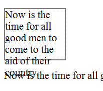
Failure Example 2:
This example is identical to the last one, except that the container is set to clip the text. The text is no longer bleeding into the next paragraph, but now it is truncated. This is also a failure.
Example Code:
<div style="font-size:100%; width:120px; height:100px; overflow: hidden; border: thin solid gray;>
Now is the time for all good men to come to the aid of their country.
</div>
<p>Now is the time for all good men to come to the aid of their country.</p>
Illustration of example 2:
Related Techniques
(none currently listed)
Tests
Procedure
Increase the text size of the content by 200%.
Check that no text is clipped, truncated, or obscured.
Expected Results
If check #2 is false, then the failure condition applies and the content fails these Success Criteria.
F70: Failure of Success Criterion 4.1.1 due to incorrect use of start and end tags or attribute markup
Applicability
Markup languages: HTML, XHTML, and other SGML or XML-based technologies.
This failure relates to:
Description
The objective of this failure is to identify examples of markup errors in element tags that could cause assistive technology to be unable to generate a satisfactory model of the page. Different user agents may implement different heuristics to recover from errors, resulting in inconsistent presentations of the page between user agents.
Some common types of problems with start and end tags that lead to this failure condition (though this is not an exhaustive list):
Opening and closing tags that are missing the opening < and closing > brackets.
Closing tag missing the initial / to indicate it is a closing tag.
Attribute values that have an opening quote but not a closing quote. Attribute values must be either fully quoted or, in some markup languages, may be unquoted.
Lack of whitespace between attributes.
Unquoted attribute values that have whitespace in the value.
Failure to provide a closing element tag for elements that do not accept empty-element syntax.
Examples
Failure Example 1: Missing angle brackets in XHTML
The following code fails because the opening tag is missing an angle bracket, and the intended boundary of the tag is unclear.
Example Code:
<p This is a paragraph</p>
Failure Example 2: Missing slash on closing tag in XHTML
The following code fails because the closing tag is missing the slash, making it look like it is in fact another opening tag.
Example Code:
<p>This is a paragraph<p>
Failure Example 3: Unbalanced attribute quoting
The following code fails because the attribute value is missing the closing quote, which makes the boundary of the attribute-value pair unclear.
Example Code:
<input title="name type="text">
Failure Example 4: Lack of whitespace between attributes
The following code fails because the there is not whitespace between attributes, which makes the boundary between attribute-value pairs unclear.
Example Code:
<input title="name"type="text">
Failure Example 5: Unquoted attribute with whitespace value
The following code fails because an attribute value is not quoted and contains whitespace, which makes the boundary of the attribute-value pair unclear.
Example Code:
<input title=Enter name here type=text>
Failure Example 6: Missing end tags in XHTML
The following code fails because the closing tag of the first paragraph is missing, making it unclear whether the second paragraph is a child or sibling of the first.
Example Code:
<p>This is a paragraph
<p>This is another paragraph</p>
Related Techniques
(none currently listed)
Tests
Procedure
Check the source code of pages implemented in markup languages.
Check whether any opening tags, closing tags or attributes are malformed.
Expected Results
If check #2 is true, then the failure condition applies and the content does not meet this Success Criterion.
F71: Failure of Success Criterion 1.1.1 due to using text look-alikes to represent text without providing a text alternative
Applicability
Any technology.
This failure relates to:
Description
The objective of this failure condition is to avoid substituting characters whose glyphs look similar to the intended character, for that intended character. The Unicode character set defines thousands of characters, covering dozens of writing systems. While the glyphs for some of these characters may look like the glyphs for other characters in visual presentation, they are not processed the same by text-to-speech tools.
For example, the characters U+0063 and U+03F2 both look like the letter "c", yet the first is from the Western alphabet and the second from the Greek alphabet and not used in Western languages. The characters U+0033 and U+04E0 both look like the number "3", yet the second is actually a letter from the Cyrillic alphabet.
Note: This failure also applies to the use of character entities. It is the incorrect character used because of its glyph representation that comprises a failure, not the mechanism by which that character is implemented.
Examples
Failure Example 1: Characters
The following word looks, in browsers with appropriate font support, like the English word "cook", yet is composed of the string U+03f2 U+043E U+03BF U+006B, only one of which is a letter from the Western alphabet. This word will not be processed meaningfully, and a text alternative is not provided.
Example Code:
ϲоοk
Failure Example 2: Character entities
The following example, like the one above, will look like the English word "cook" when rendered in browsers with appropriate font support. In this case, the characters are implemented with character entities, but the word will still not be processed meaningfully, and a text alternative is not provided.
Example Code:
ϲоοk
Working Example: "ϲоοk"
Related Techniques
(none currently listed)
Tests
Procedure
Check the characters or character entities used to represent text.
If the characters used do not match the appropriate characters for the displayed glyphs in the human language of the content, then look-alike glyphs are being used.
Expected Results
If look-alike glyphs are used, and there is not a text alternative for any range of text that uses look-alike glyphs, then the content does not meet the Success Criterion.
F72: Failure of Success Criterion 1.1.1 due to using ASCII art without providing a text alternative
Applicability
Any technology.
This failure relates to:
Description
The objective of this failure condition is to avoid the use of ASCII art when a text alternative is not provided. Although ASCII art is implemented as a character string, its meaning comes from the pattern of glyphs formed by a visual presentation of that string, not from the text itself. Therefore ASCII art is non-text content and requires a text alternative. Text alternatives, or links to them, should be placed near the ASCII art in order to be associated with it.
Examples
Failure Example 1: ASCII Art chart without a text alternative
The following ASCII art chart lacks a text alternative and therefore does not meet Success Criterion 1.1.1. Note this failure example does in fact cause this page to fail, but you may skip over the example.
Example Code:
<pre>
% __ __ __ __ __ __ __ __ __ __ __ __ __ __
100 | * |
90 | * * |
80 | * * |
70 | @ * |
60 | @ * |
50 | * @ * |
40 | @ * |
30 | * @ @ @ * |
20 | |
10 | @ @ @ @ @ |
0 5 10 15 20 25 30 35 40 45 50 55 60 65 70
Flash frequency (Hz)
</pre>
Related Techniques
(none currently listed)
Tests
Procedure
Access a page with ASCII art.
For each instance of ASCII art, check that it has a text alternative.
Expected Results
If check #2 is false, then this failure condition applies and the content fails this Success Criterion.
F73: Failure of Success Criterion 1.4.1 due to creating links that are not visually evident without color vision
Applicability
Any technology.
This failure relates to:
Description
This failure helps ensure that people who cannot perceive color differences can identify links. Link underlines or some other non-color visual distinction are required. While some links may be visually evident from page design and context, such as navigational links, links within text are often visually understood only from their own display attributes. Removing the underline and leaving only the color difference for such links would be a failure because there would be no other visual indication (besides color) that it is a link.
Note 1:
If the non-color cue only happens when the mouse hovers over the link or when the link receives focus, it is still a failure.
Note 2:
If the link is a different color and bold it would not fail because the boldness is not color dependent.
Examples
Failure Example 1:
A Web page includes a large number of links within the body text. The links are styled so that they do not have underlines and are very similar in color to the body text. This would be a failure because users would be unable to differentiate the links from the body text.
Failure Example 2:
The following code is an example of removing the underline from a link in a sentence or paragraph without providing another visual cue besides color.
Example Code:
<head>
<style type="text/css">
p a:link {text-decoration: none}
p a:visited {text-decoration: none}
p a:active {text-decoration: none}
p a:hover {text-decoration: underline; color: red;}
</style>
</head>
<body>
<p>To find out more about the <a href="rain_in_spain.htm">rain in spain</a>there are many resources.</p>
</body>
Note: If the visual cue is only provided on hover (as in the example above), it would still fail.
Related Techniques
(none currently listed)
Tests
Procedure
Check that each link within text that is part of a sentence or paragraph (or other area where they could be mistaken as non-linked text) in the page is underlined or otherwise visually identifiable (i.e., bolded, italicized) as a link without relying on color (hue).
Expected Results
If check #1 is false, then this failure condition applies and the content fails this Success Criterion.
F74: Failure of [begin change]Success Criterion[end change] 1.2.2 and 1.2.8 due to not labeling a synchronized media alternative to text as an alternative
Applicability
Pages that provide synchronized media alternatives to text.
This failure relates to:
-
Success Criterion 1.2.2 (Captions (Prerecorded))
-
Success Criterion 1.2.8 (Media Alternative (Prerecorded))
Description
The objective of this failure is to avoid situations in which synchronized media alternatives are not labeled with the text for which they are alternatives. Synchronized media alternatives provide enhanced access to users for whom synchronized media is a more effective format than text. Since they are alternatives to text, they do not need themselves to have redundant text alternatives. However, they need to be clearly labeled with the text for which they substitute, so users can find them and so users who normally expect text alternatives to synchronized media know not to look for them.
Examples
Failure Example 1: Synchronized media alternatives provided elsewhere on page
A page with instructions to complete a tax form provides a prose description of the fields to complete, data to provide, etc. Additionally, a synchronized media alternative provides spoken instructions, with video of a person completing the section being discussed in the audio. Although both versions are provided on the page, the synchronized media version is provided elsewhere on the page and is not clearly labeled with the part of the text for which it is a substitute. This makes it difficult for users encountering the text to find it, and users encountering the video do not know where its text alternative is.
Related Techniques
(none currently listed)
Tests
Procedure
Check pages that provide synchronized media alternatives to text.
Check that synchronized media is clearly labeled with the text for which it is an alternative.
Expected Results
If check #2 is false, then this failure condition applies and the content fails these Success Criteria.
F75: Failure of Success Criterion 1.2.2 by providing synchronized media without captions when the synchronized media presents more information than is presented on the page
Applicability
Any technology.
This failure relates to:
Description
The objective of this failure is to avoid situations in which synchronized media alternatives provide more information than the text for which they are alternatives, but do not provide their own text alternatives to provide access to the extra information. Synchronized media alternatives provide enhanced access to users for whom synchronized media is a more effective format than text. Since they are alternatives to text, they are do not need themselves to have redundant text alternatives in the form of captions, audio descriptions or full text alternatives. However, if they provide more information than the text for which they are an alternative, then they are more than simply alternatives but are synchronized media content in their own right. [begin change]In this case they are subject to the full requirements of Success Criterion 1.2.2 to provide captions and to Success Criterion 1.2. and 1.2.5.[end change]
Examples
Related Techniques
(none currently listed)
Tests
Procedure
Check for captions on synchronized media alternatives.
Check that the synchronized media alternative does not provide more information than is presented on the page in text.
Note: Synchronized media alternatives often use different words to present what is on the page but it should not present new information on the topic of the page.
Expected Results
If check #2 is false, then this failure condition applies and the content fails these Success Criteria.
F76: Failure of [begin add]Success Criterion[end add] 3.2.2 due to providing instruction material about the change of context by change of setting in a user interface element at a location that users may bypass
Applicability
Applies to all technologies.
This failure relates to:
Description
Without prior instruction, unexpected change of context due to change of user interface setting can sometimes confuse users. Users must receive instruction prior to such encounter. Providing the instruction in a way in which the user may not have the opportunity to review may leave opportunity for confusion.
Failure examples:
Not providing instruction on the Web page preceding the user interface element that causes change of context by change of setting.
Not providing instruction at a part of the process prior to the step where they may encounter such change of context, in case of a multi-step process in which users must go through particular steps to reach the user interface element where change of setting would cause a change of context.
Not providing mandatory instruction about the change of context in the case of intranet Web application.
Tests
Procedure
Find occurrence of change of context due to change of user interface setting
Find instructional material that all users must review prior encountering of the change of context.
Expected Results
If #1 is true and #2 is false, then this failure condition applies and content fails the Success Criterion.
F77: Failure of Success Criterion 4.1.1 due to duplicate values of type ID
Applicability
Any XML-based markup languages including HTML 4.01 and XHTML 1.x.
This failure relates to:
Description
This describes a failure condition where duplicate ID errors are known to cause problems for assistive technologies when they are trying to interact with content. Duplicate values of type ID can be problematic for user agents that rely on this attribute to accurately convey relationships between different parts of content to users. For example, a screen reader may use ID values to identify the applicable header content for a data cell within a data table, or an input control to which a given label applies. If these values are not unique, the screen reader will be unable to programmatically determine which headers are associated with the data cell or which control is associated with which label or name.
Checking that ID attribute values are unique within a document can be done by validating the document against its schema, because the schema defines which attributes contain document-wide unique identifiers.
Note 1:
In most markup languages, ID values are attribute values, for example in HTML and XHTML.
Note 2:
XML documents that use only the xml:id attribute as an ID attribute, parsing the XML document with a validating parser that supports the xml:id specification is sufficient.
Examples
Example 1
An author uses an online validation service to check that all id attribute values are unique.
Example 2
A developer utilizes features in their authoring tool to ensure that id attribute values are unique.
Resources
Resources are for information purposes only, no endorsement implied.
xml:id Version 1.0 - W3C Recommendation 9 September 2005.
Extensible Markup Language (XML) 1.0 (Fourth Edition): Validity constraint: ID
HTML 4.01: id attribute
Related Techniques
Tests
Procedure
Check that all values of type ID are unique in the Web page
Expected Results
If Step #1 is false, then this failure condition applies and the content fails the Success Criterion.
F78: Failure of Success Criterion 2.4.7 due to styling element outlines and borders in a way that removes or renders non-visible the visual focus indicator
Applicability
Any technology
This failure relates to:
Description
This describes a failure condition that occurs when the user agent's default visual indication of keyboard focus is turned off or rendered non-visible by other styling on the page without providing an author-supplied visual focus indicator. Turning off the focus indicator instructs the user agent not to present the focus indicator. Other styling may make it difficult to see the focus indicator even though it is present, such as outlines that look the same as the focus outline, or thick borders that are the same color as the focus indicator so it cannot be seen against them.
Examples
Example 1: The focus indicator is turned off with CSS
The following CSS example will remove the default focus indicator, which fails the requirement to provide a visible focus indicator.
Example Code:
:focus {outline: none}
Example 2: The outline of elements is visually similar to the focus indicator
The following CSS example will create an outline around links that looks the same as the focus indicator. This makes it impossible for users to determine which one in fact has the focus, even though the user agent does draw the focus indicator.
Example Code:
a {outline: thin dotted black}
Example 3: Elements have a border that occludes the focus indicator
The following CSS example creates a border around links that does not have enough contrast for the focus indicator to seen when drawn on top of it. In this case the focus indicator is drawn just ouside the border, but as both are black and the border is thicker than the focus indicator, it no longer meets the definition of "visible".
Example Code:
a {border: medium solid black}
Resources
No resources available for this technique.
Tests
Procedure
Set the focus to all focusable elements on a page.
Check that the focus indicator is visible.
Expected Results
#2 is true.
F79: Failure of Success Criterion 4.1.2 due to the focus state of a user interface component not being programmatically determinable or no notification of change of focus state available
Applicability
All technologies
This failure relates to:
Description
Whether a user interface component has focus is a particularly important facet of its state. Many types of assistive technology rely on tracking the current keyboard focus. Screen readers will move the user's point of regard to the focused user interface component, and screen magnifiers will change the display of the content so that the focused component is visible. If assistive technology is not notified when focus moves to a new component, the user will become confused when they attempt to interact with the wrong component.
While user agents usually handle this functionality for standard controls, custom-scripted user interface components are responsible for using accessibility APIs to make focus information and notifications available.
Examples
A custom menu displays menu items by rendering them explicitly, handling mouse and key events directly and highlighting the currently selected menu item. The programmer does not expose the menu item that has focus via the Accessibility API, so assistive technology can only determine that focus is somewhere within the menu and cannot determine which menu item has focus.
Resources
Resources are for information purposes only, no endorsement implied.
Tests
Procedure
Using the accessibility checker for the technology (or if that is not available, inspect the code or test with an assistive technology), check the controls to see if they expose the focus state through the accessibility API.
Using the accessibility checker for the technology (or if that is not available, inspect the code or test with an assistive technology), check whether assistive technology is notified when focus moves from one control to another.
Expected Results
If Check #1 or Check #2 is false, then this failure condition applies and the content fails this Success Criterion.
F80: Failure of Success Criterion 1.4.4 when text-based form controls do not resize when visually rendered text is resized up to 200%
Applicability
HTML, XHTML, and CSS
This failure relates to:
Description
The objective of this failure condition is to describe a problem that occurs when changing the size of text does not cause the text-based form controls to resize accordingly. This means that the user may have difficulty entering text and being able to read what they have entered because the text is not displayed at the text size required by the user.
Text-based form controls include input boxes (text and textarea) as well as buttons.
Examples
Failure Example 1: A Contact Form
A Contact Us form has some introductory information and then form controls for users to enter their first name, last name, telephone number and email address. The heading, introductory text and form control labels have been implemented in a scalable way but the form controls themselves have not.
The XHTML component:
Example Code:
<h1>Contact Us</h1>
<p>Please provide us with your details and we will contact you as soon as we can. Note that all of the form fields are required.</p>
<label for="fname">First Name</label><input type="text" name="fname" id="fname" /><br />
<label for="lname">Last Name</label><input type="text" name="lname" id="lname" /><br />
<label for="phone">Telephone</label><input type="text" name="phone" id="phone" /><br />
<label for="email">Email</label><input type="text" name="email" id="email" /><br />
<input type="submit" name="Submit" value="Submit" id="Submit" />
The CSS component:
Example Code:
h1 { font-size: 2em; }
p, label { font-size: 1em; }
input {font-size: 12pt}
Resources
No resources available for this technique.
Related Techniques
(none currently listed)
Tests
Procedure
Enter some text into text-based form controls that receive user entered text.
Increase the text size of the content by 200%.
Check that the text in text-based form controls has increased by 200%.
Expected Results
If check #3 is false, then the failure condition applies and the content fails these Success Criteria.
F81: Failure of Success Criterion 1.4.1 due to identifying required or error fields using color differences only
Applicability
All technologies
This failure relates to:
Description
This objective of this technique is to describe the failure that occurs when a required field or an error field is marked with color differences only, without an alternate way to identify the required field or error field. This can cause problems for people who are blind or colorblind, because they may not be able to perceive the color differences that indicate which field is required or which field is causing an error.
Examples
A user is completing an online form, and the phone number field is required. To indicate that the phone number field is required, the label "Phone Number" is displayed in blue text only, without any other indication that "Phone Number" is a required field. A blind or colorblind user may not be able to identify that "Phone Number" is a required field.
A user submits an online form and leaves a required field blank, resulting in an error. The form field that caused the error is indicated by red text only, without an additional non-color indication that the field caused an error.
Tests
Procedure
For all required fields or error fields in the Web page that are identified using color differences:
Check that an non-color way to identify the required field or error field is provided.
Expected Results
If step #1 is false, then this failure condition applies and content fails the Success Criterion.
F82: Failure of Success Criterion 3.3.2 by visually formatting a set of phone number fields but not including a text label
Applicability
Any technology
This failure relates to:
Description
This failure ensures that people with visual or cognitive disabilities will recognize phone number fields and understand what information to provide to fill in the fields. Phone numbers are frequently formatted in fixed, distinctive ways, and authors may feel that just providing visual formatting of the fields will be sufficient to identify them. However, even if all the fields have programmatically determined names, a text label must also identify the set of fields as a phone number.
Examples
Failure Example 1:
In the United States, phone numbers are broken into a three digit area code, a three digit prefix, and a four digit extension. A web page creates fixed length text input fields for the three parts of the phone number, surrounding the first field with parenthesis and separating the second and third fields with a dash. Because of this formatting, some users recognize the fields as a phone number. However, there is no text label for the phone number on the web page. This is because the label for each field will be the closest preceding text, so the three fields would be labeled "(", ")" , and "-" respectively.
Tests
Procedure
For each set of phone number fields in the web page that represents a single phone number, check that the set of fields are labeled with a visible text label that is positioned near the set of phone number fields.
For each set of phone number fields in the Web page that represent a single phone number, instructions are provided about how to fill in the fields.
Expected Results
If both check #1 and check #2 are false, then this failure condition applies and the content fails this success criterion.
F83: Failure of Success Criterion 1.4.3 and 1.4.6 due to using background images that do not provide sufficient contrast with foreground text (or images of text)
Applicability
Any technology
This failure relates to:
Description
This failure occurs when people with low vision are not able to read text that is displayed over a background image. When there is not sufficient contrast between the background image and the text, features of the background image can be confused with the text making it difficult to accurately read the text.
To satisfy Success Criterion 1.4.3 and 1.4.6, there must be sufficient contrast between the text and its background. For pictures, this means that there would need to be sufficient contrast between the text and those parts of the image that are most like the text and behind the text.
Examples
Example 1: Failure Example 1
Black text overlays an image with black lines. The lines cross behind the letters making F's look like E's etc.
Example 2: Failure Example 2
Black text overlays an image with with dark gray areas. Wherever the text crosses a dark gray area the contrast is so bad that the text cannot be read.
Tests
Procedure
Quickcheck: First do a quick check to see if the contrast between the text and the area of the image that darkest (for dark text) or lightest (for light text) meets or exceeds that required by the Success Criterion (1.4.3 or 1.4.5). If the contrast meets or exceeds the specified contrast, then there is no failure.
If the Quickcheck is false, then check to see if the background behind each letter has sufficient contrast with the letter.
Expected Results
If Quickcheck is false and #2 is false as well then this failure condition applies and the content fails the contrast Success Criterion.
F84: Failure of Success Criterion 2.4.9 due to using a non-specific link such as "click here" or "more" without a mechanism to change the link text to specific text.
Applicability
HTML and XHTML
This failure relates to:
Description
This failure describes a common condition where links such as "click here" or "more" are used as anchor elements where you need to have the surrounding text to understand their purpose and where there isn't any mechanism to make the destination clear by itself, such as a button to expand the link text.
Many blind people who use screen readers call up a dialog box that has a list of links from the page. They use this list of links to decide where they will go. But if many of the links in that list simply say "click here" or "more" they will be unable to use this feature in their screen reader, which is a core navigation strategy. That's why it's a failure of 2.4.9 to not provide any way of allowing them to know the destination from the link text alone. It is also true for people who tab through links. If all they hear as they tab through the document is "click here, click here, click here etc." they will become confused.
Examples
Example 1
Example Code:
<a href="file110.htm">Click here</a> for more information on the Rocky Mountains.
Example 2
Example Code:
<h2>News headlines</h2>
The middle east peace meetings have yielded fruitful dialogue.
<a href="r4300.htm">read more</a>
Tests
Procedure
Examine each link on the page.
Check to see if it has non-descript link text such as "click here" or "more" whose purpose can be determined from the surrounding text but not from the link text alone.
Check to see if there is a mechanism on the page which turns all non-descript links on the page into descriptive links.
Expected Results
If step #2 is true AND #3 is false, then this failure condition applies and content fails the success criterion.
F85: Failure of Success Criterion 2.4.3 due to using dialogs or menus that are not adjacent to their trigger control in the sequential navigation order
Applicability
All technologies.
This failure relates to:
Description
This describes the failure condition that results when a Web page opens a dialog or menu interface component embedded on the page in a way that makes it difficult for a keyboard user to operate because of its position in the sequential navigation order. When the user opens the dialog or menu embedded on the page by activating a button or link, his next action will be to interact with the dialog or menu. If the dialog or menu is not adjacent to the trigger control in the sequential navigation order, it will be difficult for the keyboard user to operate the dialog or menu.
Examples
Example 1: Dialog or menu embedded on the page is added to the end of the sequential navigation order
When a DHTML menu or dialog is activated, it is created dynamically, positioned visually near the trigger, and appended to the end of the DOM. Because it is appended to the end of the DOM, it is at the end of the sequential navigation order. The user must tab through the rest of the web page before he can interact with the dialog or menu.
Example 2: Dismissing a menu embedded on the page sets focus to the document
When a DHTML menu is dismissed, it is removed or hidden from the web page and focus is set to the document. The user must tab from the beginning of the navigation sequence to reach the point from which the menu was opened.
Related Techniques
Tests
Procedure
For each menu or dialog embedded on a Web page that is opened via a trigger control:
Activate the trigger control via the keyboard.
Check whether focus is in the menu or dialog.
Check whether advancing the focus in the sequential navigation order puts focus in the menu or dialog.
Dismiss the menu or dialog.
Check whether focus is on the trigger control.
Check whether advancing the focus backwards in the sequential navigation order puts focus in the trigger control.
Expected Results
If step 1a and 1b are both false, then this failure condition applies and the content fails this success criterion.
If step 2a and 2b are both false, then this failure condition applies and the content fails this success criterion.
F86: Failure of Success Criterion 4.1.2 due to not providing names for each part of a multi-part form field, such as a US telephone number
Applicability
General
This failure relates to:
Description
This describes a failure condition of Success Criterion 4.1.2 where some or all of the parts of multi-part form field do not have names. Often there is a label for the multi-part field, which is either programatically associated with the first part, or not programatically associated with any parts.
Note: A name does not necessarily have to be visible, but is visible to assistive technologies.
Examples
Failure Example 1
A US telephone number consists of a 3-digit area code, a 3-digit prefix, and a 4-digit suffix. They are typically formatted as follows ([area code]) [prefix]-[suffix], such as (206) 555-1212. Often, forms asking for a telephone number will include 3 separate fields, but with a single label, such as:
Example Code:
Phone number:
(<input type="text" size="3">) <input type="text" size="3">-<input type="text" size="4">
The failure occurs when there is not a name for each of the 3 fields in the Accessibility API. A user with assistive technology will experience these as three undefined text fields. Some assistive technologies will read the punctuation as identification for the text fields, which can be even more confusing. In the case of a 3-field US phone number, some assistive technologies would name the fields "(", ")" and "-", which is not very useful.
Failure Example 2
The same US telephone number. In this case, the label is not programatically associated with any of the parts. Phone number:
Example Code:
(<input type="text" size="3">) <input type="text" size="3">-<input type="text" size="4">
A user with assistive technology will experience these as three undefined text fields.
Failure Example 3
The same US telephone number. In this case, the label is programatically associated with the first part.
Example Code:
<label for="area">Phone number:</label>
(<input id="area" type="text" size="3">) <input type="text" size="3">-<input type="text" size="4">
A user with assistive technology will be led to believe that the first field is for the entire phone number, and will experience the second and third fields as undefined text fields.
Resources
Resources are for information purposes only, no endorsement implied.
Microsoft Active Accessibility 2.0 SDK. Includes Inspect32.exe and other MSAA tools.
Microsoft Internet Explorer Developer Toolbar. Allows examination of script-generated DOM in Microsoft Internet Explorer.
Firebug. Allows examination of script-generated DOM in Firefox.
Related Techniques
Tests
Procedure
General Procedure:
Install a tool that allows you to view the accessibility API for your platform (see Resources section)
Find each form control
Check that the name property for each control is populated
Alternative Procedure for HTML and XHTML:
Find each input, select, and textarea element in the HTML source
Check that there is a title attribute on the element
Check that there is an associated label element
Expected Results
General Procedure:
If check #3 is false, then the failure condition applies and the content fails this success criterion.
Alternative Procedure for HTML and XHTML:
If checks #2 and #3 are false, then the failure condition applies and the content fails the success criterion.
F87: Failure of Success Criterion 1.3.1 due to inserting non-decorative content by using :before and :after pseudo-elements and the 'content' property in CSS
Applicability
All technologies that support CSS.
This failure relates to:
User Agent and Assistive Technology Support Notes
:before and :after are not supported by IE7 and lower
Description
The CSS :before and :after pseudo-elements specify the location of content before and after an element's document tree content. The content property, in conjunction with these pseudo-elements, specifies what is inserted. For users who need to customize or turn off style information in order to view content according to their needs, assistive technologies may not be able to access the information that is inserted using CSS. Therefore, it is a failure to use these properties to insert non-decorative content.
Examples
Failure Example 1
In the following example, :before and :after are used to indicate speaker changes and to insert quotation marks in a screenplay.
The CSS contains:
Example Code:
p.jim:before { content: "Jim: " }
p.mary:before { content: "Mary: " }
q:before { content: open-quote }
q:after { content: close-quote }
It is used in this excerpt:
Example Code:
<p class="jim">
<q>Do you think he's going to make it?</q>
</p>
<p class="mary">
<q>It's not looking good.</q>
</p>
Failure Example 2
In this example, :before is used to differentiate facts from opinions.
The CSS contains:
Example Code:
p.fact:before { content: "Fact: "; font-weight: bold; }
p.opinion:before { content: "Opinion: "; font-weight: bold; }
It is used in this excerpt:
Example Code:
<p class="fact">
The defendant was at the scene of the crime when it occurred.
</p>
<p class="opinion">
The defendant committed the crime.
</p>
Resources
Resources are for information purposes only, no endorsement implied.
Related Techniques
Tests
Procedure
Examine all content inserted through use of the :before and :after pseudo-elements and the content property
Verify that the content is decorative.
If the inserted content is not decorative, check that the information is provided to assistive technologies and is also available when CSS is turned off.
Expected Results
If checks #2 or #3 are false, then this failure condition applies and the content fails this Success Criterion.
F88: Failure of [begin change]Success Criterion[end change] 1.4.8 due to using text that is justified (aligned to both the left and the right margins)
Applicability
All technologies.
This failure relates to:
Description
Many people with cognitive disabilities have a great deal of trouble with blocks of text that are justified (aligned to both the left and the right margins). The spaces between words create "rivers of white" running down the page, which can make the text difficult for some people to read. This failure describes situations where this confusing text layout occurs. The best way to avoid this problem is not to create text layout that is fully justified (aligned to both the left and the right margins).
Examples
Failure Example 1
In the following example of a failure, the HTML align attribute is used to create justified text.
Example Code:
<p align="justify">Lorem ipsum dolor sit amet, consectetuer adipiscing elit. Vestibulum sit amet pede. Phasellus
nec sem id mauris vehicula tincidunt. Morbi ac arcu. Maecenas vehicula velit et orci. Donec
ullamcorper porttitor velit. Sed arcu lorem, cursus sit amet, auctor eu, convallis ut, purus.
Vivamus imperdiet accumsan nunc. Maecenas pellentesque nunc a libero. Vestibulum ante ipsum
primis in faucibus orci luctus et ultrices posuere cubilia Curae; Curabitur pharetra commodo
justo. Nulla facilisi. Phasellus nulla lacus, tempor quis, tincidunt ac, rutrum et, mauris.
</p>
Failure Example 2
In this example of a failure, the CSS text-align property is used to create justified text.
Example Code:
...
p {text-align: justify}
...
<p>Lorem ipsum dolor sit amet, consectetuer adipiscing elit. Vestibulum sit amet pede. Phasellus
nec sem id mauris vehicula tincidunt. Morbi ac arcu. Maecenas vehicula velit et orci. Donec
ullamcorper porttitor velit. Sed arcu lorem, cursus sit amet, auctor eu, convallis ut, purus.
Vivamus imperdiet accumsan nunc. Maecenas pellentesque nunc a libero. Vestibulum ante ipsum
primis in faucibus orci luctus et ultrices posuere cubilia Curae; Curabitur pharetra commodo
justo. Nulla facilisi. Phasellus nulla lacus, tempor quis, tincidunt ac, rutrum et, mauris.</p>
Related Techniques
Tests
Procedure
Open the page in a common browser.
Verify that content is not justified (aligned to both the left and the right margins).
Expected Results
If test procedure #2 is false, then this failure condition applies and the content fails to meet Success Criterion 1.4.8.
F89: Failure of [begin add]Success Criteria[end add] 2.4.4, 2.4.9 and 4.1.2 due to using null alt on an image where the image is the only content in a link
Applicability
Content that contains links.
This failure relates to:
-
Success Criterion 2.4.4 (Link Purpose (In Context))
-
Success Criterion 2.4.9 (Link Purpose (Link Only))
-
Success Criterion 4.1.2 (Name, Role, Value)
User Agent and Assistive Technology Support Notes
Different assistive technologies employ different repair strategies when dealing with links that lack text alternatives. For HTML, they may use the title attribute of the anchor, if present, or they may use the value of the src attribute of the img element.
Description
This failure condition occurs when a link contains only non-text content, such as an image, and the non-text content has been implemented in a way that it can be ignored by assistive technology. Because a link is an interactive control, the user can tab to it and activate it. Since there is no text content within the link to be used as the name, assistive technology employs a variety of repair techniques to find some name to use for the link.
Often, both text and images are used on a page to link to the same target. This introduces a "stuttering" effect when two nearly links have the same name, and authors attempts to eliminate the redundancy by providing a null alt attribute for the image. Unfortuneately, this often makes the problem worse. H2: Combining adjacent image and text links for the same resource (HTML)
is the recommended approach to reduce the number of separate links and the undesirable redundancy.
Examples
Failure Example 1: HTML Search Results
A search site returns search results that include both a text link and an image link to the match site. The image has a null alt attribute, since the result already contains a link with a text description. However, the screen reader does not ignore the image link but uses heuristics to find some text that might describe the purpose of the link. For example, the screen reader might announce, "football dot gif Football Scorecard."
Example Code:
<a href="scores.html">
<img src="football.gif" alt="" />
</a>
<a href="scores.html">
Football Scoreboard
</a>
}
Resources
Resources are for information purposes only, no endorsement implied.
Related Techniques
Tests
Procedure
Check whether the link contains only non-text content.
Check whether the non-text content has been implemented in a way that it can be ignored by assistive technology.
Expected Results
If all checks are true, then this failure condition applies and the content fails the success criteria.
Appendix A: References
- CSS1
- "Cascading Style Sheets, level 1," B. Bos, H. Wium Lie, eds., W3C Recommendation 17 Dec 1996, revised 11 Jan 1999. Available at http://www.w3.org/TR/REC-CSS1/.
- CSS2
- "Cascading Style Sheets, level 2," B. Bos, H. Wium Lie, C. Lilley, and I. Jacobs, eds., W3C Recommendation 12 May 1998. Available at http://www.w3.org/TR/CSS2/.
- CSS21
- "Cascading Style Sheets, level 2 revision 1," B. Bos, T. Çelik, I. Hickson, H. Wium Lie, eds., W3C Candidate Recommendation 25 February 2004. Available at: http://www.w3.org/TR/CSS21/
- CSS3
-
[CSS 2.1 and CSS 3] Roadmap, CSS WG's table of modules and publication dates.
- FLASH
- "Flash", Adobe Systems. Available at http://www.adobe.com/devnet/swf/.
- HTML4
- "HTML 4.01 Specification," D. Raggett, A. Le Hors, I. Jacobs, eds., W3C Recommendation 24 December 1999. Available at http://www.w3.org/TR/html401/
- PDF
- "PDF", Adobe Systems. Available at http://www.adobe.com/devnet/pdf/.
- WCAG20
- "Web Content Accessibility Guidelines 2.0," B. Caldwell, M Cooper, L Guarino Reid, and G. Vanderheiden, eds., W3 Recommendation 12 December 2008, http://www.w3.org/TR/2008/REC-WCAG20-20081211. The latest version of WCAG 2.0 is available at http://www.w3.org/TR/WCAG20/.
- XHTML1
- "XHTML 1.0 The Extensible HyperText Markup Language (Second Edition)," S. Pemberton, et al., W3C Recommendation 26 January 2000, revised 1 August 2002. Available at: http://www.w3.org/TR/xhtml1/.