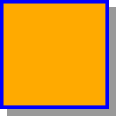
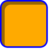
Below are some examples of an orange box with a blue border being being given a drop shadow.
|
|
|
|---|---|---|
|

|
|
|
|
|
|

|

|
|
|

|
This document contains the definition of the 'box-shadow' property, which has been removed from the CSS3 Backgrounds and Borders Module until stabilized.
This is a scrappy bit of an Editor'd Draft, is totally unstable, and has no official status whatsoever. Treat it as you would a post-it note on the editors' desk.
| Name: | box-shadow |
|---|---|
| Value: | none | <shadow> [ , <shadow> ]* |
| Initial: | none |
| Applies to: | all elements |
| Inherited: | no |
| Percentages: | N/A |
| Media: | visual |
| Computed value: | any <length> made absolute; any color computed; otherwise as specified |
The 'box-shadow' property attaches one or more drop-shadows to the box. The property is a comma-separated list of shadows, each specified by 2-4 length values, an optional color, and an optional ''inset'' keyword. Omitted lengths are 0, omitted colors are a UA-chosen color.
Where
<shadow> = inset? && [ <length>{2,4} && <color>? ]
The components of each <shadow> are interpreted as follows:
An outer box-shadow casts a shadow as if the border-box of the element were opaque. The shadow is drawn outside the border edge only: it is not drawn inside the border-box of the element.
An inner box-shadow casts a shadow as if everything outside the padding edge were opaque. The inner shadow is drawn inside the padding edge only: it is not drawn outside the padding box of the element.
If the box has a nonzero 'border-radius', the shadow is rounded in the same way.
This is still under discussion. Please send comments to www-style.
However, if the box has a border-image, the shadows drawn differently: they are masked by the border-image instead of the border area as follows.
If the UA is unable to create shadows that respect the transparent and partially-transparent aspects of the border-image, it must not create a shadow at all. The UA may ignore spread values when drawing shadows for a border-image.
If an element has multiple boxes, all of them get drop shadows, but shadows are only drawn where borders would also be drawn, see 'box-break'.
The shadow effects are applied front-to-back: the first shadow is on top and the others are layered behind. Shadows do not influence layout and may overlap other boxes or their shadows. In terms of stacking contexts and the painting order, the outer shadows of an element are drawn immediately below the background of that element, and the inner shadows of an element are drawn immediately above the background of that element (below the borders and border image, if any).
Shadows never affect layout, and do not trigger scrolling or increase the size of the scrollable area.
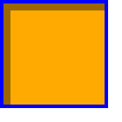
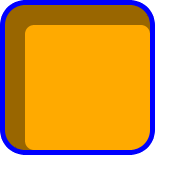
Below are some examples of an orange box with a blue border being being given a drop shadow.
|
|
|
|---|---|---|
|
|
|
|
|
|
|
|
|
|
|
|
The ''box-shadow'' property applies to the ''::first-letter'' pseudo-element, but not the ''::first-line'' pseudo-element. Outer shadows have no effect on internal table elements in the collapsing border model. If a shadow is defined for single border edge in the collapsing border model has multiple border thicknesses (e.g. an outer shadow on a table where one row has thicker borders than the others, or an inner shadow on a rowspanning table cell that adjoins cells with different border thicknesses), the exact position and rendering of its shadows are undefined.