A few examples. Padding is ommitted for clarity. See also the examples with alternative syntax.
Corresponds to HTML3 rule=all, border=1.
td, th { border: 1px solid }
The second example from the HTML3 spec. (interpreted from the ASCII graphics).
table {
    border-top: double;
    border-bottom: double;
    border-right: blank
}
thead, tbody, tfoot {
    border-top: solid;
    border-bottom: solid
}
colgroup {
    border-right: solid
}
A table with only vertical rules.
col {
    border-left: solid;
    border-right: solid
}
A table with only vertical rules between the columns.
col { border-left: solid }
table { border-left: blank }

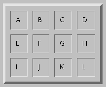
A typical Netscape table: border=5, cellspacing=10.
table { border: 16px ridge(5,10,1) }
td, th { border: 12px ridge(1,10,1) }
NB1. 16 = 5 pixel border + 10 pixel spacing + 1 pixel shadow. Similarly, 12 = 10 px spacing + 2 shadows.
NB2. It is convenient in this case to specify the ridge as 1,10,1, which sums to 12, but 2,20,2 would have given exactly the same result.
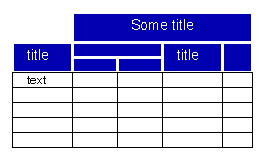
A complex table head, but no rules in the body.
thead {
    border-top: solid thick;
    border-right: blank;    /* prevent colgroup border */
    border-left: blank      /* prevent cell border */
}
colgroup { border-right: solid thick }
thead td { border: solid }
tbody td { border: blank }  /* remove colgroup border */
}
This example is complicated because there is no way to address the part of the colgroup in the thead. It seems we would need a sort intersection operator for that. The problem has been solved in this case by setting the border on the whole colgroup and then removing it again in the tbody.

Chris Wilson's example 1, in his notation:
table { border: 2px outset grey / darkgray; padding: 1px }
td { border: thin inset grey /darkgray; margin: 1px }
In my notation:
table { border: 5px ridge(2,2,1) }
td { border: 4px ridge /* implied: (1,2,1) */ }
Assuming that `thin' means 1px (not too unlikely), the table's border will be 2px shadow + 1px padding + 1px margin + 1 px shadow = 5px. Note that I also assume that shadow colors are chosen automatically.

Chris Wilson's example 2. In his notation:
table { border: 2px outset grey / darkgray; padding: 1px }
tr {border: thin inset grey /darkgray; margin: 1px }
In my notation:
table { border: 5px ridge(2,2,1) }
tr { border: 4px ridge }
Note that there are other ways of specifying the same. Instead of border on TR, one could have set top and bottom on each cell.

Chris Wilson's example 3. In his notation:
table { border: 2px outset grey / darkgray; padding: 4px }
td { border: thin inset grey /darkgray; margin: 4px }
In my notation:
table { border: 11px ridge(2,8,1) }
td { border: 10px ridge(1,8,1) }

Chris Wilson's example 4. In his notation:
table { border: 2px single black }
td { border: thin single black collapse }
In my notation:
table { border: 2px solid black }
td { border: thin solid black }
The shadow part seems to stick out, instead of being inside the border. That means it can overlap something else, but maybe that is a good thing... How about adding a transparency to the shadow? Here is an example style sheet:
table { border: thin dropshadow(thick) }
td { border: thin dotted }
#G { border: thin dropshadow(thick) override }
Cell G is assumed to have an ID `G'. The keyword `override' is used to make sure the cell's border style is honoured. If drop shadows are always `stronger' than dots, this keyword can be omitted.

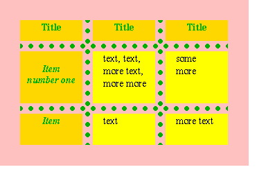
The color difference between the border and the cell is a problem. It can be solved in several ways: (1) in HTML, by putting the cell content inside another element, such as a P or DIV and putting a background on that, or (2) introducing a border-background property, or (3) specyfing that the table background is used for the border background.
Solution 1 doesn't work if the child elements have unequal height. With solution 2 and 3, the dotted style needs the extra parameter that was already suggested earlier, to set the dot's diameter.
Using solution 2 (set the yellow on child elements of the cells):
body { background: pink }
table { border: none }
td { border: 5pt green dotted(8pt,0.8) }
td p { background: yellow }
Using solution 3 (table background is used for borders):
body { background: pink }
table { border: none }
td { border: 5pt green dotted(8pt.0.8) }
td { background: yellow }
Using Dave's model:
body { background: pink }
table {
    rules: all;
    rule-style: dotted;
    rule-color: green;
    rule-width: 5pt
}
td {
    margin: 2pt;
    background: yellow
}

The problem here is the short red borders. It seems necessary to introduce the short rules as border types. Note that the endpoints of the rules are not aligned with the text, although that is more common in other tables.
Also the white lines seem to go underneath the green dots, but this could be a general rule any time a solid line and a dotted line cross.
An attempt using Dave's model:
table {
    rules: all;
    rule-style: dotted solid;
    rule-width: 5pt 2pt;
    rule-color: green white;
    /* How to suppress the rule below the thead? */
}
thead td {
    border-style: none none solid none;
    border-width: thick;
    border-color: red;
    margin: 4pt;
}
An attempt using my model:
col {
    border-left: 5pt dotted green;
    border-right: 5pt dotted green;
}
tbody tr {
    border-top: 3pt solid white
}
thead td {
    /* Introduce a `short' style */
    border-bottom: 5pt short(4pt) solid red
}

Diagonal text and diagonal borders cannot be done without introducing some new property. Note that the cells are sheared 30°, while the text is put vertically as well.
td { border: thin solid }
thead { shear: -30 }
thead td { text-rotation: 90 }

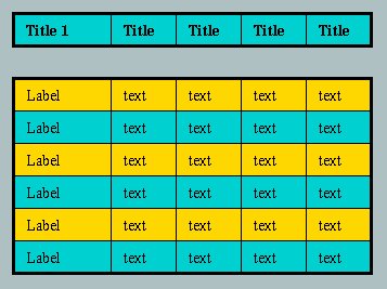
There are several ways of looking at this table: (1) is is actually two tables instead of one, (2) there is space between the head and the body, (3) between the head and the body is a double line.
Using 3 (and assuming the border background is taken from the table background):
tr { border: .4pt }
table { border: thick solid }
thead { border: 14pt double(1,12,1) }
thead { background: cyan }
tr.odd { background: yellow }
tr.even { background: cyan }

Short horizontal rules between the cells.
td, th { border-bottom: thin short }
table { border: none }    /* remove bottom border */
The default for `short' can be the cell's padding.

Single black border in the body, white (or transparent) borders in the head. (Actually, in the original, the blue parts weren't really aligned, they seemed to have been placed by an unsteady hand.)