The Hitch-Hiker's Guide
This document is a collection of tips based on the experiences of previous participants in the course and covers the following topics:
- Setting Up Your Moodle Account
- Accessing the Web on mobile
- Quick Reference Guide to the Course Content
- Assignments - How They Work
- Languages
- Weekly routine
- Twitter tag, del.icio.us bookmarks etc.
Setting Up Your Moodle Account.
The training platform we use, Moodle, is designed and built by people who are educationalists first and developers second. There are some features of the platform that are terrific and one or two that are not ideal. For example, sorry, but no, there is no persistent login and no, it really doesn't work well on mobile (we're working on this).
One thing you should do as early as possible is to set up your profile and other preferences. To do this:
- Log in
- Click your name in the top right hand corner of the screen
- Click the Edit Profile tab
- If there's a 'Show Advanced' button — click it.
You can now set your preferences for things like whether you want to receive HTML or plain text e-mails. One very useful feature is the ability to choose between receiving all e-mails in real time or a daily digest. Look for the Email digest type options.
Something that all past participants have appreciated is the discussion forum. The more information you provide about yourself the more connections you're likely to make!
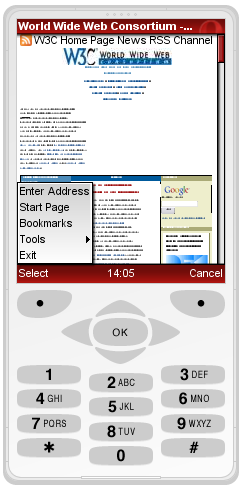
Accessing the Web on mobile
During the course you will need to access the Web on a mobile device. If you have a top end device such as an iPhone or a smart phone from Blackberry, Nokia etc. these will give a falsely good impression of how the Web works on mobile. For our purposes here, an old device is much preferable.
Accessing the Web on a mobile device can sometimes be expensive, depending on your tariff. If your phone supports wi-fi, that's generally a good (free) option, but if all else fails, you may want to use an emulator, i.e. tools you access through your desktop that show how a given page will look on a mobile device. There are references throughout the course to the dotMobi and Opera Mini emulators.
The dotMobi emulator offers a choice of whether to show a page as it would appear using the native browser on a Sony K750 or a Nokia N70. When it works, it's terrific — but it has proved to be unreliable. Also, these are, again, relatively powerful devices and are better than the ones most people actually use.
Opera Mini is more than a browser. It's a browser and a content adaptation engine. That is, Opera re-formats the content of a page designed for desktop in real time so that it works better on your mobile. It works well, but again, gives a falsely good impression of what it's like to use the Web on mobile.
For our purposes, version 4.2 is better than the current version 5. This is because version 4.2 does not include the zooming/ resizing that is now familiar with devices like the iPhone. Of course, for testing purposes, the ideal is to use both version 4.2 and version 5.
N.B. Midway through the course we look at mobile-specific stylesheets, that is, using the @media rule. If this is new to you at this stage, don't worry — that's why there's a course! Like most smartphones, Opera Mini wants to behave as if it's a desktop, not a mobile. Therefore it ignores CSS media rules by default. However, you can set Opera Mini 4.2 to respect CSS media rules as follows:
 Click the Menu button
 Choose Tools and then Settings
 Check the Mobile View option
mobiForge (the dotMobi developer site) includes a comprehensive Guide to Mobile Emulators.
Quick Reference Guide to the Course Content
This is a summary of the course content throughout the 8 weeks of the course. As much as anything it's designed to let you know what is coming up so that you can focus on the current week's topic. Early in the course many students want to jump into subject areas that we deal with later for fear that they won't be covered - this quick guide is designed to reassure you.
Week 1: Coding for the Mobile Web: You shall not use
During this week you will:
- identify markup and design issues;
- learn to avoid or fix issues to create a usable mobile Web site;
- learn common work-arounds and techniques to replace popups, nested tables, tables for layout, graphics for spacing, frames, image maps, through following worked examples.
There is one assignment this week that involves editing HTML and CSS.
Week 2: Use with caution
In week 1 you'll have seen techniques that you should not use. In week 2 we look at techniques that can make mobile Web sites much better if used properly, but that can also make them unusable for some users if done badly. In articular we look at:
- CSS
- Tabular information
- Scripts and objects
- Cookies
There is a quiz at the end of the module but no written assignment.
Week 3: Small is beautiful
Even on the smartest of smartphones, there are some features of the Web on mobile that are inescapably different from the desktop world. things like:
- limited bandwidth coupled with high latency;
- the high cost of access (especially when roaming);
- limited battery life;
- limited processing power.
Week 3 is about the techniques you need to use to minimize the impact of these limitations. The assignment asks you to put these techniques into practice by editing HTML and CSS.
Week 4/5: Understanding Basic Design Principles of a Mobile Web Page
This two week module is perhaps the core of the course and covers the key design issues. During these 2 weeks you will:
- identify the main usability issues on a mobile device;
- learn how to work around them;
- learn client-side techniques that enable you to build a page that works well both on a desktop browser and on a mobile device.
The assignment asks you to adjust specific features of a given page to change it from a desktop design to one that is mobile-friendly in 4 stages. Successful completion of this assignment is essential if you want to gain a certificate of completion.
Week 6: One Web to Rule Them All
We skim the surface of Web Science this week to look at the importance of links and identifiers. Many Web sites redirect mobile users to different addresses, other don't. When is it OK to do this? When is it not? This week's module is all about how to do it properly without 'breaking the Web.'
The assignment for this week asks you to look at published Web sites and (through an online form), note the presence or absence of certain features.
Week 7: Who Are You Talking To?
In the desktop world it's pretty easy to list the browsers and operating systems your users are likely to have. You'll almost certainly be familiar with techniques for ensuring cross-browser compatibility to reach your intended audience.
In the mobile world the landscape is substantially more complicated with far more variation between devices, operating systems, browsers and screen sizes. In some cases, two devices made by the same manufacturer running the same browser on the same operating system can have slightly different behavior. It's enough to make you scream!
This week look at server side techniques that you can use to detect at least the user's basic device type and return content more likely to be tailored to their needs. You will need to do some basic scripting in this week's assignment with opportunities for more advanced developers to show off a bit!
Week 8: mobileOK
In the final week of the course we put everything together to create a Web page that is conforms to W3C mobileOK - that is, one that will deliver at least a functional user experience on mobile.
The assignment asks you to create a page that is mobileOK. As with the assignment for weeks 4 & 5, this one is mandatory if you wish to receive a certificate of completion.
You'll find more details of the course content in the main course description.
Assignments - How They Work
Moodle has a system trough which you can submit assignments. Teachers are notified automatically when you do this and the system records that you have made your submission. When your assignment has been reviewed, you'll receive an e-mail notifying you that feedback has been left. You may be asked to look at something again — i.e. make changes to your submission in order to gain a pass.
Most of the assignments ask you to create or modify a web page and these need to be available online. If you have access to a web server you'll probably be more comfortable uploading your work to it. Alternatively there are a number of companies such as x10hosting and Free Web Hosting Area that offer free web hosting. These are limited accounts (they're free!) but they should allow you sufficient flexibility to complete the course.
Either way, once the work in online, you then send the link and any additional notes via Moodle's 'Edit my submission' button at the bottom of the assignment page. Click that and you should see a WYSIWYG editor like this:

Moodle's WYSIWYG editor
Previous participants have found it impossible to upload images through the Moodle system. If you want to include images, such as screenshots, you'll need to post them to your Web space and refer to them in your text.
In some browsers, rather than a WYSIWYG editor, you'll see a simple text box. This is because you're using a browser that Moodle doesn't fully support. In this case you just enter the HTML directly or, however awkward and emotionally difficult it may be, just use a browser you don't normally use!
Please do not send assignment submissions as e-mail attachments as these are not recorded on the system automatically.
The grade for all assignments is either 100% or 0% (i.e. pass or fail). As a reminder, to gain a certificate of completion you must successfully complete at least:
- the assignment from the week 4 & 5 module and the final (week 8) assignment;
- two of the other assignments (from weeks 1, 3 or 7);
- the quiz in week 2 or the activity in week 6.
Apart from the final one, assignments don't have closing dates as such. However, as the course progresses, the discussion in the forum, which is a critical part of the learning process, moves on and you will get less benefit from doing assignments after other participants have begun discussing other matters. Furthermore, tutor feedback is unlikely to be prompt for late submissions as the priority is on the current work.
Languages
We have participants on the course from all over the world so for many, English is a second (or third) language. You are more than welcome to write to the forum in any language since fellow participants may well be able to respond in that language. If you want a reply from the teachers then English and French are both safe.
Weekly routine
The course material for any given week is usually made available on the preceding Friday afternoon (European time). This is generally announced in an e-mail sent to the group at that time with an update on the state of the course, what has and hasn't been marked and so on.
Although the teachers are based in Europe (Britain and France), there is no set time of the day or week when you need to be online, i.e. the course can be taken equally effectively in any time zone.
Twitter tag, del.icio.us bookmarks etc.
If you're a twitter user, follow the buzz through Twitter tag #w3cmobileweb.
If you're a del.icio.us user, please use and share bookmarks under the same tag w3cmobileweb. See http://delicious.com/w3cmobileweb.
Anything Else?
If you think something is missing from this page - let us know!
Questions? Please contact us!
Last updated: $Date: 2010/03/31 08:50:14 $