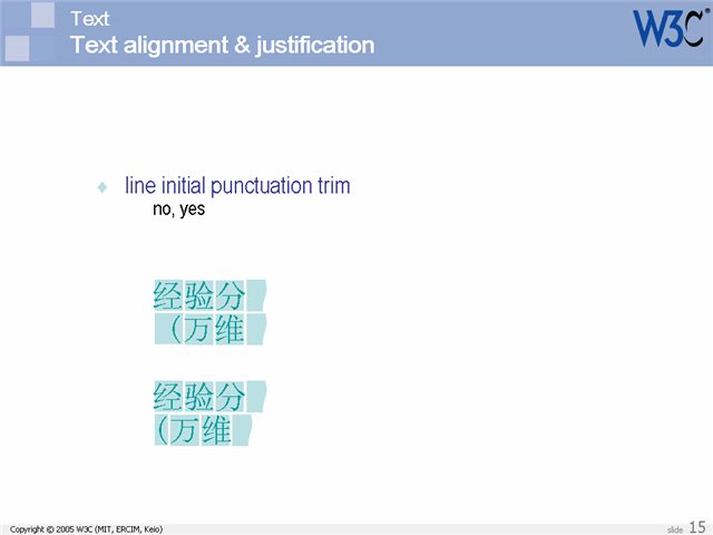
You should also be able to specify whether a full-width punctuation mark in ideographic text should be narrowed at the beginning of a line so that its 'ink' lines up with the first glyph in the lines above and below. This makes the left margin or top margin look neater, but also affects the justification of the line on which it occurs.
Version: $Id: Slide0150.html,v 1.3 2006/05/17 16:18:01 rishida Exp $