序論
Introduction
この文書の目的
Purpose of This Document
すべての文化集団は,独自の言語,文字,書記システムを持つ.それゆえ,個々の書記システムをサイバースペースに移転することは,文化的資産の継承という意味で,情報通信技術にとって非常に重要な責務といえよう.
Each cultural community has its own language, script and writing system. In that sense, the transfer of each writing system into cyberspace is a task with very high importance for information and communication technology.
この責務を実現するための基礎的な作業として,この文書では,日本語という書記システムにおける組版上の問題点をまとめた.具体的な解決策を提示することではなく,要望事項の説明をすることにした.それは,実装レベルの問題を考える前提条件をまず明確にすることが重要であると考えたからである.
As one of the basic work items of this task force, this document describes issues of text composition in the Japanese writing system. The goal of the task force is not to propose actual solutions but describe important issues as basic information for actual implementations.
この文書の作成方法
How This Document was Created
この文書の作成は,W3C Japanese Layout Task Forceが行った.このタスクフォースは,次のようなメンバーで構成され,ユーザーコミュニティーからの要望と専門家による解決策を調和させるために様々な議論を行ってきた.
This document was created by the W3C Japanese Layout Task Force. The Task Force has discussed many issues and harmonized the requirements from user communities and solutions from technological experts. It includes the following participants:
-
日本語組版の専門家(“JIS X 4051:日本語文書の組版方法”のエディターたち)
Japanese text composition experts (The editors of "JIS X 4051 : Formatting rules for Japanese documents").
-
日本における国際化,標準化活動の専門家(マイクロソフト,アンテナハウス,ジャストシステムの社員)
Internationalization and standardization experts in Japan (from Microsoft, Antenna House, JustSystems).
また,このタスクフォースは,バイリンガルによるものとしても,画期的なものといえよう.ディスカッションは,日本語の組版を問題とすることから,主として日本語で行った.しかし,議事録とメーリングリストは英語のものを用意した.また,W3CのCSS,SVG,XSL,国際化コアなどのワーキンググループメンバーとの英語及び日本語によるフェイス・ツウ・フェイスの会議も開催した.
This task force also constitutes an important innovation due to its bilingual work-flow. Discussion is mainly conducted in Japanese, because of the Japanese composition issues, but minutes and one mailing list were in English. To support development, the task force held face-to-face meetings with participating Working Groups.
文書も日本語で準備し,これを英訳し,2つの文書を公開することにした.用語についても,特殊な用語は極力避けるように努めた.英語の用語との対応についても,用語の定義内容を検討し,概念に対応できない部分を持つ場合は,日本語の用語はローマ字で表現し,今後の課題として残した.さらに,日本語組版を見慣れていない読者のために,要望事項の説明をわかりやすい英語と図表で行うように努力した.
The document itself was also developed bilingually, and is published bilingually. We carefully avoided using jargon for technical terms. Even if there were English words corresponding to the Japanese, we carefully studied any potential differences in the nuances of meaning, and if there were differences between corresponding concepts, we provided the Japanese jargon in romaji (Latin transliteration) for future discussion. Moreover, we prepared as many figures as possible, with clear and understandable English, to help non-Japanese readers.
この文書の執筆方針
Basic Principles for Development of This Document
日本語組版は,欧文組版と異なる事項がある.主に次の点で異なる.
Japanese composition exhibits several differences from Western composition. Major differences include:
-
原則として,日本語組版で使用する漢字等(cl-19),平仮名(cl-15),片仮名(cl-16)の文字の外枠は,正方形にデザインされており,これを,隙間なく詰めて組んでいく.なお,“漢字等(cl-19)”,“平仮名(cl-15)”などと示すものは,文字クラス名である(文字クラスの詳細は3.9 文字クラスを参照).
In principle, all character frames of ideographic (cl-19), hiragana (cl-15) and katakana (cl-16) characters used in Japanese composition are designed in a square box, and these characters are composed without intervening spaces (i.e. set solid). In this document, notations such as ideographic (cl-19) and hiragana (cl-15) characters indicate character classes (see 3.9 Character Class).
この文書では,このことを前提にして,主に日本語組版の特徴を次の方針で解説する.
This document mainly explains the characteristics of Japanese composition along the lines of the following policy.
-
日本語組版のあらゆる事項を対象とするのではなく,欧文組版と異なる事項を主に取り上げた.
It does not fully cover all issues of the Japanese composition system, but mainly discusses the differences from Western composition systems.
-
日本語組版の表現された結果又は表現されるべき結果だけを問題とする.あくまで日本語組版として要求される事項を取り上げ,具体的にどのように処理するかは別の次元の問題と考えるからである.
It focuses on the requirements for the Japanese visual presentation form of text composition. Technology-specific interpretations of the requirements and/or how to implement them are out of scope for this document.
-
日本語組版に関する日本工業規格(JIS)に“JIS X 4051(日本語文書の組版方法)”がある.これとの参照関係をできるだけ示すことを心掛けた.本文書では,記述をできる限り本質的で重要な事項に限定した.そのため,詳細な処理内容はJIS X 4051にゆずり,参照だけで示した箇所がある.JIS X 4051の記述のうち,本文書に記述がない部分は,特別な例外的な場合や,行組版についての具体的なアルゴリズム記述に限られる.なお,本文書では,JIS X 4051で規定されている内容だけではなく,それ以外で重要と思われる事項についても解説するようにした.したがって,本文書の内容を実装することで,日本の大部分の市場要求に応えることができる.
It explicitly refers to JIS X 4051 "Formatting rules for Japanese documents" as much as possible. This document focuses on fundamental and important issues of Japanese layout as much as possible, and for more detail references the corresponding clause of JIS X 4051. The JIS X 4051 topics that are not described in this document, are only for exceptional, corner cases or to provide some specific line composition algorithms. On the other hand, some topics that are not described in JIS X 4051 are described in detail. Accordingly, this document is sufficient to implement Japanese layout processing for most parts of the Japanese market.
また,この文書とJIS X 4051との関係でいえば,JIS X 4051の要点の解説あるいは要約,補足説明,それに関わる周辺情報の追加,JIS X 4051で規定していない事項の解説ということになる.したがって,基本的な事項を理解するためであれば,この文書で十分であるが,細部にわたる例外的な内容を知るためにはJIS X 4051を参照する必要がある.
In accordance with the stated policy, this document provides tutorial- or summary-like, supplementary explanations, related background, and additional descriptions for JIS X 4051 information. This document covers all the fundamental issues of Japanese text layout, but the reader will need to refer to JIS X 4051 for advanced discussion of exceptional topics.
-
ある組版処理が,どのような局面で使用されるかをできるだけ示すように心掛けた.
It provides typical examples of actual use for key composition features, to enable better understanding of their usage.
-
日本語組版に日常的に接していない読者のために,説明している事項の使用頻度について簡単に解説した.これは実際に調査した結果ではなく,執筆者の読書経験による判断である.これは日常的に日本語組版に接している読者にはある程度判断できることであるが,そうでない読者のために,ある程度の使用頻度情報を伝えるためである.したがって,組版処理事項の重要さをある程度判断できるようにすることを主な目的とするので,情報の正確性を意図しているものではない.
For non-Japanese readers, frequency of use is indicated for each requirement. These frequencies are not the outcome of any accurate research, but arise from the long experience of the authors. They are intuitive for ordinary Japanese text readers; however, for non-Japanese readers it may be difficult to imagine without explicit information. These frequencies are only rough information to prioritize the importance of issues. A couple of examples:
例えば,“割注の使用頻度は多くないが,その該当用語が出てきた箇所に直接補足説明できることから,古典や翻訳書において人物・用語等の簡単な紹介に重要な役割を果たしている”のように説明し,これに対し,“ルビは,最近では新聞でも採用しており,多くの文書で利用されている”のように示すことにする.
"warichu (inline cutting note) is not frequently used, but is useful to simply annotate persons, things, and so on, at the place where the text appears, especially in classic texts or translations.", or "ruby is frequently used in modern documents, including newspapers."
-
日本語組版に接していない読者を考慮し,できるだけ図解して示すようにした.また,例示も多くするように心掛けた.
In consideration of non-Japanese readers of this document, figures are used for explanations wherever possible.
-
組版処理と読みやすい組版設計の関係は別問題である.しかし,両者は不可分の関係があり,解説でも両者を同時に説明する事項も出てくる.しかし,できるだけ両者を区別して記述することを心掛けた.具体的な方法としては,読みやすい組版設計の解説は,できるだけ注記で述べるようにした.
Text layout rules and recommendations for readable design are different things, however these two issues are difficult to discuss independently. In this document, these two aspects are carefully separated. The aesthetic design recommendations are mainly described using notes.
-
この文書の解説では,組版処理の対象を主に書籍とする.執筆者の経験がその点に最も深いこともあるが,日本語組版処理において質の面から書籍の組版が重要と考えるからである.量が多いというだけでなく,質の面から見ると,書籍組版は多くの問題点を持っている.書籍組版は,その処理内容が多様であり,これらについて最も古くから多くの人々により問題点が考えられ,かつ指摘されてきた経緯がある.処理そのものについては,書籍の組版処理はむずかしく,また要求のレベルが高かったという点もある.また,書籍で考えられてきた事項の多くが,その他の文書でも応用できる点が多いといえよう.
The main target of this document is common books. The authors' experiences are mainly related to common books, and the quality required for common books is the highest in the market. There are many kinds of books in the market, and the requirements are quite diverse. The task force has a lot of accumulated experience in requirements and solutions for Japanese text composition. Nonetheless, many issues, which have been discussed over a long period of time, are applicable for other kinds of publication.
しかし,使用頻度という点でいえば,雑誌,マニュアル,Web上の文書等の重要性は,書籍と変わらない.また,これらの文書の組版処理では,書籍とは異なる事項も含んでいる.これらにおける問題点は,次の課題としたい.
In terms of frequency of use, the importance of magazines, technical manuals, and Web documents rates alongside common books. However, there are several characteristics in these publications, which are different from common books. These issues should be treated more fully in future documents.
この文書の構成
The Structure of This Document
この文書は,次の4つの部分で構成されている.
This document consists of four parts:
第2章では,日本語組版で使用される文字の特徴,縦組と横組の相違点,基本版面の設計方法及びその適用方法などについて解説する.
Section 2 explains the characteristics of letters and symbols which are used in Japanese composition, their differences in vertical writing mode and horizontal writing mode, and the design and adaptation of the kihon-hanmen.
第3章では,漢字等(cl-19),平仮名(cl-15),片仮名(cl-16)及び約物だけでなく文字に添えて行間に配置されるルビ処理及び欧文用文字(cl-27)を含む和欧文混植などの行の組版処理並びに行内での文字配置方法を解説する.
Section 3 explains line composition methods for ideographic (cl-19), hiragana (cl-15), katakana (cl-16) characters and punctuation marks, together with ruby (inter-line pronunciation information and annotation) and Japanese and Western mixed text composition, i.e. mixtures of Japanese characters and Western characters (cl-27).
第4章では,見出し,注,図版,表などの構成方法及び配置方法を解説する.
Section 4 describes construction methods and composition methods for headings, notes, illustrations and tables.
なお,日本語組版は,原則として全角のモノスペースの文字・記号を字間を空けずに(ベタ組にして)配置する.このことを前提にして本の基本となる版面(基本版面)を設計する.そのうえで実際のページでは,基本版面の設計に従い図版や文字・記号などを配置する.この基本版面の設計と,それに従いどのように図版や文字・記号などを配置するかを理解することは,日本語組版を理解する重要なポイントである.そこで,第2章では,基本版面の設計とその適用方法について,詳細に解説した.特に,2.5基本版面の設計要素の各ページに対する適用では,次の3点について,基本版面で設計した事項のどこを厳守し,どのような例外が出るかについて,典型的な例を解説した.ここでの説明の目的は,日本語組版を理解してもらうためのものであり,各要素の詳細な解説は,第3章と第4章で行うので,説明が一部では重なる部分も出てくる.
In principle, characters in Japanese composition are designed in a square box and positioned without spaces, i.e. solid setting. This is taken as a basic premise for the design of the kihon-hanmen, the basis of book layout. Furthermore, to understand Japanese layout, it is important to understand the design of the kihon-hanmen and how to position illustrations, characters, symbols etc. in relation to it. Hence, section 2 describes in detail the design of the kihon-hanmen and its dependencies. In particular, 2.5 Pagewise Arrangement of Kihon-hanmen Elements provides prototypical patterns for the three guidelines listed after this paragraph: what recommendations need to be strictly taken into account, and what exceptions are possible. (The goal of these explanations is an understanding of Japanese composition. Since detailed explanations of the various elements of the kihon-hanmen are given in sections 3 and section 4, some explanations are repeated.)
-
基本版面で決定した版面の全体のサイズ又は段組などその構造をできるだけ維持する.ただし,例外がある.
Keep to the basic size and column numbers of multi-column format that were decided upon in setting up the kihon-hanmen, with some exceptions.
-
基本版面で決定した行の位置をできるだけ維持する.ただし,例外がある.
Keep to the line positions that were decided upon in setting up the kihon-hanmen, with some exceptions.
-
基本版面で決定した文字位置をできるだけ維持する.ただし,例外がある.
Keep to the letter positions that were decided upon in setting up the kihon-hanmen, with some exceptions.
用語の参照その他
Reference of Definition and Others
この文書で使用している用語の定義は,用語集に掲げる.用語の表記,参照等は,次のように行った.“用語集”に掲げる用語への参照は,節項目の初出の箇所以外は,特に関連が深い箇所に限って行った.なお,英語版の対応用語については,対応する英語の用語がない,あるいは意味の近い用語があっても,その用語の使用により誤解を生む恐れがある用語は,ヘボン式のローマ字表記とした(ただし,b,m,pの前では“m”としないで,“n”とした).
The definitions of technical terms are described in the Terminology appendix. Terms are linked to corresponding places in the Terminology appendix only at first appearance and in important places. If there is no appropriate English terminology for Japanese terminology, or the English terminology may possibly cause misunderstanding, the Japanese terminology is only transliterated to Hepburn style romaji notation (except that "m", not "n", is used before "b", "m" and "p").
また,“用語集”に掲げる用語については,日本における標準的な定義を示すことを考慮し,JIS Z 8125 又は JIS X 4051 に定義されている用語で,かつ,この文書で使用する用語の意味と差異のないものは,そこに示されている定義を掲げた.
Also, the definitions of terminology in the Terminology appendix are basically the same as the definitions of JIS X 8125 or JIS X 4051, with respect to common Japanese usage of terminology.
文字クラス名には,その後ろの括弧内に文字クラス番号を掲げた.それぞれの文字クラスに含まれる非漢字の一覧は,文字クラス一覧に掲げた.個々の文字については,その後ろにISO/IEC 10646(UCS)の名称を掲げた.
Each character class has its own character class number in parentheses. Members of each character class are listed in Character Classes, except for CJK Ideographs. Each character in this document is named and referred to using the character names of ISO/IEC 10646 (UCS).
この文書でよく参照しているJIS X 4051の名称は,以下である.
The formal title of the frequently mentioned Japanese Industrial Standard JIS X 4051 is as follows:
JIS X 4051 : 2004 日本語文書の組版方法(Formatting rules for Japanese documents)
JIS X 4051 : 2004 Formatting rules for Japanese documents
JIS X 4051 は,日本規格協会(http://www.jsa.or.jp/)から入手できる(PDFデータの頒布はしていない).ただし,日本工業標準調査会(http://www.jisc.go.jp/)で,この規格を検索することにより,PDFの閲覧が可能である(閲覧のみに限られる).
JIS X 4051 is available from the Japan Standards Association (http://www.jsa.or.jp/), but a PDF version is not available from JSA. The PDF version is accessible from the Japanese Industrial Standards Committee site (http://www.jisc.go.jp/), however it is not possible to download it.
日本語組版の基本
Basics of Japanese Composition
日本語組版に使用する文字と配置の原則
Characters and the Principles of Setting them for Japanese Composition
日本語組版に使用する文字
Characters Used for Japanese Composition
日本語組版に使用する和文文字では,主に漢字等(cl-19),平仮名(cl-15)及び片仮名(cl-16)を使用する(dummygenerated).
Japanese letters used for composing Japanese text mainly consist of ideographic (cl-19), hiragana (cl-15) and katakana (cl-16) characters (see Fig. 1-4).
 漢字等・平仮名・片仮名
 Kanji, hiragana and katakana.
|
注1) (note 1) |
日本語組版には,漢字等(cl-19),平仮名(cl-15)及び片仮名(cl-16)以外に,多くの約物類を使用する(dummy generated).その他に,アラビア数字,ラテン文字,ギリシャ文字などの欧文用文字(cl-27)を混用する場合がある.この文書では,日本語組版で使用する文字について組版上の振る舞いから文字クラスとして分類し,解説する. In addition to ideographic (cl-19), hiragana (cl-15) and katakana (cl-16) characters, various punctuation marks (see dummy) as well as Western characters (cl-27), such as European numerals, Latin letters and/or Greek letters, may be used in Japanese text. In this document these characters are classified into character classes, for which explanations are given describing their behavior in type-setting. |
 日本語組版に使用する約物類の例
 Examples of punctuation marks.
|
注2) (note 2) |
この文書における文字クラスの詳細は,2.9 文字クラスについてで解説する.また,文字間の空き量に各文字クラスに含まれる文字・記号とISO/IEC 10646(UCS)のAnnex Aで規定されている“基本日本文字集合”(UCSのコレクション285)及び“拡張非漢字集合”(UCSのコレクション286)に含まれる非漢字との対応を示す. The details of character classes used in this document will be explained in dummy, as well as in Spacing between Characters. Also, in "Spacing between Characters" all non-Kanji characters included in ISO/IEC 10646 (UCS) Annex A collection 285 (Basic Japanese character set) and collection 286 (Extended non-Kanji character set) are explicitly classified by character class. |
漢字等,平仮名,片仮名
Kanji, Hiragana and Katakana
漢字等(cl-19),平仮名(cl-15)及び片仮名(cl-16)は,正方形の文字の外枠を持っており,その文字の外枠の天地左右中央に,文字の外枠よりやや小さくした字面を持っている(逆にいえば,字面の上下左右と文字の外枠との間には,字面により大きさは異なるが,若干の空白を持っている).文字サイズは,この文字の外枠のサイズで示す(dummygenerated).なお,字幅は,文字を配列する方向(字詰め方向)の文字の外枠の大きさをいい,横組では文字の幅となるが,縦組では文字の高さとなる(dummygenerated).漢字等(cl-19),平仮名(cl-15)及び片仮名(cl-16)の外枠は正方形なので,その字幅は全角となる.
Ideographic (cl-19), hiragana (cl-15) and katakana (cl-16) characters are the same size, and have square character frames of equal dimensions. Aligned with the vertical and horizontal center of the character frame, there is a smaller box called the letter face, which contains the actual symbol. Character size is measured by the size of the character frame (see dummy). "Character advance" is a term used to describe the advance width of the character frame of a character. By definition, it is equal to the "width" of a character in horizontal writing mode, whereas it is the height of a character in vertical writing mode (see dummy).
 漢字と仮名のサイズの示し方
 The size of kanji and hiragana, and the character frames.
|
注1) (note 1) |
小書きの仮名(cl-11)(ぁぃぅァィゥなど)は,縦組では文字の外枠の天地中央で右寄り,横組では文字の外枠の左右中央で下寄りに字面を配置する(dummygenerated).また,約物などでは,文字の外枠の天地左右中央に配置しない例がある. In vertical writing mode, the letter face of small kana (cl-11) characters (ぁぃぅァィゥ etc.) is placed at the vertical center and to the right of the horizontal center of the character frame; in horizontal writing mode, it is placed at the horizontal center and below the vertical center (see dummy). Also there are punctuation marks with letter faces that are not placed at the vertical and horizontal center of the character frame. |
 小書きの仮名と文字の外枠
 Small kana and the position of their letter face in the character frame.
漢字及び仮名の配置の原則
Principles of Arrangement of Kanji and Kana Characters
漢字等(cl-19),平仮名(cl-15)及び片仮名(cl-16)は,行に文字を配置していく際には,原則として,文字の外枠を密着させて配置するベタ組にする(図11dummy).
In principle, when composing a line with ideographic (cl-19), hiragana (cl-15) and katakana (cl-16) characters no extra space appears between their character frame. This is called solid setting (see dummy).
 ベタ組の例(横組の場合)
 Example of solid setting in horizontal writing mode.
|
注1) (note 1) |
活字組版の時代から漢字等(cl-19),平仮名(cl-15)及び片仮名(cl-16)の設計は,縦組でも横組でも読みやすく,かつ,ベタ組とした場合に読みやすいように設計されていた.ただし,活字組版では,文字サイズ別に何段階かに分けて原図(母型の元になるもの)を作成していた.しかし,今日では,同一の原図から単純に拡大・縮小して使用するので,大きな文字サイズにした際には,字間の調整が必要になる場合も出てきた.(なお,小さい文字サイズにする場合,そのまま縮小すると,解像度によっては文字の線幅にバラツキが出る.そこで各文字ごとに線幅の補正情報(ヒントデータ)を持たせ,出力品質の維持がはかられている.) In the letterpress printing era ideographic (cl-19), hiragana (cl-15) and katakana (cl-16) characters were designed so that they were easy to read in solid setting, regardless of text direction. However, unlike the letterpress printing era, when several sizes of the original pattern of a letter were required to create matrices, in today's digital era the same original pattern is used for any size simply by enlargement or reduction. Because of this, it might be necessary to adjust the inter-character space when composing lines at large character sizes. When composing lines at small character sizes, hinting data is used to ensure that the width of the strokes that make up a character look correct. |
|
注2) (note 2) |
次のようにベタ組にしない方法も,印刷物の内容によっては採用されている. Depending on the context, there are several setting methods used in addition to solid setting, as shown below.
|


日本語文書の基本となる組体裁
Page Formats for Japanese Documents
組体裁の設計
Specification of Page Formats
日本語文書の組体裁は,以下の順序で設計する.
The page format of a Japanese document is specified by:
-
まず,基本となる組体裁を設計する.
Firstly, preparing a template of the page format, which determines the basic appearance of pages of the document;
基本となる組体裁
Basic Templates of Page Formats
基本となる組体裁は,書籍では1パターンであることが多いが,雑誌では一般に数パターンを作成する.
Generally, books use only one template for page format, whereas magazines often use several templates.
書籍では,1パターンといっても,基本版面と実際のページの設計例のcで解説するように,目次などは基本となる組体裁を元に設計をしなおす.また,索引は,基本となる組体裁とは異なる設計になる例が多く,縦組の書籍でも,索引は横組とし,段組とする例が多い.この場合でも,基本となる組体裁で設計した版面サイズと索引の版面サイズが近似するように設計する.
Although in books, as will be mentioned in c of Kihon-hanmen and Examples of Real Page Format, there tends to be one template for the page format, the basic pattern is typically adapted. For example, the table of contents may contain small modifications. Furthermore, there are many examples of indexes with a different page format than the basic page format, and vertically set books often have indexes in horizontal writing mode and sometimes multiple columns. This still holds true where the goal is to make the size of the hanmen for indexes close to the size of hanmen in the basic page format.
雑誌は,性格の異なる記事の集合である.そこで記事内容により,ある部分は9ポイントの3段組,ある部分は8ポイントの4段組と,記事内容により組体裁を変えている例が多い.
Magazines gather articles of different kinds. Often the page format will differ depending on the content of the article. For example, one part may have 9 point character size and 3 columns, and another part 8 point character size and 4 columns.
基本となる組体裁の主な設計要素
Elements of Page Formats
 基本となる組体裁の設計要素(縦組の例)
 Example of a page format in vertical writing mode.
基本となる組体裁の主な設計要素としては,次がある(縦組の例をdummygeneratedに示す).
The following are the basic elements of a page format. dummy illustrates an example of a page format in vertical writing mode).
-
仕上りサイズと綴じる側(dummygenerated,日本語文書では一般に縦組では右綴じ,横組では左綴じ)
Trim size and binding side (vertically set Japanese documents are bound on the right-hand side, and horizontally set documents are bound on the left-hand side. See dummy.)
-
基本となる組方向(縦組又は横組)
Principal text direction (vertical writing mode or horizontal writing mode).
-
基本版面の体裁及びその仕上りサイズに対する位置
Appearance of the kihon-hanmen and its position relative to the trim size.
-
Appearance of running heads and page numbers, and their positions relative to the trim size and kihon-hanmen.
 綴じる側(右綴じと左綴じ)
 Binding-side (bound on the right-hand side and bound on the left-hand side).
|
注1) (note 1) |
基本版面を決定することは,単にページに長方形の領域を設定するだけではなく,その領域に論理的な格子を設定し,文字や見出し,図版などを配置する基準としているように思われるかもしれない.しかし,一旦基本版面を決定したあとは,文字をそのような格子に沿って配置する必要はない.基本版面で決定された論理的な行の位置を保持しようとする強い重力のような力は働いている.しかし,文字の行への配置に際しては,格子の存在を考慮する必要は一切ない.唯一の力は,行頭と行末を基本版面の天と地に合わせようとするものだけである. Establishing a kihon-hanmen may be seen as defining not only a rectangular area on a page, but also within that area an underlying, logical grid, to guide the placement of such things as characters, headings, and illustrations. However, once a kihon-hanmen is established, there is no absolute requirement to align characters with the grid, especially when setting characters inside a line. The only factors that influence the placement of characters are strong gravitational forces that (i) attract the first and last characters on a line to align with the border of the kihon-hanmen, and (ii) attract each line position to the line positions on which the kihon-hanmen is based. 日本語組版と基本版面の基本的概念を理解するためには,格子モデルよりも,大きさが基本版面の1行に相当する,いわばスリットモデルをイメージした方が理解が容易であろう. It may help in understanding the basic concepts of Japanese layout and kihon-hanmen to think in terms of a slit-based model, rather than a grid-based model. Each slit is the full length of the lines on which the kihon-hanmen is based. |
基本版面の設計要素
Elements of Kihon-hanmen
本の基本として設計される版面体裁が基本版面である.基本版面の設計要素としては,次がある(dummygenerated).
The kihon-hanmen is the hanmen style designed as the basis of a book. The following are the basic elements of the kihon-hanmen (see dummy).
-
使用する文字サイズ及びフォント名
Character size and typeface name
-
組方向(縦組又は横組)
Text direction (vertical writing mode or horizontal writing mode)
-
Number of columns and column gap when using multi-column format
-
1ページに配置する行数(段組の場合は1段に配置する行数)
Number of lines per page (number of lines per column when using multi-column format)
 基本版面の設計要素(縦組の例)
 Elements of kihon-hanmen. (Example in vertical writing mode.)
|
注1) (note 1) |
基本版面で設計した各要素が,実際のページでどのように適用されるかは日本語組版の特徴を理解するための重要なポイントである.そこで,その詳細は基本版面の設計要素の各ページに対する適用で解説する. To understand the characteristics of Japanese composition, it is important to understand how the various elements of the kihon-hanmen are applied to a real page. The details will be explained in Page wise Arrangement of Kihon-hanmen Elements. |
|
注2) (note 2) |
基本版面の指定等については,JIS X 4051の7.5に規定されている. The normative definition of kihon-hanmen is provided in JIS X 4051, sec. 7.5. |
|
注3) (note 3) |
仕上りサイズ別の基本版面の設計例(柱及びノンブルの設計例も含く)及び組版例が,JIS X 4051の附属書3及び附属書4に掲げられているので参考になる. Format examples (including running heads and page numbers) and composition examples for kihon-hanmen in different trim sizes are available in JIS X 4051, annexes 3 and 4. |
|
注4) (note 4) |
処理系にもよるが,文字サイズの指示には複数の単位が使用できる.書籍において,文字サイズの指示に使用されている単位としては,主にポイントと級(Q,q)がある.ポイントは,活字組版で使用されていた単位で,JIS Z 8305(活字の基準寸法)では,1ポイントは0.3514mmと規定しており,このサイズが現在でも使用されている.ただし,1ポイントを1/72インチ(約0.3528mm)とすることができる処理系も多く,このサイズを採用しているものもある.級は写真植字で使用されていた単位で,1Qは0.25mmである.文字サイズの指示では,慣れているものが使いやすいということもあり,どれか1つに整理するのは困難であり,同じ出版社内でも複数の単位が使用されている例がある. Depending on applications, character sizes can be specified with multiple ways. For books, character size is mainly specified with point or Q/q. Point was used for letterpress printing. In JIS Z 8305 (size units of printing type), one point is determined as 0.3514mm. This size is usually used. However, some of commonly used applications adopt one point as 1/72 inch, ca. 0.3528mm. Q was used for photo typesetting. one Q is 0.25mm. It is very difficult to unify the unit sizes for character size specification, because accustumed unit is the best way for actual users. In some companies, multiple units are used toghether. |
基本版面と実際のページの設計例
Kihon-hanmen and Examples of Real Page Format
基本となる組体裁を設計し,それを基準に文書の実際のページにおける各要素の配置設計を行うが,その例をいくつか示しておく(なお,この点を含め,基本版面の設計要素が各ページでどのように適用されるかについては1.5 基本版面の設計要素の各ページに対する適用で解説する).
Below are several examples of how the basic page format is created, and how then various elements are placed on a real text page. (This and other aspects of how the various elements of the kihon-hanmen are arranged on each page are explained in dummy.)
-
見出しを配置する領域の行送り方向のサイズは,基本版面で設定した行の位置を元に,それの何行分を用いるかという方法で設計する(この処理方法については,JIS X 4051の8.3.3のd)に規定されている).見出しの字詰め方向の字下げは,基本版面で設定した文字位置を基準に,その何字分を下げるかという方法で一般に設計する.dummygeneratedの例は,見出しを基本版面で設定した行の位置の3行分の中央に配置し,基本版面で設定した文字サイズの4字分下がった位置に配置している.
To set a heading, first establish a rectangular space based on a number of lines in the kihon-hanmen. For example, a '3 line space' means (3 * the size of the character frame used for the kihon-hanmen + 2 * the line gap in the kihon-hanmen). (Details of this processing are defined in JIS X 4051, sec. 8.3.3.d). The heading text is usually set in the centre of the rectangular space in the block direction, and indented from the line head. The size of the indent is usually specified as a number of characters in the kihon-hanmen. For example, a '4 character indent' means (4 * the size of the character frames used for establishing the kihon-hanmen). (See the example at dummy.)
 基本版面で設計した行の位置を基準とした見出しの設計例
 Layout example of a heading based on the line positions established by the kihon-hanmen.
注1)
(note 1)
見出しの種類や構成,その配置方法等についての詳細は,4.1 見出し処理で解説する.
Details of the different types of heading, creation of headings, methods for placing headings, etc. is explained in 4.1 Handling of Headings.
-
配置する図版のサイズ
Size of illustrations
横組の段組,例えば2段組に図版を配置する場合,図版の左右サイズは,できるだけ基本版面で設計した1段の左右サイズ又は基本版面の左右サイズを基準に設計し,そのいずれかのサイズで配置できるときは,そのように決める(dummygenerated).また,その位置は,多くは版面の天又は地にそろえて配置する(dummygenerated).
In horizontal writing mode with two columns, for example, the width of illustrations should, if at all possible, be either the width of one kihon-hanmen column or the width of the kihon-hanmen (see dummy). The illustrations are usually set at the head or the foot of the page (see dummy).
 横組の2段組における図版の設計例
 Example of illustrations in two columns, horizontal writing mode.
縦組でも,段組にする場合は,例えば,3段組の図版の天地サイズは,できるだけ基本版面で設計した1段若しくは2段の天地サイズ,又は基本版面の天地サイズを基準に設計し,そのいずれかのサイズで配置できるときは,そのように決める(dummygenerated).また,その位置は,多くは版面の天又は地にそろえて配置する(dummygenerated).
Also, in vertical writing mode, for example with three columns, the height of illustrations should, if at all possible, be either the height of one kihon-hanmen column or the height of the kihon-hanmen (see dummy). The illustrations are usually set at the right side or left side of the kihon-hanmen (see dummy).
 縦組の3段組における図版の設計例
 Example of illustrations in three columns, vertical writing mode.
注1)
(note 1)
図版の配置方法についての詳細は,本文書の将来の版で解説する.
Details of illustration positioning is explained in 4.3 Approach to Hanmen Design.
-
目次の版面サイズ
Hanmen size for the table of contents
書籍の目次の版面サイズは,基本版面のサイズを基準に設計する.例えば,縦組の目次では,左右の行送り方向のサイズは基本版面のサイズと同じにし,天地の字詰め方向のサイズは,やや小さくする例が多い(dummygenerated).
The hanmen size for the table of contents of books is based on the size of the kihon-hanmen. There are many examples of tables of contents in vertical writing mode where the left-to-right size is identical to that of the kihon-hanmen, but the top-to-bottom size is a little bit smaller (see dummy).
 縦組の目次版面の設計例
 Example of the design of the table of contents (TOC) in vertical writing mode.
注1)
(note 1)
基本版面と異なる版面にした場合の柱及びノンブルの位置については,柱及びノンブルの配置の原則で解説する(dummygenerated).
There are cases when a different hanmen than the kihon-hanmen is used for positioning of running heads and page numbers. This will be discussed in sec X (see fig X).
組方向(縦組と横組)
Vertical Writing Mode and Horizontal Writing Mode
日本語組版における組方向
Directional Factors in Japanese Composition
日本語組版における組方向は,縦組(縦書き)と横組(横書き)がある.
Japanese composition has two text directions. One is vertical direction (vertical writing mode), the other is horizontal direction (horizontal writing mode).
|
注1) (note 1) |
日本語組版に使用する漢字等(cl-19),平仮名(cl-15)及び片仮名(cl-16)は,原則として正方形の文字なので,活字組版の時代から,縦組・横組共用の印刷用文字の配置方向を変えるだけで,縦組と横組の組版が可能であった(dummygenerated).なお,横組専用の活字の設計も一部で行われた例があるが,あまり普及しなかった. Ideographic (cl-19), hiragana (cl-15) and katakana (cl-16) characters for Japanese composition have basically been designed to have a square character frame from the letterpress printing era on. Thus the same collection of printing types can be used in either vertical writing mode or horizontal writing mode, simply by changing the direction of text, (see dummy). There were some attempts to develop printing types designed exclusively for horizontal writing mode, but they were not widely accepted. |
 縦組と横組(矢印は文字を読んでいく順序を示す)
 Vertical writing mode and horizontal writing mode. (The arrows show the reading direction.)
|
注2) (note 2) |
縦組と横組の組版されたページ数を調査したデータはほとんどないが,日本における縦組と横組の本の刊行点数は,ほぼ同じくらいと予想される. There is little market data comparing the number of pages with vertical writing mode and horizontal writing mode, but it is said that both are almost the same. |
|
注3) (note 3) |
公用文は横組が推奨され,教科書等では特別な科目を除き,多くが横組であり,また,携帯小説の読者も増えており,今後は横組が増えていくと予想される.しかし,大部数の新聞のすべては縦組であり,一般の読者を対象とする発行部数の多い雑誌もほとんど縦組である.また,書籍でも読者の多い小説などでは,ほとんどが縦組である(小説は縦組でないと読めないという読者もいる).したがって,日本語組版において,縦組が重要であるということは,当分は変わらないと予想される. For official (e.g. governmental) documentation, horizontal writing mode is recommended. Educational material (with the exception of certain topics) is mostly in horizontal writing mode. Readers of "mobile novels" are increasing, and it is expected that in the future horizontal writing mode will increase in this area as well. However, most of the large newspapers are written completely in vertical writing mode, and most of the large journals for ordinary readers are almost completely set in vertical writing mode. In addition, novels, which are the most widely read kind of book publication, are almost completely in vertical writing mode (some readers say that they cannot read a novel if it is not in vertical writing mode). Hence it can be expected that the importance of vertical writing mode for Japanese will not change for the time being. |
|
注4) (note 4) |
1つの印刷物の中では,原則として縦組と横組のどちらか一方の組方向で組版するが,縦組の書籍の場合は,横組にして柱を配置するなどして,部分的に横組が混用される場合も多い(dummygenerated).例えば,ページ内に配置する表及びキャプション,図版のキャプション,柱,ノンブルなど. There is usually only one direction for all text throughout a book, but there are cases where horizontal writing mode is used in certain parts of vertically composed books (see dummy). Tables, captions for illustrations, running heads, and page numbers are usually composed horizontally in a page with a vertical writing mode. |
 縦組の本における横組の混用例
 Example of horizontal writing mode in parts of vertically set books.
縦組と横組の主な相違点
Major Differences between Vertical Writing Mode and Horizontal Writing Mode
縦組と横組の主な相違点としては,次がある.
The following are major differences between vertical writing mode and horizontal writing mode.
-
文字,行,段及びページの配置,並びに綴じの方向は,次のようになる.
Arrangement of characters, lines, columns and pages; direction of page progression.
注1)
(note 1)
縦組と横組における文字,行,及び段の配置方向は,JIS X 4051の7.4.4に規定されている.
The positioning of characters, lines and paragraphs in vertical and horizontal writing mode is defined in JIS X 4051, sec. 7.4.4.
-
縦組の場合(2段組の例であるdummygenerated)
Vertical writing mode. See dummy for an example of vertical writing mode with two columns per page.
 縦組における文字などの配置方向
 Direction of arrangement of characters in vertical writing mode.
-
文字は上から下に,行は右から左に配置する.
Characters are arranged from top to bottom, lines are arranged from right to left.
-
段は上から下に,ページは表面から開始,右から左に配置する(左方向から右方向に本は開いていく,dummygenerated).
Columns are arranged from top to bottom. A book starts with the left (recto) side and progresses from right to left (see dummy).
 縦組における本の開いていく方向
 Progression of pages for a vertically set books.
-
-
横組の場合(2段組の例であるdummygenerated)
Horizontal composition. See dummy for an example of horizontal text layout with two-columns per page.
 横組における文字などの配置方向
 Direction of arrangement of characters in horizontal writing mode.
-
文字は左から右に,行は上から下に配置する.
Characters are arranged from left to right, and lines are arranged from top to bottom.
-
段は左から右に,ページは表面から開始,左から右に配置する(右方向から左方向に本は開いていく,dummygenerated).
Columns are arranged from left to right. A book starts with the right (recto) side and progresses from left to right (see dummy).
 横組における本の開いていく方向
 Progression of pages for a horizontally set book.
-
-
-
文中に挿入される英数字の向きは,次のようになる.
Orientation of Latin alphanumeric characters in a line.
-
縦組の場合は,次の3つの配置方法がある.
There are three ways to arrange Latin alphanumerics in vertical writing mode:
-
和文文字と同じように正常な向きで,1字1字配置する.主に1文字の英数字,大文字の頭字語(dummygenerated)など.
One by one with the same normal orientation as that of Japanese characters. This is usually applied to one-letter alphanumerics or capitalized abbreviations (see dummy).
 縦組における英数字の配置例1
 Arrangement of alphanumerics in vertical writing mode - normal orientation.
注1)
(note 1)
和文文字と同じように正常な向きで,1字1字配置する場合に使用する英数字は,活字組版時代から固有の字幅を持つ欧文組版用の文字(プロポーショナルな文字)ではなく,全角でデザインされたモノスペースの欧字や数字を用いていた.
The alphanumeric characters used for this arrangement have different typographic features than those with proportional width used for Western text. They are of fixed-width and full-width design, and have been used this way since the letterpress printing era.
-
文字を時計回りに90度回転し,配置する.主に英字の単語,文など(dummygenerated).
Rotated 90 degrees clockwise. This is usually applied to English words or sentences (see dummy).
 縦組における英数字の配置例2
 Arrangement of alphanumerics in vertical writing mode - rotated 90 degrees clockwise.
注1)
(note 1)
dummygeneratedにおいて“editor”の文字の外枠の前後に隙間がある.この隙間は,和文と欧文を混ぜて配置する場合の必要な処理であり,詳細は後述するで解説する.
In dummy, there are spaces before and after the character frame for the Western word "editor". These spaces are necessary for composition of mixed Japanese and Western text, and details will be provided in a later section.
-
正常な向きのまま,横組にする(縦中横,dummygenerated).主に2桁の数字の場合などで利用されている(縦中横の処理は,JIS X 4051の4.8に規定されている).
Set horizontally without changing orientation (called tate-chu-yoko, which means horizontal-in-vertical composition) (see dummy). This is usually applied to two-digit numbers (see JIS X 4051, sec. 4.8 for the definition).
 縦組における英数字の配置例3(縦中横)
 Arrangement of alphanumerics in vertical writing mode - tate-chu-yoko.
-
-
横組の場合は,正常な向きで配置する.
In horizontal writing mode there is only one way of arranging alphanumerics, i.e. normal orientation.
-
-
表,図版などを,サイズの関係から時計回り又は反時計回りに90度回転して配置する場合,次のようにする(この処理は,JIS X 4051の7.3に規定されている).
Arrangement of tables and/or illustrations rotated 90 degrees clockwise or counter-clockwise for reasons of size. (This processing is defined in JIS X 4051, sec. 7.3.).
-
縦組の場合は,表,図版などの上側を右側にする(dummygenerated).
In vertical writing mode, align the top of tables/illustrations to the right of the page (see dummy).
 縦組において表を時計回りに90度回転して配置した例
 Example of arrangement of a table rotated 90 degrees clockwise in vertical writing mode.
-
横組の場合は,表,図版などの上側を左側にする(dummygenerated).
In horizontal writing mode, align the top of tables/illustrations to the left of the page (see dummy).
 横組において表を反時計回りに90度回転して配置した例
 Example of arrangement of a table rotated 90 degrees counterclockwise in horizontal writing mode.
注1)
(note 1)
これは,本を読んでいく流れに従うためである.
The orientation is chosen to minimize interference with the overall reading flow of the book.
-
-
改丁・改ページなどの直前ページにおいて,段組の行がページの途中で終わる場合は,次のようにする(改丁・改ページの処理は,JIS X 4051の8.1.1に規定されている).
Arrangement of an incomplete number of lines on a multi-column format page due to new recto, page break or other reasons. (The processing of new recto and page break is defined in JIS X 4051, sec. 8.1.1.).
-
縦組の場合は,“なりゆき”とし,各段の左右行数は不ぞろいになる(dummygenerated).
In vertical writing mode, just finish the line where it ends ("nariyuki"). The number of lines in each column is not uniform (see dummy).
 縦組の段組における改丁・改ページの直前ページの処理例
 How to process incomplete number of lines on a multi-column format page (vertically set book).
-
横組の場合は,各段の行数を平均にする.ただし,行数が段数で割り切れない場合,その不足する行数は,最終段の末尾を空けるようにする(dummygenerated).
In horizontal writing mode, re-arrange columns so that each column has the same number of lines. In case the number of lines is not divisible by the number of columns, add the smallest number to make it divisible and re-arrange columns using the quotient as the number of lines so that only the last column shall have the incomplete number of lines (see dummy).
 横組の段組における改丁・改ページの直前ページの処理例
 How to process incomplete number of lines on a multi-column format page (horizontally set book).
注1)
(note 1)
縦組の場合,左右又は上下のバランスは,それほど問題とならない.これに対し,横組では,左右のバランスをできるだけ考慮した方が配置位置として安定するからである.
Neither horizontal nor vertical balance of column arrangement would break the stability of vertical page layout very much, while horizontal balance of column arrangement is determinant for horizontal page layout. In vertical text it doesn't matter too much whether columns are balanced or not. For horizontally set text it is best to balance columns wherever possible.
-
基本版面の設計
Specifying the Kihon-hanmen
基本版面の設計手順
Procedure for Defining the Kihon-hanmen
日本語組版では,正方形の文字の外枠をベタ組にすることから,まず基本版面のサイズを設計し,そのうえで,仕上りサイズに対する基本版面の位置を決めている.そこで,基本版面は,次の手順で設定する(Fig. 1-26).
In Japanese composition, first the size of the kihon-hanmen is defined, using the square character frames of characters in solid setting. Taking this as a base, the position of the kihon-hanmen with regards to the trim size is then specified. The following are procedures for determining the size and position of the kihon-hanmen (see Fig. 1-26).
-
基本版面のサイズを決める.
Specifying the dimensions of the kihon-hanmen.
-
1段組の場合は,文字サイズ,1行の行長(字詰め数),1ページの行数及び行間を決める.
For a document with a single column per page, specify the character size, the line length (the number of characters per line), the number of lines per page, and the line gap.
-
多段組の場合は,文字サイズ,1行の行長(字詰め数),1段の行数,行間,段数及び段間を決める.
For a document with multiple columns per page, specify the character size, the line length (the number of characters per line), the number of lines per column, the line-gap, and the number of columns and the column gap.
 基本版面の設定手順の1
 Procedures to determine the size and position of the kihon-hanmen, step 1.
-
-
仕上りサイズに対する基本版面の配置位置を決める.
Determining the position of the kihon-hanmen relative to the trim size.
基本版面の配置位置の指定方法には,次がある.
There are various alternative methods for specifying the position of the kihon-hanmen relative to the trim size:
-
天地位置:中央,左右位置:中央
Position vertically by centering the kihon-hanmen. Position horizontally by centering the kihon-hanmen.
-
天地位置:天の空き量(横組の場合)又は地の空き量(縦組の場合)を指定,左右位置:のどの空き量を指定
Position vertically by specifying the space at the head (for horizontal writing mode) or the space at the foot (for vertical writing mode). Position horizontally by specifying the space size of the gutter.
 基本版面の設定手順の2
 Procedures to determine the size and position of the kihon-hanmen, step 2.
注1)
(note 1)
一般には,基本版面を仕上りサイズの天地左右中央に配置する例が多い.つまり,デフォルトは仕上りサイズの天地左右中央であり,基本版面のサイズによっては,天地中央よりやや上げる・下げる,又は左右に移動させるなどの操作を行う.
In most cases the kihon-hanmen is set at the horizontal and vertical center of the trim size, which should be the default positioning, but depending on the dimensions of the kihon-hanmen there may be cases where the default needs to be changed; for example, by moving the kihon-hanmen up, down, to the left or to the right of the default position.
注2)
(note 2)
仕上りサイズと四方のマージンを設定することにより基本版面のサイズを決める方法は,日本語組版では一般に行わない.この方法でしか設定できない場合は,あらかじめ基本版面のサイズと,仕上りサイズに対する基本版面の配置から四方のマージンを計算しておき,設定することになる.
It is technically possible to determine the dimensions of the kihon-hanmen by specifying the trim size and margins of all sides, but this method is not common in the tradition of Japanese composition. If this is the only way an implementation allows, the margins of each side need to be determined beforehand in relation to the dimensions of the kihon-hanmen and its position in the trim size.
-
基本版面の設計の注意点
Considerations in Designing the Kihon-hanmen
基本版面は,次のような事項を考慮し設計する(以下の説明は処理内容というよりは,どのように設計するかという問題についての解説である.なお,基本版面の指定については,JIS X 4051の7.4.1に規定がある).
The following are considerations to take into account when designing the kihon-hanmen. (This topic is not about processing, but rather an explanation of design preferences. The definition of kihon-hanmen is given in JIS X 4051, sec. 7.4.1.)
-
大人を読者対象とした本の場合の文字サイズは,一般に9ポイント(≒3.2mm)が多い.辞書など特別な本を除き,最低でも8ポイント(≒2.8mm)である.
Character size. Generally 9 point (about 3.2mm) type is common. Except for specialized publications such as dictionaries, the minimum size of type is 8 point (about 2.8mm).
注1)
(note 1)
欧文の場合,10ポイント(≒3.5mm)又は12ポイント(≒4.2mm)がよく使用されている.これは和文文字と欧文文字との文字設計の違いによる.
In Western text layout, 10 point (about 3.5mm) or 12 point (about 4.2mm) type is common. This is mainly because of a difference in design principles between Japanese and Latin characters.
-
1行の行長は,文字サイズの整数倍に設定する(dummygenerated).
Line length should be multiples of the character size (see dummy).
 1行の行長は文字サイズの整数倍
 Line length should be multiples of the character size.
注1)
(note 1)
これは,2つの理由による.この2つを満足させるために,行長は,文字サイズの整数倍に設定する必要がある.
There are basically two reasons why line length should be multiples of the character size.
-
日本語組版では,1行の行長に満たない段落の最終行を除き,行長をそろえるのが原則である.
For Japanese composition, all line lengths except that of the last line of the paragraph should, in principle, be the same.
-
漢字等(cl-19),平仮名(cl-15),片仮名(cl-16)などの印刷用の文字の外枠は,原則として正方形である.また,各文字間をベタ組とするのが原則である.
In principle, for printing, Japanese characters like ideographic (cl-19), hiragana (cl-15) and katakana (cl-16) characters are uniformly designed in the same square character frame and they are set solid (no extra space between adjacent character frames).
注2)
(note 2)
1行の行長(字詰め数)は,縦組の場合,最大で52字くらい,横組では最大で40字くらいにする.仕上りサイズの関係で,1行の行長がこれ以上になる場合は,段組にして,1行の行長を短くすることが望ましい.
The best line length (number of characters per line) is around 52 characters, maximum, in vertical writing mode, and 40 characters, maximum, in horizontal writing mode. If the trim size would take lines beyond the recommended length, consider using a multi-column format and making the line length shorter.
-
-
行と行の間の空き量(行間)は,特別な場合を除き,一定の値を確保する.また,各行の行の位置は,できるだけそろえるようにする.そこで,一般に基本版面の行送り方向のサイズは,行数と行間で設定する.
Use the same amount of line gap throughout the book, except for special cases. The size of the kihon-hanmen in the block direction is specified using the number of lines and the size of the line-gap.
注1)
(note 1)
日本語組版では,行間にルビ・圏点・傍線・下線などを配置する例がある.このようなものを配置した場合でも,行間は一定にし,変更しない(dummygenerated).本文中に注とそれを参照するための合印を行間に配置する方法があるが,この場合も同様に扱う.これらの要素が配置される文書では,基本版面の設計段階で,これらの要素との関連で,行間の大きさをどの程度にするか検討することが望ましい.なお,ルビなどの配置法そのものについては,第3章で解説する.
In Japanese composition, there are cases where ruby or emphasis (emphasis dots, bousen, underlines, etc.) are inserted between lines. In such cases the line gap is not changed but is kept constant (see dummy). It is also possible to insert reference marks to notes between lines within the main text. This case is handled in the same manner. If these elements are likely to occur in text, the line gap established during the kihon-hanmen design needs to be of an adequate size to accommodate them. Further explanations about the placement of ruby will be given in dummy.
 行間にルビなどを配置した例
 Inserting ruby or other items between lines.
注2)
(note 2)
割注は,基本版面で設定した行送り方向の行の幅(基本版面で設定した文字サイズ)よりはみ出して配置する.この場合でも,割注の入らない部分の行間を一定にし,割注のある箇所は狭くなるようにする(dummygenerated).したがって,割注が入る場合は,行間をある程度大きくしておく必要がある.この他に,縦中横,上付き・下付きの添え字などについても,行送り方向の行の幅よりはみ出して配置する場合は,同様に扱う.なお,割注などの配置法そのものについては,第2章で解説する.
Warichu (inline cutting note) juts into the line gap on either side of a line. The basic line gap isn't changed where warichu occurs (the line gap between warichu itself and the adjacent lines looks narrower than for the rest of the line), so when warichu is likely to occur in text, the line gap for the kihon-hanmen may be set slightly larger than normal to accommodate it. The same is true for tate-chu-yoko or subscript and superscript (ornament characters). Further explanation of the placement of warichu and other items is provided in dummy.
 割注が入った場合の行間の処理例
 Example of inter-line processing with warichu between lines.
注3)
(note 3)
基本版面の行間は,基本版面の文字サイズの二分アキ以上,全角アキ以下の範囲とすることが多い.行長が短い場合は,二分アキでもよい.35字を超えるような行長では,全角アキか,それよりやや詰めた行間にするのがよい.
It is common that the line gap for the kihon-hanmen is set to a value between a half em space and the one em space of the character frame used for the kihon-hanmen. A half em space can be chosen in cases where the line length is short, but a one em space or close to it is more appropriate when the line length is longer than 35 characters.
注4)
(note 4)
古典の注釈本などで,行間にルビやその他の要素を数多く配置する場合などを除き,行間を全角アキ以上にすることはない.行間を全角アキ以上にしたからといって,読みやすくなるわけではない.
Unless ruby or other design elements are placed in the space between lines (e.g. for books such as classics, with many annotations), there is no need to make the line-gap larger than full-width, since this would decrease legibility.
注5)
(note 5)
欧文の組版の行間は,文字サイズの三分アキ又はそれ以下とする場合も多い.これと比較すると日本語組版の行間は大きくなる.これも,和文文字と欧文文字との文字設計の違いによる.
It is said that the standard line-gap in Western text layout is a one third em space, which is smaller than that in Japanese composition. This difference again comes from the different approach to the design of Latin and Japanese characters.
注6)
(note 6)
基本版面を指定する方法には,行間にかえ,行送りで設定する方法もある.行送りは,隣接する行同士の基準点から基準点までの距離である(dummy).基準点は,処理系により異なるが,縦組の場合は左右中央,横組の場合は天地中央とする例が多い.配置する文字が全部同じサイズの場合は,以下の関係がある.
There is another method of specifying the kihon-hanmen that uses line feeds rather than line gaps. Line feed is the distance between two adjacent lines measured from their reference points (see dummy). The reference point differs from implementation to implementation, however, in vertical writing mode the horizontal center of the character frame is usually used, and with horizontal writing mode, the vertical center of the character frame is used. When the character size is the same for every character, the following calculation is used:
行送り=文字サイズ÷2+行間+文字サイズ÷2=文字サイズ+行間
line feed = character size / 2 + line gap + character size / 2 = character size + line gap
行間=行送り-文字サイズ
line gap = line feed - character size
 基本版面を行送りで指定する方法
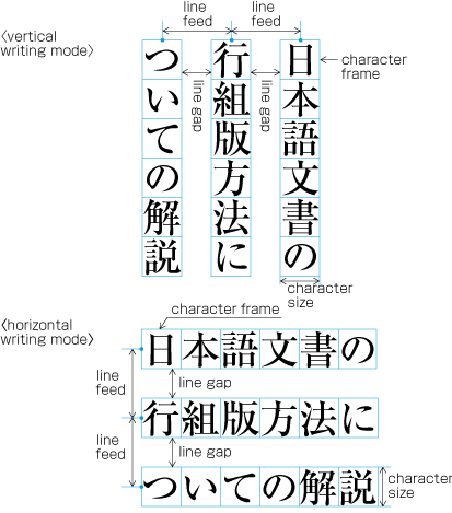 Specifying kihon-hanmen with line feed.
以上のように設定した基本版面のサイズは,次のように計算できる.
The size of the kihon-hanmen in this case can be calculated by following method:
-
縦組の1段の場合
Vertical writing mode with one column
左右サイズ=使用する文字サイズ×1ページの行数+行間×(1ページの行数-1)
Width of kihon-hanmen = character size × number of lines per page + line gap × (number of lines per page − 1)
例)
e.g.
298ポイント=9ポイント×18行+8ポイント×(18行-1)
298 point = 9 point × 18 lines + 8 point × (18 lines − 1)
天地サイズ=使用する文字サイズ×1行の行長
Height of kihon-hanmen = character size × number of characters per line
例)
e.g.
468ポイント=9ポイント×52字
468 point = 9 point × 52 characters
-
縦組の多段の場合
Vertical writing mode with multi columns
左右サイズ=使用する文字サイズ×1段の行数+行間×(1段の行数-1)
Width of kihon-hanmen = character size × number of lines per column + line gap × (number of lines per column − 1)
例)
e.g.
309ポイント=9ポイント×21行+6ポイント×(21行-1)
309 point = 9 point × 21 lines + 6 point × (21 lines − 1)
天地サイズ=使用する文字サイズ×1行の行長×段数+段間×(段数-1)
Height of kihon-hanmen = character size × number of characters per line × number of columns + column gap × (number of columns − 1)
例)
e.g.
468ポイント=9ポイント×25字×2段+18ポイント×(2段-1)
468 point = 9 point × 25 characters × 2 columns + 18 point × (2 columns − 1)
-
横組の1段の場合
Horizontal writing mode with one column
左右サイズ=使用する文字サイズ×1行の行長
Width of kihon-hanmen = character size × number of characters per line
例)
e.g.
315ポイント=9ポイント×35字
315 point = 9 point × 35 characters
天地サイズ=使用する文字サイズ×1ページの行数+行間×(1ページの行数-1)
Height of kihon-hanmen = character size × number of lines per page + line gap × (number of lines per page − 1)
例)
e.g.
468ポイント=9ポイント×28行+8ポイント×(28行-1)
468 point = 9 point × 28 lines + 8 point × (28 lines − 1)
-
横組の多段の場合
Horizontal writing mode with multi columns
左右サイズ=使用する文字サイズ×1行の行長×段数+段間×(段数-1)
Width of kihon-hanmen = character size × number of characters per line × number of columns + column gap × (number of columns − 1)
例)
e.g.
320ポイント=8ポイント×19字×2段+16ポイント×(2段-1)
320 point = 8 point × 19 characters × 2 columns + 16 point × (2 columns − 1)
天地サイズ=使用する文字サイズ×1段の行数+行間×(1段の行数-1)
Height of kihon-hanmen = character size × number of lines per column + line gap × (number of lines per column − 1)
例)
e.g.
476ポイント=8ポイント×40行+4ポイント×(40行-1)
476 point = 8 point × 40 lines + 4 point × (40 lines − 1)
基本版面の設計要素の各ページに対する適用
Page wise Arrangement of Kihon-hanmen Elements
基本版面からはみ出す例
Examples of Items Jutting Out of the Kihon-hanmen
それぞれのページに配置する各要素は,基本版面で設定した版面の内側に配置する.しかし,次のような例外がある.
The various elements of a page should remain inside the boundaries of the kihon-hanmen. However, there are exceptions such as the following:
-
版面又は段の先頭に配置する行の右側(縦組)又は上側(横組)にルビ,傍線,圏点などを付ける場合は,版面の領域の外側に接して配置する(dummygenerated).版面の末尾に配置する行の左側(縦組)又は下側(横組)にルビ,下線などを付ける場合は,版面の領域の外側に接して配置する.次項を含め,このことは基本版面で設定した行の位置を確保するためである.本文中に注と参照するための合印を行間に配置する方法があるが,この場合も同様に扱う.
Ruby or emphasis marks (bousen, emphasis dots, etc.) at the before edge of the hanmen, are placed outside the hanmen (see dummy). The same applies in cases where ruby, underline, etc. appear beyond the after edge of the hanmen. Like the handling of exceptions mentioned below, the purpose here is to preserve the line positions established for the kihon-hanmen. This technique can also be used for reference marks associated with lines of text.
 版面の外側に配置したルビの例
 Example of ruby annotation placed outside of the kihon-hanmen.
-
版面の先頭又は末尾に配置する行に基本版面で設定した行送り方向の行の幅(基本版面で設定した文字サイズ)よりはみ出して配置する要素がある場合は,基本版面で設定した行送り方向の行の幅よりはみ出して配置する部分を,版面の領域の外側にはみ出して配置する(前項とこの項の処理は,JIS X 4051の12.1.1に規定されている).例えば,縦中横の設定を行った文字列の横幅が基本版面で設定した文字サイズより大きくなる場合などである.この他に,割注,上付き・下付きの添え字なども同様な扱いとする.
When there are inline elements whose dimensions extend beyond the before edge and the after edge of a line of characters as determined by the kihon-hanmen, and when those elements appear in the first or last line of the hanmen, the parts that jut out beyond the regular line of characters also jut out of the hanmen area. For example, this is the case when the width of a sequence of characters which are set to tate-chu-yoko is wider than the characters set for the kihon-hanmen. In addition, warichu (inline cutting note) or subscript and superscript (ornament characters) are handled in the same way. (The processing rules for this item and the previous item are defined in JIS X 4051, sec. 12.1.1.)
-
ぶら下げ組とよばれる処理をした場合は,行頭禁則の処理を必要とする句点類(cl-06)及び読点類(cl-07)に限り,行末の版面の領域の外側に接して配置する(dummygenerated).なお,ぶら下げ組についてはJIS X 4051に規定されていないが,同規格の解説8.1)c)に説明がある.
Line adjustment by hanging punctuation is only necessary for full stops (cl-06) and commas (cl-07) when they would otherwise need to be wrapped to the line head. The character is placed so that it touches the hanmen at the line end (see dummy). (Hanging punctuation is not defined in JIS X 4051, but there is an explanation in sec. 8.1, c.)
 ぶら下げ組により版面の外側に配置した句点と読点の例
 Example of IDEOGRAPHIC COMMA and IDEOGRAPHIC FULL STOP placed below the kihon-hanmen.
注1)
(note 1)
ぶら下げ組は,字間による行の調整処理を少なくする方法である.
Line adjustment by hanging punctuation is a way of reducing the processing cost of line adjustment by reducing the need to change inter-character space.
注2)
(note 2)
ぶら下げ組を採用している書籍は多い.
A lot of books apply hanging punctuation.
-
図版や表を各ページに配置する場合,一般に基本版面で設定した範囲内に配置する.しかし,配置する図版や表によっては,基本版面で設定した範囲をはみ出して配置する場合もある.
Illustrations and tables are normally placed inside the area defined by the kihon-hanmen. However, there may also be cases in which a particular illustration or table juts outside the kihon-hanmen.
-
配置する図版や表を基本版面に収めると文字が読みにくくなるため,サイズを基本版面より大きくせざるを得ない場合.
Cases in which it is necessary to make the illustration or table larger than the kihon-hanmen, because reducing its size would make it unreadable.
-
視覚的効果を出すために基本版面で設定した範囲をはみ出して配置する.特に紙面いっぱいに配置する“裁切り”とよばれる方法は,書籍では多くないが,雑誌などではよく行われている(dummygenerated).
For the sake of visual effect, the illustration may bleed into the complete paper area. This is not often used in books, but is often used in magazines (see dummy).
 裁切りの例
裁切りの例
 Example of bleeds.
-
-
その他,図版のキャプションを段の領域の外側,段間に配置する方法も雑誌などでは行われている(この配置方法は体裁がよくないという意見もある).
Magazines may place the captions of illustrations outside the column area or in the column gap. (Some people regard this as bad style.)
基本版面で設定した行位置の適用
Line Positioning based on the Kihon-hanmen Design
各ページにおける行の配置位置は,基本版面で設定した行の位置に従うのが原則である.前掲した図(dummygenerated)のようにルビや圏点が付いた場合だけでなく,例えば,次のdummygeneratedに示したように,行中の一部として基本版面で設定した文字サイズより小さな文字が入る場合でも,基本版面で設定した行の位置を基準に配置し,それに後続する行も基本版面で設定した行の位置にくるようにする.
In principle, pagewise positioning of lines relies on the line positions established for the kihon-hanmen. This holds for lines with ruby or emphasis dots as shown in dummy. Even when lines contain characters that are smaller than the character size used for the kihon-hanmen (as shown in dummy), the line positions used for the kihon-hanmen continue to be used as the basic guide lines. This is so that following lines with normal-sized characters still naturally fall into the line positions established for the kihon-hanmen.
 行中に小さい文字が入った場合の行の位置
 Positioning of lines with a smaller size of text.
|
注1) (note 1) |
括弧書きの文字を小さくするのは,その部分が補足的な説明ということからである.ただし,その扱い方としては,次の3つの方式がある.限定した箇所のみ文字を小さくする方法が最もよく利用されている. Characters within brackets are made smaller, since the text is an additional explanation. Such cases are handled in the following three ways. The first method, making only characters in restricted places smaller, is the most commonly used.
|
ただし,行の配置位置については,次のような例外がある.
The following are exceptions when handling line position:
-
横組で,図版や表の左右にテキストを配置しない方法とした場合,1ページに2つ以上の図版や表が挿入されたときは,基本版面で設定した行の位置からずれることがある(dummygenerated).ただし,基本版面で設定した行の位置に配置する方法もある(dummygenerated).前者の方法は,図版や表の前後の空き量をできるだけ均一にするという考え方による(この方法を採用している書籍が多い).この処理方法については,JIS X 4051の10.3.2のd)に規定がある.
When inserting more than one illustration or table item in horizontal writing mode, assuming that there is no text to the left or right of the items, the items may either slip off the lines established for the kihon-hanmen (see dummy), or stick to the lines (see dummy). The former approach is used, whenever possible, to achieve inter-character spacing before and after illustrations or tables constant. (This method is often used in books.) (This processing method is defined in JIS X 4051, sec. 10.3.2., d.)
 図版等を複数配置した場合の行の配置例1
 Positioning of lines with multiple illustrations - 1.
 図版等を複数配置した場合の行の配置例2
 Positioning of lines with multiple illustrations - 2.
-
段落間に挿入される後注及び横組でページの下端に挿入される脚注は,基本版面で設定した文字サイズよりは小さくする.これに伴い行間も狭くするので,基本版面で設定した行の位置とはそろわない.例えば,縦組において,段落の間に入る後注の配置位置の例をdummygeneratedに示す.なお,後注の組版処理については,JIS X 4051の9.3,脚注は9.4に規定されている.
The size of characters in endnotes inserted between paragraphs or those in footnotes at the bottom of the page (in horizontal writing mode) is smaller than the character size established for the kihon-hanmen. As a result, the character size and line gap are also smaller, and so the line positions are no longer identical to those established for the kihon-hanmen. As an example, dummy shows the position of an endnote between paragraphs in vertical writing mode. (The processing of endnotes is defined in JIS X 4051, sec. 9.3, and the processing of footnotes in sec. 9.4.)
 縦組の後注の配置例
 Positioning of an endnote in vertical writing mode.
-
見出しは,前述したように必ずしも基本版面で設定した行の位置とはそろわないことがある.しかし,その行送り方向に占める領域は,基本版面で設定した行を基準に設計する(dummygenerated).
As mentioned above, the position of a heading may not be identical to the lines established for the kihon-hanmen. Nevertheless, in the block direction, headings base their alignment on the line positions established for the kihon-hanmen (see dummy).
基本版面で設定した文字位置の適用
Character Positioning based on Kihon-hanmen Design
各行に配置する文字の位置は,基本版面で設定したベタ組とした文字の配置位置に従うのが原則である.しかし,前掲したいくつかの図でも基本版面で設定した文字の位置に従っていない例がある.こうした事例は多いが,以下では,典型的な例をいくつか示す(詳細は第3章で解説する).
In principle, the characters in each line follow the solid setting positions of characters established for the kihon-hanmen. However, as already shown in some of the previous figures, there are examples where this is not the case. Such cases are rather common, and here we will show some prototypical examples (details will be given in dummy).
|
注1) (note 1) |
基本版面で設定した文字サイズのベタ組にしない箇所がある場合,その行の行頭から行末までの長さが,基本版面として設定した行長にならないケースも発生する.しかし,1行の行長に満たない段落の最終行を除き,それ以外の行の行頭から行末までの長さは,基本版面として設定した行長にそろえるのが原則である.そこで,行長をそろえる処理が必要になる.この処理方法については,行の調整処理で解説する. Where character sizes differ from the solid set sizes established for the kihon-hanmen, line lengths may not be identical with the line length of the kihon-hanmen; it is necessary to align the ends of the lines, with the exception of the last line in a paragraph. The processing method for this is explained in line adjustment. |
-
行中の一部として基本版面で設定した9ポより小さな文字が挿入されるdummygeneratedの場合である.この場合は,原則として,基本版面で設定した9ポの部分は9ポの文字の外枠に従いベタ組にするとともに,小さくした8ポの部分は,小さくした8ポの文字の外枠に従いベタ組にする.
When 9pt is the character size used to establish the kihon-hanmen, characters smaller than 9pt may be inserted in part of a line (see dummy). In such cases, the parts set at 9pt and any parts set at a smaller, say, 8pt size both use solid setting, with character frames at the respective sizes for each part.
-
行中にプロポーショナルの欧字を図1-20のように,文字を時計回りに90度回転して配置する場合は,プロポーショナルの欧字は,その字幅に応じて配置するので,基本版面で設定した文字位置とはそろわなくなる(dummygenerated).欧字の後ろに連続する和文の配置位置もずれてくる.
In cases where proportional Latin letters are rotated 90 degrees clockwise (see dummy), the proportional letters are placed according to their proportional widths. Hence, they do not fit to the character positions established for the kihon-hanmen (see dummy). Japanese letters following the Latin letters consequently slip away from the default positions as well.
 行中に欧字を配置した例
 Positioning of a mixture of Western and Japanese letters in a line.
-
改行した行の先頭(改行行頭)や段落の2行目以下の行頭(折返し行頭)に配置する始め括弧類(cl-01)の配置方法は,いくつかある(詳細は2.1.5 行頭の括弧類の配置方法で解説する).改行行頭の字下げを全角アキとする場合,又は折返し行頭に空き量をとらない配置法である天付きとする場合は,dummygeneratedのように2字目以下の文字は,基本版面で設定した文字位置とはそろわなくなる.しかし,行長をそろえる調整処理を行っているので,行末の文字は,基本版面で設定した文字位置にそろっている.
There are several methods for positioning opening brackets (cl-01) at the beginning of a line (details are explained in dummy). Because an opening bracket is not a full-width character, in cases where the indentation of the first line of a paragraph is a one em space, or if the tentsuki position is used for the bracket (that is, there is no space at the line head), the character following the bracket will be in a position which does not fit to the character positions established for the kihon-hanmen (see dummy). However, the adaptations made during the alignment of line ends will ensure that the character at the end of a line is at a position that fits with the kihon-hanmen.
 行頭の始め括弧類の配置方法により文字位置がずれた例
 Example of positioning of characters off the kihon-hanmen position due to opening brackets at the line head.
 -
dummyで解説するように句点類(cl-06),読点類(cl-07),始め括弧類(cl-01)及び終わり括弧類(cl-02)の字幅は半角であるが,これらの約物が漢字等(cl-19),片仮名(cl-16)又は平仮名(cl-15)と連続する場合は,原則として,それぞれの約物の前又は後ろに二分アキをとることで,結果として全角というサイズにする.しかし,句点類(cl-06),読点類(cl-07),始め括弧類(cl-01)及び/又は終わり括弧類(cl-02)が連続する場合は,二分アキをとらない箇所があり,このケースでは基本版面で設定した文字位置にそろわないことになる(dummygenerated).これは,見た目の体裁をよくするためである.
dummy explains that full stops (cl-06), commas (cl-07), opening brackets (cl-01) and closing brackets (cl-02) are half-width. If these punctuation marks and brackets are adjacent to ideographic (cl-19), katakana (cl-16) or hiragana (cl-15) characters, in principle there should be a half em space before or after the punctuation mark or brackets, so that these occupy in effect a full-width size. However, if they are adjacent to other punctuation marks or brackets, the half em space is not used. This is done to improve the visual appearance. In such cases, the character positions are different than the positions established when defining the kihon-hanmen (see dummy).
 句点類と始め括弧類が連続,及び終わり括弧類が連続する例
 Example of lines with consecutive punctuation marks.
-
dummyで解説するように終わり括弧類(cl-02),句点類(cl-06)及び読点類(cl-07)を行頭に配置してはならないという規則(行頭禁則という),並びに始め括弧類(cl-01)を行末に配置してはならないという規則(行末禁則)がある.これらが行頭又は行末にくる場合は,なんらかの調整が必要になる.その調整処理のために基本版面で設定した文字位置にそろわない場合が出てくる.
dummy explains the principle that closing brackets (cl-02), full stops (cl-06) and commas (cl-07) should not be placed at the line head. If by simple sequential placement these characters would appear at the line head or at the line end, some kind of adjustment becomes necessary. A similar adjustment is required for characters that should not be placed at the end of a line, such as opening brackets (cl-01). As a result of such adjustment, it may happen that other characters are placed at positions which are different from those established for the kihon-hanmen.
 行頭禁則又は行末禁則を避ける調整をした例
 Example of line adjustment to avoid those characters which shall not start and end a line.
柱とノンブル
Running Heads and Page Numbers
柱及びノンブルの位置
Positioning of Running Heads and Page Numbers
縦組の書籍における両柱方式(2.6.3)による柱及びノンブルの代表的配置位置例をdummygeneratedに示す.
Typical positions of running heads and page numbers for vertically set books with double running heads (see 2.6.3) are as shown in dummy.
 縦組の書籍における両柱方式による柱及びノンブルの代表的な配置位置例
 Typical positioning of running heads and page numbers for vertically set books with double running heads.
横組の書籍における両柱方式(2.6.3)による柱及びノンブルの代表的な配置位置例をdummygeneratedに示す.
Typical positions of running heads and page numbers for horizontally set books with double running heads (see 2.6.3) are as shown in dummy.
 横組の書籍における両柱方式による柱及びノンブルの代表的な配置位置例
 Typical positioning of running heads and page numbers for horizontally set books with double running heads.
柱及びノンブルの位置は,一般に仕上りサイズに対する絶対的な位置関係ではなく,基本版面との相対的な位置関係で設定する(柱の配置については,JIS X 4051の7.6.4に,ノンブルの配置については,JIS X 4051の7.5.4に規定がある).
In principle, positions of running heads and page numbers should be specified relative to the kihon-hanmen, not with absolute coordinates in the trim size. (Positioning of running heads is defined in JIS X 4051, sec. 7.6.4. Positioning of page numbers is defined in JIS X 4051, sec. 7.5.4.)
|
例) Example: |
|
|
基本版面との上下方向の空き量は9ポイント(9ポアキ) 9 points above the kihon-hanmen (vertical space) |
|
|
基本版面との左右方向の空き量(入りともいう)は9ポイント(9ポアキ) 9 points from the left edge of the kihon-hanmen (horizontal space) |
 柱の配置指定例(縦組)
 Positioning of a running head (vertical writing mode).
柱及びノンブルの基本版面との位置関係では,次のような点に注意する.
The following recommendations should be taken into account when positioning running heads and page numbers with reference to the kihon-hanmen.
-
縦組の書籍においてノンブル又は柱を横組にして配置する場合は,基本版面との上下方向の最低の空き量を,基本版面の文字サイズの全角アキとする.横組の書籍の場合は,同じ組方向となるので,基本版面の文字サイズよりやや大きくする.
When positioning horizontal running heads and page numbers with reference to the kihon-hanmen in vertically set books, the amount of vertical space between the edge of the kihon-hanmen and the running head is a one em space as established for the kihon-hanmen. If the kihon-hanmen of the book is horizontally set, take more vertical space than the character size in the kihon-hanmen.
-
縦組の書籍又は横組の書籍において,ノンブル又は柱を横組にして配置する場合は,左ページでは,基本版面の左端の延長線にノンブル又は柱の先頭をそろえて配置するか,基本版面の左端の延長線から基本版面の文字サイズの全角アキだけ右に寄せた位置に配置する.右ページでは,基本版面の右端の延長線にノンブル又は柱の末尾をそろえて配置するか,基本版面の右端の延長線から基本版面の文字サイズの全角アキだけ左に寄せた位置にノンブル又は柱の末尾をそろえて配置する.
Regardless of the direction of text in the kihon-hanmen of a book, horizontal running heads and page numbers on the left page should be aligned either at the left edge of the kihon-hanmen or one em space to the right of the left edge. On the right page, the tail of the running heads or page numbers should be aligned either at the right edge of the kihon-hanmen or one full-width space to left of the right edge.
-
縦組の書籍又は横組の書籍において,同一位置にノンブル及び柱を横組にして並べて配置する場合は,ノンブルと柱との空き量を柱に使用する文字サイズの2倍アキ又は1.5倍アキとする.また,柱とノンブルの位置は,左ページではノンブルを左側に,柱を右側に配置し,右ページではノンブルを右側に,柱を左側に配置する.この場合のノンブルの左右位置は,上記bに従う.
Regardless of the direction of text in a book, when arranging running heads and page numbers together on the same horizontal line, the space between the running head and the page number should be double or one and a half times the character size of the running head. On the left page, the page number should be set at the left side and the running head should be set at the right side. On right-hand pages, the page number should be set at the right side and the running head should be set at the left side. The exact positions of the page numbers are given by the instructions above (see b).
-
縦組の書籍において,ノンブル及び柱を小口側に縦組にして配置する場合(dummygeneratedの(e))は,基本版面との左右方向の最低の空き量を,基本版面の行間とする.天から基本版面の文字サイズで4倍くらい下げた位置に柱の先頭をそろえて配置し,地から基本版面の文字サイズで5倍くらい上げた位置にノンブルの末尾をそろえて配置する.
When positioning running heads and page numbers vertically to the fore-edge of the kihon-hanmen in a vertically set book (see spread (e) in dummy, for example), the minimum horizontal distance from the kihon-hanmen should be the same as that of the line gap of the kihon-hanmen. The top of the running head should be positioned approximately four kihon-hanmen characters below the head, and the bottom of the page numbers should be positioned approximately five kihon-hanmen characters above the foot.
注1)
(note 1)
ノンブルを縦組で掲げる場合は,一般に漢数字(一二三四五六七八九〇)を用い,横組で掲げる場合は,一般にアラビア数字を用いる.また,前付の部分を別ノンブルにした場合は,横組で掲げるノンブルは,一般にローマ数字の小文字を用いる.
In general, ideographic numerals (一二三四五六七八九〇) are used for vertically set page numbers, and European numerals for horizontal pagination. When using independent pagination for the front matter, small Roman numerals are used for horizontal pagination.
柱及びノンブルの配置の原則
Principles of Arrangement of Running Heads and Page Numbers
柱及びノンブルは,1冊の本の中では,同じ位置に配置する.
Positioning of all running heads and page numbers in the same book should be consistent.
|
注1) (note 1) |
目次,索引などの文字を配置する領域が,基本版面のサイズより小さくなる場合でも,仕上りサイズに対する柱及びノンブルの位置は同じである.したがって,目次,索引などの文字を配置する領域が基本版面のサイズより小さくなった分だけ,目次,索引などの文字を配置する領域と,柱及びノンブルとの空き量は変化する.次に示すdummygeneratedは,dummygeneratedで示した基本版面より小さくした目次の版面と柱及びノンブルとの位置関係を示したものであり,dummygeneratedは,基本版面より左右方向で各4ポイント小さくしただけでなく,上下方向でも各5ポイント小さくした索引の版面と柱の位置関係を示したものである. Even on a page with a text area smaller in size than that of the kihon-hanmen, such as for a table of contents or index, positioning of the running head and page number relative to the trim size will remain the same. Therefore, the positioning of running heads and page numbers relative to those areas smaller than the kihon-hanmen is different. dummy below demonstrates the respective positions of the hanmen for a table of contents and running heads or page numbers. As shown in dummy, this hanmen is smaller than the kihon-hanmen. dummy demonstrates the related positions of running heads and page numbers and the hanmen of indexes. These hanmen are not only 4 points smaller at the left and right, but also 5 points smaller at the top and bottom. |
 基本版面より小さくなった目次の版面と柱及びノンブルとの位置関係
 Positioning of running heads and page numbers on TOC pages for which the hanmen is smaller in size than the kihon-hanmen.
 基本版面より小さくなった索引の版面と柱との位置関係
 Positioning of running heads and page numbers on index pages for which hanmen is smaller in size than the kihon-hanmen.
ノンブルは,紙葉の表面を“1”として開始するので,縦組の書籍の見開きにおいては,右ページは偶数ページ,左ページは奇数ページとなり(dummygenerated),横組の書籍の見開きにおいては,左ページは偶数ページ,右ページは奇数ページとなる(dummygenerated).
Because the start of a page will be on the recto side, the right-hand page of a spread in a vertically set book is always an even page and the left-hand page is always an odd page (see dummy). Likewise, the left-hand page of a spread in a horizontally set book is always an even page and the right-hand page is always an odd page (see dummy).
 縦組の書籍における見開きのノンブル
 Page numbers on a spread in a vertically set book.
 横組の書籍における見開きのノンブル
 Page numbers on a spread in a horizontally set book.
柱及びノンブルの配置方式
Ways of Arranging Running Heads and Page Numbers
柱には,両柱方式(dummygenerated)と片柱方式(dummygenerated)とがある(柱の掲げ方についてはJIS X 4051の7.6.2に,ノンブルの掲げ方については7.5.2に規定がある).
There are two ways to arrange running heads. One is the single running head method and the other is the double running head method. (Arrangement of running heads is defined in JIS X 4051, sec. 7.6.2. Page Numbers are defined in sec. 7.5.2.).
-
両柱方式:柱を偶数ページ及び奇数ページの両方に配置する方式(図1-34).
Double running head method: Place running heads on both even pages and odd pages (see dummy).
-
Single running head method: Place running heads only on odd pages (see dummy).
 両柱方式の例
 Double running head method.
 片柱方式の例
 Single running head method.
|
注1) (note 1) |
柱は,原則として各ページに1つだけ配置するが,辞典などでは,各ページに内容を示す柱を複数配置する場合もある. In general, there will be only one running head per page. However, in some cases, such as in dictionaries, multiple running heads are printed on each page to indicate contents. |
|
注2) (note 2) |
ノンブルも原則として各ページに1つだけ配置するが,次のようなケースでは各ページに複数を配置する場合もある. In general, there will be only one page number per page. However in some cases multiple page numbers are printed on each page as in the following examples:
|
-
両柱方式では,偶数ページに章などのアウトラインレベルの高い見出し又は書名を掲げ,奇数ページには,偶数ページに掲げた書名又は見出しよりアウトラインレベルの低い節などの見出しを掲げる.ただし,目次などアウトラインレベルの異なる見出しのない部分では,偶数ページと奇数ページに同じ柱を掲げる.
In the double running head method, a higher-level title, such as that of the chapter or book, is used for the running heads on the even pages, and a lower-level title, such as that for a section, on the odd pages. Where there are no differing levels of titles, such as on the page containing the table of contents, the same running head is used on both even and odd pages.
注1)
(note 1)
柱に何を掲げるかは,その書籍の内容による.読者が各ページに何が書かれているかを検索する,又は現在説明されている内容を確認することが主な目的である.その点では書名を掲げるのはあまり意味があることではない.3つのランクの見出しがあった場合は,最も大きな見出しと,その次にランクする見出しを掲げるというのが,最も普通な方法であろう.
Which information is used for the running heads depends on the content of the book. Given that the main purpose of running heads is to signpost to readers what is written on each page, or the content of the current page, it does not make much sense to use the book title for the running head. The most common approach for a book with three levels of headings, such as chapter, section and subsection, is to use the highest level heading (i.e. chapter) and the second level heading (i.e. section).
-
片柱方式では,いずれかのレベルの見出しを掲げる.
In the single running head method, one of the headings between the top and third levels is used.
-
柱は,原則として見出しと同じ内容を掲げるが,次のような例外がある.
In principle, the contents of running heads will be the same as those of headings with the following differences:
-
見出しの字数が多い場合,文章を修正し,字数を少なくする.あまり字数の多い柱を掲げるのは体裁がよくないからである.
If headings are too long, they should be made shorter by paraphrasing them in fewer characters. Running heads with too many characters will not look good.
-
論文集などでは,著者名を見出しの後ろに括弧類などでくくって示す.
For certain publications, such as a collection of monographs, the names of authors may be added in parentheses at the end of the running head.
-
柱及びノンブルの組方向は,原則として基本版面の組方向と同じにするが,縦組の書籍における柱・ノンブルの組方向は,横組とする場合が多い.
In principle, the text direction of running heads and page numbers should be the same as that of the kihon-hanmen. For vertically set books, however, it is more common to set running heads and page numbers horizontally.
-
柱は,原則として片柱方式の場合はすべての奇数ページ,両柱方式の場合は全ページに掲げるが,次のようなページでは表示しない.これは体裁の問題からである.
In principle, for the single running head method running heads are printed on all odd pages, and for the double running head method on all even and odd pages. However, for the sake of appearance, running heads may be omitted as follows:
-
柱を表示しないページ
Pages on which running heads should be hidden:
-
Naka-tobira and han-tobira.
-
柱の配置領域が,図版などと重なったページ
Pages where a running head overlaps with other elements such as illustrations.
-
-
柱を表示しなくてもよいページ
Pages on which running heads may be hidden:
-
柱の配置領域に隣接して図版,表などが配置されているページ
Pages where a figure or a table is positioned adjacent to the running head.
-
-
-
ノンブルは,原則として全ページに掲げるが,次のようなページでは表示しない.これは体裁の問題からである.
In principle, page numbers are printed on all pages. However, for the sake of appearance, they may be omitted as follows:
-
ノンブルを表示しないページ
Pages on which page numbers should be hidden:
-
ノンブルの配置領域が,図版などと重なったページ
Pages on which a illustration or a table is positioned adjacent to the page number.
-
-
ノンブルを表示しなくてもよいページ
Pages on which page numbers may be hidden:
中扉及び半扉
Divisional title and simplified divisional title pages.
-
横書きの書籍においてノンブルを横組にして天側の余白に配置した場合で,改丁・改ページなどで見出しが始まるページ(この場合,ノンブルを地の中央に移動して表示する方法もある)
Pages in horizontally set books with a page number placed in the margin at the top of the page, and with a heading at the beginning of a new recto or new page. (In this case, it is also possible to move the page numbers to the center of the margin at the foot of the page.)
注1)
(note 1)
ページはあるが,そのページを数えない場合には,次のような例がある.
Pages are not counted in cases such as the following:
-
本扉を別紙とした場合
If a different type or color of paper is used for the main title page,
-
巻頭に別紙で口絵を挿入した場合
if a frontispiece is inserted in the opening page of a book; or
-
-
ノンブルは,1冊の本を通して数字を連続させる方法(通しノンブルという)と,前付や後付部分を別に1から数字を開始してノンブルを付ける方法(別ノンブルという)とがある.また,マニュアル等では,章別に1から数字を開始する方法もある(この場合は,1から開始した数字の前に章名を示す接頭辞を付けることが多い).
There are two types of page numbering. "Continuous pagination" means that page numbers continue throughout the whole book. "Independent pagination" means that page numbers start from "1" separately at beginning of the front matter and back matter. There is also, for example in manuals, the method of starting each chapter from page number "1". (In such cases, it is common that the name of the chapter is added as a prefix before the page number.)
注1)
(note 1)
前付と本文を別ノンブルとする場合は,それぞれを1から数字を開始してノンブルを付ける.この場合,前付部分は,本文と区別するためにローマ数字の小文字を使用する例が多い.
If the front matter and the main text have different page numbers, each starts with page number "1". In this case, it is common to use Roman numerals for the pages of the front matter, in order to distinguish them from the main text.
注2)
(note 2)
縦組の書籍で横組の索引を付けた場合は,次のような方法がある.
For vertically set books with indexes in horizontal writing mode, the following methods are available.
-
本の終わりから開始する横組の索引に,本の流れからいえば逆方向に1から数字を開始してノンブルを付ける(逆ノンブルという).
Reverse pagination. The index reads from the end of the book, and page numbers are added starting with "1" from the end of the book and flow in the same order as the index.
-
本の終わりから開始する横組の索引に,本の流れ方向に従い1から数字を開始してノンブルを付ける(索引の流れからは逆になる,通しノンブルという).
Continuous pagination. The index reads from the end of the book, but page numbers start with "1" and flow in the same order as the book. (The index pages flow in the reverse order to the page numbers.)
-
逆ノンブルと通しノンブルの両方を付ける.この場合は,通しノンブルの配置位置は本文と同じにし,逆ノンブルの位置は別の箇所にし(例えば,通しノンブルが地のときは逆ノンブルは天),本文と同じアラビア数字を用いるが,その前後に括弧を付けるなどして区別を付ける方法がよく利用されている.
Both reverse pagination and continuous pagination. In this case, the page numbers for continuous pagination are in the same position as the page numbers of the main text, and page numbers in reverse pagination are in a different position (for example, if serial pagination is in the foot of the page, reverse pagination is in the head). Often other methods are applied to distinguish the different paginations. For example, Arabic numbers are used for both continuous pagination and reverse pagination, but for reverse pagination, brackets are added around the numbers.
-
行の組版処理
Line Composition
約物などの組版処理
Line Composition Rules for Punctuation Marks
縦組と横組で異なる約物など
Differences in Vertical and Horizontal Composition in Use of Punctuation Marks
縦組と横組で異なる約物などを使用する例がある.主な例を次に示す.(なお,以下の文書では,約物を含む文字・記号について,その組版上の振る舞いで分類し,文字クラスとしてグループに分けて扱う.用語の後ろの括弧内に“(cl-01)”などと示すものは,その文字クラスの番号である.文字クラスの詳細は3.9 文字クラスについてで解説する.)
There are some punctuation marks that are used uniquely in either vertical writing mode or horizontal writing mode. In this document, characters and symbols are treated as members of a character class, classified by their behavior for composition. Each class name is followed by class id, such as opening brackets (cl-01). Details are explained in About Character Classes. The following are some typical examples:
-
-
縦組では,句点類(cl-06)には,句点[。] (IDEOGRAPHIC FULL STOP)を,読点類(cl-07)には読点[、] (IDEOGRAPHIC COMMA)を使用する.
In vertical writing mode, IDEOGRAPHIC FULL STOP "。" and IDEOGRAPHIC COMMA "、" are used for full stops (cl-06) and commas (cl-07).
-
横組で使用する句点類(cl-06)と読点類(cl-07)の組合せには,次の3つの方式がある.
In horizontal writing mode, there are three conventions in choice of symbols for full stops (cl-06) and commas (cl-07):
-
 コンマとピリオドを使用した例
 Example text using COMMA and FULL STOP.
-
コンマ[,] (COMMA)と句点[。] (IDEOGRAPHIC FULL STOP)を使用する(図56).
Using COMMA "," and IDEOGRAPHIC FULL STOP "。" (see dummy).
 コンマと句点を使用した例
 Example text using COMMA and IDEOGRAPHIC FULL STOP.
 -
読点[、] (IDEOGRAPHIC COMMA)と句点[。] (IDEOGRAPHIC FULL STOP)を使用する(図57).
Using IDEOGRAPHIC COMMA "、" and IDEOGRAPHIC FULL STOP "。" (see dummy).
 読点と句点を使用した例
 Example text using IDEOGRAPHIC COMMA and IDEOGRAPHIC FULL STOP.
注1)
(note 1)
横組では,欧文が混用される場合も多い.そこで,欧文の句読点であるコンマとピリオドとそろえるとしたのがiの方式である.理工学書でよく利用されている方式である.iiは,iのピリオド[.] (FULL STOP)が和文とのバランスが悪く,小さいということから句点[。] (IDEOGRAPHIC FULL STOP)に変えた方法であり,日本の公用文で採用されている方式である(かつては公用文でも,コンマ[,] (COMMA)とピリオド[.] (FULL STOP)を使用したことがある).
In horizontal writing mode, there are many cases of composition that mixes Japanese and Western text. The convention shown in (i) is a way to apply the same comma and full stop to both Western and Japanese texts for consistency, and is common in books on science and technology. The convention shown in (ii) was invented because in (i) FULL STOP "." appears too small for Japanese texts and using IDEOGRAPHIC FULL STOP "。" for period looks better. This convention has been adopted for Japanese official publications. (In the past, COMMA "," and FULL STOP "." were used for some official publications.)
-
-
-
かぎ括弧(始めかぎ括弧[「] (LEFT CORNER BRACKET)及び終わりかぎ括弧[」] (RIGHT CORNER BRACKET))とクォーテーションマーク(左ダブルクォーテーションマーク[“] (LEFT DOUBLE QUOTATION MARK)及び右ダブルクォーテーションマーク[”] (RIGHT DOUBLE QUOTATION MARK)並びに左シングルクォーテーションマーク[‘] (LEFT SINGLE QUOTATION MARK)及び右シングルクォーテーションマーク[’] (RIGHT SINGLE QUOTATION MARK))
LEFT CORNER BRACKET "「", RIGHT CORNER BRACKET "」", LEFT DOUBLE QUOTATION MARK "“" and RIGHT DOUBLE QUOTATION MARK "”"
-
縦組では,始めかぎ括弧[「] (LEFT CORNER BRACKET)及び終わりかぎ括弧[」] (RIGHT CORNER BRACKET)を用いる(図58).
In vertical writing mode, LEFT CORNER BRACKET "「" and RIGHT CORNER BRACKET "」" are used for quotations (see dummy).
 始めかぎ括弧及び終わりかぎ括弧を使用した例
 Examples of quoted text using LEFT CORNER BRACKET and RIGHT CORNER BRACKET.
-
横組では,始めかぎ括弧[「] (LEFT CORNER BRACKET)及び終わりかぎ括弧[」] (RIGHT CORNER BRACKET)に替えて左ダブルクォーテーションマーク[“] (LEFT DOUBLE QUOTATION MARK)及び右ダブルクォーテーションマーク[”] (RIGHT DOUBLE QUOTATION MARK),又は左シングルクォーテーションマーク[‘] (LEFT SINGLE QUOTATION MARK)及び右シングルクォーテーションマーク[’] (RIGHT SINGLE QUOTATION MARK)を用いる方法がある(図59).
In horizontal writing mode, pairs of LEFT DOUBLE QUOTATION MARK "“" and RIGHT DOUBLE QUOTATION MARK "”" or pairs of LEFT SINGLE QUOTATION MARK "‘" and RIGHT SINGLE QUOTATION MARK "’" may be used in place of LEFT CORNER BRACKET "「" and RIGHT CORNER BRACKET "」" (see dummy).
 左ダブルクォーテーションマーク及び右ダブルクォーテーションマークを使用した例
 Examples of quoted text using LEFT DOUBLE QUOTATION MARK and RIGHT DOUBLE QUOTATION MARK.
注1)
(note 1)
かぎ括弧(始めかぎ括弧[「] (LEFT CORNER BRACKET)及び終わりかぎ括弧[」] (RIGHT CORNER BRACKET))を横組で用いると,特に終わりかぎ括弧[」] (RIGHT CORNER BRACKET)の体裁がよくないのが理由である.しかし,最近は,かぎ括弧の使用が増えている.
This is because LEFT CORNER BRACKET "「" and (especially) RIGHT CORNER BRACKET "」" may not look good in horizontal writing mode, but adoption of corner brackets for horizontal writing mode seems to be increasing.
注2)
(note 2)
ダブルクォーテーションマークに似た括弧類にダブルミニュート(始めダブルミニュート[〝] (REVERSED DOUBLE PRIME QUOTATION MARK)及び終わりダブルミニュート[〟] (LOW DOUBLE PRIME QUOTATION MARK))がある(図60).これは,縦組専用の括弧類であり,横組では使用しない.
Though REVERSED DOUBLE PRIME QUOTATION MARK "〝" and LOW DOUBLE PRIME QUOTATION MARK "〟" are similar to double quotation marks in appearance (see dummy) they are exclusively used for vertical writing mode and are not to be used in horizontal writing mode.
 始めダブルミニュート及び終わりダブルミニュートを使用した例
 Examples of quoted text using REVERSED DOUBLE PRIME QUOTATION MARK and LOW DOUBLE PRIME QUOTATION MARK.
注3)
(note 3)
左ダブルクォーテーションマーク[“] (LEFT DOUBLE QUOTATION MARK)及び右ダブルクォーテーションマーク[”] (RIGHT DOUBLE QUOTATION MARK)は,横組専用の括弧類であり,縦組では使用しない.また,左シングルクォーテーションマーク[‘] (LEFT SINGLE QUOTATION MARK)及び右シングルクォーテーションマーク[’] (RIGHT SINGLE QUOTATION MARK)も横組専用の括弧類であり,縦組では使用しない.ただし,縦組において欧文用文字(cl-27)などを時計回りに90度回転させて配置する場合に使用する例がある.
LEFT DOUBLE QUOTATION MARK "“" and RIGHT DOUBLE QUOTATION MARK "”" are exclusively for horizontal writing mode and not to be used in vertical writing mode. Also, LEFT SINGLE QUOTATION MARK "‘" and RIGHT SINGLE QUOTATION MARK "’" are exclusively for horizontal writing mode and not to be used in vertical writing mode. However, in vertical writing mode, when Western characters (cl-27) are composed rotated 90 degrees clockwise, these quotation marks are sometimes used.
-
-
ブラケット(始め大括弧[[] (LEFT SQUARE BRACKET)及び終わり大括弧[]] (RIGHT SQUARE BRACKET))と,きっこう(始めきっこう括弧[〔] (LEFT TORTOISE SHELL BRACKET)及び終わりきっこう括弧[〕] (RIGHT TORTOISE SHELL BRACKET))
LEFT SQUARE BRACKET "[", RIGHT SQUARE BRACKET "]", LEFT TORTOISE SHELL BRACKET "〔" and RIGHT TORTOISE SHELL BRACKET "〕"
ブラケット([ ])を縦組用に変形したものが,きっこう(〔 〕)である.したがって,特別な場合を除き,横組ではブラケットを使用する.
LEFT TORTOISE SHELL BRACKET "〔" and RIGHT TORTOISE SHELL BRACKET "〕" are vertical variants of LEFT SQUARE BRACKET "[" and RIGHT SQUARE BRACKET "]", which are used in horizontal writing mode. Square brackets should be used in horizontal writing mode except for special cases.
|
注1) (note 1) |
句点類(cl-06)及び読点類(cl-07)は,縦組用と横組用では,文字の外枠に対する字面の配置位置が異なる.始め括弧類(cl-01),終わり括弧類(cl-02)及びハイフン類(cl-03)は,縦組用と横組用で字面の向きを変更する.その他,小書きの仮名(cl-11)は,前述したように文字の外枠に対する字面の位置が縦組用と横組用では異なる.また,長音記号[ー] (KATAKANA-HIRAGANA PROLONGED SOUND MARK)は,字形の向きを変更するだけではなく,字形そのものも変更している.横組用の長音記号は,縦組用の長音記号を単純に反時計回りに90度回転したものではない(図61). The position of the letter face of commas (cl-07) and full stops (cl-06) within the character frame differs in vertical and horizontal writing modes. The same letter face can be used for opening brackets (cl-01), closing brackets (cl-02) and hyphens (cl-03) in both vertical and horizontal writing mode by rotating clockwise 90 degrees to the inline direction. The position of the letter face of small kana (cl-11) symbols within the character frame is different in vertical and horizontal writing modes. For KATAKANA-HIRAGANA PROLONGED SOUND MARK "ー", the difference between vertical and horizontal writing modes is not only in the orientation of the letter form to the inline direction, but also the shape of the symbol (see dummy). |
 横組用の長音記号と縦組用の長音記号
 KATAKANA-HIRAGANA PROLONGED SOUND MARK for vertical and horizontal writing modes.
句読点や,括弧類などの基本的な配置方法
Positioning of Punctuation Marks (Commas, Periods and Brackets)
約物などを行に配置する場合の基本的な配置は,次のようにする.
The positioning of punctuation marks (commas, periods and brackets) in a line proceeds as follows.
|
注1) (note 1) |
約物を含め,その他の文字・記号を行頭及び行末に配置する方法,並びに隣接する文字の間隔の原則的な処理方法についての詳細は,3.9 文字クラスについてで説明する文字クラスに従い,表の形式にして文字間の空き量に示す. Basic processing of characters and symbols, including punctuation marks, which are subject to considerations of line head wrapping, line end wrapping and inter-character space adjustment, will be described in detail in Sec. 3.9 Character Class. All combinations of character class are provided as a complete table in Spacing between Characters. |
読点類(cl-07),句点類(cl-06),始め括弧類(cl-01),終わり括弧類(cl-02)及び中点類(cl-05)の字幅は,半角であるが,これらの約物が漢字等(cl-19),平仮名(cl-15)又は片仮名(cl-16)と連続する場合は,原則として,それぞれの約物の前又は後ろ(中点類(cl-05)は,その前及び後ろ)に一定の空き量をとることで,結果として全角というサイズになる(図62).漢字等(cl-19),平仮名(cl-15),及び片仮名(cl-16)の全角というサイズとそろえるとともに,これらの約物の前及び/又は後ろに空き量をとることにより,文章の区切りを示すためである.行中での句点類(cl-06)の後ろの空き量を除いて,原則とした空き量は,行の調整処理における詰める場合の対象とし,結果的に0となることもある(行の調整処理については3.8 行の調整処理を参照).
The character advance of commas (cl-07), full stops (cl-06), opening brackets (cl-01), closing brackets (cl-02) and middle dots (cl-05) is half-width (half em). But when those punctuation marks are placed side-by-side with ideographic (cl-19), hiragana (cl-15), or katakana (cl-16) characters, in principle, a given amount of space will be inserted before or after the symbols, which makes them appear as if they were intrinsically full-width (one em) (see dummy). Space is inserted before and after middle dots (cl-05). This principle makes the symbols consistent with ideographic (cl-19), hiragana (cl-15) and katakana (cl-16) characters in character width, and at the same time the space for punctuation helps to make the organization of text clearer. The space size added before or after punctuation marks is subject, in principle, to line adjustment and may eventually be removed, except for that added after full stops (cl-06). (Details of line adjustment are discussed in Sec. 3.8 Line Adjustment).

 句読点などの字幅と前後の空き量

 Character widths of commas, periods, and the space size appended before and/or after the symbols.
-
読点類(cl-07)では,原則として後ろを二分アキにする.
After commas (cl-07), a half em space is added, in principle.
-
句点類(cl-06)では,行中では後ろを二分アキにし,行末では後ろを原則として二分アキにする.
After full stops (cl-06), in the middle of a line, a half em space is added. At the end of a line, a half em space is added, in principle.
-
始め括弧類(cl-01)では,原則として前を二分アキにする.
Before opening brackets (cl-01), a half em space is added, in principle.
-
終わり括弧類(cl-02)では,原則として後ろを二分アキにする.
After closing brackets (cl-02), a half em space is added, in principle.
-
中点類(cl-05)では,原則として前及び後ろを四分アキにする.
Before and after middle dots (cl-05), a quarter em space is added, in principle.
|
注1) (note 1) |
各フォントが持っている約物がどのような字幅を持っているかは問題としない.結果として,ここで説明した配置方法になればよい.例えば,始め括弧類(cl-01)及び終わり括弧類(cl-02)の字幅を全角として扱う場合,終わり括弧類(cl-02)の後ろに始め括弧類(cl-01)が連続するときは,その字間にマイナス二分アキを挿入すると考えてもよい(マイナスの二分アキ又は四分アキを用意している処理系もある).なお,活字組版においても,二分アキを調整するために,半角のボディ+二分アキという方法が一般的であった.そのために原稿に従って活字を集める作業である文選では句読点や括弧類は拾わず,ページの体裁にする植字の際に約物を拾っていた.その後,モノタイプの利用が進み,全角サイズのボディの約物も利用されるようになり,全角と半角の約物が混用されてきた. In font implementations, punctuation marks can be given a different character width, but it is expected that the font is capable of following the line composition rules explained here to produce the final result. For example, when opening brackets (cl-01) and closing brackets (cl-02) are implemented with full-width size, it is possible that a minus half em space is inserted between adjacent closing brackets (cl-02) and opening brackets (cl-01) (Some implementations prepare minus half em spaces and quarter em spaces). In letterpress printing, it was also common practice to combine punctuation marks with a half-width body and half em spaces in order to make it easier to remove the space later for adjustment. Because of that, the types were picked up except for the punctuation marks at the type-picking phase, following the manuscript, and the punctuation marks were picked only when they were necessary in composing a page. Later, with the increasing adoption of Monotype machines, punctuation marks with a full-width body became popular and both full-width and half-width punctuation marks have been used, mixed together, since then. |
 始め小括弧及び終わり小括弧並びに始め山括弧及び終わり山括弧の配置例(左がベタ組とした例)
 Positioning of parentheses and brackets. (The left-hand side shows an example of setting them solid.)
|
注2) (note 2) |
始め括弧類(cl-01),終わり括弧類(cl-02)のうち,始め小括弧[(] (LEFT PARENTHESIS)及び終わり小括弧[)] (RIGHT PARENTHESIS)並びに始め山括弧[〈] (LEFT ANGLE BRACKET)及び終わり山括弧[〉] (LEFT ANGLE BRACKET)は,補足説明等に利用され,他の始め括弧類(cl-01),終わり括弧類(cl-02)と扱いがやや異なる.このようなことから,始め小括弧[(] (LEFT PARENTHESIS)及び終わり小括弧[)] (RIGHT PARENTHESIS)並びに始め山括弧[〈] (LEFT ANGLE BRACKET)及び終わり山括弧[〉] (LEFT ANGLE BRACKET)については,その前又は後ろの二分アキを確保しないで,ベタ組とする方針で処理する方法もある(図63). Among opening brackets (cl-01) and closing brackets (cl-02), LEFT PARENTHESIS "(", RIGHT PARENTHESIS ")", LEFT ANGLE BRACKET "〈" and RIGHT ANGLE BRACKET "〉" are used to indicate supplementary explanations, and in that case their usage differs slightly from other opening brackets (cl-01) and closing brackets (cl-02). To reflect the difference, there is an alternative convention to not append a half em space before or after the parentheses and angle brackets, and instead just set them solid (see dummy). |
読点及び中点の例外的な配置方法
Exceptional Positioning of Ideographic Comma and Katakana Middle Dot
次のような場合においては,読点[、] (IDEOGRAPHIC COMMA)の後ろ及び中点[・] (KATAKANA MIDDLE DOT)の前後の空き量をとらないことを原則とする.これは体裁上からの処理である.
The space usually added after IDEOGRAPHIC COMMA "、" and the space before and after KATAKANA MIDDLE DOT "・" are omitted, in principle, for cosmetic reasons in the following cases.
-
縦組において漢数字の位取りを示す読点[、] (IDEOGRAPHIC COMMA)の後ろはベタ組にする(図2-64の右側).
In vertical writing mode, ideographic numerals and IDEOGRAPHIC COMMA "、" used as a decimal separator are set solid (as in the right line in dummy).
 読点の例外的な配置例
 Example of exceptional positioning of the IDEOGRAPHIC COMMA.
注1)
(note 1)
 漢数字で概略の数を示す読点の配置例
 Example of the positioning of IDEOGRAPHIC COMMA with ideographic digits to represent an approximate number.
-
縦組において漢数字の小数点を示す中点[・] (KATAKANA MIDDLE DOT)の前後はベタ組にする(図66の右側).
In vertical writing mode, ideographic digits and KATAKANA MIDDLE DOT "・" representing a decimal point are set solid (as in the right line in dummy).
 中点の例外の配置例
 Example of the exceptional positioning of KATAKANA MIDDLE DOT.
注1)
(note 1)
なお,横組において,中点[・] (KATAKANA MIDDLE DOT)を単位記号中の文字(cl-25)として単位記号の中で使用する場合,中点[・] (KATAKANA MIDDLE DOT)を連数字中の文字(cl-24)の中で使用する場合及び欧文用文字(cl-27)を用いた数式・化学式の中で使用する場合は,[・] (KATAKANA MIDDLE DOT)の前後はベタ組にする.
In vertical writing mode, when KATAKANA MIDDLE DOT "・" is used as a member of unit symbols (cl-25) in unit symbols, grouped numerals (cl-24), and Western characters (cl-27) in mathematical and chemical formulae, before and after KATAKANA MIDDLE DOT "・" is set solid.
始め括弧類,終わり括弧類,読点類,句点類及び中点類が連続する場合の配置方法
Positioning of Consecutive Opening Brackets, Closing Brackets, Commas, Full Stops and Middle Dots
始め括弧類(cl-01),終わり括弧類(cl-02),読点類(cl-07),句点類(cl-06)及び中点類(cl-05)が連続する場合は,次のようにする(図67).これは体裁上からの処理である.なお,行中における句点類(cl-06)の後ろの二分アキを除いて,行末における句点類(cl-06)の後ろの二分アキを含めて原則として二分アキ又は四分アキとする箇所は,行の調整処理の詰める場合の対象にしてよい(行の調整処理については,3.8 行の調整処理を参照).なお,行末に配置する終わり括弧類(cl-02),句点類(cl-06),読点類(cl-07)及び中点類(cl-05)の配置方法については3.1.9 行末に配置する終わり括弧類,句点類,読点類及び中点類の配置方法を参照.
In cases where multiple punctuation marks, such as opening brackets (cl-01), closing brackets (cl-02), commas (cl-07), full stops (cl-06) and middle dots (cl-05), come one after the other, the following space adjustments are made for aesthetic reasons (see dummy). Note also that the half em and quarter em spaces added before or after punctuation marks, including the half em space after full stops (cl-06) appearing in the middle of a line, are subject, in principle, to line adjustment and may eventually be removed, except for those added after full stops (cl-06). (See Sec. 3.8 Line Adjustment for more about line adjustment.) For more information about the positioning of closing brackets (cl-02), full stops (cl-06), commas (cl-07) and middle dots (cl-05) at line end, see 3.1.9 Positioning of Closing Brackets, Full Stops, Commas and Middle Dots at Line End.
-
読点類(cl-07)又は句点類(cl-06)の後ろに終わり括弧類(cl-02)が連続する場合は,読点類(cl-07)又は句点類(cl-06)と終わり括弧類の字間はベタ組とし,終わり括弧類の後ろを原則として二分アキとする(図67の①).
When closing brackets (cl-02) come immediately after commas (cl-07) or full stops (cl-06), remove the default half em space between them and, in principle, add a half em space after the closing brackets (see dummy ①).
-
終わり括弧類(cl-02)の後ろに読点類(cl-07)が連続する場合は,終わり括弧類(cl-02)と読点類(cl-07)の字間はベタ組とし,読点類(cl-07)の後ろを原則として二分アキとする.また,終わり括弧類(cl-02)の後ろに句点類(cl-06)が連続する場合は,終わり括弧類(cl-02)と句点類(cl-06)の字間はベタ組とし,行中では句点類(cl-06)の後ろを二分アキとし,行末では句点類(cl-06)の後ろを原則として二分アキとする(図67の②).
When commas (cl-07) come immediately after closing brackets (cl-02), remove the default half em space between them and, in principle, add a half em space after the comma. When full stops (cl-06) come immediately after closing brackets (cl-02), remove the default half em space between them and, in middle of a line, add a half em space after the full stop; at the end of a line, in principle, add a half em space after the full stop (see dummy ②).
-
読点類(cl-07)の後ろに始め括弧類(cl-01)が連続する場合は,読点類と始め括弧類の字間は,原則として二分アキとする(図67の③).また,行中で句点類(cl-06)の後ろに始め括弧類(cl-01)が連続する場合は,句点類と始め括弧類の字間は,二分アキとする.ただし,句点類(cl-06)が行末に位置した場合は,句点類(cl-06)の後ろを原則として二分アキにする.
When opening brackets (cl-01) come immediately after commas (cl-07), in principle, add a half em space between them (see dummy ③). When opening brackets (cl-01) come immediately after full stops (cl-06) in the middle of a line, add a half em space between them. Note that when full stops (cl-06) come in the bottom of lines, in principle, insert a half space after full stops (cl-06).
-
終わり括弧類(cl-02)の後ろに始め括弧類(cl-01)が連続する場合は,終わり括弧類と始め括弧類の字間は,原則として二分アキとする(図67の④).
When opening brackets (cl-01) come immediately after closing brackets (cl-02), in principle, add a half em space between them (see dummy ④).
-
始め括弧類(cl-01)の後ろに始め括弧類(cl-01)が連続する場合は,その字間はベタ組とし,前にくる始め括弧類の前を原則として二分アキとする(図67の⑤).
When opening brackets (cl-01) come immediately after other opening brackets (cl-01), set them solid and, in principle, add a half em space before the first one (see dummy ⑤).
-
終わり括弧類(cl-02)の後ろに終わり括弧類(cl-02)が連続する場合は,その字間はベタ組とし,後ろにくる終わり括弧類の後ろを原則として二分アキとする(図67の⑥).
When closing brackets (cl-02) come immediately after other closing brackets (cl-02), set them solid and, in principle, add a half em space after the last closing bracket (see dummy ⑥).
-
終わり括弧類(cl-02)の後ろに中点類(cl-05)が連続する場合は,後ろの中点類の前及び後ろを原則として四分アキとする(図67の⑦).
When middle dots (cl-05) come immediately after closing brackets (cl-02), in principle, add a quarter em space before the following middle dot (see dummy ⑦).
-
中点類(cl-05)の後ろに始め括弧類(cl-01)が連続する場合は,前の中点類の後ろを原則として四分アキとする(図67の⑦).
When opening brackets (cl-01) come immediately after middle dots (cl-05), in principle, add a quarter em space after the preceding middle dot (see dummy ⑦).
 始め括弧類,終わり括弧類,読点類,句点類及び中点類が連続する場合の配置例
 Examples of line adjustment with multiple opening brackets, closing brackets, commas, full stops or middle dots.
それぞれの後ろ又は前を二分アキ,又は前後を四分アキにし,全角の幅にすると空き量が目立ち,体裁がよくないからである(図68).
The line adjustment rules shown above have been established because the default half em space before or after consecutive punctuation marks, or quarter em space before and after them, makes the line look sparse and doesn't make the line appear well-proportioned (see dummy).
 始め括弧類,終わり括弧類,読点類,句点類及び中点類が連続する場合の不適切な配置例
 Examples of bad line composition with unadjusted spaces between multiple opening brackets, closing brackets, commas, full stops or middle dots.
|
注1) (note 1) |
日本語組版では,全角を基本とするが,その原則通りにすると体裁がよくない場合が出てくる.このような例外的な場合は,原則である全角にするのではなく,体裁を優先し,全角としない例外処理を行う.この例外処理をどのような箇所で,どのように行うかが組版の品質にからんでくる.いかに矛盾を解決するか,という問題でもある. Japanese composition is based on the design of full-width characters, but strictly following full-width based composition sometimes produces an unbalanced appearance. In such exceptional cases, the appearance of the resulting composition must be given higher priority than the full-width design principle. When and how to invoke such exceptional procedures has a direct bearing on the quality of the text layout. In other words, it is a matter of how to resolve the conflicts between the principle and the products of it. |
行頭の始め括弧類の配置方法
Positioning of Opening Brackets at Line Head
行頭に配置する始め括弧類(cl-01)の配置方法には,図96のような方式がある.なお,改行の行頭(段落における第1行目の行頭)の字下げを全角アキとする場合である.
When starting a new line with opening brackets (cl-01) there are some patterns as shown in dummy. Note that the amount of line indent after the line feed (the first line indent of a new paragraph) is assumed to be a one em space across all the patterns.
 行頭に配置する始め括弧類の配置例
 Examples of positioning of opening brackets at line head.
|
注1) (note 1) |
元々括弧類の字幅は半角であったのであるから,何も空き量を入れなければ図69の①の方法となる.これに対し,②の方法は,行頭の括弧類の字幅について空き量を含めて全角とする処理方法である.JIS X 4051では,①の方法を採用している(ただし,オプションで②の方法も選択できる).③の方法は,小説などで会話が多い場合,改行行頭の括弧の字下げを全角アキ又は全角半(全角の1.5倍)アキとすると下がり過ぎになることから考えられた方法である(これが一般書にも採用されるようになっている).講談社,新潮社,文藝春秋,中央公論新社,筑摩書房など文芸関係の出版社では,③の方法が採用されている.岩波書店やその他の出版社では①の方法を採用している.以前の岩波書店の縦組では②の方法であり,この方法を採用している例はかなりあった.しかし,今日では②の方法を採用している例は少なくなった. Because the inherent character width of a bracket is half-width, dummy ① can be explained as the result of applying the principle that any line should start with no space. On the other hand, the principle represented by dummy ② is to assume that opening brackets should be always accompanied by the preceding half em space as if they were full-width and then apply the same principle as in dummy ①. JIS X 4051 adopts the principle shown in ① (the patterns shown in ② is offered as options) . The pattern shown in ③ was first invented in books such as novels, which use frequent line feeds and corner brackets in dialogues, for which the first line indent with one em space or one and a half em space (then this pattern was accepted and adopted by general books). Major Japanese publishers who deal with literature, such as Kodansha, Shinchosha, Bungei Shunju, Chuoh Kouronsha, and Chikuma Shobo, have adopted the pattern shown in ③. By contrast, Iwanami Shoten and other publishers adopted the pattern shown in ①. Because Iwanami Shoten once adopted pattern ② in vertical composition, there used to be many examples of it, but few examples of ② can be found today. |
|
注2) (note 2) |
段落の最初の行頭の字下げは,全角アキとするのが原則である.ただし,次のような問題点がある. The first line indent of a new paragraph is full-width in principle. However, the following exceptions can be found.
|


区切り約物及びハイフン類の配置方法
Positioning of Dividing Punctuation Marks (Question Mark and Exclamation Mark) and Hyphens
区切り約物(cl-04)(疑問符[?] (QUESTION MARK)と感嘆符[!] (EXCLAMATION MARK))の字幅は,全角とし,次のように配置する.
The dividing punctuation marks (cl-04) (QUESTION MARK "?" and EXCLAMATION MARK "!") should be full-width, and they are typeset as follows.
-
文末にくる区切り約物(cl-04)の前はベタ組とし,区切り約物(cl-04)の後ろは全角アキとする(図71).ただし,区切り約物の後ろに終わり括弧類(cl-02)がくる場合は,この字間はベタ組とし,終わり括弧類の後ろを二分アキにする(図71).
Basically, add no space before dividing punctuation marks (cl-04) at the end of a sentence and add a one em space after them (see dummy). However when a closing bracket (cl-02) follows right after the dividing punctuation mark, add no space after the dividing punctuation mark and add a half em space after the closing bracket (see dummy).
 区切り約物の配置例(縦組の場合)
 Positioning of dividing punctuation marks (Examples in vertical writing mode).
注1)
(note 1)
区切り約物(cl-04)の後ろの全角アキは,通常,全角の和字間隔(cl-14)を用いて空けている.
Many implementations use full-width ideographic space (cl-14) for the one em space appended after dividing punctuation marks (cl-04).
注2)
(note 2)
文末に区切り約物(cl-04)が付いた場合は,句点類(cl-06)は付けない.
No full stops (cl-06) should be appended after dividing punctuation marks (cl-04) at the end of a sentence.
注3)
(note 3)
文末ではなく,文中で区切り約物(cl-04)が付く場合がある.この場合は,区切り約物の前後をベタ組にするか,その前後を四分アキにする(図72).
There are some cases where dividing punctuation marks (cl-04) are used in the middle of a sentence, not at the end. In those cases, either add no space or a quarter em space before and after the dividing punctuation mark see dummy).
 文中の区切り約物の配置例(縦組の場合)
 Examples of positioning of dividing punctuation marks in the middle of a sentence (in vertical writing mode).
 注4)
(note 4)
区切り約物(cl-04)及びハイフン類(cl-03)の配置方法についての詳細は,3.9 文字クラスについてで説明する文字クラスに従い,表の形式にして文字間の空き量で示す.
The details of composition rules for dividing punctuation marks (cl-04) and hyphens (cl-03) are described in Spacing between Characters as a complete table, in accordance with the descriptions of character classes in dummy.
-
文末に付く区切り約物(cl-04)が行末にくる場合は,次のようにする(図73).
When dividing punctuation marks (cl-04) at the end of a sentence reach the end of a line, apply the following rules (see dummy).
 行末の区切り約物の配置例(縦組の場合)
 Examples of positioning of dividing punctuation marks at the end of a line (in vertical writing mode).
-
行長がそこに使用されている文字サイズの13倍とする.この場合,12倍の位置にきたときは区切り約物(cl-04)の後ろを全角アキとする.
If the line length is 13 character widths and a dividing punctuation mark (cl-04) occurs in the 12th character position, a one em space should be appended after it.
-
行長がそこに使用されている文字サイズの13倍とする.この場合,13倍の位置にくるときは区切り約物(cl-04)の後ろをベタ組とする.さらに,次の行頭の下がりは全角アキとしないで,天付きとする.
If the line length is 13 character widths and a dividing punctuation mark (cl-04) occurs in the 13th character position, no space should be appended after it. In addition, do not carry over the one em space usually appended after the dividing punctuation marks to the line head of the next line; the line in this case should be set tentsuki.
-
ハイフン類(cl-03)のハイフン[‐] (HYPHEN)の字幅は四分角,二分ダッシュ[–] (EN DASH)及び二重ハイフン[゠] (KATAKANA-HIRAGANA DOUBLE HYPHEN)の字幅は半角,波ダッシュ[〜] (WAVE DASH)の字幅は全角とし,ハイフン類(cl-03)の前後はベタ組とする.ただし,ハイフン類(cl-03)の後ろに始め括弧類(cl-01)がくる場合はそれらの字間を原則として二分アキ,ハイフン類(cl-03)の後ろに中点類(cl-05)がくる場合はそれらの字間を原則として四分アキとする.
The character width of hyphens (cl-03) varies according to the type of hyphen. HYPHEN "‐" should be quarter em width (i.e. one quarter of an em width), EN DASH "–" and KATAKANA-HIRAGANA DOUBLE HYPHEN "゠" should be half-width (a half em width), WAVE DASH "〜" should be full-width. Basically there should be no space before and after hyphens (cl-03). However, a half em space should be appended, in principle, when opening brackets (cl-01) follow right after a hyphen (cl-03) and a quarter em space when middle dots (cl-05) follow a hyphen (cl-03).
行頭禁則
Characters Not Starting a Line
終わり括弧類(cl-02),ハイフン類(cl-03),区切り約物(cl-04),中点類(cl-05),句点類(cl-06),読点類(cl-07),繰返し記号(cl-09),長音記号(cl-10),小書きの仮名(cl-11)及び割注終わり括弧類(cl-29)を行頭に配置してはならない(行頭禁則).これは体裁がよくないからである.
In principle, no line should begin with closing brackets (cl-02), hyphens (cl-03), dividing punctuation marks (cl-04), middle dots (cl-05), full stops (cl-06), commas (cl-07), iteration marks (cl-09), a prolonged sound mark (cl-10), small kana (cl-11) or warichu closing brackets (cl-29) (line-start prohibition rule). Otherwise the line would have an odd appearance.
|
注1) (note 1) |
文字クラスとしての繰返し記号(cl-09)の中の繰返し記号[々] (IDEOGRAPHIC ITERATION MARK),長音記号(cl-10)及び小書きの仮名(cl-11)を行頭禁則としない方法もあり,この方法を採用している書籍も多い.また,繰返し記号[々] (IDEOGRAPHIC ITERATION MARK)が行頭に配置された場合,元の漢字に置き換える方法もある.例えば,“家(行末)+々(行頭)”となった場合,“家(行末)+家(行頭)”とする方法である. Not a small number of books adopt a less strict set of rules which allow IDEOGRAPHIC ITERATION MARK "々" (one of the iteration marks (cl-09)), prolonged sound mark (cl-10) and small kana (cl-11) to start a line. There is another method whereby IDEOGRAPHIC ITERATION MARK "々" is replaced by a kanji character when it would otherwise be set at the head of a line. For example, 家 (at the end of a line) + 々 (at the head of the next line) will be changed to 家 (at the end of a line) + 家 (at the head of the next line). |
|
注2) (note 2) |
中点[・] (KATAKANA MIDDLE DOT)を行頭に配置することを許容とする考え方もある. There is yet another less strict rule that allows KATAKANA MIDDLE DOT "・" to start a line. |
|
注3) (note 3) |
新聞では,上記に加え,区切り約物(cl-04)(疑問符[?] (QUESTION MARK)と感嘆符[!] (EXCLAMATION MARK))を行頭に配置することを許容している.これは1行の行長が短いことによる.行長が短いと,詰めて調整する場合も,空けて調整する場合も,少ない箇所で調整を行い,字間の調整が極端になる.これを避けるために行頭禁則の条件をゆるやかにしたものと思われる. In the layout of newspaper text, in addition to above symboles, dividing punctuation marks (cl-04) (QUESTION MARK "?" and EXCLAMATION MARK "!") are allowed to start a line. This is due to the fact that the line lengths are shorter in newspapers. When the line is very short, there are fewer opportunities for inter-character space adjustment, which makes it difficult to preserve the number of characters per line. It is thought that this is the reason why the less strict set of line head wrapping rules was adopted in newspaper text layout. |
|
注4) (note 4) |
上記の注に示した許容事項を含め,行頭禁則及び次項で解説する行末禁則の詳細は,3.9 文字クラスについてで説明する文字クラスに従い,表の形式にして文字間の空き量で示す.また,行頭禁則及び行末禁則は,分割禁止と考えることもでき,これらを含めての詳細は,“附属書C 文字間での分割の可否”で示す.さらに,行頭禁則,行末禁則及び分割禁止については,複数の考え方があることから,“附属書C 文字間での分割の可否”の“C. 3 補記”で,4つのレベルに分けて,許容する(禁止としない)文字クラスを示す. Including allowance specified above, the details of the line-start prohibition rules and line-end prohibition rules are described in Spacing between Characters as a complete table, in accordance with the description of character classes in dummy. The line-start prohibition rules and line-end prohibition rules can be considered as inseparable character rules. The details of these rules are also described in Appendix C Possibilities for Line-breaking between Characters. Fathermore line-start prohibition rules and line-end prohibition rules have several variations, so there are four different levels of character classes allowed to use in line-start and in line-end, in Appendix C Possibilities for Line-breaking between Characters C.3 Addendum. |
行末禁則
Characters Not Ending a Line
始め括弧類(cl-01)及び割注始め括弧類(cl-28)を行末に配置してはならない(行末禁則).これは体裁がよくないからである.
No line should end with opening brackets (cl-01) or warichu opening brackets (cl-28) (line-end prohibition rules). Otherwise the line would have an odd appearance.
|
注1) (note 1) |
行頭禁則,行末禁則,分離(分割)禁止などの禁則を避けるために行われる処理のことを禁則処理という. The process of formatting lines to avoid non-starter characters at the line head, non-ending characters at the line end, spaces before and/or after inseparable characters, line breaking before and/or after unbreakable characters, etc., is generally called kinsokushori. |
行末に配置する終わり括弧類,句点類,読点類及び中点類の配置方法
Positioning of Closing Brackets, Full Stops, Commas and Middle Dots at Line End
行末に配置する終わり括弧類(cl-02),読点類(cl-07)及び句点類(cl-06)は,その後ろを原則として二分アキとする(図74).この,原則として二分アキとする箇所は,行の調整処理の詰める場合の対象にして,ベタ組としてもよい(行の調整処理については,3.8 行の調整処理を参照).ただし,空き量を二分アキにするか又はベタ組にするかのどちらかで,その中間の値(例えば四分アキなど)としてはならない.また,行末に配置する中点類(cl-05)は,その前及び後ろを原則として四分アキとし,全角の扱いとする(図74).この原則として四分アキとする箇所も,行の調整処理の詰める場合の対象にして,中点類(cl-05)の前及び後ろを一緒にベタ組としてもよい(行の調整処理については3.8 行の調整処理を参照).ただし,空き量を四分アキとするかベタ組にするかのどちらかで,その中間の値としてはならない.
In principle, closing brackets (cl-02), commas (cl-07) or full stops (cl-06) at the line end have a half em space after them (see dummy). This half em space can be deleted for line adjustment (for more about line adjustment, see Sec. 3.8 Line Adjustment). However, the possibilities are only half em space or solid. Other spaces, such as a quarter em space should not be used. In principle, the middle dot (cl-05) character at the line end also has a quarter em space before and after, and is handled like a full-width character (see dummy). This quarter em space can also be deleted for line adjustment, namely middle dots (cl-05) can be set solid before and after (about line adjustment, see Sec. 3.8 Line Adjustment). However, in this case also, the only possibilities are quarter em space or solid setting. Other intermediate-sized spacing should not be used.
 行末に配置する終わり括弧類,句点類,読点類及び中点類を全角扱いとする配置例
 Example of handling closing brackets, full stops, commas and middle dots at the line end like full-width characters.
|
注1) (note 1) |
JIS X 4051では,終わり括弧類(cl-02),句点類(cl-06),読点類(cl-07)及び中点類(cl-05)の行末における配置を次のように扱っている(図77). With regard to closing brackets (cl-02), full stops (cl-06), commas (cl-07) and middle dots (cl-05) at line end, the following processing is defined in JIS X 4051 (see dummy).
|
 行末に配置する終わり括弧類,句点類,読点類及び中点類の配置例(JIS X 4051)
 Example of handling closing brackets, full stops, commas and middle dots at the line end in JIS X 4051.
|
注2) (note 2) |
In the letterpress printing era, the following methods were common (see dummy).
|
 行末に配置する終わり括弧類,読点類及び句点類の後ろを二分アキ又はベタ組とした配置例
 Examples of closing brackets, commas and full stops at the end of a line with either a half em space after or set solid.
|
注3) (note 3) |
DTPなどでは,行末に配置する句点類(cl-06),読点類(cl-07)及び終わり括弧類(cl-02)のすべての後ろをベタ組とする処理法も行われている(図77). In some DTP systems etc., after full stops (cl-06), commas (cl-07) or closing brackets (cl-02) at the line end, the line end is always set solid (see dummy). |
 行末に配置する終わり括弧類,句点類及び読点類の後ろをすべてベタ組とした配置例
 Example of always applying solid setting after closing brackets, full stops, and commas at the line end.
分割禁止
Unbreakable Character Sequences
次のような文字・記号が連続する場合は,その字間で2行に分割しない(分割禁止).これは,それらの文字・記号を一体として扱いたいためである.
If the following characters and symbols appear in sequence there will be no line break between them. The reason is that these characters and symbols are to be handled as one unit.
|
注1) (note 1) |
行頭禁則又は行末禁則も,前の文字・記号と行頭禁則文字との字間で2行に分割しない(分割禁止),行末禁則文字と次にくる文字・記号との字間で2行に分割しない(分割禁止),と考えることができる. Both line head wrap and line end wrap mean that there will be no line break between characters or symbols. For line head wrap there is no break between the line head wrap character and the character or symbol before. For line end wrap, there is no break between the line end wrap character and the following character or symbol. |
|
注2) (note 2) |
2行に分割してはいけない箇所及び2行に分割してよい箇所の詳細は,3.9 文字クラスについてで説明する文字クラスに従い,表の形式にして文字間での分割の可否で示す. The details of unbreakable character sequences are described in Possibility of Line-breaking between Characters as a complete table, in accordance with the description of character classes in dummy. |
-
連続する全角ダッシュ[—] (EM DASH)と全角ダッシュ[—] (EM DASH)との間(具体的には2倍ダッシュ[――])(図77).なお,処理系によっては,[―] (HORIZONTAL BAR)にも,同様の振る舞いを実装しているものもある.
Between a sequence of EM DASH "—" characters (to be more specific, for a double dash, see dummy). Note that some systems implement HORIZONTAL BAR "―" with very similar behavior to EM DASH "—".
 全角ダッシュと全角ダッシュとの間は分割禁止
 Sequence of EM DASH characters is unbreakable.
注1)
(note 1)
全角ダッシュ[—] (EM DASH)の前後にくる他の文字との字間はベタ組にする.ただし,全角ダッシュ[—] (EM DASH)の前後に次の文字が配置される場合は,空き量を確保する.後述する三点リーダ[…] (HORIZONTAL ELLIPSIS),二点リーダ[‥] (TWO DOT LEADER),前置省略記号(cl-12)又は後置省略記号(cl-13)と,その前後に位置した文字との字間も,全角ダッシュ[—] (EM DASH)の場合と同様である.
Other characters and punctuation marks before and after EM DASH "—" are set solid. However, in the following cases some space should be set between EM DASH "—" and other characters. As mentioned in the next note, HORIZONTAL ELLIPSIS "…", TWO DOT LEADER "‥", prefixed abbreviations (cl-12) and postfixed abbreviations (cl-13) behave similarly to EM DASH "—".
-
全角ダッシュ[—] (EM DASH)の前に終わり括弧類(cl-02)又は読点類(cl-07)がくる場合は,それらの字間は原則として二分アキとする.また,行中で全角ダッシュ[—] (EM DASH)の前に句点類(cl-06)がくる場合は,その字間は二分アキとする.ただし,句点類(cl-06)が行末に位置した場合は,句点類(cl-06)の後ろを原則として二分アキにする.
Where closing brackets (cl-02) or commas (cl-07) are followed by EM DASH "—", a half em space is inserted between them, in principle. Also, in the middle of lines, where full stops (cl-06) are followed by EM DASH "—", a half em space is inserted between them. However, when full stops (cl-06) are placed at the end of a line a half em space is added after the full stops (cl-06).
-
全角ダッシュ[—] (EM DASH)の後ろに始め括弧類(cl-01)がくる場合は,その字間は原則として二分アキとする.
Where EM DASH "—" is followed by opening brackets (cl-01), a half em space is inserted between them, in principle.
-
全角ダッシュ[—] (EM DASH)の前又は後ろに中点類(cl-05)がくる場合は,その字間は原則として四分アキとする.
Where EM DASH "—" and middle dots (cl-05) are set side by side, a quarter em space is inserted between them, in principle.
注2)
(note 2)
2倍ダッシュは,それを一体にして扱うということから分割禁止としていた.また,活字組版において2倍ダッシュは,2倍角のボディで作成されており,分割できないということから,その禁止の度合いが高かった.しかし,どうしても止むを得ないという場合は,全角ダッシュにして,2行に分割することも許容されていた.
A double dash is handled as one unit, hence a line break between them is forbidden. In letterpress printing, breaking of the double dash was forbidden very strongly by the fact that the double dash was created as a double full body (so it was actually not possible to break it). Nevertheless, if it was not possible to avoid a break, two EM DASH characters were used instead the double dash. That made it possible to have a line break between them.
-
-
連続する三点リーダ[…] (HORIZONTAL ELLIPSIS)又は二点リーダ[‥] (TWO DOT LEADER)の字間(具体的には2倍三点リーダ[……]又は2倍二点リーダ[‥‥]).
Between sequences of HORIZONTAL ELLIPSIS "…" or TWO DOT LEADER "‥" (to be more specific, double HORIZONTAL ELLIPSIS "……" or double TWO DOT LEADER "‥‥").
 三点リーダと三点リーダとの間は分割禁止
 Unbreakable sequence of HORIZONTAL ELLIPSIS.
注1)
(note 1)
活字組版において2倍三点リーダなどは,全角の三点リーダを並べていたので,その禁止の度合いは,2倍ダッシュより幾分かは低かった.
In the letterpress printing era, double HORIZONTAL ELLIPSIS etc. was created as a sequence of HORIZONTAL ELLIPSIS. Hence, compared to double dash, the line break between them was not so strongly forbidden.
-
連続するアラビア数字の字間(図79,図80,図81).アラビア数字は,位置で桁を示すことによる.
Between European numerals (see dummy, dummy, and dummy.). European numerals indicate ranks via the position of a numeral.
注1)
(note 1)
連続する漢数字の字間では分割可である(位取りを示す読点,概数を示す読点,小数点を示す中点[・] (KATAKANA MIDDLE DOT)の前では分割不可であるが,それらの後ろでは分割は可である).漢数字は,“二百三十五”のように単位語を入れて表記するのが本来的な使い方であり,その位置で位を示す必要がないからである.これに対し,アラビア数字は,その数字の位置で位を示す必要があるので,原則として分割は不可である.なお,縦組でアラビア数字を正常な向きで1字1字並べた場合は,アラビア数字の漢数字的な使い方ということで,このアラビア数字の字間でも分割可である.
It is possible to have a line break between ideographic numerals. Also it is possible to have a line break after IDEOGRAPHIC COMMA "、" used as a decimal separator or an indicator for approximate number, and KATAKANA MIDDLE DOT "・" as a decimal point. However, the position between ideographic numerals and IDEOGRAPHIC COMMA "、" used as a decimal separator or an indicator for approximate number, and KATAKANA MIDDLE DOT "・" used as a decimal point is unbreakable. The reason is that the natural usage of ideographic numerals is to write them like "二百三十五", that is with inserted rank indicators (Explanation: "二" means "two", "百" means "hundred". "二百" means "two hundred". "三" means "three", "十" means "ten". "三十" means "thirty"."五" means "five". The complete sequence "二百三十五" means "Two hundred and thirty five".). Hence, it is not necessary to express rank via position. In contrast, line breaks are forbidden for European numerals, since it is necessary to express the rank via the position. Furthermore, if in vertical writing mode European numerals are placed in an upright position like ordinary Japanese characters, they are used like the ideographic numerals, and it is possible to have a line break between them.
注2)
(note 2)
アラビア数字の表記では,小数点にピリオド[.] (FULL STOP),位取りにコンマ[,] (COMMA)又は空白を使用する.これらの前及び後ろも含めて分割禁止である(図81,図81の“4”の前の空白は,位取りを示す空白である).
When writing European numerals, FULL STOP "." is used as a decimal point, COMMA "," or space is used as a rank indicator. Line breaks cannot occur before and after these characters (see dummy: the space before "4" expresses a rank).
-
前置省略記号(cl-12)(円記号[¥] (YEN SIGN),ドル記号[$] (DOLLAR SIGN)など)とその後ろにくるアラビア数字・漢数字との間(図79).それらの文字列を一体として扱いたいためである.
Between prefixed abbreviations (cl-12) (YEN SIGN "¥",DOLLAR SIGN "$",CENT SIGN "¢" etc.) and the following arabic or ideographic numeral (see dummy). The reason is that such character sequences are to be handled as one unit.
 前置省略記号とアラビア数字の間は分割禁止
 Unbreakable sequences between prefixed abbreviations and the following European numeral.
-
後置省略記号(cl-13)(パーセント[%] (PERCENT SIGN),パーミル[‰] (PER MILLE SIGN)など)とその前にくるアラビア数字・漢数字との間(図80).それらの文字列を一体として扱いたいためである.
Between postfixed abbreviations (cl-13) (PERCENT SIGN "%", PER MILLE SIGN "‰" etc.) and the preceding European numeral or ideographic numeral (see dummy). The reason is that such character sequences are to be handled as one unit.
 アラビア数字と後置省略記号の間は分割禁止
 Unbreakable sequences between postfixed abbreviations and the preceding European numeral.
注1)
(note 1)
パーセント[%] (PERCENT SIGN)については,その前にくるアラビア数字・漢数字との間で分割を認める考え方もある.パーセント[%] (PERCENT SIGN)が記号として独立性が高いということからであろう.なお,“50パーセント”とした場合は,“0”と“パ”の間では,分割可である.
Some people think that it is appropriate to have a line break between the PERCENT SIGN "%" and the preceding arabic or ideographic numeral. The reason seems to be that PERCENT SIGN "%" has a high level of independence. Furthermore it is possible to have a line break between "0" and "パ" in cases like "50パーセント" (meaning "50 percent", where "percent" is written in katakana).
-
欧文用文字(cl-27)の単語のハイフネーション可能な箇所以外の字間及び単位記号(km, kg, mmなど)の字間(図81).
Inter-letter space among Western characters (cl-27) in a word (or, sequence of letters, which it is not possible to hyphenate), or unit indicators (km, kg, mm etc.) in Latin letters (see dummy).
 欧字の単位記号(単位記号中の文字)の字間は分割禁止
 It is not possible to break a line between letters in unit symbols using Latin letters.
注1)
(note 1)
欧文用文字(cl-27)の単語は,音節(シラブル)に従い,行末にハイフン[‐] (HYPHEN)を付けることで,分割が可能になる.
When using HYPHEN "‐" at the end of a line, it becomes possible to have a line break within Western characters (cl-27).
注2)
(note 2)
この文書では,プロポーショナルな欧字を用いたkm,kgなどの単位記号の文字クラスは,単位記号中の文字(cl-25)として扱う.
In this document, description of units with proportional Western characters, such as km and kg, are treated as unit symbols (cl-25).
注3)
(note 3)
図81の“4”と“k”の字間が四分アキとなっているのは,単位記号中の文字(cl-25)とその前に配置するアラビア数字又は量を示す欧文用文字(cl-27)との字間を四分アキとすることが慣習になっていることによる.“4”と“k”との字間で2行に分割する場合は,“4”と“k”の字間の四分アキは行頭及び行末にはとらない.なお,図81の“3”と“4”の間の空き量については,cの注2)を参照.
In dummy, there is a quarter em space between "4" and "k", because of the convention to insert a quarter em between unit symbols (cl-25) and following European numerals or Western characters (cl-27). It is permitted to break a line between "4" and "k". In this case, there is no quarter em space in either the head or the end of the line. Note that the space size between "3" and "4" in Fig.81 is explained in c of (note 2).
-
グループルビで配置した親文字列及びルビ文字列の字間(図82).一体として扱うためである.
Inter-letter space among ruby letters or base characters, composed as group-ruby (see dummy).
 ルビ文字列の分割禁止の例
 Example of unbreakable sequences of ruby.
注1)
(note 1)
複数の親文字で構成される熟語ルビは,親文字の1字ごとに対応したルビ文字とのグループの間では,分割してよい(図83).ただし,親文字の1字ごとに対応したルビ文字(図83を例にすると“哺”とルビ文字の“ほ”,“乳”とルビ文字の“にゆう”,“類”とルビ文字の“るい”)は,それぞれの親文字と対応したルビ文字とを一体として扱い,それぞれのルビ文字列の字間は分割してはならない.
With ruby used for compound words (jukugo-ruby), a group of ruby characters is attached to each base character. It is possible to have a line break between such groups of ruby letters and base characters (see dummy), however, a line break should not occur between ruby characters related to a given base character.
 熟語ルビを分割した例
 Example of a line break for jukugo-ruby.
-
親文字とその前又は後ろに付く添え字との字間.添え字が付く親文字の文字列,及び添え字の文字列の字間(図84).それらの文字列を一体として扱いたいためである.
Between a subscript or superscript and an adjacent base character (preceding or following) (see dummy), or between base characters with ornament characters, or between ornament characters themselves. The reason is that these character sequences are to be handled as one object.
 添え字及び親文字の字間は分割禁止
 Unbreakable sequences between a character and its related subscripts.
-
注と本文との対応を付けるために合印が付くことが多い.この合印の前及び合印の文字列の字間(図85).これは体裁上の問題による.
In order to create a correspondence between notes and the related main text, reference marks (aijirushi) are often added. Line breaks are not allowed before the reference mark or between letters of the reference mark itself (see dummy). The application of the no-line-break rule here is a matter of style.
 注の合印の前では分割禁止
 Unbreakable sequences before an aijirushi (reference marks, European numerals or ideographic numerals).
注1)
(note 1)
この文書では,合印の文字列の文字クラスは,合印中の文字(cl-20)として扱う.
In this document, characters in reference marks are treated as characters as reference marks (cl-20).
注2)
(note 2)
合印の後ろには句点類(cl-06)がくる場合は多い.この場合は,合印と句点類の間でも,句点類は行頭禁止であるから分割禁止となる(図85).
Often there are full stops (cl-06) after reference marks. In these cases, line breaks are not allowed between the reference marks and the full stops. The reason is that full stops should not be set at the head of lines (see dummy).
-
割注行を囲む割注始め括弧類(cl-28)の後ろ,割注行を囲む割注終わり括弧類(cl-29)の前.
After warichu opening brackets (cl-28), which open warichu, or before warichu closing brackets (cl-29), which close warichu.
行の調整処理で字間を空ける処理に使用しない箇所
Character Sequences which Do Not Allow Space Insertion as Part of Line Adjustment Processing
行の調整処理の際に,字間を空けて処理する場合,次の字間には空き量を入れることは避ける(分離禁止ともいう).これは,それらの文字・記号を一体として扱いたいためである(行の調整処理については,3.8 行の調整処理を参照).
For line adjustment processing, space must not be added between the following characters. (This is called the inseparable characters rule.) The reason is that these characters or symbols should appear as one unit (for more about line adjustment, see Sec. 3.8 Line Adjustment).
|
注1) (note 1) |
行の調整処理の際に,ベタ組の字間を空けて処理できる主な箇所は,平仮名(cl-15),片仮名(cl-16),漢字等(cl-19)相互の字間ということができる.なお,空けて調整する場合は,欧文単語間の空き量なども対象になる. The main places where solid setting may be dropped for line adjustment processing are the spaces among hiragana (cl-15), katakana (cl-16), and ideographic characters (cl-19). Furthermore, things such as the amount of space between words in Western text are also a target for space adaptation. |
|
注2) (note 2) |
行の調整処理の際に字間を空ける処理が可能な箇所の詳細は,3.9 文字クラスについてで説明する文字クラスに従い,表の形式にして行の調整処理で空ける処理が可能な箇所で示す. Combinations of character classes which allow spaces to be inserted for line alignment, are described as a complete table in Opportunity of Inter-character Space Expansion for Line Adjustment, following dummy. |
-
2.1.10 分割禁止で掲げた字間は,すべて行の調整処理で字間を空ける箇所としては避ける.
There must be no space between any characters described in Unbreakable Character Sequences.
注1)
(note 1)
規定された調整処理では処理できない場合に限り,欧字の単語の字間を空けることを許容する考え方もある.
Some people think that it is only permissible to increase space between letters in Western words for cases where there is no possibility of regular line adjustment processing.
-
上記以外では,次も行の調整処理で字間を空ける箇所としては避ける.
In addition to the cases mentioned above, the inseparable character rule has to be applied to the following cases.
-
始め括弧類(cl-01)及び終わり括弧類(cl-02)の前及び後ろ.
Before or after opening brackets (cl-01) or closing brackets (cl-02).
注1)
(note 1)
始め括弧類(cl-01)の後ろ及び終わり括弧類(cl-02)の前は,分割禁止であり,かつ行の調整処理で字間を空ける処理を避ける箇所である.これに対し,始め括弧類の前及び終わり括弧類の後ろは,分割禁止ではないが,行の調整処理で字間を空ける処理を避ける箇所である.句点類(cl-06),読点類(cl-07)についても,終わり括弧類と同じように考えることができる.
After opening brackets (cl-01) or before closing brackets (cl-02) the inseparable characters rule is always applied. In contrast, before opening brackets or after closing brackets the rule is not applied. Full stops (cl-06) and commas (cl-07) are handled the same as closing brackets.
-
句点類(cl-06)及び読点類(cl-07)の前及び後ろ.
Before or after full stops (cl-06) or commas (cl-07).
-
中点類(cl-05)の前及び後ろ.
Before or after middle dots (cl-05).
-
区切り約物(cl-04)の前及び後ろ.
Before or after dividing punctuation marks (cl-04).
-
ハイフン類(cl-03)の前及び後ろ.
Before or after hyphens (cl-03).
-
全角アキなどの和字間隔の前及び後ろ.
Before or after one em, etc. spaces between Japanese characters.
-
熟語ルビが付いた親文字列の字間
Among base characters with jukugo-ruby.
-
行の調整処理例
Examples of Line Adjustment
行の調整処理の処理方法については,3.8 行の調整処理で解説するが,行の調整処理が必要になる要因の1つに約物の組版処理が関係することから,ここでは行の調整処理が必要となる主な2つの例とその調整例について解説する(図2-33).
Methods of line adjustment processing are discussed in dummy. However, since layout processing of punctuation marks is one reason for the need for line adjustment processing, we will here introduce two main examples of cases where line adjustment processing is necessary, and show adjustment examples (see dummy).
-
日本語組版では,1行の行長に満たない段落の最終行を除き,行長をそろえるのが原則である.行長は,前述したように文字サイズの整数倍に設定するので,全角の文字を並べていく限りでは,行長はそろうことになる(図86の①).
The principal approach in Japanese composition is that with the exception of the last line of a paragraph, the length of all lines is the same, so all lines are aligned. As explained before, the line length is set to be n-times the character size established for the kihon-hanmen. Hence, as long as only full-width characters are used, all lines have the same length (see ① at dummy).
-
図86の②では,読点[、] (IDEOGRAPHIC COMMA)と始めかぎ括弧[「] (LEFT CORNER BRACKET)が連続し,この2つの約物全体の字幅及び空き量の合計は1.5倍となり,行長で二分の過不足が発生する.そこで,図86の③のように始めかぎ括弧[「] (LEFT CORNER BRACKET)の前の二分アキ及び終わりかぎ括弧[」] (RIGHT CORNER BRACKET)の後ろの二分アキを四分アキに詰める処理(追込み処理という)が可能なので,ここで二分の過不足の調整を行い,行長をそろえる.
In dummy at ②, there is an IDEOGRAPHIC COMMA "、" followed by a LEFT CORNER BRACKET "「", and the total space taken by the two characters is one and a half em. That means that the line overshoots or runs short of the edge of the kihon-hanmen by a half em. To restore a uniform line length, line adjustment is applied as shown at ③ in dummy. The half em space overshoot or shortage is recovered by reducing inter-character space to a quarter em before the LEFT CORNER BRACKET "「" and after the RIGHT CORNER BRACKET "」".
-
図86の④では,15字目に始め括弧類(cl-01)がくるので,この配置を回避する調整が必要になる.その行で全角の分を詰める処理が可能であれば,その処理を行い,2行目の“前”の文字を1行目の15字目に配置し,問題を回避できる.しかし,この例では全角の分を詰める処理が不可能なので,図86の⑤のように始め括弧類を2行目に移動し,1行目の字間を空ける調整が可能な箇所で空ける処理(追出し処理という)を行い,1行目の行長をそろえる処理を行う.
At ④ in dummy, the 15th character is an opening bracket (cl-01). This should not appear at the line end. Ideally, a full width space reduction would be applied, and the character "前" on the second line would be moved onto the first line in the 15th position. In that way, the problem could be avoided. However, in this example a full-width space reduction is not possible, so line adjustment processing is applied as shown at ⑤ in dummy. The opening bracket (cl-01) is moved to the second line, and line adjustment by inter-character space expansion is applied. That means that space is inserted in the first line at places where it is allowed.
 行の調整を行った例
 Examples of line adjustment.
和欧文混植処理(縦中横処理を含む)
Japanese and Western Mixed Text Composition (including Horizontal-in-Vertical Text Composition)
和文と欧文との混植
Composition of Japanese and Western Mixed Texts
和文の中にラテン文字やギリシャ文字などの欧字・欧文を混植(和欧文混植)する例は多い.次のような例がある.
There are a lot of examples of Japanese text in which Western and/or Greek letters are mixed among Japanese letters. Examples are as follows:
-
AとBといったように欧字1字を記号として使用する.
Using one Latin letter as a symbol for something, like "A" and "B".
-
editorのように欧字の単語をそのまま使用する.
Using a Western word in a Japanese context, like "editor".
-
GDPやDTPなどの組織名や事項に関する頭字語として使用する.
Using acronyms of things and organization names, like "DTP" and "GDP".
-
欧文の文献表示などで著者名や書名などを原本通り表記する.
Writing Western book titles and authors in lists of referred books with original spelling.
箇条書きや見出しの頭に付く番号,さらに,単位記号・元素記号・数学記号等でも欧字は使用されており,日本語組版にとっては,和欧文混植は,ごく一般的な事例になっている.
Latin letters are also used in itemized lists and numbering of headings, as well as symbols for units, symbols for chemical elements, and mathematical symbols. As can be judged from these examples, mixtures of Latin letters among Japanese letters are in daily use in Japanese composition.
|
注1) (note 1) |
和文中に欧文の1つ又は複数の段落をそのまま引用する例はあるが,一般の本では,そのような例は少ない.しかし,外国語の学習書では,1つ又は複数の段落を表示し,それに対する解説を和文で行うという例は多い.その他,専門書,専門雑誌などでも欧文の1つ又は複数の段落をそのまま掲げる例がある. There are some examples which include whole Western paragraphs in Japanese documents. However, there are few ordinary books that include such paragraphs. There are a lot of examples of textbooks for foreign languages, in which one or more Western paragraphs are followed by annotations in Japanese language. Also, there are some examples in treatises and journals, which contain whole Western paragraphs. |
|
注2) (note 2) |
縦組の単位記号は,例えばセンチメートル(又はセンチ)のように片仮名を用いて表す方法が一般に採用されているが,横組では,国際単位系(SI)の表記に従い,cmのような表記を採用している例が多い. In vertical writing mode, symbols for units are usually described with katakana (cl-16), such as センチメートル (centimeter) or センチ(abbreviation of centimeter in katakana, "senchi"). In horizontal writing mode, the International System of Units (SI) is usually used, such as "cm". |
|
注3) (note 3) |
和欧文混植処理については,JIS X 4051では“4.7 和欧文混植処理”に規定されている. The treatment of mixtures of Japanese and Western characters is also described in JIS X 4051 4.7. |
横組の和欧文混植に用いる文字
Mixed Text Composition in Horizontal Writing Mode
横組では,原則としてプロポーショナルな欧字を用いる(図87).また,アラビア数字は,半角のアラビア数字又はプロポーショナルなアラビア数字を用いる.なお,欧文間隔(cl-26)は,三分アキを原則とする.ただし,行頭,割注行頭,行末及び割注行末の欧文間隔(cl-26)は,空き量を0とする.
In horizontal writing mode the basic approach is to use proportional Western fonts (dummygenerated). For European numerals, both half-width fonts and proportional fonts are used. Note that Western word space (cl-26) is a one third em space, in principle, except at line head, line head of warichu, line end and line end of warichu. Western word space (cl-26) at line head, line head of warichu, line end and line end of warichu, is set solid.
 横組にプロポーショナルな欧字を用いた例
 Example of proportional Western fonts used in Japanese in horizontal writing mode.
 全角のモノスペースの欧字を用いた例(横組ではこのような文字は使用しない)
 Example of Western full-width fonts used in Japanese in horizontal writing mode. (In horizontal writing mode, Western full-width fonts are usually not recommended.)
|
注1) (note 1) |
図88のように,全角のモノスペースの欧字を用いた印刷物も目にするが,体裁がよくないので,このような文字は使用しない. As shown in dummygenerated, there are some examples of Western full-width fonts used in horizontal Japanese typesetting, this usage is not recommended, for cosmetic reasons. |
|
注2) (note 2) |
横組で使用するアラビア数字は,和文書体と調和のとれたアラビア数字を用いるが,行の調整処理を考慮すると半角の字幅としたアラビア数字を用いるのが望ましい.和文書体に付属しているアラビア数字では,半角の字幅にしている例がある. Usually, in horizontal Japanese text, fonts are used with European numeric glyphs that are easy to balance and harmonize with Japanese fonts. Considering line adjustment, the use of fonts with half-width numeric glyphs is recommended. There are some cases of Japanese fonts with half-width glyphs for European digits. |
|
注3) (note 3) |
和文との混植に用いる欧字・アラビア数字の書体は,和文書体にセットされている文字(例えば図89のようにリュウミンR-KLのプロポーショナルな欧字・アラビア数字)を使用する方法と,欧文専用の書体を和文書体と組み合わせて使用する方法がある(例えば図90のように和文はリュウミンR-KL,欧字・アラビア数字はTimes New Roman). There are two choices for including glyphs of Latin letters and numerals in Japanese and Western mixed text compositions. One way is to use the glyphs for Western characters built into the same Japanese font. The other is to combine an independent Western font for Western characters with a Japanese font for Japanese characters. (Example: dummy is composed using proportional glyphs for Latin letters and numerals included in Ryumin R-KL. dummygenerated is composed with Ryumin R-KL for Japanese characters and Times New Roman for Latin letters and numerals.) |
 リュウミンR-KLのプロポーショナルな欧字・アラビア数字を用いた例
 Example of Japanese and Western mixed text with the same font Ryumin R-KL for both Japanese characters and proportional Western
characters.
Example of Japanese and Western mixed text with the same font Ryumin R-KL for both Japanese characters and proportional Western
characters.
 リュウミンR-KLと欧字・アラビア数字にTimes New Romanを用いた例
 Example of Japanese and Western mixed text with two distinct fonts - Ryumin R-KL for Japanese characters and Times New Roman
for Western characters.
Example of Japanese and Western mixed text with two distinct fonts - Ryumin R-KL for Japanese characters and Times New Roman
for Western characters.
|
注4) (note 4) |
ここで示した欧文間隔(cl-26)の空き量は,日本語の書籍の中に欧字が混植される場合を前提にしている.一般的にいえば,使用する欧字の書体,文字サイズや行間なども考慮する必要がある. The value of Western word space (cl-26) mentioned here is only applicable for western texts among Japanese texts in Japanese common books. In general, the value of western word space shall be decided with the consideration of the kind of western typeface, the font size and the value of line gap. |
縦組の和欧文混植に用いる文字
Mixed Text Composition in Vertical Writing Mode
縦組では,2.3.2 縦組と横組の主な相違点で解説したように,欧字及びアラビア数字を配置する方法としては,次の3つの方法がある.
As explained in 2.3.2 Major Differences between Vertical Writing Mode and Horizontal Writing Mode, there are three different styles for setting Latin letters and European numerals in vertical writing mode:
-
和文文字と同じように正常な向きで,1字1字配置する(図92).文中に配置する欧字又はアラビア数字が1字の場合は,この方法で配置する.この場合,欧字及びアラビア数字は,一般に全角のモノスペースの文字を用いる.
Setting Latin letters and/or European numerals one by one in inline direction with Japanese characters (see dummy). This style is typically adopted when composing a single Latin letter or European numeral between the adjacent Japanese letters. Full-width glyphs are specified for Latin letters and European numerals in this style.
 正常な向きで配置した欧字の例
 Example of Latin letters in normal orientation.
-
文字を時計回りに90度回転し,配置する(図92).文中に配置する欧字が一般の単語又は文の場合は,この方法で配置する.この場合,横組と同様にプロポーショナルな文字(又はアラビア数字は半角の文字)を用いる.
Setting Latin letters and/or European numerals rotated 90 degrees clockwise in vertical text mode (dummygenerated). This style is usually adopted when Latin letters compose a word or sentence. Proportional fonts are specified for characters in this style, as in horizontal writing mode (or half-width fonts for European numerals).
 文字を時計回りに90度回転し配置した欧字の例
 Example of Latin letters rotated 90 degrees clockwise.
-
縦中横(正常な向きのまま,横組にする)にして配置する(図93).2桁のアラビア数字,行の幅とほぼ同じ程度かやや行の幅よりはみ出す程度の記号として用いる2文字程度の欧字の文字列では,一般に縦中横にする(後者の2文字程度の欧字の文字列は,文字を時計回りに90度回転し,配置する方法もある).この場合,プロポーショナルな文字(又はアラビア数字は半角の文字)を用いる.
Setting Latin letters and/or European numerals in tate-chu-yoko (horizontal-in-vertical setting, see dummygenerated). Tate-chu-yoko layout is usually adopted when dealing with a two-digit number in European numerals, or a combination of two or three Latin letters, the length of which is equal to the default size of the line in paragraph direction or longer than that just to an acceptable extent. (A combination of two or three Latin letters may be rotated 90 degrees clockwise rather than set it in tate-chu-yoko layout.) Proportional glyphs (or half-width glyphs for European numerals) are used for characters in tate-chu-yoko layout.
 縦中横にしたアラビア数字の例
 Example of European numerals in tate-chu-yoko (horizontal-in-vertical setting).
注1)
(note 1)
頭字語(例えばGNPなど)又は頭字語類似の単語(例えばWeb)では,一般には1字1字を正常な向きで配置する(図94).ただし,文字を時計回りに90度回転し,配置する例もある(図95).
Acronyms, such as "GNP", and abbreviations like "Web", are usually set one by one, character-wise in normal orientation (see dummygenerated). However, there are some cases where acronyms and abbreviations are rotated 90 degrees clockwise (see dummygenerated).
 正常な向きで配置した頭字語の例
 Example of acronyms set one by one in normal orientation.
 文字を時計回りに90度回転し配置した頭字語の例
 Example of acronyms rotated 90 degrees clockwise.
注2)
(note 2)
縦組における数字は,従来はアラビア数字を使用しないで,漢数字を使用するのが原則とされていた(縦組においては,道路番号,自動車番号など限られた場合にしかアラビア数字は使用されていなかった).しかし,新聞を始めとして縦組中でアラビア数字を使用する例が増えていることから,縦中横の利用が増大している.
The ideographic numerals were traditionally used in vertical writing mode instead of European numerals. (Road numbers and car registration numbers were examples of a couple of exceptions). However, the more newspapers and other publications have been adopting European numerals in vertical writing mode, the more the use of tate-chu-yoko layout for European numerals has also been increasing.
全角のモノスペースの欧字及び全角のモノスペースのアラビア数字の配置方法
Method for Setting Full-width Latin Letters and European Numerals
縦組で全角のモノスペースの欧字及び全角のモノスペースのアラビア数字を正常な向きで1字1字配置する場合は,一般の漢字と同様に前後に配置する平仮名(cl-15),片仮名(cl-16)又は漢字等(cl-19)との字間をベタ組にして配置する(図96).また,句点類(cl-06),読点類(cl-07)若しくは終わり括弧類(cl-02)の後ろ,又は始め括弧類(cl-01)の前に全角のモノスペースの欧字又は全角のモノスペースのアラビア数字がくる場合は,読点類(cl-07)若しくは終わり括弧類(cl-02)の後ろ,又は始め括弧類(cl-01)の前は,原則として二分アキとし,句点類(cl-06)の後ろは二分アキとする.句点類(cl-06),読点類(cl-07),若しくは終わり括弧類(cl-02)の前,又は始め括弧類(cl-01)の後ろに全角のモノスペースの欧字又は全角のモノスペースのアラビア数字がくる場合は,句点類(cl-06),読点類(cl-07)若しくは終わり括弧類(cl-02)の前,又は始め括弧類(cl-01)の後ろをベタ組とする.
When full-width and fixed-width Western characters or European numerals are set in vertical writing mode as "quasi" Japanese characters, inter-character spaces between these characters and hiragana (cl-15), katakana (cl-16) or ideographic characters (cl-19) are set solid, similar to ordinary ideographic characters (cl-19) (see dummygenerated). Also, in principle, when full-width and fixed-width Western characters or European numerals are set after full stops (cl-06), commas (cl-07) or closing brackets (cl-02), or before opening brackets (cl-01), insert a half em space after commas (cl-07) or closing brackets (cl-02), or before opening brackets (cl-01). In addition, in these cases, insert a half em space after full stops (cl-06). When full-width and fixed-width Western characters or European numerals are set before a full stop (cl-06), comma (cl-07) or closing bracket (cl-02), or after an opening bracket (cl-01), the inter-character space before the full stop, comma or closing bracket, or after the opening bracket is set solid.
 全角のモノスペースの欧字及び全角のモノスペースのアラビア数字の配置例
 Setting example of full-width Latin letters and European numerals.
 全角のモノスペースのアラビア数字の途中に小数点として入る中点の配置例
 Example of setting KATAKANA MIDDLE DOT as a ranking symbol among full-width, fixed-space European numerals.
|
注1) (note 1) |
この文書では,全角のモノスペースの欧字及び全角のモノスペースのアラビア数字の文字クラスは,漢字等(cl-19)として扱う.したがって,全角のモノスペースの欧字及び全角のモノスペースのアラビア数字の前後に中点類(cl-05)がくる場合は,中点類(cl-05)と全角のモノスペースの欧字又は全角のモノスペースのアラビア数字との空き量は,原則として四分アキとする.ただし,全角のモノスペースのアラビア数字の途中に小数点として中点[・] (KATAKANA MIDDLE DOT)を用いる場合は,漢数字の場合と同様に,原則としてその前後をベタ組とする. In this document, full-width and fixed-space Western characters and European numerals are treated as members of the ideographic characters (cl-19) class. Accordingly, when KATAKANA MIDDLE DOT "・" appears before or after full-width and fixed-space Western characters and Western numerals, in principle, a quarter em space is inserted between KATAKANA MIDDLE DOT "・" and Western characters or Western numerals. However, when KATAKANA MIDDLE DOT "・" is used as a ranking symbol between Western numerals, in principle, it is set solid, like ideographic numerals. |
|
注2) (note 2) |
全角のモノスペースの欧字及び全角のモノスペースのアラビア数字を含む漢字等(cl-19)の配置方法についての詳細は,3.9 文字クラスについてで説明する文字クラスに従い,表の形式にして文字間の空き量以下で示す. The details of ideographic characters (cl-19), including full-width and fixed-width Western characters and European numerals, are described as a complete table in Spacing between Characters, in accordance with dummy. |
縦中横の処理
Handling of Tate-chu-yoko (Horizontal-in-Vertical Settings)
縦中横に配置する文字列は,横方向(左から右方向)にベタ組で配置し,その文字列全体を行の中央に配置する(図96).なお,縦中横の前後に配置する平仮名(cl-15),片仮名(cl-16)又は漢字等(cl-19)との字間は,ベタ組にする.縦中横の文字列が読点類(cl-07)若しくは終わり括弧類(cl-02)の後ろ,又は始め括弧類(cl-01)の前にくる場合は,それらとの字間を原則として二分アキとする.行中で縦中横の文字列が句点類(cl-06)の後ろにくる場合は,その字間を二分アキとする.ただし,句点類(cl-06)が行末に位置した場合は,句点類(cl-06)の後ろを原則として二分アキにする.句点類(cl-06),読点類(cl-07)若しくは終わり括弧類(cl-02)の前,又は始め括弧類(cl-01)の後ろに縦中横の文字列がくる場合は,その字間はベタ組とする.
To set strings as tate-chu-yoko (horizontal-in-vertical setting), first set from left to right using solid setting, then align the whole string to the center of the vertical line (dummygenerated). When hiragana (cl-15), katakana (cl-16) or ideographic characters (cl-19) are set before/after tate-chu-yoko, the inter-character space is set solid. In principle, when tate-chu-yoko is set after a comma (cl-07) or closing bracket (cl-02), or before an opening bracket (cl-01), a half em space is inserted. In addition, when tate-chu-yoko is set after a full stop (cl-06) in the middle of a line, a half em space is inserted. When a full stop (cl-06) is set at the end of a line, a half em space is inserted after it, in principle. When tate-chu-yoko is set before full stops, commas or closing brackets, or after opening brackets, the inter-character space is set solid.
 縦中横の配置例
 Example of setting tate-chu-yoko (horizontal-in-vertical text setting).
|
注1) (note 1) |
縦中横で配置する文字列(縦中横中の文字(cl-30))と隣接する文字間の間隔についての処理方法の詳細は,3.9 文字クラスについてで説明する文字クラスに従い,表の形式にして文字間の空き量以下で示す. The details of handling of inter-character spaces between characters in tate-chu-yoko (cl-30) and adjacent other character classes are described as a complete table in Spacing between Characters, in accordance with dummy. |
プロポーショナルな欧字を用いた和欧文混植処理
Handling of Western Text in Japanese Text using Proportional Western Fonts
縦組で文字を時計回りに90度回転して配置する欧字・欧文・アラビア数字又は横組で混植する欧字・欧文・アラビア数字の配置方法は,次のようにする.
Composition rules for Western characters, Western text and European numerals, set rotated 90 degrees clockwise in vertical writing mode, and horizontal writing mode, are as follows:
-
欧文の単語の文字列は,ハイフネーション可能な箇所以外で2行に分割してはならない.
A sequence of Western characters in a Western word should not be broken across a line-break, except where hyphenation is allowed.
-
追込み処理で字間を詰める場合,その処理対象として欧文間隔(cl-26)を優先的に使用し,追出し処理で字間を空ける場合も,その処理対象として欧文間隔を優先的に使用する.
When line adjustment is done with line adjustment by inter-character space reduction, Western word space (cl-26) is used as first priority. Also, when line adjustment is done with line adjustment by inter-character space expansion, Western word spaces are used as first priority.
-
追出し処理の際には,欧文及びアラビア数字の字間は,字間を空ける調整箇所としない.
When line adjustment by inter-character space addition is used, inter-character spaces within Western words and European numerals are not used for expansion.
-
欧字・アラビア数字の前後に配置される平仮名(cl-15),片仮名(cl-16)又は漢字等(cl-19)との字間は,四分アキとする(図98).(この四分アキを行の調整処理に使用する場合の詳細については3.8.2 詰める処理の優先順位及び3.8.4 空ける処理の優先順位を参照.)
Inter-character space, between hiragana (cl-15), katakana (cl-16) or ideographic characters (cl-19) and Western characters or European numerals, is a quarter em space (see dummy). The issue as to whether the quarter em space can be used for line end adjustment or not is discussed in dummy and dummy.
 平仮名,片仮名又は漢字等と欧字・アラビア数字の字間を四分アキとした例
 Example of a quarter em inter-character space between hiragana, katakana and ideographic characters, and Latin characters.
In the following cases, a quarter em space is not inserted (see dummy).
-
行頭においては,欧字・アラビア数字の前は空けない.行末においては,欧字・アラビア数字の後ろは空けない.
At the start of a line, there is no space before Latin characters or European numerals. At the end of the line, there is no space after Latin characters or European numerals.
-
読点類(cl-07)若しくは終わり括弧類(cl-02)の後ろ,又は始め括弧類(cl-01)の前を原則として二分アキとする.また,行中の句点類(cl-06)の後ろは二分アキとし,句点類(cl-06)が行末に位置した場合は,句点類(cl-06)の後ろを原則として二分アキにする.
In the case where Latin characters and European numerals follow a comma (cl-07) or closing bracket (cl-02), or are followed by opening brackets (cl-01), in principle, a half em space is inserted. In the case where Latin characters and European numerals follow a full stop (cl-06) in the middle of a line, a half em space is inserted. When the full stop (cl-06) is set at the end of a line, in principle, a half em space is inserted after the full stop (cl-06).
-
句点類(cl-06),読点類(cl-07)若しくは終わり括弧類(cl-02)の前,又は始め括弧類(cl-01)の後ろに欧字・アラビア数字がくる場合は,その字間はベタ組とする.
In the case where Latin characters and European numerals are set before a full stop (cl-06), comma (cl-07) or closing bracket (cl-02), or after an opening bracket (cl-01), the inter-character space is set solid.
-
 欧字・アラビア数字の前後を四分アキとしない箇所
 Example of no inter-character space before and after Latin characters and European numerals.
|
注1) (note 1) |
この文書では,プロポーショナルな欧字・アラビア数字の文字クラスは,欧文用文字(cl-27)として扱う.また,和文との混植用に設計された半角のアラビア数字がある.このアラビア数字の文字クラスは,この文書では連数字中の文字(cl-24)として扱う. In this document, proportional Western characters and European numerals are treated as members of the Western characters (cl-27) class. Note that half- and fixed-width European numerals, when mixed with Japanese text, are treated as members of the grouped numerals (cl-24) class. |
|
注2) (note 2) |
欧字・アラビア数字の前後に配置される平仮名(cl-15),片仮名(cl-16)又は漢字等(cl-19)との字間を四分アキにするのは,プロポーショナルな欧字・アラビア数字と和文では,文字設計の考え方に相違があり,欧字・アラビア数字と和文との字間をベタ組にすると(図100),字間が詰まり過ぎになるからである. The reason a quarter em space is needed between Western characters or European numerals and hiragana (cl-15), katakana (cl-16) or ideographic characters (cl-19), is that the design concept of Latin fonts and Japanese fonts are different from each other, so it looks too tight without the spaces (dummygenerated). |
 平仮名,片仮名又は漢字等と欧字・アラビア数字との字間をベタ組とした例(このような配置法にはしない)
 Example of solid setting between, katakana and ideographic characters and Latin characters and European numerals. (This method is
not recommended).
Example of solid setting between, katakana and ideographic characters and Latin characters and European numerals. (This method is
not recommended).
ルビと圏点処理
Ruby and Emphasis Dots
ルビの使用
Usage of Ruby
ルビとは,文字のそば(縦組では一般に右側,横組では一般に上側)に付けて文字の読み方,意味などを示す小さな文字のことである(図101).ルビを付ける場合,その対象となる文字のことを親文字という.ルビとしては,漢字等(cl-19)の読みを示す平仮名(cl-15)などを付けることが多く,“振り仮名”ともよばれている.
Ruby is a small-sized, supplementary text attached to a character or a group of characters in the main text. A run of ruby text, usually attached to the right of the characters in vertical writing mode or immediately above them in horizontal writing mode, indicates the reading or the meaning of those characters (see dummygenerated). The characters in the main text that are annotated by ruby are called "base characters". Mainly Hiragana (cl-15) characters are often used for ruby to indicate how to read ideographic characters (cl-19); this is known as ruby annotation or as "furigana".
 ルビと親文字
 Ruby and base characters.
|
注1) (note 1) |
ルビの使用は,漢字表記の考え方や組版におけるルビ処理方法などに影響され,変化している.特に,日本における漢字表記の基準とされてきた“当用漢字表”(1946年11月16日,内閣訓令・告示)の“使用上の注意”において,“ふりがなは,原則として使わない”とあったことから,以前はルビの使用は少なかった.しかし,“当用漢字表”を改正した“常用漢字表”(1981年10月1日,内閣訓令・告示)では,表そのものの考え方が変化した(“当用漢字表”は一般社会で使用する漢字の範囲を示したもの,“常用漢字表”は一般の社会生活において現代の国語を書き表す場合の漢字使用の目安を示したもの).例えば,“常用漢字表”の“答申前文”には,“読みにくいと思われるような場合は,必要に応じて振り仮名を用いるような配慮をするのも一つの方法であろう”とある.こうしたことから,今日ではルビの使用が増えている.従来から雑誌や書籍におけるルビ使用は,一般的なことであったが,最近では新聞でもルビを使用するようになっている. Societal change in the use of kanji when composing Japanese and changes in the use of ruby implementations in text layout methods have been affecting the usage of ruby itself. Ruby was not very popular while the Touyou Kanji Table (当用漢字表) (the list of kanji characters for everyday use, issued by the Government on November 16, 1946) was in effect because, in principle, it discouraged the use of furigana in its 'directions for use' section. The Jouyou Kanji Table (常用漢字表) (the list of kanji characters in common use, issued by the Government to replace the Touyou Kanji Table on October 10, 1981) has changed the scope of the list. (The Touyou Kanji Table defined the list of all kanji characters that can be used for any documents, while the Jouyou Kanji Table was designed to be a 'reference guide' for the use of kanji to compose contemporary Japanese for general use in society.) For example, the preface of the Jouyou Kanji Table states that one may consider the use of 'furigana (annotations to indicate pronunciation)' when the text appears too difficult to read. This is why the use of ruby has been increasing today. The use of ruby is common in magazines and books, and even newspapers have begun to use ruby these days. |
|
注2) (note 2) |
ルビの組版処理は,JIS X 4051においては第2次規格で規定が追加され,さらに2004年の改正で,熟語ルビ,肩付きルビ,親文字の両側に付けるルビ処理の規定が追加されている(“4.12 ルビ処理”). The specification of ruby composition was first introduced in the second revision of JIS X 4051, which was further revised in 2004 to add jukugo-ruby, katatsuki-ruby and the dual ruby composition with which two distinct runs of ruby are attached to the same base characters (4.12 Ruby Composition). |
ルビの組版処理の方法としては,次の3つがある.
There are three methods to treat ruby as follows:
モノルビ:親文字の1字ごとに対応してルビを付けて配置する(3.3.5 モノルビの親文字に対する配置位置).
Mono-ruby : ruby letters are set in connection with each base character (see 3.3.5).
熟語ルビ:個々の親文字の読みとともに熟語としてのまとまりを重視して配置する(3.3.7 熟語ルビの親文字に対する配置位置及び附属書F 熟語ルビの配置方法).
Jukugo-ruby : ruby letters are set not only in connection with each base character but also treated as a group as kanji compound word (see 3.3.7 and F).
グループルビ:複数の親文字で構成される語全体に掛かるように配置する(処理方法は3.3.6 グループルビの親文字に対する配置位置).
Group-ruby : The connection between ruby letters and base characters is treated as group-to-group (see 3.3.6).
このような複数の処理方法が必要になるのは,以下で説明するようにルビを付ける目的,ルビの役割の違いがあることによる.
Because of different purposes and different functionalities, there are several complicated methods for ruby as follows:
-
漢字等(cl-19)の読み方を示す主に平仮名(cl-15)のルビを付ける.これには,次の2つがある.
PURPOSE: Ruby annotation with kana (usually hiragana (cl-15)) to provide readings of ideographic characters (cl-19). There are two types of ruby for this purpose depending on the type of base character:
-
1文字の親文字(漢字等(cl-19))の音読み又は訓読みの読み方を示す1文字の平仮名(cl-15)又は複数の平仮名(cl-15)のルビを付ける(図102).このように親文字列の1文字ごとに対応させたルビの処理方法をモノルビという.
Add one or more hiragana (cl-15) ruby character to indicate the reading (Japanese onyomi or kunyomi) for each base ideographic character (cl-19) (see dummygenerated). This method, attaching one or several hiragana or katakana characters for each base ideographic character, is called mono-ruby.
 漢字等の1字の読みを示すルビの例
 Example of ruby annotation per ideographic character.
 -
日本語表記では,複数の漢字等(cl-19)で構成された熟語をよく使う.この熟語を構成する個々の漢字等(cl-19)について,音読み又は訓読みの読み方を示す平仮名(cl-15)のルビを付ける(このようなルビの使用例は多い).このような熟語に付けるルビについて,親文字とルビ文字との対応には,2つの方法がある.
In the Japanese writing system, kanji compound words (jukugo) occasionally appear, usually constructed with a couple of ideographic characters (cl-19). There are two different methods of attaching ruby letters to base ideographic characters (cl-19) for these compound words.
-
前項と同様に,個々の漢字等(cl-19)(親文字)の1文字ごとにそのルビを対応させる方法.つまり,モノルビとしてルビを処理する方法である(図2-3-3).
Mono-ruby. Ruby letters are attached to each base ideographic character (cl-19), similarly to the previous section (see dummy).
 熟語に付くルビをモノルビで処理した例
 Example of mono-ruby method. Ruby letters are attached to each base ideographic character in a compound word.
注1)
(note 1)
図103において,親文字の“凝”と“視”の字間が四分アキになっている.したがって,この行が段落の途中の行であった場合は,なんらかの行の調整処理が必要になる.
In dummy, there is a quarter em space between the base characters "凝" and "視". So when this line happens to appear in the middle of a paragraph, there needs to be some line adjustment processing.
-
個々の漢字等(cl-19)の読み方を示すと同時に,熟語単位での配置も考慮して配置する方法(図104).この方法は熟語ルビとよばれている.熟語ルビは,熟語を構成する漢字等(cl-19)の1文字1文字の読み方を示すとともに,熟語としてのまとまりを持っているので,ルビもまとまりとして読める必要がある.熟語ルビは,熟語としてのまとまりを重視した配置方法といえる.
Jukugo-ruby. Pronunciation is indicated for each ideographic character (cl-19), but the positioning takes into account the fact that together they make up a compound word (see dummy). The intention when using jukugo-ruby is to handle the ideographic character (cl-19) phrase as one object.
 熟語に付くルビを熟語ルビで処理した例
 Example of jukugo-ruby method. Ruby letters are attached to groups of ideographic characters in compound words.
注1)
(note 1)
モノルビで処理した図103と熟語ルビで処理した図104では,熟語を構成する個々の漢字等(cl-19)に付くルビ文字がすべて2字以下の場合は,その配置位置の関係は同じになる.しかし,モノルビでルビを付けた場合には,ルビ付きの親文字間を行の調整処理で字間を空ける処理の対象としている(図103でいえば,“鬼”と“門”の字間,“方”と“角”との字間).これに対し,熟語ルビでルビを付けた場合には,ルビ付きの親文字間を行の調整処理で字間を空ける処理の対象としない,という違いがある.
There is no difference between dummy of mono-ruby and dummy of jukugo-ruby, when the number of ruby letters for each base ideographic character (cl-19) is one or two. When the mono-ruby approach is adopted, the inter-character space between base ideographic characters (cl-19) can be expanded for line adjustment (in dummy, the inter-character space between "鬼" and "門", or, "方" and "角" can be expanded). When the jukugo-ruby approach is adopted, line adjustment cannot be applied to the base ideographic characters (cl-19).
注2)
(note 2)
熟語に付けるルビとの対応関係の指示方法について,“凝視”を例に概念として示せば,次のようになろう.
The following examples show the relationship between ruby letters and base ideographic characters (cl-19).
モノルビの例)
Example of mono-ruby:
“凝+(ぎよう)”“視+(し)”
"凝+(ぎよう)" "視+(し)"
熟語ルビの例1)
Example of jukugo-ruby 1:
“凝+(ぎよう)視+(し)”
"凝+(ぎよう) 視+(し)"
熟語ルビの例2)
Example of jukugo-ruby 2:
“(凝視)+(ぎよう/し)”
"(凝視)+(ぎよう/し)"
注3)
(note 3)
熟語に付けるルビでは,書籍の場合は,熟語としてのまとまりを重視する配置方法が一般的である.ただし,コンピュータ組版の機械的な処理では,熟語としてのまとまりを重視する配置方法はむずかしく,そのような配置方法としない例も増えている.新聞などでも,熟語としてのまとまりを重視する配置方法にはしていない.なお,学習参考書などでは,個々の漢字等(cl-19)の読み方を示すことが重要と考え,従来から個々の漢字等(cl-19)の読み方を示すことを重視した配置方法としている.
Books commonly adopt kana-based jukugo-ruby for ideographic compound words. However, due to technical difficulties for rendering jukugo-ruby in machine-assisted text layout, the adoption of kana-based mono-ruby is increasing. For example, newspapers do not use jukugo-ruby, and study aids generally use mono-ruby because it is considered more important to show the readings of each ideographic character (cl-19) for students than to be concerned about the beauty of the layout.
注4)
(note 4)
熟語としてのまとまりを重視する場合,複合語のときは,その複合語全体を熟語1語として考えてルビを対応させる方法と,複合語を構成する熟語単位にルビを対応させる方法がある(図105).氏名の場合も姓名を一体としてルビを対応させる方法と,性と名を別の単位としてルビを対応させる方法がある.いずれにするかは編集方針による.
Multiple ideographic compound words can form one compound phrase. In this case, there are two ways to attach ruby, i.e. attaching ruby to the compound phrase as a whole, or to each word which forms the compound (see dummygenerated). Similarly, a Japanese personal name consists of a given name and a family name, which together form a compound of a full name, and it is an editorial decision whether to attach two runs of ruby, one each for given name and family name, or to attach the full ruby text to the compound which represents the reading of the full name.
 複合語に付けるルビの例
 Examples of ruby attachment for a compound phrase.
注5)
(note 5)
熟語は,漢字等(cl-19)の1文字ごとに音読み又は訓読みするケースが多いが,中には熟語をまとめて訓読みする場合がある(熟字訓という)(110).この場合は,親文字である2文字又は3文字の漢字等(cl-19)の文字列にルビをまとめて付ければよいので,漢字等(cl-19)や平仮名(cl-15)などの親文字に片仮名(cl-16)で構成された言葉をルビとして付ける場合(111)と同じである.
In most cases, the reading of a ideographic compound word is just a concatenation of the readings of each individual ideographic character (cl-19), but some phrases have their own native readings (known as jukuji readings) (see 110), which cannot be derived from the readings of each character. Attaching ruby to those phrases, which are usually sequences of two or three ideographic characters (cl-19), is essentially the same as attaching ruby in katakana (cl-16) to ideographic character (cl-19) and/or hiragana (cl-15) base characters (see dummygenerated).
 熟字訓のルビの例
 Examples of ruby for jukuji readings.
-
-
-
漢字等(cl-19)や平仮名(cl-15)などの言葉(語)に,ルビとして別な言葉を片仮名(cl-16)で示す(読み方を示すのではなく,意味を示すルビを付けるということでもある).漢字等(cl-19)の1字の言葉に別の言葉を対応させる場合(例えば,“市”に“バザール”というルビを付ける)は,漢字等(cl-19)の1字の読み方を示した場合(例えば,“市”に“いち”というルビを付ける)と同じように考えればよいが,2文字以上の漢字等(cl-19)や平仮名(cl-15)などの親文字列に片仮名(cl-16)のルビを付ける場合は,個々の親文字とルビとの対応は問題とならず,親文字列全体に対してルビ文字列を対応させる必要がある.このケースで最も多い例は,親文字である漢字等(cl-19)の熟語に対し,それとほぼ同じ意味の外来語である片仮名(cl-16)で構成された言葉をルビとして示す場合である(図107).翻訳が増大し,また片仮名語が増えていることから,このようなルビの使用例は多くなっている.このように2文字以上の親文字列全体にまとめて付けるルビ(ルビ文字列は片仮名(cl-16)に限らない.図110及び図112)は,グループルビとよばれている.グループルビは,一体として扱い,2行に分割できない(熟語ルビは,親文字列の漢字等(cl-19)の字間で2行に分割できる).
PURPOSE: Ruby annotation that annotates a ideographic character (cl-19) or hiragana (cl-15) word with katakana (cl-16) to provide its meaning, together with it's reading. In terms of ruby layout, attaching ruby text to a single character in ideographic character (cl-19) is essentially the same as attaching the reading to a ideographic character (cl-19) (e.g. attaching ruby text "バザール", 'Bazaar', in hiragana (cl-15) or katakana (cl-16) to a ideographic character (cl-19) "市" is just like attaching the reading "いち" to that character). When attaching katakana (cl-16) ruby text to a run of base text consisting of two or more characters in ideographic character (cl-19) and/or hiragana (cl-15), the ruby text needs to be positioned as if it corresponds to the annotated text itself, no matter how the ruby characters are distributed across each base character. The most typical example of this is attaching ruby text to a kanji compound word to indicate a corresponding loan word in katakana (see dummygenerated). The use of ruby text of this kind is on the increase in proportion to the growing need for translations and loan words. This type of ruby, namely ruby letters that are attached to two or more base characters as one object (note that ruby characters are not limited to katakana (cl-16). See Fig.110 and Fig.112), is called group-ruby. Group-ruby and it's base characters are unbreakable, because of their behavior as one object (it is possible to break a line in the middle of the base characters where jukugo-ruby is in use).
 漢字等の熟語に片仮名を付けたルビの例
 Examples of ruby for compound ideographic character words to indicate corresponding words in katakana.
注1)
(note 1)
漢字等(cl-19)の1字に対し,読み方を示すルビを付ける場合と,意味を示すルビを付ける場合の組版処理がまったく同じというわけではない.後述する肩付きという方式を選んだ場合でも,意味を示すルビは中付きにするという考え方もある.
Having said that, the layout of ruby text to a single ideographic character (cl-19) is not entirely the same depending on the use of ruby, and may differ according to whether it is for indicating the reading or the meaning. In fact, the katatsuki, one of ruby layout per character which will be described in the later section, does allow the nakatsuki layout for those ruby which indicate meaning.
-
親文字である欧文の単語の読み方又は意味を示す言葉(一般に片仮名(cl-16))をルビとして付ける(図108).逆に親文字である漢字等(cl-19)や平仮名(cl-15)などの言葉に,それと同じ意味を示す欧文の単語をルビとして付ける(図108).この例は,aやbに比べると使用例は少ないが,学習参考書,翻訳書,旅行案内などではよく利用されている.
PURPOSE: Ruby annotation, usually with katakana (cl-16) characters, to indicate the reading or the meaning of a Western word used in base text (see dummygenerated). There are opposite cases where a synonymous Western word in Latin characters is attached as a ruby annotation to a Japanese word in ideographic character (cl-19) or hiragana (cl-15) and so on (see dummygenerated). These cases are less used than a and b, however they are quite common in study guides, translated books and travel guides.
 親文字又はルビが欧文の単語の例
 Examples of Latin characters used either in base text or ruby text for Western words.
注1)
(note 1)
親文字としての複数の欧字の文字列に片仮名(cl-16)若しくは平仮名(cl-15)のルビを付ける又は複数の漢字等(cl-19)や平仮名(cl-15)の親文字列に欧字のルビを付ける処理は,bと同様に親文字列全体にまとめてルビを対応させるという点では同じである.しかし,親文字とルビの文字列の長さが同じでないときは,詳細はルビが親文字よりはみ出した場合の処理で解説するが,親文字及びルビが漢字等(cl-19),平仮名(cl-15)又は片仮名(cl-16)の場合は,その字間を空けて長さのバランスをとる処理を一般に行う(図107).これに対し,親文字又はルビが欧文の単語の場合は,親文字とルビの文字列の長さが不ぞろいであっても,親文字列の欧字又はルビ文字列の欧字は,それぞれの文字の固有の字幅に応じて配置し字間は空けない,という違いがある(図108).
There is no difference in the positioning of ruby text whether attaching ruby characters in katakana (cl-16) or hiragana (cl-15) to a Western word in Latin characters or attaching ruby in Latin to a Japanese word in ideographic character (cl-19) or hiragana (cl-15). The ruby text in either case should be positioned relative to a run of base text to be annotated as in b). However, there is a difference in cases where the lengths of the base text and the ruby text are different. Details are described in Adjustments of Ruby with Length Longer than that of the Base Characters. When the length of a ruby text in ideographic character (cl-19), hiragana (cl-15) or katakana (cl-16) is shorter than the corresponding base text, the ruby text is, in general, stretched by adding inter-character spaces between ruby characters, and when the length of a ruby text in ideographic character (cl-19), hiragana (cl-15) or katakana (cl-16) is longer than the corresponding base text, the base text is, in general, stretched by adding inter-character spaces between base characters, so that the ruby and base text look similar in length (see dummygenerated). On the other hand, when the base text or ruby text is Latin word, the word is set with western solid setting, and no inter-character space will be added to any ruby or base text in Latin characters no matter how different the ruby and base text look in length (see dummygenerated). Details will be explained later.
-
親文字である平仮名(cl-15)などにルビとして漢字等(cl-19)を付ける(振り漢字という).この使用例は非常に少ない.
PURPOSE: Ruby annotation using ideographic character (cl-19) for a base text word in hiragana (cl-15). This is called furikanji, and is very rarely found.
以下では,主にa,bのルビの組版処理について解説する.
Hereafter, mainly the usage of (a) and (b) will be explained.
ルビの付け方
Choice of Base Characters to be Annotated by Ruby
ルビをどのような言葉に,どのように付けるかは各種の方法がある.
There are several methods of choosing how to attach ruby annotations to which base characters.
-
出てくる漢字等(cl-19)のすべてにルビを付ける方式を総ルビという.
'General-ruby' is the method of attaching ruby annotations to all base characters in ideographic character (cl-19).
-
出てくる漢字等(cl-19)のすべてではなく,読み方がむずかしい一部の漢字等(cl-19)のみに付ける方式をパラルビという.
'Para-ruby' is the method of attaching ruby annotations to only those base characters in ideographic character (cl-19) for which readings are difficult.
注1)
(note 1)
パラルビの場合,出てくるむずかしい同じ漢字等(cl-19)のすべてにルビを付ける方式と,むずかしい漢字等(cl-19)の初出のものに限りルビを付ける方式とがある.初出も,本ごとの初出,章ごとの初出,見開きページごとの初出など,いくつかの方式がある.
The 'para-ruby' method is further divided into the method of attaching ruby annotations regardless of multiple occurrences of the same base ideographic character (cl-19), and the method of attaching ruby annotations to only the first instance of the same base ideographic character (cl-19). Furthermore, the latter method has several variations in counting the first instance for the entire book, each chapter, or each spread, etc.
なお,熟語は,まとまりとして読むものなので,熟語にルビを付ける場合,熟語を構成する一部のむずかしい漢字等(cl-19)にのみルビを付けるのではなく,熟語を構成するすべての漢字等(cl-19)の読み方を示すのが望ましい(図108).
Note that ruby should be attached to all ideographic characters (cl-19) in a compound word, to reflect the unitary nature of the text. To attach ruby to only some of the ideographic characters (cl-19) in a compound word is not recommended (see dummygenerated).
 熟語に付けるルビの例(左側:望ましい例.右側:望ましくない例)
 Examples of ruby on kanji characters in a compound word. (Left side, recommended. Right side, not recommended.)
ルビの文字サイズ
Choice of Size for Ruby Characters
ルビの文字サイズは,原則として親文字の文字サイズの1/2とする(図109).
The character size of ruby characters is, in principle, the half size of the base characters (see dummygenerated).
 ルビの文字サイズを1/2とした例
 Examples of ruby with half the size of the base characters.
全角の字幅の漢字等(cl-19)にルビ文字を3字付ける場合に使用している三分ルビとよばれるルビもある(使用例は少ない).縦組用の三分ルビは,ルビ文字の左右の幅は親文字の1/2とするが,ルビ文字の天地サイズを親文字の1/3とする.横組用の三分ルビは,ルビ文字の天地サイズは親文字の1/2とするが,ルビ文字の左右の幅は親文字の1/3とする(図110).
The 'one-third-ruby' characters are used on rare occasions to attach three ruby characters to one full-width ideographic character (cl-19). One-third-ruby for vertical layout has the dimension of the half of the base character in width and the one third in height. Those for horizontal writing mode have the dimension of half of the base characters in height and one third in width (see dummygenerated).
 三分ルビの例
 Examples of one third ruby.
また,12ポイント以上の大きな文字サイズの見出しなどにルビを付ける場合(用例は少ない),親文字とルビとのバランスを考慮し,ルビ文字のサイズは一般に親文字の文字サイズの1/2より小さくしている.
When ruby is attached to twelve point or larger base characters (usually used for headings), the size of the ruby letter is generally smaller than half the size of the base characters, considering the proportion of the sizes of base characters and ruby. When all is said and done, these cases are very rare.
 親文字の文字サイズの1/2より小さくしたルビの例
 Examples of ruby at a size smaller than half the size of the base characters.
|
注1) (note 1) |
幼児又は高齢者向けの本で,本文の文字サイズを12ポイントとする例もある.この場合のルビの文字サイズは親文字の文字サイズの1/2の6ポイントでよい. There are cases where the body size is twelve points in books designed for infants or aged people. In these cases, the size of ruby can be six points, exactly the half size of the base characters. |
|
注2) (note 2) |
親文字の文字サイズが小さい場合(例えば7ポイント未満の場合),ルビ文字はその1/2でさらに小さくなり,可読性を損なう.そこで親文字の文字サイズが小さい場合は,ルビを付けることは望ましくない.親文字の直後に括弧を付けて読み方などを示すという方法をとるとよい. When the size of base characters is very small (for e.g. smaller than seven points), ruby which is half the size, will be even more small and illegible. In such cases where the size of base characters is very small, ruby is not a suitable method of annotation. In those cases, consider other annotation methods such as adding the reading in parenthesis immediately after the base character. |
|
注3) (note 3) |
ルビの文字サイズとはやや異なる事項であるが,ルビに小書きの仮名(cl-11)を使用するかどうかも問題となる.ルビ文字は小さいので,活字組版では,そもそもルビ文字には小書きの仮名は準備されていなかった(使用できなかった).今日ではルビに小書きの仮名を使用する例もあるが,可読性を考慮すると,小書きの仮名のルビは,特定の読みを限定したい固有名詞などに限り使用するのが望ましい. Slightly different from the question of the size of ruby, there is a question of whether or not small kana (cl-11) characters should be used in ruby annotations. Because the size is so small, there was no choice of using small kana in letterpress printing. Today there are cases where small kana are used in ruby annotations, but taking legibility into consideration, these cases should be limited to those where accurate readings are needed, such as for proper nouns. |
親文字のどちら側にルビを付けるか
Choice of Sides for Ruby with Respect to Base Characters
縦組の場合,ルビは親文字の右側,横組の場合,ルビは親文字の上側に付けるのが原則である.
In principle, ruby is attached to the right of base characters in vertical writing mode, and above in horizontal writing mode.
特別な場合は,縦組でルビは親文字の左側,横組ではルビは親文字の下側に付ける例があるが,そのように付ける例は非常に少ない.
In some special cases, ruby can be seen to the left of base characters in vertical writing mode, and below in horizontal writing mode, but this is very rare.
また,漢字等(cl-19)の読みを示すルビと意味を示すルビといったように両側に付ける例(図112)もあるが,このように付ける例も非常に少ない.
There are cases where two kinds of ruby are attached, one to either side of the base characters, one for readings and the other for meanings (see dummygenerated). This is also very rare.
 親文字の両側にルビを付けた例
 An example of ruby attached to both sides of the base characters.
以下では,ルビの文字サイズを親文字の文字サイズの1/2とし,縦組では親文字の右側,横組では親文字の上側にルビを付ける場合に限定し,その配置方法を解説する.最初にモノルビ,グループルビ及び熟語ルビの親文字とルビ文字の原則的な配置方法を解説し,その後で,前後に配置する文字との関係,さらに行頭・行末における配置方法を解説する.
In the following sections, the ruby composition methods will be explained on the assumption that the size of ruby is half the size of the base characters, and they will be attached to the right in vertical writing mode and above in horizontal writing mode. First we look at the basic composition rules of mono-ruby, group-ruby and jukugo-ruby, then the rules of positioning of ruby with respect to those characters which come before and after the base characters, and finally the composition rules at the line head and at the line end.
モノルビの親文字に対する配置位置
Positioning of Mono-ruby with Respect to Base Characters
モノルビの場合,モノルビのルビ文字列はベタ組とし,ルビ文字列が欧字やアラビア数字など固有の字幅を持つ文字の場合には,それぞれの文字の固有の字幅に応じて配置する.そのうえで,親文字列とルビ文字列の中央をそろえて配置することが原則である.しかし,親文字とルビの組合せに種々の例があり,様々な工夫もされているので,例を挙げながら解説する.
When mono-ruby characters are Japanese, they are set solid. If mono-ruby characters have their own character widths such as Western characters or European numerals, they are set according to their own widths and then the ruby text is placed so that its center matches that of its base character. There are more variations depending on the combination of the base character and ruby text and accordingly various composition rules have been invented, which will be explained with examples.
親文字1文字に平仮名(cl-15)のルビ文字が2字付く場合は,親文字の長さとルビ文字の文字列の長さはそろい,図114のようになる.
When attaching two hiragana (cl-15) ruby characters to a single base character, the lengths of the ruby text and the base text are the same and they are positioned as shown in dummygenerated.
 ルビ文字が2字の場合の配置例
 An example of composition with two ruby characters.
親文字1文字に付く平仮名(cl-15)のルビ文字が1字の場合は,次の2つの方法がある.
When attaching a single hiragana (cl-15) ruby character to a single base character, there are two ways of positioning the ruby character.
-
縦組においては親文字の天地中央とルビ文字の天地中央をそろえて配置する(図115).横組においては親文字の左右中央とルビ文字の左右中央をそろえて配置する(図115).この配置方法は,中付き(中付きルビ)とよばれている.
In vertical writing mode, attach a ruby character so that its vertical center matches that of the base character (see dummygenerated). In horizontal writing mode, attach a ruby character so that its horizontal center matches that of the base character (see dummygenerated). This positioning of a ruby character is called 'nakatsuki' (center-alignment).
 中付きと肩付きの例
 Examples of nakatsuki and katatsuki alignment.
-
縦組においては親文字の上端とルビ文字の上端をそろえて配置する(図115).この配置方法は,肩付き(肩付きルビ)とよばれている.なお,横組では,肩付きの配置方法にはしない.横組において親文字の左端とルビ文字の左端をそろえて配置すると,左右のバランスが壊れ,体裁がよくないからである(図116).
In vertical writing mode, attach a ruby character so that the top of its virtual body is aligned with the top of that of the base character (see dummygenerated). This positioning of a ruby character is called 'katatsuki' (top-alignment). For horizontal writing mode, 'katatsuki' should not be adopted. If a ruby character is attached so that the left-edge of its virtual body is aligned with the left-edge of that of the base character, it would result in the loss of the center of balance, which doesn't look good (see dummygenerated).
 横組で肩付きとした例(このような配置法にはしない)
 Example of katatsuki alignment in horizontal layout (this is intentionally wrong and should not be applied).
|
注1) (note 1) |
活字組版においては,肩付きとする方法が一般的であったが,今日では縦組においても中付きとする方法が徐々に増えている.ただし,親文字とルビの上端をそろえた肩付きの方が慣れており,読みやすいという意見もある. Katatsuki alignment was commonly used in the letterpress printing era, but today the adoption of nakatsuki alignment is increasing even in vertical writing mode. However, there is still an opinion favoring katatsuki alignment, because it is familiar and readable. |
親文字1文字に平仮名(cl-15)のルビ文字が3字以上付く場合は,ルビ文字列はベタ組にする.しかし,親文字列よりルビ文字列が長くなるので,その配置位置が問題となる.ルビ文字が1字の場合にどの方法を採用したかにより異なる.一般に次のようにしている.なお,親文字からルビがはみ出した場合における前後にくる文字との字間処理はルビが親文字よりはみ出した場合の処理で解説する.
When attaching three or more hiragana (cl-15) ruby characters to a single base character, the ruby characters are set solid. In this case, where the length of a ruby text is longer than that of its base character, positioning of the ruby text depends on which alignment has been adopted for a single ruby character. There is another issue: how to maintain the spatial balance of the ruby characters hanging over those characters which are not related base characters. The adjustment of inter-character spacing for those characters which come before and after the base character will be explained in Adjustments of Ruby with Length Longer than that of the Base Characters.
-
縦組において,ルビ文字が1字の配置方法を中付きとした場合は,親文字の天地中央とルビ文字列全体の天地中央をそろえて配置する(図117).横組においては親文字の左右中央とルビ文字列全体の左右中央をそろえて配置する(図117).
When nakatsuki alignment is adopted for a single ruby character, position a ruby text so that its vertical center is aligned with that of its base character in vertical writing mode (see dummygenerated). In horizontal writing mode, position a ruby text so that its horizontal center is aligned with that of its base character (see dummy).
 親文字にルビ文字が3字以上付く場合の配置例1
 Example 1 of positioning of ruby text with three or more characters.
-
縦組においてルビ文字が1字の配置方法を肩付きとした場合は,次の2つの方法がある.
When katatsuki alignment is adopted for a single ruby character, there are two methods, as follows.
-
親文字の前後に配置する文字の種類及びルビ文字の字数により親文字からのルビのはみ出しが後ろになるか,前になるか,又は両側になるかを決めるが,下側へのはみ出しを優先する(図118).
Depending on the type of script of the adjacent characters to the base character, and the number of ruby characters, a decision is made about whether ruby hangover is allowed on the character before its base character, or on the character after, or on both adjacent characters. At break-even situation, the hangover is usually on the character after its base character (see dummy).
 親文字にルビ文字が3字以上付く場合の配置例2(縦組)
 Example 2 of positioning of ruby text with three or more characters (vertical writing mode).
|
注1) (note 1) |
肩付きと中付きは,従来は親文字1字で,かつルビ文字が1字の場合のルビの配置方法についてのみ使用されていた用語である.しかし,ルビ文字が3字以上の場合についても拡大解釈して使用する例もある.この文書では,肩付き及び中付きという用語は,本来の意味に限定して使用している. The terms katatsuki and nakatsuki were originally used for ruby alignment only when a single ruby character is attached to a single base character. However there are cases where the meaning is stretched so that the terms can be used when three or more ruby characters are involved. We use the terms katatsuki and nakatsuki with their original meaning throughout this document. |
|
注2) (note 2) |
ルビ文字が3字以上付いた場合,下側へのはみ出しを優先するという方法は,親文字の字間及びその前後の字間をできるだけ空けない処理をするという考え方からのものである.活字組版で行われていた方法である. The preference for the choice of hanging the ruby over the character after its base character is due to the preference to avoid adjustment of inter-character spacing between base characters and their adjacent characters, which was common in letterpress printing. |
グループルビの親文字に対する配置位置
Positioning of Group-ruby with Respect to Base Characters
親文字の文字列の長さとルビ文字の文字列の長さが同じ場合は,それぞれの文字列をベタ組にし,文字列の中心をそろえて配置する(図119).
When the length of a sequence of base characters (number of characters * advance-width of each character) and that of the ruby text are the same, each text is set solid and the center of both texts are aligned with each other (see dummygenerated).
 親文字と同じ長さの場合のグループルビの配置例
 Examples of group-ruby where the length is the same as that of the base text.
親文字の文字列の長さよりルビ文字の文字列の長さが短い場合は,親文字の文字列をベタ組にし,ルビ文字の文字列の字間及びその前後を適当に空け,親文字とのバランスをとる.この場合,JIS X 4051で規定しているように,ルビ文字の文字列の字間の空き量の大きさ2に対して,先頭までの空き量及び親文字の文字列の末尾からルビ文字の文字列の末尾までの空き量を1の比率で空けると体裁がよい(図120).親文字の文字列及びルビ文字の文字列の先頭及び末尾をそろえ,ルビ文字の文字列の字間だけを空ける方法もある(図121).
When the length of the ruby text is shorter than that of its base characters, set the base text solid and attached ruby character, so that both texts balance each other. To be more specific, where 2 units of inter-character space are used between ruby characters, add 1 unit of space between the start of the base text and the start of the ruby text, and between the end of the ruby text and the end of the base text. This will give a balanced appearance, and is the method specified in JIS X 4051 (see dummygenerated). Another way is to first align the leading characters for both the base text and ruby text and the ends of both trailing characters, and then add the same amount of inter-character space between the rest of the ruby characters (see dummygenerated).
 親文字よりルビが短い場合のグループルビの配置例1
 Example 1 of distribution of group-ruby alongside base characters where the length of the ruby is shorter than that of the base characters.
 親文字よりルビが短い場合のグループルビの配置例2
 Example 2 of distribution of group-ruby alongside base characters where the length of the ruby is shorter than that of the base characters.
|
注1) (note 1) |
活字組版では,ルビ文字の字間調整が細かくできない場合も多く,親文字とルビ文字の字数に応じて,適宜ルビ文字の文字列の先頭及び末尾を空けない方法と空ける方法を選択して行ってきた.また,ルビ文字の文字列の先頭及び末尾を空ける場合は,ルビ文字の文字列の字間の空き量の大きさ2に対して,その先頭及び末尾の空き量を1の比率で空けると体裁がよい,といわれていた. In letterpress printing, there were not many choices for adjustment of inter-character space between ruby characters. Therefore, depending on the number of characters in the base text and its ruby text, the choice was whether to add a certain amount of space before the leading ruby character and after the trailing character, or not. In the former case it had been said that for 2 units of inter-character space between each c ruby characters, adding 1 unit of the leading and trailing space would give a balanced appearance. |
|
注2) (note 2) |
親文字の文字列の長さに比べ,ルビ文字の文字列の長さが極端に短い場合,JIS X 4051で規定している方法では,ルビ文字の文字列の先頭及び末尾がルビ文字の文字サイズで2倍以上空いてしまう場合がある.これは誤読の原因ともなりかねないので,ルビ文字の文字列の先頭及び末尾の空き量は,ルビ文字の文字サイズの全角(又は1.5倍)アキまでとした方がよい(図122). When the length of the ruby text is far shorter than that of the base text, the method specified in JIS X 4051 could result in space twice the size of a ruby character for the leading and the trailing space, which might give a misleading appearance. Therefore, a criterion for deciding whether or not to adopt the method of JIS X 4051 is to see if the amount of the leading and the trailing space exceeds the full-width size (or up to 1.5 times the size) of a ruby character (see dummygenerated). |
 親文字に比べルビが極端に短い場合のグループルビの配置例
 Examples of distribution of group-ruby where the length is much shorter than that of the base text.
親文字の文字列の長さよりルビ文字の文字列の長さが長い場合は,ルビ文字の文字列をベタ組とし,親文字の文字列の字間及びその前後を適当に空け,ルビ文字とのバランスをとる.この場合,JIS X 4051で規定しているように,親文字の文字列の字間の空き量の大きさ2に対して,ルビ文字の文字列の先頭から親文字の文字列の先頭までの空き量及びルビ文字の文字列の末尾から親文字の文字列の末尾までの空き量の大きさを1の比率で空けると体裁がよい(図123).親文字の文字列とルビ文字の文字列の先頭及び末尾をそろえ,親文字の文字列の字間だけを空ける方法もある(図124).
When the length of the ruby text is longer than that of the base characters, balance the base characters with the ruby text by setting the ruby text solid and adding a certain amount of inter-character space between each adjacent base character. To be more specific, for 2 units of inter-character space, add 1 unit of space between the start of the ruby text and the start of the base text, and between the end of the base text and the end of the ruby text, as specified in JIS X 4051 (see dummygenerated). Another way is to first align the start of both the leading characters and the end of the trailing characters, and then add a certain amount of inter-character space between each adjacent base character (see dummygenerated).
 親文字よりルビが長い場合のグループルビの配置例1
 Example 1 of distribution of group-ruby where the length is longer than that of the base characters.
 親文字よりルビが長い場合のグループルビの配置例2
 Example 2 of distribution of group-ruby where the length is longer than that of the base characters.
グループルビの場合,親文字の文字列とそれに付くルビ文字の文字列は,一体として扱い,2行に分割してはならない.また,親文字の文字列とそれに付くルビ文字の文字列を合わせた親文字群は,行の調整処理の際に字間を空ける処理をしてはならない.
For group-ruby, base characters and attached ruby characters are handled as one object, and internal line-breaks are prohibited. Also, for an object constructed with base characters and attached ruby characters it is prohibited to insert additional spaces between each character for line adjustment.
熟語ルビの親文字に対する配置位置
Positioning of Jukugo-ruby with Respect to Base Characters
熟語を構成するそれぞれの漢字等(cl-19)に付くルビ文字がそれぞれ2文字以下の場合,それぞれの親文字の漢字等(cl-19)とルビ文字を対応させ,3.3.5で述べた方法で配置する(図125).
If the number of ruby characters are two or less for each ideographic characters (cl-19) which participates in a kanji compound word (or jukugo), then for each run of ruby text associated with each base character, compose ruby characters as described in dummy (see dummygenerated).
 熟語ルビの配置例1
 Example 1 of distribution of jukugo-ruby.
熟語を構成するそれぞれの漢字等(cl-19)の中で,1字でもそれに対応するルビ文字が3字以上のものがある場合,熟語全体とルビ文字の文字列を対応させて配置する.熟語全体とルビ文字の文字列を対応させる方法としては,JIS X 4051で規定しているように3.3.6項のグループルビと同様な方法で配置する方法(図126)と,熟語の構成,さらにその熟語の前後にくる文字の種類を考慮して配置する方法とがある(図127).後者の方法では,熟語を構成するそれぞれの漢字等(cl-19)に対応するルビ文字が,熟語内の他の漢字等(cl-19)に最大でルビ文字サイズで全角(又は1.5倍)まで掛かってよい,としている(この処理方法の詳細は,附属書Fで解説する).
If there is any ideographic character (cl-19) in a given kanji compound word which needs three or more ruby characters, the jukugo-ruby layout cannot be used. In this case, attach the ruby text to the kanji compound word as a whole. The available methods include the layout as specified in JIS X 4051, which is similar to the group-ruby method described in dummy (see dummygenerated), and layout decided by the phonetic structure of the kanji compound word and the type of script of the adjacent characters (see dummygenerated). The latter method can be used unless a run of ruby text for the base character hangs over another base character more than a full character width (or one and a half times the full-width) of a ruby character. (The detail of this method is described in Annex F.)
 熟語ルビの配置例2
 Example 2 distribution of jukugo-ruby.
 熟語ルビの配置例3
 Example 3 distribution of jukugo-ruby.
|
注1) (note 1) |
熟語ルビには,それぞれの漢字等(cl-19)との対応でいえばルビ文字1字+ルビ文字3字又はルビ文字3字+ルビ文字1字が付くケースが多い.これをモノルビとして処理すると図128のようになる.これはあまり体裁がよくない. There are often cases where the jukugo-ruby consists of one ruby character followed by three ruby characters, and vice versa, for a kanji compound word of two base characters. If the mono-ruby layout were chosen for these cases, it would look like as shown in dummygenerated, which wouldn't be very beautiful. |
 熟語に付くルビをモノルビとして配置した例
 Example of distribution as mono-ruby for jukugo.
熟語ルビは,それぞれの漢字等(cl-19)とそれに対応するルビ文字を単位として2行に分割してもよい.漢字等(cl-19)が2字の熟語を分割する場合は,それぞれがモノルビとして処理されることになる.漢字等(cl-19)が3字の熟語ルビを分割する場合は,漢字等(cl-19)が1字のモノルビと漢字等(cl-19)が2字の熟語ルビ,又は漢字等(cl-19)が2字の熟語ルビと漢字等(cl-19)が1字のモノルビになる.それぞれの漢字等(cl-19)とそれに対応するルビ文字との関係を維持するので,分割以前と以後とでは,漢字等(cl-19)とルビ文字との対応が変わる場合もある(図129).ただし,熟語を構成する漢字等(cl-19)に熟語ルビを付けた場合には,ルビ付きの親文字の字間は,行の調整処理で字間を空ける処理の対象としない.
Jukugo-ruby can be split into two lines at the boundary of each unit of ruby text attached to one ideographic character (cl-19). When a kanji compound word consists of two characters, each unit will be processed using the mono-ruby method. When dividing a compound word that consists of three ideographic characters (cl-19), use the mono-ruby method for the first ideographic character (cl-19) and use the jukugo-ruby method for the remaining two ideographic characters (cl-19), and vice versa. In order to maintain the correspondence of each ideographic character (cl-19) to its ruby annotation, the layout of the ruby may be different after the division (see dummygenerated). Note that jukugo-ruby and its base characters cannot be the subject of inter-character space expansion for line adjustment.
 熟語ルビを2行に分割して配置した例
 Examples of distribution of jukugo-ruby split across two lines.
|
注1) (note 1) |
熟語の構成などを考慮して配置する熟語ルビの配置方法は,熟語の構成,行頭・行中・行末かの位置,その前後に配置される文字などにより変化する.この処理方法の詳細は,複雑になるので,熟語ルビの配置方法で解説する. The composition of jukugo-ruby changes in accordance with the construction of the jukugo, the position at the head, middle or bottom of the line, and adjacent characters before or after. The detail of this issue is too complicated to discuss here, so it is discussed in Positioning of Jukugo-ruby. |
|
注2) (note 2) |
ルビ文字が付いた親文字群については,親文字群中の文字(熟語ルビ以外のルビ付き)(cl-22)と親文字群中の文字(熟語ルビ付き)(cl-23)に分け,それと隣接する文字間の間隔についての処理方法の詳細は,3.9 文字クラスについてで説明する文字クラスに従い,表の形式にして文字間の空き量以下で示す. The complexes of base characters with ruby characters are classified as simple-ruby character complex (cl-22) and jukugo-ruby character complex (cl-23). The handling and positioning of these complexes with adjacent characters is discussed in Spacing between Characters as a complete table in accordance with dummy. |
ルビが親文字よりはみ出した場合の処理
Adjustments of Ruby with Length Longer than that of the Base Characters
ルビ文字の文字列が親文字の文字列より短い場合は,親文字の前後に配置する他の漢字等(cl-19)や平仮名(cl-15)とルビの付く親文字との字間をベタ組にして配置すればよい(図130).
When the length of any ruby text is shorter than that of the base characters, the main text can be just set solid because there is no need for any adjustment of the inter-character spacing between base characters and their adjacent characters in the main text.
 ルビ文字の文字列が親文字の文字列より短い場合は前後の文字との間はベタ組
 Set solid when the length of ruby text is shorter than that of base characters.
ルビ文字の文字列が親文字の文字列より長い場合は,親文字の前後に配置する他の漢字等(cl-19),平仮名(cl-15)や約物などにどこまで親文字よりはみ出したルビ文字が掛かってよいかが問題となる.一般に次のように処理している(図131,図132).これはもっぱら誤読を避けること,及び体裁を考慮しての処理である.なお,ルビ文字の文字列が親文字の文字列よりはみ出した場合についての詳細は,3.9 文字クラスについてで説明する文字クラスに従い,表の形式にして附属書 B 文字間の空き量で示す.
When the length of the ruby text is longer than that of the base characters, the method of composing the main text depends on how much the ruby text hangs over the ideographic character (cl-19), hiragana (cl-15) or punctuation marks, which are attached to the base characters. The following are the general rules (see dummygenerated and dummygenerated). They were established especially in order to avoid misreading and to maintain the beauty of the layout. Noted that the detailed value of spaces between characters for cases of ruby letters hanging over the base characters is described in "Appendix B Spacing between Characters" as Table 1 in accordance with "3.9 About Character Classes".
 ルビ文字のはみ出しがある場合の配置例1
 Example 1 of distribution of ruby characters overhanging adjacent characters.
 ルビ文字のはみ出しがある場合の配置例2
 Example 2 of distribution of ruby characters overhanging adjacent characters.
-
前又は後ろにくる漢字等(cl-19)にルビ文字を掛けてはならない.
Ruby text shall not hang over the ideographic characters (cl-19) adjacent to the base characters.
-
前又は後ろにくる平仮名(cl-15),片仮名(cl-16),長音記号(cl-10)又は小書きの仮名(cl-11)に最大でルビ文字サイズの全角までルビ文字を掛けてもよい.
When the adjacent character is a hiragana (cl-15), katakana (cl-16), prolonged sound mark (cl-10) or small kana (cl-11), the ruby text may overhang the character up to the full-width size of the ruby characters.
注1)
(note 1)
平仮名(cl-15)などに最大でルビ文字サイズの全角までルビ文字を掛けてよいということから,[図134_2]のように1文字の平仮名(cl-15)の前後に配置されるルビ文字のはみ出しがつながってしまう場合もある.これは誤読される恐れもあり,望ましくない.前のルビ文字列と後ろの文字列との間をルビ文字サイズの全角くらい空けるのが望ましい.この配置処理としては,中間に入る1文字の平仮名(cl-15)に掛かってよい限界について,前及び後ろのルビ文字列の両方を少なくする方法と,後ろに配置するルビ文字列の掛かる限界を少なくする方法とが考えられる.後者の場合,平仮名(cl-15)などにルビ文字列が掛かってよい限界を,前から掛かるのか,後ろから掛かるのかで変えることで解決する.後ろに配置する平仮名(cl-15)などに,はみ出したルビ文字列を前から掛ける場合は,ルビ文字サイズの全角までルビ文字列は掛かってよい.しかし,前に配置する平仮名(cl-15)などについて,はみ出したルビ文字列を後ろから掛ける場合は,その平仮名(cl-15)などに別のルビ文字列が前から掛かっているとき,前から掛かっている別のルビ文字列の掛かっている量を差し引いた値までとする.[図134_2]の例でいえば,前から掛かるルビの“き”は,“の”に掛かってもよいが,後ろに配置するルビの“お”は,すでに“き”がルビ文字サイズの全角まで掛かっているので,“の”には掛けてはいけないことになり,[図134_3]のようになる.
Because ruby letter may go over the base characters and overhang to adjacent hiragana (cl-15) etc. up to the full-width size of a ruby letter, ruby letters from before and from after a base hiragana (cl-15) may be consecutive without space like Fig.134_2. Such cases are not recommended because of the possibility of misreading. It is recommended to insert one em space between former ruby letters and latter ruby letters. There are to ways to carry out this. One is to reduce the maximum size of overhang to the hiragana (cl-15) base character of before ruby letter and after ruby letter, and the other is to reduce the maximum size of overhang to the hiragana (cl-15) base character of after ruby letter. The latter case is carried over to differently set the limit of overhang from before and from after. Firstly, set the ruby letters from before as usual, i.e. ruby letter may overhang up to the full-width size of a ruby letter. Secondly, ruby letter from after shall be set with one em space before, namely, the ruby letter from after can not go over the base hiragana (cl-15) letter in between. Hence, appropriate size space shall be inserted between base characters themselves (see Fig. 134_3).
 ルビ文字のはみ出しがつながってしまう望ましくない例
 An example of not recommended case that two different group of ruby letters are consecutive without space
 ルビ文字のはみ出しがつながらないようにした例
 An example of two different group of ruby letters are consecutive with space
-
前にくる終わり括弧類(cl-02),句点類(cl-06)若しくは読点類(cl-07)の後ろにある二分アキ,又は後ろにくる始め括弧類(cl-01)の前にある二分アキには,最大でルビ文字サイズで全角までルビ文字を掛けてもよい.ただし,行の調整処理で二分アキが詰められている場合は,調整で詰められた空き量までとする(例えば,四分アキとなっていれば,最大でルビ文字サイズの二分までルビ文字を掛けてもよい).
The ruby letter may go over the base characters and overhang the half em spaces which are inserted after closing brackets (cl-02), full stops (cl-06) or commas (cl-07), set before the target ruby object, up to the full-width size of a ruby letter. Also, the ruby letter may go over the base characters and hang over the half em spaces which are inserted before opening brackets (cl-01), set after the target ruby object, up to the full -width size of a ruby letter. Note that when the half em spaces are reduced for line adjustment, the room for ruby letter overhang is also compressed to the reduced space size. (For example, if the space is a quarter em in the base character size, the ruby letter can overhang by a half em in ruby letter size.)
-
分離禁止文字(cl-08)にも,最大でルビ文字サイズの全角までルビ文字を掛けてもよい.
When the adjacent character is an inseparable character (cl-08), the ruby text may overhang the character up to the full-width size of a ruby character.
-
中点類(cl-05)にも最大でルビ文字サイズの全角までルビ文字を掛けてもよい.ただし,中点類の前後の四分アキが行の調整処理で詰められている場合は,前にくる中点類の場合は中点類の後ろの空き量+ルビ文字サイズの二分まで,後ろにくる中点類の場合は中点類の前の空き量+ルビ文字サイズの二分までである.
When the adjacent character is one of the middle dots (cl-05), the ruby text may overhang the middle dots, in principle, up to the full-width size of a ruby character. But if there is any reduction of space size before and after the middle dots as a result of the line adjustment, the amount of the extension shall be up to the amount of space size after the middle dots plus 1/2 a ruby character size when the middle dots are set before the ruby object, or the space size before the middle dots plus 1/2 a ruby character size when the middle dots are set after the ruby object.
-
後ろにくる終わり括弧類(cl-02)には,最大でルビ文字サイズの全角までルビ文字を掛けてもよい.この場合,終わり括弧類の後ろの空き量に掛けてはならない.
When the adjacent character is one of the closing brackets (cl-02), the ruby text may go over the base characters up to the full-width size of a ruby character. Note that the overhang must not go beyond the closing bracket itself.
-
後ろにくる句点類(cl-06)又は読点類(cl-07)には,最大でルビ文字サイズの全角までルビ文字を掛けてもよい.この場合,句点類又は読点類の後ろの空き量に掛けてはならない.
When the adjacent character is a comma (cl-07) or full stop (cl-06), the ruby text may go over the base characters and overhang the comma or full stop up to the full-width size of a ruby character. Note that the overhang must not go beyond the comma or the period itself.
-
前にくる始め括弧類(cl-01)にも,最大でルビ文字サイズの全角までルビ文字を掛けてもよい.この場合,始め括弧類の前の空き量に掛けてはならない.
Also, when the adjacent character is one of the opening brackets (cl-01) before the ruby object, the ruby text may go over the base characters and hang over the opening brackets up to the full-width size of a ruby character. Note that the overhang must not go beyond the opening brackets.
|
注1) (note 1) |
前にくる始め括弧類(cl-01),特に始めかぎ括弧[「] (LEFT CORNER BRACKET)にルビ文字を掛けることは体裁がよくないので,避けた方がよいという考え方もある.この考え方では,始め括弧類(cl-01)にルビ文字を掛けない処理とするか,又は最大でルビ文字サイズの二分までルビ文字を掛ける処理方法とする. There is an opinion that it is not good style to hang ruby characters over opening brackets (cl-01), especially LEFT CORNER BRACKET "「" and RIGHT CORNER BRACKET "」". When this opinion holds, there are two possibilities. One is not allow ruby characters to overhang the opening brackets (cl-01). The other is allow ruby characters to overhang the opening brackets up to 1/2 the size of a ruby character. |
|
注2) (note 2) |
JIS X 4051では,片仮名は漢字と同じ文字クラスに含まれている.したがって,片仮名についてはルビ文字を掛けることは禁止されている. JIS X 4051 classifies katakana characters and kanji characters in same class. Accordingly, in JIS X 4051 it is prohibited for ruby characters to overhang adjacent katakana characters. |
|
注3) (note 3) |
ルビが付いた親文字群の前又は後ろの文字が,漢字等(cl-19),平仮名(cl-15)又は片仮名(cl-16)のいずれでも,最大でルビ文字サイズの二分までルビ文字を掛けてもよい,とする処理法もある(図133). There is another variation that allows ruby text to overhang any ideographic characters (cl-19), hiragana (cl-15) or katakana (cl-16) up to the full-width size of a ruby character (see dummygenerated). |
 ルビ文字のはみ出しがある場合の配置例3
 Example 3 of distribution of ruby characters overhanging adjacent characters.
|
注4) (note 4) |
漢字等(cl-19),平仮名(cl-15)及び片仮名(cl-16)のすべてにルビを掛けない,とする処理法もある(図134). There is a further variation that does not allow ruby text to overhang any ideographic (cl-19), hiragana (cl-15) or katakana (cl-16) characters (see dummygenerated). |
 ルビ文字のはみ出しがある場合の配置例4
 Example 4 of distribution of ruby characters overhanging adjacent characters.
行頭又は行末にルビが付いた親文字を配置する場合,ルビ文字の文字列が親文字の文字列より短いときは,親文字の先頭又は末尾を行頭又は行末にそろえて配置すればよい.
When the line head starts with ruby annotated text where the ruby text length is shorter than that of the base characters, compose the text so that the first base character is aligned with the line head. Similarly, when ruby annotated text ends at the line end and the ruby length is shorter than that of the basic characters, compose the text so that the last basic character is aligned with the line end.
行頭又は行末にルビが付いた親文字を配置する場合,ルビ文字の文字列が親文字の文字列より長いときは,親文字よりはみ出したルビ文字の文字列の先頭又は末尾を行頭又は行末にそろえて配置する(図135).また,親文字の先頭又は末尾を行頭又は行末にそろえて配置する方法もある(図136).
When the line head starts with ruby annotated text where the ruby text length is longer than that of the base characters, compose the text so that the first ruby character which overhangs the base text is aligned with the line head, and vice versa (see dummygenerated). Alternatively, there is a variation by which the text is composed so that the first base character is aligned with the line head, and vice versa (see dummygenerated).
 ルビ文字の行頭・行末の配置例1
 Example 1 of positioning of ruby characters at the line head and at the line end.
 ルビ文字の行頭・行末の配置例2
 Example 2 of positioning of ruby characters at the line head and at the line end.
親文字の先頭又は末尾を行頭又は行末にそろえて配置する方法では,行頭又は行末では,ルビ文字が版面又は段の領域よりはみ出すことは認められていないので,親文字とルビ文字の配置方法を変更する必要がある.次のようにする.
When aligning the first base character to the line head and the last base character to the line end, ruby text is not allowed to extend beyond the hanmen or the area of the column. If it does, the following adjustments should be considered in positioning base characters and ruby characters.
-
モノルビの行頭:ルビ文字の文字列の先頭と親文字の文字列の先頭をそろえる形に変更する(図136).
Mono-ruby at the line head: Make adjustments so that the top of the ruby text is aligned with that of the base characters (see dummygenerated).
-
モノルビの行末:ルビ文字の文字列の末尾と親文字の文字列の末尾をそろえる形に変更する(図136).
Mono-ruby at the line end: Make adjustments so that the bottom of the ruby text is aligned with that of the last base character (see dummygenerated).
-
グループルビの行頭:ルビ文字の文字列の先頭と親文字の文字列の先頭をそろえ,親文の文字列の字間の空き量と,親文字の文字列の末尾からルビ文字の文字列の末尾までの空き量とを1対1の比率に変更する(JIS X 4051で規定している方法,図137).
Group-ruby at the line head: Make adjustments so that the top of the ruby text is aligned with that of the first base character, and add the same amount of inter-character space between the base characters and between the end of the last base character and the end of the last ruby character after the last base character (the method specified in JIS X 4051) (see dummygenerated).
 ルビ文字の行頭・行末の配置例3
 Example 3 of positioning of ruby characters at the line head and at the line end.
-
グループルビの行末:ルビ文字の文字列の末尾と親文字の文字列の末尾をそろえ,親文字の文字列の字間の空き量と,親文字の文字列の先頭からルビ文字の文字列の先頭までの空き量とを1対1の比率に変更する(JIS X 4051で規定している方法,図137).
Group-ruby at the line end: Make adjustments so that the end of the ruby text is aligned with that of the last base character and add the same amount of inter-character space between the base characters and the space between the start of the base text and the start of the ruby text (the method specified in JIS X 4051) (see dummygenerated).
-
グループルビと同様に処理した熟語ルビが行頭又は行末にきた場合:c又はdと同じ処理になる.
Jukugo-ruby at the line head or at the line end: Make the same adjustments as described in (c) or (d) for the group-ruby.
-
熟語の構成などを考慮して配置する熟語ルビが行頭にきた場合:ルビ文字の文字列の先頭と親文字の文字列の先頭を行頭にそろえて配置する.この場合,熟語を構成するそれぞれの漢字等(cl-19)に付くルビ文字が熟語内の他の漢字等(cl-19)に最大でルビ文字サイズで全角(又は1.5倍)まで掛かってよい.それ以上掛かる場合は,親文字の文字列からルビ文字の文字列をはみ出させるか,親文字の字間を空ける.
Jukugo-ruby at the line head: Make adjustments so that the top of the ruby text is aligned with that of the first base character. A run of ruby characters for a base character may overhang the adjacent base characters of the same kanji compound word, up to the full-width size (or one and a half of it) of a ruby character. If the extension should go beyond the limit, just force the ruby text out of the base characters, or make a further adjustment by adding inter-character space between the base characters.
-
熟語の構成などを考慮して配置する熟語ルビが行末にきた場合:ルビ文字の文字列の末尾と親文字の文字列の末尾を行末にそろえて配置する.この場合,熟語を構成するそれぞれの漢字等(cl-19)に付くルビ文字が熟語内の他の漢字等(cl-19)に最大でルビ文字サイズで全角(又は1.5倍)まで掛かってよい.それ以上掛かる場合は,親文字の文字列からルビ文字の文字列をはみ出させるか,親文字の字間を空ける.
Jukugo-ruby at the line end: Make adjustments so that the end of the ruby text is aligned with that of the last base character. A run of ruby characters for a base character may overhang the adjacent base characters of the same kanji compound word, up to the full-width size (or one and a half of it) of the ruby characters. If the extension should go beyond the limit, just force the ruby text out of the base characters, or make a further adjustment by adding inter-character space between the base characters.
-
熟語ルビを親文字単位で2行に分割した場合:熟語ルビは,2行に分割され,行末及び行頭に分かれることがある.漢字等(cl-19)が2字の熟語の場合は,行末に漢字等(cl-19)が1字のモノルビ,次の行頭に漢字等(cl-19)が1字のモノルビという形になる.漢字等(cl-19)が3字の場合は,漢字等(cl-19)が1字のモノルビと漢字等(cl-19)が2字の熟語ルビ又は漢字等(cl-19)が2字の熟語ルビと漢字等(cl-19)が1字のモノルビとなる.漢字等(cl-19)が1字のモノルビの形になった場合は,a項又はb項で処理することになる.漢字等(cl-19)が2字以上の熟語ルビとなった場合は,e項,f項又はg項で処理することになる.
Jukugo-ruby split across two lines: jukugo-ruby can be split across two lines, with one part at the line end and the other at the line head. In the case of a compound word with two ideographic characters (cl-19), it is as the same as dealing with one ideographic character (cl-19) with a mono-ruby text at the line end and the other ideographic characters (cl-19) with another mono-ruby text at the next line head. In the case of a phrase with three ideographic characters (cl-19), handle one ideographic character (cl-19) with mono-ruby text and the remaining two ideographic characters (cl-19) with jukugo-ruby, and vice versa. The layout of one ideographic character (cl-19) with mono-ruby text will be composed by method (a) or (b) described above. The layout of two ideographic characters (cl-19) with jukugo-ruby text will be composed by method (f) or (g) above.
圏点の処理
Composition of Emphasis Dots
圏点(傍点ともいう)は,漢字等(cl-19)や平仮名(cl-15)などの文字列に付け,その文字列を強調する役割を果たす.
Emphasis dots (also known as bouten or side dots) are symbols placed alongside a run of ideographic character (cl-19) or hiragana (cl-15) characters to emphasize the text.
|
注1) (note 1) |
日本語組版において文中の一部の文字列を強調する方法としては,圏点を付ける方法以外に,その部分の書体を変更する(例えばゴシック体),文字の色を変更する(例えば赤色の文字にする),括弧類でくくる(例えば始めかぎ括弧[「] (LEFT CORNER BRACKET)及び終わりかぎ括弧[」] (RIGHT CORNER BRACKET),又は始め山括弧[〈] (LEFT ANGLE BRACKET)及び終わり山括弧[〉] (RIGHT ANGLE BRACKET)でくくる),傍線(又は下線)を付けるなどの方法がある.どの方式にするかは編集方針による.一般に書体を変更する方法や括弧類でくくる方法がよく使用されている.圏点を付ける方法はやや少ないが,漢文等では古くからで使用されており,歴史のある伝統的な方法である. There are many ways to emphasize a run of text in Japanese composition. Besides attaching emphasis dots, one may emphasize a certain run of text by selecting a different typeface (for example, Mincho face for normal text and Japanese gothic face for emphasis), a different color (for example, turning to red for emphasis), by enclosing the text within brackets (for example, LEFT CORNER BRACKET "「" and RIGHT CORNER BRACKET "」" or LEFT ANGLE BRACKET "〈" and RIGHT ANGLE BRACKET "〉"), by drawing a line alongside the text (or bousen, underlining the text), and so on. It is an editorial decision which emphasis method to adopt. Selecting a different typeface and enclosing text within brackets are generally used and popular emphasis methods. Attaching emphasis dots is not very common but one of the long-established and traditional methods typically used in kanbun composition (classic Chinese text). |
|
注2) (note 2) |
慣行として,圏点は,句点類(cl-06),読点類(cl-07),始め括弧類(cl-01),終わり括弧類(cl-02)などには付けない. In practice, emphasis dots are not used for commas (cl-07), full stops (cl-06), opening brackets (cl-01) or closing brackets (cl-02). |
圏点の組版処理は,次のようにする(図137).
Composition of emphasis dots is as follows (see dummygenerated).
 圏点の配置例
 Composition of emphasis dots.
-
圏点の文字サイズは,圏点を付ける対象となる親文字の文字サイズの1/2とする.
The character size of emphasis dots is the half size of the base characters to be emphasized.
-
圏点の位置は,縦組では親文字の右側とし,横組では親文字の上側とし,親文字に接し,それぞれの中心をそろえて配置する.
Emphasis dots are attached to the right of the base characters in vertical writing mode, or above them in horizontal writing mode. The center of emphasis dots is aligned with that of the base characters.
-
圏点にどのような記号を付けるかは指定によるが,一般に縦組ではゴマ[﹅] (SESAME DOT),横組ではビュレット[•] (BULLET)が使用されている.
There are many symbols that could be specified for use as emphasis dots. SESAME DOT "﹅" in vertical writing mode and BULLET "•" in horizontal writing mode are those used for emphasis dots in general.
割注処理
Inline Cutting Note (Warichu)
割注の利用
Where the Inline Cutting Note (Warichu) is used
割注とは,行の途中に挿入する注(挿入注)の一種で,2行に割って(割り書きという)挿入することから,その名前が付けられている.割注の使用頻度は多くないが,その該当用語が出てきた箇所に直接補足説明できることから,学習参考書,旅行ガイド,事典類,解説書などで利用されており,人物・用語等の簡単な紹介に重要な役割を果たしている(図139).縦組での利用が多く,横組での例は非常に少ない.
Warichu (inline cutting note) is a type of inline notation, where two lines of small characters are inserted into the text. Warichu divides a line into two sub lines. The frequency of use of the inline cutting note is not so high. However, the inline cutting note is very important for study guides, travel guides, reference books, encyclopedias and manuals, because it is very effective for inserting notes at the point in the text where they are needed (see dummygenerated). Inline cutting note is usually used in vertical writing mode. It is very infrequently used in horizontal writing mode.
 割注の例
割注の例
 Warichu (inline cutting note).
|
注1) (note 1) |
割注については,JIS X 4051では“4.16 割注処理”に規定がある. JIS X 4051 specifies inline cutting note in 4.16 "Handling of inline cutting note". |
割注の文字サイズと行間など
Character Size for Inline Cutting Notes and Line Gaps
割注の文字サイズは,指定によるが,一般に6ポイント程度の文字が使用されている(図139).
Character size for an inline cutting note depends on the character size established for the kihon-hanmen. Usually, around six point size is used (see dummygenerated).
割注そのものの行間は,一般に0である.つまり,行間をとらない(図140).
The space between adjacent lines in an inline cutting note is zero, that is to say, there is no line gap between them (see dummygenerated).
割注は,図140のように,通常,2行に割り書きし,割注全体の先頭及び末尾に,行送り方向の割注の幅と同じ文字サイズの始め小括弧[(] (LEFT PARENTHESIS)及び終わり小括弧[)] (RIGHT PARENTHESIS)でくくる形式が多い.したがって,割注を囲む括弧類(以下,割注始め括弧類(cl-28)及び割注終わり括弧類(cl-29)とよぶ)のサイズは,割注の文字サイズの2倍にする.なお,割注始め括弧類の前,及び割注終わり括弧類の後ろの漢字等,平仮名,片仮名との字間はベタ組とする.
As shown in dummygenerated, an inline cutting note usually has two lines, and is surrounded by LEFT PARENTHESIS "(" and RIGHT PARENTHESIS ")" characters that are double the size of the characters in the inline cutting note itself. There is no space between the surrounding text and parentheses for the inline cutting note.
|
注1) (note 1) |
割注を始め括弧類(cl-01)及び終わり括弧類(cl-02)でくくらずに,指定された一定の空き量をとる方法もある. There is a style of inline cutting note, which has no opening brackets (cl-01) or closing brackets (cl-02), but is surrounded by spaces that have been added explicitly to act as delimiters. |
|
注2) (note 2) |
割注始め括弧類(cl-28)及び割注終わり括弧類(cl-29)と隣接する文字間の間隔についての処理方法の詳細は,3.9 文字クラスについてで説明する文字クラスに従い,表の形式にして文字間の空き量で示す. Handling of inter-character spacing between warichu opening brackets (cl-28) or warichu closing brackets (cl-29) and adjacent characters is described in Spacing between Characters as a complete table, using the concept of character class described in dummy. |
 割注の指定例
 Example of construction of an inline cutting note.
割注の中には始め括弧類(cl-01),終わり括弧類(cl-02),句点類(cl-06),読点類(cl-07)も使用される.これらの組版処理は,本文と同じである.
Symbols, like opening brackets (cl-01), closing brackets (cl-02), commas (cl-07) and full stops (cl-06) are also used in inline cutting note text. In such cases, the handling of such symbols is the same as for the main text.
割注は,本文の1行の行送り方向の幅の中心と,割注の行送り方向の幅の中心をそろえて配置する.割注の2行の行送り方向の幅は,本文の行の幅より大きくなるが,はみ出しは両方に均等に出すことになる.この場合の行間は,割注のない部分の行間を基本版面として設定した行間とし,割注の部分は狭くなる(図35及び図34).したがって,基本版面を設定する際に,これを考慮し,行間を広めに設計する必要がある.割注は,横組に用いられる場合もあるが,その例はほとんど学習参考書や百科事典に限られる.
In vertical text, the horizontal width of the inline cutting note area is wider than the width of a kihon-hanmen line. The horizontal centers of the kihon-hanmen line and inline cutting note area are aligned. The line gap used to establish the kihon-hanmen should not be affected by the horizontal width of the inline cutting note area. In other words, the line gap for the kihon-hanmen needs to be designed wider than usual in preparation for the use of the inline cutting note. (see Fig.35 and Fig.34) Warichu is used also in horizontal text, however it is not so common, and usually occurs only in study guides and encyclopedias.
割注の2行の行長は,できるだけそろえる.本文の1行の中に割注がすべて配置できる場合は,2行に分割可能な箇所で,かつ割注全体の文字列の半分に最も近い位置で分割する(この場合の2行に分割するルール(分割可能箇所)も本文と同じである).ただし,割注の2行目の行長を1行目の行長より長くしない(図141).
The length of the two lines of the inline cutting note should be as near as possible the same. When the inline cutting note can be set in one kihon-hanmen line, the whole inline note text should be broken at a position where line breaking is permitted, and where the two resulting lines are as close as possible to the same length. The length of the second line should not be longer than the length of the first line. Note that the same line breaking rules are used as for basic text (see dummygenerated).
 1行の中に割注がすべて配置できる場合の例
 Examples showing how the inline cutting note can be set in one line of base text.
割注を本文の2行以上にわたって配置する処理
Handling an Inline Cutting Note when it Straddles Two Kihon-hanmen Lines
割注の挿入位置や分量によっては,本文の1行の中に割注がすべて配置できなく,割注を本文の2行又は3行以上にわたって配置する場合がある.この場合の文字列の配置順序及びそれぞれの割注の行長は,図142又は図143のようにする.
When an inline cutting note will not fit on a single kihon-hanmen line, it will wrap onto the following line, and will be set as shown in dummygenerated or dummygenerated.
 2行にわたって割注を配置する例
 Example of an inline cutting note straddling two base text lines.
 3行にわたって割注を配置する例
 Example of an inline cutting note straddling three base text lines.
|
注1) (note 1) |
割注の利用は,そもそも人物や事項に簡単な説明を付けるもので,注記の字数がそれほど多くならない場合に利用する形式である.したがって,割注が本文の2行にわたって配置されることは,その挿入位置により頻出する.しかし,3行にわたって配置される例はほとんどない.このような注になるのであれば,別の形式の注にすることを検討する必要がある. Normally, an inline cutting note is short, and will therefore fit on a single kihon-hanmen line. There are cases where the note wraps onto the following line, but it is rare that it extends over three or more of the kihon-hanmen lines. If the note is too large, other styles of notation should be considered. |
段落整形,そろえ及び段落末尾処理
Paragraph Adjustment Rules
段落先頭行の字下げ
Line Head Indent at the Beginning of Paragraphs
ある意味のまとまりを持った複数の文で構成されている段落(意味上の段落)を示す場合に,通常,新しい段落で改行にしている.この際,段落先頭行の字下げ(JIS X 4051では“段落字下げ”という用語を使用している)については,次のような方法がある.なお,字下げする場合は,その段落で使用している文字サイズの全角アキが原則である.
A paragraph, a section of a document which consists of one or more sentences to indicate a distinct idea, usually begins on a new line. For the related line head indent at the beginning of paragraphs (in JIS 4051, this is called the "paragraph line head indent") the following methods are available. The amount of space used for the indentation is, in principle, one em space using the character size in the paragraph.
|
注1) (note 1) |
段落先頭行の字下げについては,JIS X 4051では“4.17 段落整形処理”に規定されている.なお,段落整形とは,字下げ,字上げ,インデントなどの段落の書式をいう. The definition of line head indent at the beginning of paragraphs is provided in JIS X 4051, sec. 4.17 "paragraph appearance processing". Note that "paragraph appearance processing" includes "line head indent", "line end indent" and "indent" in general. |
|
注2) (note 2) |
段落先頭行の字下げを全角とした場合の始め括弧類(cl-01)の組版処理については,本文書の3.1.5 行頭の括弧類の配置方法dummyを参照. The layout processing for opening brackets (cl-01) in the case of full-width line head indent at the beginning of paragraphs, is described in this document, dummy. |
-
すべての段落の先頭行の字下げを行う.ほとんどの書籍・雑誌は,この方法を採用している(図144).
Line head indent at the beginning of paragraphs is applied to all paragraphs. Nearly all books and magazines make use of this method (see dummygenerated).
 段落の先頭行の字下げを行った例
 Example of line head indent at the beginning of paragraphs.
注1)
(note 1)
改行にして始めかぎ括弧[「] (LEFT CORNER BRACKET)及び終わりかぎ括弧[」] (RIGHT CORNER BRACKET)でくくった会話などを“といった……”などと受けて続く場合は,文節が連続していると考え,段落の先頭行の字下げは行わないで天付きとする(図145).横組の別行にした数式を受けて,改行で“となるので……”などと受ける場合も,同様に段落の先頭行の字下げは行わない.ただし,小説などでは,すべて段落の先頭行の字下げは行うという処理方法も行われている(図146).
In the case of written conversational text followed by, for example, "she said", if the conversational part is bounded by LEFT CORNER BRACKET "「" and RIGHT CORNER BRACKET "」" and the "she said" text appears after a line-break, the conversational text and the "she said" text are considered to be one continuous phrase. Hence, there is no line head indent at the beginning of the "she said" phrase, after the conversation part, i.e. so-called tentsuki (see dummygenerated). When you have a (mathematical) formula on a separate line in horizontal writing mode, and a following line containing text such as "will be" there is also no line head indent at the beginning of the paragraph. On the other hand, there is also an approach in novels etc., where the first line indent is applied to paragraphs (see dummygenerated).
 会話の直後の行の配置例1
 Layout example 1 of a line immediately following a written conversation.
 会話の直後の行の配置例2
 Layout example 2 of a line immediately following a written conversation.
-
すべての段落の先頭行の字下げを行わないで,天付きとする(図147).横組などの一部の書籍・雑誌で体裁を優先して採用している例があるが,あまり読みやすいとはいえない.
Line head indent at the beginning of paragraphs is not applied for any paragraph at all, and the tentsuki position is used (see dummygenerated). There are examples of this method being used in certain books and magazines for the sake of styling, but this is rather hard to read.
 段落の先頭行の字下げを行わない例
 Example of no line head indent at the beginning of paragraphs.
-
段落の先頭行の字下げは原則として行うが,見出しの直後の段落に限り字下げを行わないで,天付きとする(図148).字下げを行わない見出しと体裁をそろえるということもあり,横組の一部の書籍・雑誌などでこの方法が採用されている.
In principle, line head indent is applied at the beginning of a paragraph. However, a paragraph immediately following a tentsuki-set heading is also set tentsuki, so that the beginning of the heading and the paragraph are aligned (see dummy). In some books and magazines this method is applied to text in horizontal writing mode.
 見出しの直後の段落に限り字下げを行わない例
 Example of no line head indent at the beginning of paragraphs immediately following headings.
なお,箇条書きなどでは,逆に,段落の2行目以下の行頭を字下げするという方法も行われている(図149).“問答形式(Q&A)”などとよばれる処理方法である.番号が付く場合など,この番号が目立つという効果がある.
On the other hand, for example with itemization, there is also the method that indents the second and following lines of the paragraph (see dummygenerated). This is the so-called "questions and answer" (Q&A) form. It has the effect that numbers (if used) stand out.
 箇条書きの配置例
 Layout example for itemization.
|
注1) (note1) |
箇条書きについては,JIS X 4051では“8.4 箇条書き処理”に規定がある. The definition of itemization is provided in JIS X 4051, sec. 8.4 "itemization processing". |
字下げと字上げ
Line Head Indent and Line End Indent
字下げは,版面(1段組の場合)又は段の領域(多段組の場合)の行頭側の端から指定された量だけ行頭位置を下げる処理である.逆に行末側の端から指定された量だけ行末位置を上げる処理が字上げである.
The line head indent is the indentation of the line head by a fixed amount, starting from the line head side of the hanmen (in the case of one column) or of the column area (in the case of several columns). In contrast, the indentation of the line end position by a fixed amount, starting from the line head, is called line end indent.
字下げは,引用文を別行にして示す場合(図150)や,別行の見出しで行う例がある.字上げは,別行の見出しなどで行う場合や引用文に例がある.
There are examples of line head indent for quotations in separate lines (see dummygenerated) or for headings in separate lines. Line end indent is used, for example, for headings or for quotations in separate lines.
 別行の引用文を字下げした例
 Example of line head indent for a quotation in a separate line.
|
注1) (note 1) |
別行にする引用文では,本文と同じ文字サイズで字下げだけで本文との区別を表す方法と,文字サイズも本文よりは小さくする方法がある.前者の方法が多い.この場合,一般に本文の文字サイズの2倍の字下げとする例が多い.分量の多い引用文が数多く挿入される場合は,全角の字下げとして,さらに別行の引用文の前後を1行アキとする方法も行われている.文字サイズを本文より小さくして字下げを行う方法は,後注などの注の字下げと同様である(このような注の字下げについては,4.2.4 縦組又は横組の後注処理を参照). For quotations on separate lines, there are the following approaches: either (a) the character size is the same as for the main text, and the difference from the main text is expressed only by the line head indent; or (b) the character size is made smaller than that of the main text. The former approach is applied frequently. With this approach, the line head indent is often set at double the normal character size of the main text. If large quotations are inserted frequently, there is also an approach that uses a full-width line head indent with an empty line inserted before and after the quotation. The approach where characters are made smaller than the main text is <ins>same as the processing of endnotes</ins> , see 4.2.4 "Processing of endnotes in vertical writing mode or horizontal writing mode "). |
そろえの処理
Single Line Alignment Processing
日本語組版でいう“そろえ”とは,1行の文字列について,指定した位置に文字の配置位置を合わせることである.見出しや詩などの比較的短い行をある一定の長さと位置に調整することである.次のような方法がある(図151).指定された行長以下の文字列を処理する方法なので,見出しや,複数行からなるが短い文章で構成される“詩”などで,指定の位置にそろえる場合に利用されている.
The Japanese "single line alignment method" is a process for setting alignment for a run of text that is shorter than a given line length. This method is frequently used for headings and poems. The following methods are available (see 図151).
 そろえの配置例
 Single line alignment processing.
|
注1) (note 1) |
そろえの処理については,JIS X 4051では“4.18 そろえ等の処理”に規定されている. The single line alignment method is defined in JIS X 4051, sec. 4.18 "Single Line Alignment Processing". |
-
中央そろえ:隣接する文字の字間は,原則としてベタ組(和文と欧文との字間,始め括弧類(cl-01)の前,終わり括弧類(cl-02)の後ろなど文字間の空き量に示した原則とする空き量が必要なときは,その空き量を入れる)とするか,又は明示的に指定された空き量がある場合はその空き量を挿入し,行頭側及び行末側の空き量を均等にし,文字列の中央を,行の中央の位置に合わせて配置する.
Centering: The space between adjacent characters is, in principle, set solid. (If space is needed between Japanese text and western text, before opening brackets (cl-01) and after closing brackets (cl-02), that space is inserted based on the table in Spacing between Characters.) Also, if there is an explicit instruction to insert spaces, such spaces are inserted. If there is not solid setting but a fixed space between characters, this is used; the amount of space at the line head and line end is made equal, and the center of the character sequence is unified with the center of the line.
-
行頭そろえ:隣接する文字の字間は,原則としてベタ組(和文と欧文との字間,始め括弧類(cl-01)の前,終わり括弧類(cl-02)の後ろなど文字間の空き量に示した原則とする空き量が必要なときは,その空き量を入れる)とするか,又は明示的に指定された空き量がある場合はその空き量を挿入し,文字列の先頭を行頭の位置に合わせ,1行に満たないときは行末側を空けて配置する.
Line head alignment: The space between adjacent characters is, in principle, set solid. (If space is needed between Japanese text and western text, before opening brackets (cl-01) and after closing brackets (cl-02), that space is inserted based on the table in Spacing between Characters.) Also, if there is an explicit instruction to insert spaces, such spaces are inserted. If there is not solid setting but a fixed space between characters, this is used; the start of the character sequence is unified with the line head, and if the line is not full, the line end is kept empty.
-
行末そろえ:隣接する文字の字間は,原則としてベタ組(和文と欧文との字間,始め括弧類(cl-01)の前,終わり括弧類(cl-02)の後ろなど文字間の空き量に示した原則とする空き量が必要なときは,その空き量を入れる)とするか,又は明示的に指定された空き量がある場合はその空き量を挿入し,文字列の末尾を行末の位置に合わせ,1行に満たないときは行頭側を空けて配置する.
Line end alignment: The space between adjacent characters is, in principle, set solid. (If space is needed between Japanese text and western text, before opening brackets (cl-01) and after closing brackets (cl-02), that space is inserted based on the table in Spacing between Characters.) Also, if there is an explicit instruction to insert spaces, such spaces are inserted. If there is not solid setting but a fixed space between characters, this is used; the end of the character sequence is unified with the line end, and if the line is not full, the line head is kept empty.
-
均等割り:隣接する文字の字間は,原則としてベタ組(和文と欧文との字間,始め括弧類(cl-01)の前,終わり括弧類(cl-02)の後ろなど文字間の空き量に示した原則とする空き量が必要なときは,その空き量を入れる)とするか,又は明示的に指定された空き量がある場合はその空き量を挿入し,そのうえで,行の調整を行う際に空ける調整が可能な箇所で字間を均等に空けて,文字列の先頭を行頭の位置に,文字列の末尾を行末の位置に合わせる.
Even inter-character spacing: The space between adjacent characters is, in principle, set solid. (If space is needed between Japanese text and western text, before opening brackets (cl-01) and after closing brackets (cl-02), that space is inserted based on the table in Spacing between Characters.) Also, if there is an explicit instruction to insert spaces, such spaces are inserted. In addition, using the space made available during line adjustment processing, equal character spacing is applied where possible. The start of the character sequence is aligned to the position of the line head, and the end of the character sequence to the position of the line end.
|
注1) (note 1) |
そろえは,見出しや表の項目の配置方法でいくつかの方法が行われている.例えば,横組の見出しは左右のバランスを考慮し中央そろえが多いが,行頭そろえにする例もある. Several justification methods are applied for positioning of headings or items of tables. For example, centering is often used for headings in horizontal writing mode, taking the left-right balance is taken into account. However, there are also examples of line head alignment. |
|
注2) (note 2) |
均等割りは,俳句を別行にして掲げる場合によく利用されている(図152). Even inter-character spacing is often used for printing Haiku in separate lines (see dummygenerated). |
 均等割りにした俳句の配置例
 Example of Haiku positioning with even inter-character spacing.
段落末尾処理
Widow Adjustment of Paragraphs
段落末尾処理とは,段落の最終行の文字数が,ある文字数未満になることを避けるための処理のことである.ウィドウ(widow)処理ともいう.
The intent of widow adjustment of paragraphs is to avoid that the last line of a paragraph contains less than a given number of characters. This is also called "widow" processing.
|
注1) (note 1) |
段落末尾処理については,JIS X 4051では“4.20 段落末尾処理”に規定されている. Widow adjustment of paragraphs is defined in JIS X 4051, sec. 4.20 "Widow Adjustment of Paragraphs". |
|
注2) (note 2) |
日本語組版では,段落末尾処理はあまり重視されていない.しかし,段落の最終行が1字だけになる場合(これは許容している例が多い),もっと極端に改丁・改ページで始まる直前のページに1字だけ配置されるという場合は,避けるようにする(図153). Widow adjustment of paragraphs is not regarded as very important in Japanese composition. However, care is taken to avoid cases such as a single character in the last line of a paragraph (often this is tolerated), or - even more extreme - just one character on a page just before a page break or a new recto (see dummygenerated). |
 改ページで始まる直前のページに1字だけ配置された例(これは避ける)
 Example of just one character on a page just before a page break (to be avoided).
タブ処理
Tab Setting
タブ処理の利用
Usage of Tab Setting
タブ処理とは,ある特定の文字列を行中の指定された位置に合わせて配置することである.1つあるいは複数の文字列を行の特定の位置に配置する場合に利用できる.表形式のデータの配置,箇条書きなどに利用されている(図154).
Tab setting is useful for alignment of table data, itemized lists, etc. where a series of characters need to be set at specific alignment positions within a line (see dummygenerated).
 タブ処理の機能を使用して配置した例
 Example of tab setting.
|
注1) (note 1) |
タブ処理については,JIS X 4051では“4.21 タブ処理”に規定がある. Tab Setting is described in "JIS X 4051 4.21 Tab Setting". |
タブ処理を行うためには,タブ位置及びそのタブ種(配置位置にどのようにそろえるかの形式)の指定,さらに,その指定位置に配置する文字列が必要である.そこで,タブ処理を行う文字列の前にタブ記号を挿入しておく必要がある.タブ記号の直後にある文字列がタブ処理を行う対象の文字列になる(図155).そして,1行中に挿入したタブ記号の数だけのタブ位置とそのタブ種を指定する.
For tab setting, it is necessary to identify tab positions, tab types (how to align the characters in the tab position), and the characters to be set. For this purpose, it is necessary to insert a tab sign before the tabbed character. The series of characters just after the tab sign are the target characters (see dummygenerated). If there is more than one tab sign, it is necessary to set the same numbers of tab positions and tab types as the number of tab signs.
 タブ記号とタブ処理の対象となる文字列
 Tab signs and the target text of tab setting.
タブ処理で指定する配置位置にそろえる形式
Types of Tab Settings
タブ処理で指定する配置位置にどのようにそろえるかの形式(タブ種)としては,次のようなものが必要になる.
There are the following types of tab setting to align texts.
左(上)そろえタブ:タブ処理を行う対象の文字列の先頭をタブ位置に合わせて配置する(図156).左そろえタブは横組の場合のタブ種,上そろえタブは縦組の場合のタブ種である.
Start alignment tab setting: the start position of the text is aligned to the tab position (see dummygenerated).
 左(上)そろえタブの例
 Examples of start alignment tab settings.
右(下)そろえタブ:タブ処理を行う対象の文字列の末尾をタブ位置に合わせて配置する(図157).右そろえタブは横組の場合のタブ種,下そろえタブは縦組の場合のタブ種である.
End alignment tab setting: the end position of the text is aligned to the tab position (see dummygenerated).
 右(下)そろえタブの例
 Examples of end alignment tab settings.
中央そろえタブ:タブ処理を行う対象の文字列の中央をタブ位置に合わせて配置する(図158).
Center alignment tab setting: the center of the text is aligned to the tab position (see dummygenerated).
 中央そろえタブの例
 Examples of center alignment tab settings.
指定文字そろえタブ:タブ処理を行う対象の文字列の中にある指定された文字(例えばピリオド)の先頭をタブ位置に合わせて配置する(図159).
Alignment with a specified character tab setting: the start position of a specified character or sign (for example, a period) in the text is aligned to the tab position (see dummygenerated).
 指定文字そろえタブの例
 Examples of specified character alignment tab settings.
タブ処理を行う対象の文字列の配置方法
The Method of Setting the Target Text
行頭から,タブ記号で区切られた文字列と,タブ処理として指定された配置位置(タブ位置)を,順番に対応させて配置する.それぞれの文字列に含まれる始め括弧類(cl-01),終わり括弧類(cl-02)などの組版処理は,本文と同じである.
Set the text from the line head to the position before the tab sign in the first tab position, set the text from the first tab sign to the next tab sign in the second tab position, and so on. The behavior of opening brackets (cl-01) and closing brackets (cl-02), etc. is same as for the main text.
いくつかの配置例を示す.ただし,b以降は設計段階では予想しなかった配置となる場合が多く,一般に,タブ位置の設計のやり直しが必要になる.
Following are some examples. The behavior of text before and after the tab positions are very difficult to anticipate, so it is necessary to design using trial and error.
タブ処理の対象となる文字列が行の最初の文字列であれば,行頭に一番近いタブ位置にその文字列を合わせ,以下,順番に対応させて配置する(図160).
If the target string is the first series of the line, the characters should be set in the first tab position from the start of the line, and so on, one after another (see dummygenerated).
 タブ処理による配置例1
 Example of tab setting 1.
タブ処理の対象となる文字列が長くて,次にくるタブ位置をはみ出した場合は,その長い文字列の後ろのタブ処理の対象となる文字列は,そのはみ出した長い文字列の末尾以降にある最初のタブ位置が対応する(図161).
If the target string of text is too long to be set before the next tab position and overflows, the next string of text is aligned to the tag position after the end of the preceding string (see dummygenerated).
 タブ処理による配置例2
 Example of tab setting 2.
指定位置にタブ処理の対象となる文字列を配置した結果,前の文字列と重なってしまった場合は,直前の文字列の末尾に続けて配置する(図162).
If the beginning of the string overlaps with the end of the preceding string as the result of the tab setting indication, the following string is set just after the preceding string (see dummygenerated).
 タブ処理による配置例3
 Example of tab setting 3.
タブ処理の対象となる文字列に対応するタブ位置がない場合は,次行の先頭のタブ位置から順番に対応をとって配置する(図163).
If there is no tab position corresponding to the target string, the string should be set from the tab position of the next line, and so forth (see dummygenerated).
 タブ処理による配置例4
 Example for tab setting 4.
その他の行組版処理
Other Rules of Japanese Typesetting
添え字処理
Superscripts and Superscripts
添え字とは,文字のそばに付ける上付き文字又は下付き文字をいう.国際単位系(SI)の単位,数式,化学式等で使用されている.
Superscripts and subscripts are small letters associated with base characters, and typically used to indicate SI unit symbols, or used for mathematical or chemical formulae.
|
注1) (note 1) |
添え字については,JIS X 4051では“4.13 添え字処理”に規定がある. Superscripts and subscripts are described in JIS X 4051 sec.4.13. |
上付き文字は,一般に親文字の後ろに付くが,化学式では前に付く場合がある.下付き文字は,一般に親文字の後ろに付くが,化学式では前に付く場合がある.親文字と添え字との字間はベタ組にする.
Superscripts and subscripts are usually set after the base character, with some exceptions for chemical formulae (which appear before the base character). They should be set solid.
添え字が付く例をいくつか掲げる(図164).なお,添え字については,添え字が付く親文字を含め,この文書では親文字群中の文字(添え字付き)(cl-21)として扱う.
For examples of superscripts and subscripts see dummygenerated. In this document, superscripts and subscripts and their base characters are handled as ornamented character complex (cl-21) characters.
 添え字の配置例
 Examples of superscripts and subscripts.
|
注1) (note 1) |
親文字群中の文字(添え字付き)(cl-21)と隣接する文字間の間隔についての処理方法の詳細は,3.9 文字クラスについてで説明する文字クラスに従い,表の形式にして文字間の空き量に示す. Inter-letter space between ornamented character complex (cl-21) and adjacent characters is described in detail in Spacing between Characters in accordance with the character class concept in dummy. |
添え字の文字サイズ及び親文字に対する添え字の行送り方向の配置位置については,JIS X 4051では,“処理系定義とする”となっている.添え字の文字サイズは,親文字のサイズにもよるが,一般に親文字の60%くらいがよいであろう.
JIS X 4051 specifies the character size and the block direction positioning of superscripts and subscripts alongside the base character to be implementation definable parameters. However it is recommended that the size of superscripts and subscripts are around 60% of the base character, depending on the size of the base character.
なお,親文字群中の文字(添え字付き)(cl-21)の文字列の字間で2行に分割してはならない.また,その文字列の字間は,行の調整処理で字間を空ける箇所にはしない.
It is prohibited to break lines within an ornamented character complex (cl-21) sequence. Also, it is prohibited to use inter-character spacing within an ornamented character complex (cl-21) sequence for line adjustment.
|
注1) (note 1) |
縦組の中に添え字が付いた文字列(親文字群中の文字(添え字付き)(cl-21))を配置する場合は,文字を時計回りに90度回転し,配置する.文字列が短い場合は縦中横にして配置してもよい. In vertical writing mode, characters with superscripts or subscripts, that is ornamented character complex (cl-21) characters, are rotated 90 degrees clock-wise. If the length of the sequence is short enough, the sequence can be set as tate-chu-yoko. |
|
注2) (note 2) |
親文字の後ろに下付きと上付きとが2つ付く場合がある.この場合は,数式では親文字と下付きとをベタ組で配置し,その後ろにベタ組で上付きを配置する方法が一般的である.化学式でも同様であるが,式の意味から上付きも親文字とベタ組で配置する場合もある. When both the superscript and the subscript follow the base character, usually the subscript is set first and set solid, followed by the superscript set with solid space. For chemical formulae sometimes both superscript and subscript are set vertically in the same position with respect to the base character, and with solid space between them and the base character. |
振分け処理
Furiwake Processing
振分けとは,1行の途中に複数の言葉や文を配置する処理である.複数の選択肢を示す場合などに利用されている(図165).学習参考書,マニュアル,解説書などで使用している例がある.振分けを行う場合,複数の行を括弧類でくくることも多い.
Furiwake is a typesetting style for setting multiple phrases or sentences in the middle of a line. Furiwake is also used to indicate options (see dummygenerated). Study guides, manuals and reference books sometimes use furiwake. In many furiwake styles, multiple lines are indicated with opening brackets (cl-01) and closing brackets (cl-02), etc.
 振分けの例
振分けの例
 Example of furiwake.
振分け処理は,一般に次のように行っている(図166).以下では,振分けするそれぞれの文字列を振分け行とよぶ.
Furiwake is usually done as follows (see dummygenerated). In this document, the lines which combine to make the furiwake are called furiwake-gyou.
振分けに使用する文字は,その段落で使用している文字サイズとするが,やや小さい文字サイズにしたり,書体を変える場合もある.
The character size of the furiwake-gyou is usually the same as that of the base paragraph. Sometimes, the furiwake-gyou is a little bit smaller than the size of the base paragraph. Sometimes, the font style of the furiwake-gyou is different typeface the style of the base paragraph.
同一の振分け処理の中のすべての振分け行の先頭は,そろえる.
In the same furiwake block, the top positions of all the furiwake-gyou lines are aligned.
振分けの行長は,同一の振分け処理の中で最も長い振分け行の行長を振分け行長とする.ただし,振分けの行長を指定し,長い同一の振分け行を折り返して複数の行にすることもある.この場合の2行目以下の行頭は指定による.同一の振分け行とする文字列中に改行の指定がある場合は,その指定箇所で振分け行を分割する.この場合の行頭は,振分け行の1行目の位置とそろえる.また,同一の振分け行を複数の行に分割した場合の行間は0とする.
The line length of the furiwake block is the line length of the longest furiwake-gyou. However, it is permitted to indicate the length of the furiwake block, and break the furiwake-gyou lines. In this style, the start positions of the broken lines should be explicitly indicated. When there are line break marks in the furiwake-gyou, the line is broken in the indicated places. In this style, the start positions of the wrapped lines are aligned to the first line. The space between wrapped lines should be set solid.
異なる振分け行の行送り方向の行間は,指定による.
The line-feed space of each furiwake block should be explicitly indicated.
振分けの前後を括弧類で囲む場合,括弧類の行送り方向の幅は,振分け行の行送り方向の幅(の合計)とそろえる.
When the furiwake block is enclosed by opening brackets (cl-01) and closing brackets (cl-02), etc. the width of brackets should be the same as the width of the furiwake block.
同一の振分けは,一体として扱い,本文の複数の行にわたって配置してはならない.
One furiwake block should be set per base text line. One furiwake block should not be extended across multiple base text lines.
 振分けの配置方法
 Setting method of furiwake.
振分けを含む段落の行間は,指定による.そこに配置される振分けの内容を考慮して指定する必要がある.
The size of the line-feed space of the paragraph which contains the furiwake block, should be explicitly indicated. The space should be decided by considering the content of the furiwake block, and may therefore differ from the size of the line-feed space of kihon-hanmen.
振分けは割注と異なり,一般に行送り方向のサイズが大きくなる.そこで,版面又は段の領域の外側へのはみ出しは認められていない.版面又は段の領域の範囲内に配置する.
In general, the width of the furiwake block is larger than the width of an inline cutting note block. However, unlike in the case of the inline cutting block, the whole furiwake block should be set inside of the kihon-hanmen, or a column of the kihon-hanmen Setting a furiwake block that extends beyond the border of the kihon-hanmen is prohibited.
字取り処理
Jidori Processing
日本人名の名簿を一覧にする場合など,行中の文字列の一部について全長を指定する例がある.このような場合に,行中の指定された文字列を,字間を調整して,字詰め方向について指定された長さにする処理が字取り処理である(図167).人名など字数の異なる文字列を指定した一定の長さでそろえたい場合に利用できる.
In cases such as lists of names of Japanese people, the length of some part of the text may be explicitly defined. In such cases, different numbers of characters are set, using adjustment of the inter-character spacing, so that they are all aligned to the same length. This is called jidori processing (see dummygenerated).
 字取り処理の例1
 Example 1 of jidori processing.
横組の柱などでは,例えば,章番号などの後ろに続く文字列だけを,字取り処理する例がある.例えば,2字の文字列の字取りは,空き過ぎになるので例外的に柱の文字サイズの6倍とし,3字から6字までの文字列の字取りを柱の文字サイズの7倍とする(図168).この例では,7字以上は,ベタ組とする.
Sometimes, in horizontal writing mode, text in running heads (with the exception of chapter and section numbers) are set using jidori processing. For example, three to six characters are set in a 7 character space (based on the size of the characters in the running head (see dummygenerated). Two characters are set in a 6 character space to avoid too much space. Seven characters are set solid in a seven character space, and eight or more characters are set solid in a space of eight or more characters. This rule can be applied to other numbers of characters, such as five, six and eight.
 字取り処理の例2
 Example 2 of jidori processing.
字取り処理は,次のように行う.
Jidori processing should be done as follows:
字取りの全長の指定は,そこに使用されている文字サイズの整数倍とする.
The length for the jidori processing should be defined as a whole number of full-width characters at the size defined for the surrounding text.
指定された文字列について,字間を均等に空け,字詰め方向の先頭から末尾までを,指定された長さにする.ただし,次のような箇所は,空ける対象としない.
The jidori text should be adjusted using spacing between characters so that the sides of the text are aligned at the defined length. The following, however, should be set solid:
2行に分割してはならない箇所.連数字中の文字(cl-24)の字間,欧文用文字(cl-27)の字間,同一の分離禁止文字(cl-08)の字間など.これらの文字列は一体として扱いたいからである.
Positions where line breaks are prohibited: inter-character spaces between European numerals; between two EM DASH "—" characters; between two TWO DOT LEADER "‥" characters; between two HORIZONTAL ELLIPSIS "…" characters; and so on. These sequences should be treated as a single block.
注1)
(note 1)
始め括弧類(cl-01)の前,終わり括弧類(cl-02)の後ろなど行の調整処理で空ける対象箇所としない字間も問題となる.これらの箇所は,議論の分かれるところだが,字取り処理で空ける対象箇所としてよいだろう.ただし,始め括弧類(cl-01)の後ろ及び終わり括弧類(cl-02)の前は,2行に分割してはならない箇所なので,字取り処理で空ける対象箇所としない.次に,すべての字間を空けた例,ここで説明した方法,始め括弧類(cl-01)及び終わり括弧類(cl-02)の前後をすべて空けない例をdummyに示す.
The handling of opening brackets (cl-01) and closing brackets (cl-02) in jidori processing is also very controversial. Usually, the space before opening brackets (cl-01) and space after closing brackets (cl-02) is set solid. In jidori processing, the space before opening brackets (cl-01) and the space after closing brackets (cl-02) may be used for line adjustment, but the space after opening brackets (cl-01) and the space before closing brackets (cl-02) should not used for adjustment, because it is prohibited to break lines in these positions. dummy shows one example with even spacing for all characters, a second example as explained here, and a third example that is set solid before and after the opening brackets (cl-01) and closing brackets (cl-02).
 始め括弧類及び終わり括弧類を含んだ文字列の字取り例
 Examples of jidori processing including opening brackets and closing brackets.
欧文間隔(cl-26),和字間隔(cl-14)など空白を挿入してある箇所は,その空白の前及び後ろの2箇所ではなく,空白の前(又は後ろ)だけとする.空白の前後2箇所で空けると空き過ぎになる.
Where Western word space (cl-26) or full-width ideographic space (cl-14) are inserted, add the same space as for other inter-character spaces to the value of the Western word space or the full-width ideographic space.
指定された文字列が1字の場合など,字間を空ける箇所がないときは,文字列の後ろを空けておく.
If there is only one character, it should be aligned to the left of the jidori block.
等号類と演算記号の処理
Processing of Math Symbols and Math Operators
理工学書だけでなく,一般の本でも,等号[=] (EQUALS SIGN),ほとんど等しい[≒] (APPROXIMATELY EQUAL TO OR THE IMAGE OF),正符号[+] (PLUS SIGN),負符号[−] (MINUS SIGN)などの数学記号が使用されている.日本語組版では,等号,ほとんど等しいなどと,正符号,負符号などでは組版処理方法が異なる.そこで,この文書では,等号の類似記号を等号類(cl-17)に,正符号などの類似記号を演算記号(cl-18)に分けて,それらに限り,処理方法を解説する.
Math symbols and math operators, such as EQUALS SIGN "=", APPROXIMATELY EQUAL TO OR THE IMAGE OF "≒", PLUS SIGN "+" and MINUS SIGN "−" are commonly used not only for scientific and technical documents but also for ordinary books. In the Japanese composition system, there are two different groups of math symbols, which are each treated differently. So in this document math symbols are classified into two different classes; math symbols (cl-17) and math operators (cl-18).
|
注1) (note 1) |
等号類(cl-17)及び演算記号(cl-18)にどのような記号が含まれるかは,3.9 文字クラスについてで解説する. The members of the math symbols (cl-17) and math operators (cl-18) classes are described in dummy. Also, the handling of inter-character spaces between these math symbols and adjacent characters is described in Character Classes as a complete table, in accordance with the concept of character class, described in dummy. |
|
注2) (note 2) |
理工学書などでは,水平の罫線を使用した分数(やぐら組ともよばれている),根号式,積分記号,直和記号(シグマ)なども使用される.これらの記号は,一般書ではそれほど使用されていないので,この文書では,これらの処理は範囲としない. Because the math symbols, such as SQUARE ROOT "√", INTEGRAL "∫" and GREEK CAPITAL LETTER SIGMA "Σ", are not frequently used in common books, the handling of these math symbols is considered to be out of scope for this document. Also, mathematical and scientific notations like numerical formulae are out of scope for this document. |
等号類(cl-17)及び演算記号(cl-18)の組版処理は,次のようにする.
Composition rules for math symbols (cl-17) and math operators (cl-18) are as follows:
等号類(cl-17)及び演算記号(cl-18)の字幅は,全角とする(図169).
The width of math symbols (cl-17) and math operators (cl-18) is full-width, i.e. one em (see dummy).
別行としないで,行の途中に配置する等号類(cl-17)及び演算記号(cl-18)は,その前後に配置する連数字中の文字(cl-24),欧文用文字(cl-27)及び親文字群中の文字(添え字付き)(cl-21)との字間をベタ組とする(図169).なお,数式の先頭及び/又は末尾が連数字中の文字(cl-24)又は欧文用文字(cl-27)の場合は,漢字等(cl-19),平仮名(cl-15)及び片仮名(cl-16)と数式との間は,四分アキとする.
The inter-character space between math symbols (cl-17) or math operators (cl-18) and before and after adjacent characters, such as grouped numerals (cl-24), Western characters (cl-27), and ornamented character complex (cl-21) in one line is set solid (see dummy). However, when the top and/or the bottom of the mathematical formula is grouped numerals (cl-24) or Western characters (cl-27), the space between ideographic characters (cl-19), hiragana (cl-15) and katakana (cl-16) is quarter em space.
 行の途中に配置する等号類及び演算記号の配置例
 Example of math symbols and math operators set within an ordinary line.
注1)
(note 1)
漢字等(cl-19),平仮名(cl-15)及び片仮名(cl-16)の前後に等号類(cl-17)又は演算記号(cl-18)がくる場合も,その字間はベタ組とする(図169).ただし,“これは-5となり”のように演算記号(cl-18)と連数字中の文字(cl-24)が連続する文字列,又は“これは-aとなり”のように演算記号(cl-18)と量を示す欧文用文字(cl-27)が連続する文字列を配置する場合は,前に配置する漢字等(cl-19),平仮名(cl-15)及び片仮名(cl-16)と演算記号との字間は四分アキとした方がよい(図169).
The inter-character space between ideographic characters (cl-19), hiragana (cl-15) or katakana (cl-16) and math symbols (cl-17) or math operators (cl-18) is solid. However, it is better to insert a quarter em space between ideographic characters (cl-19),hiragana (cl-15) or katakana (cl-16) and adjacent math operators (cl-18) when the math operators (cl-18) are followed by grouped numerals (cl-24) or Western characters (cl-27) which represent some mathematical value (see dummy).
 漢字等,平仮名及び片仮名の前後に統合類又は演算記号を配置した例
 Example of math symbols and math operators set within an ordinary line.
別行とする数式,化学式などに配置する等号類(cl-17)と連数字中の文字(cl-24),欧文用文字(cl-27)及び親文字群中の文字(添え字付き)(cl-21)との字間は,四分アキとする.別行とする数式,化学式などに配置する演算記号(cl-18)と,連数字中の文字(cl-24),欧文用文字(cl-27)及び親文字群中の文字(添え字付き)(cl-21)との字間は,ベタ組とする.
When math formulae or chemical formulae are set in one independent line, the inter-character space between math symbols (cl-17) and adjacent grouped numerals (cl-24), Western characters (cl-27) and ornamented character complex (cl-21) is quarter em. Also, when math formulae or chemical formulae are set in an individual line, the inter-character space between math operators (cl-18) and adjacent grouped numerals (cl-24), Western characters (cl-27) or ornamented character complex (cl-21) is set solid.
 別行式に配置する等号類及び演算記号の配置例1
 Example of math symbols and math operators in one independent line.
注1)
(note 1)
別行とする数式,化学式などは,横組では版面又は段の領域の左右中央に配置する例が多い.縦組で時計回りに90度回転させて数式,化学式などを配置する場合は,行頭から指定した字下げした位置に配置する例が多い.
In most case when a math formula or chemical formula is set in one independent line, the position of the formula is the center of the line in horizontal writing mode, and has is indented by some indicated number of characters from the head of line in vertical writing mode.
注2)
(note 2)
別行とする数式などでは,連数字中の文字(cl-24)及び欧文用文字(cl-27)と等号類(cl-17)の前後の字間をベタ組とする方法や二分アキとする方法もある.また,等号類(cl-17)の前後の字間を四分アキ又は二分アキとした場合は,演算記号(cl-18)と連数字中の文字(cl-24)及び欧文用文字(cl-27)との前後の字間を四分アキとする方法もある.
In the formula in one independent line, there is another method to set the inter-character space between grouped numerals (cl-24) or Western characters (cl-27) and math symbols (cl-17), solid or half em. When the inter-character space before and after the math symbols (cl-17) is set to a quarter em or a half em, there is another method to set the inter-character space, between math operators (cl-18) and grouped numerals (cl-24) or Western characters (cl-27), that is, a quarter em.
 別行式に配置する等号類及び演算記号の配置例2
 Another example of setting math symbols and math operators in one independent formula line.
等号類(cl-17)及び演算記号(cl-18)は,その前後に配置する連数字中の文字(cl-24),欧文用文字(cl-27)及び親文字群中の文字(添え字付き)(cl-21)などとの字間で2行に分割してよい.
A line can be broken between math symbols (cl-17) or math operators (cl-18) and adjacent grouped numerals (cl-24), Western characters (cl-27) or ornamented character complex (cl-21).
注1)
(note 1)
別行式で,2行に分割する位置をある程度任意に選択できる場合は,まず等号類(cl-17)の前で2行に分割するとよい.それができない場合は,演算記号(cl-18)の前で2行に分割するとよい.
In an independent formula line, when there are more than one place where the line can be broken the first priority is before the math symbols (cl-17), and the next is before the math operators (cl-18).
注2)
(note 2)
数式,化学式に配置する中点[・] (KATAKANA MIDDLE DOT),始め括弧類(cl-01)及び終わり括弧類(cl-02)は,等号類(cl-17)又は演算記号(cl-18)の前後に空き量を確保する場合を除き,中点[・] (KATAKANA MIDDLE DOT)の前後,始め括弧類(cl-01)の前及び終わり括弧類(cl-02)の後ろはベタ組とする.
The inter-character space before and after KATAKANA MIDDLE DOT "・", before opening brackets (cl-01) and after closing brackets (cl-02) in an independent formula line is set solid, except for the case to set space between these characters and adjacent math symbols (cl-17) or math operators (cl-18).
行の調整処理
Line Adjustment
行の調整処理の必要性
Necessity for Line Adjustment
禁則処理その他の要因により行長に過不足が出る場合は,行の調整処理を行う.段落内では,分割禁止とされていない箇所で文字列を分割し,それぞれの行を構成していく.この際,段落末尾の1行の行長に満たない行以外の行は,指定された行長にし,段落末尾の1行の行長に満たない行以外の行頭及び行末の位置を所定の位置に配置する必要がある.段落末尾の1行の行長に満たない行は,隣接する文字の字間に文字間の空き量に示した原則とする空き量を挿入するか,又は指定された空き量がある場合はその空き量を挿入する以外は,原則としてベタ組にして文字列の先頭を行頭にそろえて配置し,文字列の末尾は行末にそろえる必要はない.
Line adjustment processing is applied where inter-character adjustments are needed to bring the line end into the correct alignment, e.g. because of line wrap or other reasons. Within a paragraph, lines are created by separating character sequences at places where line breaking is not prohibited. Except for the end of the last line of a paragraph, it is necessary to set the head and end of each line at predicable, aligned positions. For the last line of the paragraph, it is still necessary to set the head at the aligned position, however the line end need not aligned to the other alignment position. To achieve this, only inter-character spacing indicated in the table of Spacing between Characters, or explicitly chosen space sizes, are inserted, and other inter-character spaces are set solid.
|
注1) (note 1) |
欧文組版においてみられるragged right (flush left),ragged left (flash right),ragged centerとよばれる方法は,日本語組版,特に書籍の本文においては,一般に行われていない.書籍の本文における段落の処理は,欧文組版でいう“justification”が原則である.なお,欧文組版の場合のjustificationは,主に単語間の空き量(語間)を増減して1行の行長をそろえるのに対し,日本語組版では,欧文間隔(cl-26)だけでなく,以下に述べるように多くの箇所を調整に利用している. In Japanese composition, there is no concept corresponding to the Western "ragged right (flush left)", "ragged left (flush right)", or "ragged center". In Japanese composition, especially common book composition, usually only "justification" is applied. Note that, in Western composition, "justification" is usually applied for only word space sizes. In Japanese composition, it is applied for not only Western word space (cl-26) but also in several other places as explained in following text. |
|
注2) (note 2) |
段落の最終行は,1行の行長以下であれば,特に調整の必要はない.ただし,最終行が行長よりわずかに長く,後述する始め括弧類(cl-01),終わり括弧類(cl-02)などの前後の空き量を詰めて行長にそろえる処理が可能な場合は,行長の調整処理が行われることになる. Usually, the last line of a paragraph needs no adjustment. However, when the last line of a paragraph is a little bit longer than the line length, inter-character space reduction is applied for opening brackets (cl-01), closing brackets (cl-02) and at other places, if possible. |
|
注3) (note 3) |
段落を処理対象とした行の調整処理とは処理対象が異なるが,指定された行長以下の1行の文字列の位置を指定した位置に合わせる方法については,3.5.3 そろえの処理で解説する. There is another adjustment processing, besides line adjustment, called "single line alignment". Single line alignment is applied to align a run of the text that is shorter than a given line length to designated positions. Details are explained in Sec. 3.5.3 Single Line Alignment. |
行の調整処理が必要となる要因は様々であるが,主なものに次のような例がある.
There are various reasons for line adjustment processing. Examples of the most important ones will be given below.
連数字中の文字(cl-24),欧文用文字(cl-27)など字幅が全角でない文字・記号を混用する(図172).
Mixed use of characters and symbols (e.g. grouped numerals (cl-24) or Western characters (cl-27)) where not all characters are full-width (see dummy).
 連数字中の文字,欧文用文字を使用した例
 Example of grouped numerals and Western characters.
約物が連続する.例えば,終わり括弧類(cl-02)と句点類(cl-06)が連続した場合は,終わり括弧類(cl-02),句点類(cl-06)及び空き量の合計は1.5倍となる(図173).ただし,終わり括弧類(cl-02),句点類(cl-06),さらに始め括弧類(cl-01)が連続した場合は,これら約物の字幅と空き量の合計は2倍となるので,過不足はでない(図173).
Sequences of punctuation marks. For example, a sequence of a closing bracket (cl-02) and a full stop (cl-06) takes one and a half em spaces together (see dummy). However, if an opening bracket (cl-01) follows immediately after the full stop, these punctuation marks will need two em size spaces together. Hence, no adjustment is needed to correctly align the line end (see dummy).
 約物が連続した例
 Examples of sequences of punctuation marks.
-
 括弧内の文字サイズを1段階小さくした例
 Example of characters within brackets which are made a level smaller than the normal character size.
注1)
(note 1)
参照ページの表示,用語の説明などにおいて括弧を付けて補足説明する場合,基本版面の文字サイズよりは1段階小さい文字サイズにする例がある.
In cases where additional information like page references, explanations of terminology, etc. appear within brackets, sometimes the character size is a level smaller than the character size established by the kihon-hanmen.
Cases where line head wrapping, line end wrapping or unbreakable character sequences should not be broken (see dummy).
詰める処理と空ける処理
Reduction and Addition of Inter-Character Space
行の調整処理は,規定されている空き量を確保した箇所又はベタ組の字間で調整する.その方法としては,次がある.
Line adjustment processing targets places with a predefined space size or solid setting. Methods for line adjustment are as follows.
規定されている空き量を詰める処理(追込み処理).追込み処理では,読点類(cl-07)又は終わり括弧類(cl-02)の後ろの二分アキや,始め括弧類(cl-01)の前の二分アキ,欧文間隔(cl-26)などの空き量を規定の範囲内で詰める処理を行う.
Line adjustment by inter-character space reduction. This means that a half em space is reduced after commas (cl-07) or closing brackets (cl-02), or before opening brackets (cl-01), and Western word space (cl-26) is reduced within a defined limit.
字間を空ける処理(追出し処理).追出し処理では,欧文間隔(cl-26)など規定の範囲内で空けることが許されている箇所や,行の調整処理で字間を空ける処理を避けるとされていない箇所の字間について空ける処理を行う.
Line adjustment by inter-character space expansion. Line adjustment by inter-character space expansion means expanding inter-character space for line adjustment, where inter-character space is allowed to be extended up to a defined limit, such as for Western word space (cl-26) or other places where it is not prohibited to extend inter-character space.
通常,詰める処理(追込み処理)を優先し,それで処理できない場合は空ける処理(追出し処理)を行う.詰める処理(追込み処理)を優先するのは,ベタ組の箇所はできるだけ空けないという考え方による.
Normally line adjustment by inter-character space reduction is preferred. Only when there are no spaces that can be reduced is line adjustment by inter-character space expansion applied. The reason for the preference of line adjustment by inter-character space reduction comes from the thinking that characters in solid setting should not have more inter character space, if at all possible.
|
注1) (note 1) |
句点類(cl-06)及び読点類(cl-07)の行頭禁則を回避する方法としてぶら下げ組がある.この方法は,JIS X 4051では規定していないが,その“解説”では説明が行われている. Line adjustment by hanging punctuation is a method of avoiding line head wrap of full stops (cl-06) and commas (cl-07). This method is not formally defined in JIS X 4051, however JIS X 4051 does provide explanatory material about it. ぶら下げ組は,句点類(cl-06)及び読点類(cl-07)に限り,版面に接して,指定の行長よりはみ出して配置する方法である(図175).ベタ組の字間を空ける調整が避けられるとして,書籍等でも採用されている.しかし,欧文組では原則としてぶら下げ組は採用されていないので,和文と欧文との混植になじまない,また,ぶら下げ組は本来,活字組版において調整の作業を軽減するために採用されていた方法である,との反対意見がある.なお,図175において,1行目末尾及び5行目末尾のように,行末の18字目に配置できる場合は,そのまま配置する.DTPなどでは,このような句読点を3行目のようにぶら下げ組にする処理を行っている例があるが,不必要な処理といえよう. Line adjustment by hanging punctuation is a method which is only applied to full stops (cl-06) and commas (cl-07). These touch the hanmen and are set in a place outside the defined line length (see dummy). This is also applied, for example, in books, in order to avoid the addition of inter character space and maintain solid setting. However, line adjustment by hanging punctuation is not an appropriate method for dealing with a mixture of Japanese and Latin script text, since the latter principally does not apply line adjustment by hanging punctuation. In addition, there is another argument against line adjustment by hanging punctuation. Originally it was a method used in letterpress printing, to make the task of line adjustment easier. Furthermore, as shown at the end of line 1 and 5 of dummy, if possible the full stops (cl-06) or commas (cl-07) are placed at the line end (the 18th position). In DTP there are examples of hanging punctuation like in line 3, but this may be regarded as unnecessary processing. |
 ぶら下げ組の例
 Examples of line adjustment by hanging punctuation.
|
注2) (note 2) |
欧文間隔(cl-26)の空き量を規定の範囲内で詰める処理又は空ける処理についての次項以下での処理方法は,日本語の書籍の中に欧字が混植される場合を前提にしている.欧文間隔(cl-26)の空き量は,一般的にいえば,使用する欧字の書体,文字サイズや行間なども考慮する必要がある.また,詰める処理は行わないで,まず最小の空き量(例えば四分アキ)で処理し,空ける処理だけを行う方法もある. The processing mentioned here that the value of Western word spaces are reduced or added between indicated range is only applicable for the cases that Western texts are inserted into the Japanese texts in common Japanese books. In general, the value of Western word space (cl-26) shall be decided with the consideration of the kind of typeface, font size and the value of line gap. In Western typography, there is a method to decide only the minimum word space value (ex. a fourth em) and add appropriate space values, not using space reduction. |
詰める処理の優先順位
Procedures for Inter-Character Space Reduction
詰める処理(追込み処理)を行う場合は,通常,優先順位と詰める限界を決めて行う.詰める処理は,次の順序で行う.
For line adjustment by inter-character space reduction decisions must first be made about the preferred order in which reduction processing options are applied, and the maximum amount of space reduction needed. Inter-character space reduction is processed with following priorities.
|
注1) (note 1) |
JIS X 4051では割注の調整方法も規定しているが,ここでは説明がやや複雑になるので除いた. JIS X 4051 provides also definitions for the adaptation of inline cutting note, but for the purpose of this section, these are rather complex and hence left out. |
|
注2) (note 2) |
行の調整処理の際に詰める処理(追込み処理)が可能な箇所の詳細は,3.9 文字クラスについてで説明する文字クラスに従い,行の調整処理で詰める処理が可能な箇所の表4で示す. The details of inter-character spaces and where reduction processing may be applied are described in the table of Opportunity of Inter-character Space Reduction for Line Adjustment, following 3.9 About Character Classes. |
欧文間隔(cl-26)を,最小で四分アキまで文字サイズ比で均等に詰める.
Western word space (cl-26), which is usually one third em, is reduced by equal amounts, to leave a minimum of a quarter em space between words. The same space reduction is applied to all spaces on the target line at the same time.
行末に配置する終わり括弧類(cl-02),読点類(cl-07)及び句点類(cl-06)の後ろの二分アキをベタ組にする.
The half em space after closing brackets (cl-02),commas (cl-07) and full stops (cl-06) at the end of a line, is deleted and set solid.
行末に配置する中点類(cl-05)の前及び後ろの四分アキを一緒にベタ組にする.
The quarter em spaces both before and after the middle dots (cl-05) are deleted and set solid.
行中の中点類(cl-05)の前後の四分アキを,最小でベタ組まで文字サイズ比で均等に詰める.
The quarter em space before or after middle dots (cl-05), in the middle of a line, is reduced equally with proportional character size as far as solid setting.
行中の始め括弧類(cl-01)の前側,並びに終わり括弧類(cl-02)及び読点類(cl-07)の後ろ側の二分アキを,最小でベタ組まで文字サイズ比で均等に詰める.
The half em spaces before opening brackets (cl-01) or after closing brackets (cl-02) or commas (cl-07), in the middle of a line, are reduced equally with proportional character size, as far as solid setting.
注1)
(note 1)
句点類(cl-06)の後ろの二分アキは,文の区切りとしての役割が大きいので,行末に配置する場合を除いて,調整には使用しない.
With the exception of the line end position, the half space after full stops (cl-06) should not adapted, since it plays an important role as a sentence separator.
注2)
(note 2)
読点類(cl-07)と,始め括弧類(cl-01)・終わり括弧類(cl-02)では,その役割が異なることから,始め括弧類の前,終わり括弧類の後ろの二分アキを詰める調整を,読点類の後ろの二分アキを詰める調整より優先して処理している例もある.
Commas (cl-07) fulfill different roles to opening brackets (cl-01) and closing brackets (cl-02). Hence, there are examples where it is preferred to reduce the half em space before or after brackets, rather than to reduce the half em space after commas.
注3)
(note 3)
始め括弧類(cl-01)の前の二分アキ,終わり括弧類(cl-02)の後ろ及び読点類(cl-07)の後ろの二分アキを,ベタ組まで詰めるのは詰め過ぎであるという考えから,詰める限界を最小で四分アキまでとして処理している例もある.
The reduction of the half em space before opening brackets (cl-01) or after closing brackets (cl-02) and commas (cl-07) up to solid setting is regarded as too much reduction. Hence, there are examples where the maximum amount of space reduction is up to quarter em space.
平仮名(cl-15),片仮名(cl-16),漢字等(cl-19)などと,連数字中の文字(cl-24),欧文用文字(cl-27)又は単位記号中の文字(cl-25)との字間の四分アキを,最小で八分(全角の8分の1)アキまで文字サイズ比で均等に詰める.
The quarter em space between Japanese text (hiragana (cl-15), katakana (cl-16) and ideographic characters (cl-19)) and Latin script text (grouped numerals (cl-24), Western characters (cl-27) and unit symbols (cl-25)), is reduced equally with proportional character size, as far as one eighth em space.
注1)
(note 1)
漢字等(cl-19)などと,欧文用文字(cl-27),連数字中の文字(cl-24)又は単位記号中の文字(cl-25)との四分アキは,固定した空き量として,調整には使用しない例もある.
There are also examples where the quarter em space between Japanese text (hiragana (cl-15), katakana (cl-16) and ideographic characters (cl-19)) and Latin script text (Western characters (cl-27), grouped numerals (cl-24) or unit symbols (cl-25)) is regarded as fixed size space, and space adaptation is not applied.
なお,JIS X 4051では,行末に配置する終わり括弧類(cl-02),読点類(cl-07)及び中点類(cl-05)の後ろをベタ組とし,行末に配置する句点類(cl-06)の後ろは二分アキとすることから,次の順序で処理するように規定している.
In JIS X 4051, the space after closing brackets (cl-02), commas (cl-07) and middle dots (cl-05) at the end of a line are set solid, and the space after commas (cl-07) at the end of a line is set to a half em. Accordingly, JIS X 4051 defines the priority of processing as follows:
|
注1) (note 1) |
JIS X 4051で規定している行の調整処理の際に詰める処理(追込み処理)が可能な箇所の詳細は,3.9 文字クラスについてで説明する文字クラスに従い,表の形式にして行の調整処理で詰める処理が可能な箇所の表5で示す. The details of the inter-character spaces, where the inter-space reduction processing can be applied, which is defined in JIS X 4051, is described in detail in the Table 5 of Opportunity of Inter-character Space Reduction for Line Adjustment in accordance with the character class concept in dummy. |
欧文間隔(cl-26)を,最小で四分アキまで文字サイズ比で均等に詰める.
Western word space (cl-26), which is usually one third em, is reduced by equal amounts, to leave a minimum of a quarter em space between words.
中点類(cl-05)の前後の空き量を,最小でベタ組まで文字サイズ比で均等に詰める.
The quarter em space before and after middle dots (cl-05) is reduced equally with proportional character size as far as solid setting.
始め括弧類(cl-01)の前側,並びに終わり括弧類(cl-02)及び読点類(cl-07)の後ろ側の二分アキを,最小でベタ組まで文字サイズ比で均等に詰める.
The half em spaces before opening brackets (cl-01) and after closing brackets (cl-02) or commas (cl-07), are reduced equally with proportional character size as far as solid setting.
平仮名(cl-15),片仮名(cl-16),漢字等(cl-19)などと,連数字中の文字(cl-24),欧文用文字(cl-27)又は単位記号中の文字(cl-25)との字間の四分アキを,最小で八分アキまで文字サイズ比で均等に詰める.
The quarter em spaces between Japanese text (hiragana (cl-15), katakana (cl-16) and ideographic characters (cl-19)) and Latin script text (grouped numerals (cl-24), Western characters (cl-27) and unit symbols (cl-25)) are reduced equally with proportional character size, as far as a 1/8th em space.
空ける処理の優先順位
Procedures for Inter-Character Space Expansion
空ける処理(追出し処理)を行う場合も詰める処理(追込み処理)と同様,優先順位と空ける限界を決めて行う.JIS X 4051では,次の順序で処理するように規定している.
As with line adjustment by inter-character space reduction, for line adjustment by inter-character space expansion at first the order of processing and the maximum amount of space to be added are defined. In JIS X 4051, the following processing order is defined.
欧文間隔(cl-26)を,最大で二分アキまで文字サイズ比で均等に空ける.
Western word space (cl-26), which is usually one third em, is added equally with proportional character size up to a maximum of a half em size for each space.
平仮名(cl-15),片仮名(cl-16),漢字等(cl-19)などと,連数字中の文字(cl-24),欧文用文字(cl-27)又は単位記号中の文字(cl-25)との字間の四分アキを,最大で二分アキまで(又は三分アキまで)文字サイズ比で均等に空ける.
The quarter em space between Japanese text (hiragana (cl-15), katakana (cl-16) and ideographic characters (cl-19)) and Latin script text (grouped numerals (cl-24), Western characters (cl-27) and unit symbols (cl-25)) is increased equally with proportional character size, up to half em space (or one third em space).
注1)
(note 1)
詰める処理と同様に,漢字等(cl-19)などと,欧文用文字(cl-27),連数字中の文字(cl-24)又は単位記号中の文字(cl-25)との字間の四分アキは,固定した空き量として,空ける調整でも使用しないで処理している例がある.
Like with inter-character space reduction, there are also examples there the quarter em space between Japanese text (hiragana (cl-15), katakana (cl-16) and ideographic characters (cl-19)) and Latin script text (Western characters (cl-27), grouped numerals (cl-24) and unit symbols (cl-25)) is regarded as a fixed space size, and space adaptation is not applied.
a及びb以外の行の調整処理で字間を空ける処理を避けるとされていない箇所(空ける処理が可能な箇所)の字間を,最大で四分アキまで文字サイズ比で均等に空ける.
For places which do not fall under (a) or (b) and which do not have the inseparable character rule (bunrikinshi), space is added equally with proportional character size up to a quarter em space.
a,b,cで調整できない場合は,a,b,cに加え,分割禁止とされていない文字間を均等に空ける.
In addition to the adaptation in the manner of (a), (b) and (c), in cases where such processing is not possible, space is added equally with proportional character size, with the exception of places which require the inseparable character rule (bunrikinshi).
注1)
(note 1)
JIS X 4051ではdの処理に加えて,欧文用文字(cl-27)の字間を含め,均等に空けるかどうかは,処理系定義とする,となっている.
JIS X 4051 provides a definition in addition to (d). This says that it depends on each layout processing system whether inter-character space should be added equally. This includes the space between Western characters (cl-27).
注2)
(note 2)
行の調整処理の際に空ける処理(追い出し処理)が可能な箇所の詳細は,3.9 文字クラスについてで説明する文字クラスに従い,表の形式にして行の調整処理で空ける処理が可能な箇所で示す.
The detail of the places where space expansion is possible for line adjustment is described in Spacing between Characters as a complete table, in accordance with the concept of character class in dummy.
文字クラスについて
About Character Classes
文字・記号により振る舞い方は異なる
Differences in Positioning of Characters and Symbols
文字や記号を行に配置する場合,次のような点でその振る舞い(配置方法)が異なる.
The positioning of characters and symbols may vary depending on the following.
Is the character width full-width, half-width, or something else?
文字・記号が並んだ場合,その字間はベタ組にするか,又は一定の空き量をとるのか.例えば,漢字等(cl-19)と平仮名(cl-15)が並んだ場合,その字間はベタ組であり,平仮名(cl-15)の後ろに欧文用文字(cl-27)がきた場合,その字間は四分アキとなる.
Are characters and symbols appearing in sequence in solid setting, or will there be a fixed size space between them? For example, sequences of ideographic characters (cl-19) and hiragana (cl-15) are set solid, and for Western characters (cl-27) following hiragana (cl-15) there will be quarter em space.
文字が並んだ場合,その字間で2行に分割してよいか.例えば,連数字中の文字(cl-24)が並んだ場合,その字間では2行に分割してはならない.
Is it allowed to have a line break within a sequence of characters? For example, there must not be a line break in a sequence of grouped numerals (cl-24).
行の調整処理の際に,その並んだ文字の字間を使用してよいか.例えば,字間を詰めてよいか,逆に字間を空けてよいか.なお,調整処理の優先順位と調整量の限界も問題となる.
Is it allowed to use the space between characters in a sequence during line adjustment processing? For example, is inter-character space reduction or addition possible between the characters appearing in sequence? Another issue to be decided is the preferred order for adjustment processing, and the amount of the allowed adjustment.
文字・記号を振る舞い方により分ける
Grouping of Characters and Symbols depending on their Positioning
組版処理を行う場合,前項で述べたような事項について,性格を同じにする文字・記号ごとにグループに分け,文字クラスとして管理する方法がある.
During layout processing, the issues mentioned in the previous section are addressed by grouping characters and symbols according to their characteristics, and handling them as character classes.
JIS X 4051でも,“6.1.1 文字クラス”に文字クラスが示されている.なお,JIS X 4051では,“ここに挙げた文字以外を,それぞれの文字クラスに追加するか否かは,処理系定義とする”と備考に書かれている.
JIS X 4051 also provides similar character classes but that are slightly different from this document. Furthermore JIS X 4051 states that it is implementation-defined how to handle characters that are not explicitly mentioned, e.g. whether they should belong to either class or not.
|
注1) (note 1) |
JIS X 4051では,各文字クラスに含まれる文字・記号を特定する資料として,その附属書に各文字クラスに含まれる文字・記号とJIS X 0213との対応表が“附属書1”として掲げられている. In JIS X 4051 Annex 1, the member characters and symbols of each character class are specified as a mapping table to JIS X 0213 character names. |
この文書における文字クラスは,JIS X 4051における文字クラス分けを一部修正し,次のようにする.なお,文字クラス一覧に,各文字クラスに含まれている文字・記号とISO/IEC 10646(UCS)のAnnex Aで規定されている“基本日本語文字集合”(UCSのコレクション285)及び“拡張非漢字集合”(UCSのコレクション286)に含まれる非漢字との対応を示す.
A few character classes of this document are modified from JIS X 4051. In Character Classes, there is a whole mapping table to ISO/IEC 10646 Annex A collection 285 (BASIC JAPANESE) and collection 286 (JAPANESE NON IDEOGRAPHIC EXTENSION). All character classes of this document are as follows:
-
始め括弧類(cl-01)
Opening brackets (cl-01)
例)
Example:
‘“(〔[{〈《「『【
‘“(〔[{〈《「『【
など
etc.
-
終わり括弧類(cl-02)
Closing brackets (cl-02)
例)
Example:
’”)〕]}〉》」』】
’”)〕]}〉》」』】
など
etc.
注1)
(note 1)
JIS X 4051では,読点[、] (IDEOGRAPHIC COMMA)及びコンマ[,] (COMMA)については終わり括弧類と同様な配置法となるので,文字クラスとしては終わり括弧類に含めている.しかし,この文書では,読点及びコンマは読点類(cl-07)として文字クラスを独立させ,解説する.
In JIS X 4051, IDEOGRAPHIC COMMA "、" and COMMA "," are classified as closing brackets (cl-02), because they have similar positioning methods. However, in this document, the handling of IDEOGRAPHIC COMMA "、" and COMMA "," are described as an independent class, named commas (cl-07).
-
ハイフン類(cl-03)
Hyphens (cl-03)
例)
Example:
‐〜
‐〜
など
etc.
-
区切り約物(cl-04)
Dividing punctuation marks (cl-04)
例)
Example:
?!
?!
など
etc.
-
中点類(cl-05)
Middle dots (cl-05)
例)
Example:
・:;
・:;
-
句点類(cl-06)
Full stops (cl-06)
例)
Example:
。.
。.
-
読点類(cl-07)
Commas (cl-07)
例)
Example:
、,
、,
-
分離禁止文字(cl-08)
Inseparable characters (cl-08)
例)
Example:
—…‥
—…‥
など
etc.
-
繰返し記号(cl-09)
Iteration marks (cl-09)
例)
Example:
ヽヾゝゞ々
ヽヾゝゞ々
など
etc.
注1)
(note 1)
繰返し記号[々] (IDEOGRAPHIC ITERATION MARK)などは,JIS X 4051では,行頭禁則和字に含まれているが,この文書では,独立した文字クラスとした.
In JIS X 4051, iteration marks such as IDEOGRAPHIC ITERATION MARK "々" are classified as "no line break allowed before" characters. In this document, IDEOGRAPHIC ITERATION MARK "々" etc. are classified as iteration marks (cl-09).
注2)
(note 2)
繰返し記号[々] (IDEOGRAPHIC ITERATION MARK)を行頭禁則の対象としない方法がある.この場合は,漢字等(cl-19)の文字クラスとする.
There is another method where it is permitted to break a line before IDEOGRAPHIC ITERATION MARK "々". In this case, IDEOGRAPHIC ITERATION MARK "々" is regarded as a member of ideographic characters (cl-19).
-
長音記号(cl-10)
Prolonged sound marks (cl-10)
例)
Example:
ー
ー
注1)
(note 1)
長音記号[ー] (KATAKANA-HIRAGANA PROLONGED SOUND MARK)は,JIS X 4051では,行頭禁則和字に含まれているが,この文書では,独立した文字クラスとした.
In JIS X 4051, KATAKANA-HIRAGANA PROLONGED SOUND MARK "ー" is a member of "Japanese characters with no line break allowed before". In this document KATAKANA-HIRAGANA PROLONGED SOUND MARK "ー" is the only member of prolonged sound mark (cl-10).
注2)
(note 2)
JIS X 4051では,処理系定義として,長音記号[ー] (KATAKANA-HIRAGANA PROLONGED SOUND MARK)を行頭禁則和字から除くことは認められている.
In JIS X 4051, it is permitted to exclude KATAKANA-HIRAGANA PROLONGED SOUND MARK "ー" from the "Japanese characters with no line break allowed before" character class.
注3)
(note 3)
長音記号[ー] (KATAKANA-HIRAGANA PROLONGED SOUND MARK)を行頭禁則の対象としない場合は,長音記号は,片仮名(cl-16)の文字クラスとする.
When it is permitted to break a line before KATAKANA-HIRAGANA PROLONGED SOUND MARK "ー", KATAKANA-HIRAGANA PROLONGED SOUND MARK "ー" is regarded as a member of the katakana (cl-16) class.
-
小書きの仮名(cl-11)
Small kana (cl-11)
例)
Example:
ぁぃぅぇぉァィゥェォっゃゅょッャュョ
ぁぃぅぇぉァィゥェォっゃゅょッャュョ
など
etc.
注1)
(note 1)
小書きの片仮名ツ[ッ] (KATAKANA LETTER SMALL TU)などは,JIS X 4051では,行頭禁則和字に含まれているが,この文書では,独立した文字クラスとした.したがって,JIS X 4051でいう“行頭禁則和字”は,繰返し記号(cl-09),長音記号(cl-10)及び小書きの仮名(cl-11)の3つに分解されたことになる.
In JIS X 4051, small katakana letters, such as KATAKANA LETTER SMALL TU "ッ", are regarded as members of "Japanese characters with no line break allowed before" character class. In this document, small katakana letters are classified in small kana (cl-11). Accordingly, the "Japanese characters with no line break allowed before" character class in JIS X 4051 is divided to three separate classes; iteration marks (cl-09), prolonged sound mark (cl-10) and small kana (cl-11).
注2)
(note 2)
JIS X 4051では,処理系定義として,小書きの仮名(ぁぃぅァィゥなど)を行頭禁則和字から除くことは認められている.
In JIS X 4051, it is permitted to exclude small kana letters (ぁぃぅァィゥ etc.) from the "Japanese characters with no line break allowed before" character class as an implementation definable option.
注3)
(note 3)
小書きの仮名を行頭禁則の対象としない場合は,そこに含まれる小書きの平仮名は平仮名(cl-15)の文字クラス,小書きの片仮名は片仮名(cl-16)の文字クラスとする.
When it is permitted to break a line before small hiragana (ぁぃぅ etc.) are regarded as members of the hiragana (cl-15) class, and small katakana (ァィゥ etc.) are regarded as members of the katakana (cl-16) class.
-
前置省略記号(cl-12)
Prefixed abbreviations (cl-12)
例)
Example:
¥$£#
¥$£#
など
etc.
-
後置省略記号(cl-13)
Postfixed abbreviations (cl-13)
例)
Example:
°′″℃¢%‰
°′″℃¢%‰
など
etc.
-
和字間隔(cl-14)
Full-width ideographic space (cl-14)
例)
Example:
U+3000(IDEOGRAPHIC SPACE)
U+3000 IDEOGRAPHIC SPACE
-
平仮名(cl-15)
Hiragana (cl-15)
例)
Example:
あいうえおかがきぎ
あいうえおかがきぎ
など
etc.
注1)
(note 1)
JIS X 4051で,漢字など(1.~12.以外の和字)と平仮名が別のクラスになっているのは,ルビの親文字からのはみ出しがあった場合,そのはみ出しを掛けてよいかどうかで差があるからである.
The reason kanji etc. (Japanese characters except 1. to 12.) and hiragana are regarded different classes in JIS X 4051, is the difference in the case of ruby, and specifically the handling in terms of characters jutting out of the base and overhanging adjacent characters.
-
片仮名(cl-16)
Katakana (cl-16)
例)
Example:
アイウエオカガキギ
アイウエオカガキギ
など
etc.
注1)
(note 1)
片仮名は,JIS X 4051では,漢字などと同じ文字クラス(1.~12.以外の和字)に含まれている.しかし,この文書では,ルビのはみ出しがあった場合,平仮名と同様に掛かってよいとしたことから独立した文字クラスとした.
In JIS X 4051, katakana and kanji are included in the same class (Japanese characters except for 1. to 12.). However, in this document, when ruby characters jut out of the base characters and overhang adjacent hiragana or katakana, the handling is same. That is the reason that in this document, katakana (cl-16) is an independent character class.
-
等号類(cl-17)
Math symbols (cl-17)
例)
Example:
=≠<>≦≧⊆⊇∪∩
=≠<>≦≧⊆⊇∪∩
など
etc.
注1)
(note 1)
数式などに使う演算記号(+-÷×等)や等号類(=≠<>≦≧⊆⊇∪∩等)は,JIS X 4051では漢字などと同じ文字クラス(1.~12.以外の和字)又は欧文用文字に含まれている.しかし,欧字やアラビア数字と連続した場合の扱いは,漢字とは異なるので,次項の演算記号とともに新たな文字クラスを作成した.
In JIS X 4051, math symbols (+-÷×etc.) and math operators (=≠<>≦≧⊆⊇∪∩etc.) are included in the "Japanese characters excluded from 1. to 12." class or Western character class. However, handling of math symbols and math operators adjacent to Western character or Arabic numerals is different from kanji. So, in this document, new math operators (cl-18) and math symbols (cl-17) classes are defined.
注2)
(note 2)
“∪∩∧∨”は,これまでの組版上の慣習的処理から等号類に含めている.
From mathematical view point, "∪∩∧∨" shall be included in math operators (cl-18), however, in this document, these symbols are included in math symbols (cl-17) because these symbols are traditionally considered to behave same way to other Math symbols.
-
演算記号(cl-18)
Math operators (cl-18)
例)
Example:
+-÷×
+-÷×
など
etc.
-
漢字等(cl-19)
Ideographic characters (cl-19)
例)
Example:
亜唖娃阿哀愛挨〃仝〆♂♀
亜唖娃阿哀愛挨〃仝〆♂♀
など
etc.
注1)
(note 1)
JIS X 4051の文字クラス名は,“1.~12.以外の和字”である.
In JIS X 4051, corresponding character class for ideographic characters (cl-19) is "Japanese characters excluded from 1. to 12.".
-
合印中の文字(cl-20)
Characters as reference marks (cl-20)
-
親文字群中の文字(添え字付き)(cl-21)
Ornamented character complexes (cl-21)
注1)
(note 1)
JIS X 4051の名称は,“添え字付き親文字群中の文字”である.親文字群とは,親文字及びそれに付随するルビ,添え字又は圏点を含めた文字群のことである.
The name of this class in JIS X 4051 is "Characters included in ornamented base characters complex". The meaning of "base characters complex" is characters in a complex including ruby, ornament characters and emphasis dots.
-
親文字群中の文字(熟語ルビ以外のルビ付き)(cl-22)
Simple-ruby character complexes (cl-22)
注1)
(note 1)
JIS X 4051の名称は,“熟語ルビ以外のルビ付き親文字群中の文字”である.
The name of this class in JIS X 4051 is "Characters included in base characters complex with ruby (excluding jukugo-ruby)".
-
親文字群中の文字(熟語ルビ付き)(cl-23)
Jukugo-ruby character complexes (cl-23)
注1)
(note 1)
JIS X 4051の名称は,“熟語ルビ付き親文字群中の文字”である.
The name of this class in JIS X 4051 is "Characters included in base characters complex with jukugo-ruby".
-
連数字中の文字(cl-24)
Grouped numerals (cl-24)
連数字として扱われる連続した数字(アラビア数字)及び小数点のピリオド,並びに位取りのコンマ及び空白のことである.
Sequences of European numerals which are not full-width and are handled as Japanese text, the decimal point or the comma and space used as grade indicator in number.
-
単位記号中の文字(cl-25)
Unit symbols (cl-25)
ここでいう単位記号は,国際単位系(SI)として使用されているラテン文字又はギリシャ文字を組み合わせて単位を示すものである.
Units described here include combinations of Latin script and Greek script characters used for international units (SI).
注1)
(note 1)
全角の文字の外枠にラテン文字やアラビア数字などを組み合わせた単位記号がある(全角単位字).このような単位記号は,ここでいう単位記号中の文字には含めない.なお,全角単位字は,主に縦組で使用するもので,横組で使用するのは,体裁がよくないので避けた方がよい(図176).
There are units created with combinations of Latin and Greek script characters with a full-width character frame (full-width units). Such units are not part of the characters for units described here. Furthermore, full-width characters for units are mainly used in vertical writing mode. Their usage in horizontal writing mode is regarded as bad style and should be avoided (see dummy).
 全角単位字(上側)と欧文用文字(下側)を用いた単位記号の例
 Example of a unit which encompasses a full-width unit character (upper part) and characters for Latin script text (lower part).
 -
欧文間隔(cl-26)
Western word space (cl-26)
-
欧文用文字(cl-27)
Western characters (cl-27)
注1)
(note 1)
欧文用文字(cl-27)には,欧文として使用する括弧類などの欧文の約物を含む.なお,これらは和文でも欧文でも使用している種類がある.しかし,それらの字幅や字形は異なることが多い.例えば,始め小括弧(始め丸括弧)[(] (LEFT PARENTHESIS)及び終わり小括弧(終わり丸括弧)[)] (RIGHT PARENTHESIS)は,和文用と欧文用とでは,字幅が異なるだけではなく(和文用は文字の外枠の行送り方向の中央,欧文用は並び線・ディセンダラインが基準),円弧の深さ(フォントにもよるが,一般に和文用は円弧が深く,欧文用は浅い),字形(フォントにもよるが,和文用は線の太さの変化が小さく,欧文用は変化が大きい)といった違いがある.これらにつき,どの部分に和文用,どの部分に欧文用を使用するかは指定による.和文中は和文用を,欧文中は欧文用を使用するのが原則であるが,判断に迷う例もある.例えば,“エディター(editor)は……”のように和文中に英語の綴りを括弧内に示す例は多い.この始め小括弧(始め丸括弧)[(] (LEFT PARENTHESIS)及び終わり小括弧(終わり丸括弧)[)] (RIGHT PARENTHESIS)は,和文か欧文かということである.この場合の始め小括弧(始め丸括弧)[(] (LEFT PARENTHESIS)及び終わり小括弧(終わり丸括弧)[)] (RIGHT PARENTHESIS)は和文としてよいであろう.
Western characters (cl-27) include punctuation marks, such as commas, used in Western context. Among these punctuation marks, several marks are used both in a Japanese context and Western context. However, these marks have different character shapes depending on whether they are used in a Japanese context or Western context. For example, LEFT PARENTHESIS "(" and RIGHT PARENTHESIS ")" has not only different width (Japanese, half em, Western, proportional) but are also different in line position (Japanese, center of the character frame in the inline direction, Western, base line and descender line dependent) and design (Japanese, slightly bent and constant line thickness, Western, strongly curved and dynamic line thickness). The usage of these two differently designed commas should be explicit. Usually, in a Japanese context Japanese design is used, and in Western context Western design is used. However, there are some ambiguous cases, such as "エディター(editor)は……". In this case, English spelling is indicated using parentheses in a Japanese line of text. In this particular case, Japanese design is better.
-
割注始め括弧類(cl-28)
Warichu opening brackets (cl-28)
例)
Example:
(〔[
(〔[
など
etc.
-
割注終わり括弧類(cl-29)
Warichu closing brackets (cl-29)
例)
Example:
)〕]
)〕]
など
etc.
注1)
(note 1)
割注始め括弧類(cl-28)又は割注終わり括弧類(cl-29)は,割注を囲むために用いる括弧類及び空き量のことである.一般に使用する括弧類と組版処理が異なるので,別の文字クラスにしている.
warichu opening brackets (cl-28) and warichu closing brackets (cl-29) are used for surrounding inline cutting notes and the space. They are in a separate class since they differ from normal brackets with regard to their processing.
-
縦中横中の文字(cl-30)
Characters in tate-chu-yoko (cl-30)
各文字クラスの配置方法
Positioning Methods for each Character Class
文字クラスごとに,行頭・行末に配置してよいか,禁止するか,さらに行頭・行末にきた場合の配置法や,それぞれが並んだ場合の文字間の空き量は,前に配置される文字クラスと後ろに配置される文字クラスの組合せ(2次元の表)で示すことができる.JIS X 4051では,表5に“(文字間の)空き量”として示されている.
For each character class it is possible to describe whether the characters may appear at the line head or line end or not, the positioning method for the line head or line end positions (if available), the amount of space between sequences of several characters, and the combination with character classes before or after the characters (in a 2 dimensional table). In JIS X 4051 this is shown in table 5 "Amount of space (between characters)".
|
注1) (note 1) |
2次元の表に示す場合,各文字クラスの他に,“行頭”(前に配置される文字クラスの欄)及び“行末”(後ろに配置される文字クラスの欄)の項目が必要になる.そして,行頭又は行末の配置を禁止する場合は,JIS X 4051では“行頭”及び“行末”の欄に×印で示している. For the presentation as a two dimensional table, it becomes necessary for each class to have separate items about "line head" (the column about the character classes appearing before) and "line end" (the column about the character classes appearing after). If it is forbidden that the characters of the class appear at the line head or line end, JIS X 4051 uses an "X" mark in the columns for "line head" and "line end". |
また,文字クラスの文字・記号が並んだ場合,その字間で2行に分割が可能か,行の調整処理の際に字間を空けてよいかどうかも,各文字クラスの組合せ(2次元の表)で規定できる.このような事項についても,JIS X 4051では2次元の表で示している.2行に分割が可能かどうかは表6,行の調整処理の際に字間を空けてよいかどうかは表7に示されている.
Also, it can be defined for each combination of the character classes (in a two dimensional table) whether the characters of classes appearing in sequence allow for a line break between them, or whether it is possible during line adjustment processing to add inter character space between them. In JIS X 4051 these items are also shown in a two dimensional table. Table 6 shows whether a line break is possible, and table 7 shows if it is possible to add inter character space.
|
注1) (note 1) |
文字クラスの文字・記号が並んだ場合,行の調整処理の際にその字間を詰めてよいかどうかも各文字クラスの組合せ(2次元の表)で規定できる.しかし,JIS X 4051では,そのような表は示されていない.文章で示されている. It is also possible to define for each combination of character classes whether it is possible to apply kerning during line adjustment processing for character classes appearing in sequence. However, JIS X 4051 does not provide this information as a two dimensional table, but only as a textual description. |
この文書における,それぞれの文字クラスの文字・記号が並んだ場合の文字間の原則的な空き量の表を文字間の空き量に掲げる.
The width, in principle, of the space between each character or symbol in character classes used in this document is described in the table of Spacing between Characters.
この文書における,それぞれの文字クラスの文字・記号が並んだ場合に,その字間で2行に分割が可能かどうかを示す表を文字間での分割の可否に掲げる.
The combinations of adjacent characters and symbols in character classes used in this document, and where text is breakable or not, is described in the table of Possibility of Line-breaking between Characters.
この文書における,それぞれの文字クラスの文字・記号が並んだ場合に,行の調整処理の際に字間を詰めてよいかを示す表を行の調整処理で詰める処理が可能な箇所,行の調整処理の際に字間を空けてよいかを示す表を行の調整処理で空ける処理が可能な箇所に掲げる.
The width of spaces between each character or symbol in character classes used in this document, and which can be reduced, is described in the table of Opportunity of Inter-character Space Reduction for Line Adjustment. Also, expandable spaces are described in the table of Opportunity of Inter-character Space Expansion for Line Adjustment.
見出し・注・図版・表・段落の配置処理
Positioning of Headings, Notes, Illustrations, Tables and Paragraphs
見出し処理(改ページ処理も含む)
Handling of Headings (including Page Breaks)
見出しの種類
Types of Headings
見出しは,組版処理の方法で分けると,次の4つになる.
In terms of text composition, there are four types of headings.
-
中扉又は半扉
Naka-tobira or han-tobira
-
別行見出し
Block headings
-
同行見出し
Run-in headings
-
窓見出し
Cut-in headings
|
注1) (note 1) |
中扉及び半扉については,JIS X 4051では“8.2 中扉処理”に規定がある. JIS X 4051 describes naka-tobira and han-tobira in "8.2 Handling of naka-tobira". |
|
注2) (note 2) |
別行見出し,同行見出し及び窓見出しについては,JIS X 4051では“8.3 見出し処理”に規定がある. JIS X 4051 describes block headings, run-in headings and cut-in headings in "8.3 Handling of headings". |
|
注3) (note 3) |
見出しにも約物は使用される.これらの処理は,本文と同じである.しかし,見出しでは文字サイズが大きくなることから,始め括弧類(cl-01)の前の二分アキや,終わり括弧類(cl-02)及び読点類(cl-07)の後ろの二分アキを特別にベタ組又は四分アキにすることも行われている. Punctuation marks are also used in headings, and usually used in the same manner as in the main text. However, sometimes, half em spaces before opening brackets (cl-01), and, after closing brackets (cl-02) and commas (cl-07) are changed to solid setting or quarter em spaces because of the larger character size of headings. |
|
注4) (note 4) |
雑誌などでは,縦組を基本とする場合でも,見出しを強調するために大きな文字サイズで横組にして掲げる例もある(極端な場合は角度を付けて斜めにして掲げる場合もある).しかし,書籍では,一般にこのような方法は採用していない. Some types of magazine use horizontal headings with extremely large character size, even in vertical writing mode, to emphasize the headings. Even inclined headings can sometimes be seen. However, in common books, only vertically written headings are used in vertical writing mode. |
中扉は,書籍の内容を大きく区分する場合に用いる.標題のために1ページを用い(改丁とする),裏面は白ページにする.標題の他に,執筆者名や図版などを掲げる場合もある(図3-1-1).事典などでは,本文とは別の用紙を使用する例もある.
Naka-tobira is used to separate sections of books. One whole odd page is used for the section title and the following even page is left blank. Naka-tobira sometimes includes author's names and illustrations, in addition to the section title (see Fig.3-1-1). Some kinds of book, such as encyclopedias, dictionaries and annual reports, use a different kind of paper from that in the main text.
 中扉の例
中扉の例
 An example naka-tobira
半扉は,中扉を簡略にしたもので,裏面を白ページとしないで,裏面から本文を開始する.
Han-tobira is a simplified naka-tobira. The following even page is not blank, and is used for the main text.
多くの書籍では中扉又は半扉を付けている.大きく内容を区切る要素がない場合は,前付の直後,つまり本文の先頭に書名を中扉として掲げることもよく行われている.
Most books are usually set using naka-tobira or han-tobira, even when sections need not be separated with naka-tobira. In such cases, at the very top of the main text, namely just after the front matter, one naka-tobira is commonly set to show the book title itself.
別行見出しは,独立した行として見出しを掲げたものである.見出しの直後に本文を続けて配置する.大見出しや中見出しは,この形式である(図3-1-2).
A block heading is the heading occupying a whole, independent line. The main text is set from the very next line. Top level headings and medium level headings are of this type (see Fig.3-1-2).
 別行見出しの例
 An example of block heading
|
注1) (note 1) |
見出しは,内容を区分するまとまりに付ける標題である.内容の区分は,一般に階層構造をとっており,上位のレベルから中扉(又は半扉)となり,以下は大見出し,中見出し,小見出しとよばれている. Headings are sub titles, which separate and indicate sub parts with one coherent set of content. Headings are usually classified into several levels, like naka-tobira or han-tobira, top level heading, medium level heading and low level heading. |
|
注2) (note 2) |
見出しの階層構造をどのようにするかは,書籍の内容による.一般に3段階又は4段階程度に止めておくのが内容理解の面から望ましいという意見がある. The depth of heading levels depends on the content of the book itself. It is commonly said that the depth should be limited to three or four levels at most to make the structure of content clearer. |
|
注3) (note 3) |
段組の場合は,別行見出しを複数の段にまたがって配置する方法がある.“段抜き”という. In multi-column format, block headings sometimes span multiple columns. This style is called "dan-nuki midashi", which corresponds to "column spanning heading" in accordance with the terminology in Appendix G. |
 段抜きの別行見出しの例
 An example with Spanning block heading
同行見出しは,見出しに続く文章を改行することなく,見出しの直後に続ける形式の見出しである(図3-1-4).同行見出しは,小見出しに利用されている.なお,小見出しは別行見出しとすることもある.
A run-in heading is a heading immediately followed by main text without a line break, and is usually used as a low level heading (see Fig.3-1-4). Note that a low level heading can also appear as a block heading.
 同行見出しの例
 An example of run-in heading.
窓見出しは,同行見出しを少し変形した形式で,見出しに続く文章を改行することなく,見出しの直後に続けるが,見出しの後ろを2行又は3行にする(図3-1-5).窓見出しは,小見出しに利用されている.
A drop heading is a somewhat modified run-in heading style. The footprint of the heading is followed by two or three main text lines without line breaks, like drop caps (see Fig.3-1-5). Drop headings are usually used for low level headings.
 窓見出しの例
 An example of cut-in heading
別行見出しの構成
Elements of Block Heading
別行見出しの構成については,JIS X 4051では大見出し,中見出し及び小見出しについて,それぞれラベル名,番号,見出し文字列及び副題で構成するとしている(図3-1-6).ただし,ラベル名,番号及び副題は,必須要素ではなく,省略してもよいとなっている.
JIS X 4051 describes the elements of a block heading as follows: top level heading, medium level heading and low level heading have to have a label name, number, heading title and heading sub-title (see Fig.3-1-6). Note that the label name, number and heading sub-title are not mandatory.
 別行見出しの構成
 Elements of block heading
なお,これ以外に見出しの前後に記号を付ける,あるいは罫線を見出しの前後に配置する,罫線で見出しを囲むなどといったことも行われている.
There are several different styles of heading as follows: the heading is enclosed with symbols at the top and the bottom, rules (or thin lines) are inserted before and after the heading line, or the heading is enclosed with rectangular rules (or thin lines).
見出しにアクセントを付ける
Font Selection and Heading Font Size
見出しは,階層構造を示しているわけであるから,それぞれのレベルに応じた表示体裁にする必要がある.見出しについては,次のような事項で見出しのレベルに応じた表示体裁にしている.
Headings have a hierarchical structure. So, each level of heading has to have an appropriate visual style. The following issues have to be considered:
-
使用する文字サイズ
Character size for the heading
見出しのレベルに応じた文字サイズにする場合,例えば,大見出し,中見出し,小見出しとあったときは,小見出しは,本文の文字サイズ(例:9ポイント)より1段階大きく(例:10ポイント),中見出しは小見出しより1段階大きく(例:12ポイント),大見出しは中見出しより1段階大きくする(例:14ポイント).この例に従った文字サイズの見出し例を図3-1-7に示す.
The character size of headings should be selected as appropriate in accordance with the level of headings. For example, when the character size of main text is 9 point, the small-headings are usually set with 10 points, medium-headings are usually set with 12 points and large-headings are usually set with 14 points. The character size of headings is usually larger than main text, and the character size of higher level headings are larger than the size of smaller size headings. Fig 3-1-7 is an example of this principle.
 見出しの文字サイズに変化を付けた例
 An example of different character sizes corresponding to the heading levels
注1)
(note 1)
文字サイズに段階を付ける方法としては,JIS X 4051では,参考として次の2つの方法を紹介している.
JIS X 4051 describes the character sizes for different heading levels below as informative.
-
JIS Z 8305(活字の基準寸法)の表1に規定されているポイントの大きさの種類として掲げられている文字サイズのうち,左欄に掲げられている種類を基準として段階を選択する方法.[左欄に掲げられている種類は,6ポイント以上についていえば,6,7,8,9,10(以上は1ポイント差),12,14,16,18,20(以上は2ポイント差),24,28,32,36,40ポイント(以上は4ポイント差)である.]
According to table 1 in JIS Z 8305 (basic sizes of fonts), use a series of point sizes in the left column (for 6, 7, 8, 9, 10, the differences are 1 point, for 12, 14, 16, 18, 20 point, the differences are 2 points, for 24, 28, 32, 36, 40 point, the differences are 4 points).
-
基準となる文字サイズの一定の比率で大きくしていく方法.この場合は,15~20%くらいずつ増大するのがよい.
Based on the character size of main text and scaling sizes with constant ratio. The ratio is usually 15% to 20%.
注2)
(note 2)
小見出しでは,例えば,基本版面の文字サイズを9ポイントとした場合,小見出しの書体を本文の明朝体とは異なるゴシック体にしたときは,文字サイズを1段階下げて,8ポイントとする方法もある.
Small-headings are sometimes set with a Japanese gothic face and smaller character size than the character size of the main text. For example, for 8 point mincho main text, set the small-headings with 8 point Japanese gothic.
-
-
使用する書体
Type faces for headings
本文と同じ明朝体とする方法と,ゴシック体にする方法とがある.なお,これ以外の書体にする例もあるが,その例は少ない.
Both mincho and Japanese gothic are usually used. Other type face designs are seldom used.
注1)
(note 1)
本文が8ポイントや9ポイントの場合,明朝体のウェイトはL(細明朝体)かそれよりやや高くしている例が多い.この場合,見出しの文字サイズを大きくしたときは,一般に本文と同じウェイトではやや弱くなるので,ウェイトをやや太いものに変えることも必要になる(図3-1-8).
Usually, the character size for main text mincho is 8 point or 9 point and the weight is light (Hoso-mincho). For such main text, heading font weight sometimes changes to a heavier weight for better balance (see Fig. 3-1-8).
 見出しの明朝体のウェイトに変化を付けた例
 An example of same mincho but different weight for headings
 -
そろえ(字送り方向の配置位置)
Alignment of headings (inline direction)
横組の大見出しや中見出しは,中央そろえにする例が比較的多い.これに対して,縦組では,行頭そろえとし,一般に字下げを行う.
In the case of horizontal writing mode, large-headings and medium-headings are in most cases centre-aligned. In the case of vertical writing mode, headings are usually aligned to the line head with some indent.
注1)
(note 1)
字下げをする場合,大きな見出しから小さな見出しを順次下げていく.下げていく量の差は,基本版面で設定した文字サイズで2字(2倍)くらいにしている.例えば,基本版面の文字サイズを9ポイントとした場合,大見出しは9ポイントの4字(4倍),中見出しは9ポイントの6字(6倍),小見出しは9ポイントの8字(8倍)とする.
The number of characters of line head indent for a heading depends on the heading level. If the heading level is higher, the indent character number is less, if the heading level is lower, the number of indent characters is more. The character size is based on the main text of the kihon-hanmen. The differences of character numbers are usually around two characters. For example, when the character size of main text is 9 point, the indent of a large heading is 9 point by 4 times, medium-heading is 9 point by 6 times, small-heading is 9 point by 8 times.
注2)
(note 2)
見出しを字下げする場合,見出しの先頭と本文の文字位置とのそろえが問題となる.できるだけ基本版面で設定した文字位置ともそろえた方が望ましい.そこで,本文がベタ組であることを前提にすると,見出しの字下げは,基本版面で設定した文字サイズの整数倍に設定することが望ましい(図3-1-9).
The reason the value of the indent is based on the main text is to align the top of the heading to the edge of the character boundary of the main text. Accordingly, so that the main text is set solid, the indent value of a heading is recommended to be an integral multiplication of the main character size (see Fig.3-1-9).
 見出しを字下げした例
 An example of indented heading
 -
行送り方向の見出しの占める領域(行取り)
Block direction footprint of headings
各ページで行を配置していく場合,基本版面で設定した行位置にそろった方が望ましい.そこで,行送り方向の見出しの占める領域は,基本版面で設定した行位置を基準にして設定する方法が行われている.このような設定方法を行取りという.行取りの組版処理については問題が多いので,詳細は行取りの処理例及び行取り処理した見出しがページ末にきた場合の処理で解説する.
Generally, the block direction footprint of any element of layout, including figures, notes and headings, should be aligned to the line positions of the kihon-hanmen. Accordingly, the block direction space is set based on a number of lines in the kihon-hanmen. This method is usually called "gyou-dori". "Gyou-dori" is a very complicated issue, and provokes much discussion, so the detail will be discussed in another section with examples. Details will be discussed in Processing of gyou-dori and Processing of gyou-dori heading set in the bottom of the page.
-
見出しの配置される部分の開始方法(改ページなど)
The beginning position of headings around page breaks etc.
改ページなどの組版処理については,改丁・改ページ・改段処理で解説する.
The handling of headings around page breaks and other places will be discussed in How to handle headings with new recto, page break and new column.
-
見出しのレベルの表示とは直接には関係しないが,見出しでは2字や3字といった極端に字数が少ない場合がある.そこで,見出しの字数に応じてアキ組にする例がある.図3-1-10にいくつかの例を掲げておく.
At any level, when the number of characters for a heading is two or three, the heading is sometimes set with fixed inter-character spacing. Examples are shown below (see Fig.3-1-10).
 見出しをアキ組にした例
 An example of a heading with fixed inter-character spacing
 -
その他,罫線で飾りを付ける,記号を付けるなど
Whether to decorate with solid lines, or give a symbol on the top of the heading.
改丁・改ページ・改段処理
How to Handle Headings with New Recto, Page Break and New Column
大見出しなどでは,区切りを明確にするために新しいページから始める方法も行われている.次のような処理が必要になる.
A large heading sometimes starts with a new page following a page break, to clarify the separation between sections. The processing below should be followed:
|
注1) (note 1) |
新しいページから開始する処理については,JIS X 4051では“8.1 改丁・改ページ・改段処理”に規定がある. Processing with a new page is described in JIS X 4051 "8.1 New recto, Page break and new column". |
-
必ず奇数ページから開始する.改丁という.中扉,半扉,大見出しなどで採用されている.
Always begin with odd pages, i.e. new recto. Used for Naka-tobira, han-tobira and large-heading.
注1)
(note 1)
書籍は,表(おもて)面を1ページとして開始する.したがって,縦組の右綴じの場合は,左ページから開始する(左ページおこしという)が改丁になり(図3-1-11),横組の左綴じの場合は,右ページから開始する(右ページおこしという)と改丁になる.
Books usually begin with page one. Accordingly, vertical writing mode and books bound on the right-hand side begin with a left page, horizontal writing mode and books bound on the left-hand side begin with a right page after a new recto (see Fig. 3-1-11).
 改丁の例(縦組)
 An example of new recto (vertical writing mode)
 -
偶数ページか奇数ページかに関わらず,新しいページから開始する.改ページという.大見出しなどで採用されている.
Always begin with new pages, regardless of even pages or odd pages, i.e. page breaking. Used for large-heading.
-
必ず偶数ページから開始する.雑誌などで新しい記事を見開きページで開始する場合などに採用されている.縦組の右綴じの場合は,右ページから開始する(右ページおこし),横組の左綴じの場合は,左ページから開始する(左ページおこし)となる.
Always begin with even pages. Used for magazines articles beginning a spread page. Begin with right pages when in vertical writing mode and bound on the right-hand side. Begin with left pages when in horizontal writing mode and bound on the left-hand side.
-
段組の場合,新しい段から開始する.改段という.
In multicolumn format, begin with a new column.
-
前の文章に続ける(図3-1-12).“なりゆき”という.中見出しや小見出しは,一般に“なりゆき”で処理している(中見出しは改ページとすることもある).“なりゆき”の場合でも,位置により,たまたま小見出しなどが新しいページの先頭に配置されるケースもある.また“なりゆき”で配置した見出しの位置がページ末又は段の末尾になった場合も,体裁がよくないので,次のページの先頭又は段の先頭に見出しを移動することがある(詳細は行取り処理した見出しがページ末にきた場合の処理).
Following previous text (see Fig. 3-1-12), i.e. "nariyuki". Medium-headings and small-headings are usually processed with "nariyuki". Note that medium-headings are sometimes processed with a page break. Even when "nariyuki" mode is adopted, small-headings sometimes happen to be set at the top of new pages, also the headings at the very end of pages or columns are sometimes moved to the top of next page or column, for aesthetic reasons. (Details are described at Processing of gyou-dori heading set in the bottom of the page.)
 “なりゆき”の見出しの例
 An example of a "nariyuki" heading
改ページ等の直前ページの処理
Handling of Spaces just before the New Recto, Page Breaks and New Edges
改丁・改ページ・改段処理を行う場合,その直前のページの処理が問題となる(最終ページも同じ扱いとなる).次のようにする.
Spaces just before new rectos, page breaks and new columns are treated as follows (the last pages are treated as the same):
-
1段組の改丁・改ページの場合,改丁・改ページの指定直前に配置した行などの末尾の後ろは空けておけばよい(図3-1-13).
In the case of single column typesetting, the spaces just before the new rectos and page breaks are left as they are (see Fig.3-1-13).
 改ページの直前ページの処理例(1段組)
 An example of processing of the page just before a page break (one column setting)
-
改段の場合,その指定直前に配置した行などの末尾の後ろは空けておけばよい.
In the case of multiple columns, the remaining space of preceding columns is left as it is.
-
縦組の段組の場合,上段から下段に行を順次配置していく(図3-1-13).基本版面で指定された各段に配置する行数はそろえないでよい.
In the case of vertical writing mode, columns are filled with text lines from upper right to lower left. There is no need to align line numbers of the upper column and lower column, and remaining spaces are left as they are (see Fig.3-1-13).
 縦組の段組の場合における改ページ等の直前ページの処理例
 An example of text handling for vertical writing mode and multi-column format just before the page break.
-
横組の多段組の場合,基本版面で指定された各段に配置する行数をそろえる.ただし,そのページに配置する総行数を段数で割り切れなく半端が出る場合は,その半端の不足行は最も右にくる段末を空ける(図3-1-14).
In horizontal writing mode and multi-column format, the number of lines for each column is set to be the same, but where the result of the total number of lines divided by the column number chosen for the kihon-hanmen results in an odd number, the last column may have a smaller number of lines and may be followed by blank space (see Fig.3-1-14).
 横組の段組の場合における改ページ等の直前ページの処理例
 An example of handling of spaces just before page breaks, in the case of horizontal writing mode and multi-column format
行取りの処理例
Processing of Gyou-dori
見出しを配置する行送り方向の領域設定で,基本版面で設定した行位置を基準にして設定する方法が行取りである.この場合,見出しの行送り方向に占める領域は,“行の幅×行数+行間×(行数-1)”となる.しかし,見た目には,ページ(又は段)の途中に見出しを配置する場合は,その領域の前及び後ろの行間が加わり,ページ(又は段)の先頭に見出しを配置する場合は,その領域の後ろの行間が加わった大きさとなる.
"Gyou-dori" is the process of specifying the footprint of headings in the block direction by using the line positions provided by the kihon-hanmen as a basis and by deciding how many times they need to be used. The length of the footprint in the block direction is calculated as follows: (line width in the block direction) × (line number) + (line gap) * (line number − 1). However, when the heading footprint happens to appear in middle of the page or the column, the footprint has adjacent line gaps before and after, and when the heading footprint happens to appear at the top of the page or the column, the footprint has an adjacent line gap after.
別行見出しの配置を行取りの考え方で設定する方法には,次のようなものがある.
The following procedures are some of the ways "betsugyou" headings are processed based on the "gyou-dori" method:
-
基本版面で設定した2行以上の複数行の領域の中央に配置する.例えば,基本版面で設定した3行の中央に配置する場合は,“3行取り中央”という.いくつかの配置例を図3-1-15以下に示す.なお,以下の図版において,グレーの長方形は本文の文章を示し,見出しのバックにある点線の長方形は基本版面で設定した文字及び行の配置位置を示すものである.
Set the heading text at the center of the space specified with multiple lines of the kihon-hanmen. For example, when the heading is set at the center of a three line space, it is called "center of three lines space". Following are some examples (see Fig.3-1-15 et al). In these figures, gray rectangles indicate the main text, and dotted rectangles in the heading area indicate the space specified with kihon-hanmen text lines. Also, running headings and page numbers are indicated with gray rectangles.
注1)
(note 1)
副題(サブタイトル)の文字サイズは,主見出しの文字サイズの2/3くらいがよい.一体として見えるように,主見出しとの行送り方向の空き量も狭くし,例えば,主見出しの文字サイズの1/2くらいにする.字詰め方向の位置も行頭そろえの場合は,主見出しより副題を下げ,中央そろえの場合は副題も中央そろえとする.主見出しと副題は一体として扱い,2ページ又は2段にわたって分割してはならない.
The character size of a sub-title is usually two thirds of the main heading character size. The line gap is usually half the heading character size, narrower than the line gaps of main text lines. In the line head alignment case, the sub heading is indented, and in the centering case, the sub heading is also centered. The main heading and the sub heading should not be separated across two pages or two columns. It is expected that the main heading and the sub heading are treated as one object.
注2)
(note 2)
見出しを折り返す場合,折返し箇所は,見出しの字下げの量とのバランスをとり(字下げを行った見出しの末尾が基本版面で設定した行末付近にまでになるのは体裁がよくない),また,文章の内容から判断して行う.例えば,固有名詞などを途中で分割しないようにする.助詞を行頭に配置することも望ましくない.その行間は,見出しが一体として見えるように狭くする.例えば見出し文字列の文字サイズの三分アキ又は二分アキとする.折り返す行頭も1行目より下げる.折り返した見出しは一体として扱い,2ページ又は2段にわたって分割してはならない.
When heading text happens to be broken across lines, the break point should be decided with consideration given to the balance of the line head indent and the content itself. It is not aesthetically good that the bottom of the indented heading reach near the bottom of the kihon-hanmen. For example, proper nouns should not be broken, particles should not set at the top of the line. The line gap should be narrowed to be seen as one object. For example, line gap between headings that are broken across lines is one third em or a half em of the heading character size. The second line of a heading that breaks across a line is set with inline indent. The heading lines are treated as one object, and are not separately set across two pages or two columns.
-
基本版面で設定した2行以上の複数行の領域の中央に配置し,その前又は後ろに基本版面で設定した行数で空き量を設定する.例えば,基本版面で設定した1行の空き量をとる場合は,1行アキという.いくつかの配置例を図3-1-20以下に示す.
Set the heading text at the center of the footprint specified with a multiple number of lines of the kihon-hanmen, and add space size before and/or after also specified using numbers of lines of the kihon-hanmen. For example, when adding space corresponding to the size of one line of the kihon-hanmen, it is called a one line blank space. Following are some examples (see Fig.3-1-20 et al).
-
基本版面で設定した2行以上の複数行の領域の指定した位置に見出しを配置する.この場合,見出しの文字サイズ+前の空き量+後ろの空き量の合計が,基本版面で設定した2行以上の複数行の領域の合計と一致していなければならない.いくつかの配置例を図3-1-23以下に示す.
Set the heading text in the space specified with multiple number of lines from the kihon-hanmen, with specific specifications regarding size. In this case, the size of the heading block in the block direction is the total of the previous space, the character size and the after space, and the size should be the same as the space occupied by multiple lines of the kihon-hanmen. Following are some examples (see Fig.3-1-23 et al).
-
1行の見出しを基本版面で設定した行位置に配置し,その前を1行(又は複数行)空ける(複数行空ける例は少ない).この配置方法は小見出しの場合に利用されている.いくつかの配置例を図3-1-25以下に示す.
Set one line heading at the place decided by the kihon-hanmen design and set one blank line before the heading line. Blank lines may be more than one line, but such cases are very rare. This style is commonly used for small-headings. Following are some examples (see Fig3-1-25 et al).
-
行取りで配置するレベルの異なった見出しが複数あった場合,見出しのレベルに応じて行取り数を変える.また,見出しは単独で掲げる場合と,レベルの異なる見出しを連続して掲げる場合がある.この場合,同一のレベルの見出しについて,単独で掲げるときの見出しの行送り方向の空き量と,連続して掲げるときの見出しの行送り方向の空き量をできるだけそろえた方がよい.したがって,同一のレベルの見出しについて,単独で掲げるときの見出しの行取りと,連続して掲げるときの見出しの行取りを変える場合がある.その例を図3-1-28に示す.
When headings are on multiple levels, set "gyou-dori" headings with different line spaces per heading level. There are two cases. One is the single heading case, the other is adjacent multiple headings. In these cases, spaces in the block direction should look the same in both the single heading case and in the case of adjacent different level headings. To implement this design, in some cases, same level headings have different spaces depending on whether the heading is single or whether headings are adjacent. There are some examples in Fig.3-1-28.
-
見出しを基本版面で設定した複数行の領域に配置するが,複数行の行送り方向の中央に配置するのではなく,配置する行数とその前又は後ろの空き量を指示する方法もある.その例を図3-1-28 (2)以下に示す.
The heading is set in a block of multiple lines, which is specified by using the line positions provided by the kihon-hanmen as a basis, but is not set in the center of the block but rather specified by specification of line numbers and spaces before and after. See an example in Fig. 3-1-28 (2) et al.
 指定した複数行の中央に配置した例1(見出しがページの中ほどにきた場合)
 Example one of a heading set in the center of indicated multiple lines (the heading is set around the center of the page).
 指定した複数行の中央に配置した例2(見出しがページの先頭にきた場合)
 Example two of a heading set in the center of indicated lines (The heading is set in the top of the page).
 指定した複数行の中央に配置した例3(縦組の1段組にのみ許される見出しが偶数ページの末尾にきた場合)
 Example three of a heading set in the center of indicated multiple lines (the heading, which is permitted to be set in one column of the hanmen, is set at the bottom of an even page).
 指定した複数行の中央に配置した例4(副題が付いた見出しがページの中ほどにきた場合)
 Example four of a heading set in the center of indicated multiple lines (a heading with sub-title is set around the center of the page).
 指定した複数行の中央に配置した例5(2行になった見出しがページの中ほどにきた場合)
 Example five of a heading set in the center of indicated multiple lines (the heading has two lines and set in around the center of the page).
 指定した行の中央に配置し,前を空けた例1(見出しがページの中ほどにきた場合)
 Example one of a heading set in the center of indicated multiple lines with a blank line before (the heading is set around the center of the page).
 指定した行の中央に配置し,前を空けた例2(見出しがページの先頭にきた場合)
 Example two of a heading set in the center of indicated multiple lines with a blank line before (the heading is set in the top of the page).
 指定した行の中央に配置し,後ろを空けた例(見出しがページの先頭にきた場合)
 Example of a heading set in the center of indicated multiple lines with one blank line after (the heading is set in the top of the page).
 指定した複数行の指定位置に配置した例1(見出しがページの中ほどにきた場合)
 Example one of a heading set in the specified position relative to multiple lines (the heading is set in around the center of the page).
 指定した複数行の指定位置に配置した例2(見出しがページの先頭にきた場合)
 Example two of a heading set the specified position relative to multiple lines (the heading is set in the top of the page).
 見出しの前を1行アキにして配置した例1(見出しがページの中ほどにきた場合)
 Example one of a heading with one blank line before (the heading is set in around the center of the page).
 見出しの前を1行アキにして配置した例2(見出しがページの先頭にきた場合)
 Example two of a heading set with one blank line before (the heading is set in the top of the page).
 見出しの前を1行アキにして配置した例3(見出しが偶数ページの末尾にきた場合(縦組の1段組の場合に限る))
 Example three of a heading set with one blank line before (the heading is set in the bottom of even page (This case is limited to vertical writing mode and one column style)).
 大・中・小見出しの行取りの設定例
 Examples of top level, medium level and low level heading in gyou-dori style.
 配置する行数とその前又は後ろの空き量を指示した設定例1(見出しがページの中ほどにきた場合)
 Example one of a heading set with specification of line numbers in kihon-hanmen and blank lines before and after (the heading is set in around the center of the page).
 配置する行数とその前又は後ろの空き量を指示した設定例1(見出しがページの先頭にきた場合)
 Example one of instruction of line numbers in block direction for headings and blank lines before and after (The heading is set in the top of the page).
行取り処理した見出しがページ末にきた場合の処理
Processing of Gyou-dori Heading Set at the bottom of the Page
行取り処理した見出しがページ末(又はページ先頭)にきた場合の処理については,体裁を考慮して次のように処理する.
When the gyou-dori heading is set at the bottom of the page (or the top of the page), the processing is done as follows in consideration of the visual effect:
-
前項のd以外の場合,ページ末に指定された行数が確保できないときは,その行取りの設定がされた見出し全体を次ページの冒頭に配置する.前のページ末は,空けたままにしておく(dの場合は4.1.8小見出しの前を1行アキにした場合の処理).
Except for (d) of the previous section, when it is not possible to set the heading block at the bottom of the page, the block is set at the top of the next page and the remaining space at the bottom of the former page may be left blank (see "4.1.8 Processing when one line space before low level heading is set" for the case of the previous section).
-
ページ末に指定された行数は確保できるが,見出しの後ろに本文の行が1行も配置できない場合,縦組の奇数ページ,横組の奇数ページ及び横組の偶数ページのときは,その行取りの設定がされた見出し全体を次ページの冒頭に配置する(図3-1-29).前のページ末は,空けたままにしておく.縦組の偶数ページの場合は,ページ末に見出しを配置する.
When there is space for the heading block at the bottom of the page but no space for following main text, in cases involving vertical writing style on an odd page, horizontal writing style on an odd page and horizontal writing style on an even page, the heading block is set at the top of the next page and remaining space at the bottom of the previous page may be left blank (see Fig.3-1-29). In the case of vertical writing style on an even page, the heading block is set at the bottom of the page.
 縦組の奇数ページ末の見出しを次ページに配置した例
 An example of heading blocks set at the top of even page, when the heading block is come to the bottom of odd page of vertical writing style.
注1)
(note 1)
縦組の偶数ページの場合,ページ末に見出しを配置しても見開きとなり,次の奇数ページが連続するからである(図3-1-30).ただし,奇数ページと同様に,次ページに配置する方法もある.
In vertical writing style the heading block at the bottom of an even page is naturally followed by the main text on the next odd page (see Fig.3-1-30). Note that there is the style to process to set the heading block to the top of the next page like for the odd page case.
 縦組の偶数ページ末に見出しを配置した例
 An example of heading set at the bottom of vertical writing style even page
-
行取り処理した見出しが段の領域の末尾にきた場合は,体裁がよくないので,次の段の先頭に配置する.前段の末尾は空けておくのは体裁がよくないので,なんらかの処理を行い,空けないようにするのが望ましいが,やむを得ない場合は空けておく.
When the heading block of gyou-dori comes at the bottom of the column, the block is moved to the top of the next for reasons of visual aesthetics. The blank space of the bottom of a previous column needs some processing, however it may be left blank if there is no solution.
小見出しの前を1行アキにした場合の処理
Processing when a One Line Space is Set Before a Low Level Heading
見出しの前を1行アキに設定した小見出しがページ先頭にきた場合は,1行アキの処理の違いから次のような方法がある.
When a one line space is set before a low level heading, the following different cases apply when the one line space comes at the top of the page.
-
見出しの前を1行アキに設定した小見出しがページ先頭にきた場合,常に小見出しの前を1行アキにする.小見出しと1行アキはセットであり,これを一体に扱うという考え方からである.
When the low level heading with a one line space before comes at the top of the page, the one line space is always set before the heading. The reason is that the heading and the one line space before are regarded as one unified object.
注1)
(note 1)
この方針の場合,前のページ末の状態としては,(1)ページ末まで本文が配置されている.(2)1行アキになっている.(3)2行アキになっている,がある.(1)を除き,(2)及び(3)は二重に1行アキを行うことになる(図3-1-31).
With this policy, the tail of the previous page fall into one of the following three cases: (1) the lines of the before page are filled with text, (2) the last line is set blank, (3) the last two lines are set blank. Except (1), in cases (2) and (3), the blank line before the low level heading is doubled (see Fig.3-1-31).
 見出しの前を1行アキに設定した小見出しがページ先頭にきた場合の配置例1
 Example one of a low level heading where one blank line comes at the top of the page
-
見出しの前を1行アキに設定した小見出しがページ先頭にきた場合,常に小見出しの前を1行アキにしない.ページの先頭では,その前に余白があるので,1行アキにする必要はない,という考え方からである.
When a heading with one blank line comes at the top of the page, the blank line before should be deleted. At the top of the page there is already space before the line, so there is no need for an additional blank line.
注1)
(note 1)
この方針の場合,前のページ末の状態としては,(1)ページ末まで本文が配置されている.(2)1行アキになっている.(3)2行アキになっている,がある.(1)は1行アキがどちらのページにもなく,1行アキは(2)及び(3)では前のページ末で行われることになる(図3-1-32).
With this principle, there are three cases: (1) the previous page is filled with text lines, (2) the bottom of the previous page is one blank line, (3) the bottom of the previous page is two blank lines. In case (1) there is no blank line, in case (2) and (3) the blank line before the heading is at the bottom of the previous page (see Fig.3-1-32).
 見出しの前を1行アキに設定した小見出しがページ先頭にきた場合の配置例2
 Example two of a heading with one blank line that comes at the top of the page
-
見出しの前を1行アキに設定した小見出しがページ先頭にきた場合,前のページ末まで本文が配置されているときは,1行アキにする.前のページ末で1行アキ又は2行アキになっている場合は,1行アキにしない.いってみれば,“なりゆき”で処理するという方法である(図3-1-33).
When a heading with one blank line before comes at the top of the page, if the previous page is filled with lines of text, set the blank line before the heading, and if the bottom of the previous page has one or two blank lines, set no blank line before the heading (Fig.3-1-33).
 見出しの前を1行アキに設定した小見出しがページ先頭にきた場合の配置例3
 Example three of a heading with one blank line before that comes at the top of the page
同行見出しの処理
Processing of Run-in Headings
同行見出しは,小見出しに利用されている.いくつかの同行見出しの配置例を次に掲げる.同行見出しと次に続く本文との空き量は,一般に基本版面の文字サイズの全角アキとする.なお,同行見出しは,ページ末及び段組において段末に配置してよい.
Run-in headings are usually used for low level headings. The following are some examples of run-in headings. Inter-character space between the run-in heading and following main text is usually a one em space of the base character size decided for the kihon-hanmen. Note that the run-in heading may be set at the last line of the page, or of the column in multi column style.
-
本文と同じ文字サイズにし,書体をゴシック体にする(図3-1-34).
The run-in heading is set with the same character size as the main text and with Japanese gothic face (see Fig.3-1-34).
 同行見出しの配置例1
 Example one of run-in heading
-
本文の文字サイズより1段階小さな文字サイズにし,書体をゴシック体にする(図3-1-35).
Set the run-in heading with one level smaller character size than the main text and use Japanese gothic face (see Fig.3-1-35).
 同行見出しの配置例2
 Example two of run-in heading
-
本文と同じ文字サイズ及び書体にする.ただし,先頭に付くアラビア数字又は欧文用文字(cl-27)の番号をゴシック体又はウェイトの太い書体にし,やや目立つようにする(図3-1-36).
Set the run-in heading with the same character size and type-face as the main text. Note that the heading number or Western characters (cl-27) at the top of the heading are set with Japanese gothic face or bold face, for emphasis (see Fig.3-1-36).
 同行見出しの配置例3
 Example three of run-in heading
窓見出しの処理
Processing of Cut-in Headings
窓見出しも小見出しに利用される.窓見出しでは,ラベル名や番号を付けない.次のように処理する(図3-1-37).
Drop headings are also used for low level headings. A drop heading has no label name or heading number. Processing is as follows (see Fig.3-1-37):
|
注1) (note 1) |
窓見出しは,まとまりがある小見出しの区分が明確になり,新書判(105mm×173mm)とよばれる啓蒙書のシリーズでよく利用されている. A drop heading is frequently used in Shinsho-ban (Japanese non-fiction paperback style, 105mm*173mm), because it is very easy to recognize the block of low level heading text. |
 窓見出しの例
 An example of cut-in headings
-
窓見出しの文字は,本文より1段階小さくするか同じ文字サイズで,書体をゴシック体にする.
Set the cut-in heading with one rank smaller character size than the main text or the same character size as the main text, and with Japanese gothic face.
-
窓見出しの行数は,最大3行とし,1行の字数は最大で10字くらいとすることが望ましい.JIS X 4051では,“窓見出しの文字数が6字までは1行,20字までは2行,21字以上は3行とすることを既定値とする”と規定している.窓見出しの行数を2行にする場合は,窓見出しの字数の1/2の位置で折り返し,窓見出しの行数を3行にする場合は,窓見出しの字数の1/3及び2/3の位置で折り返す.不足分は,最終行の末尾を空ける.窓見出しを2行又は3行にする場合の行間は,窓見出しの文字サイズの四分アキくらいが望ましい.
It is better that the cut-in heading occupies a maximum of three lines and ten characters per line. JIS X 4051 determines that cut-in headings with up to six characters should be one line, up to twenty characters should be two lines and more than twenty-one characters should be three lines. When the cut-in heading has two lines, each line has half the number of characters of the heading text. When the cut-in heading has three lines, each line has a third of the number of characters of the heading text. If lines have a different number of characters, the last line may have less characters, and the remainder may be blank space. The line gap of two or three lines of cut-in heading is usually a fourth of an em of the heading character size.
-
窓見出しの字下げは,基本版面の文字サイズの二分アキくらいがよく,窓見出しの字詰め方向の領域は,基本版面の文字サイズの整数倍とする.窓見出しと本文との空き量は,基本版面の文字サイズの全角以上,2倍未満とする.
The line indent of a cut-in heading is usually a half em of the base character size for the kihon-hanmen. The in-line direction length of a cut-in heading is usually multiples of the character size for the kihon-hanmen. The space between the cut-in heading and the main text is usually more than one em and less than two em of the character size for the kihon-hanmen.
-
窓見出しが1行の場合は,2行取りの中央に配置し,窓見出しに続く本文は2行配置する.窓見出しが2行又は3行の場合は,3行取りの中央に配置し,窓見出しに続く本文は3行配置する.
When a cut-in heading has one line, the heading is set in the center of a two line space of the kihon-hanmen and two lines of main text are set following the cut-in heading. When the cut-in heading has two lines or three lines, the heading is set in the center of a three line space of the kihon-hanmen and three lines of main text follow the cut-in heading.
 窓見出しが1行の配置例
 An example of a one line cut-in heading
 窓見出しが2行又は3行の配置例
 An example of two lines or three lines cut-in headings
 -
窓見出しは,ページ末及び段組において段末に配置してよい.ただし,配置する行数が不足する場合は,次ページ又は次段に窓見出しを追い出し,そのページ又はその段の末尾は空けておく.1つの窓見出しを2つのページ又は2つの段にまたがって配置してはならない.
A cut-in heading may be set at the end of a page or column. Note that if the space is less than the block direction width of the cut-in heading, the heading should be set on a new page or new column and the blank before the heading may be left as is. One cut-in heading is not set across two pages or two columns.
注1)
(note 1)
2行の窓見出しがページ末にきた場合,基本版面の3行分の領域が確保できないときは,2行分の領域で配置する方法もある.
When a two line cut-in heading comes at the end of a page and only two lines of kihon-hanmen are left for the heading, two lines of main text may follow the cut-in text, in some cases.
段抜きの見出しの処理
Processing of Column Spanning Headings
段組における複数の段の領域にわたって配置する段抜きの別行見出しは,次のように処理する.
In multi-column pages, headings spanning multiple columns are processed as follows:
|
注1) (note 1) |
段組の書籍では,開始ページの大見出しなどは,一般に基本版面で設定した段数を使った段抜きにしている.雑誌の場合は,開始ページのタイトルなどは,一般に基本版面で設定した段数を使った段抜きにしているが,中見出しなどでは,基本版面で設定した段数より少ない段数を使った段抜きにしている例がある. In multi-column books, the top level heading for the start page usually spans all columns designed in the kihon-hanmen. In common magazines, the title of the start page of an article usually spans all columns designed in the kihon-hanmen. There are examples where medium headings do not span not all columns. |
-
基本版面で設定した段数にする段抜きの別行見出しは,一般に改ページ又は改丁で開始する先頭ページに配置する.しかし,ページの途中に配置する場合もある.この場合は,基本版面で設定した段数より少ない段数を使った段抜きの別行見出しを含め,本文は,別行見出しを“かべ”として,その前で折り返すようにする(図3-1-38).
A spanning heading spanning all columns in the kihon-hanmen is usually set at the top of the page after the page break or new recto. However, there are cases where full spanning headings are set around the middle of the page. In such cases, main text lines are turned back before the heading block, including before headings that are not full spanning headings (see Fig.3-1-38).
 段抜きの別行見出しの前で本文は折り返す例1
 Example one of spanning block heading turned back before the heading block
-
段抜きの見出しの前で折り返す場合,行数に半端が出るときは,その半端の不足行は,最も後ろになる段を空ける(図3-1-39).縦組では最下段,横組では最右段を空ける.
When turning back main text before a spanning block, if the divided text lines are not same, the last column has less lines and remaining blank lines may be left as is (see Fig.3-1-39). In vertical writing mode, the column with the least number of lines is the column nearest the bottom, and in horizontal writing mode, the column with the least number of lines is the right-most column.
 段抜きの別行見出しの前で本文は折り返す例2
 Example two of turning back of main text lines before spanning block heading
-
基本版面で設定した段数より少ない段抜きの別行見出しは,ページの途中に配置される場合が多い.この場合の配置位置,つまり,どの段から開始するかは,次のように処理する.
The less spanning block headings are usually set in the middle of the page. In these cases, the way in which multi column heading blocks are set is decided as follows:
-
段の領域に配置していった結果,段抜きの別行見出しが版面内の先頭の段に出現した場合は,先頭の段を開始する段とする(図3-1-40).
When setting main text lines in multiple columns, if the spanning block heading appears in the first column, the spanning heading block is set to start from the first column (Fig.3-1-40).
 段抜きの別行見出しを開始する段の例1
 Example one of spanning block heading started from the first column
-
段の領域に配置していった結果,段抜きの別行見出しが版面内の2段目以降の段に出現した場合は,出現した段又はその上の段を開始する段とする.出現位置が段の領域の前(例えば1/2未満の位置)にきた場合は,すぐ上の段とする(図3-1-41).出現位置が段の領域の後ろになる場合は,出現した段とする(図3-1-42).ただし,配置した結果,段抜きの別行見出しが版面の領域をはみ出した場合は,上の段にする(図3-1-43).
When main text lines are set following the multi column region, if a spanning block heading does not appear in the top column, the heading is set in that column or in the previous column. If the heading block appears before the block direction center of the column, the heading is set from the previous column (see Fig.3-1-41). If the heading block appears after the block direction center of the column, the heading is set from that column itself (see Fig.3-1-42). Note that if the line direction bottom of the heading block runs out of the hanmen, the heading block is set from previous columns (see Fig.3-1-43).
 段抜きの別行見出しを開始する段の例2
 Example two of spanning block heading started from the first column
 段抜きの別行見出しを開始する段の例3
 Example three of which column the spanning block heading is set from
 段抜きの別行見出しを開始する段の例4
 Example four of which column the spanning block heading is set from
-
-
段抜きの別行見出しは,段の末尾に配置してはならない.基本版面で設定した段数にする段抜きの別行見出しは,次ページの先頭に配置する.前のページ末は,改丁・改ページの直前のページと同じ処理を行う.基本版面で設定した段数より少ない段抜きの別行見出しは,配置位置を変更する(開始する段を1段下にする).
Spanning block headings are not set at the bottom of columns. Full spanning block headings are moved to the top of the next page. The bottom of the previous page is processed in the same way as for new recto and page break cases. Less column spanning block headings are moved to other positions, usually one column down.
注の処理
Processing of Notes
注の種類
Kinds of Notes
日本語組版で利用されている注を表す形式としては,始め小括弧[(] (LEFT PARENTHESIS)及び終わり小括弧[)] (RIGHT PARENTHESIS)内に補足する方法や割注以外に次がある.
The following kinds of notes are used in Japanese text layout, besides notes between LEFT PARENTHESIS "(" and RIGHT PARENTHESIS ")" or warichu:
-
後注(こうちゅう):縦組でも横組でも利用される形式で,段落の後ろ,項・節・章の後ろ又は本全体の本文の後ろに掲げる注である.縦組では,この後注が最も多い(図3-2-1).横組では脚注に続いて使用例が多い(図3-2-1 (2)).
Endnotes: Notes used both in horizontal writing mode and vertical writing mode, set after a paragraph, a clause, a chapter or the whole base text. In vertical writing mode this type is most frequently used (see Fig3-2-1). In horizontal writing mode, the frequency of this type is second after footnotes (see Fig.3-2-1 (2)).
 縦組における後注の例
 An example of an endnote in vertical writing mode
 横組における後注の例
 An example of an endnote in horizontal writing mode
-
頭注(縦組):縦組において,基本版面の天側に掲げられる注である.基本版面の設計段階であらかじめ注のための領域を天側に確保し,ページ(又は見開き)を単位として,その範囲にある項目に関連した注を設定した領域内に配置していく(図3-2-2).頭注は,例えば,古典の注釈本において,文中の語句に説明を施す場合によく利用されている.この場合,版面内を上中下の3つの領域に分け,一番上の領域を注,中央領域に古典の原文,下端の領域に翻訳した現代文を掲げるという形式も行われている.
Headnotes (in vertical writing mode) : Notes set above the kihon-hanmen in vertical writing mode. The area for the headnote is reserved at the upper part of the kihon-hanmen when the kihon-hanmen is designed, and notes related to a page or spread are set in the same page or spread (see Fig.3-2-2). Headnotes are frequently used as explanations for words and idioms of Japanese classic texts. Japanese classic texts are sometimes set with three vertical areas, the top area is used for head notes, the middle area is used for the original text and the bottom area is used for a modern Japanese translation.
 縦組における頭注の例
 An example of headnotes in vertical writing mode
-
脚注(横組):脚注は,基本版面の地側に掲げられる注である(図3-2-3).横組では,脚注の利用が最も多い.
Footnotes (in horizontal writing mode) : Notes set beneath the kihon-hanmen (see Fig.3-2-3). In horizontal writing mode, footnotes are the most frequently used note style.
 横組における脚注の例
 An example of a footnote in horizontal writing mode
-
脚注(縦組):縦組の脚注は,基本版面の設計段階であらかじめ注のための領域を基本版面の地側に確保し,そこに配置していく.頭注の形式に似ているが,注の配置位置を下部にした形式である(図3-2-4).古典などの注釈本や啓蒙的な本で,専門的な事項の説明を施す場合などに利用されている.この形式の注を採用した場合で図版を配置するときは,図版のサイズにもよるが,できるだけ,注の領域に図版も配置するようにしている.
Footnotes (in vertical writing mode) : The area for the footnote for vertical writing mode is reserved at the bottom of the kihon-hanmen beforehand, when the kihon-hanmen is designed, and notes are set in this area. This is similar to a headnote, but the location is beneath the base text. It is used in Japanese classic texts and keimousho (enlightening books), as explanations for technical terms. When illustrations are included in the footnote, basically the illustrations should be set within the footnote area (see Fig.3-2-4).
 縦組における脚注の例
 An example of a footnote in vertical writing mode
-
傍注(縦組):縦組において,見開きを単位として,その範囲にある項目に関連した注を,見開きの左ページ(奇数ページ)の小口側に掲げる注である(図3-2-5).縦組の傍注の使用例は少ないが,本文の流れを阻害しないで,かつ,関連項目の近くに注を掲げることができるので,もっと利用が増えてもよい形式である.
Sidenotes (in vertical writing mode) : In vertical writing mode, related notes in a spread are set in the fore-edge of the left (recto) page (see Fig3-2-5). In vertical writing mode, sidenotes are not frequently used. However, this style may be used more frequently, because for the reader this style causes minimal disturbance when following the flow of the base text, and the notes can be set very near to the related base text.
 縦組における傍注の例
 An example of a sidenote in vertical writing style
-
傍注(横組):横組おける傍注は,サイドノートとよばれており,基本版面の設計段階であらかじめ注のための領域を小口側に確保し,ページを単位として,その範囲にある項目に関連した注をそこに配置していく(図3-2-6).注だけでなく,この領域に図版等も配置される.横組おける傍注の位置を小口側でなく,ページの右側とした例もある(図3-2-7).横組の傍注の使用例は多くないが,図版等が入る啓蒙的な本で利用されている.
Sidenotes (in horizontal writing mode) : In horizontal writing mode an area for a sidenote is reserved at the fore-edge side when the kihon-hanmen is designed, and the notes related to the page are set in the sidenote area of the same page (Fig.3-2-6). Related illustrations are also set in the area. There are cases where sidenotes in horizontal writing style are set not in the fore-edge but right side of both recto and verso pages (Fig.3-2-7). There are not so many cases of sidenotes in horizontal writing style. This style is sometimes used for keimousho (enlightening books) with many illustrations.
 横組における傍注の例1(傍注を小口側に配置)
 Example one of a sidenote in horizontal writing mode
 横組における傍注の例2(傍注をページの右側に配置)
 Example two of a sidenote in horizontal writing mode (sidenotes are set in the right side of the pages)
|
注1) (note 1) |
注の処理については,JIS X 4051では“9 注の処理”に規定があり,後注(縦組・横組),脚注(横組),傍注(縦組)の処理法が規定されている. The processing of endnotes (vertical writing mode, horizontal writing mode), footnotes (horizontal writing mode) and sidenotes (vertical writing mode) is described in JIS X 4051 clause 9 "The processing of notes". |
|
注2) (note 2) |
注にも約物は使用される.これらの処理は本文と同じである. Punctuation marks are also used in notes. The behavior of punctuation marks in notes is the same as in base text. |
|
注3) (note 3) |
書籍の本文における段落の処理と同様に,注の処理でも欧文組版でいう“justification”が原則である.したがって,本文と同様に,注においても行の調整処理が必要になる.その方法も本文と同じである. The justification process is also applied to text processing in notes like in base text and paragraph processing. Accordingly, the line adjustment process is also applied to notes like in base text, and the details of the line adjustment process is very much the same as for base text. |
|
注4) (note 4) |
縦組における傍注は,見開きを1つのページと考えれば,横組における脚注を縦組に応用した形式ということができよう. Sidenotes in vertical writing mode can be considered as a modified footnote in horizontal writing mode, when conceiving a spread as a page. |
|
注5) (note 5) |
上記に掲げた注の形式以外に,学習参考書や歴史の教科書などで人物や事項の簡単な説明,古典の現代文への翻訳などを行間に配置する例がある.このように行間に配置する注の形式もある(図3-2-8).行間注などとよばれている. Other than these styles of note, explanations of facts and persons in study aid books and history texts, and modern translations of Japanese classic texts are sometimes set between lines. These notes are called interlinear notes (see Fig.3-2-8). |
 行間に配置した注の例
 An example of a note in inter lines
|
注6) (note 6) |
どのような注の方式を選択するかは,その書籍における注の主な目的,注の分量,注の内容などによる.一般に,注は,参照したい際にすぐに参照できるように,本文の該当箇所のできるだけ近くに配置することが望ましい.しかし,注はとりあえず飛ばして,本文だけを読んでいく場合もあるので,本文だけを読んでいく際に阻害しないような場所に注を配置する,ということも考慮する必要がある. The appropriate style of notes is dependent on the purpose of the notes, the volume of the notes and the content of the notes in each book. In general, it is preferable that notes are set as close as possible to the corresponding position of the base text. However, because sometimes notes are skipped to follow the base text stream, notes should not prevent the user reading the base text without reading the notes. |
注の番号
Note Numbers
注は,本文の該当箇所との関連を示さないで,そのページにある項目に関連した注を配置する例もある.しかし,多くは本文の該当箇所との関連を示す注の番号を付け,関連を示す方法をとっている.
Some notes have no explicit relationship to the specific position of the base text, and describe issues only vaguely related to the issues on the same page. However, in most cases, notes are explicitly related to specific positions within the base text using note numbers.
|
注1) (note 1) |
縦組の頭注・脚注,横組の傍注などに,本文の該当箇所との関連を示さないで,そのページにある項目に関連した注を配置する例がある. There are cases, in the headnote for vertical writing mode and the sidenote for horizontal writing mode, where notes are set without an explicit relationship to the position of the base text. |
|
注2) (note 2) |
注の番号には,アラビア数字(縦組・横組),漢数字(縦組)がよく使用されている.この他に,*,**,…,とアステリスク[*] (ASTERISK)の個数で示す方法,さらに,アステリスク[*] (ASTERISK),ダガー[†] (DAGGER),ダブルダガー[‡] (DOUBLE DAGGER),段落記号[¶] (PILCROW SIGN),節記号[§] (SECTION SIGN),双柱[‖] (DOUBLE VERTICAL LINE TO),番号記号[#] (NUMBER SIGN)で順序を示す方法がある. Western numerals (for both vertical writing mode and horizontal writing mode) and ideographic numerals (for vertical writing mode) are frequently used for note numbers. Beside these numerals, a series of ASTERISK "*" characters, like "*", "**" and "***", or a sequence of ASTERISK "*", DAGGER "†", DOUBLE DAGGER "‡", PILCROW SIGN "¶", SECTION SIGN "§", DOUBLE VERTICAL LINE "‖", NUMBER SIGN "#" in this order are used as note numbers. |
|
注3) (note 3) |
注の番号は,アラビア数字又は漢数字を使用した場合,その前後に括弧類を付ける形式もとられている.縦組では,前に始め小括弧[(] (LEFT PARENTHESIS)を,後ろに終わり小括弧[)] (RIGHT PARENTHESIS)を付ける形式が多く,横組では,後ろにのみ終わり小括弧[)] (RIGHT PARENTHESIS)を付ける形式が多い. Sometimes western numerals and ideographic numerals used as note numbers have accompanying parentheses. Usually, in vertical writing mode they are accompanied by LEFT PARENTHESIS "(" and RIGHT PARENTHESIS ")", and in horizontal writing mode, only RIGHT PARENTHESIS ")". |
|
注4) (note 4) |
 アラビア数字の注の番号を縦中横にした例
 An example of western numerals as note numbers in tate-chu-yoko style.
|
注5) (note 5) |
縦組で注の番号に漢数字を用いた場合は,文字を変形し,上下の文字の外枠のサイズを50%にした漢数字を使用する例が多い.このような文字は平字(ひらじ)とよばれている(図3-2-10). In vertical writing mode, the shapes of ideographic numerals used as note numbers are usually modified to a half em size in height. These ideographic characters are called hiraji (see Fig.3-2-10). |
 注の番号に平字の漢数字を使用した例
 An example of ideographic numerals as note numbers with hiraji shape
本文中の該当項目に付けた注の番号を合印(あいじるし)という.文字クラスとしては,合印中の文字(cl-20)となる.
Note numbers in corresponding positions in the base text are called reference marks. The character class of reference mark is characters as reference marks (cl-20).
注の番号の開始方法には,いくつかの方針がある.後注の場合は,配置位置にもよるが,章,節などを単位として,章や節が変わるたびに1から開始する形式が多い.縦組の傍注は,見開き単位で開始する形式が多く,横組の脚注は,ページ単位で開始する形式が多い.
There are several principles related to how to reset the series of note numbers. Endnotes are usually reset every chapter or section. Sidenotes in vertical writing mode are usually reset in every spread. Footnotes in horizontal writing mode are usually reset in every page.
頭注(縦組),脚注(縦組),傍注(横組)では,注の番号を付けずに,該当項目を見出し項目としてゴシック体にして冒頭に掲げる形式もとられている(図3-2-11).
Headnotes (in vertical writing mode), footnotes (vertical writing mode) and sidenotes (in horizontal writing mode) sometimes have no note numbers and are set with corresponding heading text with Japanese gothic typeface at the top of the note text (see Fig.3-2-11).
 脚注(縦組)で冒頭の項目名をゴシック体にした例
 An example of a footnote (in vertical writing mode), with corresponding heading text with Japanese gothic face
合印の処理
The Processing of the Reference Mark
縦組又は横組の合印(合印中の文字(cl-20))は,該当項目に接して,その右側(縦組)又は上側(横組)の行間に配置する方法と,該当項目の後ろの行中に配置する方法がある.
There are two styles for setting reference marks (characters as reference marks (cl-20)). One is to set the reference mark adjacent to the target word and on the interlinear right side (in vertical writing mode) or interlinear upper side (in horizontal writing mode). The other is to set the reference mark in the line just after the target word.
|
注1) (note 1) |
合印中の文字(cl-20)を該当項目の後ろの行中に配置する場合,文末のときは,一般に句点類(cl-06)の前に配置する.句点類(cl-06)の後ろに配置する方法もあるが,その例は少ない. characters as reference marks (cl-20) When the target word is at the bottom of the sentence, characters as reference marks (cl-20) are set before the full stops (cl-06). There is another method that sets the characters as reference marks (cl-20) after the full stops (cl-06), but this method is very rare. |
該当項目の右側(縦組)又は上側(横組)に配置する場合は,次のようにする(図3-2-12,図3-2-13).
The method where the reference mark is set on the right side (vertical writing mode) or above (horizontal writing mode) is as follows (see Fig.3-2-12, Fig.3-2-13).
 縦組の合印中の文字を右側の行間に配置する例
 An example where reference marks are set in the right inter-line space in vertical writing mode
 横組の合印を上側の行間に配置する例
 An example where reference marks are set in inter-line space above in horizontal writing mode
-
文字サイズは,6ポイントくらいとする.
Character size of reference marks is around 6 points.
-
縦組の場合,合印中の文字(cl-20)の最下端と該当項目の最下端とをそろえる.横組の場合,合印中の文字(cl-20)の最右端と該当項目の最右端とをそろえる.そろえた結果,行頭側に付く合印中の文字(cl-20)が版面又は段の領域よりはみ出す場合は,このはみ出しは禁止されているので,合印中の文字(cl-20)の先頭を行頭にそろえる.この場合,該当項目の最下端又は最右端よりはみ出してもよい.
In vertical writing mode, the bottom edges of the character frames of the target word and the characters as reference marks (cl-20) are aligned. In horizontal writing mode, the right side of the characters as reference marks (cl-20) and the target word are aligned. The characters as reference marks (cl-20) are not set outside of the area of the hanmen or column, so in such cases, characters as reference marks (cl-20) are aligned at the top of the line. In this case, characters as reference marks (cl-20) may jut out of the bottom of the target word.
-
合印中の文字(cl-20)が付く該当項目は,2行に分割可能な箇所では2行に分割してよいが,合印中の文字(cl-20)は始め括弧類(cl-01)及び終わり括弧類(cl-02)を含めて一体として扱い,その字間では2行に分割してはならない.
The target word corresponding to the reference mark can be split across a line break where permitted. However, characters as reference marks (cl-20) are not split when including opening brackets (cl-01) and closing brackets (cl-02) and are treated as one object.
-
合印中の文字(cl-20)が付く場合でも,その行間は変更しない.
Reference marks do not affect the default line gap.
-
版面又は段の先頭の行に合印中の文字(cl-20)が付く場合,合印中の文字(cl-20)は,版面の外側に接して配置する.(図3-2-12,図3-2-13)
Reference marks, attached to the word set in the first line of the page or column, are set touching the outside of the hanmen or column area (see (Fig.3-2-12, Fig.3-2-13).
縦組において,合印中の文字(cl-20)を該当項目の後ろの行中に配置する場合は,次のようにする(図3-2-14).
In vertical writing mode, characters as reference marks (cl-20) are set just after the target word inline, as follows (see Fig.3-2-14):
 縦組の合印中の文字を該当項目の後ろの行中に配置する例
 An example of reference marks set inline just after the target word in vertical writing mode
-
合印中の文字(cl-20)の文字サイズは,基本版面の文字サイズより1段階又は2段階小さくする.
Character size of reference marks is one or two levels smaller than the character size defined for the kihon-hanmen.
-
合印中の文字(cl-20)の行における行送り方向の文字の配置位置は,行の右端にそろえて配置する.
The right side of characters as reference marks (cl-20) is set aligned with the right side of the base character line.
-
合印中の文字(cl-20)の前後は,合印中の文字(cl-20)の後ろ側に始め括弧類(cl-01)が配置される場合を除いて,ベタ組とする(附属書 B 文字間の空き量).
Characters as reference marks (cl-20) are set solid with the base text before and after, except when followed by opening brackets (cl-01) (see Appendix B "Spacing between Characters").
-
合印中の文字(cl-20)は始め括弧類(cl-01)及び終わり括弧類(cl-02)を含めて一体として扱い,その字間では2行に分割してはならない.また,行の調整処理で字間を空けてはならない.また,合印中の文字(cl-20)の前とその前に配置される文字・記号との字間も同様とする.
Characters as reference marks (cl-20) do not include line breaks when including opening brackets (cl-01) and closing brackets (cl-02), and are handled as one object. Characters as reference marks (cl-20) are not used for the line adjustment process, i.e., are set solid. Also, characters as reference marks (cl-20) and base characters before and after are set solid.
横組において,合印中の文字(cl-20)を該当項目の後ろの行中に配置する場合は,次のようにする(図3-2-15).
In horizontal writing mode, characters as reference marks (cl-20) are set inline just after the target word as follows (Fig.3-2-15):
 横組の合印中の文字を該当項目の後ろの行中に配置する例
 An example of reference marks set inline just after the target word in horizontal writing mode
-
合印中の文字(cl-20)に使用する文字は,添え字の上付き文字と同じとする.
Characters as reference marks (cl-20) are same kind to characters for superior scripts.
-
合印中の文字(cl-20)の前後は,合印中の文字(cl-20)の後ろ側に始め括弧類(cl-01)が配置される場合を除いて,ベタ組とする.
Characters as reference marks (cl-20) and base characters before and after are set solid, except for characters as reference marks (cl-20) followed by opening brackets (cl-01).
-
合印中の文字(cl-20)は始め括弧類(cl-01)及び終わり括弧類(cl-02)を含めて一体として扱い,その字間では2行に分割してはならない.また,行の調整処理で字間を空けてはならない.また,合印中の文字(cl-20)の前とその前に配置される文字・記号との字間も同様とする.
Characters as reference marks (cl-20) are not broken across a line end when including opening brackets (cl-01) and closing brackets (cl-02), and are handled as a one object. Characters as reference marks (cl-20) are not used for the line adjustment process, i.e., are set solid. Also, characters as reference marks (cl-20) and base characters before and after are set solid.
縦組又は横組の後注処理
Processing of Endnotes in Vertical Writing Mode or Horizontal Writing Mode
段落の後ろに配置した縦組における後注の一般的な配置例を図解して示す(図3-2-16).
The following figure is a common example of endnotes set at the end of paragraphs in vertical writing mode (see Fig.3-2-16).
 段落の後ろに配置した縦組の後注の配置例
 An example of endnotes set at the end of paragraphs in vertical writing mode
縦組又は横組において後注を配置する際に,特に問題となる事項を解説する.
Specific issues related to setting endnotes in vertical writing mode or horizontal writing mode include the following:
-
後注の文字サイズは,基本版面の文字サイズより1段階又は2段階小さくする.
The character size of endnotes should be one or two levels smaller than the character size of the base text in the kihon-hanmen.
注1)
(note 1)
例えば,基本版面の文字サイズが9ポイントの場合,B6又は四六判では7ポイント,A5では8ポイント又は7ポイントとする.
For example, when the character size of the base text is nine points, the character size of endnotes in B6 size or four by six size is seven points, and in A5 size is eight points or seven points.
-
字下げは,基本版面の文字サイズの2倍くらいにする.後注の行長は,後注の文字サイズの整数倍にする.また,後注の末尾は,版面又は段の領域の下端(縦組)又は右端(横組)に接して配置する.これに従い,字下げの量は調整が必要になり,基本版面の文字サイズの整数倍にならない例も多い.
The indent length should be around two characters sizes of the base text in the kihon-hanmen. The line length of endnotes should be an integer-based number of times the endnote character size. The bottom of the endnote line should be set aligned with the bottom edge of the kihon-hanmen or column area. Accordingly, the indent length of endnotes needs to be adjusted and the length may sometimes differ by an integer-based number of units based on the base character size of the kihon-hanmen.
注1)
(note 1)
例えば,基本版面の文字サイズが9ポイント,字詰め数が43字の場合,後注の文字サイズを7ポイントとすると,字下げの量は,次のように計算できる.
For example, supposing the character size of the base text in the kihon-hanmen is nine points and one line contains forty three characters, the character size of the endnote is seven points, the indent length is calculated as follows:
基本版面の行長
line length of base text
387ポイント=9ポイント×43字
387 point = 9 point × 43 characters
7ポイントの字数に換算
convert to 7 point based line length
387ポイント=7ポイント×55字+2ポイント
387 point = 7 point × 55 characters + 2 point
後注の行長を7ポイント×53字とすると,字下げの量は,次の計算から,16ポイントとなる.
Suppose the line length of the endnote is 7 points by 53 characters, the length of indent is 16 points with following calculation:
16ポイント=387ポイント-7ポイント×53字
16 point = 387 point − 7 point × 53 characters
後注の行長を7ポイント×52字とすると,字下げの量は,次の計算から,23ポイントとなる.
Suppose line length of the endnote is 7 points by 52 characters, indent length is 23 points with following calculation:
23ポイント=387ポイント-7ポイント×52字
23 point = 387 point − 7 point × 52 characters
したがって,この場合の後注の字下げの量は,16ポイント又は23ポイントとする.
Accordingly, in this case, the indent length of the endnote is 16 points or 23 points.
-
後注の行頭側に付く注の番号の後ろは,一般に後注の文字サイズの全角アキとする.
The inter-letter space after the head endnote number is usually the size of a full-width character of the endnote.
-
後注が2行以上となった場合,後注の2行目以下の字下げは,1行目より,後注の文字サイズの2倍又は全角とする.
When the endnote is two lines or more, the second line and after are indented one or two full-width character sizes longer than the first line.
-
後注の行間は,文字サイズを小さくしているので,それに応じて狭くする.
Line gaps of endnotes are narrower than the line gap of the kihon-hanmen because of the smaller character size of endnotes.
-
改ページ,改丁などで開始する章などの末尾に後注を配置する場合,改ページ,改丁などで開始される直前のページに後注は配置され,後注の後ろは空白となり,大きな問題はでない.後注とその前に配置される本文との行間を決めればよい.しかし,段落の間などに後注を挿入する場合は,後注の前及び後ろに配置される本文との行間が問題となる.原則として,後注とその前後に配置する本文との最小の行間は,基本版面で設定した行間とする.また,通常,版面又は段の末尾に配置される行は,版面又は段の領域の末尾にそろえる.この場合の行送り方向の半端は,原則として後注の後ろを増やして処理するが,版面又は段の末尾に後注がきたときは,後注の前にとる(図3-2-17).
When new chapters are begun after a page break or new recto, endnotes are set just before the page or page break or new recto, and the space after the endnote may be left as is. Only the line gap between the base text and the endnote should be specified. However, when the endnotes are set between paragraphs, the line gap before and after the endnote becomes an issue. Basically, the minimum size of line gaps between the endnote and the base text, before and after, is the line gap decided for the kihon-hanmen, and usually, the line at the end of the hanmen or a column is aligned with the bottom of the hanmen or the column. In these cases, the fraction of line gap is basically adjusted by the increase of the line gap after the endnote, but when the endnote comes to the end of the hanmen or the column, the line gap before the endnote is increased (Fig.3-2-17).
 後注前後の行間の処理例
 An example of the handling of line gaps before and after endnotes
横組の脚注処理
Processing of Footnotes in Horizontal Writing Mode
横組における脚注の配置位置は,1段組の場合は,合印があるページの版面の最下端に接して配置し,多段組の場合は,合印がある段の領域の最下端に接して配置する.そのページ又は段に対応する脚注の全部又は一部が入りきらない場合は,入りきらない脚注部分を次ページ又は次の段に,そのページ又は段に入る脚注の前に挿入する.
Setting positions of footnotes in horizontal writing mode are at the bottom of the hanmen in the page where the target words and the reference marks appear in one column, and at the bottom of the column space where the target words and the reference marks appear in two or more columns. When footnotes overflow from the hanmen or the column, the overflowed part of the footnotes is inserted before the footnotes of the next page or next column.
|
注1) (note 1) |
多段組の場合,各段ごとに段の領域に脚注は配置する(図3-2-18).しかし,合印があるページの下端に全段を通して配置する方法も行われている(図3-2-19). In the case of multiple columns, footnotes are set at the bottom of the column where corresponding reference marks appear (see Fig.3-2-18). However, there are cases where all footnotes in the page are set at the bottom of the hanmen with one column (see Fig3-2-19). |
 多段組の脚注の配置例1
 Example one of footnotes in multiple columns
 多段組の脚注の配置例2
 Example two of footnotes in multiple columns
|
注2) (note 2) |
改ページ,改丁などの直前ページなどに脚注を配置する場合も,脚注を区切る罫線を含めて版面の最下端に接して配置し,余白は,本文と脚注との間にとる(図3-2-20).本文に連続して配置し,脚注の後ろに余白をとる方法もあるが,日本語組版では,その例は少ない(図3-2-21). When footnotes are set just before page breaks or new rectos, footnotes are set aligned with the bottom of the kihon-hanmen including rules, and spaces between base text and footnotes are used for the alignment (see Fig3-2-20). There are cases where footnotes are set continuously following the base text and the space after footnotes is left as is, but in Japan these cases are few (see Fig.3-2-21). |
 脚注の改ページ,改丁などの直前ページへの配置例1
 Example one of footnotes before page break or new recto
 脚注の改ページ,改丁などの直前ページへの配置例2
 Example two of footnotes before page break or new recto
|
注3) (note 3) |
合印があるページ又は段に,対応する脚注の一部が入りきらず,入りきらない部分を次ページ又は次段に配置する場合は,合印があるページ又は段に配置した脚注の最後及び次ページ又は次段に配置する脚注の先頭に矢印などのガイドを付けるとよい.特に配置先が偶数ページになる場合は,ガイドが必要になる.逆にいえば,このような配置になる場合は,できるだけ避けた方がよい.これは組版上の処理というよりは編集上の工夫が必要になり,例えば,可能であれば本文中の合印の付く位置を変更するなどの工夫を行うとよい. When some part of a footnote overflows to the next page or the next column, it is recommended to set an arrow symbol or similar symbol at the very end of the part of the footnote set in the page or the column where the corresponding reference mark appears, to indicate that the footnote is continuing to the next page or the next column. Especially, when the overflowed part of the footnote is set in an even page, such guidance is very useful. To put it the other way around, it is better to avoid such cases. Treating such cases is not a matter of type setting methodology but of editorial issues. One editorial solution is to change the position of the reference mark by modification of the page layout. |
1段組の横組における脚注の一般的な配置例を図解して示す(図3-2-22).
Following figure is an common example of footnotes in horizontal writing mode (see Fig3-2-22).
 1段組の横組の脚注の配置例
 An example of footnotes in single column horizontal writing mode
横組の脚注を配置する際に,特に問題となる事項を解説する.
The following items are outstanding issues when setting footnotes in horizontal writing mode:
-
脚注の文字サイズは,基本版面の文字サイズより1段階又は2段階小さくする.
The character size of footnotes is one or two levels smaller than the character size of the base text in the kihon-hanmen.
-
脚注は,一般にその前に区切りのための罫線を挿入するので,字下げは行わなくてよい.ただし,脚注の行長は,脚注の文字サイズの整数倍にする必要があるので,基本版面で設定した行長と脚注の行長との差は,左端にとり(字下げとなる),脚注の行末は版面又は段の領域の右端に接するようにする.
Usually footnotes are accompanied by lines to separate the base text and footnotes (i.e. rules), indentation is not needed. However because the line length of footnotes should be multiples of the character size of footnotes, the difference in line length of the base text and line length of footnotes is adjusted with the insertion of left side spaces and the bottom of footnote is aligned with the kihon-hanmen or column area.
注1)
(note 1)
例えば,基本版面の文字サイズが9ポイント,字詰数が34字の場合,脚注の文字サイズを7ポイントとすると,字下げの量は,次のように計算できる.
For example, when the base text line length is nine point by thirty four characters and footnote character size is seven point, the remaining spaces of footnotes are calculated as follows:
基本版面の行長
line length of base text
306ポイント=9ポイント×34字
306 point = 9 point × 34 characters
7ポイントの字数に換算
convert to 7 point based line length
306ポイント=7ポイント×43字+5ポイント
306 point = 7 point × 43 characters + 5 point
脚注の行長を7ポイント×43字とすると,字下げの量は5ポイントとなる.
When line length of footnotes is set as seven point by forty three characters, the space inserted in the left side of footnote lines is 5 point.
注2)
(note 2)
例えば,基本版面の文字サイズが9ポイント,字詰数が35字の場合,脚注の文字サイズを7ポイントとすると,字下げの量は,次のように計算できる.
For example, when base text line length is 9 point by thirty five characters and footnote character size is seven point, the left spaces of footnotes are calculated as follows:
基本版面の行長
line length of base text
315ポイント=9ポイント×35字
315 point = 9 point × 35 characters
7ポイントの字数に換算
convert to 7 point based line length
315ポイント=7ポイント×45字
315 point = 7 point × 45 characters
脚注の行長を7ポイント×45字とすると,字下げの量は0ポイントとなる.
when line length of footnote is seven point by 45 characters, there is no left space inserted.
-
脚注の行頭側に付く注の番号の後ろは,一般に脚注の文字サイズの全角アキとする.
The inter-character space between footnote numbers at the top of the line and footnote text is usually a full-width of footnote text character in size.
-
脚注が2行以上となった場合,脚注の2行目以下の字下げを1行目より,脚注の文字サイズの全角アキとするか,逆に,1行目の字下げを2行目より,脚注の文字サイズの全角アキとする(図3-2-23).
When a footnote has two or more lines, the second line or below is indented by one em space, or the first line is indented by one em space of footnote character size (Fig.3-2-23).
 脚注の2行目以下又は1行目の字下げの例
 Examples of indents of footnotes, first line indentation and second line and below indentation
-
脚注の行間は,文字サイズを小さくしているので,それに応じて狭くする.脚注の行間は,基本版面の行間にもよるが,脚注の文字サイズの二分くらいか,それよりやや詰めるくらいがよい.
Line gaps of footnotes are narrower according to the smaller size of footnote characters. The line gap of footnotes is recommended to be a half em of a footnote character size or slightly narrower, depending on the base text line gap.
-
脚注とその前に配置する本文との間を区切るための罫線を挿入する.この罫線は,表罫(おもてけい)とする.罫線の長さは,基本版面で設定した行長にもよるが,行長の1/3くらいにする.左端は版面又は段の左端にそろえる.区切るための罫線と脚注との行間は,脚注の行間よりやや広くすることが望ましい.
A line called a rule is inserted between the base text and footnotes to distinguish the footprint of the footnotes. For this purpose, a thin border is used. The length of the line is usually one third of the line length of the kihon-hanmen, depending on the kihon-hanmen design. The left side of the line is aligned to the left side of the hanmen or column. The line gap between the line and the footnote is slightly wider than the usual line gap among footnotes.
注1)
(note 1)
脚注と本文とを区切る罫線を入れない方法もあるが,日本語組版では,その例は少ない.
There are cases without the line between base text and footnotes, but in Japan these cases are few.
-
脚注と本文とを区切る罫線と,その前にくる本文との空き量(行間)は,最小を基本版面で設定した行間の大きさとする.脚注の下端は,版面又は段の領域の最下端にそろえるので,行送り方向のサイズで半端が出る.この半端は本文と区切りのための罫線との間にとる.したがって,脚注と本文とを区切る罫線と,その前にくる本文との空き量(行間)は,基本版面で設定した行間から,基本版面の文字サイズ+行間未満の値の間で変動する.
The minimum size of line gaps among base text, the rule, and footnotes is a line gap size of the base text in the kihon-hanmen. The bottom line of footnotes is aligned to the edge of the kihon-hanmen or column area. Accordingly, fractions will appear. This fraction is inserted between the base text area and the rule. Accordingly, the fraction between the rule and the base text area will change between the line gap of the kihon-hanmen and the character size plus line gap of the kihon-hanmen.
注1)
(note 1)
脚注と本文とを区切る罫線を入れない方法の場合は,脚注と本文との間の最小の空き量(行間)を基本版面で設定した行間より大きくする必要がある.例えば,基本版面の文字サイズを9ポイントとした場合,この行間の最小の空き量を12ポイントといったように,基本版面の文字サイズよりも大きくした方がよい.
When rules are not used between base text and footnotes, the line gap between base text and footnotes is set wider than the usual line gap between base text of kihon-hanmen. For example, when the character size of the base text in the kihon-hanmen is nine point, the minimum size of the line gap between the base text and the footnotes is twelve point. Usually, it is recommended that the minimum size of the line gap between the base text and the footnotes is set larger than the character size of the base text in the kihon-hanmen.
縦組の傍注処理
Processing of Sidenotes in Vertical Writing Mode
縦組における傍注の一般的な配置例を図解して示す(図3-2-24).
The following figure is a common example of sidenotes in vertical writing mode (see Fig.3-2-24).
 縦組の傍注の配置例
 An example of sidenotes in vertical writing mode
縦組の傍注は,横組の脚注の形式と似ている.したがって,その処理は,横組の脚注の処理の応用でもある.縦組の傍注を配置する際に,特に問題となる事項に限り解説する.
Side notes in vertical writing mode are similar to footnotes in horizontal writing mode. Accordingly, general methods for footnotes in horizontal writing mode can be applied to sidenotes in vertical writing mode. The following items are outstanding issues only applied to sidenotes in vertical writing mode:
-
縦組の傍注は,その見開き内に付いている合印に対応する注を,奇数ページの左端にそろえて配置する.多段組では最下段の左端にそろえて配置する.
Side notes in vertical writing mode are set at the left side of the odd page of the spread to which corresponding reference marks appear. In multiple columns, sidenotes are aligned to the left side of the lowest column.
-
注の分量が多い場合は,偶数ページにはみ出してよい.多段組の場合は,上の段にはみ出してよい.
When the volume of sidenotes is too great, the sidenotes may overflow to the even page. In multiple columns, the sidenotes may overflow to the column above.
-
対応する傍注の全部又は一部が入りきらない場合には,入りきらない傍注部分を,直後の見開きにおける奇数ページ又は奇数ページの最下段に,次の見開きの合印に対応する傍注の前に挿入する.
When it is not possible to set any sidenotes or some of the sidenotes in a spread, the overflowed part may be inserted before the sidenotes corresponding to the next reference mark in an odd page or the lowest column in an odd page of the next spread.
-
改ページ,改丁などの直前のページなどでは,奇数ページ・偶数ページに関わらず,その部分の最終ページに配置する.なお,最終ページに配置できないではみ出しが出る場合,そのはみ出しは,1段組のときは次ページの先頭から配置し,傍注の配置が済んだところで改ページ,改丁などの処理をする.多段組の場合は,はみ出しは,次ページの先頭段から配置し,傍注の配置が済んだところで改ページ,改丁などの処理をする.
In pages just before a page break or a new recto, the sidenotes are set in the last page of the section following the base text, even if the last page is even. If it is not possible to set the side notes in the page, the part of the notes that juts out is set from the top of the next page or the top of the first column, then the page is followed by page break or new recto.
-
上記dで配置した結果,余白が出た場合の処理は,脚注のように本文と脚注との間にとる形式ではなく,傍注の後ろにとる方法が多い.
In the above cases, the remaining space is usually inserted after the sidenote, unlike the case where footnotes are inserted between the base text and the footnotes in horizontal writing mode.
-
傍注とその前に配置する本文との間を区切るための罫線を挿入する.この罫線は,表罫(おもてけい)とする.罫線の長さは,基本版面で設定した行長にもよるが,行長の1/3くらいにする.上端は版面又は段の上端にそろえる.区切るための罫線と傍注との行間は,脚注の行間よりやや広くすることが望ましい.
A thin line is inserted between the base text and sidenotes to distinguish them. The line is a thin border. The length of the line depends on the line length of the kihon-hanmen, but is usually one third of the line length, and the top end of the line is aligned to the top edge of the kihon-hanmen. It is recommended that the gap between the line and the sidenotes is a little bit wider than for footnote cases.
注1)
(note 1)
傍注と本文とを区切る罫線を入れない方法もある.
There are cases when the lines to distinguish base text and sidenotes are not inserted.
-
傍注と本文とを区切る罫線と,その前にくる本文との空き量(行間)は,最小を基本版面で設定した行間の大きさとする.傍注の左端は,版面又は段の領域の最左端にそろえるので,行送り方向のサイズで半端がでる.この半端は本文と区切りのための罫線との間にとる.したがって,傍注と本文とを区切る罫線と,その前にくる本文との空き量(行間)は,基本版面で設定した行間から,基本版面の文字サイズ+行間未満の値の間で変動する.
The minimum value of the line gap between the line to distinguish the base text and sidenotes is the value of line gap decided in the kihon-hanmen. The left side of the last line of the sidenotes is aligned to the left edge of the kihon-hanmen or the column. Accordingly, a fraction space in the block direction is inserted between the base text area and the rule, and the fraction between the rule and the base text area will change between the line gap of the kihon-hanmen and the character size plus line gap of the kihon-hanmen.
頭注(縦組)・脚注(縦組)・傍注(横組)の処理
Processing of Headnotes (in Vertical Writing Mode), Footnotes (in Vertical Writing Mode) and Sidenotes (in Horizontal Writing Mode)
頭注(縦組),脚注(縦組)及び傍注(横組)(以下,この項では並列注という)の処理は似ているのでまとめて解説する.
Processing of headnotes in vertical writing mode, footnotes in vertical writing mode and sidenotes in horizontal writing mode is very similar, so these processing methods will be described together in this section. These types of notes will be called parallel-notes, hereafter.
|
注1) (note 1) |
頭注(縦組),脚注(縦組)及び傍注(横組)の処理については,JIS X 4051では規定されていない. There is no description about headnotes in vertical writing mode, footnotes in vertical writing mode and sidenotes in horizontal writing mode in JIS X 4051. |
並列注と本文との対応には,次のような方法がある.
There are the following relationships between the parallel-note and the main text:
-
注の番号を付ける方法.本文の該当箇所に合印(合印中の文字(cl-20))を付け,並列注の先頭に注の番号を掲げ,それで対応させる.
Setting the note number as a reference mark: Set a number as a reference mark (characters as reference marks (cl-20) at the corresponding main text position, and set the same number at the very top of the parallel-note.
注1)
(note 1)
本文中に付ける合印(合印中の文字(cl-20))の処理は,後注や横組の脚注の場合と同じである.
Processing of reference marks (characters as reference marks (cl-20) is very similar to the processing of endnotes and footnotes in horizontal writing mode.
-
記号などで示す方法.本文の該当項目の横に記号を付ける(例えば,アステリスク[*] (ASTERISK)),又は本文の該当語句の書体を変更し(例えば,ゴシック体),並列注の先頭に掲げる項目を強調する書体に変更して(例えば,ゴシック体)示す(図3-2-25(1),図3-2-25(2)).
Setting symbols as a reference mark: Set a symbol (ex. ASTERISK "*") beside the corresponding main text position or change the font style or corresponding main text position to another font style (ex. Japanese Gothic) (Fig.3-2-25(1), Fig.3-2-25(2)).
 記号を付けて並列注の項目を示した例
 Examples of numbers and a symbol to indicate corresponding reference marks
 書体を変更して並列注の項目を示した例
 Examples of changed font style to indicate corresponding reference marks
-
そのページ又は見開きにある項目に関係する並列注を掲げるが,本文との対応を示さない方法.並列注の先頭に掲げる項目を強調する書体にして(例えば,ゴシック体),それだけで示す.
Set parallel-notes in the same spread where the corresponding main text positions appear without reference marks. Only the key words are emphasized with a difference of font style (ex. Japanese Gothic).
並列注を配置する際に,特に問題となる事項を解説する.
There are some issues specific to setting parallel-notes as follows:
-
並列注の文字サイズは,基本版面の本文部分の文字サイズより1段階又は2段階小さくする.
The character size of parallel-notes is one or two ranks smaller than the character size of main text in the kihon-hanmen.
-
並列注の字詰め方向の長さ(行長)は,注の文字サイズの整数倍にする.判型や注の分量にもよるが,15字から20字くらいである.ケースによっては25字程度にする場合もある.
The line length of parallel-notes is an integer based multiple of the character size of notes. It depends on the book size; around fifteen characters to twenty characters in a line is recommended. In some cases around twenty five characters is acceptable.
-
並列注の行間は,並列注に使用する文字サイズの二分が基準である.並列注の分量が多い場合は,並列注に使用する文字サイズの三分くらいにする例もある.
The line gap of parallel-notes is basically a half em of the character size of the parallel-notes. When the volume of parallel-notes is high, there are cases of one third em.
-
並列注の領域の行送り方向のサイズは,基本版面の本文部分の行送り方向のサイズとそろえる.
The size of the parallel-note area in the block direction is the same as the size of the main text in the kihon-hanmen.
注1)
(note 1)
基本版面における本文部分の行送り方向のサイズは,文字サイズ,行数及び行間(又は行送り)で設定する.このサイズと並列注の領域の行送り方向のサイズはそろえる.したがって,並列注の行送り方向のサイズは,並列注の文字サイズ×並列注の行数+並列注の行間×(並列注の行数-1)で計算した値と一致しない場合がある.
The size of the main text in the kihon-hanmen in the block direction is calculated with character size, number of lines and line gap. The block direction size of the parallel-note area is the same with regards to the result of the calculation. Accordingly, the block direction size of the parallel-note area might be different from the result of following calculation: (character size of parallel-note) × (number of lines of parallel-note + line gap of note × (number of lines of parallel-note − 1).
-
並列注と本文との字詰め方向の空き量は,基本版面の本文部分の文字サイズの2倍くらいとする.
It is recommended to set the space between parallel-notes and the main text in inline direction at around double the em character size of the main text in the kihon-hanmen.
-
後注のように1行目の行頭の位置より2行目の行頭の位置を下げるということは,並列注では,通常,行わない.並列注の先頭行は,天付きとする例が多いが,(一般の段落と同じように)並列注に使用する文字サイズの全角下げる方法もある.
Usually, indentation of the second line and after, like end notes, is not applied to parallel-notes. In the majority of cases, the first line of a parallel-note is set as tentsuki. There are cases where the first line is indented by one a em character size of the parallel-notes, like common paragraphs.
-
注の番号とそれに続く並列注との間の空き量は,並列注に使用する文字サイズの二分アキくらいとする.注の番号の書体と対象となる用語を変更し(例えば,ゴシック体),ベタ組で続ける例もある.強調した用語とそれに続く並列注との間の空き量は,並列注に使用する文字サイズの全角アキとする.注の番号などの配置例をいくつか示す(図3-2-25).
The inter-letter space between the note number and the following parallel-note text is around one em of a parallel-note character size. There are cases where the note number and target word are changed to a different font style (ex. Japanese Gothic) and the note number and the target word are set solid. The inter-letter space between the target word and parallel-note text is one em of the parallel-note text size (see Fig.3-2-25).
 頭注(縦組)の注の番号などの配置例
 Examples of headnotes in vertical writing mode
並列注を配置する際の本文との位置関係は,次のようにする.
The setting of parallel-notes and the main text area is as follows:
-
本文の該当箇所と並列注の位置はできるだけそろえる.縦組では,該当項目の文字の右端と並列注全体の最右端とをそろえ,横組では,該当項目の文字の上端と並列注全体の最上端とをそろえる(図3-2-26).
The position of target text and the position of a parallel-note in block direction are aligned as near as possible. In vertical writing mode, the right edge of the target word and the right edge of the parallel-note are aligned. In horizontal writing mode, the upper edge of the target word and the upper edge of the parallel-note are aligned (see Fig.3-2-26).
 頭注(縦組)の配置位置例1
 Example one of headnotes in vertical writing mode
-
上記aにより配置した結果,並列注が並列注のページの領域をはみ出す場合は,ページ単位での調整を行う.ページ単位での調整を行う場合,縦組では右側,横組では上側に移動する(図3-2-27).この処理は,並列注全体の最右端又は最上端を並列注領域の先頭に達するまで行い,それでもはみ出しが出る場合は,はみ出した並列注の全部又は一部を次のページの先頭に配置する.なお,縦組で並列注が全体に多数入るような場合は,ページを単位としての調整だけでなく,見開きを単位とした調整の処理を行う方法もある.
After these methods are applied, if the parallel-note text overflows, there needs to be some arrangement to handle that within the page. In vertical writing mode, the parallel-note positions are shifted to the right, and in horizontal writing mode, the parallel-note positions are shift above (see Fig.3-2-27). This arrangement is done until the first parallel-note reaches the right edge in vertical writing mode or the top edge in horizontal writing mode. If there is more overflow, the overflowed part of the parallel-notes is set at the top of the next page. In vertical writing mode, arrangements may be applied not within the page but within the spread.
 頭注(縦組)の配置位置例2
 Example two of headnote in vertical writing mode
注1)
(note 1)
次の見開きに,並列注の全部又は一部を配置する場合は,その見開きの並列注との間に区切りの罫線を入れる例もある.
When the overflowed part of the parallel-notes is set on the next page, there are cases where a line is inserted between the overflowed part and the parallel-notes in the page.
-
同一のページ又は見開きを単位に,その領域に複数の並列注を配置し,位置関係の調整が必要な場合は,次のようにする.
When there are multiple parallel-notes set in the same page or the same spread, the following methods are applied:
-
異なる並列注を密着して並べる場合の行送り方向の間の空き量は,指定した空き量(指定がないときは並列注の行間の大きさ)とする.
The line gap between the two different parallel-notes is explicitly specified, or the value for the line gap within the parallel-note itself is applied if there is no explicit instruction.
-
位置の調整を行う際には,前に配置した並列注から位置を決めていき,次に配置する並列注は,本文の該当箇所又は直前の並列注との間に所定の空き量をとって配置していく.その結果,並列注の領域をはみ出した場合は,並列注の領域の末尾から配置していく.その結果,並列注の先頭からはみ出した場合は,先頭から出現順に,各並列注の間に所定の空き量を確保し,配置し,並列注が並列注の領域の末尾からはみ出したときは,はみ出した並列注を次のページ又は見開きの先頭に配置する.
The arrangement of positioning is done as follows. First, the parallel-note positions are settled from first parallel-note, and second parallel-note and after is set with the instructed line gap or corresponding position to the target word in the main text. Second, if the parallel-note will overflow, the parallel-notes are set from the bottom of parallel-note area. Third, if the parallel-notes still overflow, parallel-notes are set from the top of the parallel-note area with appropriate line gap, and the overflowed part of the parallel-notes is set at the top of the next page or next spread.
-
並列注を次のページ又は見開きに配置した場合,その配置した並列注の後ろに所定の空き量を確保して,その残りの領域を次のページ又は見開きの並列注の配置領域とする.
When the parallel-notes will overflow to the next page or next spread, the instructed line gap is inserted between the overflowed part of the parallel-notes and the original parallel-note part. The realm after the overflowed part is the area for the original parallel-notes.
-
図版の配置処理
Positioning of Illustrations
図版配置の指定方法
Specification of the Position of Illustrations
書籍に図版(図や写真等)の配置を指定する方法としては,次の2つがある.
There are two methods for specifying the position of illustrations.
-
あらかじめ本文のテキストについて指定の文字サイズ,字詰めや行間で組版し,文字の配置領域のサイズを分かるようにしておき,それを利用して,ページごとにレイアウトを行い,図版を配置する具体的なページと,そのページ内での詳細な配置位置を指定する方法.
With this method, first, the in slip for the body of the book is created. Then, for each page, layout processing is executed, and the positioning of illustrations on a specific page and its position in that page are specified.
-
図版と本文のテキストとの対応を指示し,ページ内での図版配置位置は原則のみを指定する方法.
With this method, the relation between the main text and the illustration is specified, and the position of the illustration within the page is specified only in principle.
注1)
(note 1)
一般的には,図版が多く入る場合はaの方法,それほど入らない場合はbの方法で指定を行う.bの方法では,図版を配置する具体的なページは,組版の結果として決まるので,奇数ページになるか,偶数ページになるかも結果として決まるケースが多い.
Normally, if there are many illustrations inserted, method "a" is used. If there are not so many illustrations, method "b" is used. With method "b", the concrete page for a given figure is determined as the result of the layout process. Hence, it is often the case that the choice of odd page or even page for a figure is determined as a result of the layout process.
注2)
(note 2)
bの方法を縦組で採用した場合,普通は,図3-1に示したように“天・小口寄り”に図版を配置する.偶数ページに図版を配置する場合はページの右側になり,奇数ページではページの左側になる.
Normally, when applying method "b" for vertical layout, the illustration is placed on the head or fore-edge (see Fig. 3-1). For even pages, the figure will be on the left, for odd pages, it will be on the right side.
 縦組の図版配置の一般的な例
 Common example of illustration positioning
注3)
(note 3)
bの方法を横組で採用した場合においては,代表的な配置法として,1段組のときは図版を版面の左右中央に配置し,図版の左右には文字を配置しない方法がある.この場合,普通は,図3-2の左ページに示したように段落の間に図版を配置するか,右ページに示したように版面の地(又は天)ということになる.
The prototypical method for horizontal layout using method "b" is to position the illustration centered, without characters to the left or to the right. In this case, the illustration is normally either positioned between paragraphs (see the left page in Fig. 3-2), or at the foot or head (see the right page in Fig. 3-2).
 横組の図版配置の一般的な例
 Common example of figure positioning in horizontal layout
注4)
(note 4)
図版には,キャプション及び注が付く場合が多い.キャプションは,一般に図版の下側に配置する.また,キャプションには,図版番号が付く例も多い.キャプションは,本文の文字サイズよりは小さくし,フォントも変える場合が多い.2行以上になった場合では,キャプションがまとまって見えるように行間はあまり空けないようにする.キャプションのフォントを変える場合,キャプション全体をゴシック体にする方法(図3-3の上側の例)と,図番号だけをゴシック体にする方法(図3-3の下側の例)がある.後者の方法は,適度に強調されるので,図版をそれほど挿入しない場合に採用できる方法である.
Illustrations are often accompanied by captions or notes. Captions are normally positioned below the illustration. Captions also frequently include illustration numbers. The character size in captions is smaller than in the main text, and often a different font is used. If the caption stretches across more than 2 lines, inter-line spacing is not too large, so that the caption looks compact. If the font of the caption is changed, the whole caption will be in a gothic typeface, or only the illustration number will be in a gothic typeface. The latter case means a moderate emphasis of the illustration and can be used for putting the figure into the background (see Fig. 3-3).
 キャプションの組方例
 Example for layout of captions
以下では,bに限定して解説する.また,以下では,図版,キャプション及び注を一体としたデータがあるのものとし,その全体を配置する方法について解説する.
The explanation below is restricted to method (b). Illustration, captions and notes will be regarded as one piece of data. The positioning method for this single piece of data is explained.
図版配置の基本的な考え方
Basic Concepts about Illustration Positioning
図版と本文のテキストとの対応を指示し,ページ内での図版配置位置は原則のみを指定する場合,本文のテキストの説明と図版配置位置との関係は,同一ページのできるだけ近い位置が望ましい.
When the position of an illustration within a page is specified only by the relation between illustration and main text, it is desirable that the explanation of the illustration in the main text and the illustration are as close as possible to each other.
|
注1) (note 1) |
本文のテキストにおける参照箇所の出現位置,図版のサイズなどにより,本文のテキストにおける参照箇所と同じページに配置できない場合も出てくる.この場合は,次の事項を考慮して配置位置を決める. Depending on the size of an illustration, it may not be possible to have references to the illustration and the illustration itself on the same page. In such cases, the following considerations for illustration positioning are taken into account.
|
縦組における図版配置の条件
Requirements for Illustration Positioning in Vertical Layout
図3-1の縦組の場合において,図版を配置する際に必要となる条件としては,次がある.
For vertical layout as in Fig. 3-1, the following requirements for illustration positioning apply.
-
書籍では見開きを基準に設計し,“天・小口寄り”などといった指定を行うので,見開きを基準とした指定ができなければならない.具体的には,“小口寄り”又は“のど寄り”という指定に対応しなければならない.
In books, the spread is the basis for the design, and the illustration position is specified towards the head and fore-edge. Hence it is necessary to use the spread as the basis for the specification of the position. Concretely it means that the position has to correspond to "towards the fore-edge" or towards the gutter.
-
縦組では,図版の上端を版面の天側に,かつ図版の左端又は右端を版面の小口側に接して配置する例が多いので,版面(又は仕上りサイズ)から指定した位置に図版を配置できなければならない.なお,版面いっぱいに配置する場合でも,図版の内容によっては,版面から1mm程度内側に配置した方が体裁がよいケースもある.
In vertical layout, often the upper part of an illustration touches the head of the hanmen, or the left or right part touches the fore-edge. This makes it necessary to position the illustration relying on the hanmen (or the final size). Furthermore, even if the complete hanmen is occupied by the illustration, depending on the illustration content, in some cases it is better style to position the illustration about 1mm inside the hanmen.
注1)
(note 1)
版面から1mm程度内側に配置するのは,見た目で版面の文字面と図版をそろえるためである.
The reason for the positioning 1mm inside the hanmen is that in that way, the character area of the hanmen and the illustration appear to be arranged together.
-
通常は,bで述べたように版面からの指定位置でよいが,裁切りにする場合などでは,仕上りサイズをはみ出して図版を配置できる必要がある(実例は図39).なお,こうした場合などでは,仕上りサイズの角を原点としての位置指定ができれば,直感的な指定が可能になる.(図3-4)
As said in "b", normally, it is appropriate to specify a position starting from the hanmen. However, in the case of a bleed, it is necessary to jut out of the final size to position the illustration (see Fig.39). Furthermore, in such cases it is possible to specify an intuitive position, if the specification of the position uses the edge of the trim size as the origin (see Fig. 3-4).
 裁切りの配置の位置指定の原点例
 Bleed positioning
-
図版を配置した周囲に本文のテキストを配置する場合は,通常,最小の空き量及び最大の空き量を指定する.最小の空き量は,一般に本文に使用する文字サイズ(基本版面で設定した文字サイズ)又は本文の行間(基本版面で設定した行間)である.また,周囲に配置する際の行長は,使用する文字サイズの整数倍にする必要がある.
If base text is placed around illustrations, normally the smallest space size between them is specified. The smallest space size is the character size used for the main text (which is specified for the kihon-hanmen), or the line gap (also specified for the kihon-hanmen). It is also necessary to specify the line length of surrounding text as an integral multiple of the character size in use.
注1)
(note 1)
基本版面で設定した文字サイズ9ポイント,行間8ポイントの場合の最小の空き量及び最大の空き量の例を示す(図3-1).
Here an example is shown of the smallest and largest space size between an illustration and characters, for a character size of 9 points in the kihon-hanmen and 8 points for line gap (see Fig. 3-1).
字詰め方向の空き量
Space in the inline direction
9ポイント≦図版と周囲の文字の空き量<18ポイント
9points≦space size of illustration and surrounding characters<18points
行送り方向の空き量
Space in the block direction
9ポイント≦図版と周囲の文字の空き量<26ポイント
9points≦space size of illustration and surrounding characters<26points
又は,行送り方向の空き量
or, Space in the block direction
8ポイント≦図版と周囲の文字の空き量<25ポイント
8points≦space size of illustration and surrounding characters<25points
 図版の周囲の空き量の例
 An example of space size around illustration
注2)
(note 2)
図版とその周囲の本文のテキストとの空き量は,できれば統一した方がよい.例えば,基本版面で設定した文字サイズの1.5倍で統一する.この場合,配置する際の行長は,使用する文字サイズの整数倍にする必要があるので,図版サイズによっては不統一が発生する.しかし,図版サイズは,設計段階では多少の調整が可能である.そこで,字数又は行数について,それぞれの場合における図版サイズの一覧を作成しておき,その一覧の中から当てはまる数値を図版の設計段階で採用すれば,図版周囲の空き量を統一できる.
If possible, it is appropriate to unify the space between illustrations and surrounding main texts. For example it can be unified to be 1.5 times the character size used in the main text. Depending on the size of the illustration it may be that such unification is not possible, since it is necessary that the line-length be an integral multiple of the character size in use. But, at the design step, some modifications of the illustration size are possible. Accordingly it is possible to unify the space around illustrations, by creating an overview of the various sizes of illustrations and the related numbers of characters and lines, and choose from that overview the applicable numbers and apply these during the design step.
-
本文のテキストを図版の周囲に配置する場合で,その配置領域の字詰め方向の長さが極端に短い場合(例えば基本版面で指定する1行の行長の1/4又は9字以下の場合)は,本文のテキストは配置しないで,空けておいた方がよい(図3-5).また,図3-6の左側の例のように,行送り方向の図版の前後には,本文のテキストを1行だけ配置することは体裁がよくないので避ける(図3-6の例では右側のようにするとよい).
If the number of characters of main text to be placed around illustrations in inline direction is very small (for example 1/4 of the line length of the kihon-hanmen or less than 9 characters), it is better to not place the characters and leave the space free (see Fig. 3-5). Also, as shown in the left part of Fig. 3-6, for the arrangement of illustrations in the block direction, it is bad style and should be avoided to have only one line of main text (in Fig. 3-6, the right side shows the appropriate way).
 縦組で配置領域の字詰め方向の長さが極端に短い場合
 A case where the number of characters of main text in inline direction is very short
 縦組で行送り方向の図版の後ろに1行だけ配置した例(左側を右側の配置に変更する)
 Example of only one full length line of vertical text after illustrations in the block direction (the left case should be changed to the right case)
注1)
(note 1)
字詰め方向の図版の周囲に文字を配置することは,回り込みという.
The placement of characters around illustrations in the inline direction is called mawarikomi.
横組における図版配置の条件
Requirements for Illustration Positioning in Horizontal Layout
図3-2の横組の場合において,図版を配置する際に必要となる条件としては,次のような事項がある.
In the case of horizontal layout as in Fig. 3-2, the following requirements for illustration positioning apply.
|
注1) (note 1) |
以下では,主に1段組の場合に限定して問題を考えていくことにする. Below, the discussion is restricted to problems arising within one column space. |
-
図3-2の場合,説明のある段落の直後に配置することが基本である(図3-7).
In case of Fig. 3-2, the basic approach is to position the illustration directly after the paragraph with its explanation (see Fig. 3-7).
 図版を説明のある段落の直後に配置した例
 Positioning directly after the explaining paragraph
この位置にスペースの関係で配置できない場合は,版面の地又は次ページの天に配置する(図3-8).
If due to space it is not possible to position the illustration in that place, it is placed at the head or foot of the hanmen (see Fig. 3-8).
 図版を地又は天に配置した例
 Placing the illustration at the foot or head of the hanmen
注1)
(note 1)
段組の場合は,その段の領域の地又は次段の天に配置する.
In the case of a print space (out of several), the illustration is placed at the foot or head of that print space.
-
図3-2のように図版の左右には本文のテキストを配置しないで空けておく方法が多い.しかし,ページの小口側(図3-9)又は右側(図3-10)に配置する方法もある.ページの小口側又は右側に配置する場合でも,縦組のように天側に配置するのではなく,図3-9又は図3-10のように本文のテキストと連動して配置位置を決めることが多い.つまり,説明のあるページ途中の段落の横か,天又は地に配置する.
As shown in Fig. 3-2, often characters are not put to the right or left of an illustration, and the space is left blank. However, there is also the possibility of placing the illustration at the side of the fore-edge (see Fig. 3-9) or the right side (see Fig. 3-10). Also in these cases, the illustrations are not placed - like in vertical layout - at the side of the head, but often in linkage with the main text. That is, the illustrations are placed on the page with their explanations, beside the mid paragraph anchor point or on the head or foot (see Fig. 3-9 and Fig. 3-10).
 版面の小口側に図版を配置した例
 Example of placing an illustration at the fore-edge of the hanmen
 版面の右側に図版を配置した例
 Example of placing an illustration at the right side of the hanmen
-
図3-11の左側のように行送り方向の図版の前後に本文のテキストを1行だけ配置するのは,縦組同様に体裁がよくないので避ける.図3-11の例でいえば,図の下の1行を図版の上に移動し,図版は版面の下端に配置する.
As shown in the left part of Fig. 3-11, like in vertical layout, it is bad style and must be avoided to have just one line of the main text around an illustration in the block direction. In the example in Fig. 3-11, the problem is solved by transferring the single line below the illustration above it and placing the illustration at the bottom fore-edge of the hanmen.
 横組で行送り方向の図版の後ろに1行だけ配置した例(左側を右側の配置に変更する)
 Example for horizontal layout of having just only one line after the illustration in the block direction (should change the left case to the right case)
-
段組において,複数の段にまたがって配置する図版は,一般に天か地に配置する(図3-12).
Illustrations which stretch across several columns in a print space are normally placed at the head or foot (see Fig. 3-12).
 複数段にまたがって配置した図版の例
 Example of illustration stretching across several columns
JIS X 4051における図版配置の基本的な考え方
Basic Ideas about Illustration Positioning in JIS X 4051
これまでの説明を前提にして,JIS X 4051の図版をページに配置する処理の主な規定内容を紹介する.
To provide some background for the preceding discussion, the main definitions of JIS X 4051 will be introduced below.
-
JIS X 4051では,図版配置については“相対位置指定”と“絶対位置指定”の2つの方法を規定している.次に同規格の用語の定義を掲げる.
JIS X 4051 defines two methods for illustration positioning: "relative position specification" and "absolute position specification". Below the definitions from this standard are described.
相対位置指定:ブロック類の指定が本文段落などの流れとともに出現した行を配置位置基準とし,行送り方向の分割を不可とする,ブロック類の配置位置指定方法.(ブロック類:図・写真等のブロック及び表のブロックの総称)
Relative position specification: the specification of block units appears together with the flow of, say, paragraphs of the main text within lines. The lines are the basis for positioning, and segmentation of the line feed is not possible. ("block unit": a general term for blocks of figures, images etc. and tables)
絶対位置指定:ブロック類の指定が出現した版面又は見開きを単位とする領域からの絶対的な位置を配置位置基準とする,ブロック類の配置位置指定方法.
Absolute position specification: the specification of block units appears within the hanmen or spread. An absolute position based on these is the basis for illustration placement.
図3-1のように天及び小口からの2方向から指定する場合は,絶対位置指定の方法となる.
In the case of Fig. 3-1, where the position is specified from two directions (from the head or the fore-edge), the absolute position specification method is used.
図3-2,図3-9又は図3-10のように,字詰め方向は指定の位置,行送り方向は,リンクした本文のテキストの位置により決まるものは,相対位置指定ということになる(もちろん天又は地に配置する場合は絶対位置指定の方法も可能である).
As shown in Fig. 3-2, Fig. 3-9 or Fig. 3-10, when the position in the inline direction is given as specified, and the position in the block direction is determined depending on the position of the main text which refers to the block unit, the adopted method is relative positioning (of course absolute positioning is possible too for placement at the head or foot ).
なお,JIS X 4051では,絶対位置指定の方法では,のど・小口の指定方法の配置を規定している.しかし,相対位置指定では,のど・小口の指定方法の配置を規定していない.相対位置指定であっても,のど・小口の指定方法による配置ができることが望ましい.
Furthermore, JIS X 4051 defines the placement of the specification method for gutter and fore-edge with absolute positioning method, but not with relative positioning. It is desirable to allow for a positioning based upon a specification method of gutter and fore-edge, also for relative positioning.
-
いずれの方法もリンクした本文のテキスト(JIS X 4051の用語では本文段落)と配置する図版が同一ページにある場合は,図3-6 又は図3-11 のように図版の行送り方向の前又は後ろに1行だけ配置する場合を除き問題はない.対応する本文のテキストの位置又は図版のサイズの関係から,図版が版面又は段の領域からはみ出した場合,また,本文のテキストと図版を配置するページが異なる場合が問題となる.JIS X 4051では,この点につき,以下のように規定している.
When both the main text (or the main paragraph in JIS X 4051 terminology) and the illustration are on the same page, either method does not raise any problem unless there is only a single line of the main text to be laid out before the illustration in the block direction on the top of the content page area or after the illustration at the bottom as shown in Fig. 3-6 or in Fig. 3-11. The problematic cases are where, via the relation to the corresponding text or the size of the illustration, the illustration juts out of the the hanmen or the area of the column, or the page of the main text and the page of the illustration are different. About these issues JIS X 4051 makes the following definitions.
-
相対位置指定の方法では,本文のテキストにおけるリンクの指定が出現した行の直後に図版を配置することになっている.配置した結果,版面や段の領域から図版がはみ出した場合は,図3-13のように版面又は段の領域内にある部分(a)と,領域からはみ出した部分(b)の長さを比較する.本文のテキストの説明より先になることはできれば避けたいので,単純に1/2ではなく,比重を変更してある.具体的には,図3-13のように,aとbとの関係がa ≧ 2bの場合は,図3-14のように,図版はそのページ(同一のページ)内に配置し,リンクの指定がある行を含め図版の領域と重なる行は次のページに移動する.
With the relative positioning method, the illustration is placed directly after the line in which the anchor in the main text is defined. If, as a result of the positioning, the illustration juts out of the hanmen or the column, the length of the part of the illustration inside the hanmen or the column (a), and the part outside the area (b) will be compared (see Fig. 3-13). Since it should be avoided (if possible) that an illustration appears before its explanation in the main text, the comparison uses not a simple 1/2, but a relative weight. If concretely like in Fig. 3-13 the relation between a and b is a ≧ 2b, the illustration is placed on that page (in the final stage), and the lines which overlap with the area of the illustration (including the line with the anchor) are put on the following page, they are put out (see Fig. 3-14).
 相対位置指定で同一ページに配置する例(a ≧ 2bの場合の位置調整前)
 Example of positioning on the same page with relative positioning specification (before the adaptation in case of a ≧ 2b)
 相対位置指定で同一のページに配置する例(a ≧ 2bの場合の位置調整後)
 Example of positioning on the same page with relative positioning specification (after the adaptation in case of a ≧ 2b)
また,図3-15のようにa < 2bの場合は,図3-16のように図版を次のページに移動し,その空いた領域には,次のページから本文のテキストをもってくることになる.
Also, in the case of a < 2b (see Fig 3-15), the illustration is placed on the following page, and the free area is filled with main text taken from the following page.
 相対位置指定で次のページに配置する例(a < 2bの場合の位置調整前)
 Example of positioning on the following page with relative positioning specification (before the adaptation in case of a < 2b)
 相対位置指定で次のページに配置する例(a < 2bの場合の位置調整後)
 Example of positioning on the following page with relative positioning specification (after the adaptation in case of a < 2b)
注1)
(note 1)
本文のテキストにおける図版についての説明は必ずしも限定した特定の箇所ではなく,ある範囲の中で解説している例が多い.リンクの指定が後ろになっても,ある程度は許容できるという考え方である.
There are many examples where the explanation of the illustration is not necessarily at a restricted, specific place, but it is within a given area. Hence, up to a certain extend it is regarded as OK to be permissive and have the anchor later.
注2)
(note 2)
同一のページに配置するか,又は次のページに配置するかを決める際の比重を1/3(1:2)とすることが,すべてのケースで正解ということにはならないだろう.したがって,この比率は変更できると考えてよい.しかし,1/3とすることで,かなりのケースには対応できるものと考えることができよう.
It is not in every case the right approach to set the relative weight of parts outside the area and inside the area to 1/3 (1:2). Consequently, it is safe to assume that these proportions can be modified. Nevertheless, when specifying 1/3, many cases can be matched.
注3)
(note 3)
配置する図版を次のページに配置した場合は,空いた部分には当然,次のページから本文のテキストを移動し,また,同一のページに配置するためには,その部分にある本文のテキストを次のページに移動する処理が必要になる.
In the case of taking the illustration out, the free space on the page is naturally filled with text from the main text of the following page. For this purpose, processing is necessary to put text from that part of the main text on the following page.
-
絶対位置指定の方法でも,同様の考え方である.しかし,比較する量は相対位置指定の方法とは異なる.
The same basic ideas apply also for absolute positioning. However, the portions to be compared are different than with relative positioning.
絶対位置指定の方法では,まず本文のテキストにおいてリンクの指定が出現した時点における指定の出現位置と版面又は段の領域の最後までの距離を計算する(図3-17の左側のa).次にそのページの指定位置に図版を配置した結果としてリンクの指定が移動し,その移動したリンクの指定が同一ページの場合は,そのページに図版を配置すればよい.
With the absolute positioning method, first the distance between the specification of the position via the anchor in the main text, and the distance to the end of the area of the hanmen or the column are calculated (see a in the left part of Fig. 3-17). Next, as a result of the positioning of the illustration, the anchor will be moved. If the moved anchor is on the same page, the illustration will be placed on that page.
リンクの指定が次のページになった場合は,そのリンクの指定と版面又は段の領域の先頭までの距離を計算する(図3-17の右側のb).
If the anchor has moved to the following page, the distance between that anchor and the beginning of the area of the hanmen or the column will be calculated (see b in the right part of Fig. 3-17).
 絶対位置指定における配置例1(左は図版配置前,右は配置後)(a < 2bの場合)
 Example of positioning with absolute positioning specification (in case of a < 2b)
そのうえで,aとbを比較し,a ≧ 2bの場合は,最初にリンクの指定が出現したページに図版を配置し,a < 2bの場合は,最初にリンクの指定が出現した次のページに図版を配置する.図3-17の例ではa < 2bとなるので,図版は左ページ(13ページ)の左側に移動することになる(図3-18).
In addition, a and b are compared. If a ≧ 2b, the illustration is placed on the page where the anchor appeared first. In the case of a < 2b, the illustration is placed after the page where the anchor appeared first. In the example in Fig. 3-17, a < 2b, the illustration is moved to the left page (page 13), see Fig. 3-18.
 図版の配置例1の最終的な配置位置
 Illustration positioning example 1, final position
例えば,図3-19のように,右ページ(12ページ)のページ末から数えて5行目に最初にリンクの指定が出現し,図版を配置した結果,リンクの指定が左ページ(13ページ)の2行目に移動した場合はa ≧ 2bとなるので,右ページ(12ページ)に図版を配置したままとなる.
Fig. 3-19 shows an example where an anchor firstly appears in the 5th line of a page (page 12), and as a result of illustration placement, the anchor is moved to the second line of the left page (page 13). In this case a ≧ 2b, and the illustration is left on the right page (page 12).
 絶対位置指定における配置例2(左は図版配置前,右は配置後)
 Absolute positioning example 2 (left is before illustration positioning, right is after)
-
-
その他の図版配置についての規定をいくつか紹介しておくことにする.
In addition some more definitions related to illustration positioning are introduced below.
-
絶対位置指定の方法では,行送り方向の前後に1行だけテキストを配置するケースは予想できるので避けることができる.これに対して相対位置指定の方法では,結果として行送り方向の前後に1行だけテキストを配置するケースが発生する.これは体裁がよくないので,避けるための処理法をJIS X 4051では規定している.
With the absolute positioning method, a stranded line before or after the illustration in the block direction can be predicted and hence avoided. In contrast, with the relative positioning method, it happens that a stranded line in the block direction is left out as a result. This is bad style, and JIS X 4051 defines a processing method for avoiding it.
-
段落の間などに様々な要素が入り,行送り方向の版面サイズの領域調整が必要になる.この場合に,基本版面で設定した体裁(文字サイズや行間など)と異なる体裁となる要素について,その要素の前後の空き量を均一にする考え方と,できるだけ基本版面で設定した行の配置位置を維持する考え方とがある.JIS X 4051では,これら2つの方法を規定している(詳細は3.5 行送り方向の版面の調整処理で解説する).
Several elements come in between e.g. paragraphs, and it is necessary to adapt the area of the hanmen size in the block direction. For this case, there are several approaches about style designed via the kihon-hanmen (character size, line spacing etc.) and different style elements: the approach of unifying the space around such elements, or the approach of maintaining (if at all possible) the position of lines specified during the design of the hanmen. JIS X 4051 defines two methods for this topic (see section 3.5 Adjustment of the hanmen in the Block Direction).
-
図版の周囲に必要な空き量を確保し,本文のテキストを回り込みで配置する場合の行長は,そこに使用する文字の整数倍にする必要があり,その規定も行われている(図3-1).
When the space around an illustration is maintained and main text is inserted in the free area, it is necessary to adapt the line length to integral multiple of the characters used. Such aspects are defined in JIS X 4051 as well (see Fig. 3-1).
-
また,回り込みでは,極端に字数が少ない場合は,空けておいた方がよい.回り込みで配置する字数が基本版面で指定する1行の行長の1/4以下又は9字以下の場合は,本文のテキストを配置しないことを規定している.図3-9又は図3-10で,ページの途中に相対位置指定の方法で配置した場合,図版の上と下の空き量はそろえる必要があり,その点も規定している(図3-20).
Also, if the number of surrounding characters is extremely low, it is better to keep the surroundings free. If the number of surrounding characters is 1/4 of the line length of the kihon-hanmen or 9 characters below, JIS X 4051 specifies that no main text should surround an illustration. In Fig. 3-9 or Fig. 3-10 the illustration is placed midway down the page using the relative positioning method, so it is necessary to unify the space above and below the illustration. JIS X 4051 also provides definitions for this aspect (see Fig. 3-20).
 ページの途中に配置した図版と文字との上下の空き量
 Space between an illustration placed midway a page and the characters above and below it
-
見開きを単位にした図版の配置については,絶対位置指定による方法を規定している(その方法は,4.4.4 見開きに配置する表の処理).
For positioning of illustrations relying on the spread, JIS X 4051 defines a method using the absolute positioning method (see 4.4.4 Processing of tables allocated in a spread)..
-
表の処理
Processing of Tables
表の構成
Elements of Tables
表は,こま(小間,セル)内に数字や事項などを配置し,そのこまを縦及び横の列又は行として配置,一覧できるようにしたものである.
A table is set of cells, which includes numbers, facts or information, arranged in rows across and down lines for easy recognition at a glance.
|
注1) (note 1) |
表の処理については,JIS X 4051では“11.表処理”に規定がある. There are descriptions in "JIS X 4051 11. Processing of tables". |
表の構成については,JIS X 4051では,横組の例として次のような図を掲げている(図3-4-1).以下では,ここで用いている用語を使用する.
In JIS X 4015, there is a figure of an example of the structure of table in horizontal writing mode as follows (see Fig.3-4-1). The following descriptions will use the terminology in this figure.
 表の構成(JIS X 4051による)
 Structure of a table (from JIS X 4051)
なお,表は,多くのジャンルで規定されているので,以下では,主に日本語組版特有の問題に限定して解説する.
Tables are used for various purposes, and there is a lot to consider with regards to the processing of tables, so, only Japanese language related issues are discussed here.
表の全体の組方向
Direction of Tables Themselves
Tables themselves can be classified according to horizontal mode and vertical mode.
|
注1) (note 1) |
表の全体の組方向とは,表の基本とする組方向である(表においては,こまごとに組方向を変更することができる).表の全体の組方向としては,縦組の書籍であっても,数値などを掲げた表は,ほとんど横組とし,縦組とした表は少ない.しかし,縦組の書籍の後付などに掲げる年譜や年表などの表では縦組とする例は多い(図3-4-2及び図291). The text direction of each cell may change cell by cell, but the direction of the table itself is decided by the majority direction of the cells. The direction of almost all tables themselves, especially those containing numerals, are in horizontal mode and vertical mode tables are rare. However, in set in vertical writing mode, there are many vertical examples of chronological histories and chronological tables as back matter. |
 表の全体の組方向が縦組の表の例
 An example of table, with vertical direction
|
注2) (note 2) |
一部のこまの組方向を,表の全体の組方向と異なる組方向にする表は,多くはないが,ヘッダー列に項目名を表示する場合などに例がある(図3-4-3). There are examples of tables containing cells with a different text direction from the dominant text direction of the table, but not so many. This style is used to display item names in a header row. |
 組方向の異なるこまを含んだ表の例
 An example of horizontal table with vertical text cells
表の全体の組方向が横組の場合の原点の位置及びこま内容の配列順序は,次のようにする(図3-4-4).
When the direction of a table itself is horizontal, the position of the origin and the setting order of cell contents is as follows (Fig.3-4-4):
-
原点は,表の全体の左上とする.
The origin is the left upper top of the table.
-
行内でのこまの順序は,左のこまから右のこまへとする.
The order of cells in a line is from left to right.
-
表内での行の順序は,上の行から下の行へとする.
The order of lines in a table is from top to bottom.
-
列こま合成したこまを含む表の場合,列こま合成したこまに配置するこま内容は,列こま合成した複数の行の最初の行に限る.図3-4-4を例にすると,1列目2行目のこまには,4番目のこま内容を配置するが,3行目では,8番目のこま内容は列こま合成したこまを飛ばし,2列目に配置する.
In the first line of Fig. 3-4-4, cells from cell ① to cell ③ are filled with cell contents, consequently, in the second line, cells from cell ④ to cell ⑦ are filled with cell contents, and in the third line, cell ④ is skipped and cells from cell ⑧ to cell ⑩ are filled with cell contents.
 横組の表における原点の位置及びこま内容の配列順序
 An example of the position of the origin and the setting order of cell contents in horizontal table
表の全体の組方向が縦組の場合の原点の位置及びこま内容の配列順序は,次のようにする(図3-4-5).
When the direction of a table itself is vertical, the position of the origin and the setting order of cell contents is as follows (Fi.3-4-5).
 縦組の表における原点の位置及びこま内容の配列順序
 An example of the position of the origin and setting order of cell contents in vertical table
-
原点は,表の全体の右上とする.
The origin is the right upper top of the table.
-
行内でのこまの順序は,上のこまから下のこまへとする.
The order of cells in a line is from top to bottom.
-
表内での行の順序は,右の行から左の行へとする.
The order of lines in a table is from right to left.
-
列こま合成したこまを含む表の場合,列こま合成したこまに配置するこま内容は,列こま合成した複数の行の最初の行に限る.図3-4-5を例にすると,1列目2行目のこまには,4番目のこま内容を配置するが,3行目では,8番目のこま内容は列こま合成したこまを飛ばし,2列目に配置する.
In the first line of Fig. 3-4-5 cells from cell ① to cell ③ are filled with cell contents, consequently, in the second line, cells from cell ④ to cell ⑦ are filled with cell contents, and in the third line, cell ④ is skipped and cells from cell ⑧ to cell ⑩ are filled with cell contents.
1つのこま内容における組方向は,横組又は縦組のいずれか一方とする.混在してはならない.組方向を変更したい場合は,別のこまにする.
The text direction in a cell content is vertical or horizontal only, and cannot be mixed. When different text directions are needed in a cell, the cell is divided into two cells.
表を配置した例
An Example of Layout with a Table
基本版面の組方向が縦組の書籍に表を配置した例を次に掲げる(図3-4-6).この配置された表について,問題となる事項について補足しておく.
Following is an example of a vertical writing mode book with a table (see Fig.3-4-6). The issues to be noted are as follows:
 基本版面の組方向が縦組の書籍に表を配置した例
 An example of a vertical writing mode book with a table.
-
基本版面の組方向は縦組であるが,表全体の組方向は横組である.ただし,一部のヘッダー列は列こま合成して,そのこまの組方向は縦組にしている.
The direction of the kihon-hanmen is vertical, and the table itself is predominantly in horizontal writing mode. However, some cells of the header row are cell merged and vertically set.
-
表に使用する文字サイズは,基本版面の文字サイズ(9ポイント)よりは小さく7ポイントにしてある(8ポイントとする例もある).キャプションも同じ7ポイントであるが,表番号のみ強調してゴシック体にしてある(キャプション全体をゴシック体とする例もある).注は表の文字サイズより小さく6ポイントである.
The character size of the table text is smaller than the character size of the kihon-hanmen (kihon-hanmen: nine point, table: seven point or eight point). The caption of the table is also seven point with the number emphasized with Japanese Gothic (there are cases where all the caption text is emphasized with Japanese Gothic). The note attached to the table is six point, smaller than the table text.
-
罫線は,必要な部分に限定して使用している.一番上の罫線のみ強調して中細罫(ちゅうぼそけい)とし(この部分を裏罫(うらけい)又は表罫(おもてけい)とする例もある),その他は表罫を使用している.
The usage of visible lines to distinguish cells is limited. In this case, the top horizontal line is emphasized with a width of 0.25 mm., other horizontal lines are 0.12 mm. width. There are cases where the top horizontal line is 0.4 mm. or 0.12 mm.
注1)
(note 1)
表罫,中細罫及び裏罫の太さについては,JIS X 4051では参考として,次の数値を掲げている.
In JIS X 4051, the widths of thin borders, mid borders and thick borders are described as informative.
表罫
OMOTEKEI (thin border)
0.12 mm
0.12 mm
中細罫
CHUUBOSOKEI (mid border)
0.25 mm
0.25 mm
裏罫
URAKEI (thick border)
0.4 mm
0.4 mm
注2)
(note 2)
表罫,裏罫及び中細罫の名称は,活字組版からのものであるが,コンピュータ組版でも使用されている.活字組版における表罫及び裏罫は,図3-4-7のような形をしており,細くなった部分を上にして使用すると表罫となり,上下を反対にして太い部分を上にすると裏罫となる.そのことから上である“表”と,上下を反対にした“裏”という名称が付いている.中細罫は,上部の細い部分を,表罫と裏罫の中間の幅になるようにしたもので,中細罫も上下反対にすると裏罫になる.したがって,活字組版の場合,表罫,中細罫又は裏罫において,それぞれで表現される罫線の幅は異なるが,土台部分は同じ幅となる.なお,土台部分には,1ポイント又は五号(=10.5ポイント)の1/8(≒1.3ポイント)の幅のものが使用されていた.土台そのものが罫線の幅となる裏罫では,後者の方が前者よりは印刷された結果として,やや太くなる.
The notations of OMOTEKEI, URAKEI and CHUUBOSOKEI are inherited from the letterpress printing age, and have been used in computerized type setting. The physical shape of the border in letterpress printing is shown in Fig.3-4-7. OMOTEKEI is printed with the sharp edge and URAKEI is printed with bottom flat edge. The width of the top edge of CHUUBOSOKEI is cast between the top edge of OMOTEKEI and the bottom edge of OMOTEKEI, so CHUUBOSOKEI can be used as URAKEI when the bottom edge is used. Furthermore, in letterpress printing, the width of OMOTEKEI, CHUUBOSOKEI and URAKEI are different but the width of the bottom of the borders is the same as each other. However, there are two kinds of bottom of border, one is 1/8 of one point, the other is 1/8 of one GOU (i.e. 10.5 points), namely 1.3 point. When the GOU-KEISEN (5 border) is used, the URAKEI is thicker than the POINT-KEISEN.
 活字組版における表罫と裏罫
 Physical OMOTEKEI and URAKEI in letterpress printing
注3)
(note 3)
JIS X 4051では,表を“複数の項目を見やすいように二次元的に配置し,罫線で区切ったもの”と定義しており,備考に“罫線を用いない表は,不可視という属性の罫線を用いているものと解釈する”と説明がされている.
In JIS X 4051, there are descriptions about tables as follows: A table is a two dimensional layout of items separated with lines. Note: Tables without lines can be seen as using invisible lines.
注4)
(note 4)
JIS X 4051の備考に“罫線は,罫線の太さの中心までの距離を指定された空き量として罫線を配置する”との記載がある.したがって,この方法で処理する場合は,罫線とこま内容との空き量の処理では罫線の幅は“0”ということになる.これに対し,幅のある罫線の端より指定された空き量(こま余白)を確保する方法もある.この文書における空き量の考え方は,後者であるが,表罫の場合は,どちらの方法でも大きな差はない.
In a note of JIS X 4051, there is a description that the distance between KEISEN and other items (i.e. cell padding) is measured with the center of the width of KEISEN. Accordingly, by this description KEISEN is treated as if the width of KEISEN is zero. OMOTEKEI can be regarded as zero width, however, the width of URAKEI should be considered, and cell padding is measured from the edge of the KEISEN. In this document, the cell padding is measured from the edge of KEISEN. However, for OMOTEKEI, the difference between the center of KEISEN and the edge of KEISEN can be ignored.
-
表の先頭の1行目は,ヘッダー行である.表の最左端の2列(一部は行こま合成して1列)は,ヘッダー列である.
The top column of the table is used for row header names. and the first two rows from left are used for column header names, partially merged to one row.
-
各列の幅は,同一の列のこまに配置する項目のうちで,最も左右の幅の大きな文字列を計算し,その左右の空き量としてそのこま内容の文字サイズの各二分アキを加え,かつ,表に使用した文字サイズの整数倍になるように設定してある.また,同じような内容が配置される場合は,その幅が同じになるようにしてある(左から数えて4列目と5列目).
The width of each row is calculated as follows: firstly, calculate the width of the widest cell content in the column, and add space the size of a half em of the character size of the cell to both edges of the text. Secondly, adjust for the multiples of the character size used for the table. Thirdly, if the cell contents among different rows are similar, the width of the rows are set the same (in the fourth and fifth rows from the left).
注1)
(note 1)
横組の表において,項目と罫線との空き量の最小は,一般に,その表に使用した文字サイズの二分アキ(余裕がないときは四分アキ)とするとよい.“0”とすることは避ける.
In tables with horizontal writing mode, the minimum space between the content and the KEISEN is usually a half of the basic character size of the table, and at least a fourth of the basic character size of the table. The space should not reduced to solid.
-
ヘッダー行の一部のこまで,1行にすると列の幅のバランスがとれなくなるので,2行にしてある.行間は“0”にしている.
Some row headers have two lines with no line gap to maintain appropriate proportions with the cell contents.
-
ヘッダー列及びヘッダー行のこまに配置する文字列は,縦組にしたこま以外の漢字などの項目では,“合計”のこまを除き,均等割りにしてある(“合計”のこまは,合計対象の項目と区別するために,他のこまと差を付けている).
Column header names and row header names are set with evenly distributed-character spacing, except for vertically set KANJI cells and "total" cells. "Total" cells shall be distinguished from other ordinary cells.
-
ヘッダー列及びヘッダー行の左右の位置は,こまの左右中央に配置している.
The horizontal position of names of header rows and the header column are horizontally centered.
-
ヘッダー行及びヘッダー列以外のこま(いずれも数値)では,小数点のある2列の数値は小数点の位置をそろえ,金額の列の数値は右そろえで配置してある.数値のこまでは,最も長い文字列をこまのほぼ中央の位置に配置している(後ろの空き量は前の空き量よりは大きくしない).
For cells except header rows and header columns, all numeric data is set aligned by the decimal point, or line end aligned for currency. Numeric data is centered according to the longest numeric cell, but the space size after shall not be longer than the space size before.
-
罫線とこま内容の行送り方向の空き量は,可視の罫線との間は二分アキ,不可視の罫線との間は四分アキとしてある.したがって,ヘッダー列以外の部分は,見た目の行間が二分アキともいえる.なお,この表のヘッダー行では,2行になったこまがあるので,この部分の罫線との空き量をやむをえない場合の最小の空き量である四分アキにしている(図286のa及びbの空き量).1行のこまの罫線との空き量があまり大きくならないようにするためである.
The block direction spaces between KEISEN and cell contents are as follows: the spaces between visible KEISEN and cell content are a half em space of the basic table character size. The spaces between invisible KEISEN and cell content are a fourth em space of the basic table character size. Namely, it can be said that the visible line gaps are one half em except for the header row. In this example, there are two line cells as a header, the block direction spaces between KEISEN and cell contents are set with a minimum gap of one fourth em (see Fig.286 a and b). The reason is not to make a space between KEISEN and cell contents for other one line cells.
注1)
(note 1)
項目と不可視の罫線との間は四分アキとして,見た目の部分では,一般に表の行間は,二分アキくらいが体裁がよいといわれている.しかし,1ページ大になるような大きな表では,二分アキの行間では空き過ぎに見える場合がある.こうした場合には,見た目の行間を四分アキくらいにすることがある.ただし,この場合は,5行又は10行のグループ分けして,グループ間の行間をやや大きくとると見やすい.
It is basically recommended that the spaces between visible KEISEN and cell content should be a half em and between invisible KEISEN and cell content should be a quarter em from an aesthetic view point. However, when the table is large enough to occupy one full page, it might seem that the half em space sizes are too large. In such cases, the space sizes may be reduced to a quarter em, and exceptional spaces may be set every five or ten lines.
ページへの配置からみた表の種類
Kinds of Tables from Allocation to Page Position
表のページへの配置という面から表を分類すると,次のように分けることができる.
There are several kinds of tables as follows:
-
キャプション,表の本体,注を含めて一体として扱い,複数のページ又は複数の段にわたっての分割を不可とする表.
Tables treated as one object with captions and notes together with the table itself, where it is prohibited to divide across two or more pages or columns.
-
表と対応がある本文の行(リンクの指定)の出現位置を基準に配置する表(4.3.5 JIS X 4051における図版配置の基本的な考え方で解説する用語でいえば,“相対位置指定”によるもの(図3-4-8)).
Linked with an anchor of the base text, and moved with the anchor. The position of the table is relative (see Fig.3-4-8 and 4.3.5).
 “相対位置指定”により配置した表の例
 An example of relatively allocated table
-
版面からの絶対的な位置を配置位置基準として配置する表(4.3.5で解説する用語でいえば,“絶対位置指定”によるもので,見開きを単位とする領域からの絶対的な位置を配置位置基準とするものを除いたもの(図3-4-9)).
Tables allocated with absolute position in the kihon-hanmen, except for the tables allocated with absolute position in a spread (see Fig.3-4-9).
 “絶対位置指定”により配置した表の例
 An example of a table allocated with absolute position
-
-
見開きを単位とする領域からの絶対的な位置を配置位置基準として配置する表(図3-4-10).
Tables allocated in a spread with absolute position (see Fig.3-4-10).
注1)
(note 1)
見開きを単位として配置する表でも,基本版面の範囲内に配置することが望ましいが,このような例では大きな表となることが多く,図291のように基本版面の範囲内に収まらない場合もある.
It is preferable to set the tables within the kihon-hanmen, even if the table is large enough to occupy a spread, however, usually these tables are too large to set within the kihon-hanmen, so there are many cases where tables spill out of the kihon-hanmen (see Fig.291).
 見開きを単位として配置した表の例
 An example of a table allocated in a spread with absolute position
-
表と対応がある行(リンクの指定)の出現位置を基準に配置する表であるが,複数のページ又は複数の段にわたって行送り方向への分割を可として配置する表.JIS X 4051では,このような表の配置を“連続位置指定による配置”とよんでいる(図3-4-11).
Tables anchored to base text and moving with the position of the anchor, can also be divided across two or more pages or columns. In JIS X 4051, this type of table is called "continuously allocated tables" (see Fig.3-4-11).
 分割を可として配置する表の例
 An example of a table continuously allocated through two pages
|
注1) (note 1) |
aの配置方法は,図版と同様である. Allocation method of a is similar to illustrations. |
|
注2) (note 2) |
bの配置方法は,図版と似ているが,分割位置の処理で違いがある. Allocation method of b is similar to illustrations, except for the method of division. |
|
注3) (note 3) |
上記の表の種類と組方向との関係は,a及びbは,基本版面の組方向と異なってよいが,cは行送り方向の分割を行うために,基本版面と同じ組方向でなければならない. The writing mode of a and b may be different from the writing mode of the kihon-hanmen. However, c must be the same as the kihon-hanmen, because of the division of the table. |
|
注4) (note 4) |
上記のaの1は,図版などと同様に横組の書籍に挿入される表でよく利用されている.縦組でのこの形式は,漢数字を用いた表の使用が減っていることから,その例は少ない.aの2は,主に縦組の書籍に挿入される表(表全体の組方向は横組)で利用されている.bは,大きな表の場合に利用されているが,その例はあまり多くない.cは,年表・年譜などを表形式で掲げる場合に利用されている. Tables of a-1 style are frequently used in horizontal writing mode books, like illustrations. The usage of a-1 style tables in vertical writing mode books has been decreasing together with the decrease of tables with ideographic numerals. Tables of a-2 style are mainly used in vertical writing mode books as horizontal writing mode tables. Tables of b style are used for large tables, however, the usages are not so frequent. Tables of c style are used for chronologies or biographical sketches in table style. |
見開きに配置する表の処理
Processing of Tables Allocated in a Spread
4.4.4のbに記述した見開きに配置する場合,配置の指示があった行(リンクの指定)と同じ見開きに表(又は図版)が配置できればよい.しかし,異なる場合も多い.この場合の処理方法も4.3.5 JIS X 4051 X 4051における図版配置の基本的な考え方で解説したように(ただし,版面でなく,見開きの領域を単位に),リンクの指定が出現した時点における指定の出現位置と見開きの領域の最後までの距離を計算し(図3-4-12),さらに,表(又は図版)をリンクの指定が出現した見開きに仮に配置した結果,次の見開きにはみ出した配置の指示があった行(リンクの指定)までの距離を計算し(図3-4-13),両者の大きさを比べ,どの見開きに配置するかを決定する(図3-4-12-3).
When a table is allocated in a spread, it is desirable to allocate within the spread. However, sometimes it is impossible to allocate in the same spread where the table is linked to. In such cases, the spread where the table is allocated is decided as follows (see 4.3.5): Firstly, calculate the distance between the anchor position of the base text and the last position of the spread (see Fig.3-4-12). Secondly, calculate the distance between the original position of the anchor and the position of the anchor when the table is allocated at the spread where the anchor was originally positioned, and consequently the position of the anchor is overflowed to the next spread (see Fig.3-4-13). Finally, compare these two distances, and decide whether to allocate the table to the original spread or next spread (see Fig.3_4_3).
 見開きの領域を単位として配置する場合の距離の計算1(配置前)
 First step of the calculation of the distance of the allocation method to a spread.
 見開きの領域を単位として配置する場合の距離の計算2(仮配置後)
 Second step of the calculation of the distance of the allocation method to a spread.
 見開きの領域を単位として配置する場合の距離の計算3(最終配置後)
 Last step of the calculation of the distance of the allocation method to a spread.
次にどの位置で表を分割するかが問題となる.図版の分割の場合は,ある意味どこでもよいわけなので,指定によるか,版面内に入る範囲ということになる.これに対し表の場合は,分割位置に制限があり,また罫線の扱いも決める必要がある.次のような事項を考慮し,分割位置を決める.
The next problem is where to divide a table. In some senses, illustrations can be divided wherever specified or at the kihon-hanmen border. On the other hand, there are some limitations and issues to consider when dividing tables as follows:
-
列又は行を単位に分割する.ただし,ヘッダー列の後ろと,それに続くヘッダー列でない列の間,ヘッダー行の後ろと,それに続くヘッダー行でない行の間では分割しない.キャプションの直後でも分割しない.
Tables are divided at the border of rows or columns, with condition that the border between the header and adjoining cells shall not be divided, also it is prohibited to divide just after captions.
-
分割する位置に罫線がある(可視とする罫線がある)場合の処理は,一般に次のようにしている.
When there is a visible KEISEN at the expected dividing position, the common approach is as follows:
-
表の全体における字詰め方向の外枠の罫線を可視とする場合,列の間の表の先頭部分を含む側の分割位置の罫線は不可視とし,表の末尾を含む側の分割位置の罫線は可視とする(図3-4-13).
When the outer frame KEISENs of inline direction are visible, the top side KEISEN at the dividing position shall be invisible and the bottom side KEISEN at the dividing position shall be visible (see Fig.3-4-13).
 見開きに配置する表の罫線の処理例1
 Example one of KEISEN of a table set in a spread
-
表の全体における字詰め方向の外枠の罫線を不可視とする場合は,列の間の表の先頭部分を含む側の分割位置の罫線は可視とし,表の末尾を含む側の分割位置の罫線は不可視とする(図3-4-14).
When the outer frame KEISENs of inline direction are invisible, the top side KEISEN at the dividing position shall be visible and the bottom side KEISEN at the dividing position shall be invisible (see Fig.3-4-14).
 見開きに配置する表の罫線の処理例2
 Example two of KEISEN of a table set in a spread
-
表の行を単位とする分割の場合は,表の先頭部分を含む側の分割位置の罫線は不可視とし,表の末尾を含む側の分割位置の罫線は可視とする.
When the tables are divided by column units, the KEISEN at the dividing position of the top part shall be invisible, and the bottom part KEISEN shall be visible.
-
分割を可とする表の処理
Processing of Dividable Tables
分割を可とする表の処理は,次のようにする.
Processing of dividable tables is as follows:
-
分割を可とする表は,配置の指示があった行(リンクの指定)の直後から,少なくとも指定された空き量を確保して開始する.
Dividable tables are set from the position of the specified anchor text position with specified line direction gap
注1)
(note 1)
このような表は,一般には,改ページなどで開始されるケースが多い.
These dividable tables are frequently started just after the page breaks.
-
分割を可とする表の基本版面の字詰め方向の幅は,基本版面における行長を超えないようにする.多段組の場合は,段の範囲内にする.
The inline length of the table shall not hang out from the inline length of the kihon-hanmen or the column.
-
版面又は段の末尾(すでに他の図版等が配置されている場合は,その空き量を確保した箇所)で,領域内に入る部分の表の行の境界で分割する.
Dividable tables are divided at the bottom of the kihon-hanmen or the column and between lines of the table. When there are other tables or illustrations are set in the page, the space for the other tables or illustrations should be kept beforehand.
注1)
(note 1)
表の行,つまりこまを単位に分割するということである.これはJIS X 4051の規定に従ったものであるが,表の内容によっては,必ずしもこまを単位とした分割ではなく,こまの中に複数の行が配置される場合は,このこま内の行を単位とした分割を可とする処理も行われている.
Usually, dividable tables are divided by columns of the table. This method is based on the description of JIS X 4051. However, some kinds of tables may be divided between lines of a column, in conjunction with the cell contents.
-
キャプション及びヘッダー行は,次の箇所で分割してはならない.
Captions and header line shall not be divided in following cases:
複数行となったキャプションの行間
Between header with two lines.
キャプションとヘッダー行との間
Between caption and header column.
ヘッダー行の中
Between header column.
ヘッダー行とそれにつづくヘッダーでない行との間
Between header column and the first column of the content.
-
ヘッダー行は,分割した次のページの冒頭にも先頭ページに掲げたものと同じ内容で掲げる.ただし,基本版面の組方向が縦組の場合は,次のページが奇数ページの場合は,ヘッダー行を掲げない.つまり,偶数ページの先頭だけ掲げるという方法が一般的である(図3-4-15).
The same header column shall also be set at the top of the divided tables. Noted that when the kihon-hanmen is in vertical writing mode, if the following page is odd, there is usually no header column, i.e. the divided tables on even pages have a header column (see Fig.3-4-15).
 分割を可とする表のヘッダー行の掲げ方例(縦組)
 An example of divided tables with same header columns in vertical writing mode.
-
表の行を単位とする分割の場合は,表の先頭側の分割位置の罫線は不可視とし,表の末尾側の分割位置の罫線は可視とする.ただし,両方を可視とする方法もある.
When the table is divided by columns, the top KEISEN of the divided position shall be invisible, and the bottom KEISEN of the divided position shall be visible. However, there are methods where both top and bottom KEISENs are visible.
行・段落などの行送り方向の配置処理
Block Direction Setting Process of Lines, Paragraphs etc.
ルビなどが付いた場合の行間の処理
Line Gap Arrangement with Ruby and Other Objects
各ページや段に行を配置していく場合,基本版面で設定した行位置にできるだけ配置するのが原則である.
When setting lines in pages or columns, basically each line should be set by aligning with the line positions set in the kihon-hanmen
また,1段組の版面,段組の段にあって,改ページ等の直前ページなど以外では,その版面又は段の末尾に配置する行は,原則として版面又は段の末尾に接して配置する必要がある.
Also the last line of each page or each column should be set at the very end of the kihon-hanmen area or the column area.
そこで,次のような例では,行間に配置する.
The following objects should be set in the interlinear space.
-
Underlines and sidelines
-
行間に配置する合印
Interlinear reference marks
次のような例では,文字の大きさなどにより行間にはみ出して配置する場合がある.
The following objects might jut into the interlinear space in conjunction with character size and other factors.
-
縦中横処理を行った文字列
Tate-chu-yoko processed texts
-
行送り方向の配置位置を文字単位で変更した文字列
The strings some of character positions are moved to block direction.
-
段落で指定された文字サイズより大きいサイズの文字列(図3-5-1)
Strings where the character size is larger than the size specified in the kihon-hanmen (see Fig.3-5-1).
 段落で指定された文字サイズより大きいサイズの文字列の配置例
 An example of strings some of characters' size is larger than the kihon-hanmen character size
逆に,次のように段落で指定された文字サイズより小さいサイズの文字列が挿入される場合は,基本版面で設定した行位置を維持するために,見た目の行間が広くなる(図3-5-2).
On the other hand when characters are inserted that are smaller than the basic character size of the paragraph, to keep the line gap of the paragraph visible the interlinear space looks wider as shown below (see Fig.3-5-2).
 段落で指定された文字サイズより小さいサイズの文字列の配置例
 An example of inserted smaller characters than basic paragraph character size
なお,行間に配置する次のa~cを版面又は段の領域の先頭行に配置する場合は,先頭行に接する版面又は段の領域の外側に配置する(図3-5-3).
When the following interlinear objects are set at the very top of the page or the column, these objects are set out of the hanmen or the column area (see Fig.3-5-3):
縦組における親文字の右側に付けるルビ,圏点及び傍線
In vertical writing mode, ruby, emphasis dots and sidelines at the right side of the character.
横組における親文字の上側に付けるルビ及び圏点
In horizontal writing mode, ruby and emphasis dots above the character.
縦組及び横組みにおける行間に配置する合印
In horizontal writing mode and vertical writing mode, reference marks between lines.
 版面の外側に配置する例
 An example of objects set out of the kihon-hanmen
さらに,行間にはみ出して配置する次のa~eを版面又は段の領域の先頭行に配置する場合は,はみ出した部分を先頭行に接する版面又は段の領域の外側に配置する.
When the following objects which jut into the interlinear area are set on the very top line of the hanmen or column area, the part of the object that juts out is set outside of the hanmen or column area:
縦中横処理を行った文字列
characters processed with tate-chu-yoko
添え字
ornamented characters
割注
warichu
行送り方向の配置位置を文字単位で変更した文字列
characters where each base line is changed to block direction
段落で指定された文字サイズより大きいサイズの文字列
characters where the size is larger than the size dictated by the kihon-hanmen
また,行間に配置する次のa及びbを版面又は段の領域の末尾行に配置する場合は,末尾行に接する版面又は段の領域の外側に配置する.
Following interlinear objects are set outside the hanmen or column area, when set at the very last line of the hanmen or column area:
縦組における親文字の左側に付けるルビ及び傍線
in vertical writing mode, ruby and sideline set left side of the base character
横組における親文字の下側に付ける下線
in horizontal writing mode, underline under main text
さらに,行間にはみ出して配置する次のa~eを版面又は段領域の末尾行に配置する場合は,はみ出した部分を末尾行に接する版面又は段の領域の外側に配置する(図3-5-4).
When the following objects which jut into the interlinear area are set for the very end line of the hanmen or column area, the part of the objects that juts out is set outside of the hanmen or column area (see Fig.3-5-4):
縦中横処理を行った文字列
characters processed with tate-chu-yoko
添え字
ornamented characters
割注
warichu
行送り方向の配置位置を文字単位で変更した文字列
characters where each position is changed to block direction
段落で指定された文字サイズより大きいサイズの文字列
characters whose size is larger than the size dictated by the kihon-hanmen
 版面の外側にはみ出して配置する例
 An example of warichu jutting from kihon-hanmen
段落間処理
Processing of Spaces between Paragraphs
段落と段落の間は,特に指定がない場合は,その段落で指定されている行間を確保すればよい.
The space between paragraphs is usually same as line gap specified for the paragraphs.
|
注1) (note 1) |
JIS X 4051では,“異なる文字サイズや行間の段落が連続する場合は,基本版面の行間とする.”と規定している. JIS X 4051 determines that "the space between paragraphs where different character sizes are specified shall be the line gap specified for kihon-hanmen". |
段落の間の空き量が指定されている場合は,その空き量にする.JIS X 4051では,段落の前の空き量を“段落前アキ”,段落の後ろの空き量を“段落後アキ”とよんでいる.“段落前アキ”又は“段落後アキ”が指定されている場合は,その空き量を段落の間にとる.このJIS X 4051でいう“段落前アキ”又は“段落後アキ”は,絶対的な空き量で指定する方法(図3-5-5)と,行数で指定する方法がある(図3-5-5 (2)).
Sometimes the space between paragraphs is specified. JIS X 4051 determines the space before the paragraph as "space before paragraph" and the space after the paragraph as "space after paragraph". When the "space before paragraph" or the "space after paragraph" is specified, the space will be kept between paragraphs. Thus "space before paragraph" or "space after paragraph" in the JIS X 4051 context is usually specified with absolute space sizes (see Fig.3-5-5) or a number of lines (see Fig.3-5-5 (2)).
 “段落前アキ”及び“段落後アキ”の指定がある場合の処理1(序文の末尾ページの例)
 Example one where the "space before paragraph" or the "space after paragraph" is specified
 “段落前アキ”及び“段落後アキ”の指定がある場合の処理例2(引用文を挿入した例)
 Example one where the "space before paragraph" or the "space after paragraph" is specified (quotations are inserted)
|
注1) (note 1) |
“段落前アキ”又は“段落後アキ”が指定されている段落が版面又は段の先頭又は末尾に配置される場合は,JIS X 4051では,次のように処理するとなっている(行数での指定がある場合の処理は,後述の図3-5-8,図3-5-9,図3-5-10). JIS X 4051 describes "space before paragraph" and "space after paragraph" at the top or the bottom of the hanmen or column as follows (see Fig.3-5-9 Fig.3-5-9 and Fig.3-5-10 about the space specified with number of lines):
|


|
注2) (note 2) |
JIS X 4051では,前の段落で“段落後アキ”が指定され,後ろの段落で“段落前アキ”が指定された場合の段落間の空き量は,“段落後アキ”と“段落前アキ”との合計とする,となっている. JIS X 4051 determines that when the previous paragraph is accompanied with "space after paragraph" and the next paragraph is accompanied with "space before paragraph" the size of the space between these two paragraphs is sum of the "space after paragraph" and the "space before paragraph". |
行数で指定する場合,その段落で指定されている文字サイズ及び行間を基準に段落の間を空ける.見出しの場合は,基本版面で設定した文字サイズ及び行間が基準となる.段落間の空き量を1行アキとした場合について図で示しておく(図3-5-8,図3-5-9,図3-5-10).
When the "space before paragraph" or the "space after paragraph" is specified with a number of lines, the space is calculated with the basic character size and line gap of the paragraph. The space accompanying the header is calculated with the character size and the line gap of the kihon-hanmen. When the spaces among paragraphs are specified as a size of one line space, the results are as follows:
 段落の間の空き量を行数で指定した場合の処理例1(版面の中ほど)
 Example one of the space size between paragraphs with number of lines (at the middle of the hanmen)
 段落の間の空き量を行数で指定した場合の処理例2(版面の先頭)
 Example two of the space sibe between paragraphs with number of lines (at the top of the hanmen)
 段落の間の空き量を行数で指定した場合の処理例3(版面の末尾)
 Example two of the space size between paragraphs with number of lines (at the bottom of the hanmen)
行送り方向の領域の調整処理
Adjustment of Processing of Realm in Block Direction
行などを配置していく場合,改ページ等の直前のページを除いて,版面の末尾又は段の領域の末尾に配置する行などは,版面の末尾又は段の領域の末尾にそろえて配置するのが原則である.しかし,次のような場合には,行などが末尾にそろわなくなる.
Except for the last line before the page break or new recto, the very last line set at the bottom of a page or a column is set to be aligned to the border of the kihon-hanmen or the column area. However, sometimes exceptions arise as follows:
基本版面で設定した文字サイズや行間とは異なったサイズの段落などを配置する.その結果,特に調整しない場合は,版面又は段の領域に配置する最終行が,版面の末尾又は段の領域の末尾にそろわない.別行見出しや段落の間に挿入される後注などが,その例である.
Paragraphs and other objects set using a different character size or line gap from the kihon-hanmen. If there is no adjustment, the bottom of the last line will not be aligned to the bottom of the kihon-hanmen or column area in the block direction. Examples are block headings and end notes inserted after a paragraph.
版面又は段の末尾への配置が禁止されている要素(例えば別行見出し)がきたために,それを次のページ又は次の段に配置し,その結果,版面又は段の末尾に空白の領域が発生する.
When setting objects which are prohibited at the bottom of a kihon-hanmen or the bottom of a column, such as block headings, some blanks may appear on the previous page or in the previous column.
この場合,次のいずれにするか判断し,処理する必要がある.なお,ここでは,次のaの調整処理を“行送り方向の領域の調整処理”とよぶことにする.
In these cases, there are two ways to solve the issue. Hereafter, procedure (a) will be called "adjustment processing in block direction".
版面又は段の領域に配置する最終行を版面又は段の末尾にそろえるため,発生した空白分を版面又は段の領域内の適当な箇所に追加して調整処理を行う.
Set the bottom of the line aligned to the bottom of the kihon-hanmen or the bottom of the column in the block direction, and move blanks to appropriate positions within the kihon-hanmen or the column.
版面又は段の末尾に発生する空白の領域は,そのままとしておく.
Let the blanks appearing at the bottom of the hanmen or the column in block direction remain as they are.
以下では,行送り方向の領域の調整処理に関連した事項をまとめておく.
There are some issues related to the adjustment procedure in the block direction as follows:
まず,できるだけ行送り方向の領域の調整処理が必要にならないようにすることである.行への配置位置は,ずれることもあるが,後ろに配置されるものに影響を与えないようにする例としては,次がある.
First, make best efforts to reduce such cases. Some examples of how not to let objects affect the alignment to the kihon-hanmen lines of following objects are:
-
別行見出し:別行見出しの行送り方向の配置領域を整数の行数で設定する(4.1.6).
Block heading: the area of the block heading is specified by an integral number of lines (see 4.1.6).
注1)
(note 1)
行送り方向の幅が,その段落の文字サイズより大きくなる別行にする数式(例えば,やぐら組とする分数)では,見出しと同様に,行取りで指定する方法と,数式の行送り方向の前後の最低の行間(一般にその段落での行間)を設定し,行送り方向の予期せぬ半端が出た場合は,その版面又は段の中で調整を行う方法がある.なお,やぐら組とする分数とは,水平の分数罫の上下に分母と分子を配置する方法である.
Some mathematical formulas where the block direction width is wider than the hanmen or column character size, like fractional formulas, can be set in two ways. One is to specify the space of the area with a number of lines and when the area has some aligned space in the block direction the adjustment is done within the hanmen or within the column.
-
段落間の空き量:空き量を整数の行数で設定する(4.5.2 段落間処理).
Block direction space between paragraphs: to specify the size of a space with a number of lines (see 4.5.2 Processing of spaces between paragraphs).
-
その他,鑑賞するための俳句などを大きな文字サイズで掲げる場合などでも,行送り方向の配置領域を整数の行数で設定する.
Other cases such as Haiku with larger characters, where the space of the block is specified with a number of lines.
注1)
(note 1)
俳句などを別行で引用する場合,本文に比べ字数の少ない俳句のバランスがとれない場合もある.そこで,字間を二分アキ若しくは四分アキにする,又は行長を一定に定め,字間を均等割りとする方法も行われている(図156).
When haiku and other short texts are quoted in a block area the inter-letter-space is sometimes set as a half em or fourth em, or by setting the length of the line and setting the text using the even inter-letter spacing method (see Fig.256).
後ろに連続する部分があるが,横組の脚注などのように基本版面で設定した内容と異なる要素を版面又は段の末尾に必ず接して配置し,行送り方向の領域の調整処理の調整は,その末尾に配置したものと本文との間で行う例としては,次がある.
When there is a following object and the properties of the object are different from the properties of the kihon-hanmen, set the object to align with the bottom edge of hanmen or column and adjust the space between the object and the text before. Examples are as follows:
後ろに連続する部分があり,かつ,所定の空き量で配置していった結果,版面又は段の領域の末尾に空白が発生した場合で,行送り方向の領域の調整処理を版面又は段の途中で行う例としては,次がある.
When there is following text and objects and there is a blank as the result of setting text and objects with specified spaces, adjustment is done with the block direction space among text lines and objects. Examples are as follows:
-
JIS X 4051でいうところの相対位置指定により配置した図版又は表が回り込みがなしで挿入された場合(4.3.5).この場合は,次のように調整する.
Cases where an illustration or a table is inserted with "relative positioning and no turn around mode" in terms of JIS X 4051 (see Fig.4.3.5). Process should be implemented as follows:
回り込みがない相対位置指定により配置した図版又は表が,版面又は段の先頭又は末尾に1点だけ配置される場合は,図版又は表と本文との間で領域の調整を行う(図3-6-1).
When only one illustration or table with "relative positioning and no turn around mode" is allocated at the top or the bottom of the hanmen or the column, the adjustment of the hanmen or the column is done between the illustration or the table and the main text (see Fig.3-6-1).
注1)
(note 1)
絶対位置指定により配置した図版又は表(回り込みはなし)が,版面又は段の先頭又は末尾に1点だけ配置される場合も1と同様である.
When only one illustration or table with absolute position indication without turn around is set at the very top or the very bottom of the hanmen or the column in block direction, the process is implemented as for case 1.
 相対位置指定により配置した図版の領域の調整例1(版面の先頭)
 Example one of adjustment of allocation of a illustration with"relative positioning mode" (at the top of a hanmen)
回り込みがない相対位置指定により配置した図版又は表が,版面又は段の中ほどに1点だけ配置される場合は,本文と図版又は表の前及び後ろで領域の調整を均等に行う(図3-6-2).
When only one illustration or table with "relative positioning and no turn around mode" is allocated in the middle of a hanmen or a column the adjustment of the hanmen or the column is done evenly in the space before and after the illustration or table (see Fig.3-6-2).
 相対位置指定により配置した図版の領域の調整例2(版面の中ほど)
 Example two of adjustment of allocation of a illustration with "relative positioning mode" (at the middle of a hanmen)
図版が2点以上挿入された場合は,本文と図版又は表の前及び後ろの複数の箇所で調整を均等に行う([図41]).
When two or more illustrations or tables are inserted, a fractional blank is distributed to multiple spaces between main text and illustrations or tables (see [Fig.41]).
注1)
(note 1)
図版が2点以上挿入された場合,複数の箇所で調整を均等に行うと,本文の行の位置が基本版面で設定した行の位置とずれるケースも出てくる.そこで,図版の後ろに本文を配置する場合に,基本版面で設定した行の位置を基準に配置する方法もある([図42]).図41の処理方法は,図版の前後の空き量が均一になるが,図42の方法では,1つの図版の前及び後ろの空き量は均一にするが,異なる図版では異なるケースも出てくる.
When two or more illustrations are inserted, if the adjustment is done at more than one position, the line position of main text might be moved from the kihon-hanmen. To avoid that, one approach is to set lines after the illustration with alignment to the kihon-hanmen line position (see Fig.42). In processing like Fig.41, the size of the space before and after illustrations are very similar, however, in cases like Fig.42, the size of the space before and after one illustration are same, but, the sizes of spaces before and after different illustrations might be different from each other.
注2)
(note 2)
絶対位置指定により配置した図版又は表(回り込みはなし)が,版面又は段の先頭及び末尾に各1点配置する場合も注1で述べた問題が出てくる.図版の前後の空き量を均一にする方法と,基本版面で設定した行の位置を基準に配置する方法とがある.
When the illustrations or tables with absolute position indication without turn around are set at the very top and the very bottom of the hanmen or column area, the issue mentioned in (note 1) will also arise. There are also two approaches. One is to make spaces before and after illustrations or tables equal, and the other is to force the line position so that it is aligned to the line position of the kihon-hanmen.
-
後注を挿入する場合(4.2.4).この場合は,原則として後注とその後ろにくる本文の間で行送り方向の領域の調整処理を行う.ただし,版面又は段の末尾にだけ後注を配置する場合は,後注とその前にくる本文の間で行送り方向の領域の調整処理を行う.
Cases where an endnote is inserted (see 4.2.4). In these cases, basically the adjustment is done between the endnote and the main text just after the endnote. However, when endnotes are only set at the very end of the hanmen or the column, the adjustment is done between the endnote and the main text before the endnote.
-
別行にした引用文などの文字サイズを基本版面で設定した文字サイズより小さく,行間も狭めた場合.この場合の字下げ及び行間の処理並びに行送り方向の領域の調整処理の方法は,段落の間に挿入する後注の処理と基本は同じである(図3-6-3,図3-6-3-2).
Cases where an inserted quotation block has a smaller character size and narrower line gap than the kihon-hanmen. In these cases, the adjustment processing in block direction is basically the same as for endnotes inserted between paragraphs (see Fig.3-6-3, Fig.3-6-3-2).
 別行にした引用文の文字サイズを小さくした場合の配置例1
 First example of a case quoted text block has smaller character size than kihon-hanmen
 別行にした引用文の文字サイズを小さくした場合の配置例2
 Second example of a case quoted text block has smaller character size than kihon-hanmen
なお,行送り方向の領域の調整処理が必要であるが,調整を行う箇所がない場合は,版面又は段の末尾を空けておく.例えば,後注の分量が多くなり,それだけで1ページを構成する場合などである.
When there is no place for the adjustment even if it is necessary, the blank at the very bottom of the hanmen or the column area in block direction is left as it is. One example is the blank after endnotes occupying one full page.
後ろに連続する部分があるが,版面又は段の領域の末尾に空白が発生しても,そのまま空けておく例としては,次がある.
There are cases that there is not enough blank to set the following object and there happen to remain blank at the bottom of the realm of the hanmen or the column. The examples to let the rest blanck as is are as follows:
-
分割を可とする表の先頭部分の分割可能部分がなく,次の版面又は段の先頭に配置した場合の前の版面又は段の末尾.分割を可とする表を途中で分割した場合の,前の版面又は段の末尾.
Cases where there are no dividable positions in the first part of a dividable table and the table is set at the top of the next page or the next column and there remains some blank space at the bottom of the previous hanmen or the previous column. Also cases where a dividable table is divided and there remains some blank space at the bottom of the previous hanmen or the previous column.


