Copyright © 2003 W3C® (MIT, ERCIM, Keio), All Rights Reserved. W3C liability, trademark, document use and software licensing rules apply.
This document describes techniques for creating accessible Hypertext Markup Language content [HTML4], [XHTML1]. This document is intended to help authors of Web content who wish to claim conformance to "Web Content Accessibility Guidelines 2.0" [WCAG20]. While the techniques in this document should help people author HTML that conforms to "Web Content Accessibility Guidelines 2.0", these techniques are neither guarantees of conformance nor the only way an author might produce conforming content.
Note: This document contains a number of examples that illustrate accessible solutions in CSS but also deprecated examples that illustrate what content developers should not do. The deprecated examples are highlighted and readers should approach them with caution -- they are meant for illustrative purposes only.
This document is prepared by the Web Content Accessibility Guidelines Working Group (WCAG WG) to show how HTML Techniques for WCAG 2.0 might read. This draft is not yet based on consensus of the WCAG Working Group nor has it gone through W3C process. This Working Draft in no way supersedes HTML Techniques for WCAG 1.0 published as a W3C Note September 2000. The content of this draft has not changed significantly since the September 2000 draft, although we have attempted to provide a code example and "checklist item" for every technique. This draft signifies a renewed effort by the WCAG WG to provide guidance on using X/HTML to create accessible content.
Please refer to "Issue tracking for WCAG 2.0 Techniques for HTML/XHTML" for a list of open issues related to this Working Draft. The "@@History of Changes to HTML Techniques for WCAG 2.0 Working Drafts" is also available.
This section describes the status of this document at the time of its publication. Other documents may supersede this document. A list of current W3C publications and the latest revision of this technical report can be found in the W3C technical reports index at http://www.w3.org/TR/.
The Working Group welcomes comments on this document at w3c-wai-gl@w3.org. The archives for this list are publicly available.
Patent disclosures relevant to this specification may be found on the WCAG Working Group's patent disclosure page in conformance with W3C policy.
This document has been produced as part of the W3C Web Accessibility Initiative (WAI). The goals of the WCAG WG are discussed in the Working Group charter. The WCAG WG is part of the WAI Technical Activity.
Cross references to Guidelines have not been included, except for one technique to show how they appear - see Short text equivalents for img elements ("alt-text"). The guidelines are currently in flux and it would be difficult to create meaningful and persistent references. Future versions of this document will include complete guideline information.
To encourage migration to newer technologies, examples for techniques are XHTML unless there is a specific reason to use HTML. Some references have not yet been updated to point preferentially to XHTML. This wil be adjusted in a future draft of this document.
Language about this document is known to contain errors and will be rendered obsolete...
title
attributeThe title
attribute is used where appropriate.
In general, one can provide supplementary information about elements using the title
attribute. The attribute value contains the content.
Note that while the title
attribute is permitted and can be used in this way on most elements in HTML, there are some elements for which different usages are recommended for accessibility purposes. Refer to:
Editorial Note: It is expected that the Techniques Gateway will define what "supplementary information" is and how it should be used.
meta
http-equiv
of "refresh; url=..." is not used to automatically redirect users.
This element can specify metadata for a document including keywords, and information about the author. Please refer to the section on automatic page refresh for information on why META should not be used to redirect or auto-refresh pages.
This is a deprecated example that changes the user's page at regular intervals. Content developers should not use this technique to simulate "push" technology. Developers cannot predict how much time a user will require to read a page; premature refresh can disorient users. Content developers should avoid periodic refresh and allow users to choose when they want the latest information.
<html xmlns="http://www.w3.org/1999/xhtml"> <head> <title>The World Wide Web Consortium</title> <meta http-equiv="refresh" content="60" /> </head> <body> <p> ... </p> </body> </html>
This is a deprecated example which, using the meta
element, forwards the user from one page to another after a timeout. However, this markup is non-standard, it disorients users, and it can disrupt a browser's history of visited pages.
<html xmlns="http://www.w3.org/1999/xhtml"> <head> <title>Don't use this!</title> <meta http-equiv="refresh" content="5; url=http://www.example.com/newpage" /> </head> <body> <p> If your browser supports Refresh, you'll be transported to our <a href="http://www.example.com/newpage">new site</a> in 5 seconds, otherwise, select the link manually. </p> </body> </html>
Editorial Note: Are there any examples we can use that are not deprecated? .htaccess is a server-side technique, perhaps point to that (after a server-side techniques document exists)
@@
meta
http-equiv
of "refresh" is not used to periodically refresh pages.
This section discusses how to use metadata to increase the accessibility of Web content. Metadata is information about the content rather than the content itself. For example, the author, the creation date, expiration date, or primary language of the document. Metadata can be used by search engines to help users find content that has been made accessible or it can be used by the user agent (browser) to render the presentation in a way that fits the user's needs.
For more general information about Metadata refer to:
The Dublin Core Metadata Initiative, particularly the DC Accessibility Interest Group
Evaluation and Report Language (EARL)
Editorial Note: The WCAG WG anticpates that a separate techniques document will focus on metadata, semantic web issues, and RDF and will be referenced from this section.
title
element to describe the document.The title
element describes the document.
All documents, including individual frames in a frameset, should have a title
element that defines in a simple phrase the purpose of the document.
Note that the (mandatory) title
element, which only appears once in a document, is different from the
title
attribute, which applies to almost every HTML 4.01 element.
This example defines a document's title.
<html xmlns="http://www.w3.org/1999/xhtml"> <head> <title>The World Wide Web Consortium</title> ... </head> <body> ... </body> </html>
address
elementThe address
element is used when a page's author is defined.
Editorial Note: Describe how to use address to indicate contact information on the Web page.
This element can be used to provide information about the creator of the page.
<address> This document was written by <a href="mailto:wendy@w3.org">Wendy Chisholm</a> </address>
!doctype
statementThe !doctype
statement defines the HTML or XHTML version of documents.
Validating to a published formal grammar and declaring that validation at the beginning of a document lets the user know that the structure of the document is sound. It also lets the user agent know where to look for semantics if it needs to. The W3C Validation Service validates documents against a whole list of published grammars.
It is preferable to validate to grammars that have been designed with accessibility in mind. Refer to the Technologies Reviewed for Accessibility.
This is an example defining an English-language document as using the HTML 4.01 Transitional DTD.
<!DOCTYPE html PUBLIC "-//W3C//DTD HTML 4.01 Transitional//EN" "http://www.w3.org/TR/html4/loose.dtd"> <html> <head> <title>Web Content Accessibility Guidelines 2.0</title> </head> <body> ... </body> </html>
link
element and navigation toolsThe link
element is used to describe the structure of documents.
Content developers should use the link
element and link types (refer to [HTML4] section 6.12) to describe document navigation mechanisms and organization. Some user agents may synthesize navigation tools or allow ordered printing of a set of documents based on such markup.
The following link
elements might be included in the head of chapter 2 of a book:
Editorial Note: Include screen shots from iCab here.
<html xmlns="http://www.w3.org/1999/xhtml"> <head> <link rel="Next" href="chapter3" /> <link rel="Prev" href="chapter1" /> <link rel="Start" href="cover" /> <link rel="Glossary" href="glossary" /> <title>Chapter 2</title> </head> <body> ... </body> </html>
link
element and alternative documentsThelink
element is used to refer to accessible, alternative versions of the content.
The link
element may also be used to designate alternative documents. Browsers should load the alternative page automatically based on the user's browser type and preferences.
User agents that support link
will load the alternative page for those users whose browsers may be identified as supporting "aural","braille", or "tty" rendering.
<html xmlns="http://www.w3.org/1999/xhtml"> <head> <title>Welcome to the Virtual Mall!</title> <link title="Text-only version" rel="alternate" href="text_only" media="aural, braille, tty" /> </head> <body> ... </body> </html>
The following HTML 4.01 mechanisms group content and make it easier to understand.
Use
fieldset
to group form controls into semantic units and describe the group with the
legend
element.
Use
optgroup
to organize long lists of menu options into smaller groups..
Use tables for tabular data and describe the table with
caption
.
Group table rows and columns with
thead
,
tbody
,
tfoot
, and
colgroup
.
Nest lists with
ul
,
ol
, and
dl
.
Use section headings (
h1
- h6) to create structured documents and break up long stretches of text. Refer to the following section for more information.
Break up lines of text into paragraphs (with the
p
element).
Group related links. Refer to the section link groups
All of these grouping mechanisms should be used when appropriate and natural, i.e., when the information lends itself to logical groups. Content developers should not create groups randomly, as this will confuse all users.
Header elements (h1
through h6
) are used, in order, to define the structure of documents.
Long documents are often divided into a variety of chapters, chapters have subtopics and subtopics are divided into various sections, sections into paragraphs, etc. These semantic chunks of information make up the structure of the document.
Sections should be introduced with the HTML heading elements (
h1
-h6
). Other markup may complement these elements to improve presentation (e.g., the
hr
element to create a horizontal dividing line), but visual presentation is not sufficient to identify document sections.
Since some users skim through a document by navigating its headings, it is important to use them appropriately to convey document structure. Users should order heading elements properly. For example, in HTML, h2
elements should follow h1
elements, h3
elements should follow h2
elements, etc. Content developers should not "skip" levels (e.g., h1
directly to h3
). Do not use headings to create font effects; use style sheets to change font styles for example.
Editorial Note: Edit this section to clarify "semantic chunks," "other markup," "introducing sections," "navigating its headings," etc.
Note that in HTML, heading elements (H1 - H6) only start sections, they don't contain them as element content. This HTML markup shows how style sheets may be used to control the appearance of a heading and the content that follows:
<html xmlns="http://www.w3.org/1999/xhtml"> <head> <title>Cooking techniques</title> <style type="text/css"> /* Indent heading and following content */ div.section2 { margin-left: 5% } </style> </head> <body> <h1>Cooking techniques</h1> <p> ... some text here ... </p> <div class="section2"> <h2>Cooking with oil</h2> ... text of the section ... </div> <div class="section2"> <h2>Cooking with butter</h2> ... text of the section ... </div> </body> </html>
CSS (not HTML header elements) are used to create font effects.
Editorial Note: Should this be a CSS technique? Or in a category of "don't abuse markup"?
This section explains how and why to mark changes in language as well as identifying the primary language used for content. Many assistive technologies handle a variety of languages. When the language is not identified, assistive technologies often make a best guess using the default language set by the user. This often results in confusing pronunciations or displays.
Editorial Note: Needs clarification. "handle languages" "default language set by user" "confusing pronunciations" Perhaps add some sound clips and transcripts of confusing pronunciations and displays.
The lang
attribute is used to identify changes in the natural language of a document.
If you use a number of different languages on a page, make sure that any changes in language are clearly identified by using the
lang
attribute.
Identifying changes in language are important for a number of reasons:
It will allow braille translation software to follow changes in language, e.g., substitute control codes for accented characters, and insert control codes necessary to prevent erroneus creation of Grade 2 braille contractions.
Editorial Note: We may want to put a glossary at the end of the document defining things like "Grade 2 braille contractions").
Similarly, speech synthesizers that "support" multiple languages will be able to speak the text in the appropriate accent with proper pronunciation. If changes are not marked, the synthesizer will try its best to speak the words in the primary language it works in. Thus, the French word for car, "voiture" would be pronounced "voter" by a speech synthesizer that uses English as its primary language.
Marking changes in language can benefit future developements in technology, for example users who are unable to translate between languages themselves will be able to use machines to translate unfamiliar languages.
This example uses the lang
attribute of the span
element to define one phrase as French and another as Italian.
<p> And with a certain <span lang="fr">je ne sais quoi</span>, she entered both the room, and his life, forever. "My name is Natasha," she said. "<span lang="it">Piacere,</span>" he replied in impeccable Italian, locking the door. </p>
The lang
attribute of the html
element is used to define the natural language of documents.
It is good practice to identify the primary language of a document, either with markup (as shown in the example) or through HTTP headers. The lang attribute allows assistive technology to orient and adapt to the pronunciation and syntax that are specific to the language of the page. This attribute may also play a major role in the emerging global, multi-lingual, simultaneous translation web environment.
Editorial Note: Note the HTTP headers is not an HTML technique. But we should have some way of speaking to the effects of HTTP headers and the preference with respect to the lang
attribute.
This example defines the content of an HTML document to be in the French language.
<html lang="fr" xmlns="http://www.w3.org/1999/xhtml"> <body> ...document écrit en français... </body> </html>
The techniques in this category demonstrate how to add structure to pieces of text. They refer to "inline" tags that allow control over the presentation of specific words and phrases in the document.
strong
and em
elements, (not b
and i
elements) are used to denote emphasis.
The
em
and
strong
elements were designed to indicate structural emphasis that may be rendered in a variety of ways (font style changes, speech inflection changes, etc.). The
b
and
i
elements were deprecated in HTML 4.01 and XHTML because they were used to create a specific visual effect.
This example shows how to use the em
and strong
elements to emphasize text.
...What she <em>really</em> meant to say was, "This isn't ok, it is <strong>excellent</strong>!...
abbr
elements are used to expand abbreviations where they first occur.
Mark up abbreviations with
abbr
and use
title
to indicate the expansion.
This also applies to shortened phrases used as headings for table row or columns. If a heading is already abbreviated provide the expansion in abbr
. If a heading is long, you may wish to provide an abbreviation, as described in Data Tables: The caption element.
Editorial Note: Describe the difference between abbreviations and acronyms (a very FAQ).
This example shows how to use the abbr
element properly.
<p>Welcome to the <abbr title="World Wide Web">WWW</abbr>!</p>
This example shows how to use the abbr
attribute in a table heading.
<table> <tr> <th>First name</th> <th abbr="SS#">Social Security Number</th> </tr> ... </table>
acronym
elements are used to expand acronyms where they first occur.
This example shows how to use the acronym
element.
<acronym title="Keep It Simple Stupid">KISS</acronym>
q
elements are used to mark up short, inline quotations.
The
q
element marks up inline quotations.
NOTE:The q
element, though designed for semantic markup, is unsupported, or poorly-supported, in most browsers. So this is a future technique.
blockquote
elements are used to mark up block quotations.
The
blockquote
element marks up block quotations.
This example marks up a longer quotation with
blockquote
:
<blockquote cite="http://www.example.com/loveslabourlost"> <p> Remuneration! O! that's the Latin word for three farthings. --- William Shakespeare (Love's Labor Lost). </p> </blockquote>
blockquote
blockquote
elements are NOT used for formatting effects such as indentation.
Only use blockquote
to indicate a quotation. Do not use it to create an indented effect on the page. blockquote
is a semantic element and using it improperly can confuse the user.
Markup, rather than images is used to convey information wherever possible.
Editorial Note: Does this section fit best here or with images or on its own? Perhaps pull bit about ascii art from images and combine with this into a separate section called "Markup and Style Sheets" ? or perhaps create a more general section in Gateway Techniques that would discuss benefits of marking text as text rather than developing raster images.
Using markup (and style sheets) where possible rather than images (e.g., a mathematical equation, link text instead of image button) promotes accessibility for the following reasons:
Text may be magnified or interpreted as speech or braille.
Search engines can use text information.
As an example, consider these techniques for putting mathematics on the Web:
Ensure that users know what variables represent, for example, in the equation "F = m * a", indicate that F= Force, m = mass, a = acceleration.
For straightforward equations, use characters, as in "x + y = z"
For more complex equations, mark them up with MathML [MATHML] or TeX. Note. MathML can be used to create very accessible documents but currently is not as widely supported or used as TeX.
Provide a text description of the equation and, where possible, use character entity references to create the mathematical symbols. A text equivalent must be provided if the equation is represented by one or more images.
TeX is commonly used to create technical papers that are converted to HTML for publication on the Web. However, converters tend to generate images, use deprecated markup, and use tables for layout. Consequently, content providers should:
Make the original TeX (or LaTeX) document available on the Web. There is a system called "AsTeR" [ASTER] that can create an auditory rendition of TeX and LaTeX documents. Also, IBM has a plug-in for Netscape and Internet Explorer that reads TeX/LaTeX documents and some of MathML (refer to [HYPERMEDIA]). Note. These tools work primarily in the English environment and may not work so well with speech synthesizers whose primary language is not English.
Ensure that the HTML created by the conversion process is accessible. Provide a single description of the equation (rather than "alt" text on every generated image as there may be small images for bits and pieces of the equation).
Structural elements are used as needed.
The HTML 4.01 specification defines the following structural elements for miscellaneous markup needs:
cite
Contains a citation or a reference to other sources.
dfn
Indicates that this is the defining instance of the enclosed term.
code
Designates a fragment of computer code.
samp
Designates sample output from programs, scripts, etc.
kbd
Indicates text to be entered by the user.
var
Indicates an instance of a variable or program argument.
ins
Indicates text inserted into a document.
del
Indicates text deleted from a document.
Editorial Note: How often are these elements used? Are they supported by assistive technologies? The code element is used often in W3C documents, what about elsewhere? Should we keep this section? Perhaps keep it but make it clear it is for completeness and information?
Editorial Note: This is about several elements so perhaps should be split up. But it's really just a list of structural elements. Do we need that list in techniques? Can we point to some resource (e.g., HTML spec) in a single technique and say "use structural elements per the HTML spec"? Or do we have to list every possible structural element we want people to use - including the obviousl ones like p
?
The HTML list elements
dl
,
ul
, and
ol
should only be used to create lists. Do not use lists for formatting effects such as indentation. Refer to information on CSS and tables for layout in the CSS Techniques [WCAG10-CSS-TECHNIQUES].
Until either CSS2 is widely supported or user agents allow users to control rendering of lists through other means, authors should consider providing contextual clues in unnumbered nested lists. Non-visual users may have difficulties knowing where a list begins and ends and where each list item starts. For example, if a list entry wraps to the next line on the screen, it may appear to be two separate items in the list. This may pose a problem for legacy screen readers.
Editorial Note: Do we still need this note? How is current support for nested lists? Which versions of which screen readers handle nested lists well?
Editorial Note: From 2003-07-30 telecon: We need techniques for UL, OL, DL, examples that don't rely on CSS, and technique for older AT that don't support nested lists well
Ordered lists are formatted such that their items can be followed logically.
Ordered lists help non-visual users navigate. Non-visual users may "get lost" in lists, especially in nested lists and those that do not indicate the specific nest level for each list item. Until user agents provide a means to identify list context clearly (e.g., by supporting the ':before' pseudo-element in CSS2), content developers should include contextual clues in their lists.
For numbered lists, compound numbers are more informative than simple numbers. Thus, a list numbered "1, 1.1, 1.2, 1.2.1, 1.3, 2, 2.1," provides more context than the same list without compound numbers, which might be formatted as follows:
1. 1. 2. 1. 3. 2. 1.
and would be spoken as "1, 1, 2, 1, 2, 3, 2, 1", conveying no information about list depth.
[CSS1] and [CSS2] allow users to control number styles (for all lists, not just ordered) through user style sheets.
Editorial Note: As above, how well do current screen readers support nested lists? How well is the support for CSS control of list styles?
The CSS2 style sheet in this example shows how to specify compound numbers for nested lists created with either UL or OL elements. Items are numbered as "1", "1.1", "1.1.1", etc.
<style type="text/css"> ul, ol { counter-reset: item } li { display: block } li:before { content: counters(item, "."); counter-increment: item } </style>
Images used as bullets are created using CSS.
To change the bullet style of unordered list items created with the
li
element, use style sheets. In CSS, it is possible to specify a fallback bullet style (e.g., "disc") if a bullet image cannot be loaded.
Editorial Note: Same issue as in Style headers; should this be moved to CSS?
This example sets bullets in an unordered list to an image called "star.gif", or, alternatively, a disc.
<html xmlns="http://www.w3.org/1999/xhtml"> <head> <title>Using style sheets to change bullets</title> <style type="text/css"> ul { list-style: url(star.gif) disc } </style> </head> <body> <ul> <li>Audrey</li> <li>Laurie</li> <li>Alice</li> </ul> </body> </html>
To further ensure that users understand differences between list items indicated visually, content developers should provide a text label before or after the list item phrase:
<html xmlns="http://www.w3.org/1999/xhtml"> <head> <title>Bullet styles example</title> <style type="text/css"> .newtxt { font-weight: bold; color: red; background-color: yellow } .newbullet { list-style : url(yellow.gif) disc } </style> </head> <body> <ul> <li class="newbullet">Roth IRA <span class="newtext">(New)</span></li> <li>401(k)</li> </ul> </body> </html>
This section discusses the accessibility of tables and elements that one can put in a
table
element.
Editorial Note: The resolution of issue 248 will effect this section. Include definition of "data table" here and "layout table" in the next section.
Editorial Note: Describe how to determine if a table is a data table or a layout table. Discuss why it is so important to mark up data tables correctly. Show bad example (e.g., Matt's W3N stock table) and the issues created by bad markup. Use real examples or create derivatives.
caption
elementThe caption
element is used to describe the nature of data tables. (optional)
Provide a caption via the
caption
element. A table caption describes the nature of the table in one to three sentences. Two examples:
"Cups of coffee consumed by each senator."
"Who spends the most on pollution cleanup?"
title
attribute on the table
elementThe title
attribute is used to provide additional descriptive information. (optional, summary
or caption
are preferred)
The title
attribute does not imply additional meaning or context and can be applied to any element; the summary
attribute and caption
element were designed specifically for use on tables. Thus, title
is not the preferred method to provide a description of a data table.
The
summary
attribute is used to describe the purpose and structure of tables. (optional)
It is rare to use both the caption
element and the summary
attribute since one or the other should be enough to provide a description.
Summaries are useful for non-visual readers. A summary may also describe how the table fits into the context of the current document. Two examples:
"This table charts the number of cups of coffee consumed by each senator, the type of coffee (decaf or regular), and whether taken with sugar."
"Total required by pollution control standards as of January 1, 1971. Commercial category includes stores, insurance companies and banks. The table is divided into two columns. The left-hand column is 'Total investment required in billions of dollars'. The right--hand column is 'Spending' and is divided into three sub-columns. The first sub-column is titled '1970 actual in millions of dollars', the second is '1971 planned in millions of dollars', and the third is 'Percent change, 1970 versus 1971.' The rows are industries." [NBA, 1996].
The
abbr
attribute on th
elements is used to provide terse substitutes for header labels. (optional)
When supported, short heading labels will decrease repetition and reading time when tables are read aloud.
thead
is used to group repeated table headers,
tfoot
for repeated table footers, and
tbody
for other groups of rows. (optional)
Editorial Note: Describe the use and benefits of row structure elements. Clearly explain when it is a good idea to use these. Use Joe's example of tbody.
Editorial Note: Describe the use and benefits of column structure elements. Much of this may be theoretical.
The
scope
attribute is used to specify the set of data cells for which each header cell provides header information.
When browsers and assistive technologies know which headers apply to which data cells, the header information is available for each cell and can be displayed or read in association with the data.
Editorial Note: Need support information for scope, headers, and axis techniques. Provide information to help determine which technique (scope, headers, or axis) to use.
The
headers
attribute is used on each data cell to associate a list of header cells that provide header information.
For more complicated tables (where the scope
attribute can not be applied because the relationship applies to more than two headers), the headers
attribute allows you to associate more than two headers with each data cell.
The
axis
attribute is used to place a cell into a conceptual category.
Conceptual categories can be used to group data that might be similar but fall under different headings. For example, "meals" is a category that could be applied to numbers that fall under both the "San Jose" and "Seattle" headings.
pre
element.The pre
element is NOT used to create tabular layout.
The pre
element is not used to create tabular layout; the table
elements is used. Watch out for pre
markup within a table.
Editorial Note: Is using br a separate issue or included in the pre issue? Perhaps make this more general? i.e., use tables appropriately, don't use pre or br to format data?
The th
element is used to indicate which cells contain header information. (only applies to data tables)
For information about table headers, refer to the table header algorithm and discussion in the HTML 4.01 Recommendation [HTML4], section 11.4.3
This example shows how to associate data cells (created with
td
) with their corresponding headers by means of the
headers
attribute. The headers
attribute specifies a list of header cells (row and column labels) associated with the current data cell. This requires each header cell to have an id
attribute.
A speech synthesizer might render this tables as follows:
Caption: Cups of coffee consumed by each senator Summary: This table charts the number of cups of coffee consumed by each senator, the type of coffee (decaf or regular), and whether taken with sugar. Name: T. Sexton, Cups: 10, Type: Espresso, Sugar: No Name: J. Dinnen, Cups: 5, Type: Decaf, Sugar: Yes
<table border="1" summary="This table charts the number of cups of coffee consumed by each senator, the type of coffee (decaf or regular), and whether taken with sugar."> <caption>Cups of coffee consumed by each senator</caption> <tr> <th id="header1">Name</th> <th id="header2">Cups</th> <th id="header3" abbr="Type">Type of Coffee</th> <th id="header4">Sugar?</th> </tr> <tr> <td headers="header1">T. Sexton</td> <td headers="header2">10</td> <td headers="header3">Espresso</td> <td headers="header4">No</td> </tr> <tr> <td headers="header1">J. Dinnen</td> <td headers="header2">5</td> <td headers="header3">Decaf</td> <td headers="header4">Yes</td> </tr> </table>
This example associates the same header (
th
) and data (
td
) cells as the previous example, but this time uses the
scope
attribute rather than
headers
. scope
must have one of the following values: "row", "col", "rowgroup", or "colgroup". Scope specifies the set of data cells to be associated with the current header cell. This method is particularly useful for simple tables. It should be noted that the spoken rendering of this table would be identical to that of the previous example. A choice between the headers
and scope
attributes is dependent on the complexity of the table. It does not affect the output so long as the relationships between header and data cells are made clear in the markup.
<table border="1" summary="This table charts ..."> <caption>Cups of coffee consumed by each senator</caption> <tr> <th scope="col">Name</th> <th scope="col">Cups</th> <th scope="col" abbr="Type">Type of Coffee</th> <th scope="col">Sugar?</th> </tr> <tr> <td>T. Sexton</td> <td>10</td> <td>Espresso</td> <td>No</td> </tr> <tr> <td>J. Dinnen</td> <td>5</td> <td>Decaf</td> <td>Yes</td> </tr> </table>
This example shows how to create categories within a table using the
axis
attribute.
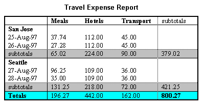
This table lists travel expenses at two locations: San Jose and Seattle, by date, and category (meals, hotels, and transport). The following image shows how a visual user agent might render it. [Description of travel table]
<table border="1"> <caption>Travel Expense Report</caption> <tr> <th></th> <th id="header2" axis="expenses">Meals</th> <th id="header3" axis="expenses">Hotels</th> <th id="header4" axis="expenses">Transport</th> <td>subtotals</td> </tr> <tr> <th id="header6" axis="location">San Jose</th> <th></th> <th></th> <th></th> <td></td> </tr> <tr> <td id="header7" axis="date">25-Aug-97</td> <td headers="header6 header7 header2">37.74</td> <td headers="header6 header7 header3">112.00</td> <td headers="header6 header7 header4">45.00</td> <td></td> </tr> <tr> <td id="header8" axis="date">26-Aug-97</td> <td headers="header6 header8 header2">27.28</td> <td headers="header6 header8 header3">112.00</td> <td headers="header6 header8 header4">45.00</td> <td></td> </tr> <tr> <td>subtotals</td> <td>65.02</td> <td>224.00</td> <td>90.00</td> <td>379.02</td> </tr> <tr> <th id="header10" axis="location">Seattle</th> <th></th> <th></th> <th></th> <td></td> </tr> <tr> <td id="header11" axis="date">27-Aug-97</td> <td headers="header10 header11 header2">96.25</td> <td headers="header10 header11 header3">109.00</td> <td headers="header10 header11 header4">36.00</td> <td></td> </tr> <tr> <td id="header12" axis="date">28-Aug-97</td> <td headers="header10 header12 header2">35.00</td> <td headers="header10 header12 header3">109.00</td> <td headers="header10 header12 header4">36.00</td> <td></td> </tr> <tr> <td>subtotals</td> <td>131.25</td> <td>218.00</td> <td>72.00</td> <td>421.25</td> </tr> <tr> <th>Totals</th> <td>196.27</td> <td>442.00</td> <td>162.00</td> <td>800.27</td> </tr> </table>
Editorial Note: Refer to section (to be written) at beginning of "Data Tables" that provides information about deciding if a table is used for data or layout.
Authors should consider using style sheets for layout and positioning. However, when it is necessary to use a table for layout, the table must linearize in a readable order. When a table is linearized, the contents of the cells become a series of paragraphs (e.g., down the page) one after another. Cells should make sense when read in row order and should include structural elements (that create paragraphs, headings, lists, etc.) so the page makes sense after linearization.
Also, when using tables to create a layout, do not use structural markup to create visual formatting. For example, the TH (table header) element, is usually displayed visually as centered, and bold. If a cell is not actually a header for a row or column of data, use style sheets or formatting attributes of the element.
The td
, table
, and tr
elements and the border
, cellspacing
, and cellpadding
attributes are only used in layout tables. th
, tbody
, caption
, colgroup
, tfoot
, and thead
are NOT used in layout tables.
The th
element is used to create header information for data cells. When the th
element is used, user agents and assistive technologies might try to associate the contents of the cell with others in the same column or row. If a user knows the table is used for layout, they can use different navigation strategies to make sense of the table.
Editorial Note: The HTML 4.01 spec seems to preclude using the td
element for anything except data. The HTML WG has said that tables are only for data (full stop). We need to solicit HTML WG feedback about this section.
If the summary
is used on a layout table, the value is null (summary="")
Using a null summary is similar to a null alt-text; the author is indicating that the table is used for presentation purposes.
Logical reading order of cells is created in layout tables.
Editorial Note: Instead of providing a linear text alternative, ensure that the table can be linearized.
Tables used to lay out pages where cell text wraps pose problems for older screen readers that do not interpret the source HTML or browsers that do not allow navigation of individual table cells. These screen readers will read across the page, reading sentences on the same row from different columns as one sentence.
For example, if a table is rendered like this on the screen:
There is a 30% chance of Classes at the University rain showers this morning, of Wisconsin will resume but they should stop before on September 3rd. the weekend.
This might be read by a screen reader as:
There is a 30% chance of Classes at the University rain showers this morning, of Wisconsin will resume but they should stop before on September 3rd. the weekend.
Screen readers that read the source HTML will recognize the structure of each cell, but for older screen readers, content developers may minimize the risk of word wrapping by limiting the amount of text in each cell. Also, the longest chunks of text should all be in the last column (rightmost for left-to-right tables). This way, if they wrap, they will still be read coherently. Content developers should test tables for wrapping with a browser window dimension of "640x480".
Editorial Note: Internationalization issues with recommending longest text in last column? Wrapping less of an issue these days? Can test wrapping by increasing font size or resizing window, don't need to give exact dimensions do we?
Since table markup is structural, and we suggest separating structure from presentation, we recommend using style sheets to create layout, alignment, and presentation effects. Thus, the two columns in the above example could have been created using style sheets. Please refer to the section on style sheets for more information.
It is usually very simple to linearize a table used to layout a page - simply strip the table markup from the table. There are several tools that do this, and it is becoming more common for screen readers and some browsers to linearize tables.
However, linearizing data tables requires a different strategy. Since data cells rely on the information provided by surrounding and header cells, the relationship information that is available visually needs to be translated into the linear table.
For example, specify the column layout order. The natural language writing direction may affect column layout and thus the order of a linearized table. The
dir
attribute specifies column layout order (e.g., dir="rtl"
specifies right-to-left layout).
Editorial Note: also the case for layout tables?
Editorial Note: Provide an example
Editorial Note: again, there are tools to help produce linearized versions of data tables. We will provide a link
This markup will also help browsers linearize tables (also called table "serialization"). A row-based linear version may be created by reading the row header, then preceding each cell with the cell's column header. Or, the linearization might be column-based. Future browsers and assistive technologies will be able to automatically translate tables into linear sequences or navigate a table cell by cell if data is labeled appropriately. The WAI Evaluation and Repair Tools Working Group maintains a list of tools some of which help authors determine if tables will linearize in a readable order. Refer to [WAI-ER].
Quicktest! To get a better understanding of how a screen reader would read a table, run a piece of paper down the page and read your table line by line.
This section explains how to create hyperlinks that are compatible and comprehensible to users of assistive technologies.
title
attribute.The title
attribute of the a
element is used to clarify links where appropriate.
Editorial Note: We're not sure how the title attribute should relate to the link text.
Text equivalents are provided for images that are used as links.
When an image is used as the content of a link, specify a text equivalent for the image. The text equivalent should describe the function of the link.
This example uses the alt
attribute of the img
element to describe a graphical link.
<a href="routes.html"> <img src="topo.gif" alt="Current routes at Boulders Climbing Gym" /> </a>
If you provide link text, use empty quotes as the alt
attribute value of the img
element. (e.g.: alt=""
) Note that this text will appear on the page next to the image.
Editorial Note: Need more clarification that this is null alt-text and not a space? Point to a section in images that describes null alt-text in more detail.
<a href="routes.html"> <img src="topo.gif" alt="" /> Current routes at Boulders Climbing Gym </a>
Images do not have an adjacent text link that is redundant.
Editorial Note: This is about icons and text used as links side by side. If they point to the same resource, things can be repetitive or confusing. Such links should be combined into one.
An icon and text link are side by side. The alt text for the image is the same as the text link beside it, leading to a "stutter" effect as the link is read twice.
<a href="products.html"> <img src="icon.gif" alt="Products page" /> </a> <a href="products.html"> Products page </a>
An icon and text link are side by side. In an attempt to remove the "stutter" the alt text for the image is null. However, now one of the links has an unknown destination.
<a href="products.html"> <img src="icon.gif" alt="" /> </a> <a href="products.html"> Products page </a>
An icon and text are within the same link. The icon has null alt text and the text beside it describes the link.
<a href="products.html"> <img src="icon.gif" alt="" /> Products page </a>
Links are grouped structurally and identified with the
title
attribute.
Group links via one of the following mechanisms (in descending order of preference):
ul
or ol
div
map
When links are grouped into logical sets (for example, in a navigation bar that appears on every page in a site) they should be marked up as a unit. Navigation bars are usually the first thing someone encounters on a page. People who are sighted are often able to ignore navigation parts and start reading the content of the page. Someone using a screen reader must first listen to the text of each link in the navigation bar before reading the interesting content. There are several ways to mark up content so that a user with a screen reader can jump over the navigation bar and avoid reading all of the links.
Although graphical menus and link groups are accessible when alt
attributes are used, there
are advantages to creating navigation menus that are completely text-based. Graphical
text is not easily scalable. The size of graphical text cannot be increased
easily by those who may need a larger font. Alternatively, text based menus
allow for relative font sizes to be used on menu links. Relative font sizes
can be easily increased in most browsers without the use of assistive
technology.
Editorial Note: The above paragraph outlines benefits for using text-based navigation. It may be appropriate to expand these ideas into an optional technique in a future draft.
tabindex
to skip link groups (@@ future)The HTML 4.01
tabindex
attribute is used to allow users to jump to an anchor after the set of navigation links. This attribute is not yet widely supported.
Editorial Note: This creates user agent problems, this technique needs to say don't do it.
A link that allows users to skip over grouped links is provided.
Editorial Note: Describe how to skip link groups with a link and a bookmark anchor.
In this example, the
map
element groups a set of links, the title
attribute identifies it as a navigation bar,
tabindex
is set on an anchor following the group, and a link at the beginning of the group links to the anchor after the group. Also, note that the links are separated by non-link, printable characters (surrounded by spaces).
<map title="Navigation Bar"> <p> [<a href="#how">Bypass navigation bar</a>] [<a href="home.html">Home</a>] [<a href="search.html">Search</a>] [<a href="new.html">New and highlighted</a>] [<a href="sitemap.html">Site map</a>] </p> </map> <h1> <a id="how" name="how" tabindex="1">How to use our site</a> </h1> <!-- content of page -->
A style sheet is provided that allows users to hide the set of navigation links.
CSS to hide link groups
The accesskey
attribute of navigational elements is used to allow rapid keyboard access.
Keyboard access to active elements of a page is important for many users who cannot use a pointing device. User agents may include features that allow users to bind keyboard strokes to certain actions. HTML 4.01 allows content developers to specify keyboard shortcuts in documents via the
accesskey
attribute.
Note: Until user agents provide an overview of which key bindings are available, provide information on the key bindings.
In this example, if the user activates Alt + C (in most user agents), the link will be followed.
<a accesskey="C" href="doc.html">XYZ company home page</a>
This example assigns "U" as the accesskey (via
accesskey
). Typing the access key modifier plus the key, e.g., Alt + U, gives focus to the label, which in turn gives focus to the input control, so that the user can input text.
<form action="submit" method="post"> <p> <label for="user" accesskey="U">name</label> <input type="text" name="user" id="user" /> </p> </form>
Pop-ups or other windows to appear do not appear unexpectedly and the current window is not changed without informing the user.
Editorial Note: include info about using target attribute on A to generate new windows. test that an unknown target causes a new window to open.
This example demonstrates two ways to inform users that a new window will be opened when the link is selected.
<a href="page2.html" target="_blank"> More detail (opens new window) </a> OR <a href="page2.html" target="_blank"> <img src="newwindow.gif" alt="opens in new window" /> More detail </a>
Pop-ups or other windows do not appear and the current window is not changed without informing the user.
Content developers should avoid specifying a new window as the target of a frame with target="_blank"
.
Editorial Note: This should be relaxed to fit current WCAG 2.0 thinking. i.e., "extreme changes in context are identified before they occur so the user can determine if they wish to proceed or so they can be prepared for the change" Thus, pop-ups are allowed as long as the user is notified before the pop-up appears. Also, more and more user agents may be configured to not display pop-ups or display them in the background, thus no change in context effects the user.
This section discusses accessibility of images (including simple animations such as GIF animations) and image maps.
For information about math represented as images, refer to the section on using text markup and style sheets rather than images.
img
elements ("alt-text")The alt
attribute of the img
element is used to provide a text equivalent for images.
When using the
img
element, specify a short text equivalent with the
alt
attribute. Note. The value of this attribute is referred to as "alt-text".
The image contains alt text that plays the same function on the page as the image. Note that it does not necessarily describe the visual characteristics of the image itself.
<img src="companylogo.gif" alt="MyCompany">
The title
attribute on images is not used.
While the title
attribute can be used on most elements, it should not be used on the img
element. The semantics of title
are too easily confused with alt
and longdesc
(see Short text equivalents for img elements ("alt-text") and Long descriptions of images) and user agent support is extremely inconsistent.
object
elements ("alt-text") The body of the object
element provides a text-equivalent for image objects.
When using
object
, specify a text equivalent in the body of the object
element.
The image object has content that provides a brief description of the function of the image.
<object data="companylogo.gif" type="image/gif"> MyCompany </object>
For images using the img
element, detailed information about the image is described in a separate file, and the longdesc
attribute is used to direct users to that file.
When a short text equivalent does not suffice to adequately convey the function or role of an image, provide additional information in a file designated by the
longdesc
attribute.
Editorial Note: Link to information that descrcibes how to write descriptions, e.g., Excerpts from the NBA Tape Recording Manual, Third Edition.
This example directs users to a file called "2001sales.html" to describe the sales data for 2001.
Here are the contents of 2001sales.html:
In sales97.html:
A chart showing how sales in 1997 progressed. The chart is a bar-chart showing percentage increases in sales by month. Sales in January were up 10% from December 1996, sales in February dropped 3%, ..
<img src="97sales.gif" alt="Sales for 1997" longdesc="sales97.html">
For images using the object
element, detailed information about the image is described in the body of the tag, and links to other content are provided where appropriate.
When using object
, specify longer text equivalent within the element's content.
Note that object
content, unlike "alt text", can include markup. Thus, content developers can provide a link to additional information from within the OBJECT element.
This example presents a long description of the image inside the object
element.
<object data="97sales.gif" type="image/gif"> Sales in 1997 were down subsequent to our <a href="anticipated.html">anticipated purchase</a> ... </object>
This example presents a link to a long description inside the object
element.
<object data="97sales.gif" type="image/gif"> Chart of our Sales in 1997. A <a href="desc.html">textual description</a> is available. </object>
For user agents that don't support longdesc
, provide a description link as well next to the graphic.
This example uses a descriptive link to provide a description link to the document sales.html.
<img src="97sales.gif" alt="Sales for 1997" longdesc="sales.html"> <a href="sales.html" title="Description of 1997 sales figures">[D]</a>
Images are described in document text as needed.
Editorial Note: We hope to deprecate this technique in the future but right now felt it is useful.
A means to skip over multi-line ASCII art is provided.
Avoid ASCII art (character illustrations) and use real images instead since it is easier to supply a text equivalent for images. However, if ASCII art must be used provide a link to jump over the ASCII art.
If the ASCII art is complex, ensure that the text equivalent adequately describes it.
A link, placed before ASCII art, targets a named anchor after the ASCII art.
<a href="#post-art">skip over ASCII art</a> <!-- ASCII art goes here --> <a id="post-art" name="post-art">caption for ASCII art</a>
ASCII art may also be marked up as follows [skip over ASCII figure or consult a description of chart]:
<pre title="Figure showing the percentage of photosensitive patients in whom a photoconvulsive response was elicited by a 2 second train of flashes with eyes open and closed."> % __ __ __ __ __ __ __ __ __ __ __ __ __ __ 100 | * | 90 | * * | 80 | * * | 70 | @ * | 60 | @ * | 50 | * @ * | 40 | @ * | 30 | * @ @ @ * | 20 | | 10 | @ @ @ @ @ | 0 5 10 15 20 25 30 35 40 45 50 55 60 65 70 Flash frequency (Hz) </pre>
Audio rendering of the example as read in a screen reader
Transcript:
% 100 start 90 star star 80 star star 70 at star 60 at star 50 star at star 40 at star 30 star at at at star 20 10 at at at at at 0 5 10 15 20 25 30 35 40 45 50 55 60 65 70 Flash frequency H Z
Emoticons and other ASCII symbols are used judiciously.
Another way to replace ASCII art is to use human language substitutes. For example, <wink>
might substitute for a winking smiley: ;-). Or, the word "therefore" can replace arrows consisting of dashes and greater than signs (e.g., -->), and the word "great" for the uncommon abbreviation "gr8".
An image map is an image that has "active regions". When the user selects one of the regions, some action takes place -- a link may be followed, information may be sent to a server, etc. To make an image map accessible, content developers must ensure that each action associated with a visual region may be activated without a pointing device.
Client-side image maps are used instead of server-side image maps except where the regions cannot be defined with an available geometric shape.
Image maps are created with the
map
element. HTML allows two types of image maps: client-side (the user's browser processes a URI) and server-side (the server processes click coordinates). For all image maps, content developers must supply a text equivalent.
Content developers should create client-side image maps (with
usemap
) rather than server-side image maps (with
ismap
) because server-side image maps require a specific input device.
Redundant text links for each active region of a server-side image map are provided.
If server-side image maps must be used (e.g., because the geometry of a region cannot be represented with values of the
shape
attribute), authors must provide the same functionality or information in an alternative accessible format. One way to achieve this is to provide a textual link for each active region so that each link is navigable with the keyboard. If you must use a server-side image map, please consult the section on server-side image maps
When a server-side image map must be used, content developers should provide an alternative list of image map choices. There are three techniques:
Include the alternative links within the body of an
object
element (refer to the previous example illustrating links in the object
element).
If
img
is used to insert the image, provide an alternative list of links after it and indicate the existence and location of the alternative list (e.g., via that
alt
attribute).
If other approaches don't make the image map accessible, create an alternative page that is accessible.
A server side image map with duplicate text links provided on the page.
<a href="http://www.example.com/cgi-bin/imagemap/my-map"> <img src="welcome.gif" alt="Welcome! (Text links follow)" ismap="ismap" /> </a> <p> [<a href="reference.html">Reference</a>] [<a href="media.html">Audio Visual Lab</a>] </p>
Redundant text links for each active region of a client-side image map are provided.
In addition to providing a text equivalent for client side image map regions, provide redundant textual links. For each area
, provide an a
on the page with the same href
and the same link text as the alt
of the area
. If the
a
element is used instead of area
, the content developer may describe the active regions and provide redundant links at the same time.
Editorial Note: The last sentence describes a practices that works inconsistently if at all. See Roberto Scano's post. Should we remove it?
Editorial Note: In WCAG 1 this is an "until user agents" requirement. Wat should we do with it?
alt
for area
.Alternative text for the area
element is provided.
Provide text equivalents for image maps since they convey visual information. As with other links, the link text should make sense when read out of context. Refer to the section on Links for information on writing good link text. Users may also want keyboard shortcuts to access frequently followed links. Refer to the section on Keyboard access to links.
If
area
is used to create the map, use the
alt
attribute.
Editorial Note: We need to adjust the above to match whatever we end up saying about clear link text, above.
This example uses the alt
attribute of the area
element to provide text equivalents of image map links.
<img src="welcome.gif" usemap="#map1" alt="Image map of areas in the library" /> <map id="map1" name="map1"> <area shape="rect" coords="0,0,30,30" href="reference.html" alt="Reference" /> <area shape="rect" coords="34,34,100,100" href="media.html" alt="Audio visual lab" /> </map>
The object
element in HTML allows authors to embed programmatic code written in other languages, such as Java or Macromedia Flash. However, not all user agents are able to process these objects. Many users of assistive technologies are not able to access the content in programmatic objects. This section explains how to ensure that the content you provide is accessible to those users.
A text equivalent inside the object
element is provided.
If
object
is used, provide a text equivalent in the content of the element:
This example shows a text equivalent for a Java applet using the object
element.
<object classid="java:Press.class" width="500" height="500"> As temperature increases, the molecules in the balloon... </object>
This example takes advantage of the fact the object
elements may be embedded to provide for alternative representations of information
<object classid="java:Press.class" width="500" height="500"> <object data="Pressure.mpeg" type="video/mpeg"> <object data="Pressure.gif" type="image/gif"> As temperature increases, the molecules in the balloon... </object> </object> </object>
embed
Alternative content for embed
is provided with noembed
.
Provide alternative content for the embed
element in a noembed
element. The noembed
is rendered only if the embed
is not supported. While it can be positioned anywhere on the page, the best location is beside or as a child of embed
.
Editorial Note: Is it true that noembed
can go either beside or inside embed
? Is there a preference?
noembed
is provided beside an embed
.
<embed src="moviename.swf" width="100" height="80" pluginspage="http://example.com/shockwave/download/" /> <noembed> <img alt="Still from Movie" src="moviename.gif" width="100" height="80" /> </noembed>
embed
alt
for embed
is provided.
Provide alternative content for the embed
element in the alt
attribute.
alt
is provided for embed
.
<embed src="moviename.swf" width="100" height="80" pluginspage="http://example.com/shockwave/download/" alt="Still from Movie" />
The embed
element within the object
element is provided for backward compatibility.
Some objects, such as those requiring a plug-in, should also use the
object
element. However, for backward compatibility with Netscape browsers, use the proprietary embed
element within the object
element as follows:
For more information refer to [MACROMEDIA].
This example demonstrates how to use embed
with the object
element to preserve backward compatibility.
<object classid="clsid:A12BCD3F-GH4I-56JK-xyz" codebase="http://example.com/content.cab" width="100" height="80"> <param name="Movie" value="moviename.swf" /> <embed src="moviename.swf" width="100" height="80" pluginspage="http://example.com/shockwave/download/" /> <noembed> <img alt="Still from Movie" src="moviename.gif" width="100" height="80" /> </noembed> </object>
For visually enabled users, frames may organize a page into different zones. For non-visual users, relationships between the content in frames (e.g., one frame has a table of contents, another the contents themselves) must be conveyed through other means.
Frames as implemented today (with the
frameset
,
frame
, and
iframe
elements) are problematic for several reasons:
Without scripting, they tend to break the "previous page" functionality offered by browsers.
It is impossible to refer to the "current state" of a frameset with a URI; once a frameset changes contents, the original URI no longer applies.
Opening a frame in a new browser window can disorient or simply annoy users.
The title
attribute of the frame
element is used.
Use the title
attribute of the frame
element to describe the contents of each frame. This provides a label for the frame so users can determine which frame to enter and explore in detail.
Note that the title
attribute labels frames, and is different from the title
element which labels documents. Both should be provided, since the first facilitates navigation among frames and the second clarifies your current location.
The title
attribute is not interchangable with the name
attribute. The title
labels the frame for users; the name
labels it for scripting and window targeting. The name is not presented to the user, only the title is.
This example shows how to use the title
attribute with frame
.
<html xmlns="http://www.w3.org/1999/xhtml"> <head> <title>A simple frameset document</title> </head> <frameset cols="10%, 90%"> <frame src="nav.html" title="Navigation bar" /> <frame src="doc.html" title="Documents" /> <noframes> <body> <a href="lib.html" title="Library link">Select to go to the electronic library</a> </body> </noframes> </frameset> </html>
The longdesc
attribute of the frame
element describes the purpose of frames and how frames relate to each other if it is not obvious by frame titles alone.
The use of longdesc
(long description) in frames is not recommended
because the longdesc
attribute in frames is currently not well supported by user
agents.
This example uses the longdesc
attribute of the frame
element to link to a document called "frameset-desc.html", which contains this copy:
#Navbar - this frame provides links to the major sections of the site: World News, National News, Local News, Technological News, and Entertainment News.
#Story - this frame displays the currently selected story.
#Index - this frame provides links to the day's headline stories within this section.
<!DOCTYPE html PUBLIC "-//W3C//DTD XHTML 1.0 Transitional//EN" "http://www.w3.org/TR/xhtml1/DTD/xhtml1-transitional.dtd"> <html xmlns="http://www.w3.org/1999/xhtml"> <head> <title>Today's news</title> </head> <frameset cols="10%,*,10%"> <frameset rows="20%,*"> <frame src="promo.html" name="promo" title="promotions" /> <frame src="sitenavbar.html" name="navbar" title="Sitewide navigation bar" longdesc="frameset-desc.html#navbar" /> </frameset> <frame src="story.html" name="story" title="Selected story - main content" longdesc="frameset-desc.html#story" /> <frameset rows="*,20%"> <frame src="headlines.html" name="index" title="Index of other national headlines" longdesc="frameset-desc.html#headlines" /> <frame src="ad.html" name="adspace" title="Advertising" /> </frameset> <noframes> <body> <p> <a href="noframes.html">No frames version</a> </p> <p> <a href="frameset-desc.html">Descriptions of frames.</a> </p> </body> </noframes> </frameset> </html>
The noframes
element is used to support user agents that don't support frames.
Provide meaningful content in the noframes
element. noframes
follows the frameset
and contains a body
element.
Meaningful content can include a version of the entire content of the frames in the frameset, or it can consist of instructions and links for users to find the content. Often the links point to the frame documents, outside their frames context. noframes
content must not consist of instructions for users to switch to a frames-capable browser.
In this example, the user will receive a link to table_of_contents.html
, which would allow him or her to navigate through the site without using frames.
<html xmlns="http://www.w3.org/1999/xhtml"> <head> <title>This is top.html</title> </head> <frameset cols="50%, 50%" title="Our big document"> <frame src="main.html" title="Where the content is displayed" /> <frame src="table_of_contents.html" title="Table of Contents" /> <noframes> <body> <a href="table_of_contents.html">Table of Contents.</a> <!-- other navigational links that are available in main.html are available here also. --> </body> </noframes> </frameset> </html>
Only HTML documents are used as frame sources.
Content developers must provide text equivalents of frames so that their contents and the relationships between frames make sense. Note that as the contents of a frame change, so must change any description. This is not possible if an image or other object is inserted directly into a frame. Thus, content developers should always make the source (src
) of a frame an HTML file. Images may be inserted into the HTML file and their text alternatives will evolve correctly.
Editorial Note: This is worded as if there are no exceptions. Isn't it possible to design an accessible frameset that uses non-html resources as the frame source?
This example shows a frameset linking to HTML documents.
<html xmlns="http://www.w3.org/1999/xhtml"> <head> <title>A correct frameset document</title> </head> <frameset cols="100%" title="Evolving frameset"> <frame name="goodframe" src="apples.html" title="Apples" /> </frameset> <!-- In apples.html --> <p><img src="apples.gif" alt="Apples" /></p> </html>
This incorrect example links directly to an image. Note that if, for example, a link causes a new image to be inserted into the frame: the initial title of the frame ("Apples") will no longer match the current content of the frame ("Oranges").
<p>Visit a beautiful grove of <a target="badframe" href="oranges.gif" title="Oranges">oranges</a> </p> <html xmlns="http://www.w3.org/1999/xhtml"> <head> <title>A bad frameset document</title> </head> <frameset cols="100%" title="Static frameset"> <frame name="badframe" src="apples.gif" title="Apples" /> </frameset> </html>
Links to frames that load inaccessible formats are sufficiently descriptive.
iframe
Accessible, alternative content for the iframe
element is provided.
Provide alternative content for iframe
by providing meaningful and accessible content between the start and end tags.
iframe
longdesc is not used
on iframe
.
Editorial Note: We just want to say that while HTML permits longdesc, it isn't meaningful to provide.
This section discusses the accessibility of forms and form controls that one can put in a FORM element.
A logical tab order through links, form controls, and objects has been created.
Editorial Note: Describe use of accesskey. Indicate whether links, form controls, and objects have their own "tabspaces" or whether they share a common one.
In this example, we specify a tabbing order among elements (in order, "field2", "field1", "submit") with
tabindex
:
<form action="#" method="post"> <p> <input tabindex="2" type="text" name="field1" /> <input tabindex="1" type="text" name="field2" /> <input tabindex="3" type="submit" name="submit" /> </p> </form>
The fieldset
and legend
elements in HTML 4 are used to group form controls logically.
Content developers should group information where natural and appropriate. When form controls can be grouped into logical units, use the
fieldset
element and label those units with the
legend
element.
Editorial Note: Try to make this less subjective, i.e. replace "natural," "appropriate," and "logical units" with something more objective.
This example uses the fieldset
element to group a user's personal information together, and labels that grouping with the legend
element.
<form action="http://example.com/adduser" method="post"> <fieldset> <legend>Personal information</legend> <label for="firstname">First name:</label> <input type="text" id="firstname" tabindex="1" /> <label for="lastname">Last name:</label> <input type="text" id="lastname" tabindex="2" /> ...more personal information... </fieldset> <fieldset> <legend>Medical History</legend> ...medical history information... </fieldset> </form>
optgroup
is used to group options logically under the select
element.
Content developers should group information where natural and appropriate. For long lists of menu selections (which may be difficult to track), content developers should group
select
items (defined by
option
) into a hierarchy using the
optgroup
element. Specifies a label for the group of options with the
label
attribute on optgroup
.
This example uses the optgroup
element to logically group several options (using the option
element) into categories labeled "PortMaster 3", "PortMaster 2", and "IRX".
<form action="http://example.com/prog/someprog" method="post"> <select name="ComOS"> <optgroup label="PortMaster 3"> <option label="3.7.1" value="pm3_3.7.1"> PortMaster 3 with ComOS 3.7.1 </option> <option label="3.7" value="pm3_3.7"> PortMaster 3 with ComOS 3.7 </option> <option label="3.5" value="pm3_3.5"> PortMaster 3 with ComOS 3.5 </option> </optgroup> <optgroup label="PortMaster 2"> <option label="3.7" value="pm2_3.7"> PortMaster 2 with ComOS 3.7 </option> <option label="3.5" value="pm2_3.5"> PortMaster 2 with ComOS 3.5 </option> </optgroup> <optgroup label="IRX"> <option label="3.7R" value="IRX_3.7R"> IRX with ComOS 3.7R </option> <option label="3.5R" value="IRX_3.5R"> IRX with ComOS 3.5R </option> </optgroup> </select> </form>
The label
element is used to associate form elements with their labels.
Editorial Note: Only describe/permit explicit label (with the "for" attribute), not implicit label (label wrapped around control plus text).
Editorial Note: add an example that shows how to explicitly associate label with form control and describe difference from previous example.
<label for="firstname">First name:</label> <input type="text" name="firstname" id="firstname" tabindex="1" />
Default, place-holding characters are included in edit boxes and text areas.
Editorial Note: This is a negative technique, an example of something you shouldn't do. This technique corresponds to a WCAG 1.0 checkpoint. There is a proposal for an erratum that states the until user agents clause is met and this checkpoint (and thus technique) are no longer necessary.
This example fills a textarea
element with code so that legacy assistive technologies will recognize it.
<textarea name="yourname" rows="20" cols="80"> Please enter your name here. </textarea>
Images used as "submit" buttons include a text equivalent.
For image submit buttons, use the alt
attribute of the input
element to provide a functional label. This label should indicate the button's nature as a submit button, not attempt to describe the image. The label is especially important if there are multiple submit buttons on the page that each lead to different results.
The input
element is used to create many kinds of form controls. Although the HTML DTD permits the alt
attribute on all of these, it should be used only on image submit buttons. User agent support for this attribute on other types of form controls is not well defined, and other mechanisms should be used to label these controls.
This example uses the alt
attribute of an image submit button to label it as a "submit" button.
<form action="http://example.com/prog/text-read" method="post"> <input type="image" name="submit" src="button.gif" alt="Submit" /> </form>