1. Introduction
This section is not normative.
The CSS layout algorithms, by default, size and position boxes in relation to each other so that nothing overlaps.
This specification defines several ways to violate these assumptions when needed, moving elements around in ways that can make them overlap other content:
-
Relative positioning, which visually shifts a box relative to its laid-out location.
-
Sticky positioning, which visually shifts a box relative to its laid-out location in order to keep it visible when a scrollable ancestor would otherwise scroll it out of sight.
-
Absolute positioning, which ignores normal layout entirely, pulling the element out of flow and positioning it relative to its containing block with no regard for other content.
-
Fixed positioning, which absolutely positions the box and affixes it to the viewport or page frame so that it is always visible.
These positioning schemes, controlled by the position property and the inset properties, are powerful but easy to misuse. With appropriate care, they allow many interesting and useful layouts that couldn’t otherwise be achieved with standard layout rules; without, they allow a page to be laid out in an unusable overlapping jumble of content.
1.1. Module Interactions
This module replaces and extends the positioning scheme features defined in [CSS2] sections:
- 9.1.2 Containing blocks
- 9.3 Positioning schemes
- 9.4.3 Relative positioning
- 9.6 Absolute positioning
- 9.7 Relationships between display, position, and float
- 9.8 Comparison of normal flow, floats, and absolute positioning
- 10.1 Definition of "containing block"
- 10.3.7 Absolutely positioned, non-replaced elements
- 10.3.8 Absolutely positioned, replaced elements
- 10.6.4 Absolutely positioned, non-replaced elements
- 10.6.5 Absolutely positioned replaced elements
It also replaces and supersedes the inset* property definitions in [CSS-LOGICAL-1] (CSS Logical Properties 1 § 4.3 Flow-relative Offsets: the inset-block-start, inset-block-end, inset-inline-start, inset-inline-end properties and inset-block, inset-inline, and inset shorthands).
1.2. Value Definitions
This specification follows the CSS property definition conventions from [CSS2] using the value definition syntax from [CSS-VALUES-3]. Value types not defined in this specification are defined in CSS Values & Units [CSS-VALUES-3]. Combination with other CSS modules may expand the definitions of these value types.
In addition to the property-specific values listed in their definitions, all properties defined in this specification also accept the CSS-wide keywords as their property value. For readability they have not been repeated explicitly.
2. Choosing A Positioning Scheme: position property
| Name: | position |
|---|---|
| Value: | static | relative | absolute | sticky | fixed |
| Initial: | static |
| Applies to: | all elements except table-column-group and table-column |
| Inherited: | no |
| Percentages: | N/A |
| Computed value: | specified keyword |
| Canonical order: | per grammar |
| Animation type: | discrete |
The position property determines which of the positioning schemes is used to calculate the position of a box. Values other than static make the box a positioned box, and cause it to establish an absolute positioning containing block for its descendants. Values have the following meanings:
- static
- The box is not a positioned box, and is laid out according to the rules of its parent formatting context. The inset properties do not apply.
- relative
- The box is laid out as for static, then offset from the resulting position. This offsetting is a purely visual effect, and, unless otherwise specified, does not affect the size or position of any other non-descendant box except insofar as it increases the scrollable overflow area of its ancestors. This positioning scheme is called relative positioning.
- sticky
- Identical to relative, except that its offsets are automatically adjusted in reference to the nearest ancestor scroll container’s scrollport (as modified by the inset properties) in whichever axes the inset properties are not both auto, to try to keep the box in view within its containing block as the user scrolls. This positioning scheme is called sticky positioning.
- absolute
-
The box is taken out of flow such that it has no impact on the size or position of its siblings and ancestors,
and does not participate in its parent’s formatting context.
Instead, the box is positioned and sized solely in reference to its absolute positioning containing block, as modified by the box’s inset properties, see § 4 Absolute Positioning Layout Model. It can overlap in-flow content or other absolutely positioned elements, and is included in the scrollable overflow area of the box that generates is containing block. This positioning scheme is called absolute positioning.
- fixed
-
Same as absolute,
except the box is positioned and sized relative to a fixed positioning containing block (usually the viewport in continuous media, or the page area in paged media).
The box’s position is fixed with respect to this reference rectangle:
when attached to the viewport it does not move when the document is scrolled,
and when attached to the page area is replicated on every page when the document is paginated.
This positioning scheme is called fixed positioning and is considered a subset of absolute positioning.
Authors may wish to specify fixed in a media-dependent way. For instance, an author may want a box to remain at the top of the viewport on the screen, but not at the top of each printed page. The two specifications may be separated by using an '@media' rule, as in:
@media screen{ h1#first{ position : fixed} } @media print{ h1#first{ position : static} }
A position value of absolute or fixed blockifies the box, causes float to compute to none, and forces the box to establish an independent formatting context.
2.1. Containing Blocks of Positioned Boxes
The containing block of a static, relative, or sticky box is as defined by its formatting context. For fixed and absolute boxes, it is defined as follows:
- If the box has position: absolute:
-
The containing block is established
by the nearest ancestor box that establishes an absolute positioning containing block,
in the following way:
- If the ancestor is not an inline box,
- the containing block is formed by the padding edge of the ancestor, unless otherwise specified (for example, see CSS Grid Layout 1 § 9.1 With a Grid Container as Containing Block).
- If the ancestor is an inline box, using the writing mode of that box,
-
the containing block is formed by forming a rectangle from
the start-most content edges (in both axes) of the first box fragment of the ancestor,
and the end-most content edges of the end-most box fragment(s) of the ancestor in each axis.
If there are multiple fragments on the same line
(e.g. due to bidi reordering),
take the start-most fragment
as the first fragment.
What is a useful containing block to form when the box is fragmented across multiple lines? [Issue #8284]
Note: The containing block formed by a fragmented inline box was undefined in [CSS2].
If no ancestor establishes one, the absolute positioning containing block is the initial containing block.
Note: Properties that can cause a box to establish an absolute positioning containing block include position, transform, will-change, contain…
- If the box has position: fixed:
-
The containing block is established
by the nearest ancestor box that establishes an fixed positioning containing block,
with the bounds of the containing block determined identically to the absolute positioning containing block.
Note: Properties that can cause a box to establish a fixed positioning containing block include transform, will-change, contain…
If no ancestor establishes one, the fixed positioning containing block is:
-
in continuous media, the layout viewport (whose size matches the dynamic viewport size); as a result, fixed boxes do not move when the document is scrolled.
Note: In this respect, they are similar to fixed background images (background-attachment: fixed).
-
in paged media, the page area of each page; fixed positioned boxes are thus replicated on every page. (They are fixed with respect to the page box only, and are not affected by being seen through a viewport; as in the case of print preview, for example.)
Note: As a result, parts of fixed-positioned boxes that extend outside the layout viewport/page area cannot be scrolled to and will not print.
-
With no positioning, the containing blocks (C.B.) in the following document:
<!DOCTYPE html> < html > < head > < title > Illustration of containing blocks</ title > </ head > < body id = "body" > < div id = "div1" > < p id = "p1" > This is text in the first paragraph...</ p > < p id = "p2" > This is text< em id = "em1" > in the< strong id = "strong1" > second</ strong > paragraph.</ em ></ p > </ div > </ body > </ html >
are established as follows:
| For box generated by | C.B. is established by |
|---|---|
| html | initial C.B. (UA-dependent) |
| body | html |
| div1 | body |
| p1 | div1 |
| p2 | div1 |
| em1 | p2 |
| strong1 | p2 |
If we position "div1":
#div1{ position : absolute; left : 50 px ; top : 50 px }
its containing block is no longer "body"; it becomes the initial containing block (since there are no other positioned ancestor boxes).
If we position "em1" as well:
#div1{ position : absolute; left : 50 px ; top : 50 px } #em1{ position : absolute; left : 100 px ; top : 100 px }
the table of containing blocks becomes:
| For box generated by | C.B. is established by |
|---|---|
| html | initial C.B. (UA-dependent) |
| body | html |
| div1 | initial C.B. |
| p1 | div1 |
| p2 | div1 |
| em1 | div1 |
| strong1 | em1 |
By positioning "em1", its containing block becomes the nearest positioned ancestor box (i.e., that generated by "div1").
2.1.1. Further Adjustments to the Containing Block
Some features can alter the effective containing block rectangle of absolutely positioned boxes. These are applied in the following order, with earlier steps modifying the containing block that later steps see:
-
The grid-placement properties on an absolutely positioned box whose containing block is generated by a grid container can change the containing block rectangle to a specified grid area. See CSS Grid Layout 1 § 9.1 With a Grid Container as Containing Block.
-
The inset-area and position-try properties can change the containing block rectangle to a specified area of an inset-area grid. See CSS Anchor Positioning § 3.1 The inset-area Property.
The element’s original containing block is its containing block before applying any of these effects.
2.2. Painting Order and Stacking Contexts
The z-index property applies to all positioned boxes. When z-index is auto:
-
Fixed and sticky positioned boxes nonetheless form a stacking context.
-
Relative and absolute positioned boxes do not form a stacking context, but are painted as if those elements did generated new stacking contexts, except that their positioned descendants and any would-be child stacking contexts take part in the current stacking context.
Note: The root element always forms a stacking context regardless.
See CSS2 § 9.9 Layered presentation and Appendix E: Elaborate description of Stacking Contexts for details about z-index, stacking contexts, and painting order.
3. Positioning Coordinates
The precise location of a positioned box is controlled by the inset properties: the physical inset properties top, right, bottom, left; the flow-relative inset properties inset-block-start, inset-inline-start, inset-block-end, and inset-inline-end; and their shorthands, inset-block, inset-inline, and inset.
The interpretation of these inset properties varies by positioning scheme:
-
for absolute positioning, they represent insets from the containing block.
-
for relative positioning, they represent insets from the box’s original margin edge.
-
for sticky positioning, they represent insets from the scrollport edge.
3.1. Box Insets: the top, right, bottom, left, inset-block-start, inset-inline-start, inset-block-end, and inset-inline-end properties
| Name: | top, right, bottom, left, inset-block-start, inset-inline-start, inset-block-end, inset-inline-end |
|---|---|
| Value: | auto | <length-percentage> |
| Initial: | auto |
| Applies to: | positioned elements |
| Inherited: | no |
| Percentages: | refer to size of containing block; see prose |
| Computed value: | the keyword auto or a computed <length-percentage> value |
| Canonical order: | per grammar |
| Animation type: | by computed value type |
| Logical property group: | inset |
These inset properties represent an inward “inset” on the corresponding side of the box (with respect to the box’s own writing mode; see CSS Writing Modes 3 § 6 Abstract Box Terminology). For example, top represents a downward inset of the top edge. The physical and flow-relative properties interact as defined in [CSS-LOGICAL-1]. Values have the following meanings:
- <length>
- The inset is a fixed distance from the reference edge. Negative values are allowed.
- <percentage>
- The inset is a percentage relative to the containing block’s size in the corresponding axis (e.g. width for left or right, height for top and bottom). For sticky positioned boxes, the inset is instead relative to the relevant scrollport’s size. Negative values are allowed.
- auto
- Represents an unconstrained inset; the exact meaning depends on the positioning scheme.
Note: For fixed positioned elements, using large values or negative values can easily move elements outside the viewport and make the contents unreachable through scrolling or other means.
3.2. Box Insets Shorthands: the inset-block, inset-inline, and inset properties
| Name: | inset-block, inset-inline |
|---|---|
| Value: | <'top'>{1,2} |
| Initial: | auto |
| Applies to: | positioned elements |
| Inherited: | no |
| Percentages: | see individual properties |
| Computed value: | see individual properties |
| Canonical order: | per grammar |
| Animation type: | by computed value type |
The inset-block and inset-inline properties are shorthand properties for setting inset-block-start + inset-block-end or inset-inline-start + inset-inline-end, respectively, in a single declaration. The first component value sets the start side, the second sets the end; if omitted, the second value defaults to the first.
| Name: | inset |
|---|---|
| Value: | <'top'>{1,4} |
| Initial: | auto |
| Applies to: | positioned elements |
| Inherited: | no |
| Percentages: | see individual properties |
| Computed value: | see individual properties |
| Canonical order: | per grammar |
| Animation type: | by computed value type |
The inset property is a shorthand property that sets all of the inset properties in a single declaration, assigning values to the longhands representing each side exactly as the margin property does for its longhands.
By default, the inset property values are assigned to the corresponding physical longhand properties—top, right, bottom, and left—which for historical reasons do not have an inset- prefix. This matches the behavior of other "4 values assigned to sides" properties, such as margin.
Allowing properties such as this to resolve to the flow-relative longhands is under discussion in [CSS-LOGICAL-1].
Yes, we understand it’s a little confusing that inset doesn’t expand to any inset-* properties.
3.3. Relative Positioning
For a relatively positioned box, the inset properties move the box inward from the respective edge, without changing its size. left moves the box to the right, right moves it to the left, etc. Since boxes are not split or stretched as a result of relative positioning opposing used values in a given axis must be negations of each other:
- If opposing inset properties in an axis both compute to auto (their initial values), their used values are zero (i.e., the boxes stay in their original position in that axis).
- If only one is auto, its used value becomes the negation of the other, and the box is shifted by the specified amount.
- If neither is auto, the position is over-constrained; (with respect to the writing mode of its containing block) the computed end side value is ignored, and its used value becomes the negation of the start side.
The following three rules are equivalent, and shift the box 1em to the left:
div.a8{ position : relative; direction : ltr; left : -1 em ; right : auto} div.a8{ position : relative; direction : ltr; left : auto; right : 1 em } div.a8{ position : relative; direction : ltr; left : -1 em ; right : 5 em }
If specified on a table-row-group, table-header-group, table-footer-group, or table-row box the shift affects all the contents of the box, including all table cells that originate in the affected row, but not those that don’t.
Note: Since position does not apply to table-column-group or table-column boxes, they are not affected by relative positioning.
3.4. Sticky positioning
Sticky positioning is similar to relative positioning except the offsets are automatically calculated in reference to the nearest scrollport.
For a sticky positioned box, the inset properties represent insets from the respective edges of the nearest scrollport, defining the sticky view rectangle used to constrain the box’s position. (For this purpose an auto value represents a zero inset.) If this results in a sticky view rectangle size in any axis less than the size of the border box of the sticky box in that axis, then the effective end-edge inset in the affected axis is reduced (possibly becoming negative) to bring the sticky view rectangle’s size up to the size of the border box in that axis (where end is interpreted relative to the writing mode of the containing block).
But if the nearest scrollport were only 100px tall, then the effective bottom-edge inset becomes -120px, resulting in a sticky view rectangle that’s 200px tall, enough to fully contain the margin box of the sticky box.
For each side of the box, if the corresponding inset property is not auto, and the corresponding border edge of the box would be outside the corresponding edge of the sticky view rectangle, then the box must be visually shifted (as for relative positioning) to be inward of that sticky view rectangle edge, insofar as it can while its position box remains contained within its containing block. The position box is its margin box, except that for any side for which the distance between its margin edge and the corresponding edge of its containing block is less than its corresponding margin, that distance is used in place of that margin.
Note: A sticky positioned element with a non-auto top value and an auto bottom value will only ever be pushed down by sticky positioning; it will never be offset upwards.
Note: Multiple sticky positioned boxes in the same container are offset independently, and therefore might overlap.
3.4.1. Scroll Position of Sticky-Positioned Boxes
For the purposes of any operation targeting the scroll position of a sticky positioned element (or one of its descendants), the sticky positioned element must be considered to be at its offsetted position.
3.5. Absolute (and Fixed) Positioning
For an absolutely positioned box, the inset properties effectively reduce the containing block into which it is sized and positioned by the specified amounts. The resulting rectangle is called the inset-modified containing block. (For disambiguation, the actual containing block of an absolutely positioned box can also be called the absolute-position containing block.)
3.5.1. Resolvings Insets: the “Inset-Modified Containing Block”
If only one inset property in a given axis is auto, it is set to zero. If both inset properties in a given axis are auto, then, depending on the box’s self-alignment property in the relevant axis:
- for self-start alignment or its equivalent
- Set its start-edge inset property to the static position, and its end-edge inset property to zero.
- for self-end alignment or its equivalent
- Set its end-edge inset property to the static position, and its start-edge inset property to zero.
- for center alignment
- Let start distance be the distance from the center of its static-position rectangle to the start edge of its containing block, and end distance be the distance from the center of its static-position rectangle to the end edge of its containing block. If start distance is less than or equal to end distance, then set the start-edge inset property to zero, and set the end-edge inset property to (containing block size - 2 × |start distance|); otherwise, set the end-edge inset property to zero and the start-edge inset property to (containing block size - 2 × |end distance|).
For the rules above, ignore overflow alignment, and treat normal as start and any baseline or stretch alignment value as its fallback alignment.
If these adjustments result in an effective containing block size in any axis less than zero, then the weaker inset in the affected axis is reduced (possibly becoming negative) to bring that size up to zero. In the case that only one inset is auto, that is the weaker inset; otherwise the weaker inset is the inset of the end edge (where end is interpreted relative to the writing mode of the containing block).
Note: Sizing and positioning of the absolutely positioned box into this inset-modified containing block is as described in § 4 Absolute Positioning Layout Model.
If its self-alignment property in an axis is normal, then the resolved value of its weaker inset in that axis is the value necessary to match that edge of its inset-modified containing block to the corresponding edge of its margin box after layout. (Otherwise the resolved value is the used value described above.)
3.5.2. Calculating the Static Position and the “Static-Position Rectangle”
When both inset properties in a given axis are auto, they are resolved into a static position by aligning the box into its static-position rectangle, an alignment container derived from the formatting context the box would have participated in if it were position: static (independent of its actual containing block). The static position represents an approximation of the position the box would have had if it were position: static.
- Block Layout
-
The static positions of a block-level box are defined in [CSS2] Chapter 10.
The static-position rectangle is a zero-thickness rectangle spanning between
the inline-axis sides of the box’s static-position containing block and positioned at its block-start static position (see CSS2§10.6.4).
Note: In block layout the static-position rectangle corresponds to the position of the “hypothetical box” described in CSS2.1§10.3.7. Since it has no alignment properties, CSS2.1 always uses a block-start inline-start alignment of the absolutely-positioned box within the static-position rectangle.
- Inline Layout
- The static positions of an inline-level box are defined in [CSS2] Chapter 10. The static-position rectangle is a zero-thickness rectangle spanning between the line-over/line-under sides of the line box that would have contained its “hypothetical box” (see CSS2§10.3.7); and positioned at its inline-start static position.
- Flex Layout
- The static-position rectangle of the child of a flex container corresponds to the content edges of the flex container in the cross axis, and to the outer edges of its hypothetical position in the main axis. See static position of a flex container child in [CSS-FLEXBOX-1].
- Grid Layout
- By default, the static-position rectangle of the child of a grid container corresponds to the content edges of the grid container. However, if that grid container also establishes the box’s actual containing block, then the grid area specified by the grid-placement properties establishes its static-position rectangle instead. See the static position of a grid container child in [CSS-GRID-1].
Finding the static position and the static-position rectangle assumes that both float and clear (as well as position) have their initial values, and can consequently require assuming a different hypothetical value for display as well. (The containing block the element would have had under these conditions is the static-position containing block.) To the extent the box alignment properties have an effect, they use the static-position containing block as the effective containing block, including using its writing mode for resolving alignment axes and directions. Additionally, the containing block of fixed positioned elements is assumed to be the initial containing block instead of the viewport, and all scroll containers should be assumed to be scrolled to their initial scroll position. Lastly, all auto margins on the box itself are treated as zero.
Boxes in the top layer always use the initial containing block as their static-position rectangle.
3.5.3. Fragmenting Absolutely-positioned Elements
In a fragmented flow, an absolutely positioned box is positioned relative to its containing block ignoring any fragmentation breaks (as if the flow were continuous). The box may subsequently be broken over several fragmentation containers.
For absolutely positioned content in paged media that resolves to a position on a page other than the page being laid out (the current page), or resolves to a position on the current page that has already been rendered for printing, printers may place the content:
- on the current page,
- on a subsequent page, or
- may omit it altogether.
Note: A block-level element that is split over several pages can have a different width on each page, and there may be device-specific limits.
User agents must not paginate the content of fixed-positioned boxes.
Note: User agents might print invisible content in other ways. See CSS Paged Media 3 § 3.2 Content outside the page box.
4. Absolute Positioning Layout Model
Absolute positioning not only takes a box out of flow, but also lays it out in its containing block (after the final size of the containing block has been determined) according to the absolute positioning layout model:
-
First, its inset-modified containing block is calculated,
defining its available space.
(See § 3.5 Absolute (and Fixed) Positioning.)
Because an absolutely positioned box does not affect the size of its containing block, its available space is always definite.
- Next, its width and height are resolved against this definite available space, as its preferred size capped by its maximum size (if any), floored by its minimum size. See § 4.1 Automatic Sizes of Absolutely-Positioned Boxes. Percentages, however, are resolved against the original containing block size.
- Then, the value of any auto margins are calculated, see § 4.2 Auto Margins of Absolutely-Positioned Boxes.
-
Lastly, its margin box is aligned within the inset-modified containing block as defined by its self-alignment properties.
For this purpose, if neither safe nor unsafe is specified, the box aligns at an "in-between" level of safety: it is unsafe-aligned within its inset-modified containing block, but shifted, if necessary, to not overflow the union of its original containing block and its inset-modified containing block—unless it is larger than that rectangle, in which case it is start-aligned to it.
4.1. Automatic Sizes of Absolutely-Positioned Boxes
The automatic size of an absolutely positioned box is resolved against its inset-modified containing block as follows (treating auto margins as zero):
- If its self-alignment property in the relevant axis is stretch
- Or if it is normal and the box is non-replaced, not a table wrapper box, and has no auto inset in the relevant axis
-
Its automatic size is its stretch-fit size.
- Otherwise
-
Its automatic size is its fit-content size.
However, if the box has an aspect-ratio, then an automatic size in the ratio-dependent axis is instead resolved as a max-content size. When both axes have an automatic size, if only one axis has an auto inset then that axis is the ratio-dependent axis, else the block axis is the ratio-dependent axis. An automatic size in the ratio-determining axis is determined as above.
The automatic minimum size of an absolutely-positioned box is always zero.
Note: To the extent that form controls can be resized
(and are not directly representing replaced elements such as images),
they are expected to be treated as non-replaced here.
In HTML, all form controls
other than <input type=image> are treated as non-replaced.
4.2. Auto Margins of Absolutely-Positioned Boxes
If either inset property in the relevant axis is auto, then any auto margins resolve to zero.
Otherwise, the remaining space is calculated as the size of its inset-modified containing block in the relevant axis minus the box’s used size in the relevant axis, and this remaining space is divided among any auto margins in the relevant axis. However, (all with respect to the writing mode of the containing block), if in the inline axis the remaining space is negative and both margins are auto, the start margin resolves to zero and the end margin receives the remaining space.
5. Old Absolute Positioning Layout Model
This section is being replaced with the new § 4 Absolute Positioning Layout Model section. It is preserved here for comparison: both models should yield the same result in horizontal writing modes when the box’s self-alignment is normal.
5.1. The Width of Absolutely-Positioned, Non-Replaced Elements
The constraint that determines the used values for these elements is:
left + margin-left + border-left-width + padding-left + width + padding-right + border-right-width + margin-right + right = width of containing block
If all three of left, width, and right are auto: First set any auto values for margin-left and margin-right to 0. Then, if the direction property of the element establishing the static-position containing block is ltr set left to the static position and apply rule number three below; otherwise, set right to the static-position and apply rule number one below.
If none of the three is auto: If both margin-left and margin-right are auto, solve the equation under the extra constraint that the two margins get equal values, unless this would make them negative, in which case when direction of the containing block is ltr (rtl), set margin-left (margin-right) to 0 and solve for margin-right (margin-left). If one of margin-left or margin-right is auto, solve the equation for that value. If the values are over-constrained, ignore the value for left (in case the direction property of the containing block is rtl) or right (in case direction is ltr) and solve for that value.
Otherwise, set auto values for margin-left and margin-right to 0, and pick one of the following six rules that apply.
- If left and width are auto and right is not auto, then the width is shrink-to-fit. Then solve for left.
- If left and right are auto and width is not auto, then if the direction property of the element establishing the static-position containing block is ltr set left to the static-position, otherwise set right to the static-position. Then solve for left (if direction is rtl) or right (if direction is ltr).
- If width and right are auto and left is not auto, then the width is shrink-to-fit. Then solve for right.
- If left is auto, width and right are not auto, then solve for left.
- If width is auto, left and right are not auto, then solve for width.
- If right is auto, left and width are not auto, then solve for right.
| Is auto? | Result | ||||
|---|---|---|---|---|---|
| left | width | right | margin-left | margin-right | |
| ✔ | ✔ | ✔ | any |
| |
| ✘ | ✘ | ✘ | ✔ | ✘ | auto margin → free space |
| ✘ | ✔ | ||||
| ✔ | ✔ |
| |||
| ✘ | ✘ | treat right as auto | |||
| ✔ | ✘ | ✔ | any |
| |
| ✔ | ✔ | ✘ | any |
| |
| ✘ | ✔ | ✔ | any |
| |
| ✔ | ✘ | ✘ | any |
| |
| ✘ | ✘ | ✔ | |||
| ✘ | ✔ | ✘ | |||
5.2. The width of absolute or fixed positioned, replaced elements
If height and width both have computed values of auto and the element also has an intrinsic width, then that intrinsic width is the used value of width.
If height and width both have computed values of auto and the element has no intrinsic width, but does have an intrinsic height and intrinsic ratio; or if width has a computed value of auto, height has some other computed value, and the element does have an intrinsic ratio; then the used value of width is:
(used height) * (intrinsic ratio)
If height and width both have computed values of auto, the element has an intrinsic ratio but no intrinsic height or width, and the containing block’s width does not itself depend on the replaced element’s width, then the used value of width is calculated from the constraint equation used for block-level, non-replaced elements in normal flow.
Otherwise, if width has a computed value of auto, and the element has an intrinsic width, then that intrinsic width is the used value of width.
Otherwise, if width has a computed value of auto, but none of the conditions above are met, and then the used value of width becomes 300px. If 300px is too wide to fit the device, user agents should use the width of the largest rectangle that has a 2:1 ratio and fits the device instead.
After establishing the width, in order to position the replaced element, apply the following rules as appropriate.
- If both left and right have the value auto, and if the direction property of the element establishing the static-position containing block is ltr, set left to the static position and solve for right; else if direction is rtl, set right to the static position and solve for left.
- If left is auto and right is not auto, replace any auto on margin-left or margin-right with 0, then solve for left.
- If right is auto and left is not auto, replace any auto on margin-left or margin-right with 0, then solve for right.
- If at this point both margin-left and margin-right are still auto, solve the equation under the extra constraint that the two margins must get equal values, unless this would make them negative, in which case when the direction of the containing block is ltr (rtl), set margin-left (margin-right) to 0 and solve for margin-right (margin-left).
- If at this point there is an auto remaining, solve the equation for that value.
- If at this point the values are over-constrained, ignore the value for either left (in case the direction property of the containing block is rtl) or right (in case direction is ltr) and solve for that value.
5.3. The Height Of Absolutely Positioned, Non-Replaced Elements
For absolutely positioned elements, the used values of the vertical dimensions must satisfy this constraint:
top + margin-top + border-top-width + padding-top + height + padding-bottom + border-bottom-width + margin-bottom + bottom = height of containing block
If all three of top, height, and bottom are auto: First set any auto values for margin-top and margin-bottom to 0, then set top to the static position, and finally apply rule number three below.
If none of the three are auto: If both margin-top and margin-bottom are auto, solve the equation under the extra constraint that the two margins get equal values. If one of margin-top or margin-bottom is auto, solve the equation for that value. If the values are over-constrained, ignore the value for bottom and solve for that value.
Otherwise, set auto values for margin-top and margin-bottom to 0, and pick one of the following six rules that apply.
-
If top and height are auto and bottom is not auto, then the height is based on the Auto heights for block formatting context roots, and solve for top.
-
If top and bottom are auto and height is not auto, then set top to the static position, then solve for bottom.
-
If height and bottom are auto and top is not auto, then the height is based on the Auto heights for block formatting context roots, and solve for bottom.
-
If top is auto, height and bottom are not auto, then solve for top.
-
If height is auto, top and bottom are not auto, then solve for height.
-
If bottom is auto, top and height are not auto, then solve for bottom.
5.4. The Height Of Absolutely Positioned, Replaced Elements
If height and width both have computed values of auto and the element also has an intrinsic height, then that intrinsic height is the used value of height.
Otherwise, if height has a computed value of auto and the element has an intrinsic ratio then the used value of height is:
(used width) / (intrinsic ratio)
Otherwise, if height has a computed value of auto and the element has an intrinsic height, then that intrinsic height is the used value of height.
Otherwise, if height has a computed value of auto, but none of the conditions above are met, then the used value of height must be set to the height of the largest rectangle that has a 2:1 ratio, has a height not greater than 150px, and has a width not greater than the device width.
After establishing the height, in order to position the replaced element, apply the following rules as appropriate.
-
If both top and bottom have the value auto, replace top with the element’s static position.
-
If bottom is auto, replace any auto on margin-top or margin-bottom with 0.
-
If at this point both margin-top and margin-bottom are still auto, solve the equation under the extra constraint that the two margins must get equal values.
-
If at this point there is only one auto remaining, solve the equation for that value.
-
If at this point the values are over-constrained, ignore the value for bottom and solve for that value.
6. Informative Comparison of Normal Flow, Floats, and Positioning
This section is not normative.
To illustrate the differences between normal flow, relative positioning, floats, and absolute positioning, we provide a series of examples based on the following HTML:
<!DOCTYPE html> < html > < head > < title > Comparison of positioning schemes</ title > < style > body { display : block ; font-size : 12 px ; line-height : 200 % ; width : 400 px ; height : 400 px } p { display : block } span { display : inline } </ style > </ head > < body > < p > Beginning of p contents.< span id = "outer" > Start of outer contents.< span id = "inner" > Inner contents.</ span > End of outer contents.</ span > End of p contents.</ p > </ body > </ html >
The final positions of boxes generated by the outer and inner elements vary in each example. In each illustration, the numbers to the left of the illustration indicate the normal flow position of the double-spaced (for clarity) lines.
Note: The diagrams in this section are illustrative and not to scale. They are meant to highlight the differences between the various positioning schemes, and are not intended to be reference renderings of the examples given.
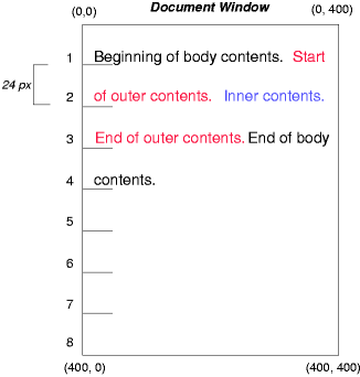
6.1. Normal Flow Example
Consider the following CSS declarations for outer and inner that do not alter the normal flow of boxes:
The P element contains all inline content: anonymous inline text and two SPAN elements. Therefore, all of the content will be laid out in an inline formatting context, within a containing block established by the P element, producing something like:
6.2. Relative Positioning Example
To see the effect of relative positioning, we specify:
#outer{ position : relative; top : -12 px ; color : red} #inner{ position : relative; top : 12 px ; color : blue}
Text flows normally up to the outer element. The outer text is then flowed into its normal flow position and dimensions at the end of line 1. Then, the inline boxes containing the text (distributed over three lines) are shifted as a unit by -12px (upwards).
The contents of inner, as a child of outer, would normally flow immediately after the words "of outer contents" (on line 1.5). However, the inner contents are themselves offset relative to the outer contents by 12px (downwards), back to their original position on line 2.
Note that the content following outer is not affected by the relative positioning of outer.
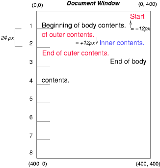
Note also that had the offset of outer been -24px, the text of outer and the body text would have overlapped.
6.3. Floating Example
Now consider the effect of floating the inner element’s text to the right by means of the following rules:
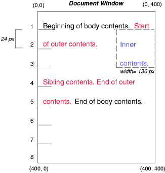
Text flows normally up to the inner box, which is pulled out of the flow and floated to the right margin (its width has been assigned explicitly). Line boxes to the left of the float are shortened, and the document’s remaining text flows into them.
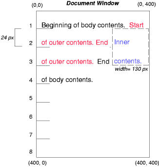
To show the effect of the clear property, we add a sibling element to the example:
<!DOCTYPE html> < html > < head > < title > Comparison of positioning schemes II</ title > < style > # inner { float : right ; width : 130 px ; color : blue } # sibling { color : red } </ style > </ head > < body > < p > Beginning of p contents.< span id = "outer" > Start of outer contents.< span id = "inner" > Inner contents.</ span > < span id = "sibling" > Sibling contents.</ span > End of outer contents.</ span > End of p contents.</ p > </ body > </ html >
These styles cause the inner box to float to the right, as before, and the document’s remaining text to flow into the vacated space:
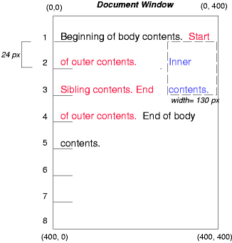
However, if the clear property on the sibling element is set to right (i.e., the generated sibling box will not accept a position next to floating boxes to its right), the sibling content begins to flow below the float:
6.4. Absolute Positioning Example
Next, we consider the effect of absolute positioning. Consider the following CSS declarations for outer and inner:
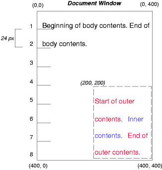
#outer{ position : absolute; top : 200 px ; left : 200 px ; width : 200 px ; color : red; } #inner{ color : blue}
which cause the top of the outer box to be positioned with respect to its containing block. The containing block for a positioned box is established by the nearest positioned ancestor (or, if none exists, the initial containing block, as in our example). The top side of the outer box is 200px below the top of the containing block and the left side is 200px from the left side. The child box of outer is flowed normally with respect to its parent.
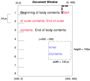
The following example shows an absolutely positioned box that is a child of a relatively positioned box. Although the parent outer box is not actually offset, setting its position property to relative means that its box may serve as the containing block for positioned descendants. Since the outer box is an inline box that is split across several lines, the first inline box’s top and left edges (depicted by thick dashed lines in the illustration below) serve as references for top and left offsets.
#outer{ position : relative; color : red} #inner{ position : absolute; top : 200 px ; left : -100 px ; height : 130 px ; width : 130 px ; color : blue; }
This results in something like the following:
If we do not position the outer box:
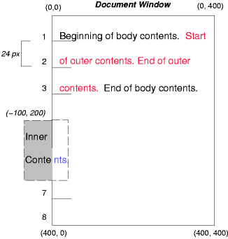
#outer{ color : red} #inner{ position : absolute; top : 200 px ; left : -100 px ; height : 130 px ; width : 130 px ; color : blue; }
the containing block for inner becomes the initial containing block (in our example). The following illustration shows where the inner box would end up in this case.
Relative and absolute positioning may be used to implement change bars, as shown in the following example. The following fragment:
< p style = "position: relative; margin-right: 10px; left: 10px;" > I used two red hyphens to serve as a change bar. They will "float" to the left of the line containing THIS< span style = "position: absolute; top: auto; left: -1em; color: red;" > --</ span > word.</ p >
might result in something like:
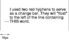
First, the paragraph (whose containing block sides are shown in the illustration) is flowed normally. Then it is offset 10px from the left edge of the containing block (thus, a right margin of 10px has been reserved in anticipation of the offset). The two hyphens acting as change bars are taken out of the flow and positioned at the current line (due to 'top: auto'), -1em from the left edge of its containing block (established by the P in its final position). The result is that the change bars seem to "float" to the left of the current line.
7. Acknowledgments
This module would not have been possible without input and support from many helpful people. Thanks to Rossen Atanassov, Bert Bos, Oriol Brufau, Tantek Çelik, Arron Eicholz Sylvain Galineau, John Jansen, Chris Jones, Ian Kilpatrick, Anton Prowse.
Changes
The following significant changes were made since the 3 April 2023 Working Draft:
- Adjusted alignment of absolutely positioned boxes to, by default, constrain the box to its containing block. See § 4 Absolute Positioning Layout Model. (Issue 10316)
- Specified the static-position rectangle of top layer boxes to be the initial containing block. (Issue 9939)
- Clarified that the fixed positioning containing block corresponds to the layout viewport (specifically) in continuous media. (Issue 6453)
The following significant changes were made since the 17 February 2023 Working Draft:
- Updated the containing block formed by inline boxes fragmented across multiple lines to use the endmost edge of all the fragments in each axis; this proposed definition is still under discussion, however. (Issue 8284)
The following significant changes were made since the 01 September 2022 Working Draft:
- Added § 2.2 Painting Order and Stacking Contexts and defined sticky-positioned boxes to always form a stacking context. (Issue 1053)
- Updated sticky positioning to using its offsetted positioning for scroll operations. (Issue 7930)
- Fixed incorrect/ambiguous translation from CSS2 regarding the edges of a fragmented inline box forming a containing block in the presence of bidi. (Issue 7917)
- Defined the containing block formed by edges of a fragmented inline box to match the Blink implementation (Issue 609) while opening up a discussion on what’s the best thing to do (Issue 8284)
- Imported the definition of static-position containing block from CSS2.
- Clarified writing modes used to calculate static positions. (Issue 7599, Issue 7612)
- Added a note about treating HTML form controls as non-replaced elements for the purpose of absolute positioning. (Issue 6789)
- Corrected duplicate, conflicting “Animation type” lines for position. (Issue 6846)
- Clarified “equivalent alignment”. (Issue 6607)
The following significant changes were made since the 16 December 2021 Working Draft:
- Fixed conceptual definitions of static position and static-position rectangle to be consistent with their actual usage.
- Explicitly defined that absolute positioning forces the box to establish an independent formatting context (as previously noted in [CSS-DISPLAY-3]). (Issue 7124)
The following significant changes were made since the 19 May 2020 Working Draft:
-
Defined automatic sizing of non-replaced absolutely-positioned boxes with an aspect ratio.
(Issue 5151
However, if the box has an aspect-ratio, then an automatic size in the ratio-dependent axis is instead resolved as a max-content size. When both axes have an automatic size, if only one axis has an auto inset then that axis is the ratio-dependent axis, else the block axis is the ratio-dependent axis. An automatic size in the ratio-determining axis is determined as above.
-
Aligned resolution of auto margins and automatic sizes of positioned boxes with [CSS2].
(Issue 5374, Issue 5077, Issue 5327)
If this results in a sticky view rectangle size in any axis less than the size of the border box of the sticky box in that axis, then the effective end-edge inset in the affected axis is reduced (possibly becoming negative) to bring the sticky view rectangle’s size up to the size of the border box in that axis (where end is interpreted relative to the writing mode of the containing block) .
If neither is auto, the position is over-constrained; (with respect to the writing mode of its containing block) the computed end side value is ignored, and its used value becomes the negation of the start side.
However, (all with respect to the writing mode of the containing block), if in the inline axis the remaining space is negative and both margins are auto, the start margin resolves to zero and the end margin receives the remaining space.
- If its self-alignment property in the relevant axis is stretch
- Or if it is normal and the box is non-replaced and has no auto inset in the relevant axis
-
Its automatic size is its stretch-fit size.
- If its self-alignment property in the relevant axis is stretch
The following significant changes were made since the 17 May 2016 Working Draft:
- Rewrote the whole spec for editorial clarity, technical precision, and compatibility with [CSS-ALIGN-3], [CSS-WRITING-MODES-3], [CSS-BREAK-3], and [CSS-DISPLAY-3].
Privacy Considerations
This specification introduces no new privacy considerations.
Security Considerations
If an attacker is able to inject arbitrary CSS, positioned layout can make it easier to position elements the attacker has control of over arbitrary other elements of the page, potentially tricking users of the page. (There are many routes to this attack: negative margin, transform, etc. Don’t let people apply arbitrary CSS to bits of your page.)
position: fixed can allow a page to emulate modal dialogs, potentially tricking a user into thinking they’re interacting with the user agent and entering in sensitive information that they page can then capture. User agents must ensure that their native dialogs are positioned in ways that the page cannot emulate; in particular, that at least some of the dialog is outside the "poisoned pixels" that web content can paint to.