See Understanding Techniques for WCAG Success Criteria for important information about the usage of these informative techniques and how they relate to the normative WCAG 2.0 success criteria. The Applicability section explains the scope of the technique, and the presence of techniques for a specific technology does not imply that the technology can be used in all situations to create content that meets WCAG 2.0.
HTML, XHTML and CSS
This failure relates to:
The objective of this failure condition is to describe a problem that occurs when changing the size of text causes text to be clipped, truncated, or obscured, so that it is no longer available to the user. In general, this failure occurs when there is no way for a user agent's layout engine to honor all the layout hints in the HTML at the new font size. Some of the ways in which this can occur include:
Setting the overflow property of the enclosing element to hidden
Using absolutely positioned content
Creating popups that aren't big enough for their content at the new font size
Note: The Working Group has discovered many misunderstandings about how to test this failure. We are planning to revise this failure in a future update. Until then, if the content passes the success criterion using any of the listed sufficient techniques, then it does not meet this failure.
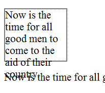
The font size is set in a scalable way, but the container is set to a fixed pixel size. A gray border shows the boundaries of the text container. When the text is resized, it spills out of its container, and obsures the next paragraph.
Example Code:
<div style="font-size:100%; width:120px; height:100px; border: thin solid gray;">
  Now is the time for all good men to come to the aid of their country.
</div>
<p>Now is the time for all good men to come to the aid of their country.</p>
Illustration of example 1:

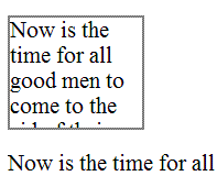
This example is identical to the last one, except that the container is set to clip the text. The text is no longer bleeding into the next paragraph, but now it is truncated. This is also a failure.
Example Code:
<div style="font-size:100%; width:120px; height:100px; overflow: hidden; border: thin solid gray;">
 Now is the time for all good men to come to the aid of their country.
</div>
<p>Now is the time for all good men to come to the aid of their country.</p>
Illustration of example 2:

(none currently listed)
Note: The Working Group has discovered many misunderstandings about how to test this failure. We are planning to revise this failure in a future update. Until then, if the content passes the success criterion using any of the listed sufficient techniques, then it does not meet this failure.
Increase the text size of the content by 200%.
Check that no text is clipped, truncated, or obscured.
If check #2 is false, then the failure condition applies and the content fails these Success Criteria.