CSS Techniques for Web Content Accessibility Guidelines
1.0
W3C Note 6 November 2000
- This version:
-
http://www.w3.org/TR/2000/NOTE-WCAG10-CSS-TECHS-20001106/
- (plain text,
PostScript, PDF, gzip tar file of HTML, zip archive of HTML)
- Latest version:
-
http://www.w3.org/TR/WCAG10-CSS-TECHS/
- Previous version:
-
http://www.w3.org/TR/2000/NOTE-WCAG10-CSS-TECHS-20000920/
- Editors:
- Wendy Chisholm, W3C;
Gregg Vanderheiden, Trace R & D
Center, University of Wisconsin -- Madison;
Ian Jacobs, W3C
Copyright
©1999 - 2000 W3C® (MIT,
INRIA, Keio), All Rights
Reserved. W3C
liability,
trademark, document
use and software
licensing rules apply.
This document describes techniques for authoring accessible Cascading Style
Sheets (CSS). Cascading Style
Sheets are defined by the W3C Recommendations "CSS Level 1" [CSS1] and "CSS
Level 2"
[CSS2]. This document is intended to help authors of Web content who
wish to claim conformance to "Web Content Accessibility Guidelines 1.0"
([WCAG10]). While the techniques in
this document should help people author CSS that conforms to "Web Content
Accessibility Guidelines 1.0", these techniques are neither guarantees of
conformance nor the only way an author might produce conforming content.
This document is part of a series of documents about techniques for
authoring accessible Web content. For information about the other documents in
the series, please refer to "Techniques for Web Content Accessibility
Guidelines 1.0" [WCAG10-TECHS].
Note: This document contains a number of examples that
illustrate accessible solutions in CSS but also deprecated examples that
illustrate what content developers should not do. The deprecated examples are
highlighted and readers should approach them with caution -- they are meant for
illustrative purposes only.
This version has been published to correct some broken links in the previous
version.
The 6 November 2000 version of this document is a Note in a series of Notes
produced and endorsed by the Web Content
Accessibility Guidelines Working Group (WCAG WG). This Note has not been
reviewed or endorsed by W3C Members. The series of documents supersedes the
single document 5 May 1999 W3C
Note Techniques for Web Content Accessibility Guidelines 1.0. The topics
from the earlier document have been separated into technology-specific
documents that may evolve independently. Smaller technology-specific documents
allow authors to focus on a particular technology.
While the "Web Content Accessibility Guidelines 1.0" Recommendation [WCAG10] is a
stable document, this series of companion documents is expected to evolve as
technologies change and content developers discover more effective techniques
for designing accessible Web content.
The
history of changes to the series of documents as well as the list of open and closed
issues are available. Readers are encouraged to comment on the document and
propose resolutions to current issues. Please send detailed comments on this
document to the Working Group at
w3c-wai-gl@w3.org; public archives are
available.
The English version of this specification is the only normative version. Translations of
this document may be available.
The list of known errors in this document is available at "Errata in Web Content
Accessibility Guidelines." Please report errors in this document to wai-wcag-editor@w3.org.
The Web Accessibility Initiative (WAI) of the World Wide Web
Consortium (W3C) makes available a variety of resources on
Web accessibility. WAI Accessibility Guidelines are produced as part of the WAI Technical Activity. The
goals of the Web Content Accessibility Guidelines Working Group are described
in the
charter.
A list of current W3C Recommendations and
other technical documents is available.
Checkpoints in this section:
14.3 Create a style of presentation that is consistent across pages.
[Priority 3] .
- Use a minimal number of style sheets for your site
- Use linked style sheets rather than embedded styles, and avoid inline style
sheets.
- If you have more than one, use the same "class" name for the same concept
in all of the style sheets.
Checkpoint in this section:
11.2 Avoid deprecated features of W3C technologies. [Priority 2] .
In order to ensure that users can control styles, CSS2 changes the semantics
of the "!important" operator defined in CSS1. In CSS1, authors always had final
say over styles. In CSS2, if a user's style sheet contains "!important", it
takes precedence over any applicable rule in an author's style sheet. This is
an important feature to users who require or must avoid certain color
combinations or contrasts, users who require large fonts, etc. For instance,
the following rule specifies a large font size for paragraph text and would
override an author rule of equal weight:
Example.
P { font-size: 24pt ! important }
The CSS2 'inherit' value - available for every property - leads to compact
"!important" style rules that govern most or all of a document. For instance,
the following style rules force all backgrounds to white and all foreground
colors to black:
Example.
/*   Sets the text color to black
and the background color to
white for the document body.  */

BODY {
  color: black ! important ;
  background: white ! important
}

 /*   Causes the values of 'color' and 'background'
to be inherited by all other elements,
strengthened by !important. Note that this
may be overridden by other, more specific,
user styles.  */

* {
  color: inherit ! important ;
  background: inherit ! important
}
CSS2 also includes these user control features:
- System colors (for 'color', 'background-color', 'border-color', and
'outline-color') and system fonts (for 'font') mean that users may apply their
system color and font preferences to Web documents.
- Dynamic outlines (the 'outline' property) allow users (e.g., with low
vision) to create outlines around content that don't affect layout but do
provide highlight information.
For example, to draw a thick black line around an element when it has the
focus, and a thick red line when it is active, the following rules can be
used:
Example.
:focus  { outline: thick solid black }
:active { outline: thick solid red }
Checkpoints in this section:
3.4 Use relative rather than absolute units in markup language attribute
values and style sheet property values. [Priority 2] .
Techniques:
- Use the "em" unit to set font sizes.
- Use relative length units and percentages. CSS allows you to use relative
units even in absolute positioning. Thus, you may position an image to be
offset by "3em" from the top of its containing element. This is a fixed
distance, but is relative to the current font size, so it scales nicely.
- Only use absolute length units when the physical characteristics of the
output medium are known, such as bitmap images.
Example.
Use em to set font sizes, as in:
H1 { font-size: 2em }
rather than:
H1 { font-size: 12pt }
End example.
Example.
Use relative length units and percentages.
BODY { margin-left: 15%; margin-right: 10%}
End example.
Example.
Only use absolute length units when the physical characteristics of the
output medium are known.
.businesscard { font-size: 8pt }
End example.
Checkpoints in this section:
- 3.1 When an appropriate markup language exists, use markup
rather than images to convey information. [Priority 2] ,
- 6.1 Organize documents so they may be read without style
sheets. For example, when an HTML document is rendered without associated style
sheets, it must still be possible to read the document. [Priority 1]
Techniques:
- Provide a text equivalent for any important image or text generated by
style sheets (e.g., via the 'background-image', 'list-style', or 'content'
properties).
- Ensure that important content appears in the document object. Text
generated by style sheets is not part of the document source and will not be
available to assistive technologies that access content through the Document
Object Model Level 1 ([[DOM1]).
CSS2 includes several mechanisms that allow content to be generated from
style sheets:
- the :before and :after pseudo-elements and the 'content' property. When
used together, these allow authors to insert markers (e.g., counters and
constant strings such as "End Example" in the examples below) before or after
and element's content.
- the 'cue', 'cue-before', and 'cue-after' properties. This properties allow
users to play a sound before or after an element's content.
- List styles, which may be numbers, glyphs, or images (usually associated
with the LI element in HTML). CSS2 adds international list styles to the styles
defined in CSS1. See the 'list-style-type' and 'content' properties.
Generated content can serve as markers to help users navigate a document and
stay oriented when they can't access visual clues such as proportional
scrollbars, frames with tables of contents, etc.
For instance, the following user style sheet would cause the words "End
Example" to be generated after each example marked up with a special class
value in the document:
Example.
DIV.example:after {
  content: End Example
}
Users could also, for example, number paragraphs so that they could locate
their current reading position in a document:
Example.
P:before {
  content: counter(paragraph) ". " ;
    counter-increment: paragraph
}
Checkpoints in this section:
11.2 Avoid deprecated features of W3C technologies. [Priority 2] .
Techniques:
Example.
Always specify a fallback generic font:
BODY { font-family: "Gill Sans", sans-serif }
End example.
Example.
<STYLE type="text/css">
   P.important { font-weight: bold }
   P.less-important { font-weight: lighter; font-size: smaller }
   H2.subsection { font-family: Helvetica, sans-serif }
</STYLE>
End example.
Checkpoints in this section:
7.2 Until user agents allow users to control blinking, avoid causing
content to blink (i.e., change presentation at a regular rate, such as turning
on and off). [Priority 2] .
The following CSS2 properties can be used to style text:
- Case: 'text-transform' (for uppercase, lowercase, and capitalization).
- Shadow effects: 'text-shadow'
- Underlines, overlinks, blinking: 'text-decoration'. Note.
If blinking content (e.g., a headline that appears and disappears at regular
intervals) is used, provide a mechanism for stopping the blinking. In CSS,
'text-decoration: blink' will cause content to blink and will allow users to
stop the effect by turning off style sheets or overriding the rule in a user
style sheet. Do not use the BLINK and MARQUEE elements. These elements are not
part of any W3C specification for HTML (i.e., they are non-standard
elements).
Checkpoints in this section:
3.3 Use style sheets to control layout and presentation. [Priority 2]
.
Content developers should use style sheets to style text rather than
representing text in images. Using text instead of images means that the
information will be available to a greater number of users (with speech
synthesizers, braille displays, graphical displays, etc.). Using style sheets
will also allow users to override author styles and change colors or fonts
sizes more easily.
If it is necessary to use a bitmap to
create a text effect (special font, transformation, shadows, etc.) the
bitmap must be accessible (see the sections on text
equivalents and
alternative pages).
Example.
In this example, the inserted image shows the large red characters
"Example", and is captured by the value of the "alt" attribute.
<P>This is an
   <IMG src="BigRedExample.gif" alt="example">
   of what we mean.
</P>
End example.
Checkpoints in this section:
3.3 Use style sheets to control layout and presentation. [Priority 2]
.
The following CSS2 properties can be used to control the formatting and
position of text:
- Indentation: 'text-indent'. Do not use the BLOCKQUOTE or any other
structural element to indent text.
- Letter/word spacing: 'letter-spacing', 'word-spacing'. For example instead
of writing "H E L L O" (which users generally
recognize as the word "hello" but would hear as individual letters), authors
may create the same visual effect with the 'word-spacing' property applied to
"HELLO". Text without spaces will be transformed more effectively to
speech.
- White space: 'white-space'. This property controls the white space
processing of an element's content.
- Text direction: 'direction', 'unicode-bidi'.
- The :first-letter and :first-line pseudo-elements allow authors to refer to
the first letter or line of a paragraph of text.
The following example shows how to use style sheets to create a drop-cap
effect.
Example.
<HEAD>
<TITLE>Drop caps</TITLE>
<STYLE type="text/css">
      .dropcap { font-size : 120%; font-family : Helvetica }
</STYLE>
</HEAD>
<BODY>
<P><SPAN class="dropcap">O</SPAN>nce upon a time...
</BODY>
Note. As of the writing of this document, the CSS
pseudo-element ':first-letter', which allows content developers to refer to the
first letter of a chunk of text, is not widely supported.
Checkpoints in this section:
- 2.2 Ensure that foreground and background color combinations
provide sufficient contrast when viewed by someone having color deficits or
when viewed on a black and white screen. [Priority 2 for images,
Priority 3 for text].
Techniques:
- Use numbers, not names, for colors.
Example.
Use numbers, not names, for colors:
   H1 {color: #808000}
   H1 {color: rgb(50%,50%,0%)}
End example.
Deprecated example.
H1 {color: red}
End example.
Use these CSS properties to specify colors:
- 'color', for foreground text color.
- 'background-color', for background colors.
- 'border-color', 'outline-color' for border colors.
- For link colors, refer to the :link, :visited, and :active
pseudo-classes.
Ensure that foreground and background colors contrast well. If specifying a
foreground color, always specify a background color as well (and vice
versa).
Checkpoints in this section:
- 2.1 Ensure that all information conveyed with color is also
available without color, for example from context or markup.
[Priority 1]
Ensure that information is not conveyed through color alone. For example,
when asking for input from users, do not write "Please select an item from
those listed in green." Instead, ensure that information is available through
other style effects (e.g., a font effect) and through context (e.g,.
comprehensive text links).
For instance, in this document, examples are styled by default (through
style sheets) as follows:
- They are surrounded by a border.
- They use a different background color.
- They begin with the word "Example" or "Deprecated Example".
- They also end with the phrase "End example", but that phrase is hidden by
default with 'display: none'. For user agents that don't support style sheets
or when style sheets are turned off, this text helps delineate the end of an
example for readers who may not be able to see the border around the
example.
Quicktest! To test whether your document
still works without colors, examine it with a monochrome monitor or browser
colors turned off. Also, try setting up a color scheme in your browser that
only uses black, white, and the four browser-safe greys and see how your page
holds up.
Quicktest! To test whether color contrast is
sufficient to be read by people with color deficiencies or by those with low
resolution monitors, print pages on a black and white printer (with backgrounds
and colors appearing in grayscale). Also try taking the printout and copying it
for two or three generations to see how it degrades. This will show you where
you need to add redundant cues (example: hyperlinks are usually underlined on
Web pages), or whether the cues are too small or indistinct to hold up
well.
For more information about colors and contrasts, refer to
[LIGHTHOUSE].
Checkpoints in this section:
- 3.6 Mark up lists and list items properly.
[Priority 2]
- 13.2 Provide metadata to add semantic information to pages
and sites. [Priority 2]
Content developers are encouraged to use UL for unordered lists and OL for
ordered lists (i.e., use markup appropriately) combined with CSS to provide
contextual clues.
The following CSS2 style sheet shows how to provide compound numbers for
nested lists created with either UL or OL elements. Items are numbered as "1",
"1.1", "1.1.1", etc.
Example.
<STYLE type="text/css">
    UL, OL { counter-reset: item }
    LI { display: block }
    LI:before { content: counters(item, "."); counter-increment: item }
</STYLE>
End example.
Until either CSS2 is widely supported by user agents or user agents allow
users to control rendering of lists through other means, authors should
consider providing contextual clues in nested lists. The following CSS1
mechanism shows how to hide the end of a list when style sheets are turned on,
and to reveal it when style sheets are turned off, when user style sheets
override the hiding mechanism, or when style sheets aren't supported.
Example.
  <STYLE type="text/css">
      .endoflist { display: none }
  </STYLE>
  <UL>
     <LI>Paper:
        <UL>
           <LI>Envelopes
           <LI>Notepaper
           <LI>Letterhead
           <LI>Poster paper
           <span class="endoflist">(End of Paper)</span>
        </UL>
     <LI>Pens:
        <UL>
           <LI>Blue writing pens
           <LI>whiteboard pens
           <span class="endoflist">(End of Pens)</span>
        </UL>
     <LI>Fasteners:
        <UL>
           <LI>paper clips
           <LI>staples
           <LI>Big lengths of rope.
           <span class="endoflist">(End of Fasteners)</span>
        </UL>
     <span class="endoflist">(End of Office Supplies)</span>
  </UL>
End example.
Note: This example does not help the case of wrapping list items. With some
more effort, the author could put similar markup at the end of each list
item.
Checkpoints in this section:
- 3.3 Use style sheets to control layout and presentation.
[Priority 2]
- 5.3 Do not use tables for layout unless the table makes
sense when linearized. Otherwise, if the table does not make sense, provide an
alternative equivalent (which may be a linearized version). [Priority 2]
.
Layout, positioning, layering, and alignment should be done through style
sheets (notably by using CSS floats and absolute positioning):
- 'text-indent', 'text-align', 'word-spacing', 'font-stretch'. Each of these
properties allows users to control spacing without adding additional spaces.
Use 'text-align: center' instead of the deprecated CENTER element.
- 'margin', 'margin-top', 'margin-right', 'margin-bottom', 'margin-left'.
With these properties, authors can create space on four sides of an element's
content instead of adding non-breaking spaces ( ).
- 'float', 'position', 'top', 'right', 'bottom', 'left'. With these
properties, the user can control the visual position of almost any element in a
manner independent of where the element appears in the document. Authors should
always design documents that make sense without style sheets (i.e., the
document should be written in a "logical" order) and then apply style sheets to
achieve visual effects. The positioning properties may be used to create margin
notes (which may be automatically numbered), side bars, frame-like effects,
simple headers and footers, and more.
- The 'empty-cells' property allows users to leave table cells empty and
still give them proper borders on the screen or on paper. A data cell that is
meant to be empty should not be filled with white space or a non-breaking space
just to achieve a visual effect.
Provide text equivalents for all
images, including invisible or transparent images.
If content developers cannot use style sheets and must use invisible or
transparent images (e.g., with IMG) to lay out images on the page, they should
specify alt="" for them.
Deprecated example.
Authors should not use spaces for the value of "alt" to
prevent the words from running together when the image is not loaded:
my poem requires a big space<IMG src="10pttab.gif" alt=" ">here
In this next example, an image is used to force a graphic to appear in a
certain position:
   <IMG src="spacer.gif" alt="spacer">
   <IMG src="colorfulwheel.gif" alt="The wheel of fortune">
End example.
Checkpoints in this section: 6.1 Organize documents so they may be read without style
sheets. For example, when an HTML document is rendered without associated style
sheets, it must still be possible to read the document. [Priority 1] .
Rules and borders may convey the notion of "separation" to visually enabled
users but that meaning cannot be inferred out of a visual context.
Use these CSS properties to specify border styles:
- 'border', 'border-width', 'border-style', 'border-color'.
- 'border-spacing' and 'border-collapse' for tables.
- 'outline, 'outline-color', 'outline-style', and 'outline-width' for dynamic
outlines.
Authors should use style sheets to create rules and borders.
Example.
In this example, the H1 element will have a top border that is 2px thick,
red, and separated from the content by 1em:
   <HEAD>
   <TITLE>Redline with style sheets</TITLE>
   <STYLE type="text/css">
        H1 { padding-top: 1em; border-top: 2px red }
   </STYLE>
   </HEAD>
   <BODY>
   <H1>Chapter 8 - Auditory and Tactile Displays</H1>
   </BODY>
End example.
If a rule (e.g., the HR element) is used to indicate structure, be sure to
indicate the structure in a non-visual way as well. (e.g., by using structural
markup).
Example.
In this example, the DIV element is used to create a navigation bar, which
includes a horizontal separator.
   <DIV class="navigation-bar">
      <HR>
      <A rel="Next" href="next.html">[Next page]</A>
      <A rel="Previous" href="previous.html">[Prevous page]</A>
      <A rel="First" href="first.html">[First page]</A>
   </DIV>
End example.
Checkpoints in this section:
- 6.1 Organize documents so they may be read without style
sheets. For example, when an HTML document is rendered without associated style
sheets, it must still be possible to read the document. [Priority 1]
,
Using the positioning properties of CSS2, content may be displayed at any
position on the user's viewport. The order in which items appear on a screen
may be different than the order they are found in the source document. The
following example demonstrates a few principles:
- the text appears visually in the browser in a different order than in the
markup.
- CSS positioning may be used to create tabular effects. A TABLE element
could have been used to create the same effect.
Note that a class is defined for each object that is being positioned. The
use of "id" could be substituted for "class" in these examples. "Class" was
used because in the live example, the objects are replicated and thus not
unique.
Deprecated example.
<head><style type="text/css">
  .menu1 { position: absolute; top: 3em; left: 0em;
           margin: 0px; font-family: sans-serif;
           font-size: 120%; color: red; background-color: white }
  .menu2 { position: absolute; top: 3em; left: 10em;
           margin: 0px; font-family: sans-serif;
           font-size: 120%; color: red; background-color: white }
  .item1 { position: absolute; top: 7em; left: 0em; margin: 0px }
  .item2 { position: absolute; top: 8em; left: 0em; margin: 0px }
  .item3 { position: absolute; top: 9em; left: 0em; margin: 0px }
  .item4 { position: absolute; top: 7em; left: 14em; margin: 0px }
  .item5 { position: absolute; top: 8em; left: 14em; margin: 0px }
  #box { position: absolute; top: 5em; left: 5em }
</style></head>
<body>
<div class="box">
  <span class="menu1">Products</span>
  <span class="menu2">Locations</span>
  <span class="item1">Telephones</span>
  <span class="item2">Computers</span>
  <span class="item3">Portable MP3 Players</span>
  <span class="item5">Wisconsin</span>
  <span class="item4">Idaho</span>
</div>
</body>
End example.
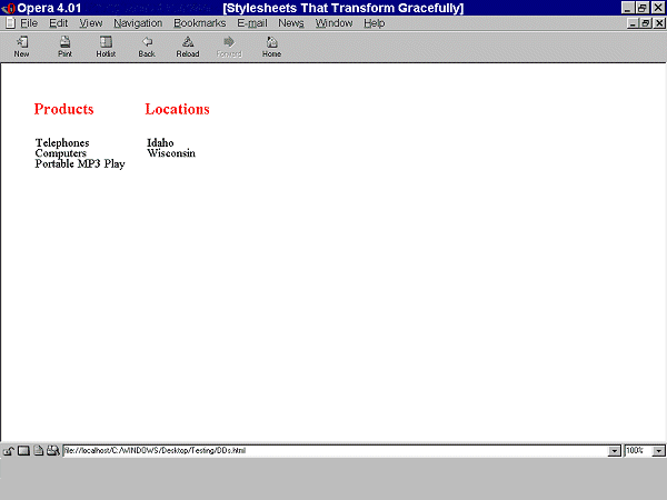
When style sheets are applied, the text appears in two columns. Elements of
class "menu1" (Products) and "menu2" (Locations) appear as column headings.
"Telephones, Computers, and Portable MP3 Players" are listed under Products and
"Wisconsin" and "Idaho" are listed under Locations as shown in this screen
shot:

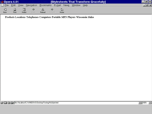
When style sheets are not applied, all of the text appears in one line of
words, "Products Locations Telephones Computers Portable MP3 Players Wisconsin
Idaho". They appear in the order in which they are written in the source.
Therefore, what appear as column headings when style sheets are applied are the
first phrases since they were defined first in the source. The following screen
shot illustrates this:

The following example shows that the same visual appearance may be created
in a browser that support style sheets as well as creating a more meaningful
presentation when style sheets are not applied. Structural markup (definition
lists) have been applied to the content. Note that the margins have been set to
0 since in HTML browsers, definition lists are displayed with a margin set on
the DD element.
Example.
<head><style type="text/css">
  .menu1 { position: absolute; top: 3em; left: 0em;
           margin: 0px; font-family: sans-serif;
           font-size: 120%; color: red; background-color: white }
  .menu2 { position: absolute; top: 3em; left: 10em;
           margin: 0px; font-family: sans-serif;
           font-size: 120%; color: red; background-color: white }
  .item1 { position: absolute; top: 7em; left: 0em; margin: 0px }
  .item2 { position: absolute; top: 8em; left: 0em; margin: 0px }
  .item3 { position: absolute; top: 9em; left: 0em; margin: 0px }
  .item4 { position: absolute; top: 7em; left: 14em; margin: 0px }
  .item5 { position: absolute; top: 8em; left: 14em; margin: 0px }
  #box { position: absolute; top: 5em; left: 5em }
</style></head>
<body>
<div class="box">
<dl>
  <dt class="menu1">Products</dt>
    <dd class="item1">Telephones</dd>
    <dd class="item2">Computers</dd>
    <dd class="item3">Portable MP3 Players</dd>
  <dt class="menu2">Locations</dt>
   <dd class="item4">Idaho</span>
   <dd class="item5">Wisconsin</span>
  </dt>
</dl>
</div>
</body>
End example.
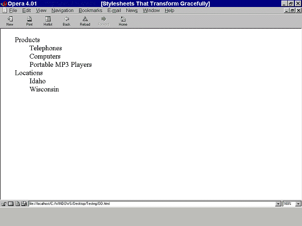
When style sheets are applied, it
looks as it did before. However, now when the style sheets are not applied, the
text appears in a definition list rather than a string of words. What appear as
column headings when style sheets are applied, appear as defined terms when
style sheets are not applied as demonstrated in the following screen shot.

Note. Experience the difference between these examples for yourself: test file for style sheets that transform
gracefully.
Checkpoints in this section:
7.3 Until user agents allow users to freeze moving content, avoid movement
in pages. [Priority 2]
- hide/show content,
- change presentation (movement and colors)
Checkpoints in this section: 11.3 Provide information so that users may receive documents
according to their preferences (e.g., language, content type, etc.)
[Priority 3] .
CSS2's aural properties provide information to non-sighted users and
voice-browser users much in the same way fonts provide visual information. The
following example show how various sound qualities (including 'voice-family',
which is something like an audio font) can let a user know that spoken content
is a heading:
Example.
H1 {
  voice-family: paul;
  stress: 20;
  richness: 90;
  cue-before: url("ping.au")
}
The following properties are part of CSS2's aural cascading style
sheets.
- 'volume' controls the volume of spoken text.
- 'speak' controls whether content will be spoken and, if so, whether it will
be spelled or spoken as words.
- 'pause', 'pause-before', and 'pause-after' control pauses before and after
content is spoken. This allows users to separate content for better
comprehension.
- 'cue', 'cue-before', and 'cue-after' specify a sound to be played before
and after content, which can be valuable for orientation (much like a visual
icon).
- 'play-during' controls background sounds while an element is rendered (much
like a background image).
- 'azimuth' and 'elevation' provide dimension to sound, which allows users to
distinguish voices, for example.
- 'speech-rate', 'voice-family', 'pitch', 'pitch-range', 'stress', and
'richness' control the quality of spoken content. By varying these properties
for different elements, users can fine-tune how content is presented
aurally.
- 'speak-punctuation' and 'speak-numeral' control how numbers and punctuation
are spoken, which has an effect on the quality of the experience of aural
browsing.
Furthermore, the 'speak-header' property describes how table header
information is to be spoken before a table cell.
Checkpoints in this section: 11.3 Provide information so that users may receive documents
according to their preferences (e.g., language, content type, etc.)
[Priority 3] .
CSS2 lets users access alternative representations of content that is
specified in attribute values when the following are used together:
- attribute selectors.
- the attr() function and the 'content' property'
- the :before and :after pseudo-elements
In the following example, the value of the "alt" attribute for the IMG
element is rendered after the image (visually, aurally, etc.):
Example.
 IMG:after {
    content: attr(alt)
 }
Note that the value of the attribute is displayed even though the image may
not be (e.g., the user has turned off images through the user interface).
Checkpoints in this section: 11.3 Provide information so that users may receive documents
according to their preferences (e.g., language, content type, etc.)
[Priority 3] .
The CSS2 "media types" (used with @media rules) allow authors and users to
design style sheets that will cause documents to render more appropriately on
certain target devices. These style sheets can tailor content for presentation
on braille devices, speech synthesizers, or
TTY devices. Using "@media" rules can also reduce download times by
allowing user agents to ignore inapplicable rules.
For the latest version of any
W3C specification please consult the list of
W3C Technical Reports at http://www.w3.org/TR.
- [CSS1]
- "CSS, level 1
Recommendation", B. Bos, H. Wium Lie, eds., 17 December 1996, revised 11
January 1999. This CSS1 Recommendation is
http://www.w3.org/TR/1999/REC-CSS1-19990111. The latest version of CSS1 is available at
http://www.w3.org/TR/REC-CSS1.
- [CSS2]
- "CSS, level 2
Recommendation", B. Bos, H. Wium Lie, C. Lilley, and I. Jacobs, eds., 12
May 1998. This CSS2 Recommendation is
http://www.w3.org/TR/1998/REC-CSS2-19980512/. The latest version of CSS2 is available
at http://www.w3.org/TR/REC-CSS2.
- [WCAG10]
- "Web Content
Accessibility Guidelines 1.0", W. Chisholm, G. Vanderheiden, and I. Jacobs,
eds., 5 May 1999. This WCAG 1.0 Recommendation is
http://www.w3.org/TR/1999/WAI-WEBCONTENT-19990505/.
-
[WCAG10-TECHS]
- "Techniques for Web Content
Accessibility Guidelines 1.0", W. Chisholm, G. Vanderheiden, I. Jacobs,
eds. This document explains how to implement the checkpoints defined in "Web
Content Accessibility Guidelines 1.0". The latest draft of the techniques is
available at http://www.w3.org/TR/WCAG10-TECHS/.
Note: W3C does not guarantee the stability of any of
the following references outside of its control. These references are included
for convenience. References to products are not endorsements of those
products.
- [UWSAG]
- "The
Unified Web Site Accessibility Guidelines", G. Vanderheiden, W. Chisholm,
eds. The Unified Web Site Guidelines were compiled by the Trace R & D Center at the University
of Wisconsin under funding from the National Institute on Disability and
Rehabilitation Research (NIDRR), U.S. Dept. of Education.
- [LIGHTHOUSE]
- The Lighthouse provides
information about accessible colors and contrasts.
- Web Content Guidelines Working Group Co-Chairs:
- Jason White,
University of Melbourne
- Gregg Vanderheiden, Trace Research
and Development
- W3C Team contact:
- Wendy Chisholm
- We wish to thank the following people who have contributed their time and
valuable comments to shaping these guidelines:
- Harvey Bingham, Kevin Carey, Chetz Colwell, Neal Ewers, Geoff Freed, Al
Gilman, Larry Goldberg, Jon Gunderson, Eric Hansen, Phill Jenkins, Leonard
Kasday, George Kerscher, Marja-Riitta Koivunen, Josh Krieger, Chuck Letourneau,
Scott Luebking, William Loughborough, Murray Maloney, Charles McCathieNevile,
MegaZone (Livingston Enterprises), Masafumi Nakane, Mark Novak, Charles
Oppermann, Mike Paciello, David Pawson, Michael Pieper, Greg Rosmaita, Liam
Quinn, Dave Raggett, T.V. Raman, Robert Savellis, Jutta Treviranus, Steve
Tyler, and Jaap van Lelieveld

