Copyright © 2005 W3C® (MIT, ERCIM, Keio), All Rights Reserved. W3C liability, trademark, document use rules apply.
This document provides information to Web content developers who wish to satisfy the success criteria of "Web Content Accessibility Guidelines 2.0" [WCAG20] (currently a W3C Working Draft). The techniques in this document are specific to Cascading Style Sheet content [CSS1], [CSS2] (and in the future [CSS21] and [CSS3]) although some techniques contain Hypertext Markup Language content [HTML4], [XHTML1] [CSS1] and ECMAScript solutions. Use of the illustrative techniques provided in this document may make it more likely for Web content to demonstrate conformance to WCAG 2.0 success criteria (by passing the relevant tests in the WCAG 2.0 test suite - to be developed) than if these illustrative techniques are not used.
There may be other techniques besides those provided in this document that may be used to demonstrate conformance to WCAG 2.0; in that case, it is encouraged to submit those techniques to the WCAG WG for consideration for inclusion in this document, so that the set of techniques maintained by the WCAG WG is as comprehensive as possible. Deprecated examples illustrate techniques that the Working Group no longer recommends, but may be applicable in some cases.
This document is part of a series of documents published by the W3C Web Accessibility Initiative (WAI) to support WCAG 2.0.
This section describes the status of this document at the time of its publication. Other documents may supersede this document. A list of current W3C publications and the latest revision of this technical report can be found in the W3C technical reports index at http://www.w3.org/TR/.
This version of CSS techniques has not significantly changed since the 19 November 2004 Working Draft. The Web Content Accessibility Guidelines Working Group (WCAG WG) has focused on addressing issues related to Guidelines and Success Criteria. This publication demonstrates how the different documents may link to each other. As the focus of the WCAG WG returns to techniques and test suites, the structure and presentation of the techniques documents will likely change to reflect the relationships between Guidelines, Techniques, and testing documents. In future revisions, we expect to distinguish between techniques required for conformance versus those that are optional. Please refer to "Issue tracking for WCAG 2.0 Techniques for CSS" for a list of open issues related to this Working Draft. The "History of Changes to CSS Techniques for WCAG 2.0 Working Drafts" is also available.
Please send comments about this document to public-comments-wcag20@w3.org. The archives for the public comments list are publicly available. Archives of the WCAG WG mailing list are also publicly available.
Publication as a Working Draft does not imply endorsement by the W3C Membership. This is a draft document and may be updated, replaced or obsoleted by other documents at any time. It is inappropriate to cite this document as other than work in progress. The WCAG WG intends to publish this as a Working Group Note at the time that WCAG 2.0 becomes a Recommendation.
This document has been produced as part of the W3C Web Accessibility Initiative (WAI). The goals of the WCAG WG are discussed in the Working Group charter. The WCAG WG is part of the WAI Technical Activity.
The term "style sheet" comes from the idea of a document that tells a human typesetter the house policies for how documents of particular types (not particular documents) should appear.
From the Abstract of CSS 2.1 [CSS2] : "CSS 2.1 is a style sheet language that allows authors and users to attach style (e.g., fonts and spacing) to structured documents (e.g., HTML documents and XML applications). By separating the presentation style of documents from the content of documents, CSS 2.1 simplifies Web authoring and site maintenance...It supports media-specific style sheets so that authors may tailor the presentation of their documents to visual browsers, aural devices, handheld devices, etc."
"CSS design principles" [CSS2] lists 10 principles including simplicity, flexibility, and accessibility. The CSS features intended to make the Web more accessible to people with disabilities:
Properties to control font appearance allow authors to replace bit-mapped text images with text that can be more easily customized to meet user needs.
Positioning properties allow authors to eliminate mark-up tricks (e.g., invisible images) to force layout.
The semantics of !important rules mean that users with particular presentation requirements can override the author's style sheets.
The 'inherit' value for all properties improves cascading generality and allows for easier and more consistent style tuning.
Improved media support, including media groups and the braille, embossed, print, and tty media types, will allow users and authors to tailor pages to those devices.
Where style sheets may be optional to display HTML, they are required to display XML. As explained in question C.23 of The XML FAQ by Peter Flynn:
Therefore, the differences between CSS for XML and HTML are that in XML:
CSS defines styles for elements and attributes (including class if that is defined in the language),
content is marked up for function since there is no hardwired presentation,
style information is usually required to be in an external style sheet,
To apply the same external style sheet to both HTML and XML
make the HTML class names the same as the XML element names,
define each style twice: once with a period (HTML class name) and once without (XML element name). e.g., .copyright, copyright {font-size : .5em}
For more information about XML and CSS:
The XML FAQ by Peter Flynn
For more information about creating accessible XML applications refer to the XML Accessibility Guidelines.
CSS Design Principles in the CSS2 Spec
Accessibility Features of CSS by Ian Jacobs and Judy Brewer
User agent support information is not included in this draft. In future drafts, the WCAG WG intends to provide this information to help authors decide which techniques to implement. Providing this information requires extensive user agent and assistive technology testing. The WCAG WG welcomes submissions of test result information that demonstrates user agent or assistive technology support (or lack of support) of existing techniques. Submissions of additional techniques are also welcome.
As work on the technology-specific checklists progresses, we expect to clearly distinguish between techniques required for conformance versus those that are optional. That distinction is not made in this Working Draft. The issue is captured as Issue #772 -"How do we make it clear that there are some techniques that are sufficient and some that are optional?"
Techniques need to identify how they should be applied in various baselines as discussed in the question of baseline. It is proposed that a set of baselines will be described and each technique indicate whether it is sufficient, optional, or not recommended in that baseline.
This technique relates to the following sections of the guidelines:
Use "em" or % for properties that need to change
Editorial Note: Currently this is mapped to the guidelines for 'separating content from structure' and 'technology support,' however there was discussion at the 23 June 2004 techniques teleconference about a new guideline/success criteria about "transform gracefully." Issue 827
Think about what needs to change in size and what doesn't. Raster images, for example, have fixed width and heights...Similarly, if I just want to move the text away from the border of the page, setting the padding on the body to 5 px shouldn't be a problem. Text, on the other hand, should always be free to change size (a good reason not to use text in images). But when my text doubles in size, do I need the gutter next to it to double in size as well? Probably not. In fact, doubling the gutter might even decrease the usability of the page.
Font properties that need to change:
font size,
line height,
Editorial Note: Tim Boland created a list of all CSS 2.1 properties that support length units (of both relative and absolute values). Should we test all to determine accessibility issues related to use of px, %, and em for each property? Issue 728. Is it ok to have fixed width layout specified in pixels and text specified in ems? Issue 1013.
Use em to set font sizes
h1 { font-size: 2em }
Rather than
h1 { font-size: 12pt }
This technique relates to the following sections of the guidelines:
Use px for properties that do not need to change:
height and width of raster images,
margins,
borders,
Editorial Note: Tim Boland created a list of all CSS 2.1 properties that support length units (of both relative and absolute values). Should we test all to determine accessibility issues related to use of px, %, and em for each property? Issue 728. Is it ok to have fixed width layout specified in pixels and text specified in ems? Issue 1013. Also, Issue 1020.
Editorial Note: Currently this is mapped to separating content from structure and technology support, however there was discussion at the 23 June 2004 techniques teleconference about a new guideline/success criteria about "transform gracefully." Issue 827
Use px for margins otherwise as text increases the margin will widen and space available for text will decrease.
Editorial Note: Add another example to show width and height of images?
body { margin-left: 15px; margin-right: 15px}
This technique relates to the following sections of the guidelines:
Use :first-letter, :first-line, or span to select individual characters or lines.
The :first-letter and :first-line pseudo-elements allow authors to refer to the first letter or line of a paragraph of text. Issue 735.
This example uses span and class to create a drop cap .
<style type="text/css"> .dropcap { font-size : 120%; font-family : Helvetica } </style> ... <p><span class="dropcap">O</span>nce upon a time...</p>
This example uses the :first-letter pseudo-element instead of span and class to create a drop cap.
<style type="text/css"> p.dropcap:first-letter { font-size : 120%; font-family : Helvetica } </style> ... <p class="dropcap">Once upon a time...</p>
Provide alternative presentations of attribute values (optional)
Editorial Note: Related to text equivalents to reduce cognitive load?
Editorial Note: This technique does not clearly map to any Success Criteria or Guideline.
CSS2 lets users access alternative representations of content that is specified in attribute values when the following are used together:
attribute selectors.
the attr() function and the 'content' property'
the :before and :after pseudo-elements
The value of the "alt" attribute for the IMG element is rendered after the image (visually, aurally, etc.). Note that the value of the attribute is displayed even though the image may not be (e.g., the user has turned off images through the user interface).
img:after { content: attr(alt) }
This technique relates to the following sections of the guidelines:
Optimize presentation for a variety of devices by providing media-specific style sheets
Editorial Note: Wording needs work
The CSS2 "media types" (used with @media rules) allow authors and users to design style sheets that will cause documents to render more appropriately on certain target devices. These style sheets can tailor content for presentation on braille devices, speech synthesizers, or TTY devices. Using "@media" rules can also reduce download times by allowing user agents to ignore inapplicable rules.
This technique relates to the following sections of the guidelines:
Use style sheets to create borders around groups of content.
Editorial Note: This technique does not clearly map to any existing Success Criterion.
Borders may visually convey "separation" or "grouping." Use these CSS properties to specify border styles:
'border', 'border-width', 'border-style', 'border-color'.
'border-spacing' and 'border-collapse' for tables.
The html:h1 element has a top border that is 2px thick, red, and separated from the content by 1em.
<style type="text/css"> h1 { padding-top: 1em; border-top: solid 2px red } </style> ... <h1>Chapter 8 - Auditory and Tactile Displays</h1>
This technique relates to the following sections of the guidelines:
Use 'margin', 'margin-top', 'margin-right', 'margin-bottom', 'margin-left' to create space on four sides of an element's content.
Editorial Note: This technique does not clearly map to any existing Success Criterion.
Instead of using non-breaking spaces ( ), create space with CSS.
This technique relates to the following sections of the guidelines:
Use 'direction' and 'unicode-bidi' to specify direction of text.
Text direction: 'direction', 'unicode-bidi'.
Editorial Note: Clarify that this technique only applies when the language of the content requires a change in direction of presentation.
This technique relates to the following sections of the guidelines:
Use 'text-indent', 'text-align', 'word-spacing', 'font-stretch' to control spacing. Use 'text-align: center' instead of the deprecated html:center element.
Editorial Note: Add 'clear' to the list?
This technique relates to the following sections of the guidelines:
Use 'float', 'position', 'top', 'right', 'bottom', 'left' to control position.
With these properties, the user can control the visual position of almost any element in a manner independent of where the element appears in the document. Authors should design html content that makes sense without style sheets (i.e., the document should be written in a "logical" order) and then apply style sheets to achieve visual effects. The positioning properties may be used to create margin notes (which may be automatically numbered), side bars, frame-like effects, simple headers and footers, and more.
Placeholder
Editorial Note: Issue 298 - support for display: none and visibility: hidden.
This technique relates to the following sections of the guidelines:
Use CSS to hide labels for form controls which are not visually necessary
Use these CSS properties to hide a label element
'height', 'width', 'position', 'overflow' or 'display'
While it is usually best to include visual labels for all form controls, there are situations where a visual label is not needed due to the surrounding textual description of the control and/or the content the control contains. Users of screen readers, however, need each form control to be explicitly labeled so the intent of the control is well understood when navigated to directly. The label can be made to not display by setting its position:absolute, height and width to 0 and overflow:hidden. or by setting display:none. These techniques will prevent the label from being seen by sighted users but screen readers will speak the label even though it is not displayed. The labels will be displayed to all users if CSS is turned off in the browser.
Editorial Note: The following two examples are very similar - are two examples helpful or should they be combined into one?
Editorial Note: Reference a techniques for the title
attribute in the HTML Techniques?
JAWS 4.51 |
Reads the hidden or 0 sized label when reading the page and when navigating from control to control |
WindowEyes 4.5 sp3 |
Reads the hidden label when reading the page and when navigating from control to control. Will read the label twice when it is reading the page, once when it encounters the hidden label in the HTML stream and again when it speaks the control descriptions and associates the label with it. |
Home Page Reader 3.02 |
Reads the hidden label in item reading mode and in control reading mode. |
The following combo boxes each have an explicit label identifying the purpose of the control. The label is hidden by assigning the nosize style to each label. The nosize style prevents the label from displaying by setting width:0px, height:0px, position:absolute; and overflow:hidden. The screen readers will speak the hidden label that is explicitly associated with each combo box.
Note that instead of using the nosize style described above, you could instead use postion:absolute; and left:-200px; to position the label "offscreen". This technique works with the screen readers as well. Only position elements offscreen in the top or left direction, if you put an item off to the right or the bottom, many browsers will add scroll bars to allow the user to reach the content.
<style type="text/css"> .nosize { position:absolute; width:0px; height:0px; overflow:hidden; } </style> <p> Enter name (first, last): <label for="firstName" class="nosize">Enter first name</label> <input id="firstName" name="first" type="text" size="10" /> <label for="lastName" class="nosize">Enter last name</label> <input id="lastName" name="last" type="text" size="15" /> </p>
In the following example the label is hidden by assigning the nodisplay style to each label. The nodisplay style prevents the label from displaying by setting display:none. The screen readers will speak the hidden label that is explicitly associated with each combo box.
<style type="text/css"> .nodisplay { display:none; } </style> <div>Enter month and year of membership expiration: <label for="month" class="nodisplay">Select month membership expires.</label> <select id="month"> <option value="1">01</option> <option value="2">02</option> <option value="3">03</option> <option value="4">04</option> <option value="5">05</option> <option value="6">06</option> <option value="7">07</option> <option value="8">08</option> <option value="9">09</option> <option value="10">10</option> <option value="11">11</option> <option value="12">12</option> </select> <label for="year" class="nodisplay">Select year membership expires.</label> <select id="year"> <option value="2004">2004</option> <option value="2005">2005</option> <option value="2006">2006</option> </select> </div>
CSS2 includes several mechanisms that allow content to be generated from style sheets:
the :before and :after pseudo-elements and the 'content' property. When used together, these allow authors to insert markers (e.g., counters and constant strings such as "End Example" in the examples below) before or after and element's content. Issue 191 - example from Gregory Rosmaita
the 'cue', 'cue-before', and 'cue-after' properties. These properties allow users to play a sound before or after an element's content.
List styles, which may be numbers, glyphs, or images (usually associated with the li
element in HTML). CSS2 adds international list styles to the styles defined in CSS1. See the 'list-style-type' and 'content' properties. Issue 738.
Editorial Note: Break these out into separate techniques?
Generated content can serve as markers to help users navigate a document and stay oriented when they can't access visual clues such as proportional scrollbars, frames with tables of contents, etc.
Editorial Note: Issue 253: should we add a cautionary note about the potential misuses of CSS generated text?
This technique relates to the following sections of the guidelines:
Provide a text equivalent for important images generated by style sheets via the 'background-image', 'list-style', or 'content' properties.
Editorial Note: Is the intent of this to say, "if something important is included via css, either do not include via CSS or describe in the HTML somewhere?" However, this conflicts with "generate content to help identify structure."
Editorial Note: Split into 2 techniques? 1. how to use generated content to increase accessibility and 2. if you use, beware of the possible side effects. For example, if using FIR, you constrain the size of the area in which the text appears. Thus, if you turn off images, you could resize the text but the text may be larger than the area in which it is displayed - unreadable.
Editorial Note: If it is a background image, does it need a label? There is no exception in 1.1 for background images. Also, is there a way to "explicitly associate" a text equivalent with images included via css?
This technique relates to the following sections of the guidelines:
Use :before and :after to provide additional structural information
Editorial Note: Text generated by style sheets is not part of the document source and may not be available to assistive technologies that access content through the Document Object Model Level 1.
The following style sheet generates the words "End Example" after each example.
div.example:after { content: "End Example" }
Users can number paragraphs to help locate current reading position in a document.
p:before { content: counter(paragraph) ". " ; counter-increment: paragraph }
This CSS2 style sheet provides compound numbers for nested lists created with either UL or OL elements. Items are numbered as "1", "1.1", "1.1.1", etc.
Editorial Note: Find real-world example, such as a legal document, where this is actually used or would be beneficial.
<style type="text/css"> ul, ol { counter-reset: item } li { display: block } li:before { content: counters(item, "."); counter-increment: item } </style>
Use CSS, not images, to change list bullets.
To change the bullet style of unordered list items created with the
li
element, use style sheets. In CSS, it is possible to specify a fallback bullet style (e.g., "disc") if a bullet image cannot be loaded.
This example sets bullets in an unordered list to an image called "star.gif", or, alternatively, a disc.
<html xmlns="http://www.w3.org/1999/xhtml"> <head> <title>Using style sheets to change bullets</title> <style type="text/css"> ul { list-style: url(star.gif) disc } </style> </head> <body> <ul> <li>Audrey</li> <li>Laurie</li> <li>Alice</li> </ul> </body> </html>
To further ensure that users understand differences between list items indicated visually, content developers should provide a text label before or after the list item phrase:
<html xmlns="http://www.w3.org/1999/xhtml"> <head> <title>Bullet styles example</title> <style type="text/css"> .newtxt { font-weight: bold; color: red; background-color: yellow } .newbullet { list-style : url(yellow.gif) disc } </style> </head> <body> <ul> <li class="newbullet">Roth IRA <span class="newtext">(New)</span></li> <li>401(k)</li> </ul> </body> </html>
This technique relates to the following sections of the guidelines:
Use 'color,' 'background-color,' 'border-color,' 'outline-color,' and dynamic pseudo-classes to specify colors
Use the following CSS properties to specify colors:
'color', for foreground text color.
'background-color' ,for background colors.
'border-color', 'outline-color' for border colors.
For link colors, refer to the :link, :visited, and :active pseudo-classes.
This technique relates to the following sections of the guidelines:
For best user agent support use a numerical hex value to specify colors.
For complete user agent support use only hexadecimal rgb values to represent colors. All user agents support colors specified as six digit hexadecimal rgb values in the format #rrggbb. While #rgb is allowed when the hexadecimal value is a matching pair of characters (for example #FF0000 can be represented as #F00) this is not fully supported by user agents. The use of rgb(r,g,b), where r, g, and b represent the decimal red, green, and blue values respectively, is also not fully supported by all user agents. All browsers do support the 16 colors defined in the HTML 4 Specification and most modern browsers do support the x11 color names list in the CSS3 Color Module spec.
JAWS4.51 |
JAWS can be set to speak the foreground color of elements. With this option on, JAWS will speak most of the color names from the x11 color names list in the CSS3 Color Module spec. Colors must be specified using the text name or the six digit hex value - 3 digit hex values and rgb values do not work. |
WindowEyes 4.5 sp3 |
WindowEyes can be set to speak the font attributes under the cursor or the mouse when a specific key sequence is pressed. WindowEyes always speaks the color as an rgb value no matter how it is provided in the style. |
The color 'red' is specified using hex value and the 'red' CSS color keyword.
h1 {color: #FF0000} h2 {color: red}
CSS 2.1: Colors. The CSS 2.1 specification contains 17 color keywords.
x11 color names list in the CSS3 Color Module spec.
16 colors defined in the HTML 4 Specification
This technique relates to the following sections of the guidelines:
Ensure that foreground and background colors contrast well.
One test for determining whether color contrast is sufficient to be read by people with color deficiencies or by those with low resolution monitors, print pages on a black and white printer (with backgrounds and colors appearing in grayscale). Also try taking the printout and copying it for two or three generations to see how it degrades. This will show you where you need to add redundant cues (example: hyperlinks are usually underlined on Web pages), or whether the cues are too small or indistinct to hold up well.
Editorial Note: Still want to recommend this test? Instead could recommend brewer palette or other techniques. Move this to General techniques? Issue 739 - Additional comments about this technique.
Effective Color Contrast by Aries Arditi, PhD, Lighthouse International
Color Use Guidelines for Data Representation by Cynthia A. Brewer, Department of Geography, Penn State
Type and colour by Joe Clark. Chapter 9 in Building Accessible Websites
This technique relates to the following sections of the guidelines:
If specifying a foreground color, always specify a background color as well (and vice versa).
Editorial Note: Accessibility issue? Can't user agents override?
This technique relates to the following sections of the guidelines:
Always specify a fallback font.
Editorial Note: What is the accessibility issue?
Editorial Note: JIS-related issue with selecting readable fonts. Issue 892
A sans-serif font will be used if "Gill Sans" is not available on the user's machine.
h1 { font-family: "Gill Sans", sans-serif }
Working with Fonts and CSS by Eric Meyer and Apple Developer Connection.
This technique relates to the following sections of the guidelines:
Use font-family, font-size, font-size-adjust, font-stretch, font-style, font-variant, and font-weight to control font characteristics.
Use CSS properties to format text instead of the following deprecated font elements and attributes in HTML: font
, basefont
, face
, and size
.
Font characteristics are specified for two classes of the html:p element (primary and secondary) and for one class of the h2 element (subsection).
<style type="text/css"> p.primary { font-weight: bold } p.secondary { font-weight: lighter; font-size: smaller } h2.subsection { font-family: Helvetica, sans-serif } </style>
Placeholder
Editorial Note: Placeholder for technique about using xx-small to xx-large. Issue 307.
This technique relates to the following sections of the guidelines:
Use style sheets to style text rather than creating images of text.
Using text as text makes the information available to people who use speech synthesizers and braille displays. Using style sheets will also allow users to change colors or font sizes.
If it is necessary to use a raster-based image to create a text effect, the image must be accessible (refer to the section on text equivalents ).
The image shows the word "Example" in large, red characters. The alt
attribute contains the text equivalent.
<p>This is an <img src="BigRedExample.gif" alt="example"/> of big red text. </p>
Creates large, red characters.
<style type="text/css"> em.BigRedExample {color: red; font-size: 3 em} </style> ... <p>This is an <em class="BigRedExample">example</em> of big red text. </p>
This technique relates to the following sections of the guidelines:
Make images of text accessible using background and positioning
While the preferred technique is not to use images of text , many designers prefer text in images to achieve a particular effect. When text as images is necessary, it can be made accessible to assistive technologies using background and positioning properties. The image text is inserted using background:url(url of image); Alternative text is provided that will display if CSS or image loading are turned off in the browser. When creating the style for the alternative text, make certain that its width and height are smaller than the size of the text image.
The .replace span displays the words "Hello World" image via the background property. A screen reader will speak the alternative text in the h1
element that has been styled with .replace. Note: there may be some text wrapping issues for users with very large fonts (40pt or more) and images turned off.
<style type="text/css"> .replace { width: 300px; height: 100px; position: relative; } .replace span { background: url("hello_world.gif") no-repeat; width: 100%; height: 100%; position: absolute; } </style> <h1 class="replace" ><span ></span>Hello World!</h1>
Editorial Note: The link to the Gilder Image Transform technique (at blog.tom.me.uk) is broken.
This technique relates to the following sections of the guidelines:
Use text-indent to indent text.
Editorial Note: There is an "and" relationship between this and using structural elements (e.g., in HTML, use the header element and then style with css)
Use letter-spacing, word-spacing, and white-space to manage space between letters, words, and other white space
When letters are separated by whitespace characters they are read as individual letters. Thus, "H E L L O"
will be read by a screen reader as the individual letters, 'H', 'E', 'L', 'L', 'O' rather than the word "hello." Create the same visual effect with the 'letter-spacing' property applied to "HELLO." Text without spaces will be transformed effectively to speech.
Letter/word spacing: 'letter-spacing', 'word-spacing'.
White space: 'white-space'. This property controls the white space processing of an element's content.
Editorial Note: Accessibility issue? This technique should not imply that capitalization of acronyms or abbreviations should be achieved via CSS.
The space between characters is increased by '0.1em'.
p.space { letter-spacing: 0.1em } ... <p class="space">HELLO</p>
This technique relates to the following sections of the guidelines:
Use 'text-transform' to change case
Case: 'text-transform' (for uppercase, lowercase, and capitalization).
Create shadow effects with 'text-shadow'
Shadow effects: 'text-shadow'
Editorial Note: 'text-shadow' has been dropped from the CSS 2.1 specification. Thus, this technique is likely to be removed from this document.
This technique relates to the following sections of the guidelines:
Underline, overline, or blink with 'text-decoration'
Using CSS to create blinking content gives users the ability to stop the blinking by either turning off style sheets or overriding the effect through user agent settings. Do not use the 'blink' and 'marquee' elements - they are not standard.
Editorial Note: Issue 1021 Do we want to mention blink if there is a possibility it might not be controllable by the user agent? Should we recommend not using blink at all?
Firefox 1.0 |
Does support text-decoration:blink. Blinking can not be turned on or off via JavaScript. |
Internet Explorer 6.0 |
Does not support text-decoration:blink. |
Mozilla 1.71 |
Does support text-decoration:blink. It can be turned off via JavaScript by changing the className property on the blinking element to a style that does not contain text-decoration:blink. |
Opera 7.54 |
Does support text-decoration:blink. It can be turned off via JavaScript by changing the className property on the blinking element to a style that does not contain text-decoration:blink. |
Use 'empty-cells' to display empty table cells
The 'empty-cells' property allows users to leave table cells empty and still display cell borders on the screen or on paper. A data cell that is meant to be empty should not be filled with white space or a non-breaking space to achieve a visual effect.
This technique relates to the following sections of the guidelines:
Use style sheets to outline groups of content.
Outlines may visually convey "separation" or "grouping." Use these CSS properties to specify outline styles:
'outline, 'outline-color', 'outline-style', and 'outline-width' for dynamic outlines.
This technique relates to the following sections of the guidelines:
Use ACSS or SSML to create auditory presentations
Editorial Note: If the audio-contrast guideline said something about the ability to turn sounds off or user control of styling sounds, then we could link to a success criterion. As it is, it is linked to a guideline but no criterion. 2005-06-24 Michael Cooper: mapped to guideline about mechanism to turn off background audio, thinking that might be in spirit of this ednote, but not sure.
Editorial Note: Mark this as a future technique and create placeholder for reference to CSS3 speech module. In CSS 2.1, aural style sheets moved to an appendix. In CSS3, likely to reference SSML and other work by voice browser working group.
CSS2's aural properties provide information to non-sighted users and voice-browser users much in the same way fonts provide visual information.
The following properties are part of CSS2's aural cascading style sheets.
'volume' controls the volume of spoken text.
'speak' controls whether content will be spoken and, if so, whether it will be spelled or spoken as words. Issue 304 - Internationalization issues - "spell" implies applicability only to letter-based languages.
'pause', 'pause-before', and 'pause-after' control pauses before and after content is spoken. This allows users to separate content for better comprehension.
'cue', 'cue-before', and 'cue-after' specify a sound to be played before and after content, which can be valuable for orientation (much like a visual icon).
'play-during' controls background sounds while an element is rendered (much like a background image).
'azimuth' and 'elevation' provide dimension to sound, which allows users to distinguish voices, for example.
'speech-rate', 'voice-family', 'pitch', 'pitch-range', 'stress', and 'richness' control the quality of spoken content. By varying these properties for different elements, users can fine-tune how content is presented aurally.
'speak-punctuation' and 'speak-numeral' control how numbers and punctuation are spoken, which has an effect on the quality of the experience of aural browsing.
Furthermore, the 'speak-header' property describes how table header information is to be spoken before a table cell.
This example shows how various sound qualities (including 'voice-family', which is something like an audio font) can let a user know that spoken content is a heading.
h1 { voice-family: paul; stress: 20; richness: 90; cue-before: url("ping.au") }
This technique relates to the following sections of the guidelines:
Use structural markup and document order to design content that makes sense when CSS is not applied
Using the positioning properties of CSS2, content may be displayed at any position on the user's viewport. The order in which items appear on a screen may be different than the order they are found in the source document.
Editorial Note: "and" relationship with use of structural elements
The following example demonstrates a few principles:
the text appears visually in the browser in a different order than in the markup.
CSS positioning may be used to create tabular effects. An HTML table
element could have been used to create the same effect.
Note that a class is defined for each object that is being positioned. The use of "id" could be substituted for "class" in these examples. "Class" was used because in the live example, the objects are replicated and thus not unique.
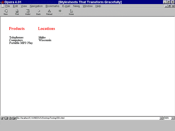
The first graphic illustrates that when style sheets are applied, the text appears in two columns. Elements of class "menu1" (Products) and "menu2" (Locations) appear as column headings. "Telephones, Computers, and Portable MP3 Players" are listed under Products and "Wisconsin" and "Idaho" are listed under Locations.
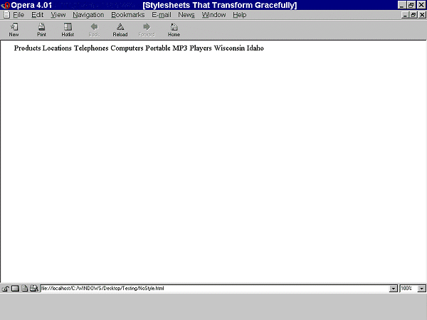
The second graphic illustrates that when style sheets are not applied and the appropriate structural elements have not been used, all of the text appears in one line in the source order, "Products Locations Telephones Computers Portable MP3 Players Wisconsin Idaho."
<head> <style type="text/css"> .menu1 { position: absolute; top: 3em; left: 0em; margin: 0px; font-family: sans-serif; font-size: 120%; color: red; background-color: white } .menu2 { position: absolute; top: 3em; left: 10em; margin: 0px; font-family: sans-serif; font-size: 120%; color: red; background-color: white } .item1 { position: absolute; top: 7em; left: 0em; margin: 0px } .item2 { position: absolute; top: 8em; left: 0em; margin: 0px } .item3 { position: absolute; top: 9em; left: 0em; margin: 0px } .item4 { position: absolute; top: 7em; left: 14em; margin: 0px } .item5 { position: absolute; top: 8em; left: 14em; margin: 0px } #box { position: absolute; top: 5em; left: 5em } </style> </head> <body> <div class="box"> <span class="menu1">Products</span> <span class="menu2">Locations</span> <span class="item1">Telephones</span> <span class="item2">Computers</span> <span class="item3">Portable MP3 Players</span> <span class="item5">Wisconsin</span> <span class="item4">Idaho</span> </div> </body>
The following example shows that the same visual appearance may be created in a browser that support style sheets as well as creating a more meaningful presentation when style sheets are not applied. Structural markup (definition lists) have been applied to the content. Note that the margins have been set to 0 since in HTML browsers, definition lists are displayed with a margin set on the DD element.
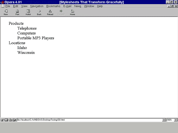
The graphic illustrates that when style sheets are applied to the appropriate markup it looks as it did before and when the style sheets are not applied, the text appears in a definition list rather than a string of words.
<head> <style type="text/css"> <!-- .item1 { left: 0em; margin: 0px; position: absolute; top: 7em; } .item2 { left: 0em; margin: 0px; position: absolute; top: 8em; } .item3 { left: 0em; margin: 0px; position: absolute; top: 9em; } .item4 { left: 14em; margin: 0px; position: absolute; top: 7em; } .item5 { left: 14em; margin: 0px; position: absolute; top: 8em; } .menu1 { background-color: #FFFFFF; color: #FF0000; font-family: sans-serif; font-size: 120%; left: 0em; margin: 0px; position: absolute; top: 3em; } .menu2 { background-color: #FFFFFF; color: #FF0000; font-family: sans-serif; font-size: 120%; left: 10em; margin: 0px; position: absolute; top: 3em; } #box { left: 5em; position: absolute; top: 5em; } --> </style> </head> <body> <div class="box"> <dl> <dt class="menu1">Products</dt> <dd class="item1">Telephones</dd> <dd class="item2">Computers</dd> <dd class="item3">Portable MP3 Players</dd> <dt class="menu2">Locations</dt> <dd class="item4">Idaho</dd> <dd class="item5">Wisconsin</dd> </dt> </dl> </div> </body>
Placeholder
Editorial Note: This section should discuss ECMAscript, and style sheets. It should reference a real world accessible example. Previously used examples were the MWC example or "the company." What about examples that use other host languages (not only HTML, but also SVG and MathML)? Demonstrate hide/show content, movement, and changes in color. To be developed by the script gurus and included in HTML techs?
Placeholder
Editorial Note: Placeholder for issue 199
Participants in the WCAG WG Techniques Task Force: Jenae Andershonis, Tim Boland, Ben Caldwell, Michael Cooper, Tom Croucher, Don Evans, Becky Gibson, David MacDonald, Matt May, Sailesh Panchang, Chris Ridpath, Lisa Seeman, Jim Thatcher
Feedback also received from Joe Clark, Charles McCathieNevile, Jens Meiert, Charles Munat, Gregory Rosmaita, Roberto Scano, and Gregg Vanderheiden.
Editorial Note: This list is likely incomplete.