Abstract
CSS (Cascading Style Sheets) describe the rendering of documents on
various media. When textual documents (e.g., HTML, WML) are laid out
on visual media (e.g., screen, paper), CSS represents the elements
of the document by rectangular boxes that are laid out one after the other or
nested inside each other in an ordering that is called a flow. This
module describes the characteristics of the flow and of the various kinds of
boxes.
The flow includes "floating" boxes, but tables [CSS3TBL] and "absolute" and "fixed" positioning [CSS3POS] are described in other
modules. Also, the rules for partitioning a flow into pages (for paged media)
is described elsewhere [CSS3PAGE],
as are the special boxes for ruby annotations [CSS3RUBY] and the multicolumn layouts [CSS3COL].
The box model builds on the inline text modules ([CSS3TEXT] and [CSS3LINE]), that describe how text is laid out on a
line, including treatment of superscripts, bidirectional ("bidi") and
vertical text.
The flow can be horizontal (typical for most languages), but in level 3 of
CSS, flows can also be vertical (typical for the Uighur script and often used
for ideographic scripts).
Status of this document
This is a draft of a module of CSS level 3. It should eventually become a
CSS3 Recommendation, most likely as a chapter in a larger set of modules.
All the properties and features described here that also exist in CSS
level 2 are intended to be backwards compatible, except in very rare cases
that are explicitly marked. There is a small number of new properties, mostly
to deal with vertical writing, and some properties from CSS2 have become
shorthand properties for more detailed new ones in CSS3.
This draft should not be cited except as "work in progress." It is a work
item of the CSS working group which is part of the Style
activity (see summary). It may be modified
or dropped altogether at any point in time. Implementations for the purpose
of experimenting with the specification are welcomed, as long as they are
clearly marked as experimental.
Feedback on this draft is invited. The preferred place for discussion of
this draft is the public, archived mailing
list www-style@w3.org (see instructions).
Patent disclosures relevant to CSS may be found on the Working Group's
public patent disclosure page.
To find the latest version of this working draft, please follow the
"Latest version" link above, or visit the list of W3C Technical Reports.
Table of contents
1. Dependencies on other
modules
This CSS3 module depends on the following other CSS3 modules:
- CSS3 module: text [CSS3TEXT] — the creation of inline boxes
- Math [?]
- CSS3 module: line box model [CSS3LINE] — the construction and dimensions of
line boxes, that are made out of inline-level boxes
- CSS3 module: syntax [CSS3SYN]
- CSS3 module: values & units [CSS3VAL]
- [others?]
It has non-normative (informative) references to the following other CSS3
modules:
- CSS3 module: tables - how the box model is modified inside tables.
- CSS3 module: positioning - how the box model is modified for absolutely
positioned elements.
- CSS3 module: ruby - how the box model is modified for ruby annotations.
- Generated text and lists
- Selectors [SELECT]
- CSS3 module: border [CSS3BORDER] — 'border-width' property
- CSS3 module: color [CSS3COLOR] — color and opacity
- [others?]
2. Notations used in this
specification
Each property is introduced by a table summarizing its usage. See [where? Introduction?] for an explanation. The values
'inherit' and 'initial' are
valid on all properties, but are omitted from the tables for brevity's sake.
They are explained in [where? Cascading module?]
Note that non-normative notes generally start with the word
"note" and are rendered like this paragraph.
3. Introduction
[To do: provide some examples with XHTML and "generic XML."]
The formatting model of CSS for visual media is based on a "flow" of
rectangular boxes, that are either juxtaposed or nested, according to certain
rules. There are several kinds of boxes (block boxes, inline boxes, table
boxes, floating
boxes,...). Properties such as 'margin' and 'float' can modify the position of a box relative to
other boxes to a certain extent.
Typically, an element in the source document corresponds to a box on the
display, but sometimes an element has more than one box (e.g., a list item
and its bullet, or a box that is broken over two lines), and sometimes there
is no box at all (if the rendering has been suppressed with the property
'display: none'). Conversely, every box either
belongs to a single element in the source, or it is an "anonymous" box that
belongs to no element but is created by the rules in the style sheet (but
then it indirectly belongs to the element that its parent box belongs to).
This relation is important for interactive presentations, including WYSIWYG
editors, because every event on a box, such as a mouse click, can
unambiguously be linked to a specific element in the document source.
CSS level 3 supports three orientations of flows. In this module we will refer
to them as horizontal, vertical-rl and vertical-lr. Horizontal flow has
horizontal text and the flow grows downwards. This is the typical flow for
most languages, e.g., English, Greek or Arabic. Vertical-rl flow has vertical
text and the flow grows to the left. This orientation is often used in
Japanese and Chinese. Vertical-lr flow also has vertical text, but
the flow grows to the right ("lr" = "left to right").
This is the typical orientation for the Uighur script, one of the scripts
used for Mongolian. Horizontal flow that grows upwards is not supported, and
neither are diagonal flows nor complex shapes (spirals, zigzag,...). Such
texts can usually be achieved with a combination of SVG [SVG10] and CSS. The orientation of a flow is set
(indirectly) with the 'writing-mode' shorthand property.
Boxes have a content with a
certain width and height (which can often be set explicitly with the 'width' and 'height' properties). Around
that can be an optional area called the padding (the thickness of which is controlled with the 'padding' property; '0' means
no padding). Around the padding can be a border (controlled by the 'border'
property). Finally, boxes also have a margin around the border (specified with the 'margin' property). The
outside edges of these areas are called content
edge, padding edge, border
edge and margin edge respectively. When we talk
about the width/height of a box, we mean the width/height of the content
area, unless otherwise specified.
Apart from the areas and edges defined above, the text uses a number of
other technical terms in the definitions of properties. Those terms are
always linked to the glossary at the end of this
document.
4. The 'display', 'display-model'
and 'display-role' properties
| Name:
| display-model
|
| Value:
| inline-inside | block-inside | table | ruby
|
| Initial:
| text
|
| Applies to:
| all elements
|
| Inherited:
| no
|
| Percentages:
| N/A
|
| Media:
| visual
|
| Computed value:
| specified value
|
| Name:
| display-role
|
| Value:
| none | block | inline | list-item | run-in | compact | table-row |
table-cell | table-row-group | table-header-group | table-footer-group |
table-column | table-column-group | table-caption | ruby-text | ruby-base |
ruby-base-group | ruby-text-group
|
| Initial:
| inline
|
| Applies to:
| all elements
|
| Inherited:
| no
|
| Percentages:
| N/A
|
| Media:
| visual
|
| Computed value:
| specified value
|
| Name:
| display
|
| Value:
| inline | block | inline-block | list-item | run-in | compact | | table |
inline-table | table-row-group | table-header-group | table-footer-group |
table-row | table-column-group | table-column | table-cell | table-caption |
ruby | ruby-base | ruby-text | ruby-base-group | ruby-text-group | none
|
| Initial:
| inline
|
| Applies to:
| all elements
|
| Inherited:
| no
|
| Percentages:
| N/A
|
| Media:
| visual ('none' applies to all)
|
| Computed value:
| see individual properties
|
The 'display-model' property determines the
algorithm with which an element lays out its children, 'display-role' specifies
what role an element has in its parent's algorithm, and 'display' is a shorthand for
the most common combinations of the two.
The equivalence between 'display', 'display-model' and 'display-role' is as
follows:
|
| inline-inside
| block-inside
| table
| ruby
|
|
|
| none**
| none
| none
| none
| none
|
|
|
| inline
| inline
| inline-block
| inline-table
| ruby
|
|
|
| block
| ***
| block
| table
| ??
|
|
|
| list-item
| ***
| list-item
| *
| ??
|
|
|
| run-in
| run-in
| *
| *
| *
|
|
|
| compact
| compact
| *
| *
| *
|
|
|
| table-cell
| ***
| table-cell
| *
| ??
|
|
|
| table-caption
| ***
| table-caption
| *
| ??
|
|
|
| table-row-group**
| table-row-group
|
| table-header-group**
| table-header-group
|
| table-footer-group**
| table-footer-group
|
| table-column**
| table-column
|
| table-column-group**
| table-column-group
|
| table-row**
| table-row
|
| ruby-base**
| ruby-base
|
| ruby-text**
| ruby-text
|
| ruby-base-group**
| ruby-base-group
|
| ruby-text-group**
| ruby-text-group
|
|
|
|
The values of 'display-model' have the following meaning.
(For ease of reading, we describe only horizontal flow.)
- table
- See the Tables module [CSS3TBL].
- ruby
- See the Ruby module [CSS3RUBY].
- inline-inside
- If this is not an inline-level
element, the effect is the same as for 'block-inside'. Otherwise the
element's inline-level children and text sequences that come before the first
block-level child are rendered as additional
inline boxes for the line boxes of the containing
block. Ditto for the text sequences and inline-level children after
the last block-level child. The other children and text sequences are
rendered as for 'block-inside'.
- block-inside
- Child elements are rendered as described for their 'display-role'.
Sequences of inline-level elements and anonymous inline
elements (ignoring elements with a display-role of 'none') are
rendered as one or more line
boxes. (How many line boxes depends on the line-breaking rules,
see the Text module [[!CSS3-text].)
Note that an element with 'display-model' of 'block-inside' may contain anonymous inline
elements. For example, the texts "Your" and "or your" are anonymous
inline elements of this paragraph:
<p>
Your <em>money</em> or your <em>life!</em>
</p>
The difference between 'inline-inside' and 'block-inside' is subtle. It is best illustrated with the
difference between inline elements and inline-block elements. Assume the
following document:
<p>The two words <span>two words</span> appear twice in this para.</p>
Further assume the following style sheet:
p    { display-model: block-inside }
span { display-role: inline; display-model: inline-inside }
The second line is equivalent to (and would usually be written as) 'span {display: inline}'. The rendering might look like
this:
If the 'display-model' of the span is changed to
'block-inside' (i.e., equivalent to 'span {display: inline-block}'), and we further set the
'width' to an appropriate value, e.g.:
p    { display-model: block-inside }
span { display-role: inline; display-model: block-inside;
       width: 2.5em}
then the rendering will become like this:
The values of 'display-role' have the following meaning.
(Where we talk about "next element," we ignore any intervening elements with
'display-role: none'.) The descriptions assume horizontal flow for easier
reading, but vertical flow is analogous.
- none
- The element is not rendered. The rendering is the same as if the element
had been removed from the document tree, except for possible effects on
counters (see [generated] or [paged]).
Note that :before and :after pseudo elements of this element
are also not rendered, see [generated].)
- run-in
- The effect depends on what comes after the element. If the next element
(in the depth-first, left to right tree traversal, so not necessarily a
sibling) has a 'display-model' of 'block-inside', the current element will be
rendered as if it had display-role 'inline' and was the first child of that
block element. Otherwise this element will be rendered as if it had
display-role 'block'. [Does this explain Ian's
tests?]
- compact
- The effect depends on the intrinsic
size of this element and on what comes after it. If the next element
has a 'display-role' of 'block', and the intrinsic width of the compact
element is less than or equal to the left margin of that block (resp. the
right margin, if the block's 'direction' is 'rtl'), then the compact element
is rendered in the left (right) margin of the block at its intrinsic size and
baseline aligned with the first line box of the block. [Do we need a different alignment depending on script?]
In all other cases the compact element is rendered as if its display-role was
'block'.
- list-item
- The element is rendered the same as if it had display-role 'block', but
in addition a marker is generated (see 'list-style').
- block
- The element is rendered as a rectangular block. See Collapsing margins for its position relative to
earlier boxes in the same flow. In paged media [ref] or inside another
element that has two or more columns, the box may be split into several
smaller boxes.
- inline
- The element is rendered inside a line box. It may be split into several
boxes because of line breaking and bidi processing (see the Text module).
- table-...
- See the Tables module [CSS3TBL].
The computed value of 'display-role' is influenced by the 'float' property (and, in case
the Positioning module [CSS3POS] is
in use, also by 'position'):
- If the computed value of 'float' is 'none', the computed value
of 'display-role'
is the same as the specified value.
- Otherwise, the computed value of 'display-role' is 'block', unless the specified value is 'none' or 'list-item', in which
case it is the same as the specified value.
[The idea here is that a list item can float and still keep
its bullet. Is this useful? Or should list items turn into normal blocks when
they float?]
(As usual, the above holds after processing 'inherit' and 'initial'.)
[Add an elaborate illustration showing line boxes, block elements, margins
between them, a marker, etc.]
Here is an HTML example with various types of boxes:
<style type="text/css">
  h3 { display: run-in; margin: 1em 0 }
  h3:after { content: ". " }
  p { display: block; margin: 1em 0 }
  img { display: block; margin: 2em }
  span { display: inline-block; padding: 0.6em;
    font-size: 70%; vertical-align: middle }
</style>
<h3>First heading</h3>
<h3>Second heading</h3>
<p>This paragraph has an image that is displayed as a block:
  <img src="w3c_home" ALT="W3C">
  and also an inline-block:
  <span>
    This element<br>
    has two lines
  </span>
A possible rendering is as follows:
The first h3 was not rendered inline, because it
was not followed by a block. The top and bottom margin that was set on h3 only apply when the element is rendered as a block.
4.1. Mixing flow layout with other
layouts
In document formats that combine different layout models (e.g., a document
type that combines SVG with HTML in a single document), it may be necessary
to introduce additional values for 'display-model', for the layout models that
are not defined by CSS3. It is up to the specification of such formats to
define appropriate keywords.
[Do we recommend a naming scheme?]
5. The 'padding' properties
| Name:
| padding
|
| Value:
| [ <length> | <percentage> ]{1,4}
|
| Initial:
| (see individual properties)
|
| Applies to:
| all elements
|
| Inherited:
| no
|
| Percentages:
| width* of containing block
|
| Media:
| visual
|
| Computed value:
| see individual properties
|
| Name:
| padding-top , padding-right, padding-bottom, padding-left
|
| Value:
| [ <length> | <percentage> ]
|
| Initial:
| 0
|
| Applies to:
| all elements
|
| Inherited:
| no
|
| Percentages:
| width* of containing block
|
| Media:
| visual
|
| Computed value:
| <length>
|
Sets the thickness of the padding around a box. The value may not be
negative. The color/pattern of the element's background extends into the
padding. See the 'background' property.
'Padding' is a
shorthand that sets the four other properties at the same time. If 'padding' has 4 values, they
are for top, right, bottom and left in that order. If left is omitted, it is
the same as right. If bottom is omitted it is the same as top, if right is
omitted it is the same as top.
When the padding is 0, we say that the padding is absent.
Note that percentages on 'padding-top' and 'padding-bottom' are relative to the width of the containing block, not the height (at
least in a horizontal flow; in a vertical flow they are relative to the
height).
6. The 'border-width'
properties
[Move this to the Border module? For the Box model, we just
need the fact that borders have a certain width, without saying how it is
specified.]
| Name:
| border-top-width, border-right-width, border-bottom-width, border-left-width
|
| Value:
| <length> | <percentage> | thin | medium
| thick
|
| Initial:
| medium
|
| Applies to:
| all elements
|
| Inherited:
| no
|
| Percentages:
| width* of containing block
|
| Media:
| visual
|
| Computed value:
| specified value
|
| Name:
| border-width
|
| Value:
| <border-width>{1,4}
|
| Initial:
| (see individual properties)
|
| Applies to:
| all elements
|
| Inherited:
| no
|
| Percentages:
| N/A
|
| Media:
| visual
|
| Computed value:
| see individual properties
|
[Border-width doesn't allow percentages in CSS2; should we
allow percentages (of the containing block's width) in CSS3?]
These properties set the thickness the border. For the style, color, etc. of the border, as
well as for the 'border' shorthand property,
see the Border module [CSS3BORDER].
The <border-width> can be '<length> | thin | medium
| thick'. The <length> may not be negative. The lengths
corresponding to 'thin', 'medium' and 'thick' are not specified, but the
values are constant throughout a document and thin <= medium <= thick.
A UA could, e.g., make the thickness depend on the 'medium' font size: one
choice might be 1, 3 & 5px when the 'medium' font size is 17px or less.
'Border-width'
is a shorthand that sets the four 'border-*-width' properties. If it has four
values, they set top, right, bottom and left in that order. If left is
missing, it is the same as right; if bottom is missing, it is the same as
top; if right is missing, it is the same as top.
Note that the initial width is 'medium', but the initial
style is 'none' and therefore the computed width is 0. See [CSS3BORDER].
When the computed width of the border is 0, we say that the border is
absent.
7. The 'margin' properties
| Name:
| margin-top , margin-right, margin-bottom, margin-left
|
| Value:
| <length> | <percentage> | auto
|
| Initial:
| 0
|
| Applies to:
| all elements
|
| Inherited:
| no
|
| Percentages:
| width* of containing block
|
| Media:
| visual
|
| Computed value:
| <length>
|
| Name:
| margin
|
| Value:
| [ <length> | <percentage> | auto ]{1,4}
|
| Initial:
| (see individual properties)
|
| Applies to:
| all elements
|
| Inherited:
| no
|
| Percentages:
| width* of containing block
|
| Media:
| visual
|
| Computed value:
| see individual properties
|
These properties set the thickness of the margin. The value may be negative, but the UA may
impose a lower bound.
'Margin' is a
shorthand to set top, right, bottom and left together. If four values are
given, they set top, right, bottom and left in that order. If left is
omitted, it is the same as right. If bottom is omitted, it is the same as
top. If right is omitted it is the same as top.
The meaning of 'auto' on 'margin-left' '-right',
'-top' and '-bottom' is as follows:
Margins must satisfy certain constraints, which means that the computed
value may be different from the specified value. See equation
(1) below.
Note that in a horizontal flow, percentages on
'margin-top' and
'margin-bottom'
are relative to the width of the containing
block, not the height (and in vertical flow, 'margin-left' and 'margin-right' are relative to the height,
not the width).
Note that 'margin-top' and 'margin-bottom' do not apply to
non-replaced, inline elements (in horizontal flow); see [CSS3LINE].
8. The 'width' and 'height'
properties
| Name:
| width, height
|
| Value:
| <length> | <percentage> | <number> | auto
|
| Initial:
| auto
|
| Applies to:
| all elements, except inline-level elements with 'display-model' of 'inline-inside'
|
| Inherited:
| no
|
| Percentages:
| width, resp. height of containing block, but see prose
|
| Media:
| visual
|
| Computed value:
| <length> or 'auto' (see text)
|
[Idea by David Baron: add keyword values 'intrinsic' and
'min-intrinsic' to force an element to have its intrinsic or minimum width.]
This property sets the width resp, height of the content area.
The value may not be negative and in addition the UA may impose a certain
lower bound.
Width and height are symmetric: the role of width and height are exactly
interchanged in horizontal and in vertical text. Below we explain only width;
height can be derived from that by interchanging "horizontal" and "vertical."
The computed value is normally a <length>, but in the
following cases it can also be 'auto':
In these two cases, a specified value of 'auto'
cannot be replaced by a <length> on the basis of information
that is available at the start of the element, i.e., based solely on the
width and height of preceding elements and ancestors.
8.1. The <length>
and <percentage> values
A <percentage> is relative to the computed value of the
width or height of the containing block, but if
that value is 'auto' the computed value for the
percentage is also 'auto'.
Note: when 'width' or 'height' is set to a value other than 'auto' on a replaced element, the size of content area is
set to that value and the content may be scaled or otherwise deformed to fit
the area; see "the 'auto' value" below. If both 'width' and 'height' are set, the scaling
may even be different in the two directions; see the 'fit' property.
8.2. The <number>
value
A <number> value sets the width or height to that many
times the intrinsic width resp. height of
the element. [It is only defined for replaced
elements?] The computed value is the result of
that multiplication (a <length>) [or is
it the number? does it matter?].
If a replaced element does not have an intrinsic size, the
computed value is UA dependent?
Here are some examples. Compare the following rules to set the size of an
image, assuming 'height'
is 'auto' in each case:
img {width: 50px} /* exactly 50px wide */
img {width: 50%} /* half as wide as the containing block */
img {width: 50em} /* 50� the current font size */
img {width: auto} /* the intrinsic size */
img {width: 1} /* ditto, i.e., the intrinsic size */
img {width: 0.5} /* half the intrinsic width */
Note that <number> does not exist in CSS
level 2.
8.3. The 'auto' value
We describe the meaning of 'auto' on elements
that have horizontal flow. Vertical flow
is analogous, but with the roles of 'width' and 'height' interchanged.
For replaced elements there are two cases. (1) Both width and height are
'auto': in this case both are set to the intrinsic size. (2) Only one of the two is 'auto': in this case 'auto' is
computed as the size that keeps the aspect ratio the same, i.e., width :
height = intrinsic-width : intrinsic-height. If the intrinsic width or height
is zero, the element is not scaled and the computed value of 'auto' is the intrinsic size. If the
element does not have an intrinsic size and no aspect ratio either, the
computed value is UA dependent.
For non-replaced elements, 'auto' on 'height' is always the intrinsic height that corresponds to the
element's computed width. The computed value of 'auto' on 'width' depends on the type of box:
- If the element is a flow root other
than the root element, width is the
intrinsic width.
- If the element is the root element
on paged media, the value is the computed width value of the 'size' property.
- Otherwise, if the element is a block-level
element and its containing block
also has a horizontal flow, equation (1) below determines the width.
- Otherwise, if the element is block-level and the containing block has a
different orientation, the computed value
is the intrinsic width.
- Otherwise (i.e., the element is positioned, is a table element or a
ruby), see the positioning [CSS3POS], table [CSS3TBL] or ruby [CSS3RUBY] modules.
Note that in CSS2, floating elements (case 1) were given a
certain small, UA-dependent width, but in CSS3 they are given their intrinsic
width (often referred to as "shrink-wrapped").
8.4. Constraints on width,
height and margins in block-level elements
For block-level elements with horizontal flow in a containing block also with horizontal flow, the
computed values of the 'width' and margins must satisfy this constraint:
(1)
(width of containing block) = margin-left + border-left + padding-left +
width + padding-right + border-right + margin-right
The following cases can occur:
- None of width, margin-left and margin-right are specified as 'auto' and
the values satisfy the constraint.
- None of width, margin-left or margin-right was specified as 'auto' and
the equation is not satisfied. There are two sub-cases: (1) if the 'direction' of the element
is 'ltr', the specified value of 'margin-right' is ignored
and 'margin-right' is set to the value that makes the equation true; (2) if
'direction' is 'rtl', it is 'margin-left' that is ignored and computed
from the equation.
- If exactly one of width, margin-left or margin-right is 'auto', its value
is computed from the equation.
- If width and one or both margins are 'auto', the margins that are 'auto'
are set to 0 and the equation is solved for width.
- If both margin-left and margin-right are 'auto', the equation is solved
under the extra constraint that margin-left = margin-right.
If, after solving the equation, width has a value that is smaller than
'min-width', the
computed value of 'width'
is set to the computed value of 'min-width' and the constraint is evaluated
again as if width had been specified with this value.
If, after solving the equation, width has a value that is larger than both
'max-width' and 'min-width', the computed
value of 'width' is set to
the larger of 'max-width' and 'min-width' and the constraint is evaluated
again as if 'width' had
been specified with this value.
Note: case 5 can be used to center block-level elements:
BLOCKQUOTE {
    width: 30em;
    margin-left: auto;
    margin-right: auto }
This is different from 'text-align: center', which centers each line
inside the block, but not the block inside its parent.
Block-level elements with a vertical flow inside a containing block with a
vertical flow are analogous, but with a constraint on height and
margin-top/margin-bottom:
(2)
(height of containing block) = margin-top + border-top + padding-top +
height + padding-bottom + border-bottom + margin-bottom
9. The 'box-width' and
'box-height' properties (or 'box-sizing'?)
| Name:
| box-width, box-height
|
| Value:
| <length> | <percentage> | auto
|
| Initial:
| auto
|
| Applies to:
| same as 'width' and 'height'
|
| Inherited:
| no
|
| Percentages:
| see 'width' and 'height'
|
| Media:
| visual
|
| Computed value:
| <length> or 'auto' (see text)
|
'Box-width' and
'box-height', if not
set to 'auto', override 'width' and 'height' respectively. They set the width/height
from border-edge to border-edge. I.e., 'box-width:
X' is equivalent to setting 'width: (X - padding-left - border-left -
padding-right - border-right)'
BUTTON { box-width: 10% }
The computed value is either the specified <length>, or
the result of adding the relevant padding to the computed value of 'width' or 'height', except that if the
computed value of 'width'
resp. 'height' is 'auto', then so is 'box-width' resp. 'box-height'.
The property 'box-sizing' was first proposed to provide an upgrade path
for certain browsers that interpreted 'width' the wrong way. 'Box-width' and 'box-height' are proposed as improved versions
of 'box-sizing'.
However, newer versions of those browsers have already fixed the bug and it
is not clear that these properties are really needed anymore. In cases where
they could be useful on their own, it might be both more powerful and easier
to use if there were a more generic solution, based on the idea of an extra
box around the element, that can have not just its own width, but also other
properties, such as borders, position, etc. Such an extra box can result from
a transformation (XSLT, behaviors or otherwise, even something expressed in
CSS itself), or from an extension of the box model, where every element has
an (or as many as needed) implicit parents, addressed by a pseudo-element
':container' or similar.
| Name:
| box-sizing
|
| Value:
| content-box | border-box
|
| Initial:
| content
|
| Applies to:
| elements to which 'width' or 'height' applies
|
| Inherited:
| no
|
| Percentages:
| N/A
|
| Media:
| visual
|
| Computed value:
| 'content-box' or 'border-box'
|
Description:
- content-box
- This is the behavior of width and height as specified by CSS2. The
specified width and height apply to the width and height respectively of the
content box of the element. The padding and border of the element are laid
out and drawn outside the specified width and height.
- border-box
- The specified width and height on this element determine the border box
of the element. That is, any padding or border specified on the element is
laid out and drawn inside this specified width and height. The content width
and height is computed by subtracting the border and padding widths of the
respective sides from the specified width and height. This is the behavior of
width and height as commonly implemented by legacy HTML user agents for
replaced elements and input elements.
Yet another possibility: Introducing simple expressions can
also solve the same problem, but in a different way: BUTTON { border:
2px solid; width: 10% - 2 * 2px }
And yet another idea is to create a pseudo-element
':container' that represents a second box that every box has around itself:
BUTTON:container {width: 10%}. Indeed, the ':container' could
have borders, padding and margins as well, and maybe even another
':container' around itself, but then cascading would suffer.
10. The 'min-width',
'max-width', 'min-height' and 'max-height' properties
| Name:
| max-width, max-height
|
| Value:
| <length> | <percentage> | auto |
inherit
|
| Initial:
| auto
|
| Applies to:
| same as 'width' and 'height'
|
| Inherited:
| no
|
| Percentages:
| see 'width' and 'height'
|
| Media:
| visual
|
| Computed value:
| <length> or 'auto' (see text)
|
Set the maximum width and height of an element's content area.
'Auto' means there is no maximum.
| Name:
| min-width, min-height
|
| Value:
| <length> | <percentage>
|
| Initial:
| 0
|
| Applies to:
| same as 'width' and 'height'
|
| Inherited:
| no
|
| Percentages:
| see 'width' and 'height'
|
| Media:
| visual
|
| Computed value:
| <length> or 'auto' (see text)
|
Set the minimum width and height of an element's content area.
'Min-width'
overrides 'max-width',
and both override 'width',
in case any of them conflict. Analogous for 'min-height', 'max-height' and 'height'
11. The 'fit' and 'fit-position'
properties
[This section should move to the "Generated & Replaced
Content" module.]
| Name:
| fit
|
| Value:
| fill | none | meet | slice
|
| Initial:
| fill
|
| Applies to:
| replaced elements
|
| Inherited:
| yes
|
| Percentages:
| N/A
|
| Media:
| visual
|
| Computed value:
| specified value
|
| Name:
| fit-position
|
| Value:
| [ [<percentage> | <length> ]{1,2} | [
[top | center | bottom] || [left | center | right] ] ] | auto
|
| Initial:
| 0% 0%
|
| Applies to:
| replaced elements
|
| Inherited:
| yes
|
| Percentages:
| refer to width and height of box itself
|
| Media:
| visual
|
| Computed value:
| specified value
|
The 'fit' property gives
a hint for how to scale a replaced element if neither its 'width' nor its 'height' property is 'auto'. Not all replaced objects can be scaled, but images
typically can.
- fill
- Scale the object's height and width independently so that the content
just touches all edges of the width � height box.
- none
- Do not scale the object.
- meet
- Make the object as large as possible with its width <= 'width' and height <= 'height', while preserving its
aspect ratio. Position the object as for 'hidden'.
- slice
- Make the object as small as possible with its width >= 'width' and height >= 'height', while preserving its
aspect ratio. Position the object as for 'hidden'.
See 'overflow' for how to render the parts that stick out of the box.
See the 'overflow'
property for what happens to parts of the object that stick out of the box.
The keywords are intended to convey the visual effect in the
case that 'overflow'
is 'hidden', which is expected to be the most common
case.
The 'fit-position' determines the alignment of
the object inside the box. The values have the same meaning as the values on
'background-position', with the
addition of the value 'auto', specifically:
-
- <percentage> <percentage>
- With a value pair of '0% 0%', the upper left corner of the image is
aligned with the upper left corner of the box's padding edge. A value pair of
'100% 100%' places the lower right corner of the image in the lower right
corner of padding area. With a value pair of '14% 84%', the point 14% across
and 84% down the image is to be placed at the point 14% across and 84% down
the padding area.
- <length> <length>
- With a value pair of '2cm 2cm', the upper left corner of the image is
placed 2cm to the right and 2cm below the upper left corner of the padding
area.
- 'top left', 'left top'
- Same as '0% 0%'.
- 'top', 'top center', 'center top'
- Same as '50% 0%'.
- 'right top', 'top right'
- Same as '100% 0%'.
- 'left', 'left center', 'center left'
- Same as '0% 50%'.
- 'center', 'center center'
- Same as '50% 50%'.
- 'right', 'right center', 'center right'
- Same as '100% 50%'.
- 'bottom left', 'left bottom'
- Same as '0% 100%'.
- 'bottom', 'bottom center', 'center bottom'
- Same as '50% 100%'.
- 'bottom right', 'right bottom'
- Same as '100% 100%'.
- 'auto'
- Put one of the object's corners in the corresponding corner of the box,
depending on the element's 'writing-mode':
| writing-mode
| corner
|
| lr-tb
| top left
|
| rl-tb
| top right
|
| tb-rl
| top right
|
| tb-lr
| top left
|
| bt-rl
| bottom right
|
| bt-lr
| bottom left
|
The computed value is the same as the specified value, i.e., the keywords
are not replaced by percentages and the percentages are not replaced by
something else. (This is an exception to the general rule that percentages
are computed to some other value before being inherited.)
Note: these properties do not exist in CSS2.
Note that areas of the box not covered by the replaced
element will show the element's 'background'.
Note: the 'fit' property has the same meaning as the fit attribute in [SMIL10], except that the value "scroll" is not
available, because the 'overflow' property can be used instead.
12. The 'crop' property
[This section should move to the "Generated & Replaced
Content" module.]
| Name:
| crop
|
| Value:
| <shape> | none
|
| Initial:
| auto
|
| Applies to:
| replaced elements
|
| Inherited:
| no
|
| Percentages:
| relative to intrinsic size
|
| Media:
| visual
|
| Computed value:
| specified value
|
Do we want this? Or should people just copy the image and
cut it before sending it to a browser?
Call 'none' 'auto' instead? That's what it's called in
'clip'.
This property allows a replaced element to be just a rectangular area of
an object, instead of the whole object.
The 'crop' property adds
a step when determining the intrinsic
width and height of an element. With 'crop' the notion of computed intrinsic
width and height are introduced. When the layout algorithms reference the
"intrinsic width" (and/or height), they are referring to the computed
intrinsic width and height.
The computed intrinsic width and height of an element are the result of
applying the crop to the actual intrinsic width and height of the element.
- 'auto'
- The element's computed intrinsic width and height are the same as its
actual intrinsic width and height.
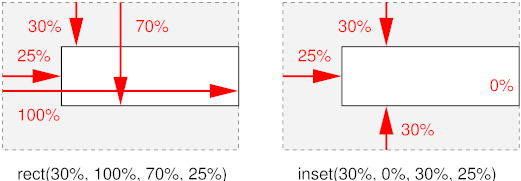
- rect(top, right, bottom,
left)
- Each of the four arguments can be a <length> or a
<percentage>. All percentage values are computed relative to
the intrinsic dimensions of the element. Values are offsets relative to the
top left of the element. The computed intrinsic width and height of the
element are determined by subtracting the left from the right for the width,
and similarly top from bottom for the height. However, if this computation
results in a negative value, it is considered to be zero.
- inset-rect(top, right, bottom,
left)
- Like rect(), except that the values are offsets relative to the
respective edges of the element.
If the element does not have an intrinsic width, the UA may in some cases
be able to infer the intrinsic width that the style sheet writer assumed.
First the UA must find the computed 'width' and computed 'height' and then the intrinsic width can be found
as follows (the intrinsic height is analogous):
- If 'crop' is 'auto', the assumed intrinsic width is the same as the
computed value of 'width'
- If 'crop' is 'rect(t, r, b, l)' and r is a percentage, the intrinsic
width can be solved from the equation: r = computed 'width' + l
- If 'crop' is 'rect(t, r, b, l)' and r is not a percentage, the
intrinsic width cannot be computed and the result is UA
dependent.
- If 'crop' is 'inset-rect(t, r, b, l)', then the intrinsic width can
always be solved from the equation intrinsic width = l + computed 'width' + r
Note: 'crop' does not impact the scaling, stretching,
tiling or positioning of the replaced element. 'crop' simply allows the
author to essentially use a part of a replaced element in place of the
element itself for all intents and purposes. For control over scaling,
stretching and positioning, please see the 'fit', 'fit-position' and 'position' properties.
The following example displays both the whole sheep and its head:
<p>Here is Woolly, the CSS sheep:
<img src="woolly" alt="Woolly">
<p>And here he is as a thumbnail:
<img src="woolly" alt="Woolly thumbnail"
  style="crop: rect(0px, 115px, 85px, 30px)">
The result might look like this:
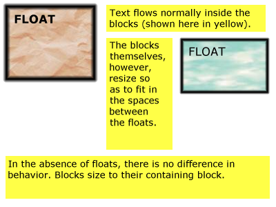
13. Floating boxes
A float is a box that creates a new flow, while the parent flow wraps
around it. The 'float'
property determines where the box is positioned relative to the parent flow:
left or right (for horizontal flows), top or bottom (for vertical flows)
Example: the following rule floats all IMG boxes with
class="icon" to the left (and sets the left margin to '0'):
IMG.icon {
  float: left;
  margin-left: 0;
}
Consider the following HTML source and style sheet:
<!DOCTYPE HTML PUBLIC "-//W3C//DTD HTML 4.0//EN">
<HTML>
  <HEAD>
    <TITLE>Float example</TITLE>
    <STYLE type="text/css">
      IMG { float: left }
      BODY, P, IMG { margin: 2em }
    </STYLE>
  </HEAD>
  <BODY>
    <P><IMG src=img.gif alt="This image will illustrate floats">
       Some sample text that has no other...
  </BODY>
</HTML>
The IMG box is floated to the left. The content that follows is formatted
to the right of the float, starting on the same line as the float. The line
boxes to the right of the float are shortened due to the float's presence,
but resume their "normal" width (that of the containing block established by
the P element) after the float. This document might be formatted as:
Formatting would have been exactly the same if the body of the document
had been:
<BODY>
  <P>Some sample text
  <IMG src=image.gif alt="This image will illustrate floats">
           that has no other...
</BODY>
because the content to the left of the float is displaced by the float and
re-flowed down its right side.
13.1. The 'float' property
| Name:
| float
|
| Value:
| left | right | top | bottom | inside | outside | start | end | none
|
| Initial:
| none
|
| Applies to:
| all but positioned elements, generated content, and the root element
|
| Inherited:
| no
|
| Percentages:
| N/A
|
| Media:
| visual
|
| Computed value:
| specified value
|
The values have the following meanings:
- left, top
- If the containing block has horizontal flow: the element generates a box that
is floated to the left. Content flows on the right side of the box, starting
at the top (subject to the 'clear' property). If the containing block has vertical flow the box is floated to the top and
content flows on the bottom side of the box (subject to the 'clear' property).
Note: for readability it is recommended to use 'left' in style sheets for horizontal flow and 'top' for vertical flow.
It would be more intuitive (less surprising) if 'left' only
worked in horizontal flow and 'top' only in vertical flow.
- right, bottom
- Analogous to 'left', but content flows on the
left side, respectively the top side of the box.
- inside
- Same effect as 'left' or 'right' depending on whether the float will appears on a
right, resp. left page in paged media. Same as 'left' on non-paged media. (See the Paged media module
[ref] for information on left/right pages.)
- outside
- Same effect as 'right' or 'left' depending on whether the float will appears on a
right, resp. left page in paged media. Same as 'right' on non-paged media.
- start
- Same effect as either 'left', 'right', 'top' or 'bottom, depending on the
'direction' of the
containing block, as follows:
| 'direction'
| effect
|
| ltr
| left/top
|
| rtl
| right/bottom
|
- end
- Same effect as either 'left', 'right', 'top' or 'bottom', depending on
the 'direction' of the
containing block, as follows:
| 'direction'
| effect
|
| ltr
| right/bottom
|
| rtl
| left/top
|
- none
- The box is not floated.
Note: The keywords 'start' and 'end' are intended to be
mnemonic for floating towards the "start of the line" and "end of the line"
respectively. They are most useful for floats that must float to the left or
right depending on the script and in those cases avoid having to use language
selectors.
Note that the computed value of 'display-role' is influenced by 'float'.
A floating box causes the content of elements in its parent flow to wrap
around the rectangular outline of the floating box only, not around any
descendant box of the floating box that may stick out of the floating box.
(Note that whether such a descendant overlaps other content or is clipped
depends on the 'overflow' property.)
["Floating" to top/bottom of a page is a different
mechanism; text does not wrap around such elements. See "paged media"
module.]
Here are the
precise rules that govern the behavior of floats (rules are for horizontal flow, vertical flow is analogous):
- Principle of horizontal containment: The left margin edge of a left-floating box may not be to the
left of the left edge of its containing
block. An analogous rule holds for right-floating boxes. (Note that
margins can be negative, so the content might still be outside the
containing block.)
- Principle of vertical containment: A floating box's top
margin edge may not be higher than the top of its containing block.
- Principle of avoidance of overflow: The right margin
edge of a left floating box may not be to the right of the right edge of its
containing block, unless its left margin edge coincides with the containing
block's left edge. Analogous for a right-floating box. (This makes floating
boxes "wrap" when their collective width would be wider than the containing
block. The only case where a float can cause overflow is when the float
itself is wider than the containing block.)
- Principle of preservation of ordering: The top margin
edge of a floating box may not be higher than the top margin edge of any
float or block-level box in the current flow that is generated by an earlier
element in the document.
- Principle of progressive rendering: The top margin edge
of a floating box may not be higher than the top of any line box that
contains a box generated by an element earlier in the source. (This ensures
that lines above the current one, that may already have been rendered, do not
have to be redrawn.)
- Principle of excluded quarter planes: If there is an
earlier left-floating box in the current flow, the left margin-edge of the
current box must be to the right of that box's right margin-edge or the
current box's top margin edge must be below its bottom margin edge. If there
is an earlier right floating box, the right margin-edge of the current box
must be to the left of the earlier box's left margin edge, or the current
box's top margin edge must be below its bottom margin edge. (Note: another
name for this principle might be "avoiding overlap", but it is stronger than
that.)
- Principle of tight packing: A floating box must be
placed as high as possible without violating principles 1-6.
- Principle of meaningful names: A left-floating box must
be put as far to the left as possible, a right-floating box as far to the
right as possible, without violating principles 1-7.
Note: in CSS2, the rules were the same, but phrased and
numbered differently: 2 + 3 are now 6, 4 is now 2, 5 is now 4, 6 is now 5, 7
is now 3, 8 is now 7, 9 is now 8.
In a multicolumn box [link], [...]
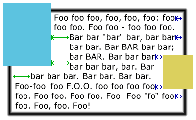
Here is an illustration of the rules. Assume this source fragment:
<STYLE TYPE="text/css">
  P { width: 24em }
  #L1 { float: left; width: 8em; height: 3em }
  #L2 { float: left; width: 4em; height: 6em }
  #R1 { float: right; width: 6em; height: 9em }
  #L3 { float: left; width: 7em; height: 9em }
  #R2 { float: right; width: 3em; height: 5em }
</STYLE>
<P>
  <IMG ID=L1 SRC="L1.png" ALT="L1">
  <IMG ID=L2 SRC="L2.png" ALT="L2">
  <IMG ID=R1 SRC="R1.png" ALT="R1">
  <IMG ID=L3 SRC="L3.png" ALT="L3">
  <IMG ID=R2 SRC="R2.png" ALT="R2">
  blah bla blah bla blah...
</P>
The figure below shows the result. Note that L3 could not be to the right
of L1 and L2, so it had to be below both of them. R2 could not be placed
higher than L3, because it came after L3.
A float can overlap boxes in its parent flow
(e.g., when a normal flow box next to a float has negative margins or a
negative 'text-indent'). When an inline-level box overlaps with a float, it
should be rendered in front of the float. When a block-level box overlaps, it must be rendered
behind the float. Note that any textual content of that block-level box
should still be drawn in front of the float, because it is considered part of
(possibly anonymous) inline-level boxes. On the other
hand, the content of a block-level replaced
element is drawn behind it.
For performance reasons, however, a UA may choose to draw inline-level
boxes behind the float as well.
Note that this is a change from CSS2 and CSS1, where a UA was
not allowed to draw those inline-level boxes behind the float.
Here is an illustration, showing what happens when a float overlaps
borders of elements in the normal flow.
The problem seems to be that we expect the background of
blocks with a negative top margin to obscure the text of earlier blocks, but
we don't expect a "normal" block (with a nonnegative margin) to obscure any
text that might overflow from the previous block. Maybe the negative margin
has an effect on the z-index. Or maybe we should say that blocks with
negative margins do not obscure earlier text, unless specified to do
so by means of z-index.
Note that the rule about blocks behind floats and floats behind text may
lead to a visually inconsistent situation, as in the following figure.
An old idea (at least from
1996) is to add a value 'contour' to 'float', so that the float is no longer rectangular,
but takes on its "intrinsic" shape. This allows to wrap text around it much
tighter. The syntax of 'float' becomes:
Value: [ <float-side> || <wrap-type> ]
where <float-side> is: left | right | top | bottom | inside |
outside | start | end | none; and <wrap-type> is box | contour. The
default <float-side> is 'none' and the default <wrap-type> is
'box'.
How to find the shape of an object depends on the type of object. For a
GIF or PNG image, the contour is the boundary between fully transparent parts
of the image and the rest. For other objects, it is possible to define a
'shape' property to explicitly define the desired contour, but that may be
taking it too far.
For a left-floating object, only the right and bottom edges of the contour
are used, and the contour is "simplified" so that there are no holes and text
is never interrupted by part of the float.
13.2. The clear property
| Name:
| clear
|
| Value:
| none | left | right | top | bottom | inside | outside | start | end |
both
|
| Initial:
| none
|
| Applies to:
| block-level elements
|
| Inherited:
| no
|
| Percentages:
| N/A
|
| Media:
| visual
|
| Computed value:
| specified value
|
This property indicates which sides of an element's box(es) may
not be adjacent to an earlier floating box. (It may be that the
element itself has floating descendants; the 'clear' property has no effect on those.)
This property only applies to block-level elements (including
floats). For compact and run-in boxes, this
property applies to the final block box to which the compact or run-in box
belongs.
Values have the following meanings when applied to non-floating block
boxes:
- left, top
- If the element is in a horizontal
flow, the top margin of the generated box is increased enough that
the top border edge is below the bottom margin edge of any left-floating
boxes that resulted from elements earlier in the source document. If the
containing block has a vertical flow, the
right margin is increased so that the right border edge is to the left of the
left margin edge of any earlier top-floating boxes. In vertical-lr
flow, the left margin is increased until the left border edge is to the
right of the right margin edge of any earlier top floats.
- right, bottom
- Analogous, but the margin is increased to stay clear of any right/bottom
floating boxes, rather than left/top ones.
- inside
- Same effect as 'left' or 'right' depending on whether the element's boxes will
appears on a right, resp. left page in paged media. Same as 'left' on non-paged media. (See the Paged media module
[ref] for information on left/right pages.)
- outside
- Same effect as 'right' or 'left' depending on whether the element's boxes will
appears on a right, resp. left page in paged media. Same as 'right' on non-paged media.
- start
- Same effect as either 'left', 'right', 'top' or 'bottom, depending on the
'direction' of the
element, as follows:
| 'direction'
| effect
|
| ltr
| left/top
|
| rtl
| right/bottom
|
- end
- Same effect as either 'left', 'right', 'top' or 'bottom', depending on
the 'direction' of the
element, as follows:
| 'direction'
| effect
|
| ltr
| right/bottom
|
| rtl
| left/top
|
- both
- The generated box is moved clear of both left/top and right/bottom
floating boxes of earlier elements in the source document.
- none
- No constraint on the box's position with respect to floats.
[Be more precise about the order in which margins are
established: collapse first, then add effect of clear; collapse positive
margins only, then add 'clear, then add negative margins; collapse earlier
elements only, then add clear, then collapse following elements... Need to
dig out an old thread on www-style.]
When the property is set on floating elements, it results in a
modification of the rules for positioning the
float. An extra constraint is added:
- The top margin edge of the float must be
below the bottom margin edge of all earlier left-floating boxes (in the case
of 'clear: left'), or all earlier right-floating boxes (in the case of
'clear: right'), or both ('clear: both').
[define vertical case]
Example. Assuming a rule such as this:
P { clear: left }
formatting might look like this:
13.3. The clear-after
property
| Name:
| clear-after
|
| Value:
| none | left | right | top | bottom | inside | outside | start | end |
both
|
| Initial:
| none
|
| Applies to:
| block-level elements
|
| Inherited:
| no
|
| Percentages:
| N/A
|
| Media:
| visual
|
| Computed value:
| specified value
|
It is sometimes useful to make sure that the bottom border of a
block-level element goes below floating elements. The 'clear-after' property
increases the bottom padding as needed. The padding-bottom will be calculated
from the bottom margin-edge of the lowest float that originates in the same
flow and comes before the end of the element, i.e., including floating
descendants of the element itself.
Which padding is increased depends in fact on the orientation: in
horizontal orientation ('writing-mode' is 'lr-tb' or 'rl-tb'), the bottom
padding is increased, in vertical orientation ('tb-rl' or 'bt-rl') the left
padding and in vertical-lr ('tb-lr' or 'bt-lr') the right padding.
Note: Since a floating element is a flow root,
setting 'clear-after' on such an element only takes
into account any descendant floats in the flow established by the element
itself.
The value of the property determines which kinds of floats are taken into
account:
- none
- No effect.
- left, top
- Only left and top floating elements are considered.
- right, bottom
- Only right and bottom floating elements are considered,
- inside
- If the bottom of the element occurs on a right-hand page, only left
floating elements are considered. On a left-hand page, only right floating
elements. On media that are not paged, 'inside' means the same as 'left'.
- outside
- Analogous
- start
- If the 'direction'
of the element is 'ltr', same as 'left', otherwise same as 'right'.
- end
- If the 'direction'
of the element is 'ltr', same as 'right', otherwise same as 'left'.
- both
- Both left/top and right/bottom floats are considered.
Instead of a new property 'clear-after', another idea is to add one or
more values to 'clear'. If 'clear' is turned into a set, instead of a single
value, one could add the value'after' (clears both left and right floats) or
several values like 'left-after' and 'right-after':
| Name:
| clear
|
| Value:
| none | [ left | right | top | bottom | inside | outside | start | end |
both | after]+
|
| Initial:
| none
|
| Applies to:
| block-level elements
|
| Inherited:
| no
|
| Percentages:
| N/A
|
| Media:
| visual
|
| Computed value:
| specified value
|
The following rule would ensure that a SECTION starts below all preceding
floats and doesn't end until after all floats it contains:
section {clear: left right after}
13.4. The
'float-displace' property
| Name:
| float-displace
|
| Value:
| line | indent | block | block-within-page
|
| Initial:
| line
|
| Applies to:
| all block-level elements
|
| Inherited:
| yes
|
| Percentages:
| N/A
|
| Media:
| visual
|
| Computed value:
| Same as specified value
|
| Computed value:
| specified value
|
This property determines the line wrapping policy in the presence of
floats. Values have the following meanings:
- line
- Line boxes should be shortened and moved so as to avoid floats. The
margin, border, padding and background of the element are not affected by
floats. (This is the behavior as described in CSS2.) [add
description or image?]
- indent
- The distance between the margin edge of the floats and the start of the
line box is set to the distance between the active reference indent edge (see the 'indent-edge-reset'
property) and the content edge of the block box. This ensures that relative
indents are preserved in the presence of floats.
- block
-
The containing block's width as used by the horizontal formatting model is
reduced by the width of the floats intruding upon its content area (not
taking into account floating descendants or floating elements that appear
later in the document tree). The block is then flowed in this reduced
containing block width.
If the effective containing block width is, by the algorithm given above,
reduced to a value smaller than the sum of the margin-left,
border-width-left, padding-left, width, padding-right, border-width-right,
and margin-right values (treating any 'auto' values as zero) then the
margin-top of the block is increased until the effective containing block
width is no longer so constrained or until all floats have been cleared,
whichever occurs first.
- block-within-page
- As for the 'block' value, but the determination of intrusions that adjust
the width of the block is done separately on each page on which the block
appears. Thus, the block may be narrowed on the first page due to one or more
intrusions, but may expand (or contract) its width on subsequent pages with
different intrusions. The computed value of the 'width' property for this
case is...?
A set of rules for HTML might look like this:
OL, UL, LI {float-displace: indent}
TABLE {float-displace: block}
Lines in a list will get extra indentation when they are next to a float,
so you can still see that they are part of the list, and tables will be made
narrower as a whole.
14. The
'indent-edge-reset' property
| Name:
| indent-edge-reset
|
| Value:
| none | margin-edge | border-edge | padding-edge | content-edge | inherit
|
| Initial:
| none
|
| Applies to:
| all elements with a block-level inner formatting context.
|
| Inherited:
| no
|
| Percentages:
| n/a
|
| Media:
| visual
|
| Computed value:
| specified value
|
This property determines which edge to use as the reference indent edge when calculating the amount of
indent to preserve when the value of 'float-displace' is set to 'indent'.
- none
- This block does not introduce a new reference edge.
- margin-edge
- border-edge
- padding-edge
- content-edge
- A new reference indent edge is introduced by this block. Which edge is
used as the reference indent edge is determined by which value is given.
The reference indent edge is the nearest ancestor in the same formatting
context which has a non-none value for 'indent-edge-reset'. If no ancestor in
the formatting context has a value specified for this property, then the
content edge of the root of the formatting context is used.
15. Collapsing margins
The top and bottom margins of a block-level
box define the minimum distance of the box to block-level boxes
above and below it. The actual distance between boxes is the maximum of the
margins involved (unless there are any negative margins, see below). We say
that such margins collapse.
For example, in this HTML fragment
<UL STYLE="margin-bottom: 1em">
  <LI STYLE="margin-bottom: 0.5em">...</LI>
</UL>
<P STYLE="margin-top: 0.6em">
  ...
</P>
and assuming there are no paddings and borders, the bottom of the last
line box of the <LI> will be 1em above the top of the first line box of
the <P>, since 1em is the maximum of the three margins.
The principle is that adjacent margins of block-level boxes in the same
flow collapse. The precise rules are below.
When the margins of two or more boxes collapse, it means that the computed
value of all margins involved is the maximum of the nonnegative specified
margins plus the minimum of the negative specified margins. E.g., if there are four margins that collapse and their
values are 1.5cm, 2cm, -1cm and -1.2cm, the computed value of all four of
them will be max(1.5cm, 2cm) - max(1cm, 1.2cm) = 2cm - 1.2cm = 0.8cm.
Note that this means that "collapsing" is a commutative
relation (if margin A collapses with margin B, then margin B collapses with
margin A) as well as a transitive relation (if A collapses with B and B
collapses with C, then A collapses with C).
For the purposes of these rules, elements with 'display:
none' are treated as if they did not exist at all.
Margins of floating
boxes never collapse, neither with normal flow boxes nor with other
floating boxes.
Note that margins of absolutely positioned boxes also do not
collapse with any other margins. See [CSS3POS].
[CSS2 said that margins of relatively positioned boxes also
do not collapse, but that looks like a mistake.]
In a horizontal flow, the following
margins collapse:
- The bottom margin of a box and the bottom margin of its last child,
provided both are block-level and the former has no bottom padding, no bottom
border and horizontal flow.
- The top margin of a box and the top margin of its first child, provided
both are block-level and the former has no top padding, no top border and
horizontal flow.
- The bottom margin of a box and the top margin of its next sibling,
provided both are block-level.
- The top and bottom margin of a block-level
box, if the the box has a height of 'auto' or 0, no top or bottom padding, no top or bottom
border and no content (i.e., no line boxes and no replaced content).
Note that "no content" is not the same as "empty element" in XML. For
example, an empty element may have content because of generated text [CSS3GENCON], and a nonempty element
may have no content, when none of its descendants has any content. Example:
<style type="text/css">
  div.test:before {content: "Test"}
  em {display: none}
</style>

<div class="test"/>

<div><em>Nothing here...</em></div>
The first div is an empty element, but does have content (and
thus its top and bottom margins are not adjacent and do not collapse). The
second div is not an empty element, but nevertheless it has no
content, and its top and bottom margins are therefore adjacent and will
collapse.
A vertical-rl flow is analogous. To be
precise, if the orientation of a flow is
vertical-rl:
- The left margin of a box collapses with the left margin of its last
child, provided both are block level and the former has no left padding, no
left border and vertical orientation.
- The right margin of a box collapses with the right margin of its first
child, provided both are block level and the former has no right padding, no
right border and vertical orientation.
- The left margin of a box and the right margin of its next sibling,
provided both are block-level.
- The left and right margin of a block-level box, if it has a width of
'auto' or 0, no left or right padding, no left or
right border and no content (i.e., no line boxes and no replaced content).
Analogously, if the orientation is vertical-lr, the following margins collapse:
- The right margin of a box and the right margin of its last child,
provided both are block level and the former has no right padding, no right
border and vertical-lr orientation.
- The left margin of a box and the left margin of its first child, provided
both are block level and the former has no left padding, no left border and
vertical-lr orientation.
- The right margin of a box and the left margin of its next sibling,
provided both are block-level.
- The left and right margin of a block-level box, if it has a width of
'auto' or 0, no left or right padding, no left or
right border and no content (i.e., no line boxes and no replaced content).
Here are some examples. Assume these style rules:
H1 { margin-bottom: 2.2em }
H2.subtitle { margin-top: -1em }
P { margin-top: 0.9em; margin-bottom: 0 }
UL { margin-top: 1.6em }
LI { margin-top: 0.6em }
BLOCKQUOTE.break { margin-top: 0.8em; border: thin solid }
In the following example, the bottom of the h1 and the top of the h2
collapse to a margin of 2.2em - 1em = 1.2em:
<H1>The flight of the bumblebee</H1>
<H2 CLASS=subtitle>Accompanied by winds and woods</H2>
In the following example the bottom of the first p, the top of the UL, the
top of the LI and the top of the second P collapse to a margin of 1.6em =
max(0, 1.6em, 0.6em, 0.9em):
<P>...in the following list:</P>
<UL>
  <LI><P>one item must be the first</P></LI>
</UL>
In the following example, the margins between the H1 and the BLOCKQUOTE
collapse (2.2em), but the border of the BLOCKQUOTE keeps the P from
collapsing with either of them. The P starts 0.9em below that border:
<H1>ceasar's words</H1>
<BLOCKQUOTE CLASS=break>
  <P>gallia est omnis divisa in partes tres...</P>
</BLOCKQUOTE>
Note that in paged media [CSS3PAGE] margins that occur at the top or bottom of a
page disappear, in a mechanism similar to (but not the same as) collapsing.
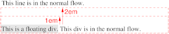
Note that the combination of collapsing margins with floats can interfere
with progressive rendering to a certain extent. For example, in the following
situation, the position of the floating div won't be known until the position
of the div after the float has been calculated, because the two margins (1em
and 2em) have to collapse:
  ...
  This line is in the normal flow.
</div>
<div style="display: block; margin-top: 1em">
  <div style="float: left; background: silver">
    This is a floating div.
  </div>
  <div style="display: block; margin-top: 2em">
    This div is in the normal flow.
  </div>
</div>
16. The 'overflow' property
| Name:
| overflow
|
| Value:
| visible | hidden | scroll | auto
|
| Initial:
| visible
|
| Applies to:
| block-level and replaced elements
|
| Inherited:
| no
|
| Percentages:
| N/A
|
| Media:
| visual
|
| Computed value:
| specified value
|
'Overflow' is a
shorthand for 'overflow-x' and 'overflow-y'. It sets both to the same value.
This property specifies whether the content of a block-level or replaced
element is clipped when it overflows the element's box (which is acting as a
containing block for the content). Values have the following meanings:
- visible
- This value indicates that content is not clipped, i.e., it may be
rendered outside the content box.
- hidden
- This value indicates that the content is clipped and that no scrolling
mechanism (see below) should be provided
to view the content outside the clipping region; users will not have access
to clipped content (though access through some alternative mechanism, such as
the DOM may still be possible). The size and shape of the clipping region is
specified by the 'overflow-clip' property.
- scroll
- This value indicates that the content is clipped to the content box and
that if the user agent uses a scrolling mechanism that is visible on the
screen, that mechanism should be displayed for a box whether or not any of
its content is clipped. Compared to 'auto', this avoids any problem with
scrollbars appearing and disappearing in a dynamic environment. When this
value is specified and the target medium is 'print' or 'projection',
overflowing content should be printed.
- auto
- The behavior of the 'auto' value is UA-dependent, but should cause a
scrolling mechanism to be provided for overflowing boxes.
Note that 'text-overflow' (see [CSS3TEXT]) can be used to give a visual indication
where text has been clipped.
Note that 'scroll' and 'auto' make the element into a flow root.
The scrolling mechanism depends on the UA. The
most common mechanism is a scrollbar, but panners, hand cursors, page
flickers, etc. are also possible. The mechanism that is recommended for
mobile devices is the marquee effect.
[Should there be a way for the author to select a particular
scrolling mechanism (even if not all UAs support all methods)?]
A UA that uses marquee should use the marquee
properties to control the way the content moves. If 'overflow' is 'auto', the content moves only if it overflows; with 'scroll' it moves also if it does not overflow.
Even if 'overflow' is set to 'visible', content may be clipped to a UA's document
window by the native operating environment.
Example(s):
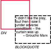
Consider the following example of a block quotation (BLOCKQUOTE) that is
too big for its containing block (established by a DIV). Here is the source
document:
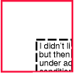
<DIV>
<BLOCKQUOTE>
<P>I didn't like the play, but then I saw
it under adverse conditions - the curtain was up.
<DIV class="attributed-to">- Groucho Marx</DIV>
</BLOCKQUOTE>
</DIV>
Here is the style sheet controlling the sizes and style of the generated
boxes:
DIV { width : 100px; height: 100px;
      border: thin solid red;
      }

BLOCKQUOTE   { width : 125px; height : 100px;
      margin-top: 50px; margin-left: 50px;
      border: thin dashed black
      }

DIV.attributed-to { text-align : right; }
The initial value of 'overflow' is 'visible', so the BLOCKQUOTE would
be formatted without clipping, something like this:
Setting 'overflow'
to 'hidden' for the DIV element, on the other hand, causes the BLOCKQUOTE to
be clipped by the containing block:
A value of 'scroll' would tell UA's that support a visible scrolling
mechanism to display one so that users could access the clipped content.
Implementation note: it is recommended that scrolling causes the content
and the padding to scroll, but the border and the margin to remain fixed.
Also, any visible scrolling mechanism (scrollbars, panner, etc.) should be
placed just inside the border.
The combination of collapsing margins, 'max-height' and 'overflow: auto' can lead to subtle differences in
implementations, unless special care is taken. A UA should assume that an
element can be rendered without a scrolling mechanism first, perform
all the collapsing of margins, and check that the content height is indeed
less than the 'max-height'. If it is not, the process is
repeated under the assumption that a scrolling mechanism is needed.
In the following document fragment, the outer DIV has 'height: auto', but 'max-height:
5em'. The inner DIV has large margins that do not fit in 5em, but a
small content that does:
...
    #d1 { overflow: auto; max-height: 5em }
    #d2 { margin: 3em; line-height: 1 }
...
<div id="d1">
  <div id="d2">
    This DIV has big margins.
  </DIV>
</DIV>
If we assume that d1 needs scroll bars, then all contents of d1 will be
inside the scrolling region, including the single line of text and twice 3em
of margins, which adds up to 7em. Since 7em is greater than 5em, the maximum
allowed height, it seems we made the right assumption and d1 indeed needs
scrollbars.
However, we should have started by assuming that no scrollbars are needed.
In that case the margins of d2 collapse with the margins of d1 and the
content height of d1 is just the height of the line of text, 1em, which is
less than 5em, proving that the assumption was correct and d1 indeed should
not have scrollbars.
Do we want to give the designer control over what kind of scrolling
mechanism is provided? Or where it is positioned? In that case we should also
provide ways to set the color of the visible parts of that mechanism, e.g:
scroller: scrollbar | panner | invisible
scroller-color: <color>
scroller-background: <color>
scroller-position: [ top | bottom | left | right | center ]{1,2}
An 'invisible' scrolling mechanism is one that takes up no space in the
rendering. It may be tied to the mouse wheel, to a combination of keys, to
something that pops up on top of the box when it gets the focus or is
hovered, etc. If scrollbars or panners have a 3D look, the "shadows" will be
automatically computed as for the 3D border styles. The 'scroller-position'
syntax is more is actually restricted more restricted than shown: 8 positions
around the edge of the box for 'panner', and 4 edges for 'scrollbar'.
17. The 'overflow-x' and
'overflow-y' properties
| Name:
| overflow-x
|
| Value:
| visible | hidden | scroll | auto | inherit
|
| Initial:
| visible
|
| Applies to:
| block-level and replaced elements
|
| Inherited:
| no
|
| Percentages:
| N/A
|
| Media:
| visual
|
| Computed value:
| specified, except 'visible', see text
|
All values are treated the same as for 'overflow', but on this property, they only
affect whether or not the element is horizontally clipped or has a horizontal
scrolling mechanism.
| Name:
| overflow-y
|
| Value:
| visible | hidden | scroll | auto | inherit
|
| Initial:
| visible
|
| Applies to:
| block-level and replaced elements
|
| Inherited:
| no
|
| Percentages:
| N/A
|
| Media:
| visual
|
| Computed value:
| specified, except 'visible', see text
|
All values are treated the same as for 'overflow', but on this property, they only
affect whether or not the element is vertically clipped or has a vertical
scrolling mechanism.
The computed value is the specified value, except in the following case:
combinations of 'overflow-x' and 'overflow-y' where one is 'visible' and the other is 'scroll' or 'auto' are not
possible. In that case the computed value of 'visible' will be 'auto'.
[Many combinations give the same result: need to decide if
it is easier to add extra values to 'overflow' instead: scroll-auto,
auto-scroll, hidden-auto, auto-hidden, hidden-scroll, scroll-hidden,
visible-hidden, hidden-visible. Do the combinations with 'hidden' make
sense?]
18. The marquee properties
| Name:
| marquee-style
|
| Value:
| none | slide | scroll | alternate
|
| Initial:
| alternate
|
| Applies to:
| block-level and replaced elements
|
| Inherited:
| yes
|
| Percentages:
| N/A
|
| Media:
| visual
|
| Computed value:
| specified value
|
| Name:
| marquee-direction
|
| Value:
| forwards | backwards | ahead | reverse | left | right | up | down | auto
|
| Initial:
| auto
|
| Applies to:
| block-level and replaced elements
|
| Inherited:
| yes
|
| Percentages:
| N/A
|
| Media:
| visual
|
| Computed value:
| specified value
|
| Name:
| marquee-speed
|
| Value:
| slow | normal | fast | <length> [ / <time> ]?
|
| Initial:
| normal
|
| Applies to:
| block-level and replaced elements
|
| Inherited:
| yes
|
| Percentages:
| N/A
|
| Media:
| visual
|
| Computed value:
| <length>
|
| Name:
| marquee-repetition
|
| Value:
| <integer> | infinite
|
| Initial:
| infinite
|
| Applies to:
| block-level and replaced elements
|
| Inherited:
| yes
|
| Percentages:
| N/A
|
| Media:
| visual
|
| Computed value:
| keyword or <length>
|
| Name:
| marquee
|
| Value:
| <'marquee-style'> || <'marquee-direction'> ||
<'marquee-speed'> || <'marquee-repetition'>
|
| Initial:
| (see individual properties)
|
| Applies to:
| block-level and replaced elements
|
| Inherited:
| yes
|
| Percentages:
| N/A
|
| Media:
| visual
|
| Computed value:
| (see individual properties)
|
These properties only apply if the UA uses a marquee effect for 'overflow'. The 'marquee' property is a
shorthand for the other four. The values have the following meaning:
'Marquee-style':
- none
- The content does not move at all.
- slide
- The content starts completely outside the content box, then moves into
view and continues until it completely disappears at the other end.
- scroll
- The content starts completely outside the content box, then moves into
view and continues until the last part is inside the content edge.
- alternate
- The content starts visible, with one edge of the content
against an edge of the box and then moves until the opposite edge of the
content is against the opposite edge of the box. It depends on the size of
the content (bigger or smaller than the box) and the 'marquee-direction'
at which edge the content starts.
Note that 'none' can also be
achieved with 'overflow: hidden'.
'Marquee-direction':
- left
- The content starts by moving left.
- right
- The content starts by moving right.
- up
- The content starts by moving up.
- down
- The content starts by moving down.
- forwards
- The direction depends on 'writing-mode': the initial direction is the
inline progression direction (i.e., to the
right if the 'writing-mode' is 'lr-tb'.)
- backwards
- The content starts by moving against the inline
progression direction (i.e., to the left if the 'writing-mode' is 'lr-tb'.)
- ahead
- The content starts by moving in the block
progression direction (i.e., down if 'writing-mode' is 'lr-tb'.)
- reverse
- The content starts by moving against the block
progression direction (i.e., up if 'writing-mode' is 'lr-tb'.)
- auto
- If the content doesn't overflow, or overflows only horizontally (in
horizontal orientation, or vertically
in vertical orientation), then the effect is the same as 'backwards'. Otherwise the effect is the same as 'reverse'.
If the content overflows in one direction (say: vertically), but 'marquee-direction'
is set to another direction (say: 'left'), this
prohibits the marquee effect from being used to access the clipped text. The
UA should provide some other scrolling mechanism in that case.
Note that content moves either horizontally or vertically,
not both at the same time. Even if the content overflows in both directions
and 'marquee-direction' is 'auto', the content only moves up (and down), not
sideways. (The UA should provide a scrollbar or other mechanism to access the
text clipped off the side.)
'Marquee-speed':
- slow
- The content moves at a slow speed. This should be slower than 'normal'.
- normal
- The content moves at a normal speed. This should be
such that a normal reader can read text in the medium font that is moving 'backwards' or 'reverse' at this speed.
- fast
- The content moves at a fast speed. This should be faster than 'normal'.
- <length>
- The content moves this much per second. Negative values are allowed.
(E.g., '-4.25px' and 'forwards' has the same effect as '4.25px' and 'backwards'.)
- <length>/<time>
- The content moves <length> per <time>. The <time> may
not be 0. Negative values are allowed. (E.g., '8.5px/-2s' with 'forwards' is
equivalent to '4.25px' with 'backwards' and also to '-8.5px/2s' with 'forwards'.)
[Any limit to the conformance requirements on
<length>? Or is that for the profile to say?]
'Marquee-repetition':
- <integer>
- The content moves this many times. The number may not be negative.
- infinite
- The content moves continually.
The following may be used to produce a "news ticker" effect on mobile
devices:
p { overflow: scroll;
    white-space: nowrap;
    marquee: slide infinite }
To make an overflowing list item on a mobile device move only when it has
the focus, one could use the following style rules. (By default, the content
will alternate continuously):
li { overflow: hidden;
     white-space: nowrap }
li:focus { overflow: scroll }
19. The overflow-clip
property
| Name:
| overflow-clip
|
| Value:
| auto | rect(...) | inset-rect(...)
|
| Initial:
| auto
|
| Applies to:
| block-level and replaced elements
|
| Inherited:
| no
|
| Percentages:
| width and height, see text
|
| Media:
| visual
|
| Computed value:
| specified value
|
'Overflow-clip'
defines what part of an element's content is visible when 'overflow' is 'hidden'. Note that the element's background, padding and
border are not clipped, although those of any children are.
- auto
- The content is clipped to the element's content
area (typically a rectangle of 'width' by 'height', unless the box
is split because of page breaks).
- rect(T, R, B, L)
- The content is clipped to a rectangle given by four offsets from the top
left corner of the content area (or another corner, depending on 'writing-mode'). See
below for the exact meaning of T, R, B and
L.
- inset-rect(t, r, b, l)
- The content is clipped to a rectangle given by four offsets from the four
edges of the content area. See below for the exact meaning of t,
r, b and l.
The four arguments of 'rect()' and 'inset-rect()' must be lengths, percentages or the keyword 'auto'. They may be negative. Percentages refer to the
actual values of 'width' or 'height'. I.e., even if their computed value is
'auto', an argument of '100%' still refers to the full width or height of the
content. Note: this is similar to how percentages work on
'background'. The keyword 'auto' means the same as '0' (T,
L, t, r, b and l), or
'100%' (R and B).
If 'writing-mode' is 'tb-lr' or 'tb-rl', the four
arguments define the top, right, bottom and left edges of the clipped area,
respectively. T, B and t are measured
downwards from the top of the content area; R, L and
l are measured rightwards from the left edge; r is
measured leftwards from the right content edge; and b is measured
up from the bottom edge. See the figure below.
For other orientations, the offsets are rotated: for 'rl-tb' and 'rl-bt',
the T, B and t are measured from the right
edge; for 'lr-tb' and 'lr-bt' they are measured from the left edge; for
'bt-lr' and 'bt-rl' they are measured from the bottom. The other arguments
are rotated accordingly.
The computed value of the property is the same as the specified value,
i.e., percentages are not replaced by absolute lengths.
Note that percentages are not allowed in CSS level 2.
Note that there is also a 'clip' property (see [CSS3POS]). It is independent of 'overflow' but only applies
to absolutely positioned elements.
[What is the use case for this property, apart from the fact
that its functionality was possible with 'clip' in CSS2 (but never
implemented and not maintained in CSS 2.1)?]
20. The visibility
property
| Name:
| visibility
|
| Value:
| visible | hidden | collapse
|
| Initial:
| visible
|
| Applies to:
| all elements
|
| Inherited:
| yes
|
| Percentages:
| N/A
|
| Media:
| visual
|
| Computed value:
| specified value
|
The 'visibility'
property specifies whether the boxes generated by an element are rendered.
Invisible boxes still affect layout. (Set the 'display' property to 'none' to suppress box generation altogether). Values have
the following meanings:
- visible
- The generated box is visible.
- hidden
- The generated box is invisible (fully transparent), but still affects layout.
- collapse
- Please consult the section on dynamic row and column effects [ref] in
tables. If used on elements other than rows or columns, 'collapse' has the same meaning as 'hidden'.
Note that there is a separate property 'opacity' (see the Color
module [CSS3COLOR]) to set the
transparency of elements to
values between fully opaque and fully transparent.
In the following example, pressing either form button invokes a
user-defined script function that causes the corresponding box to become
visible and the other to be hidden. Since these boxes have the same size and
position, the effect is that one replaces the other. (The script code is in a
hypothetical script language. It may or may not have any effect in a
CSS-capable UA.)
<!DOCTYPE HTML PUBLIC "-//W3C//DTD HTML 4.0//EN">
<HTML>
<HEAD>
<STYLE type="text/css">
<!--
   #container1 { position: absolute;
                 top: 2in; left: 2in; width: 2in }
   #container2 { position: absolute;
                 top: 2in; left: 2in; width: 2in;
                 visibility: hidden; }
-->
</STYLE>
</HEAD>
<BODY>
<P>Choose a suspect:</P>
<DIV id="container1">
   <IMG alt="Al Capone"
        width="100" height="100"
        src="suspect1.jpg">
   <P>Name: Al Capone</P>
   <P>Residence: Chicago</P>
</DIV>

<DIV id="container2">
   <IMG alt="Lucky Luciano"
        width="100" height="100"
        src="suspect2.jpg">
   <P>Name: Lucky Luciano</P>
   <P>Residence: New York</P>
</DIV>

<FORM method="post"
      action="http://www.suspect.org/process-bums">
   <P>
   <INPUT name="Capone" type="button"
          value="Capone"
          onClick='show("container1");hide("container2")'>
   <INPUT name="Luciano" type="button"
          value="Luciano"
          onClick='show("container2");hide("container1")'>
</FORM>
</BODY>
</HTML>
21. Glossary
When a definition below mentions the value of a property, it refers to the
computed value [CSS3VAL]:
- root box, root
element
- The box resp. element that has no parent box resp. element. The root
element of the source document generates the root box.
- positioned box, positioned element
- A box resp. element whose 'display-role' property is not 'none' and whose 'position' property is either 'absolute' or 'fixed'. A
positioned element generates a positioned box. Note that 'position' does not apply to
the root element.
- floating box, floating
element
- A box resp. element whose 'display-role' property is not 'none', whose 'position' property is either 'static' or 'relative' and whose
'float' property is not
'none'. A floating element generates a floating box.
Note that 'position'
and 'float' do not apply
to the root element.
- normal-flow box, normal-flow element
- A box resp. element whose 'display-role' property is not 'none', whose 'position' property is 'static' or 'relative', whose
'float' property is 'none' and whose orientation is the same as its parent's. The
root box resp. element is also a normal-flow
box resp. element.
- block-level box, block-level element
- Informally: an element that creates a block whose width is determined by
its parent, not by its content. Formally: a normal-flow box resp. element whose 'display-role' property
is 'block', 'list-item', 'run-in' (under certain
conditions) or 'compact' (under certain conditions).
See the 'display-role' property for when 'run-in' and 'compact' are
rendered as block-level boxes.
- inline-level box, inline-level element
- Informally: an element that is rendered inside a line box. Formally: a normal-flow box resp. element whose 'display-role' property
is 'inline', 'run-in' (under certain conditions) or
'compact' (under certain conditions). See the 'display' property for when
'run-in' and 'compact' are
rendered as inline-level boxes.
- flow root
- A box (or element) that is either the root
box, a positioned box, a floating box, a block-level box that has a different orientation than its parent, or else an inline-level box with 'display-model' set to 'block-inside' or a box with 'display-role' set to 'table-cell' or 'table-caption',
or any other box with 'overflow' set to 'scroll' or 'auto'. It is called
a "flow root," because it is the root of a flow.
- flow, normal flow
- A flow consists of a flow root box with
all its children that are normal-flow boxes, plus all their children
that are normal-flow boxes, etc., recursively. The word "normal flow" is
sometimes used as a synonym for flow.
- horizontal flow
- A flow with horizontal text, i.e., whose
flow root has a horizontal orientation.
- vertical flow
- A flow with vertical text, i.e., whose
flow root has vertical-rl or vertical-lr orientation.
- orientation
- The orientation of an element. An element can have one of three
orientations:
- horizontal: elements with 'writing-mode' of
'lr-tb' or 'rl-tb' have lines that are horizontal and are added top to bottom
- vertical-rl: elements with 'writing-mode' of
'tb-rl' or 'bt-rl' have lines that are vertical and are stacked from right to
left
- vertical-lr: elements with 'writing-mode' of
'bt-lr' or 'tb-lr' have lines that are vertical and are added from left to
right
Vertical refers to both vertical-rl and
vertical-lr.
The orientation of the containing block
of the root element is per definition
the same as that of the root element itself.
- inline progression direction, block progression direction
- The inline progression direction of an element roughly corresponds to the
direction in which letters follow each other, while the block progression
direction is the direction in which blocks follow each other. They are given
by the 'writing-mode' property, according to this
table. (See the Text module [CSS3TEXT] for a fuller explanation.)
| writing-mode
| inline progression
| block progression
|
| lr-tb
| right
| down
|
| lr-bt
| right
| up
|
| rl-tb
| left
| down
|
| rl-bt
| left
| up
|
| tb-rl
| down
| left
|
| tb-lr
| down
| right
|
| bt-rl
| up
| left
|
| bt-lr
| up
| right
|
- containing block (of an element)
- The containing block of a normal-flow
element or of a floating element
is the content area of the nearest ancestor
that is either a flow root or a block-level element.
The containing block of the root
element is chosen by the UA, but it is suggested that UAs use the
viewport.
The containing block of a positioned
element is the padding edge of the
nearest ancestor that is a flow root.
[Check this with Position module.]
Note that if this nearest ancestor has columns, the
containing block is a column. See the multicolumn module[ref].
- intrinsic size, intrinsic
width, intrinsic height
-
The width & height that an element has "naturally," i.e., without
outside constraints. We don't define where the intrinsic size of replaced elements
comes from, but we assume there is one. (For raster images, it is typically
the size in pixels; for vector graphics, the design size.) All occurrences of
the intrinsic size of replaced elements in this specification refer to the
computed intrinsic size, i.e., after applying the 'crop' property to it, unless
explicitly stated otherwise.
The intrinsic width of a non-replaced element in a horizontal flow is found as follows: set 'display' to 'block' and
find the minimum width such that increasing the width (1) does not lead to a
different number of line breaks and (2) does not decrease the number of child
elements that overflow (see 'overflow'). The intrinsic height is the box's
height at that width. Vertical flow is analogous, but find the minimum height
and the corresponding width. The intrinsic size of elements with a 'display' value that is not
defined by this specification should be defined in the specification that
defined that value.
The intrinsic size of non-replaced elements is used, e.g., to determine
when a 'compact' element is rendered as a block, or what the optimal size of
a table is.
- minimum intrinsic size, minimum intrinsic width, minimum
intrinsic height
- [The width of floats, abs. pos. elts. and table cells is
min(intrinsic width, max(minimum intrinsic width, available width)). Need a
definition for minimum intrinsic size here...]
- link element
- An element that is the source anchor of a link. See the '
@link' rule and the 'collapse' property.
- replaced element
- A link element whose 'content' property is 'link'. (Informally: an element whose content is not
rendered by the box model of this chapter. The prime example is an image,
i.e., a link in the source document that is replaced by the image that it
points to; hence the name.)
- line box
- Sequences of inline-level elements are laid out one after
the other, aligned on their baselines and broken over several lines according
to the rules for line breaking and text alignment. Each resulting line is
wrapped in a box that is called the line box and whose height is determined
from the various 'line-height' and 'line-box-contain' properties of each of
the boxes on the line. Line boxes are then stacked together with no
intervening margins to form the content of a block-level box. See the Line
box model [CSS3LINE].
- nominal font (of an element)
- The first font in the list of fonts of the 'font' property for which the
UA can determine the position of the element's dominant baseline (see 'dominant-baseline')
in the font's em-box.
Note that this usually means that the UA actually has that
font. Note also that the nominal font need never actually appear, e.g., if
the element has no textual content.
- anonymous inline element
- If an element with a 'display-model' of 'block-inside' contains text (that is not inside a child
element and that is not white space that can be collapsed), all uninterrupted
sequences of such text are anonymous inline elements. "Anonymous" means more
than "no name": it means the elements cannot be selected, not even with the
universal selector (*), and thus all their properties are either inherited or
set to their initial values. In particular 'display' is set to 'inline'.
- anonymous block element
- If an element has child elements with a 'display-role' of 'inline' as well as child elements with other 'display-role' values
(except 'none'), then every sequence of elements
with 'inline' (including anonymous inline elements) is
considered to be contained inside an anonymous block element. Such elements
do not affect the matching of selectors and they themselves cannot be
selected, but they help to explain the box model. [Actually, it doesn't, since this gloss is not referenced
anywhere. Check whether it can be removed.]
Here is an example of anonymous inline elements.
<P>This is a <EM>short</EM> paragraph</P>
Assume that P has 'display: block' (which implies 'display-model: flow') and that EM has 'display: inline' (implying 'display-model: inline'), then the two texts "This is a"
and "paragraph" are anonymous inline elements. The text "short" is not an
anonymous inline element, because the EM itself is
already inline.
22. Profiles
There are 3 modules defined by this chapter:
- CSS1 box model: horizontal text, floats
- CSS2 box model: CSS1 plus run-in
- CSS3 box model: CSS2 plus vertical
The 3 modules consist of the following properties/values:
| CSS1 box model
|
- width, height
- border properties, margin properties, padding properties
- float (left, right, none), clear (left, right, both, none)
- [...]
|
| CSS2 box model
| CSS1 box model, plus:
- min-width, max-width, min-height, max-height
- [...]
|
| CSS3 box model
| CSS2 box model plus:
- box-sizing
- float (top, bottom, inside, outside), clear (top, bottom, inside,
outside)
- [...]
|
[...]
Acknowledgments
[acknowledgments. David Baron, Ian Hickson]
David Baron discovered that the assumption about whether a scrolling
mechanism is needed can influence whether it is indeed needed or not. See the
explanation under "The
overflow property".
Many people on the www-style@w3.org mailing list provided valuable
reviews, corrections and proposals. Among them, Bj�rn H�hrmann deserves
special mention.
[Comments:
]
References
Normative references
-
- [CSS3LINE]
- Eric A. Meyer. CSS3 module: linebox model. (forthcoming).
W3C working draft. (Work in progress.)
- [CSS3SYN]
- David Baron. CSS3 module: syntax. (forthcoming). W3C working
draft. (Work in progress.)
- [CSS3TEXT]
- Michel Suignard; Chris Lilley (eds). CSS3 module: text. 17
May 2001. W3C working draft. (Work in progress.) URL: http://www.w3.org/TR/2001/WD-css3-text-20010517
- [CSS3VAL]
- H�kon Wium Lie. CSS3 module: values and units.
(forthcoming). W3C working draft. (Work in progress.)
Other references
-
- [CSS3BG]
- Tim Boland; Bert Bos. CSS3 module: backgrounds. 19 February
2002. W3C working draft. (Work in progress.) URL: http://www.w3.org/TR/2002/WD-css3-background-20020219
- [CSS3BORDER]
- Tapas Roy. CSS3 module: Border. (unpublished). W3C Working
Draft. (Work in progress.)
- [CSS3COL]
- H�kon Wium Lie. CSS3 module: Multi-column layout. 18 Jan
2001. W3C working draft. (Work in progress.) URL: http://www.w3.org/TR/2001/WD-css3-multicol-20010118
- [CSS3COLOR]
- Tantek �elik; Chris Lilley. CSS3 module: color. 5 March
2001. W3C working draft. (Work in progress.) URL: http://www.w3.org/TR/2001/WD-css3-color-20010305
- [CSS3FONT]
- Michel Suignard; Chris Lilley. CSS3 module: fonts. 31 July
2001. W3C working draft. (Work in progress.) URL: http://www.w3.org/TR/2001/WD-css3-fonts-20010731
- [CSS3GENCON]
- H�kon Wium Lie; Ian Hickson. CSS3 module: generated text.
(forthcoming). W3C working draft. (Work in progress.)
- [CSS3LIST]
- Tantek �elik; Ian Hickson. CSS3 module: lists. 20 Feb 2002.
W3C working draft. (Work in progress.) URL: http://www.w3.org/TR/2002/WD-css3-lists-20020220
- [CSS3PAGE]
- Robert Stevahn. CSS3 module: paged media. 28 Sep 1999. W3C
working draft. (Work in progress) URL: http://www.w3.org/TR/1999/WD-css3-page-19990928
- [CSS3POS]
- Bert Bos. CSS3 module: absolute positioning. (forthcoming).
W3C working draft. (Work in progress.)
- [CSS3RUBY]
- Michel Suignard. CSS3 module: Ruby. 16 Feb 2001. W3C working
draft. (Work in progress.) URL: http://www.w3.org/TR/2001/WD-css3-ruby-20010216
- [CSS3TBL]
- Bert Bos; Pierre Saslawsky. CSS3 module: tables.
(forthcoming). W3C working draft. (Work in progress.)
- [CSS3UI]
- Tantek �elik. CSS3 module: basic user interface.
(forthcoming). W3C working draft. (Work in progress.) URL: http://www.w3.org/TR/css3-ui
- [SELECT]
- Daniel Glazman; Tantek �elik; Ian Hickson; et al. Selectors.
13 Nov 2001. W3C Candidate Recommendation. URL: http://www.w3.org/TR/2001/CR-css3-selectors-20011113
- [SMIL10]
- Various. Synchronized Multimedia Integration Language (SMIL) 1.0
Specification. Jun 1998. W3C Recommendation. URL: http://www.w3.org/TR/1998/REC-smil-19980615
- [SVG10]
- Various. Scalable Vector Graphics (SVG) 1.0 Specification.
Sep 2001. W3C Recommendation. URL: http://www.w3.org/TR/2001/REC-SVG-20010904
Index
- anonymous block element, #
- anonymous inline element, #
- 'background', #
- 'background-position', #
- block-level box, #
- block-level element, #
- block progression direction, #
- border area, #
- border-bottom-width, #
- border edge, #
- border-left-width, #
- border-right-width, #
- border-top-width, #
- 'border-top-width', #
- border-width, #
- box-height, #
- box-sizing, #
- box-width, #
- clear, #
- clear-after, #
- 'clip', #
- collapsing margins, #
- containing block, #
- content area, #
- content edge, #
- crop, #
- 'direction', #
- display, #
- display-model, #
- display-role, #
- 'dominant-baseline', #
- fit, #
- fit-position, #
- float, #
- float-displace, #
- floating box, #
- floating element, #
- float rules, #
- flow, #
- flow root, #
- 'font-size', #
- height, #
- horizontal, #
- horizontal flow, #
- 'icon', #
- indent-edge-reset, #
- inline-level box, #
- inline-level element, #
- inline progression direction, #
- intrinsic height, #
- intrinsic size, #
- intrinsic width, #
- line box, #
- line-box, #
- 'line-box-contain', #
- 'line-height', #
- link element, #
- 'list-style', #
- margin, #
- margin area, #
- margin-bottom, #
- margin edge, #
- margin-left, #
- margin-right, #
- margin-top, #
- marquee, #
- marquee-direction, #
- marquee-repetition, #
- marquee-speed, #
- marquee-style, #
- max-height, #
- max-width, #
- min-height, #
- minimum intrinsic height, #
- minimum intrinsic size, #
- minimum intrinsic width, #
- min-width, #
- nominal font, #
- normal flow, #
- normal-flow box, #
- normal-flow element, #
- 'opacity', #
- orientation, #, #
- overflow, #
- overflow-clip, #
- overflow-x, #
- overflow-y, #
- padding, #
- padding area, #
- padding-bottom, #
- padding edge, #
- padding-left, #
- padding-right, #
- padding-top, #
- 'position', #
- positioned box, #
- positioned element, #
- 'quotes', #
- reference indent edge, #
- replaced element, #
- root box, #
- root element, #
- "shrink-wrapped", #
- 'size', #
- 'text-indent', #
- 'text-overflow', #
- transparency, #
- transparent, #
- Vertical, #
- vertical flow, #
- vertical-lr, #
- vertical-rl, #
- visibility, #
- width, #
- 'writing-mode', #
Property index
| Property
| Values
| Initial
| Applies to
| Inh.
| Percentages
| Media
|
| border-top-width, border-right-width,
border-bottom-width, border-left-width
| <length> | <percentage> | thin | medium | thick
| medium
| all elements
| no
| width* of containing block
| visual
|
| border-width
| <border-width>{1,4}
| (see individual properties)
| all elements
| no
| N/A
| visual
|
| box-sizing
| content-box | border-box
| content
| elements to which 'width' or 'height' applies
| no
| N/A
| visual
|
| box-width, box-height
| <length> | <percentage> | auto
| auto
| same as 'width' and 'height'
| no
| see 'width' and 'height'
| visual
|
| clear
| none | [ left | right | top | bottom | inside | outside | start | end |
both | after]+
| none
| block-level elements
| no
| N/A
| visual
|
| clear
| none | left | right | top | bottom | inside | outside | start | end |
both
| none
| block-level elements
| no
| N/A
| visual
|
| clear-after
| none | left | right | top | bottom | inside | outside | start | end |
both
| none
| block-level elements
| no
| N/A
| visual
|
| crop
| <shape> | none
| auto
| replaced elements
| no
| relative to intrinsic size
| visual
|
| display
| inline | block | inline-block | list-item | run-in | compact | | table |
inline-table | table-row-group | table-header-group | table-footer-group |
table-row | table-column-group | table-column | table-cell | table-caption |
ruby | ruby-base | ruby-text | ruby-base-group | ruby-text-group | none
| inline
| all elements
| no
| N/A
| visual ('none' applies to all)
|
| display-model
| inline-inside | block-inside | table | ruby
| text
| all elements
| no
| N/A
| visual
|
| display-role
| none | block | inline | list-item | run-in | compact | table-row |
table-cell | table-row-group | table-header-group | table-footer-group |
table-column | table-column-group | table-caption | ruby-text | ruby-base |
ruby-base-group | ruby-text-group
| inline
| all elements
| no
| N/A
| visual
|
| fit
| fill | none | meet | slice
| fill
| replaced elements
| yes
| N/A
| visual
|
| fit-position
| [ [<percentage> | <length> ]{1,2} | [ [top | center | bottom]
|| [left | center | right] ] ] | auto
| 0% 0%
| replaced elements
| yes
| refer to width and height of box itself
| visual
|
| float
| left | right | top | bottom | inside | outside | start | end | none
| none
| all but positioned elements, generated content, and the root element
| no
| N/A
| visual
|
| float-displace
| line | indent | block | block-within-page
| line
| all block-level elements
| yes
| N/A
| visual
|
| indent-edge-reset
| none | margin-edge | border-edge | padding-edge | content-edge | inherit
| none
| all elements with a block-level inner formatting context.
| no
| n/a
| visual
|
| margin
| [ <length> | <percentage> | auto ]{1,4}
| (see individual properties)
| all elements
| no
| width* of containing block
| visual
|
| margin-top ,
margin-right, margin-bottom, margin-left
| <length> | <percentage> | auto
| 0
| all elements
| no
| width* of containing block
| visual
|
| marquee
| <'marquee-style'> || <'marquee-direction'> ||
<'marquee-speed'> || <'marquee-repetition'>
| (see individual properties)
| block-level and replaced elements
| yes
| N/A
| visual
|
| marquee-direction
| forwards | backwards | ahead | reverse | left | right | up | down | auto
| auto
| block-level and replaced elements
| yes
| N/A
| visual
|
| marquee-repetition
| <integer> | infinite
| infinite
| block-level and replaced elements
| yes
| N/A
| visual
|
| marquee-speed
| slow | normal | fast | <length> [ / <time> ]?
| normal
| block-level and replaced elements
| yes
| N/A
| visual
|
| marquee-style
| none | slide | scroll | alternate
| alternate
| block-level and replaced elements
| yes
| N/A
| visual
|
| max-width, max-height
| <length> | <percentage> | auto | inherit
| auto
| same as 'width' and 'height'
| no
| see 'width' and 'height'
| visual
|
| min-width, min-height
| <length> | <percentage>
| 0
| same as 'width' and 'height'
| no
| see 'width' and 'height'
| visual
|
| overflow
| visible | hidden | scroll | auto
| visible
| block-level and replaced elements
| no
| N/A
| visual
|
| overflow-clip
| auto | rect(...) | inset-rect(...)
| auto
| block-level and replaced elements
| no
| width and height, see text
| visual
|
| overflow-x
| visible | hidden | scroll | auto | inherit
| visible
| block-level and replaced elements
| no
| N/A
| visual
|
| overflow-y
| visible | hidden | scroll | auto | inherit
| visible
| block-level and replaced elements
| no
| N/A
| visual
|
| padding
| [ <length> | <percentage> ]{1,4}
| (see individual properties)
| all elements
| no
| width* of containing block
| visual
|
| padding-top ,
padding-right,
padding-bottom,
padding-left
| [ <length> | <percentage> ]
| 0
| all elements
| no
| width* of containing block
| visual
|
| visibility
| visible | hidden | collapse
| visible
| all elements
| yes
| N/A
| visual
|
| width, height
| <length> | <percentage> | <number> | auto
| auto
| all elements, except inline-level elements with 'display-model' of
'inline-inside'
| no
| width, resp. height of containing block, but see prose
| visual
|
The following properties are defined in other modules:
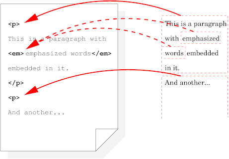
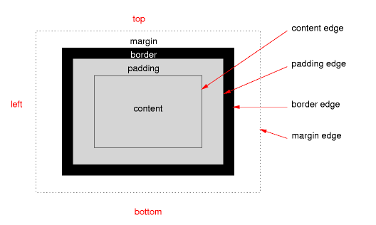
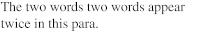
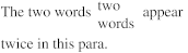
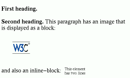
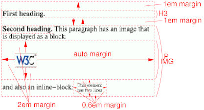
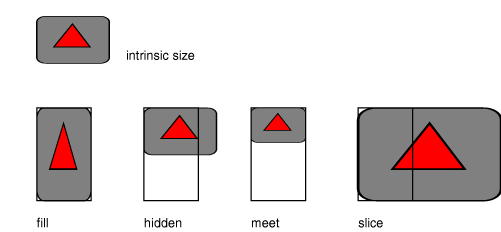
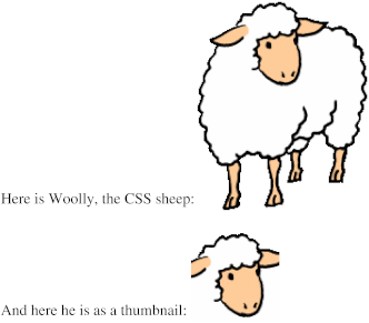
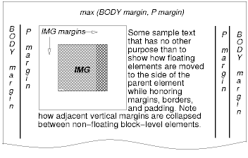
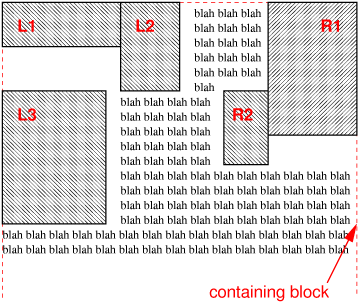
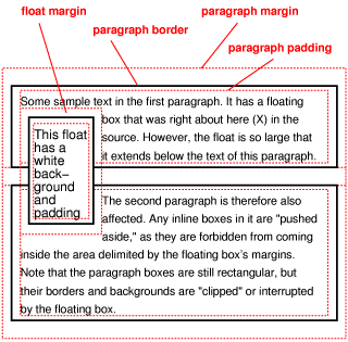
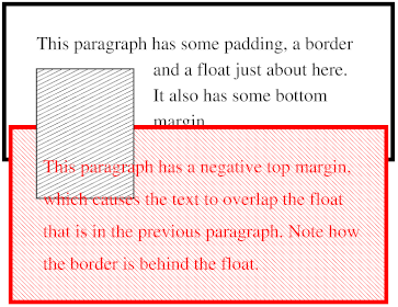
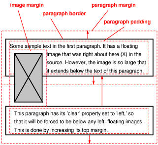
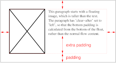